Breaking Out Of The Box: Design Inspiration (May 2016)

Email Newsletter
Weekly tips on front-end & UX.
Trusted by 182,000+ folks.
 Try ProtoPie AI free →
 Register Free Now
 SurveyJS: White-Label Survey Solution for Your JS App
 Celebrating 10 million developers


Today we’ll be looking at eye candy that will undoubtedly help you start the new week with your creativity freshly nurtured. Grab your cup of coffee or tea, and let these designs shine on you with their smart details, fantastic textures, and well-chosen color palettes.
I’ve sifted through the web to dig up little nuggets of inspiration to indulge in — just for you. This time I’ve collected a potpourri of styles ranging from delicate and subtle to bold and playful. Nothing but design goodness. So please lean back and soak it all in.
Sergey Brin
Sergey Brin with his Google Glass. The beard is a nice touch with the dots. Love the vertical geometrical lines, and how these few straight and circular lines give this expression on his face.

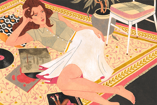
Refinery 29
Drawing people is one of the things I most struggle with. The texture on the body is quite inspiring. The lips, eyebrows, and eyes are so good. Smart details also with the tiny line under the eye and on the chin.
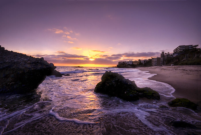
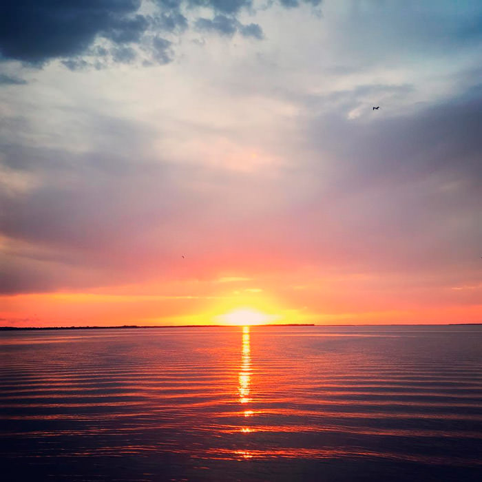
Totuava Bay, Laguna, CA
The colors of the sky with those subtle gradients in combination with the gold reflection of the sun on the water is what made me choose this one.
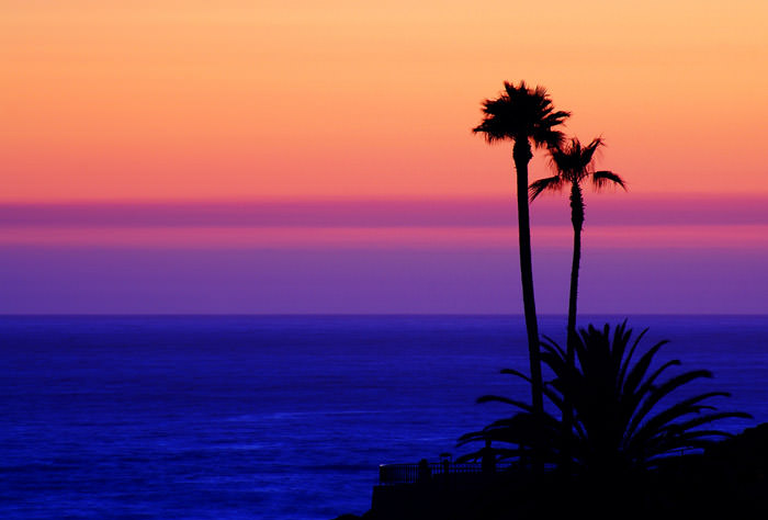
Just Another Day In Paradise
More wanderlust! Beautiful photo of the sun setting over the Pacific Ocean at Laguna Beach. I especially loved the silhouette of the palm trees standing tall against the colorful sky.
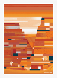
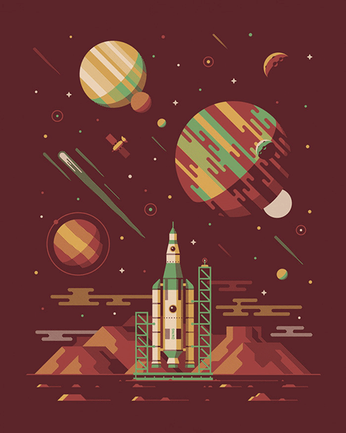
The Martian
Order in randomness. Illustration inspired by the movie the Martian. Excellent use of shapes in a seemly unorganized way; but if you look closer it’s so cleverly done. Love the textures.
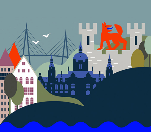
German Landscapes
I really like the composition, especially how the different buildings and aerial elements are stacked after each other. Not your ordinary color palette as well.
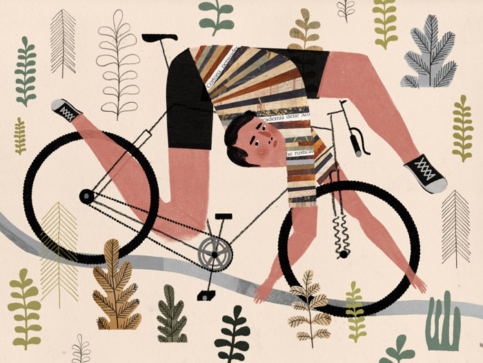
Trouble Getting Back Into The Groove Of Riding
In Belgium there is an expression in the cycling world that says ‘tussen je kader hangen’ which means you are total loss, kaput. This illustration expresses this literally. The shoelaces are just perfect. Beautiful stripes and great textures on the jersey too.
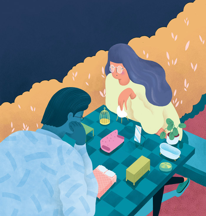
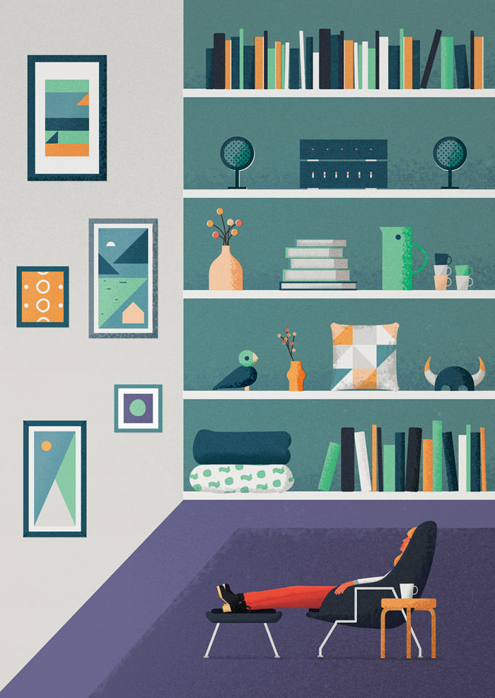
Furniture Chess
Illustrations go beyond reality. It’s one of its true strengths. This piece is so strong. I love the curvy lines of the 2 persons in combination with the straight lines of the table. The color palette is perfect and the textures give it its final touch.
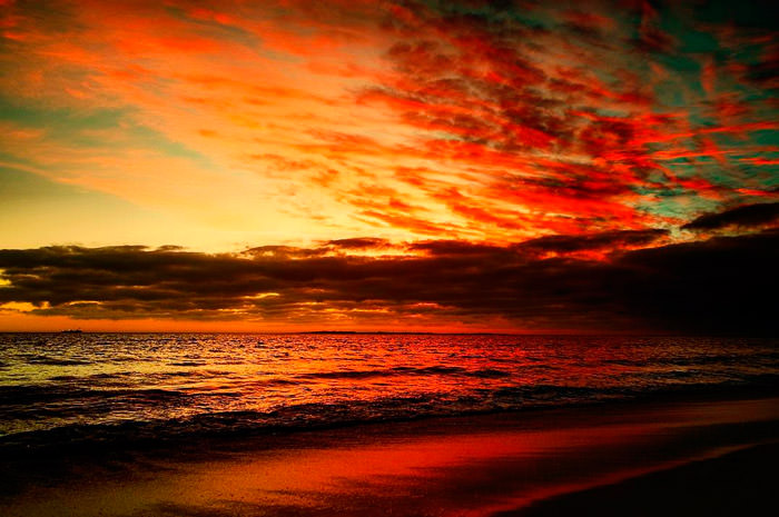
Cape Town Sunset
Just when you think you’ve seen all possible color combinations that nature has at its disposal, you come across another one. Fire in the sky!
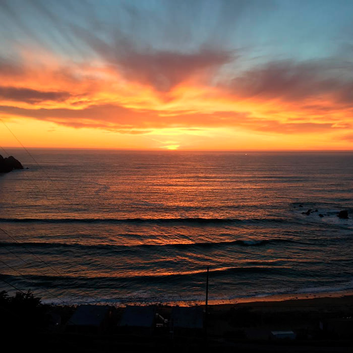
Shelter Cove
Perfect for sampling different shades of orange. Beautiful sunset taken at Shelter Cove in Pacifica, California.
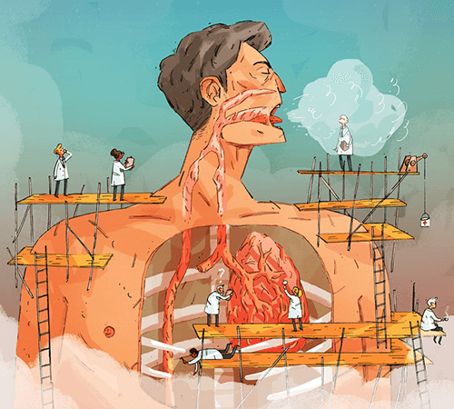
Throat Infections
One of my favorite things to do is analyzing illustrations that are created for editorial purposes. It’s such a great way to discover how much fantasy & thought went into it. This one is about diagnosing throat infections.
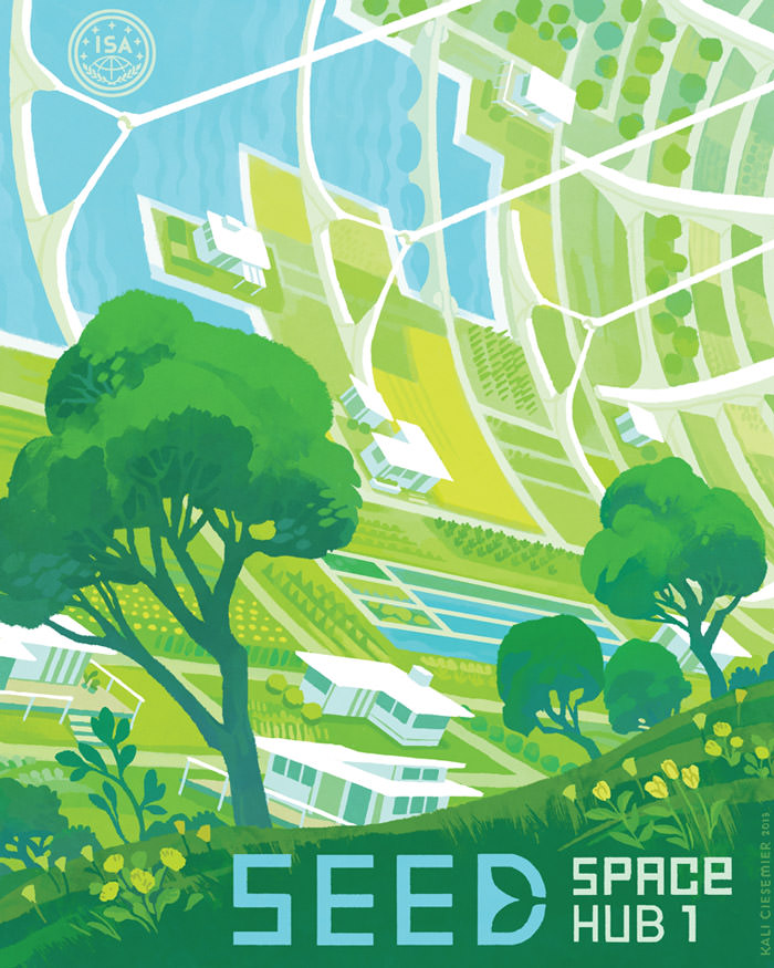
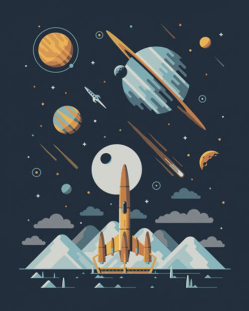
Seed Space Hub 1
I’m a lifelong sci-fi fan and this illustration for a travel poster for a new ecological space habitat is wonderful. The inverted curved perspective is what makes this poster so special.
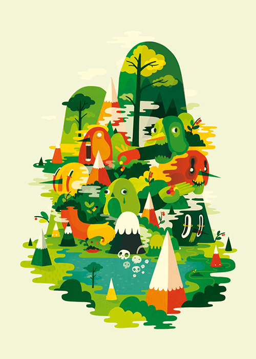
Picking Berries At Pihtipudas
Fantastic color usage with those different shades of green. There’s also much to discover with these fun and playful characters and this illustration is also bursting with energy.
Sunset By Greg
I’m a sucker for sunrise or sunset pictures. They serve a huge purpose not only as visual inspiration, but they usually contain a welt of color information ideal for subtracting a color palette from.
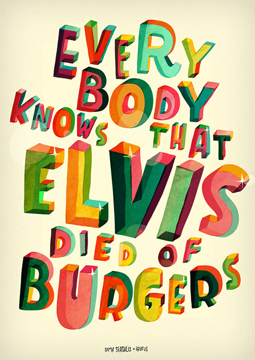
Everybody Knows That Elvis Died Of Burgers
Custom lettering is a labor of love. This one is based on lyrics from a song by Damn Seagulls. The subtle textures and the transparency on the letters are so well done. I really like that you can look inside. The colors are perfectly chosen to create this wonderful 3D transparency effect.
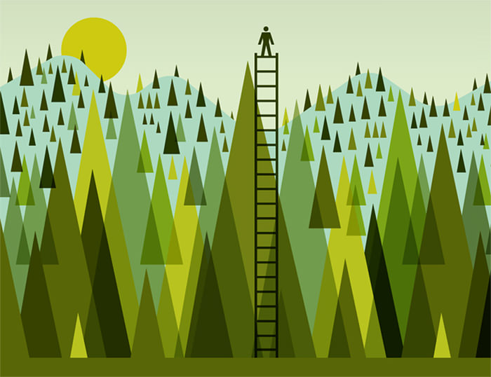
Burning Question
Illustration for Wired Magazine’s ‘Burning Question’ section: “How do I make my GPS better?” So simple but yet so effective. Love the shades of green and the simplicity in this one.
Baku Magazine
Finding the right art for your home can be a tough journey. Perfectly illustrated here. Subtle details make this one my pick such as the texture of his shirt, the dotted lines on the jeans, and the wood finish on the furniture.

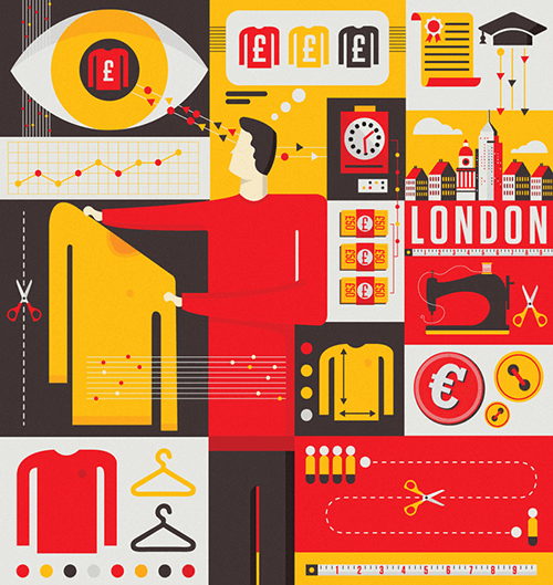
Transport For London
opt poster campaign with Transport for London for the upcoming prudential bike race. Love how the red carpet meanders over the suburbs in such wavy line, and how the red contrast against the green background.
Code School Is Hiring - Product Designer
Nice collage to accompany a job announcement. Excellent use of colors with just some limited usage of a few drop shadows, and a perfect composition.

Brisbane Airport
You feel the sun shining into this spacey building. Light and shadow are so perfectly done through perfect choice and application of colors. The style of the faces is an original approach with the black noses. Some wonderful details too such as the brush stroke like texture on the sofa.
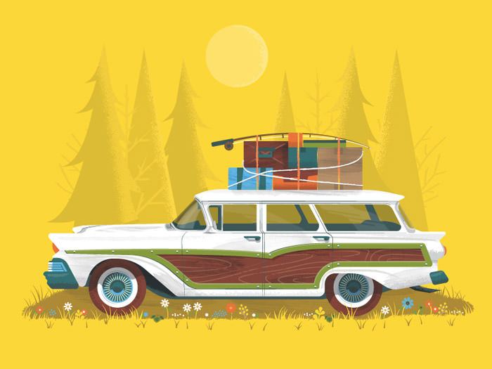
Get Lost
The grass and flowers put the explorer car perfectly in the frame. Some sweet details on the car as well. The spokes of the wheels and green frames together with the wood. Details matter.
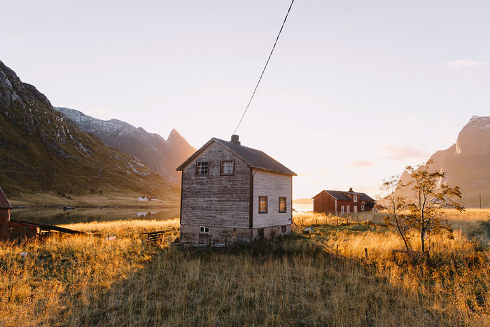
Wandering In Nature With Alex Strohl
French photographer Alex Strohl lives in Montana, in the U.S, and has gone back to Europe with his wife to take pictures for his book ‘Alternative Living’. Sometimes you just have to be in the right spot at the right time. Here it’s the golden light moment coming from behind the house and giving the grass its glow.
Explorers Club: Orion
I’m a big fan of DKNG’s work. Their explorers series are wonderful color screen prints. The line patterns are a nice touch. There’s an 8min video that reveals its process.
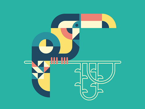
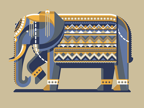
Toucan
Beautiful geometric interpretation of a toucan. The shapes are cleverly arranged. All in all a lovely idea and execution.
Explorers Club: Europa
Last one out of the explorer series of DKNG. All of these are beautiful screen print posters that would fit any wall. The layers of color and patterns always get me. Love the nice 45° diagonal feel in these illustrations. Inspirational!
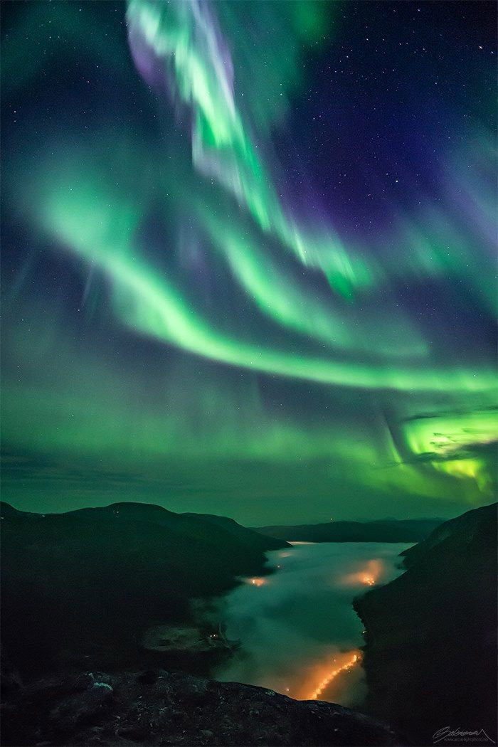
Skyfall By Ole Salomonsen
The Northern Light is still one of the most amazing phenomena that nature has in its bag of tricks. Those greenish blue color variations never tire me; they always keep inspiring me.
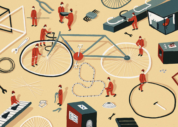
Boneshaker
Now you know how a bike gets assembled when you order one online. These miniature mechanics give this illustration a certain cuteness I like. These red accents draw your attention, which is a nice bonus.
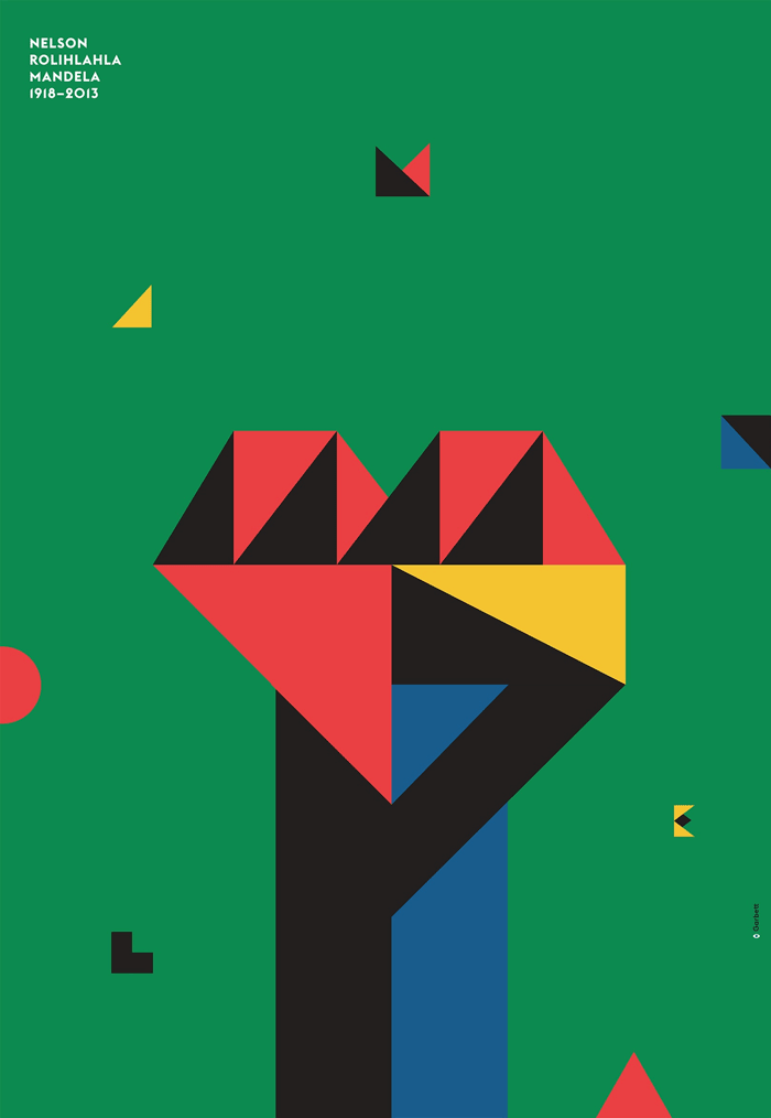
An Ode To A Hero
Love this geometric fist done by Australian design studio Garbett. It’s an ode to Nelson Mandela. Bold color usage in combination with clever placement of shapes.
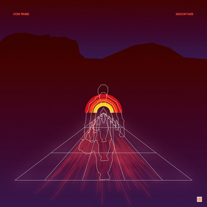
Silicon Tare
Besides Tycho there’s also another band that has album art that has been consistently great. That band is Com Truise. The latest cover plays wonderfully with depth of field.
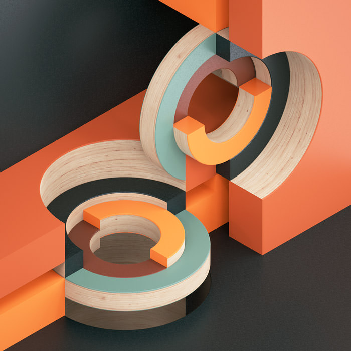
Circular Intersections
A study in abstract & circular compositions which explore intersections within an isometric environment. The interaction between colors and shapes is what grabs my attention.
Mystery Project 79.1
A prime example of a fantastic use of ornaments. With all details going, they’ve used some clever thinking to arrange it so that it works as a whole.
Coffee Break
So many wonderful details to discover here. The way she applied the darker green on the dress, the subtle details on her shoes and legs. Interesting way of how the shadow and highlights are applied. So inspiring to look at!
Standing Out
An editorial illustration for an Accounting Technician Magazine which is all about standing out in your profession. The idea was to colorfully illustrate individuals who have stood out from the crowd in their respected professions. The few colors are so well applied.
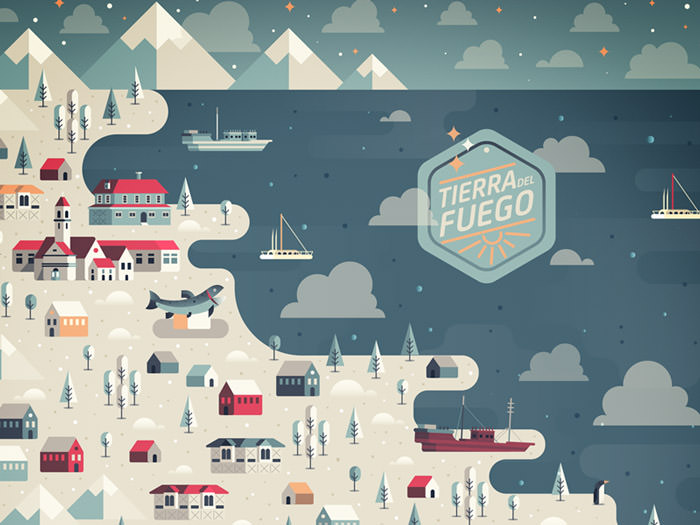
Tierra Del Fuego
Love the composition of this illustration, and the flat 2D style. Depth is added so perfectly by applying the right colors for shadow and highlight. The X’s in the houses are a cool detail.
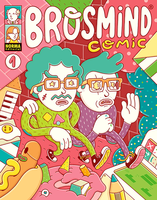
Brosmind Comic
Brosmind aka the Spanish Mingarro brothers have their own full-color comic book. This one is full of details as always. I like the letters on the bottom of the shoe sole. Both of their first name, Juan and Alejandro. The eyes are magical too. It all looks moldable.
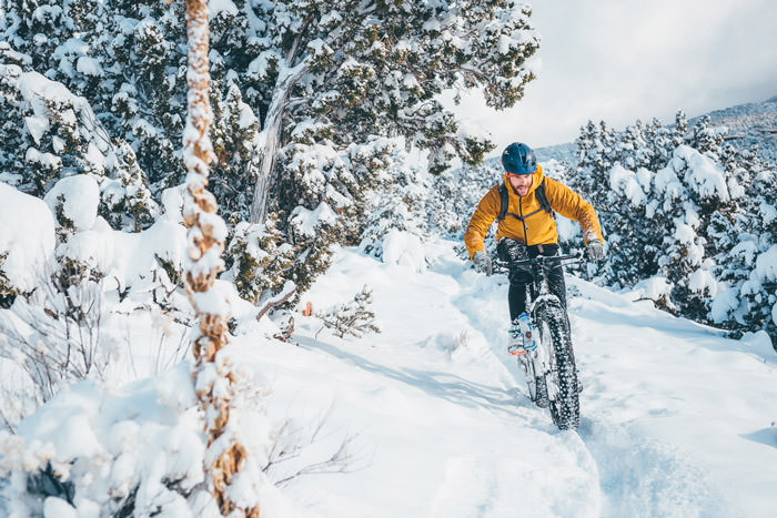
Breaking Trail In Santa Fe, New Mexico
Let’s play! The lure of a fat bike and snow. A setting for some beautiful photos. The yellow jacket works so wonderfully in this scene.
New Yorker / Scandinavia
Illustration for the book review section—highlighting the beauty (and obsession) of Danish design in the home. I recognize a few items in here. Subtle use of textures, and wonderful color palette and usage of colors. So perfect.
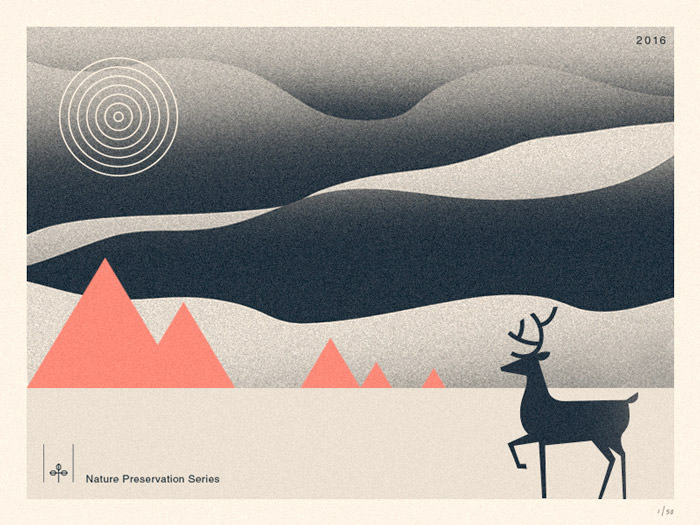
Nature Preservation Series I
The curvy lines in the background, which I assume represent the sky, are very well done. The concentric circles and the straight lines of the mountains create this nice contrast. This extra color accent finishes it off perfectly.
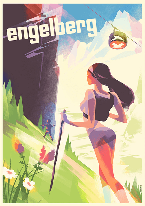
Engelbert Summer 2016
Once more ‘wondrous’ work from Mads. How he combines shadows and textures is so inspiring. The colors are so very well chosen and blend perfectly together. His illustrations are always so very elegant.
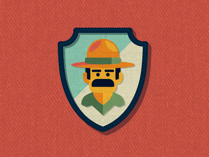
Outside Lands Patch: Ranger Dave
Now that’s a super mustache! These simple little details add so much character to Ranger Dave. There’s more to absorb such as great colors and inspiring textures.
Myths - Gosia Herba
One detail that immediately pops out here are the odd proportions and textural elements. A perfect example that you don’t have to follow any rules but let your imagination guide you. Love the pastel en peachy tones too.
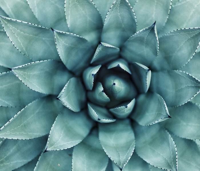
Botanical Garden, Københaven K, Denmark
Plants always have inspired me with the way everything is layered and stacked. Love the green gradients and how there is a little triangle inside each leave.
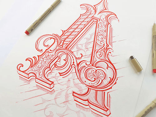
Hand Lettering III
Incredible hand lettering work that must take ages to create. The different hardness of the lines, the textures used inside, and those little ornaments throughout. So incredibly well done. It’s just jaw dropping.
Play Beach Boys
Another example of an illustration that proves that things don’t need to be mirrored to reality. Here the perspective is a little bit off and that works wonderfully well. I love the color combo too.

Circular Intersections II
Second photo from a study in abstract & circular compositions which explores intersections within an isometric environment. The interaction between colors and shapes is what grabs my attention.

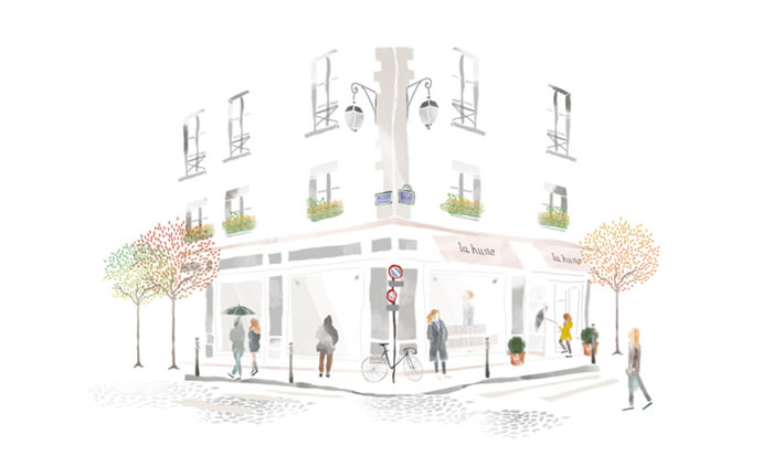
La Hune
Wonderful watercolor work by Catherine Cordasco. It has a certain flair to it with subtle color touches. The overall softness in her illustration style is really beautiful.
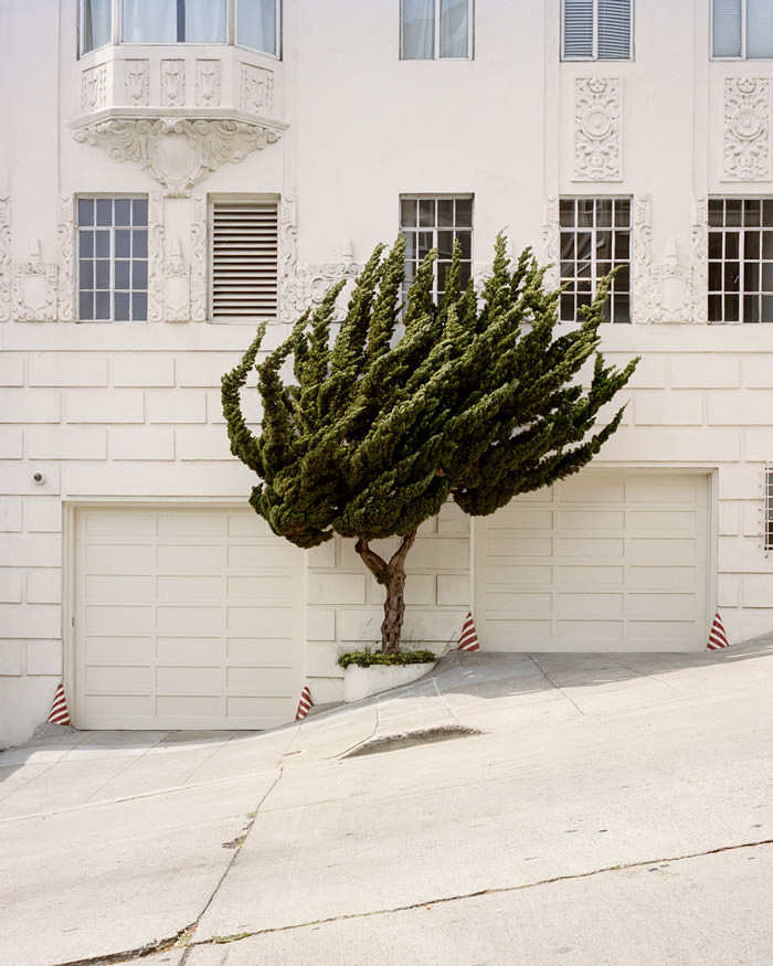
Windswept
What I love about this picture is that the tree totally looks like the branches are grown towards the wind direction and that the lines are almost apparel with the steepness of the street. It also helps that it is the only touch of color in the scene.
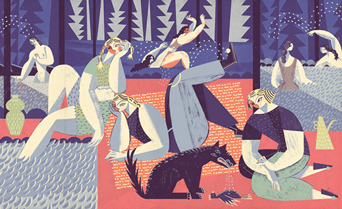
Dinner By Moonlight
Always a bonus when you can add a little humor to your work.
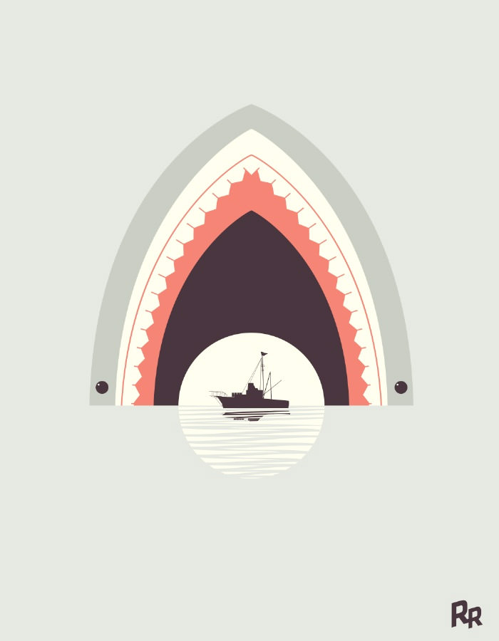
Shark Selfie
Just like the previous illustration. Humor almost never disappoints. Great color usage.

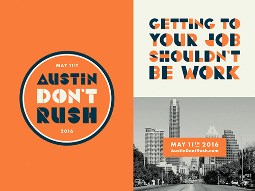
Austin Don’t Rush
Modern with a mid-century vibe to it. That’s how I would describe this. The typography and tone of colors work very well. Love the star in the letter A. That’s just perfect.
What About You?
What projects inspire you the most? What helps you stay creative? Let us know in the comments below!
Further Reading
- Modern Art Movements To Inspire Your Logo Design
- Beautiful Photoshop Illustrations By Artists Around The World
- Inspiring Illustrator Artworks By Artists Around The World
- Rediscovering The Joy Of Design


