Improve Your Designs With The Principles Of Continuation And Common Fate (Part Three)

Email Newsletter
Weekly tips on front-end & UX.
Trusted by 182,000+ folks.
 Celebrating 10 million developers


 Custom Web Forms for Angular, React, & Vue. Your backend.
Creating an effective web design is like putting a puzzle together, with the various parts coming together to tame the chaos and form a whole, well-organized design. At the foundation of this organization are the gestalt grouping principles.
In the first two parts of this series, we looked at the principles of similarity and proximity to understand how elements can be organized by their relatedness to other elements, and we looked at the principles of closure and figure-ground to understand how relationships are formed through the use of positive and negative space. In the final part of this series, we’ll focus on the principles of continuation and common fate, which involve movement, both implied and animated, to create relationships.
As in the previous articles, we’ll first dig into how the principles work and then take a look at real-world examples so that you can use them effectively in your own designs. Let’s jump right in with continuation.
Continuation
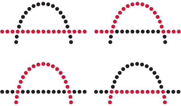
A road stretching into the distance. Stairs climbing up a tall hill. A river winding through a city. Every day we experience similar scenes that lead our eyes through them, without even realizing it. We tend to follow continuous, uninterrupted movement, following elements that are aligned in straight lines or curves. We perceive these aligned elements as related groupings more so than we do elements in lines and curves that are unaligned. This is the principle of continuation.

Continuation dictates how we interpret direction and movement through a composition. Our mind chooses the path of least resistance, perceiving lines as continuing along their established direction. In the examples below, our eye follows the less abrupt path, following the straight line or the curved path through the compositions on the left, more so than the jarring paths on the right.
Continuation In Practice
When designing, we can use continuation to guide the eye through our designs, establishing relationships between elements as well as directing attention to specific groups or elements.
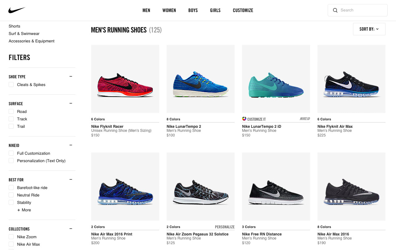
As seen on Nike’s website, shown below, rows of shoes are nicely aligned, allowing our eye to follow an established path from left to right. Continuation guides our eye through each row, grouping them together and communicating to us that they are related products. Continuation is further enhanced by all of the shoes pointing in the same direction, encouraging movement from left to right. By the way, I should add that many of the principles I’ve discussed in previous articles are also at work here. Continuation is often aided by similarity and proximity, and, in this example, the principles help to align things by grouping alike items close together, to form a relationship.
On mobile devices, real estate is limited, and in the context below, continuation is helpful in guiding the eye through the options in each category in Apple’s App Store. Even though we see only the first few apps, we understand that more options are to the right. Continuation works to establish this path and the direction for us to follow, moving horizontally from left to right. Again, many principles are at work here to assist continuation, including similarity and proximity, but also closure, because our mind fills in the blanks of what to expect beyond the first few apps. Additionally, because items that move together are perceived to be related, common fate is at work here, too (we’ll dig more into this shortly).
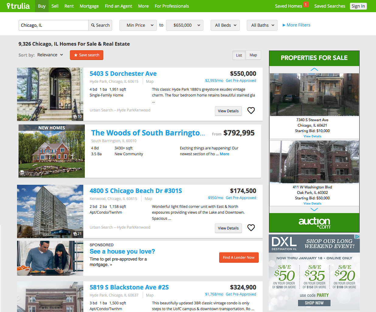
Continuation is suitable not only for horizontal movement, though. It can also lead the eye vertically through a composition, compelling us to scroll through to view items. In the example below from Trulia, consistent elements are neatly aligned and grouped into cards, which guide the eye down through the listings.
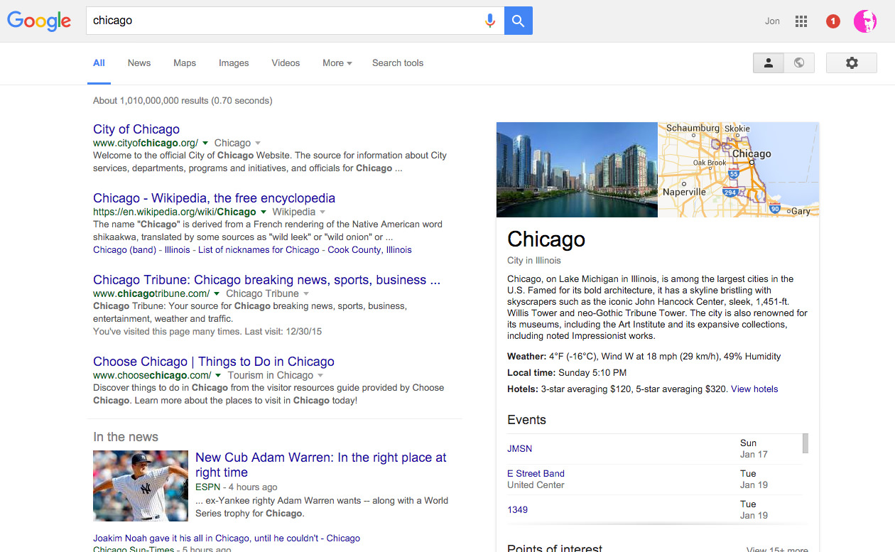
In addition, columns of information, such as what you find in a Google search result, also use continuation to guide the eye. The main column of results on the left, as well as the informational box on the right, both encourage movement vertically through the information.
Disrupting Flow
While continuation can be used to guide users through a composition, we can also disrupt it to focus attention or delineate the beginning or end of a section. As we see in the following example from Warby Parker, consistent, vertically aligned images of sunglasses draw us down through the screen. Suddenly, this flow is interrupted by an image shape that we’re not used to. This image stops our movement and focuses our attention on it.
The disruption here may or may not be intentional. We need to be careful that any interruption we do introduce is deliberate and serves a purpose. Certain disruptions can be harmful. Leaving too much space between elements or using large elements or images that don’t seem to serve a purpose could mistakenly signify an end and cause users to stop when you don’t want them to. This is particularly pronounced on mobile devices, where vertical scrolling space is limited.
Creating Effective Continuation
As we saw in the examples, continuation guides movement through a design, easing the effort of navigating a composition, while creating relationships between elements and groupings. To create effective continuation, we can follow a few simple best practices:
- Avoid disruption, or use it to your advantage. To encourage movement, avoid elements in your design that might disrupt the established direction of movement, such as too much white space between elements or large graphics or images. Conversely, as in the Warby Parker example, you can use disruption to focus attention on an important element or to signify the beginning or end of a section or grouping.
- Ensure good alignment and consistency between elements. Make sure that the elements establishing direction are aligned well and consistently styled. Poorly aligned or inconsistently styled elements will either undermine the direction of movement or cause the eye to lose the established direction. As seen in the Trulia example, well-aligned and consistently styled elements will minimize the cognitive load on users as they navigate the composition.
- Use cues to suggest direction. For horizontal scrolling, such as we saw in the App Store, indicate that there is more to see to the left or right to help establish the direction of movement.
Following these rules will help guide users through your design and assist them to better understand related groupings.
Pretty easy, eh? Continuation is a fairly straightforward, simple principle to understand, and it is easy to recognize in designs and to apply it in our own work. We often use it without planning to or even thinking about it. However, recognizing it and understanding how it encourages movement through a design will help you craft a better experience for your users.
Our next principle is a bit more complicated, incorporating animation to form relationships. Let’s see what it’s all about.
Common Fate
Common fate is a powerful principle for designers to wield, because it involves movement and animation. Movement can be used to clarify relationships between elements, helping users to see how different elements group together, as well as to guide attention to where we want it. When elements move in the same direction, they are perceived to be more related than elements that don’t move or that move in different directions or at different speeds.
Take fish, for example. We’ve all most likely seen a school of fish swimming together in synchronized movement. They do this, in part, as a defence mechanism to guard against predators — by sticking together, they’re less likely to be eaten than when on their own. This behavior exemplifies the principle of common fate beautifully. When fish swim together like this, they truly are sharing a common fate, sharing the same motion, direction and speed to achieve their goal of survival. We perceive the fish as a whole, related, moving mass, rather than thousands of individual fish.
This relatedness of elements moving together is perceived to be strongest when the elements are synchronized — moving in the same direction and at the same time and speed. Even when elements are grouped by similarity, as we see below, the elements that move together are perceived as being related, regardless of their previous grouping.

When direction, timing or speed vary, the relationships weaken. As we see below, when the circles move in different directions and at different speeds, we lose the relationship we had when they were moving together at a consistent speed and in a consistent direction. Now, there is no order or synchronized movement to indicate what is related.

Common Fate In Practice
You might not realize it but common fate is all around you, every day. It can be seen in traffic, such as cars moving together down a road, and in nature, such as a flock of birds flying together overhead. In design, we use common fate to define related elements, distinguish between elements that are most important and keep the user focused in the current context.
As seen in Facebook’s Paper app, even something as commonplace as the act of swiping through articles shows common fate in action. Here, as the cards move in the same direction, they are perceived as being related content, separate from the navigation tools and the larger article image above. The movement guides attention to the cards, giving them more salience and keeping focus on the task of scanning articles.
Likewise, common fate is in action in the example below from Epicurious, an app for discovering recipes and creating shopping lists. Here, when the sort button is tapped, we see that the options move together as one, causing us to perceive them as being related elements that perform similar actions. The movement also keeps attention focused on the task at hand.
Another great example of the principle in action is seen in Peek’s calendar app. Peek uses common fate throughout the app to convey relationships between elements. For example, as seen below, when a date is tapped, content unfolds and moves down, exposing the day’s events. This movement serves to relate the events to the day selected and to focus attention on the events within.
Disrupting Synchrony
As we’ve seen, when elements move together in the same direction and speed, they form strong relationships that are distinct from other elements in the design. The true power of common fate, however, appears when this movement is disrupted. When something goes against the grain of synchronized movement, it disrupts our expectations and we zero in on the disturbance. This is where we can guide the user’s attention to an element or grouping within a design, clarifying relationships between groupings or states.
When my microwave recently went on the fritz, I jumped into Home Depot’s app to do a little research and stumbled upon common fate in action. After swiping through microwaves, moving up and down through the listings, I decided to compare a couple of models. Tapping the “Compare” button at the top moved the listings slightly to the right, exposing checkboxes to select microwaves for comparison. This unexpected movement created enough contrast with the motion of swiping through listings that it focused my attention on the new context of selecting products for comparison.
One of my favorite uses of common fate is found in Houzz’s app. Houzz is a home-improvement app for discovering designs and products to inspire your own home design. Common fate is used brilliantly to attract attention to products for exploration and purchase within the app. Below, as we swipe through images, searching for inspiration, we are engaged in common fate as images move in the same direction. However, the forward movement is suddenly disrupted by swinging green product tags within an image. This unexpected motion, disrupting the movement of swiping, grabs our attention immediately and makes us want to further explore the products in the image.
Finally, PBS uses common fate to call attention to the next article to read. As we get to the end of an article, the suggested next article slides in from the right, disrupting the vertical movement of scrolling and focusing our attention on the element. If this were just a static link at the bottom of the screen, it might be overlooked, especially with the social media links fighting for attention. But by animating the next article element and having it move against the vertical scrolling, our attention is focused on it, instead of the elements around it.
Creating Effective Common Fate
Through motion, common fate helps users to understand which elements are related, as well as which are important. We can follow a couple of best practices to create effective common fate in our own work:
- Keep movement synchronized. As we saw in the Paper example, elements or groupings that move together are perceived to be related. To make it effective, keep the direction and speed of these moving parts constant.
- Use contrast to focus attention. Disrupting the expected movement causes the user to focus on the disturbance, as we saw in the Houzz example. Use this contrast to focus attention on important elements or to signify changing states.
Conclusion
There you have it: two principles you can use to create a better experience for your users. With continuance, we can guide and encourage movement through a design. With common fate, we can help users understand which elements or groupings are related, as well as guide attention to where we want it.
Using these principles, along with the principles of similarity, proximity, closure and figure-ground, will strengthen your own design skills and help you create a better experience for your users. Oh, and one final thing. After applying these principles, make sure to test out your designs with users to see what works best for them.
Previous Articles On Gestalt Principles
- “Improve Your Designs With These Principles of Similarity and Proximity,” Jon Hensley, Smashing Magazine
- “Improve Your Designs With the Principles of Closure and Figure-Ground,” Jon Hensley, Smashing Magazine
Resources
- Universal Principles of Design: 125 Ways to Enhance Usability, Influence Perception, Increase Appeal, Make Better Design Decisions, and Teach Through Design (revised and updated), William Lidwell, Kritina Holden and Jill Butler, Rockport Publishers, 2010
Further Reading
- What Saul Bass Can Teach Us About Web Design
- The Principles Of Visual Communication
- An Actionable And Reliable Usability Questionnaire With Only 7 Items: Inuit
- Rediscovering The Joy Of Design


