A Roadmap To Building A Delightful Onboarding Experience For Mobile App Users

Email Newsletter
Weekly tips on front-end & UX.
Trusted by 182,000+ folks.


 Celebrating 10 million developers

 Custom Web Forms for Angular, React, & Vue. Your backend.
When launching an app, you need to spend a lot of time and resources to attract users. You can pull people into your app using a variety of means, including advertising, referral programs, public relations and content marketing. But when people finally download an app, they sometimes feel abandoned. You must clearly show users why they need your app.
Studies reveal that 90% of all downloaded apps are used only once and then eventually deleted by users. People often abandon apps because of a poorly designed interface or an overall negative experience. Instead of having their problem solved by the app, people get confused trying to wade through a jungle of screens, menus and buttons.
In chapter 5 of Fundamental UI Design, Jane Portman says:
"But once the user logs into the app, they’re often left alone. They start drowning instead of swimming towards their goal."
For users to give your app a second chance, they need to understand four things:
- why they need the app,
- what the app can do for them,
- what are its most important features,
- how to use these features.
The best way to communicate the purpose of your app is through an engaging onboarding experience.
What’s Onboarding?
The term “onboarding” comes from the field of human resources. It means helping a new employee adapt to a new workplace. According to UserOnboard, in software development, onboarding is about helping users to successfully adopt and fully embrace a product.
Onboarding follows the 80⁄20 rule. It is effective only if you can quickly teach people how to use the small subset of features that they will spend 80% of their time using. But you should also explain why those features are so useful.
Onboarding is accomplished by displaying a set of brief messages that show users how to interact with the app to solve a problem or that show the app’s main idea or killer features. Onboarding can take several forms:
- introductory slides or video,
- tips,
- interface tour,
- content samples,
- hybrid solution.
All of these solutions are effective at communicating with users. Choose the one that would work best for your target audience and that makes sense for your app’s functionality.
The following video shows slides that could be used to onboard users of a travel app:
I like this implementation because it’s fun. “In the process of flight you will be in cryogenic sleep…” — this is a great example of capturing the user experience of an app. I also like the brevity of the design. Only three slides — “Create account,” “Choose the planet” and “Departure” — but they perfectly convey the purpose of the app.
The Beats Music app uses an onboarding wizard to engage users and personalize their music-listening experience:
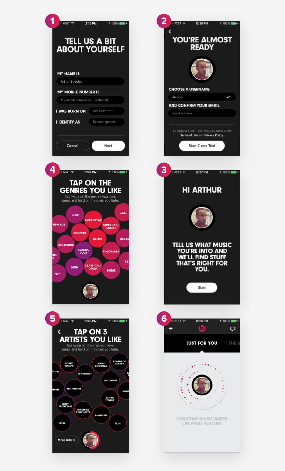
This type of onboarding design appeals to the user’s music taste, making their experience unique. The message “just for you” is a great way to indicate how the user will benefit from sharing their preferences with the app. What’s more, people love to talk about themselves and about what they like. An onboarding wizard might be the best strategy for an app that has to cater to various tastes.
IFTTT, a well-known service for automating small tasks between Internet-connected services, uses tips to explain its unique offering:
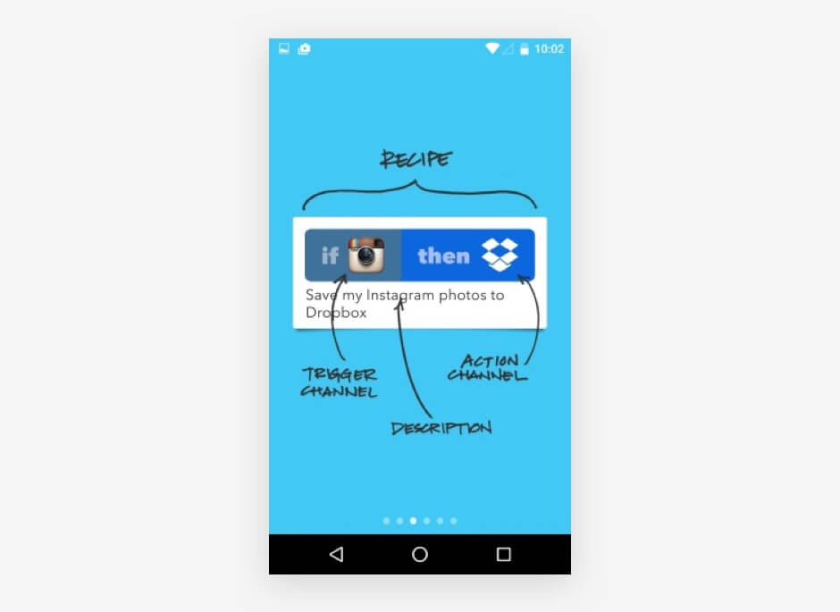
IFTTT shows what a recipe looks like and explains every element on the screen. Specific terms are used — trigger channel, action channel — helping people to clearly understand the logic of “if… then.”
Strategies
Now that we know the different types of onboarding, let’s figure out how to design an onboarding experience to be as delightful as possible.
If you were to design onboarding for a photo-editing app, you could create four to five introductory slides. A financial app with charts, graphs and budgeting functionality might require a detailed tour or a system with tips. For a music-editing app, you could implement a helper to briefly explain how to use the controls to create a track.
Some designers take a hybrid approach, combining two or more types. For example, you could combine an introductory video containing clues and a help menu with detailed instructions. Check out the video for Google’s Inbox app for an example.
Let’s explore six strategies to engage users.
Trigger Positive Emotions
Once people start using an app, they will easily forget the introductory training and get lost in the UI. To point them in the right direction, you could gamify the app. For example, you could provide tips along with “achievements,” or praise users for completing an assignment. Achievements trigger positive emotion. If people associate your product with a feeling of success, they will continue using it.
In chapter 5 of Fundamental UI Design, Jane Portman says:
"Any user onboarding is all about psychology: the early feeling of success and accomplishment will make the user come back."
Look at how MailChimp triggers positive emotion by praising users for accomplishing a task:
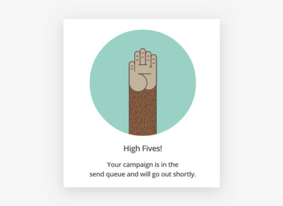
MailChimp uses its unique voice in all its communication with customers. “High fives” is fun, uplifting and hip. MailChimp simply needs to tell the user that their campaign will soon go out, but MailChimp adds emotion to the message. Leveraging emotion is a powerful skill in design.
Onboarding speaks to emotion when it meets the following criteria:
- the navigation makes sense and is easily understood;
- the design is visually appealling to the target audience;
- moving through the slides is so enjoyable that the user wants to continue;
- the entire onboarding experience is memorable and personal, reflecting the personality of the brand and its customers.
We used these criteria to design our own onboarding process at Yalantis. The concept below illustrates how we can use emotional appeal to engage the target audience of a hypothetical fashion app. The idea was to help young women choose stylish clothing. But we didn’t focus strictly on explaining the functionality of the hypothetical product. We created the onboarding experience as an example of emotionally attractive design.
We used Adobe After Effects (but you could easily implement this concept using any prototyping tool, along with your own illustrations). We picked out natural colors for the prototype to associate the onboarding experience with a person’s everyday life.
Show What Users Can Do
When constructing an onboarding experience, take the customer’s perspective. Showing how customers would benefit from the product is one way to show how great it is.
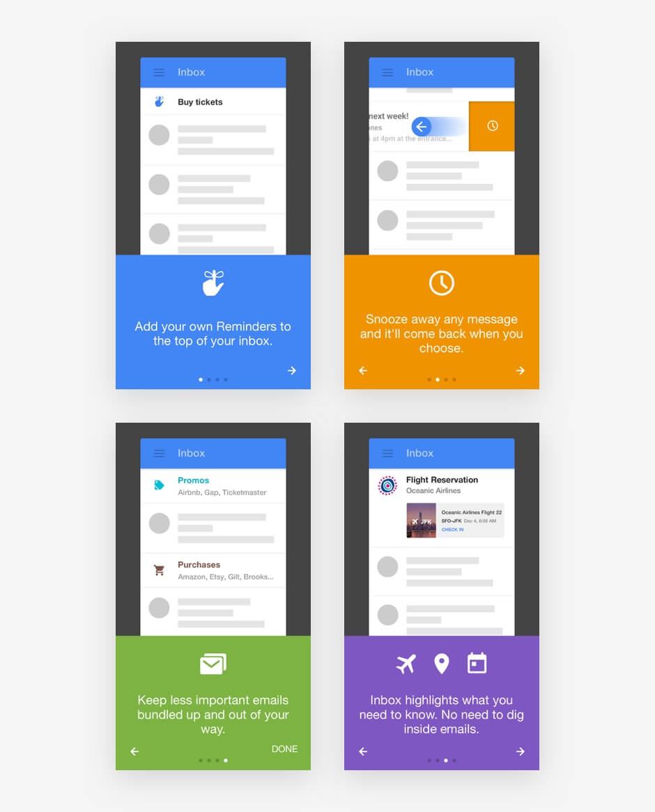
Write down three short sentences that briefly explain what the app does and the value it offers. Google’s Inbox app is a great example of what this might look like:

Inbox uses verbs and icons to describe the value on each screen. Verbs push people to take action better than any other part of speech.
In our own example, shown below, we demonstrated the process of interacting with a video-editing app from the moment the user pushes the record button through to the steps of editing the video, applying filters and sharing the video to social media. We highlighted the benefits of all of the functionality of this app. Even though video functions might sound complicated, we chose simple words for the slides so that users would clearly understand how they would benefit from the app.
Draw Attention To Competitive Advantages
If your product has to compete with a lot of similar solutions, clearly highlight its competitive advantage. Use three to four slides to tell people what makes your app different from others. Be clear and concise when explaining why people need your app.
“Comprehensive,” “Twice a day,” “Definitive” and “Reminders” — the fours slides below explain the value of the News Digest app by Yahoo better than a thousand words.
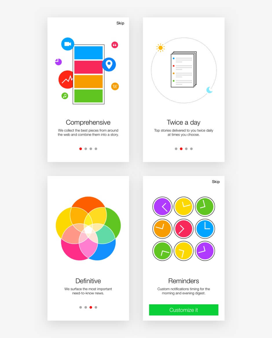
I like the colors of the News Digest app’s onboarding design. Not only do the messages emphasize how different Yahoo’s app is from similar apps on the market, but the colors match the user interface.
Explain With Content Samples
Users will better understand how to interact with an app if they see samples of the content.
Content samples are primarily used in productivity and document-editing apps. You could always combine content samples with tips and slides.
Here is how Dropbox uses content samples to onboard users of its Paper app:
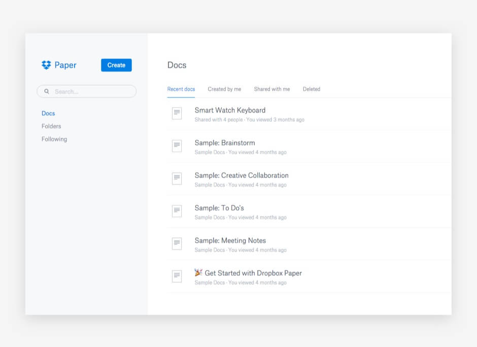
Collaborating on ideas organized in documents and folders might sound complicated, but Dropbox uses the onboarding experience to show how easy it really is. The interface is clean and clear, helping people to quickly get the idea.
Onboarding with content samples is also seen in Readdle’s Documents app for the Mac.
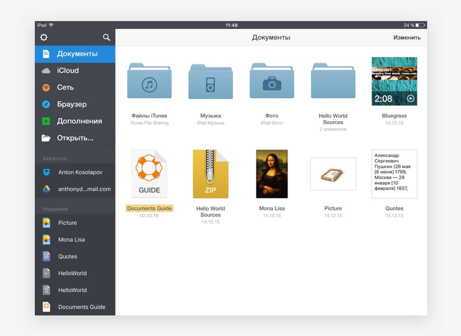
Readdle shows users which files they can manage and where these files can be taken from. Content samples emphasize the uniqueness of the app’s value proposition: one place for all of your files.
Make The First Impression Have A Lasting Impact
First and foremost, onboarding design should get a user to take an action the first time they use the app.
An initial “blank slate” that is properly designed can push the user to take their first action. A call to action, such as an illustration with a prompt to create a new document, can get the user creating. Use the blank slate to set expectations for what will happen.
An effective blank slate educates, delights and prompts the user. Consider the following three apps, which excellently fill up the emptiness of the screen:
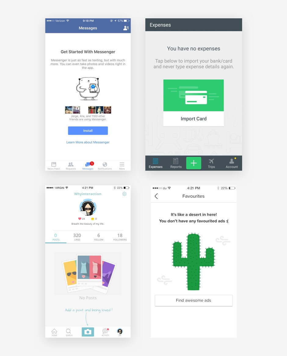
In the first screenshot, we see an invitation to install a messaging app, with a description of the value that it offers. The second screenshot nudges the user to import a bank card that will simplify their expense tracking. The third shot recommends that users add posts to their profile to make it more attractive. The last is a fun design, inviting the user to “find awesome ads.”
Implement A System Of Progressive Learning
This is the most complex strategy and is suitable for large and technically sophisticated projects with a high threshold for entry. Progressive learning involves a hybrid system of unobtrusive tutorials, tips and motivation at all stages of interaction.
With this method, users learn how to use the product without any videos or additional guides. They are able to easily discover hidden features needed for professional work. Progressive learning usually includes a system of assignments.
Elements
Once you pick out a strategy that works for you, think about the design. There are four key elements of onboarding design.
Buttons And Navigation
If you present a slideshow, indicate with arrows and other symbols where in the interface the user should move to next.
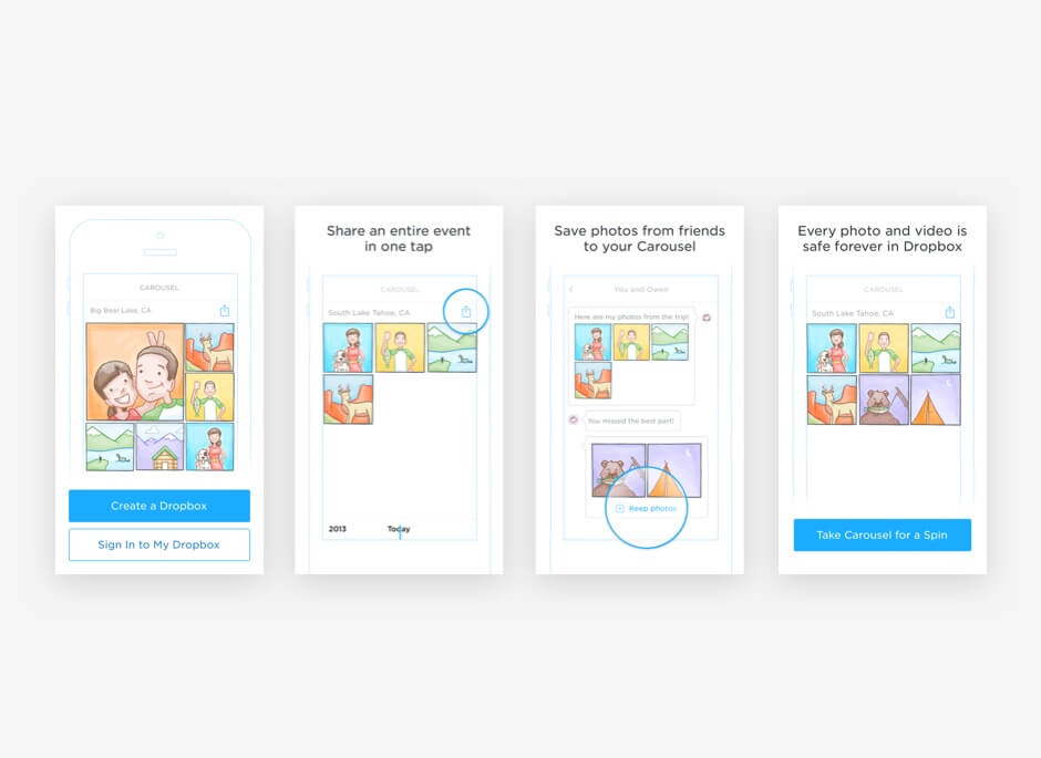
One of the best onboarding designs I have seen so far was in the now-defunct Carousel app by Dropbox. When users launched the app for the first time, they were invited to “start.” Upon clicking “start,” they could scroll down to see slides that describe the main functions of the app. Indicators nudged users to scroll down to see the next sketches. At the end of the onboarding experience, users could register to use the app.
When it launched, Carousel was pretty successful, largely because of its smartly designed interface and engaging onboarding experience. Unfortunately, the project was shut down, primarily due to weak product positioning in the Dropbox ecosystem and strong competition from Google Photos, Apple iCloud and Facebook Moments. Dropbox moved Carousel’s core functionality to its main app.
In our example of onboarding for a virtual-reality travel app, we used actionable navigation. Every click took the user to another stage. We also implemented vertical scrolling through tips to achieve an intuitive user experience. We used Apple Motion to create this prototype.
Tips
Tips are a set of communicative elements that show up on the screen in a certain order. Tips are attached to various components of the interface, briefly describing how users can interact with these components.
Use tips to quickly guide users through the interface, helping them to take their first steps in the app. You can also use tips to show new functionality after the app has been updated.
Tips can be presented in various ways:
- to emphasize active elements,
- as textual hints,
- in popup windows,
- to fill up blank areas of the screen.
Consider what type of user you are showing the tip to. Experienced users will get irritated by elementary tips, so allow them to skip past.
Also, some users just don’t want to be onboarded, no matter how great and engaging the experience is. You need to respect their wishes and let them move on.
Text
Text for onboarding needs to follow certain guidelines:
- Brevity and clarity
Keep each slide to a single sentence that describes a key value of the app in clear plain language. - Readability
Text should strike the eye and be easily readable against the background. - Composition
The fonts and presentation of text should match the overall design language and reflect the mood of the product.
Listen to your users, and try to figure out what they would like and want to hear. Consider what might be hard for them to understand and would, therefore, need more thorough explanation.
Note: If you are planning to market your app in Arab countries or in southeast Asia, allow the interface to be flipped horizontally or vertically. Speakers of right-to-left languages and of Chinese, Japanese and Korean shouldn’t feel left out. Check out our article “Arabic, Japanese, and Chinese Layouts in User Interface and User Experience Design.”
Graphics
Don’t overload the interface with text. Use illustrations. Images will leave a visual trace in the user’s memory, which is not as easy to achieve with text alone. Two of the most important criteria for visuals are simplicity and universality. Your images, icons and symbols should be received equally well in different countries and regions.
The main content types you would use in the graphic design are illustrations, photos, video, GIFs and screenshots.
Now that we know the strategies and elements we can use in onboarding, the only thing left is to build the actual design.
Prototyping Tools For Onboarding Design
We use the following prototyping tools at Yalantis:
- Principle
- Pixate
- Flinto
- InVision
- Atomic
- Framer.js
- Form (by RelativeWave)
All of these enable you to create interactive prototypes that can be shared with your team.
My favorite is Principle. I can use it to make an interactive prototype with custom animations in a few minutes. It’s easy to work with. Unlike a lot of other mobile UI prototyping tools, Principle is conveniently designed. Its simplicity will improve your performance and make the design process more flexible and versatile.
Framer.js and Form by RelativeWave are for folks who think that designers should know how to code. These tools will make it easier for developers to implement the prototypes you create.
The easiest tool for creating prototypes is InVision, but it has some limitations with animations.
We also use the following video editors:
- Adobe After Effects
- Apple Motion
These enable you to create sleek customized animations and to experiment with how interface elements transform.
How To Make Onboarding Work
Onboarding design isn’t about explaining every single detail of the interface so that users don’t get lost. A typical mobile app has a lot of different functions, components and interaction. You don’t need to talk about all of them in the onboarding process.
It’s enough to point out the app’s main purpose and benefits. Here is a brief summary of the overall process of designing the onboarding process:
- List a few core features of the product.
- Identify the product’s value proposition
- Write down your competitive advantage and how the product is positioned in the market.
- Describe one specific use case for the app.
- Choose the most appropriate onboarding strategy to convey the app’s value.
- Design the graphic elements and navigation flow.
- Create an interactive prototype of your onboarding design.
- Test the prototype.
- Iterate to improve the experience.
Common Mistakes
Designers sometimes make mistakes when designing the onboarding experience. Here are the most common missteps:
- Don’t explain obvious details in the interface that would make users feel dumb.
- Don’t make onboarding too long or unclear. You will trigger only negative emotion and misunderstanding.
- Don’t copy similar apps. Onboarding design should be unique to the product and adapted to your particular users.
- Don’t onboard for the sake of it. Onboarding is one component in the overall system of communication with the user, not just a feature to be designed because everyone else is doing it. Onboarding should complement and enhance the experience of using a product.
And always remember that even the best onboarding experience won’t fix problems in a product’s overall user experience.
This might take some time, but in the end, the user experience is all that matters. Keep these points in mind when creating an onboarding experience:
- Measure the effectiveness of your onboarding design with analytics and user testing. With relevant data at hand, you can develop a personal recipe for success.
- Learn from other people’s mistakes. We’re lucky to have a lot of resources for that.
- Study great examples of onboarding. Check out UX Archive to gain insight.
According to Samuel Hulick of Help Scout, onboarding is not a feature. Its design is a long process that doesn’t end at the sign-up button.
Conclusion
Even though a lot has been said about the importance of onboarding, many companies still don’t pay attention to it. This is understandable — after all, designing it can take a lot of time and resources.
But let’s see what the numbers tell us:
- According to one study by Gomez of online shopping behavior, 88% of online consumers are less likely to return to a website after a bad experience.
- First impressions are 94% design-related.
- Good onboarding can result in a 60% increase in conversion rate.
I’d be glad to hear your thoughts on onboarding design. Please let me know what you think in the comments below.
Further Reading
- The Thumb Zone: Designing For Mobile Users
- How To Design Error States For Mobile Apps
- Beyond The Button: Embracing The Gesture-Driven Interface
- What Sci-Fi Tells Interaction Designers About Gestural Interfaces


