Designing Modular UI Systems Via Style Guide-Driven Development

Email Newsletter
Weekly tips on front-end & UX.
Trusted by 182,000+ folks.


 Custom Web Forms for Angular, React, & Vue. Your backend.
 Celebrating 10 million developers
Using a style guide to drive development is a practice that is gaining a lot of traction in front-end development — and for good reason. Developers will start in the style guide by adding new code or updating existing code, thereby contributing to a modular UI system that is later integrated in the application. But in order to implement a modular UI system, we must approach design in a modular way.
Modular design encourages us to think and design a UI and UX in patterns. For example, instead of designing a series of pages or views to enable a user to accomplish a task, we would start the design process by understanding how the UI system is structured and how its components can be used to create the user flow.
In this post, I’ll explain the value of modularity in UI design and how it ties into the process of style guide-driven development, which improves the implementation of flexible and user-friendly applications, while helping designers and developers collaborate more productively.
Modular Design In The UI
Modular design is about breaking down a design into small parts (modules), creating them independently, and then later combining them into a larger system. If we look around us, we will find many examples of modular designs: Cars, computers and furniture are all modular. Because of their modularity, parts of these systems can be exchanged, added, removed and rearranged. This is great for consumers because they get to customize the system to fit their needs. Do you want a sunroof, a more powerful motor, leather seats? You got it! The modular design of cars allows for these types of customizations and much more.
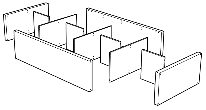
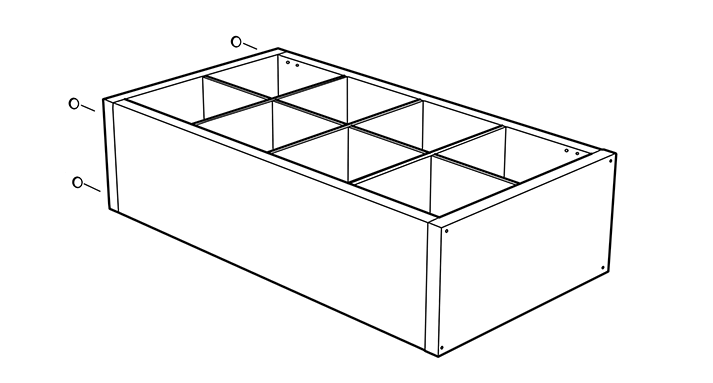
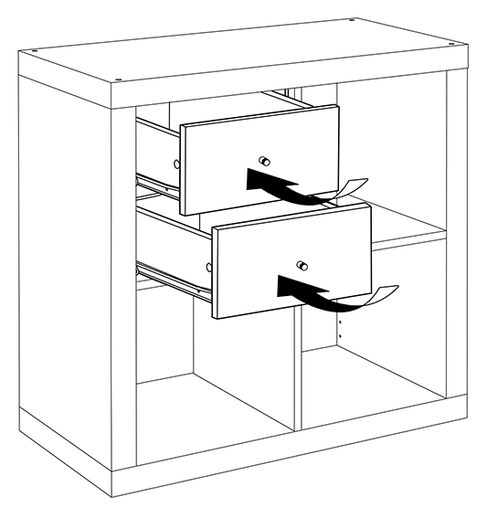
Another great example is IKEA furniture. In the illustrations below, you can see that the modularity of the design is not only in the shape of the bookcase, which allows it to be set in different directions, or in that you can add inserts in its openings, but also in the very parts that make the piece itself, which are rectangles of different sizes, repeating the same pattern.
From a manufacturing perspective, modular design is also cost-efficient. One important aspect of this is that building small simple parts that can be connected later is easier and cheaper than building one large complex piece at once. Additionally, the solution can be reused over and over, maximizing productivity.
The goals in creating a UI design are similar. As designers, we want to create a UI system that is efficient in both construction and operation. When we find a solution to a problem, we want to be able to reuse the solution in many places. This not only saves time, but also establishes a pattern that users can learn once and reapply in other areas of the application. We also want to be able to customize the system for certain scenarios without having to restructure everything.
This is exactly what modularity brings to UI design: It leads to a system that is flexible, scalable and cost-efficient, but also customizable, reusable and consistent.
Examples Of Modular Design
Some examples of modular UI design can be seen in patterns such as responsive grids, tile window design and card design. In all of them, modules are used repeatedly to provide a flexible layout that easily adapts to different screen sizes. In addition, the modules act as containers for components, enabling us to insert different types of content and functionality, much like the inserts that can be added to an IKEA cabinet.

Is This Homogeneous?
If modular design is about designing a system, and UI systems mostly comprise the same parts (buttons, typefaces, icons, grids, etc.), then you might be wondering:
- Aren’t modular designs all going to look the same?
- How will this affect brand identity?
- How can the UI of a product be made to be unique?
These questions, while valid, raise an underlying question: Where do innovation and uniqueness in product design lie? This debate has picked up lately (see “In Defense of Homogeneous Design”), but I would say that, because visual design is what we see first, we tend to think that innovation and uniqueness lie in the way a design looks. However, visual design is just one part of that. Innovation and uniqueness in product design need to be accounted for in the entire product: in the intrinsic value that it provides and in the way people experience it, which includes its appearance. Take a chair. It is required to be a chair, but not all chair designs look, feel or work the same. In fact, chair design has historically been an area of innovation in design and materials. Similarly, UIs have their own requirements, and using patterns that are proven to work doesn’t mean sacrificing innovation and uniqueness. On the contrary, innovation and uniqueness will be needed to solve the particular problems your customers have. The beauty of modular design is that it encourages us to approach these solutions as a system of parts that are interconnected, rather than to find original solutions in an isolated way for the sake of being different. In other words, an innovative design applied to a UI control won’t stay relegated to one place in the application, but instead will permeate the entire system, maintaining cohesion and improving usability.
The Modularity Of Style Guide-Drive Development
From the implementation side, style guide-driven development is also very modular. For starters, the process begins with a discovery phase: understanding the problem that needs to be solved, gathering requirements and iterating through design solutions. While the design solutions are usually presented as an entire package or feature, they should really be the combination of the many parts of the system documented in the style guide. Some parts of the design might be new, but they should still be created as modules. The point is to use the style guide to determine which modules are available in the UI system that can be reused or extended to create the design.
(What if there is no style guide? Do not fret! I will show you in the next section how to design in a modular way, even if you are not using a style guide.)
The next step in style guide-driven development is the abstraction phase, which is basically the exercise of breaking down the design solution into smaller parts. During this phase, designers and developers work together to discern the proposed design and identify the elements and components (i.e. modules) that will be either used or enhanced or that will need to be created for implementation.
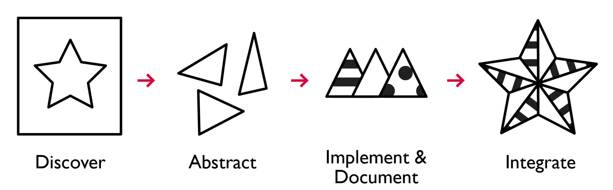
The abstraction phase serves as well to trace a plan for the next step: implementation and documentation. During this phase, the modules are either built or enhanced in isolation from the rest of the existing modules. In web development, this means building a component or defining the styles for an element independent of the application. This is an important aspect of modularity, because it helps you to identify any problems early in the process, preventing unforeseen dependencies with other parts of the system. The result is more stable parts that are easier to integrate in the whole.
Something unique about style guide-driven development is that, while implementation progresses, documentation also takes place, rather than being an afterthought. This is possible because when a style-guide generator is used, the documentation becomes a living style guide, serving as both a framework and a sandbox for implementation:
- The living style guide serves as a framework of definitions for UI elements (such as headings, lists, links, input controls, etc.) and as a library of components (such as navigation systems, toolbars, search tools, grid tables, etc.) that are available for use. This means that development is not started from scratch every time. Instead, it builds upon existing definitions in the UI system and contributes to it.
- It is also a sandbox because it serves as a demonstration space to build and test the implementation. This is exactly where the development takes place before it is integrated in the application.
The last step of style guide-driven development, the integration phase, resembles the assembly step in modular design. The UI elements or components that are needed have been developed and are ready to be integrated in the application. What remains is to configure and customize them. During integration, the style guide is like any good instruction manual that is used to assemble a physical modular design.
Now that we have identified the fundamental concepts of modular design and style guide-driven development, let’s put them to use.
Designing In A Modular Way
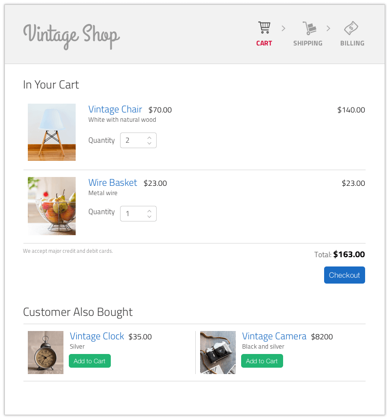
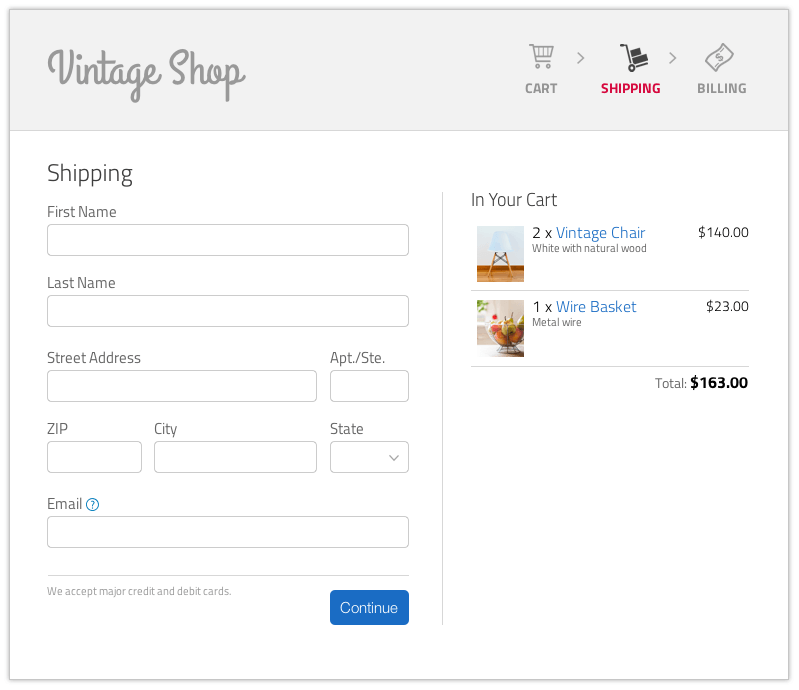
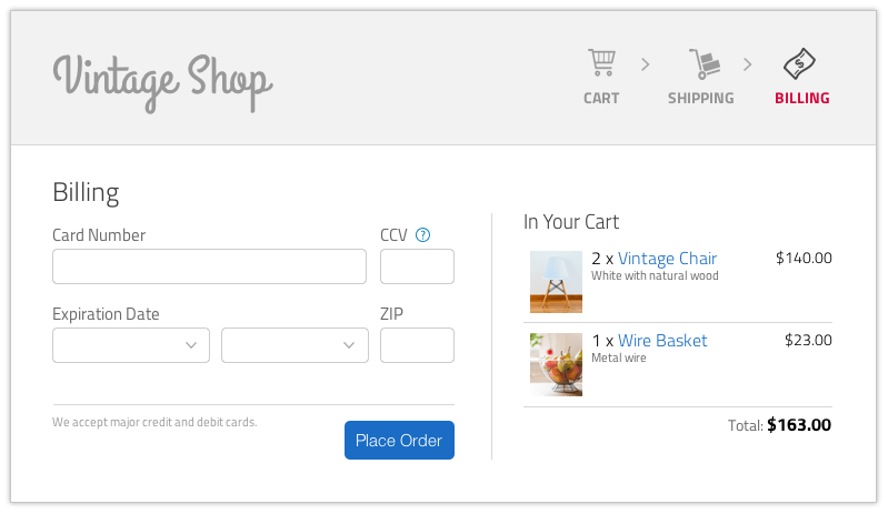
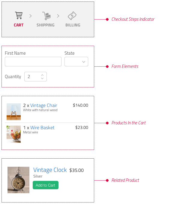
Picture this: You have come up with a great user flow, put together mockups and prototypes to illustrate the interactions, and documented every single part. Chances are that your designs already follow a style guide, which could put you at a great advantage. (If not, don’t sweat it!) Just step back and start mapping out the main parts of your design solution at a high level. These parts could be the interaction points where certain things are accomplished. For example, a checkout flow could look like this:
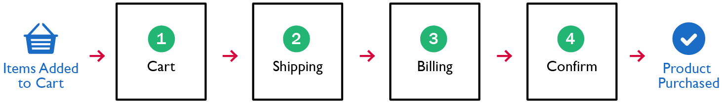
But hold your guns! These are not modules yet. To get to there, we need to identify the UI elements that are persistent in the flow, such as:
- the checkout steps indicator,
- form elements used to enter information,
- the representation of products in the cart,
- the representation of related products that others have bought,
- policies about the purchase,
- help text,
- messages and alerts.
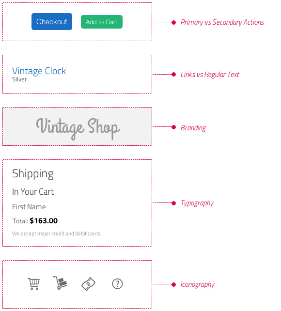
Digging a little deeper, we will also find styles and interaction patterns:
- Styles:
- colors used to denote:
- error, success, warning and information messages;
- primary versus secondary actions;
- inactive versus selected versus disabled states;
- links versus regular text;
- branding;
- typography used to denote different types of content:
- font size for laying out information hierarchically;
- font types for highlighting messages or providing additional information;
- lists to summarize information;
- iconography to convey visual meaning and for quick reference to common actions.
- Interaction patterns:
- showing upcoming steps (disabled);
- showing previous steps (enabled so that the information can be edited);
- displaying summaries that can be edited;
- validating information once the user has clicked out of the field;
- providing help text on rollover;
- updating the cart once a selection has been made.
Once the design has been broken down into all of these smaller pieces, we will finally have our modules. At this point, it’s easier to see that a lot of them apply not only to the checkout process, but to many other areas of the application. With a modular design approach, these modules can be created so that they are usable in this particular design as well as in future ones.
Atomic design is worth mentioning as a methodology that can accelerate this process of creating modular designs. This methodology analyzes the relationships between the different parts of the system and how they interrelate, using chemistry as an analogy. Going through the steps is pretty much the reverse of our previous exercise:
- We start from the atoms, which are the smallest modules in the system (in our example, the buttons, typography and iconography).
- The modules grow in complexity, binding together into molecules, which provide more functionality (in our example, the checkout steps indicators and the related products module).
- Then, there are organisms, which are molecules that are grouped together in the application (in our example, the application’s header and various forms).
- Leaving the chemistry analogy, the next level is the templates, which are predefined structures where organisms are placed.
- Lastly, there are pages, which are instances of templates.
The missing piece here is a way to document the modules that have been identified. This is not only a matter of creating a specification document to capture how the modules need to be built, or writing guidelines that capture high-level definitions such as brand colors and font families (which are typical of any standard style guide). Rather, the documentation needs to be more sophisticated and dynamic, so that when these modules change (and you know they will!), the documentation doesn’t become obsolete. This is exactly where living styles guides fill in the gap!
Using A Living Style Guide
A living style guide can be very useful during the design process because it provides several things.
A Baseline To Work With
Instead of starting from scratch every time, the style guide provides the visual direction and the modules you should use to create the design.
Because a living style guide is generated from actual code, it reflects the latest and greatest version of the implemented design.
Documentation Of Design Solutions
The knowledge that has been acquired to resolve a particular UI or UX problem can be consigned for later use.
This helps to maintain consistency in the implementation, encouraging you to fit any new solution into part of the current design.
You will be developing patterns that users can get familiar with, thus enhancing usability.
Ease Of Communication
The guide helps to communicate the design by providing the most up-to-date representation of the UI (unlike static mockups, which get outdated quickly).
A common UI language is developed because you have to name the various elements in the style guide. This requires collaboration not only among UI designers, but between the designers and developers, which is a great advantage when you have to communicate how a design should be implemented.
Whether you have an existing style guide or are planning to create one, automating the process will put you in the right direction, driving the design process in a modular way. So, if you are ready to shop for a generator of living style guides, then I’d recommend the following resources:
- “An In-Depth Overview of Living Style Guide Tools,” Robert Haritonov, Smashing Magazine
- “Overview of Pattern Library Generators,” David Hund, GitHub
- “Style Guide Generator Roundup,” Susan Robertson, A List Apart
Don’t Take It To The Extreme!
Now that we have looked at how to finetune the design process to incorporate modularity, as well as the advantages of a living style guide, let’s explore some of the common pitfalls you might encounter along the way.
The Style Guide Does Not Replace Design Work
It’s not uncommon to hear from managers that, once the living style guide is in place, most of the design work is done. While a lot of the repetitive and trivial work is done (like prototyping the different states of a button over and over), consider that:
- new features will continually need to be built,
- finding a solution involves making design decisions.
So, yes, having a living style guide and following style guide-driven development improves the development workflow, but it doesn’t take the designer out of the equation. Having a tool that speeds up workflows and boosts communication is advantageous to both designers and developers. But the great thing about this approach is that it allows a lot of room for the UI to be customized, thereby enhancing the user experience — and figuring that out is part of the designer’s role.
Don’t Follow Patterns To The Extreme
We should always strive to use patterns in an application. For example, consistent use of colors and font sizes can quickly indicate to the user elements in the UI that can be interacted with. However, avoid using a pattern just because it has been implemented before; rather, use it because it really solves the problem at hand.
For example, if you have established the pattern of displaying toolbars at the top of the screen, this pattern will work in most cases, but there will be times when presenting a contextual toolbar, closer to where the user is taking action, makes more sense. So, always question whether reuse of a pattern prioritizes ease of implementation over the user experience.
Don’t Overlook Design Iteration
This ties in a bit to the previous point. Don’t overlook the value of iteration and innovation when trying new patterns and finding ways to design an interface, even if at first sight they do not follow the style guide. The style guide should not be a rein on your effort to create the best user experience possible. Rather, as the name suggests, it should be a guide, a starting point to help you resolve problems by tapping into previous work and experience. Iteration during the design phase should continue to be as important as ever and should spur you to improve on established patterns.
The Maintenance Burden
Among the gazillion things your job involves, maintaining the style guide should be the last thing that feels like a burden. To overcome this, I find the following practices helpful:
- Find a documentation system that is easy to install and easy to interact with on a regular basis.
- Make documentation updates a part of your workflow, rather than an afterthought once the implementation is already out. Document as you go!
- Establish guidelines that make it easy for everybody to contribute to the documentation. This will distribute the workload and increase the sense of ownership.
Design Modular To Build Modular
Creating a flexible UI system that is consistent and easy to customize, while also scalable and cost-efficient, depends not only on how it is built, but on how it is designed. A library of components has very little value if every new design is created independently, ignoring established standards and patterns.
On the flip side, it’s not about making cookie-cutter interfaces that reuse the same styles and patterns because it’s convenient. A good design is effective not because of its uniqueness, but because it combines both form and function to create a great experience. This goal should always be top of mind, and using a method such as style guide-driven development to bring modularity to both design and development should help you to create a cohesive UI system that achieves this goal.
Further Reading
- How To Make An Effective Style Guide
- An In-Depth Overview Of Living Style Guide Tools
- Automating Style Guide-Driven Development
- Free Style Guides Icon Set For Writers And Editors
 (cc, ml, al, il, mrn)

