Accessibility: Improving The UX For Color-Blind Users

Email Newsletter
Weekly tips on front-end & UX.
Trusted by 182,000+ folks.
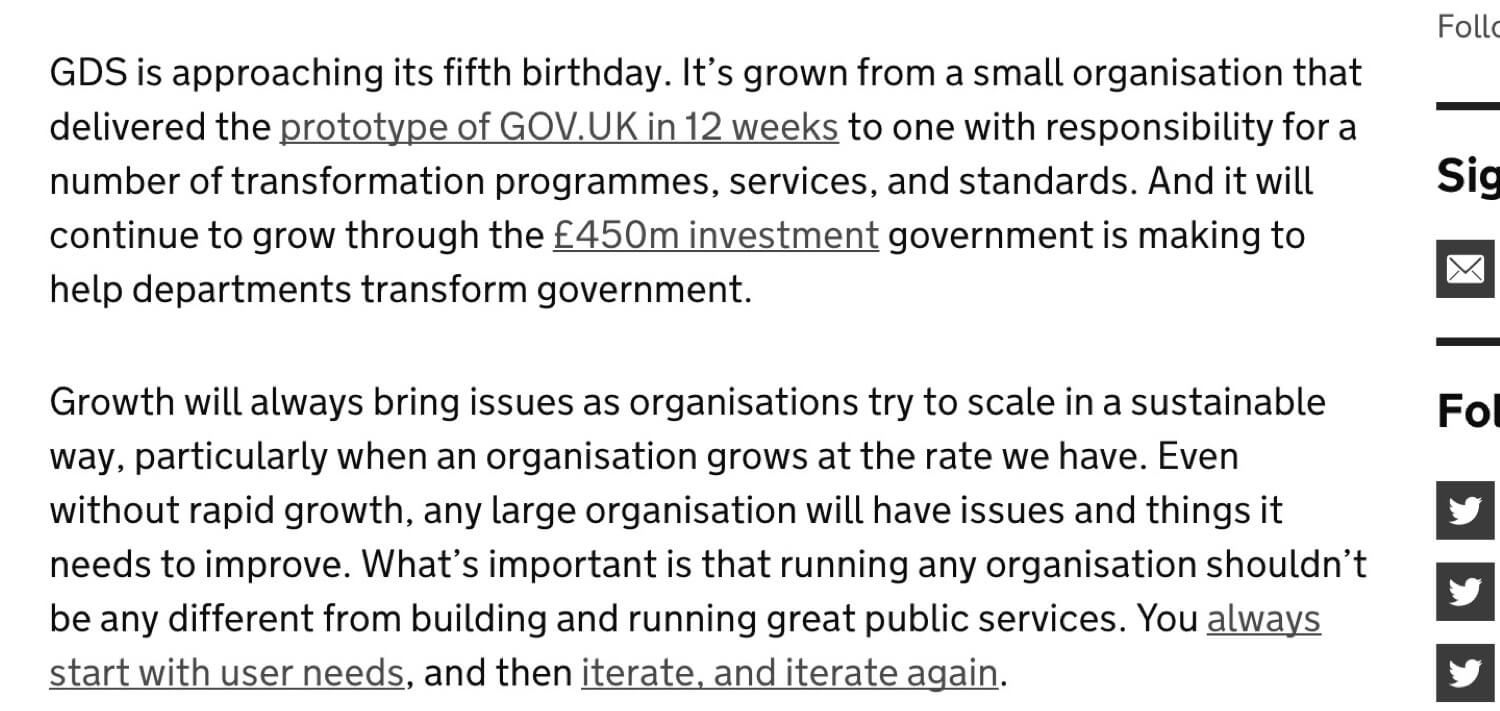
 Celebrating 10 million developers


 Custom Web Forms for Angular, React, & Vue. Your backend.
According to Colour Blind Awareness 4.5% of the population are color-blind. If your audience is mostly male this increases to 8%. Designing for color-blind people can be easily forgotten because most designers aren’t color-blind. In this article I provide 13 tips to improve the experience for color-blind people – something which can often benefit people with normal vision too.
What Is Color Blindness?
There are many types of color blindness but it comes down to not seeing color clearly, getting colors mixed up, or not being able to differentiate between certain colors.
These problems can also be exacerbated by the environments in which people use websites. This could include low-quality monitors, bad lighting, screen glare, tiny mobile screens and sitting far away from a huge television screen.
Relying solely on color for readability and affordance makes a website difficult to use, which ultimately affects readership and sales.
While the following tips aren’t exhaustive, they do cover the majority of problems color-blind people experience when using websites.
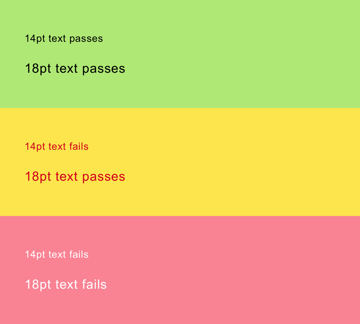
1. Text Readability
To ensure text is readable it should pass accessibility guidelines based on the combination of text color, background color and text size as follows:
“WCAG 2.0 level AA requires a contrast ratio of 4.5:1 for normal text and 3:1 for large text (14 point and bold or larger, or 18 point or larger).” — WebAim color contrast checker
Here are a few examples of color and size combinations that do and do not pass:
2. Text Overlaid On Background Images
Text overlaid on imagery is tricky because some or all of the image may not have sufficient contrast in relation to the text.

Reducing the background opacity increases the contrast, making the text easier to read.

Alternatively, you can style the text itself to have a solid color or a drop shadow, or anything else that matches your brand guidelines.
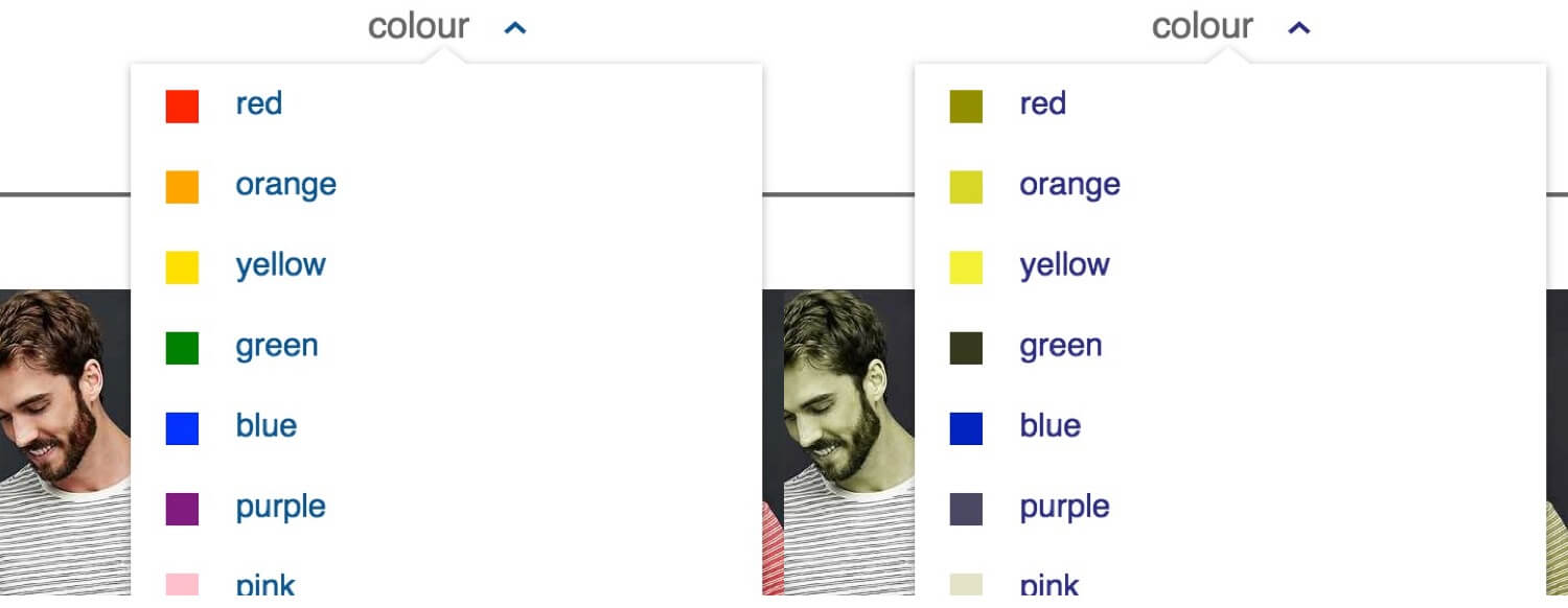
3. Color Filters, Pickers And Swatches
The screenshot below shows the color filter on Amazon as seen by someone with and without protanopia (red–green color blindness). Without descriptive text it is impossible to differentiate between many of the options available.
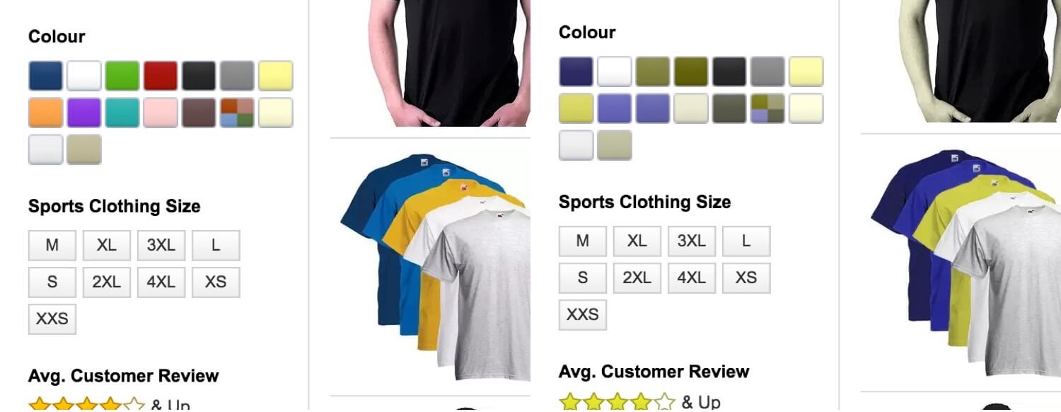
Amazon shows descriptive text when the user hovers, but hover isn’t available on mobile.
Gap solves this problem by adding a text label beside each color as shown below:
This happens to be beneficial for people with normal vision too. For example, black and navy are difficult colors to differentiate on screen. A text label takes the guesswork out of it.
4. Photographs Without Useful Descriptions
The screenshot below shows a SuperDry T-shirt for sale on its website. It is described as “Leaf Jaspe” which is ambiguous as leaves can come in an assortment of colors (green, yellow, brown. etc.).
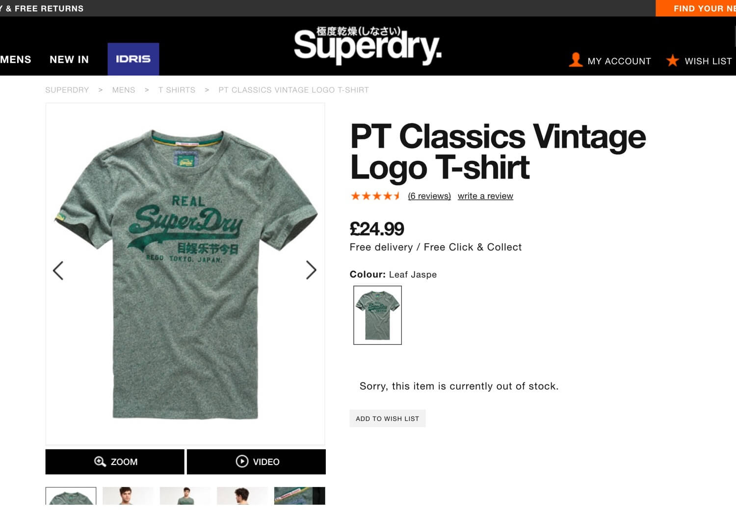
Jaspe (or rather “jaspé”) means randomly mottled or variegated, so using this in addition to the specific color would be useful: “Gray Green Leaf Jaspe.”
5. Link Recognition
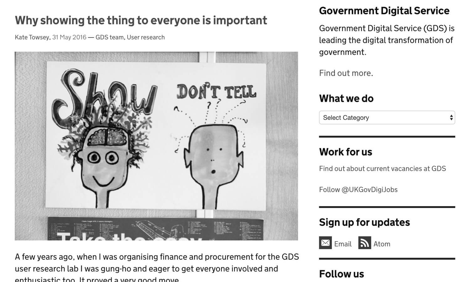
Links should be easy to spot without relying on color. The screenshot below simulates the vision of somebody with achromatopsia (can’t see color) viewing the UK Government Digital Service (GDS) website. Many of the links are hard to see. For example, did you notice that “GDS team, User research” (located under the heading) are links?
To find a link, users are left having to hover with their mouse waiting for the cursor to change to a pointer. On mobile, they are left to tap on text hoping it will make a page request.
The links above with icons are easier to see. For those without, it would be a good idea to add an underline, which is exactly what GDS does within the body of its articles:
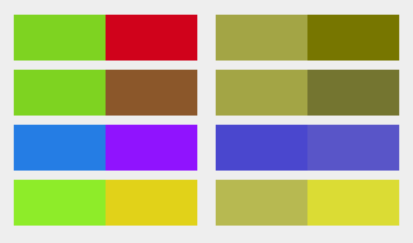
6. Color Combinations
In the physical world you can’t always control which colors appear next to one another: a red apple may have dropped and nestled itself into some green grass. However, we can control the colors we use to design our website. The following color combinations should be avoided where possible:
- green/red
- green/brown
- blue/purple
- green/blue
- light green/yellow
- blue/grey
- green/grey
- green/black
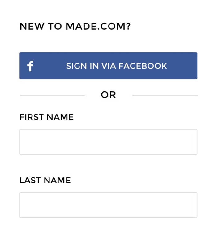
7. Form Placeholders
Using a placeholder without a label is problematic because placeholder text usually lacks sufficient contrast. Apple has this problem with their registration form, as shown below:
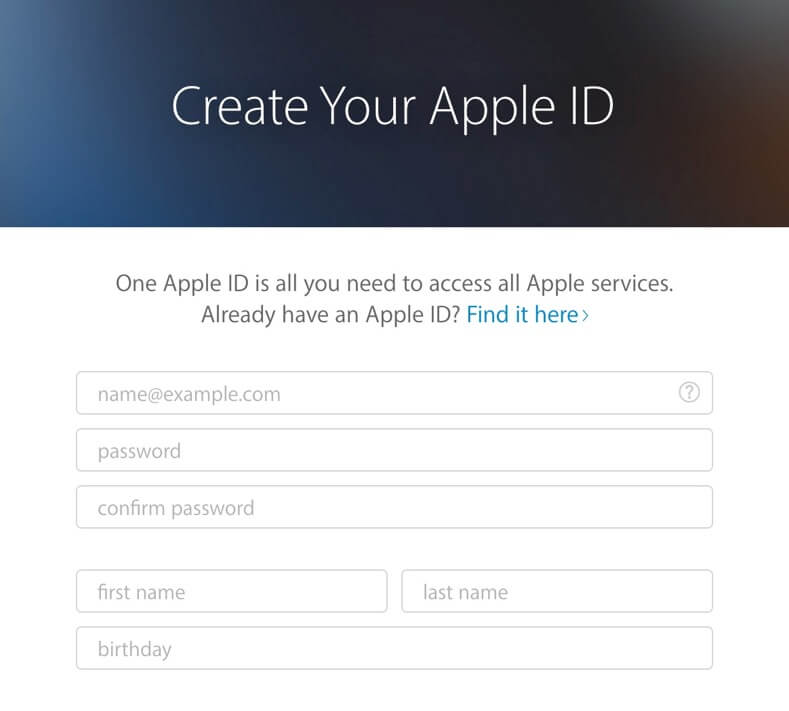
Increasing the contrast is not advisable because it will then be hard to tell the difference between placeholder text and user input.
It’s better to use labels – a good practice anyway – with sufficient contrast, which is exactly what Made.com does as shown below:
8. Primary Buttons
Often, primary buttons use color alone to present themselves as such, and Argos does just this on its login screen:
Instead, consider using size, placement, boldness, contrast, borders, icons and anything else that will help – within the bounds of your brand guidelines. As an example, Kidly uses size, color and iconography:

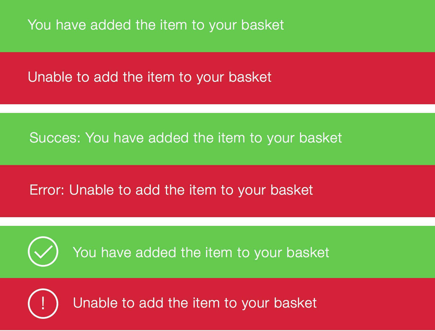
9. Alert Messaging
Success and error messages are often colored green and red respectively. Most color-blind people don’t suffer from achromatism, and so will naturally associate different colors with different messages. However, using prefix text such as “Success” or, my preference, an icon makes it quick and easy to read as shown below:
10. Required Form Fields
Denoting required fields with color is a problem because some people may not be able to see the differences.
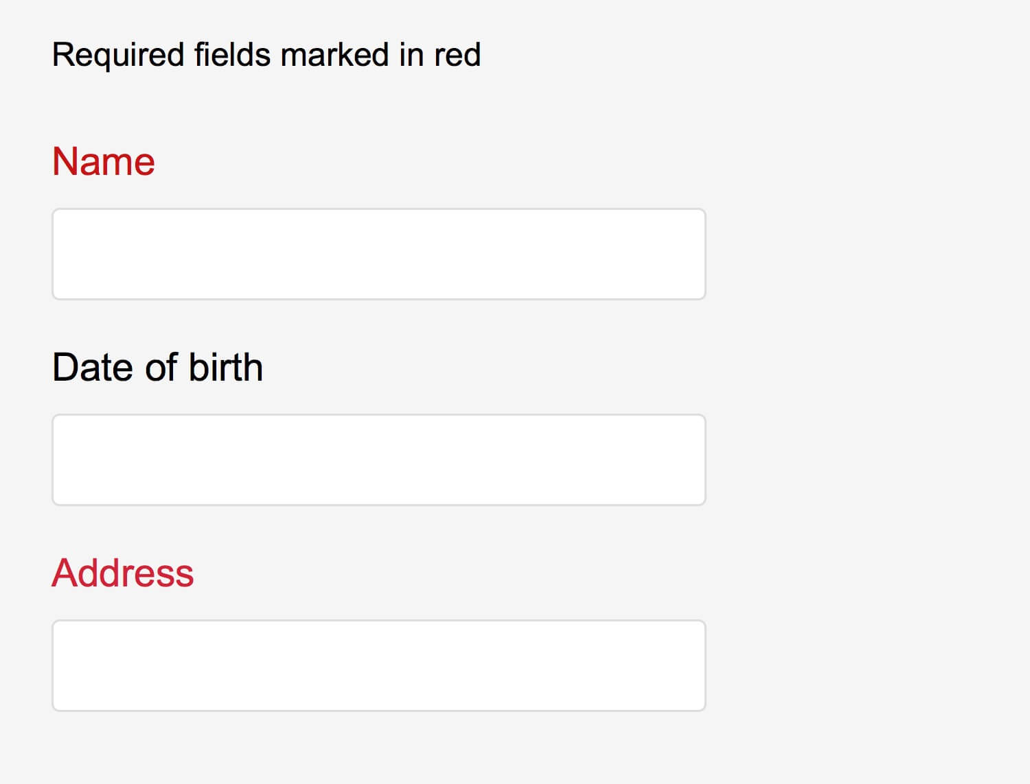
Instead, you could consider:
- Marking required fields with an asterisk.
- Even better, marking required fields with “required.”
- Where possible, remove optional fields altogether.
11. Graphs
Color is often used to signify different segments of a graph. The image below demonstrates how people with different vision would see this. The color-blind-friendly graph is on the right.
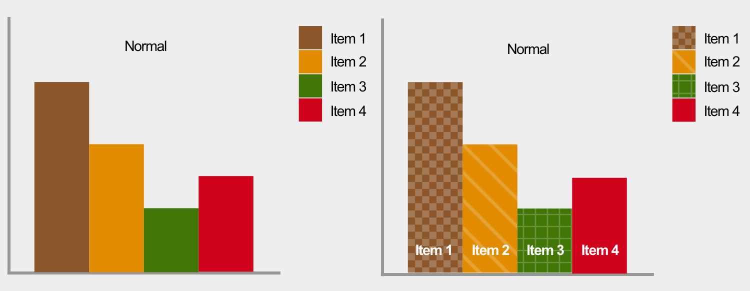
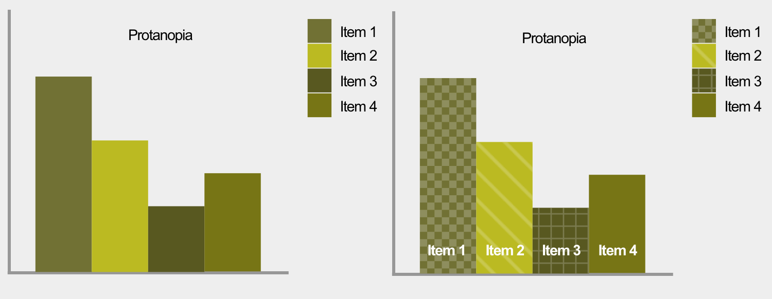
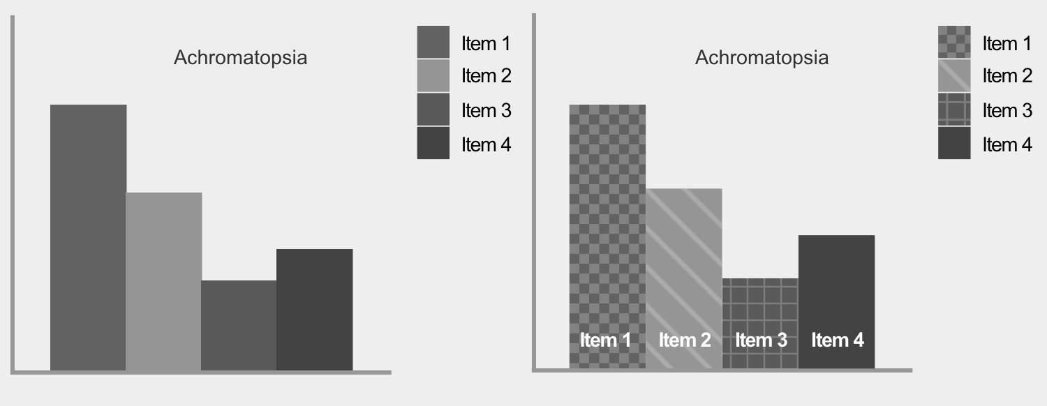
Using patterns and, where possible, placing text within each segment makes graphs easy to understand. When text doesn’t fit – as is often the case with a small pie chart segment – using a key will suffice.
12. Zoom
One accessibility feature that browsers have, is enabling someone to zoom in as much as they need. This improves readability–which is especially helpful on a mobile device.
Unfortunately, zoom can be disabled using the Viewport Meta Tag, which is problematic. For example, text size may be too small to read in relation to the color contrast—but zooming in effectively increases the font size, making it easier to read. So don’t disable zoom on your website.
13. Relative Font Size
Similarly to the previous point, browsers provide the ability to increase text size (instead of zooming the entire page as a whole), in order to improve readability. However, some browsers disable this functionality when the font-size is specified in absolute units such as pixels. Using a relative font size unit, such as ems, ensures that all browsers afford this capability.
Tooling
There are lots of tools available to help you design for color-blind people:
- Check My Colours: if you have an existing website, you can just enter a URL and receive feedback of what needs to be improved.
- WebAim’s color contrast checker: provide two colors to see if they pass accessibility guidelines.
- I Want To See Like The Color Blind: apply color blindness filters to your web page right within Chrome.
- Color Oracle: a color blindness simulator for Windows, Mac and Linux, showing you what people with common color vision impairments will see.
Conclusion
The tips in this article are not exhaustive, and they are not necessarily applicable to every situation. However, they do cover the majority of problems color-blind people experience when using websites.
It’s more important to take away the principles, so that you can integrate them into your own design process. Ultimately, websites aren’t just meant to look good – they are meant to be easy to use for everyone, including people who are color-blind.
Further Reading
- Accessibility APIs: A Key To Web Accessibility
- Notes On Client-Rendered Accessibility
- Making Accessibility Simpler, With Ally.js
- The Underestimated Power Of Color In Mobile App Design
 (cc, og, il, mrn)

