Retrofitting Zooming UI To Legacy Websites: An Impossible Task?

Email Newsletter
Weekly tips on front-end & UX.
Trusted by 200,000+ folks.


It’s well known that, in the ‘80s, Microsoft and Apple made the graphical user interface (GUI), the dominant interface on desktop computers. What’s less known is that the GUI, whose navigation is based on pages and links, is not the only possible interface. And we know that finding our way in a modern GUI, whether for a website or application, is not always easy.
One problem is of design, meaning that an interface could simply be poorly designed. But a different problem may very well be the way our brains are wired; even well-designed interfaces can be difficult to navigate and use.
In this article, we will investigate an alternative to the classic “pages and links” paradigm, a model dubbed “zoom navigation.” We will try to answer the question, If zoom navigation is better, then why is it so uncommon? At the end of the article, we will introduce some prototypes and discuss their technical implementations.
Navigation: Zooming Versus Following Links
Imagine a wall in your office covered with sticky notes, images and labels. These pieces are grouped together by proximity. From a distance, you have a general overview and understand the groupings. If the sticky-note wall is new to you, you might start to explore it. You might read the big labels from a distance or walk closer to the wall to see more details. Now, imagine that the wall is not new to you, and you’re searching for specific information. You know you put that information on a green sticky, and you might remember that it was close to a red cross mark. So, you walk closer to the right side of the wall, and there it is: the sticky you were looking for!
This physical experience is similar to the digital experience we have each time we use Google Maps. Starting somewhere on a map, you might zoom in:
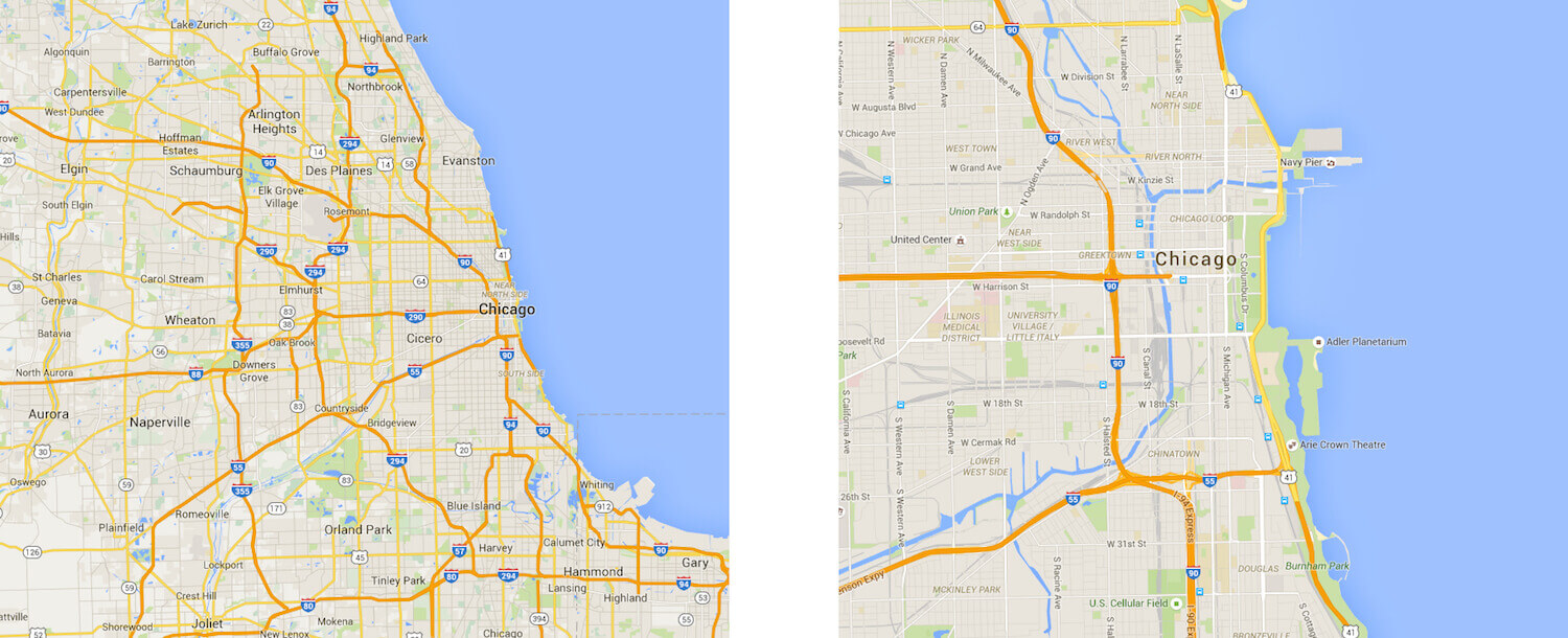
As in the sticky-note example, you can now see details you couldn’t see before. And, of course, you may have zoomed out instead of in when starting off:
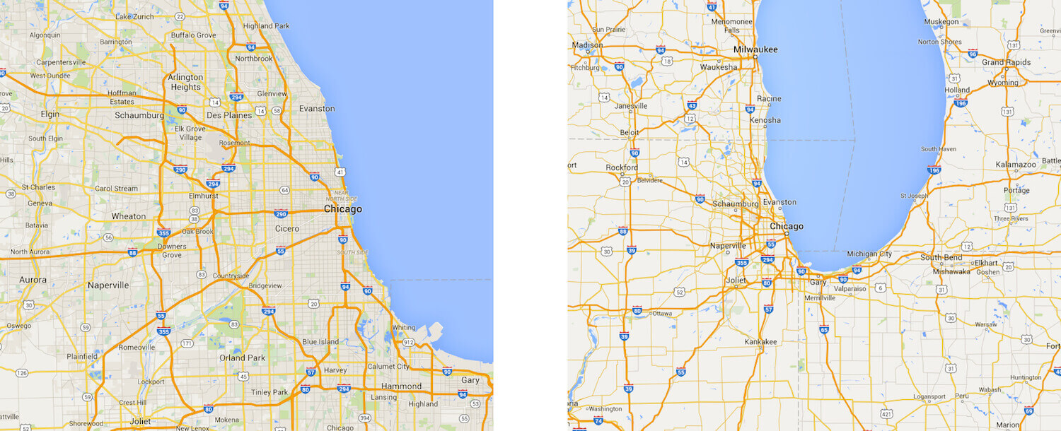
You might zoom in or out many times to find what you’re looking for. There are no links, no pages and no scrolling bars, just this huge canvas where you can see things from a distance, as if on an airplane, or close up.
Now imagine you’re in a room with many doors. The doors have labels. Some make sense, others don’t. You can’t see what’s behind a door. And when you walk into a room, you can’t see the room you’ve just left. After having walked through many doors, you don’t have a map of the system of rooms; you have to keep track of the relationships between rooms in your head. This sounds like a description of a maze right?

The digital counterpart of this is websites as we know them. The rooms of the maze are a website’s pages, and the maze’s labelled doors are the navigation menu, with sometimes cryptic links.
Google Maps is arguably the best-known example of an interface whose navigation is based on a zooming mechanism. But it’s not the only one. Much design software works like this. Take Sketch, where it’s possible to zoom in and out on an infinite canvas.[1]
Even though Google Maps is well known and certain design applications use zooming navigation, there are not many more examples. Conventional navigation is made of pages and links. Is this because people dislike zooming in and out? Let’s quickly examine this hypothesis. Google Maps is one of the most widespread apps. It’s ranked number 6 in Nielsen’s list of top smartphone apps of 2015 (at number 10 is Apple Maps, which has similar zooming navigation). Sketch is an award-winning Mac app that’s been very successful in the last couple of years.
These facts alone don’t prove that zooming navigation is much appreciated by these users. Surely many other factors account for users’ love for this applications, but it’s hard to believe that people dislike this kind of navigation either, because it is so integral to both applications.
If it’s not true that people dislike this kind of navigation, then is it true that people like navigation based on pages and links more? Upon examination, this doesn’t seems to be the case either. Most articles by Nielsen Norman Group about usability in one way or another are about standard links navigation.
Another hypothesis is that zooming navigation isn’t technically easy to implement. While we can agree that many of the best developers out there are working on Google Maps, and we might also agree that the small team of software engineers working on Sketch consists of very gifted people, it seems unrealistic that they are the only ones.
Let’s try to better understand the features of zooming navigation.
Jef Raskin’s Zooming Navigation Idea
In 2000, human-computer interaction expert Jef Raskin wrote about Zoomworld in his book The Humane Interface (see paragraphs 6.1 and 6.2). Zoomworld is an interface concept based on a zooming navigation paradigm similar to the ones we’ve just reviewed.
Raskin believed that zooming navigation is superior to the maze-like standard navigation model because of how we humans have evolved: We are good at knowing where we are in relation to things and where things are relative to each other. We are also good at recognizing marks. We are not good at finding our way in a maze.
Imagine if we could fly above a maze, being able to see the entire layout and getting a quick sense of where things are, diving to zoom in on a detail and climbing to zoom out. Zooming navigation might allow for just that, exploiting our cognitive strengths and easing our brain’s workload.
Raskin introduces the idea of zooming navigation in the design of an intensive care unit (ICU). As a first step, he shows a user zooming into room 132 Davis:
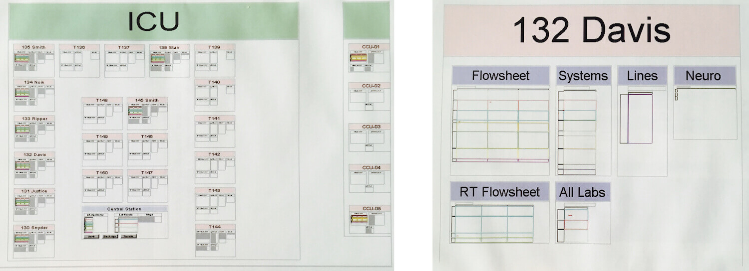
On the left above, we have a view of the entire ICU. We are not able to read everything; we get a sense of the location of rooms, and we might be able to read the names of the rooms (at least in Raskin’s original screenshot). We also understand that the ICU is not the only unit.
Again, once in room 132 Davis, we can’t see every detail. For example, we can’t read any content in the “Flowsheet,” “System” or “Lines” section. We can just read the titles and see the shapes of the sections (for example, a table, a list, a picture). To see the details of the flowsheet, we would have to zoom in:
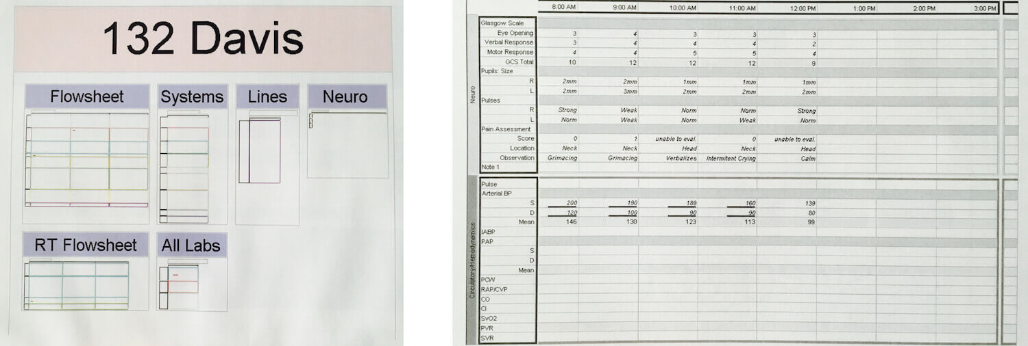
We saw the same with Google Maps: When we zoomed in, we saw new roads, new rivers, new labels.
Is that confusing for the user? Will they lose their sense of location and where things are? They probably won’t because of the mind’s ability to close the gap between the room view and the flowchart view. See the white gutter between room 132 and the flowsheet above? That’s closed by our mind. The easier that gutter is to close and the better the design and the animation of the zoom interaction, the less the user will feel confused. This ability to close gaps with our imagination is called “closure.” [2]
At any time, we can zoom out to view part of the hospital, whereupon we would see that the ICU is located on floor 1:
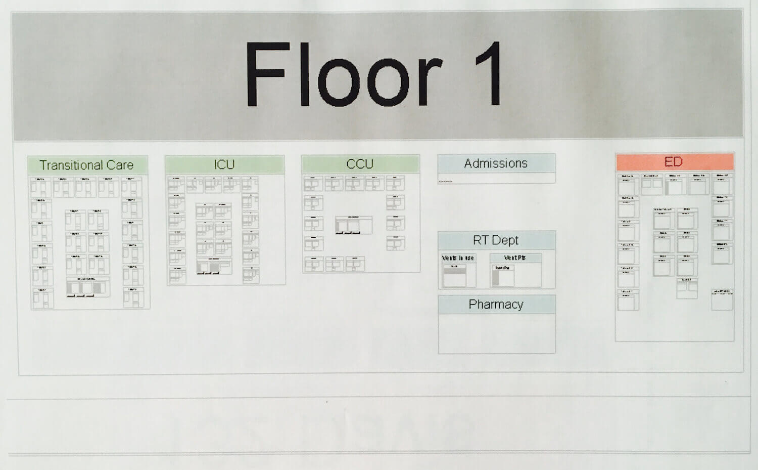
Again, we can’t read everything. Could this be the real problem, the crucial weak point of the whole zooming concept and the one preventing its widespread adoption? We could make a few observations that would suggest this feature is actually more of an advantage than a weakness.
First, we don’t read everything, even when we’re able to. A ton of usability literature [3] shows us that we don’t read websites, but rather scan them. According to usability guru Steve Krug, people “glance at each new page, scan some of the text…. There are almost always large parts of the page that they don’t even look at.”
Secondly, our aim when viewing things from a distance, as if on an airplane, is to get the big picture, to grasp positions and marks. The zoomed-out view supports our need to make sense of the context.
If context were not essential to us, we wouldn’t have introductions and tables of contents in books; we wouldn’t ask about the neighborhood before looking into buying a house; and we wouldn’t listen for a few moments before jumping into a conversation between friends we’ve just approached. The examples in favor of understanding context before details are countless.
Context plays a role in responsive design. We’ll return to this later when we explore zooming navigation in a multi-device world. Let’s get back to Raskin’s hospital. He states that tests prove that this interface is easier for nurses to learn than any other alternative. [4]
From this example, we can appreciate the main points that distinguish zooming navigation from links navigation: There are no links, no pages and no page-scrolling bars; we can zoom in and out multiple times; and, finally, the interface design should support closure.
Let’s check some modern examples to see how they compare with Raskin’s model.
Hybrid Interface
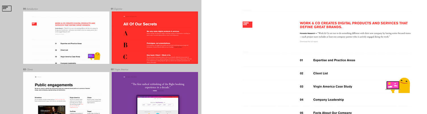
Above on the left is the desktop view of the home page of Work & Co. On the right is where we “land” when we click the white rectangle in the top left of the home page.
Closure is easy: There are no new elements in the zoomed-in state. And the zoom animation is exactly what we would expect from a zoom interaction. There are pages, and we can scroll them — we might have expected that, because we come from a long history of scrollable interfaces — but that’s not part of Raskin’s zooming model.
Another example is the website of Joni Korpi. He is (another) pioneer who was inspired by Raskin’s ideas.
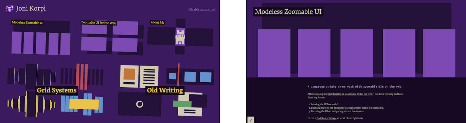
Above left is his home page (desktop view). On the right is the result of clicking the top-left region, labelled “Modeless Zoomable UI.”
We need some mental work to close the gutter here. There’s no hint on the home page of the text on the “Modeless” page. And the full animation is not a pure scaling up; it’s something different that doesn’t faithfully support the zoom mechanism. [5]
Also, notice that there’s just one zooming level and that we can move about the website with links. Like the previous example, this is a hybrid interface with features of both worlds: Raskin’s and the “pages and links” world.
Another pioneer is David DeSandro, who provides a technical explanation of the process of creating the website for Beercamp 2011:

I can appreciate the multi-level zooming navigation here, whose mechanics are delegated to the horizontal navigation bar and the scrolling down arrow. What I like about DeSandro’s implementation is the unreadable “mess” at the center of the page. It seems like a mistake before we realize we can zoom in. This is the essence of zooming: the distinction between the forest and a single tree. What users don’t like is having to scroll in two different ways. The introduction of a new mode becomes confusing.
According to Raskin, whenever we add to pure zooming navigation some of what he calls “our old habits,” such as links or scrolling, we defeat the purpose of the paradigm, which is to exploit our innate cognitive skills.
Granted, when we use Korpi’s interface, we see many inconsistencies with the original model. And even if we think that there’s something fundamentally true in Raskin’s ideas, we also think that there might be many possibilities for extending those ideas. [6] That’s why I think that Joni Korpi’s work is promising and valuable.
Going back to our question of why zooming is not more widespread, in our investigation till now, we couldn’t find any good reason why it hasn’t been adopted. Korpi wrote to us saying that he found that designing zooming interaction itself (i.e. how the user actually zooms in and out) to be a challenge. Is the actual interaction a possible weakness of the zooming idea and the answer to our question? Before diving into the interaction problem, let’s go back to 2007, when this idea had its best chance to exit the darkness.
Multi-Device World
Raskin presented the idea of zooming navigation for a fixed-width interface. He wasn’t concerned with multi-device design. Google Maps works seamlessly on phones and desktop computers. It seems that zooming is almost by default the appropriate method of browsing a single interface on both big and small screens. Did we ignore the advantages of zooming in this new multi-device world? Let’s investigate.
When the iPhone appeared in 2007, its “browsing interaction was clumsy.” Websites designed for much bigger screens were impossible to read on the phone. We needed to pinch and zoom to make a portion of the screen big enough to be readable, and then scroll or drag to move around.
Ethan Marcotte proposed a solution: responsive design, which is now the standard. The benefits were immediately clear. We could see text and images without having to pinch and zoom.
Marcotte tells us that he attacked the problem starting from the issue of the relative width of elements; then, he attacked the problem of image width, and then the problem of breaking points in the layout. What’s interesting is not the remarkable way he solved the technical problems he faced, but that the implicit goal of his work has always been to enable the user to see and read everything on every screen, big and small.
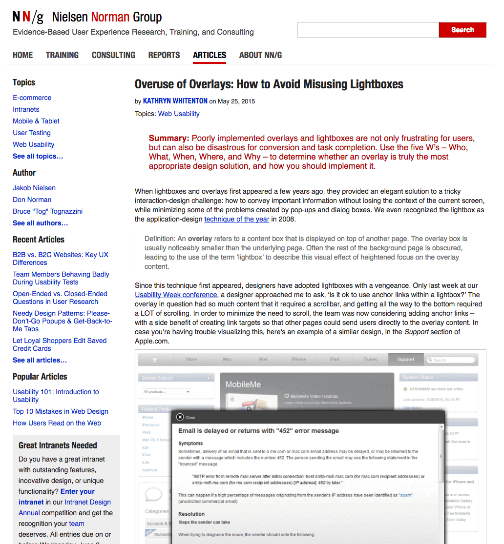
What if we were to admit that not being able to read everything is not really a cost if we can see and read the main pieces of content? To better understand this point, compare the following two views of the same page, taken from Nielsen Norman Group’s website:
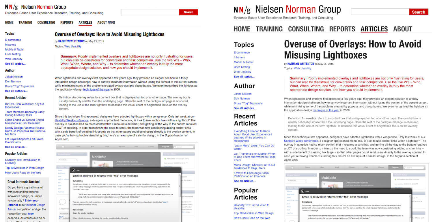
On the left, we can’t read anything. We can make out the structure, but that’s probably not enough to understand the context (i.e. what the website is about and what options are available). Also, we can’t tell whether we’d be interested in the main content (i.e. the article’s text).
We’d have to zoom in to know. By contrast, on the right, we can see the name of the website, the link labels in the main horizontal navigation, the section titles in the secondary vertical navigation, and the title of the article. That’s enough to grasp the general context of the website and to decide whether we are interested.
By questioning Marcotte’s implicit hypothesis and including some unreadable interface parts, we have two advantages over a responsive design. The first advantage is that users would be able to grasp the context quickly without any interaction. That’s not a minor point. On a responsive website, you often have to at least scroll or click on a hidden menu to grasp the context. The second advantage is that we don’t have to change the layout at breaking points; it’s just a different zoom level, and it may or may not include new parts of the canvas. This means we deliver the same experience on all devices. That’s not the case with responsive websites, which by definition have to change the position of content on different devices to keep the content at a readable size.
The Interaction Problem
Back to an important problem with zoom navigation: How should one zoom in and out? There’s no convention. This is perhaps a problem, but also an opportunity. Raskin lived in a desktop world, and he talked about an ad hoc mouse. Now we have to think about this interaction for a multi-device world.
This is Korpi’s take:
"Even if we ignore the really hard cases, like screen readers [7] (and we shouldn’t), we can safely expect that our users can tap, tap and hold, tap and drag, and scroll vertically. That’s a very narrow set of interactions to design around, a stark contrast to where you might usually see ZUIs or other complex UIs: desktop applications with their keyboards and mice/trackpads, and video games with their controllers. Designing with this limited palette of interactions tends to lead to UIs cluttered with hovering buttons and a prevalence of modes — something Raskin and other UI pioneers strongly advocate against. It’s a massive challenge and likely contributes to why ZUIs haven’t seen much use."
Add to this consideration the different navigation models of devices. For example, we can use the “back” button on an Android device to zoom out, but we can’t on an iPhone.
While these problems might explain why zoom navigation has not succeeded in a mobile world, they don’t explain why the idea did not succeed between 2000 (when Raskin published his ideas) and 2007 (when Apple created the iPhone).
I am optimistic. History has taught us that good ideas sometimes go unnoticed for a long time.
Retrofitting
If we take a fixed-width website and open the developer tools in any browser, we can:
- add the
viewportmeta tag to set the content’s width and initial scale; - change the pixel values to percentages;
- add some media queries to see how fast we can turn a good-enough website into a better experience on mobile.
This is a testament to how clever responsive design is.
Ben Callahan describes this approach as “finding the fastest and lowest-risk approach to creating a better experience on an existing site for users on any device screen” or, in a word, “retrofitting.”
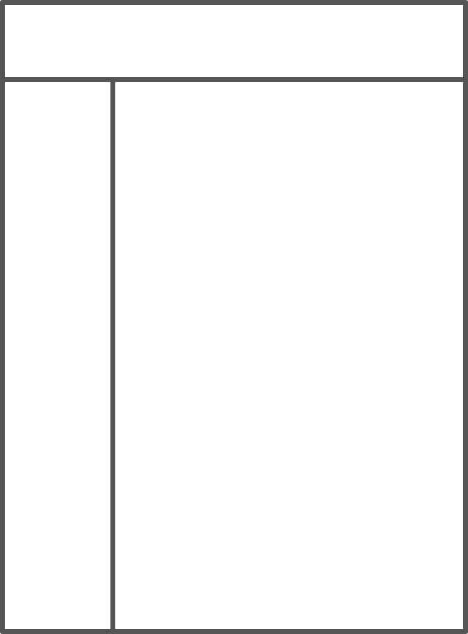
Let’s explore a possible zooming retrofit of Nielsen Norman Group’s website (shown above). We’ve already started the retrofit by increasing the font size of the most important text (see the right side of the image). We can’t read the links in the sidebar or the main article. In this example, the page is basically made up of three regions (see the layout below). To read the main content, we would zoom into the region (by tapping anywhere in the region). We can do that now with a double-tap, but we’ll get scroll bars. [8]
Once you’re in a region, you can move between regions by swiping. Check it on mobile: Zoom in on a single scene with a single tap, and move to the next by swiping. Then, zoom out with another single tap. This makes for a modal interaction gesture that might be improved by using the “back” button to zoom out.
This is a hybrid interface with pages, links, scrolling and specific use of the zoom interaction. It’s worth testing with users because it preserves the context better than a responsive solution, and it takes advantage of the zooming capability to exploit our brain’s strengths.
Retrofitting: A Very Early Technical Exploration
Retrofitting an old website might be technically possible by using CSS transformations and JavaScript. However, as with most things, it will depend a lot on the situation. For a legacy website, a complete rewrite might be a much better investment than trying to patch on more stuff. For another website, the latter might be a better option.
So, for a moment, let’s imagine that we are trying to attach zooming powers to a legacy website. How would we start? Following a basic prototype (or see the accompanying video if the prototype doesn’t work on your device), we will briefly describe what one potential approach looks like. Try double-tapping the sidebar on your smartphone and swipe to the right to see how the zooming effect works.
Please keep in mind that we are by no means stating that this approach is the right solution. It’s just an idea of how it could work.
Avoiding a long-drawn technical explanation, we can roughly summarize the approach taken with the prototype like so:
- Apply classes to regions of the legacy website that you want to make zoomable.
- Scale up headlines a bit using CSS and media queries on the device sizes you wish to target.
- Use jQuery (or vanilla JavaScript) to loop through and map all of the regions that you defined earlier with classes, and save them to an array for later use.
- With JavaScript, apply the CSS transformations of
scaleandtransform-originto thebodyelement of the page. Also, addtransition: transform-origin .14s ease-in-outfor extra smoothness. - Grab the top and left corners of a given region when clicking on or double-tapping them.
- Use these values as the coordinates for the
bodyelement’stransform-originproperty. You can now use the entirebodyas an auto-zooming map. - Using Hammer, update the coordinates of the next or previous region when swiping either left or right, to navigate back and forth between regions when zoomed in.
That’s basically how the prototype works. In this way, we can think of the body element as one big movable, zoomable map (or newspaper) that we are holding firmly in both hands. We are not collapsing the layout into blocks, as we do with classical responsive design; rather, we still see a large chunk of the entire website at once, with indicators (such as the larger headlines) that you can then zoom into.
The extra dependency on Hammer is not necessary, but it does make this kind of retrofitted zooming interface much easier to implement. If you’re not keen on adding dependencies, you can omit this and write your own handlers for touching, tapping and swiping.
You can check the prototype’s JavaScript source. It would be amazing to see how you build on what we’ve written or take a different approach.
Starting From Scratch (Not Retrofitting)
How might one go about creating a hybrid zooming interface similar to Work & Co’s website, which we saw earlier? Here, we’ll walk through the steps of one way to build it (a rough prototype is available, as well as a video). I’ll spare you a long technical description and instead focus on sharing the gist of how it works. Feel free, though, to go through the source code and expand on it.
Note that we are using Jekyll and GitHub Pages as our foundation.
- After creating the basic entry point for the website (i.e.
index.html), create anavelement to use as the focal point for how users will explore and navigate the website. - Create the top-level pages (e.g. “About Us”, “Product,” etc.) somewhere where you can easily access them via AJAX or, in our case, through jQuery’s
loadmethod. - Wrap the contents of the pages in an element with the ID of
content. You can name it whatever you want; it’s only needed to load particular fragments of the page in our zooming navigation. - Add links to the top-level pages to the
navelement as something other than anchor tags, and add the data attributedata-hrefto them as well. - Add the permalink to each link’s
data-href, so that we have something to hook into with JavaScript later. Using a CMS or anything that auto-generates a list of top-level pages and their permalinks will save you a lot of time. - Style the links as tap-friendly icons, including both the page title and a preview of whatever page each icon represents. Refer to the CSS and the prototype if needed.
- Using JavaScript, load the contents of the top-level pages into each icon’s preview area. jQuery’s
loadmethod makes this very easy because you can use thedata-hrefwith the permalink defined earlier as the method’s destination. Refer to the JavaScript for details on how we did this. - With the contents of the top-level pages loaded into the icons, we can add more styles that determine how the content should look when in icon form and how it should look when the user zooms into the page. In our case, we’ve changed the flexbox
flex-basisvalue and the font size of the page’s content. We’ve given the page’s content in the preview a very small font size and given the icon itself aflex-basisvalue of 50% when zoomed out. When the user zooms in, we scale up the font size and make the icon fill out the entire viewport, as you can see in the prototype. - Finally, in the JavaScript, apply event handlers that toggle between the zoomed-in class and the zoomed-out class for when the user taps in and out of an icon. These classes will be responsible for scaling the font size up and down and for scaling the
flex-basisvalue of the icon from 50% to 100%. - With these elements implemented, you can now tap an icon to see it scale up to full size, similar to Work & Co’s website and our prototype.
These steps provide a basic structure for the prototype explored throughout this article. As you might have noticed, we added some final touches in the form of CSS transitions to make the scaling feel smoother.
Also, while this is a mix of CSS and JavaScript, you could definitely implement this purely in JavaScript if you wanted to.
Even though this hybrid zooming interface is an interesting way to display a website’s pages, we need to keep certain things in mind if we want to maintain performance. Because we are loading actual pages in the previews, we should be careful about lazy-loading images, scripts or anything else that could be a burden on the initial loading of the website. So, be extra vigilant about lazy-loading images and so on if you end up building your next website with a zooming interface.
Conclusion
This article is the result of a lot of research. In our investigation, we didn’t find any solid reasons why a zooming GUI is not worth implementing. [9] Quite the opposite, in fact: Raskin’s idea holds a lot of promise.
Perhaps the reason why zooming interfaces are rare is that traditional HTML linking quickly became the dominant navigation paradigm, and zooming navigation presented problems of implementation.
We have good reasons now in a multi-device world to give zooming navigation another chance and to experiment with ideas and implementations.
Footnotes
- Google Maps and Sketch serve different purposes. While Google Maps may be defined as information software, which serves the human urge to learn and which helps people find information, Sketch may be defined as manipulation software, which serves the human urge to create. Bret Victor goes into this in depth in “Magic Ink.” The fact that zooming navigation supports both kinds of software is another factor in its favor.
- Closure is the phenomenon of “mentally completing that which is incomplete based on past experience”. Scott McCloud thoroughly explains this ability of our mind in chapter 3 of Understanding Comics.
- See chapter 2 of Don’t Make Me Think by Steve Krug for an interesting and illuminating essay on how we use the web. Jakob Nielsen comes to the same conclusion in “How Users Read on the Web.” Also interesting by Jakob Nielsen are “Website Reading: It (Sometimes) Does Happen” and “F-Shaped Pattern for Reading Web Content.”
- The “learning time” of the new interface was measured. Other solutions “proved slower… and require excessive training.” Other metrics that Raskin considers important in assessing the value of an interface are speed of operation, error rate and ease of implementation.
- In the mechanics of Joni Korpi’s zooming navigation, the user would click the target element to zoom in and then press the “Escape” button or click a button in the bottom-left of the screen to zoom out. How the zooming in and out interaction works is critical to how “friendly” the interface is perceived to be. Each example we’ve examined has its own method, and Raskin has his own. We haven’t gone into detail with each method to avoid making this article run too long. That being said, while poor implementation could very well constitute the main thrust of the argument against zooming navigation, Google Maps and Sketch show us that doing it well is absolutely possible.
- Harlem.org is another example of an hybrid interface with specific use of the zooming mechanism. Clicking on any area of the group photo zooms us into a subset of the group, whereupon we can click again to zoom in on a single person to read their biography. This example was praised by Steve Krug as an effective instance of unconventional navigation. As everyone would agree, conventions are important in designing interfaces because they help users grasp things quickly; but if we always followed convention, we would never improve anything.
- Perhaps screen readers could be accommodated if we used some of the new voice-command plugins that activate the microphone. A blind user in a zooming interface would hear a website’s pages listed by the screen reader. On this page, you could say, “One for about, two for contact,” etc. If the user said “One,” the interface would zoom into the “About” page by triggering a click on that element.
- The NNGroup website has recently introduced a responsive layout, but that doesn’t change our reasoning. For the sake of argument, let’s imagine NNGroup didn’t introduce any layout change at any breakpoint.
- Raskin is also the name of a desktop application that adheres to the ideas of its namesake. From an informal survey of apps, we’ve invariably found that when some form of zooming is present in an app, navigation is great. For example, Workflowy zooms into a navigation sublist.
Further Reading
- Exploring The Potential Of The Off-Canvas Pattern
- When Off-Canvas Isn’t Good Enough
- How To Keep Framework Development Simple And Bug-Free
- A Simple JavaScript Plugin For Responsive Navigation
 (vf, ml, al, il, mrn)

