How To Roll Out New Features Without Hurting Loyal Users

Email Newsletter
Weekly tips on front-end & UX.
Trusted by 182,000+ folks.


 Custom Web Forms for Angular, React, & Vue. Your backend.

 Celebrating 10 million developers
“Be agile; release early; release often.” We know the drill. But is it strategically wise to keep rolling out features often? Especially once a product you’re building reaches a certain size, you probably don’t want to risk the integrity of your application with every new minor release.
The worst thing that can happen to your product is that loyal users, customers who have been using that one little feature consistently over the years, suddenly aren’t able to use it in the same convenient way. The change might empower users more, but the experience becomes less straightforward. Frustration and anxiety enter social media quickly and suddenly, and the pressure on customer support to respond meaningfully and in time increases with every minute. Of course, we don’t want to roll out new features only to realize that they actually hurt loyal users.
We can prevent this by being more strategic when rolling out new versions of our products. In this article, we’ll look into a strategy for product designers and front-end engineers to thoroughly test and deploy a feature before releasing it to the entire user base, and how to avoid UX issues from creeping up down the road.
Before diving into an actual testing strategy, let’s step back and examine common misconceptions of how a new feature is designed, built and eventually deployed.
New Feature Misconceptions
Whenever a new feature for an existing product is designed, the main focus is usually on how exactly it should be integrated in the existing interface. To achieve consistency, we designers will often look into existing patterns and apply the established design language to make the new feature sit well in the UI. However, problems often occur not because components don’t work together visually, but rather because they turn out to be confusing or ambiguous when combined in unexpected ways.
Perhaps the interface’s copy is ambiguous in related but distant areas of the website, or the outcome of two features being actively used at the same time makes sense from a technical perspective but doesn’t match user expectations or has major performance implications and hurts the UX.
In fact, in design, it is these numerous combinations that are so difficult to thoroughly predict and review. One way to approach the problem while already in the design process is by considering the outliers — use cases when things are more likely to go wrong. What would a user profile look like if the user’s name is very long? Is an overview of unanswered emails still obvious when a dozen inbox labels are being used? Would a new filter make sense for users who have just signed up and have just a few emails in their inbox?
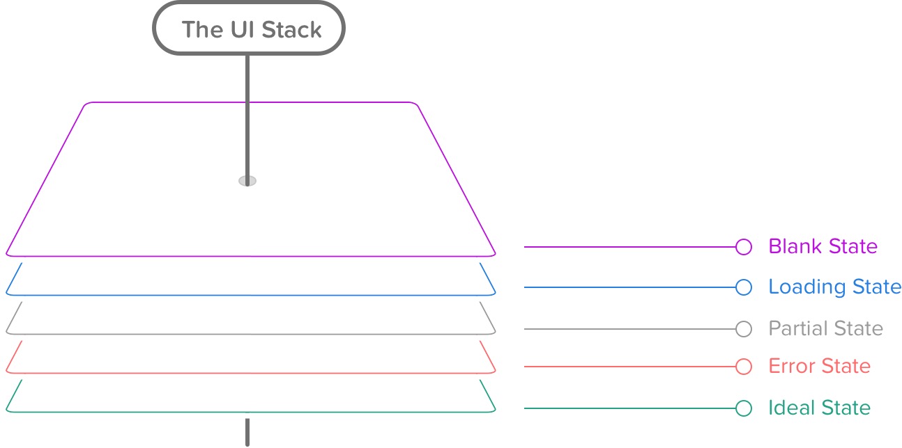
Designing Outliers: The User Interface Stack
How exactly can we design the outliers once we’ve identified them? A good strategy is to study the different states of the user interface. The “user interface stack,” an idea introduced by Scott Hurff, is versatile and complicated, and when we design our interfaces, usually it’s not enough to craft a pixel-perfect mockup in Photoshop, Sketch or HTML and CSS — we have to consider various edge cases and states: the blank state, the loading state, the partial state, the error state and the ideal state. These aren’t as straightforward as we might think.
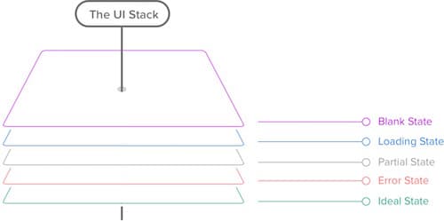
The blank state doesn’t have to be empty — we could be using service workers to provide a better offline experience to regular visitors. The partial state doesn’t have to be broken — we could improve the experience with broken images and broken JavaScript through progressive enhancement.
The ideal state might significantly differ from our “perfect result” mockups — due to custom user preferences and the user’s browser choice; some content and web fonts might not be displayed because of a browser’s configuration, for example.
So, the landscape is, as always, complex, convoluted and unpredictable, and we can’t make the risk of things going wrong negligible, but this doesn’t mean we can’t minimize the risk effectively. By exploring outliers and the entire user interface stack early on, we can prevent common UX issues in the early design stage. It doesn’t get easier on the technical side, though.
The Butterfly Effect In Deployment
Even minor changes tend to lead to chain reactions, introducing bugs in areas and situations that seem to be absolutely unrelated. The main reason for this is the sheer amount of variables that influence the user experience but that are out of our control. We do know our ways with browsers, but that doesn’t mean we know more about the context in which a user chooses to see the website we have so tirelessly and thoroughly crafted.
Now, while minor changes like the padding on a button or a progressively enhanced textarea might not seem like a big deal, we tend to underestimate the impact of these shiny little changes or features on a large scale. Every single time we make a design or development decision, that change does have some effect in the complex system we’re building, mostly because the components we are building never exist in isolation.
The reality is that we never just build a button, nor do we never just write a new JavaScript function — buttons and functions belong to a family of components or libraries, and they all operate within a certain setting, and they are unavoidably connected to other parts of the system by their properties or by their scope or by their name or by the team’s unwritten conventions.
These “silent,” hardly noticeable connections are the reason why rolling out features is difficult, and why predicting the far-reaching consequences of a change often proves to be an exercise in keen eyesight. That’s why it’s a good idea to avoid unnecessary dependencies as far as you can, be it in CSS or JavaScript — they won’t help you with maintenance or debugging, especially if you’re relying on a library that you don’t fully understand.
Luckily, to better understand the impact of a change, we can use resources such as a browser’s developer tools. We can measure the reach of a selector or the reach of a JavaScript function, and sometimes it might be a good idea to keep coming back to it during development to keep the scope of the change as local and minimal as possible.
This is helpful, but it’s also just one part of the story. We make assumptions, consciously and unconsciously, based on our own experience with the interface and our own habits — often forgetting that assumptions might (and, hence, will) vary significantly from user to user. Most applications do have just one interface, but this interface or its configurations can have dozens of states — with views changing depending on the user’s settings and preferences.
Think about dashboards with cards that can be customized (analytics software), mail clients with “compact,” “comfortable” and “detailed” views (Gmail), a booking interface that changes for logged-in customers and for guests, a reading experience for people using an ad blocker or an aggressive antivirus filter. The butterfly effect has an impact on more than just the code base; all of those external factors weigh in as well, and testing against them — unlike with unit tests or QA in general — is very difficult because we often don’t even know what to test against.
Feature Validation And Local Maximum
We can use diagnostics and metrics to determine what changes need to be made, but by following data alone, you might end up stagnating at what we tend to call a “local maximum,” a state of the interface with a good enough design but that utterly lacks innovation because it always follows predictable, logical iterations. When working on a project and exploring the data, we tend to group features in the following four buckets:
- Broken features. Features that appear to be broken or inefficient — obviously, we need to fix them;
- Unused features. Features that work as intended but are rarely used — often a sign that they either should be removed or desperately need innovation;
- Unexpected use features. Features that are used in a way that is extremely different from what their creators had originally envisioned — a good candidate for slow, continual refinement;
- Workhorse features. Features that are heavily used and seem to be working as planned — in which case we ask ourselves whether there is any way to further improve their UX by exploring both the slow iterative process and entirely different innovative concepts in parallel.
The first two buckets are critical for keeping an interface functional and usable, while the latter two are critical for keeping users engaged and delighted. Ideally, we want to reach both goals at the same time, but time, budget and team restrictions have the upper hand.
Still, once a new iteration or a new idea is chosen, it can be tempting to jump into designing or building the new feature right away. But before even thinking about how a feature would fit in an existing interface, it’s a good strategy to validate the idea first — with a quick prototype and user research. A common way to achieve this is by using a quick iterative process, such as Google Ventures’ design sprint. By iterating within a couple of days, you can identify how the new feature should be implemented and/or whether it’s useful in the way you had imagined it to be initially.
With design sprints, we expose the idea to usability research early on. In Google Ventures’ methodology, you would test a design with five users a day; then, you would iterate and go through another round of testing of the new design. The reason why all of the same users are involved is because if you test a different design with each user that day, you would have no valid data to know which elements should change. You need a few users to validate one design iteration.
We apply a slightly different model in our sprints. When we start working on a new feature, once an early first prototype is built, we bring designers, developers and the UX team together in the same room, invite real users to test and then iterate on a tight schedule. On the first day, the first testers (two to three people) might be scheduled for a 30-minute interview at 9:00 am, the second group at 11:00 am, the next one at 2:00 pm, and the last one around 4:00 pm. In between user interviews, we have “open time windows,” when we actually iterate on the design and the prototype until at some point we have something viable.
The reason for this is that, early on we want to explore entirely different, sometimes even opposite, directions quickly; once we gather feedback on different interfaces, we can converge towards what feels like the “absolute maximum” interface. We can get very diverse feedback on very diverse design iterations faster this way. The feedback is mostly based on three factors: heat maps that record user clicks, the time users need to complete a task and how delightful the experience is to them. Later in the week, we keep working consistently with a larger number of users, very much like Google does, permanently validating the new design as we go.
So far so good, but sometimes a seemingly innovative new feature collides with an existing feature, and having them both in the same interface would clutter the design. In this case, we explore whether one of the options could be considered an extension of the other. If it could be, then we start by reiterating its functionality and the design. That’s when we have to choose radical redesign or incremental change. The latter is less risky and will keep a familiar interaction pattern for users, while the former is required if critical changes are impossible to achieve otherwise or if the gains from incremental changes would be too shallow.
In either case, it’s critical to keep the focus on the entire user experience of the product, rather than on the value of a single feature within that product. And once you’ve chosen the feature and you’ve designed and built the first prototype, it’s time to test.
The Eight Levels Of Testing
Well, then, how do we effectively prevent errors and failures from creeping into an actual live environment? How many checks and reviews and tests do we run before a feature gets deployed? And in what sequence do we run these tests? In other words, what would the ultimate strategy for rolling out features look like?
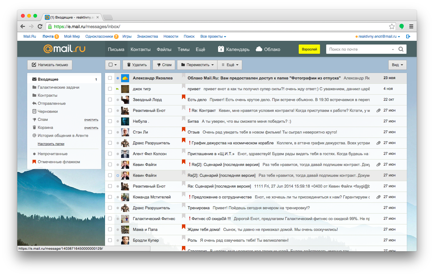
One of the better strategies for rolling out features was proposed by Andrew Sumin, head of development at Mail.ru, a major email provider in Russia. The strategy wouldn’t be applicable to every project, but it’s a reasonable and comprehensive approach for companies serving mid-sized and large products to thousands of customers.
Let’s look at the strategy in detail and cover the eight steps of a feature roll-out, covering Mail.ru’s process of product development:
- test with developers,
- test with real users in a controlled environment,
- test with company-wide users,
- test with beta testers,
- test with users who manually opt in,
- split-test and check retention,
- release slowly and gradually,
- measure the aftermath.
In Mail.ru’s case, the most important feature to keep intact no matter what is composing a message (obviously). That’s the most used piece of the interface, and allowing it to be unavailable or to work incorrectly even for seconds would be absolutely out of the question. So, what if we wanted to extend the functionality of a textarea, perhaps by adding a few smart autocomplete functions, or a counter, or a side preview?
1. Test With Developers
The more time passes by in development, the more expensive it becomes to fix a problem. Again, think about how connected all decisions are in product development; the more refined the product is, the more decisions have to be reverted, costing time and resources. So, identifying and resolving problems early on matters from both a business perspective and a design and development perspective.
You can’t debug an idea, though, so initial testing should take place during production, on the very first prototypes. The first testers at Mail.ru, then, are the developers who actually write the code. The company encourages its employees to use the product for in-house communication (and even private communication); so, developers could be considered hardcore users of the product.
The first step is quite obvious: design and build the feature, and then locally test, review and roll it out on the staging server. This is where QA testing comes in, with comprehensive tools and task runners that attempt to crash the feature and interface, potentially automated with monkey testing tools such as Gremlins.js.
The results are monitored and then fed back into the feedback loop for the next iteration of the feature. At some point, the developers will feel quite confident with the build: the change seems to be working as expected, and the requirements have been met. That’s when real user testing kicks in.
2. Test With Real Users In A Controlled Environment
When the first working prototype is finished, the feature is tested with actual users in interviews. Customers are invited to complete tasks, and as they do, the UX team monitors dead ends and issues that pop up and addresses them on spot.
However, not only is the new feature being tested; the usability test’s goal is to ensure that the new feature doesn’t affect critical components of the interface, which is why users complete routine tasks, such as composing a message and opening, replying to and browsing emails in their inbox. If both the new feature and the old features are well understood, the process can move on.
3. Test With Company-Wide Users
Obviously, the feedback from the usability test prompts developers to introduce changes, which then feed back to the usability testers, going back and forth until the result seems to hold value for a larger audience. The next step, then, is for the feature to be spotlighted within the company: A company-wide email is sent out encouraging all colleagues to check the feature and submit reports, bugs and suggestions in a tracker.
With testing, there isn’t a particularly big difference between users in “remote” departments within the company and users in the wild. Even internal users don’t know what changes to expect or know exactly what a feature does or how it’s supposed to work or look like. The only main difference is that colleagues can be prompted to quickly submit feedback or leave a comment. That’s when voting forms are introduced. Testers can not only play with the feature but also add a comment and upvote or downvote it. Voting has to be weighed against product strategy and business requirements, but if users clearly find a feature useless or helpful, that’s a simple and effective way to gather feedback and to test whether the product works as expected.
4. Test With Beta Testers
If a feature has passed a technical check, a usability check and review within the company, the next logical step is to introduce it to some segments of the audience. However, instead of rolling it out to a random segment of users, the team submits a feature for review among beta testers — users who have opted to participate in tests and submit feedback for experimental features. They can downvote or upvote a feature, as well as report bugs and commit pieces of code.
But how do you choose appropriate beta-testers? Well, if you want to encourage testers to break the interface, you might focus on advanced loyal users with technical skills — users who would be able to provide technical detail about a bug if necessary, and users who know the existing interface well enough to be able to anticipate problems that other users might have.
However, you need criteria to determine whether a user is advanced enough to be a beta tester. In the case of an email client, it could be someone who uses Chrome or Firefox (i.e. they know how to change their default browser), who has created more than three folders in their inbox and who has also installed the mobile app.
5. Test With Users Who Manually Opt In
Up until this point, the tests have involved a manageable number of users, configurations and test reports. Yet the diversity of users, systems and configurations out in the wild, including operating system, browser, plugins, network settings, antivirus software and other locally installed applications, can be slightly more daunting in scale.
In Mail.ru’s case, the next step is to roll out the feature in a live interface, behind a flag, and to send out an email to this larger segment of active users, presenting the new feature and inviting them to activate it on their own in the interface, usually with a shiny “Update” button. To measure the value of the feature to actual users, the team again uses a voting system, with a few prompts here and there, basically asking users whether they find the feature helpful or useful. Notice that the difference between this level and the previous level is that the manual opt-in involves a much larger audience — many of whom aren’t technical at all, unlike beta testers.
So, timing and coordination matter. You probably wouldn’t pick a random day to send out the email to active users, because you’ll want the customer support team and developers to be available when the stream of bug reports starts coming in. That’s why the email is sent out at the beginning of the week, when all (or most) developers are available and the support team is ready to spring into action, having been briefed and actively connected with the developers via Skype or Slack. In a smaller company, you could even have developers sit in for a few hours at support desks to get to the core of a problem faster by speaking directly to customers.
6. Split-Test And Check Retention
In the steps thus far, except for usability testing, all testers have used the new feature voluntarily. However, if you enable the feature by default, suddenly users will have to use it, and this is a very different kind of group, one we haven’t tested at all.
To make sure you don’t break the habits of passive users, you could split-test with three small segments of users and measure retention. After all, you want to make sure that a new version works at least as well as the previous one. Identify the most important activity in the interface and measure not only how much time users spend on it before and after the roll-out, but also how much time passes until they return. In Mail.ru’s case, retention entails users checking their email and composing a message. The more often a user comes back, the higher the retention, which is an indicator of a better UX.
Each segment gets a slightly different view, which enables us test how to display the new feature to all users later. For the first segment, we add the new feature and provide a tutorial on how to use it. For the second segment, we just add the new feature. For the third segment, we could leave the feature as is. For all of these segments, we could implement the change at the same time, select a reasonable timeframe to run the test, measure retention and then compare results. The higher the retention of a segment, the more likely that design will be promoted to all users later on.
7. Release Slowly And Gradually
If a feature has made it all the way to this point, then it probably already works well for a large segment of the audience. This is when you could gradually roll it out to all users — with a voting prompt to gather feedback. If the feedback is mostly positive, you can keep rolling out the feature and it will eventually become an integral part of the interface. Otherwise, you would evaluate the feedback and return to the lab for the next iteration.
Rolling out the feature isn’t enough, though: It has to be communicated to users. A common way to do that is through email and social media. Still, a quick walkthrough tutorial explaining the value of the feature in real-life scenarios might be helpful, too. Also, don’t forget to integrate a suggestions box to gather feedback immediately.
8. Measure The Aftermath
Once the feature has been rolled out, we can monitor how it performs and try different methods to draw attention to it, so that users will be able to perform their tasks more efficiently. You could track the most common tasks or most visited pages and then display a little inline note recommending a slightly smarter and faster way for the user to achieve their goal, and then measure whether the user prefers this new feature or the usual method.
Don’t forget to bring the feedback back to the entire team, not only the developers or designers, so that they are motivated and engaged and see how people use a feature that was initially nothing more than a rough idea. Nothing is more motivating than seeing happy, delighted people using an application exactly the way you envisioned, or in entirely different ways. It will also nourish the growth of the team’s subsequent features.
The review process looks complex and thorough, but sometimes only time and a wide net for user testing will uncover a problem. For example, if a change affects what the overview of incoming messages looks like, no unit test could uncover difficulties that users of assistive software might encounter. In a mail interface, what do you want the accessibility device to read out first: the date, the sender, the subject line or the message itself? The way you rearrange the columns in the overview might change the way users choose to access the information; so, allowing them to turn off the new feature would be critical as well.
Conclusion
So, what does a roll-out strategy look like? You could start by exploring the graph of dependencies to understand how far-reaching your change might be. Then, you could test the feature with developers and with real users in a controlled environment. Then, you could ask colleagues to review the feature, before sending it to a select group of beta testers. Finally, you could make the feature available as an option to users. And, before enabling the feature for everybody, you could run a split-test to figure out the best way to introduce the feature, and then measure the retention rates for critical tasks.
Obviously, deployment is not a linear process. Throughout the process, you might need to take two steps back in order move one step forward — until you finally have a release candidate. The workflow covered above might seem to be quite slow and not particularly agile, but you drastically minimize the risk of users suddenly being confronted with an unexpected problem and having an inferior experience as a result. In some situations, it might be very well worth it.
Further Reading
- How We Started Releasing Features Twice As Fast
- The Website Launch Checklist – 15 Essential Checks Before You Go Live
- A User-Centered Approach To Web Design For Mobile Devices
- How To Launch Anything


