Front-End Challenge Accepted: CSS 3D Cube

Email Newsletter
Weekly tips on front-end & UX.
Trusted by 182,000+ folks.


 Custom Web Forms for Angular, React, & Vue. Your backend.
 Celebrating 10 million developers
Do you like challenges? Are you willing to take on a task that you’ve never come across before, and do it under a deadline? What if, in carrying out the task, you encounter a problem that appears unsolvable? I want to share my experience of using CSS 3D effects for the first time in a real project and to inspire you to take on challenges.
It was an ordinary day when Eugene, a manager at CreativePeople, wrote to me. He sent me a video and explained that he was developing a concept for a new project and was wondering if it was possible for me to develop something like what was in the video.
It was a 3D object (a cuboid, to be precise) that rotated around one of the axes. I already had some experience with working with CSS 3D, and a solution started to form in my mind. I Googled keywords like “CSS 3D cube” to confirm my ideas and answered Eugene that it was possible.
Eugene’s next question was whether I would take on the project? I like tricky tasks, so I couldn’t refuse. At the time, I didn’t realize what I was getting into, but I was beyond determined.
Sharpen Your Axes
Let’s remind ourselves about axes — not war axes, but the number lines, the same axes as in the three-dimensional Cartesian coordinate system that we studied in school. As Wikipedia tells us:
"The Cartesian coordinate system for a three-dimensional space is an ordered triplet of lines (axes) that are pair-wise perpendicular, have a single unit of length for all three axes and have an orientation for each axis."
The picture below shows how the axes are oriented in a web browser.
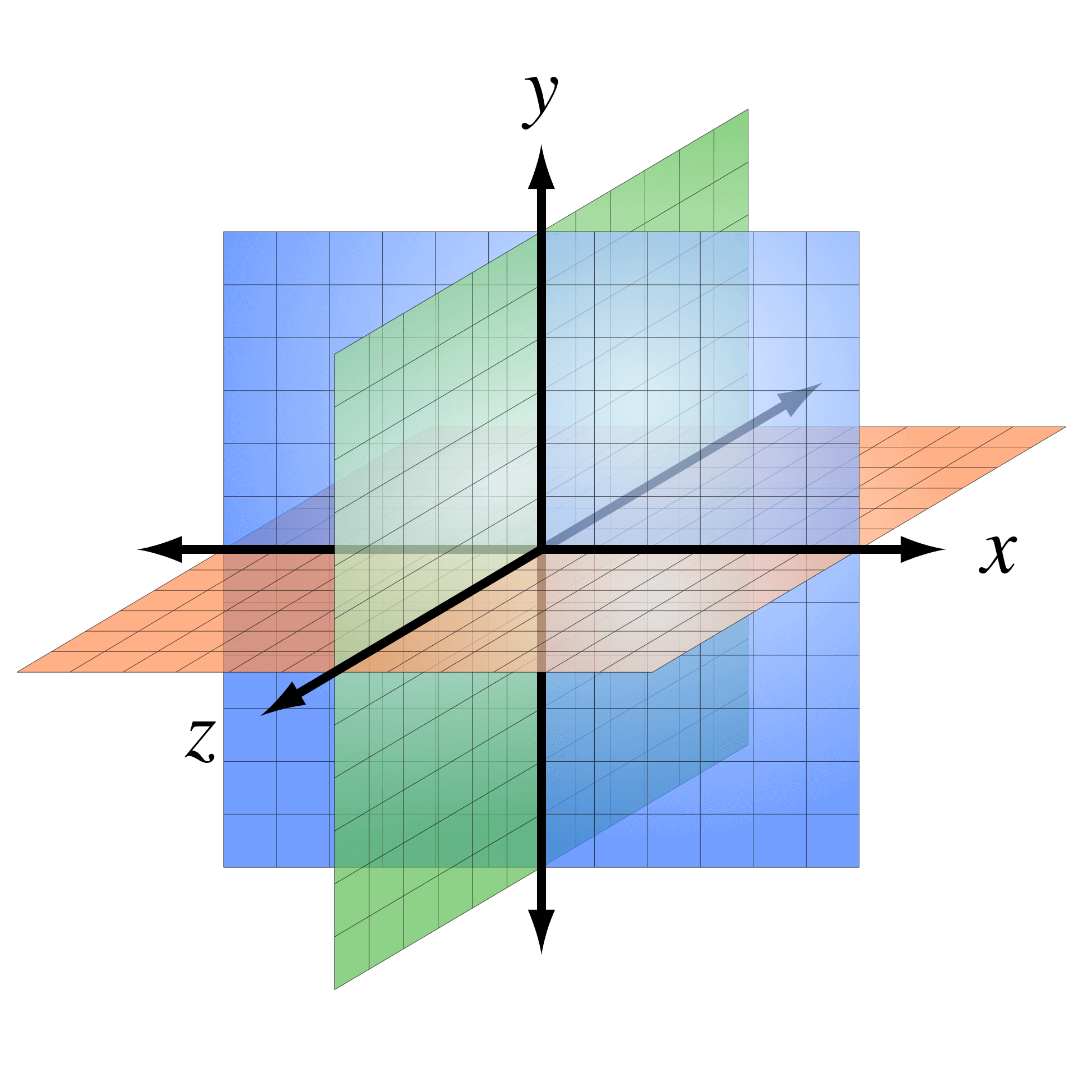
The x-axis is horizontal, the y-axis is vertical, and the z-axis appears to come out from the screen towards you. The z-axis’ zero value is the plane of the screen. Remember this.
Clearing Up The Perspective
To create a 3D object, I needed an element (let’s call it a “scene”) with a perspective. The perspective is the depth of the scene, and it depends on the sizes of the objects it contains.
.scene {
  perspective: 800px;
}
If the perspective is too small, objects could get distorted. If it is too big, the 3D effect will be reduced to nothing.
See the Pen jqgMvL by Anna Selezniova (@askd) on CodePen.
Furthermore, there is only one angle of view for all objects in the scene. And the 3D effect depends on the viewpoint’s position.
See the Pen oxKzKv by Anna Selezniova (@askd) on CodePen.
So, how do we calculate the perspective? I discovered that it depends on the axis of rotation. For the x-axis, the height value multiplied by 4 would fit. For the y-axis, it would be the width value multiplied by 4. Here is my magic formula:
const perspective = dimension * 4;Considered From All Sides
After determining the perspective, I started to create a 3D object. I chose a cube because it is straightforward and predictable. A cube element is created as a regular div, relatively positioned, with the width and height defined (say, 200px). It transforms into a 3D object through the transform-style property with a value of preserve-3d. It tells the browser to render all nested elements according to the rules of the 3D world.
In my case, the cube has six divs (or “sides”), absolutely positioned. The class names correspond to the initial positions of the sides (back, left, right, top, bottom, front). Here is the markup:
<div class="scene">
  <div class="cube">
    <div class="side back"></div>
    <div class="side left"></div>
    <div class="side right"></div>
    <div class="side top"></div>
    <div class="side bottom"></div>
    <div class="side front"></div>
  </div>
</div>
By default, all of the sides will be on one plane. So, I needed to rearrange them. Here is how that looks:
See the Pen mPNwPx by Anna Selezniova (@askd) on CodePen.
And here is the resulting CSS:
.cube {
  position:relative;
  width: 200px;
  height: 200px;
  transform-style: preserve-3d;
}
.side {
  position: absolute;
  width: 200px;
  height: 200px;
}
.back {
  transform: translateZ(-100px);
}
.left {
  transform: translateX(-100px) rotateY(90deg);
}
.right {
  transform: translateX(100px) rotateY(90deg);
}
.top {
  transform: translateY(-100px) rotateX(90deg);
}
.bottom {
  transform: translateY(100px) rotateX(90deg);
}
.front {
  transform: translateZ(100px);
}
To rotate the cube, I set the transform property on the cube element to an arbitrary rotational angle along the x-axis:
.cube {
  transform: rotateX(42deg);
}
Overcoming The Shortcomings
According to the assignment, I was to rotate the cube only along the x-axis, so I didn’t need the left or right side. I added captions to align with the initial positions of the remaining sides.
I started to rotate the cube and found that the captions on the bottom and back sides were displayed upside down:
See the Pen GZVvMR by Anna Selezniova (@askd) on CodePen.
To solve this problem, I rotated each of these sides along the x-axis by 180 degrees:
.back {
  transform: translateZ(-100px) rotateX(180deg);
}
.bottom {
  transform: translateY(100px) rotateX(270deg);
}
Going Beyond The Screen
I started to fill the sides with real content and immediately encountered another problem. I needed to display 1-pixel dotted lines, but they were blurry and looked bad.
See the Pen VjeBPg by Anna Selezniova (@askd) on CodePen.
I soon realized what the problem was. Do you remember that 3D TV ad in which the image extends beyond the screen? It was something like that with my cube.
If you could look at the cube from the left or right side, you would see that its center was on the plane of the screen (zero on the z-axis) and that the front side was beyond the screen. Therefore, it increased visually and blurred.
See the Pen WwVEMR by Anna Selezniova (@askd) on CodePen.
To solve this problem, I shifted the cube along the z-axis to align the front side to the plane of the screen:
.cube {
  transform:translateZ(-100px);
}
Here is the cube now, almost ready:
See the Pen Xdvery by Anna Selezniova (@askd) on CodePen.
Using The Magic Numbers
I guess you’ve noticed that I’m using the magic number 100 to shift the sides along the axis. The value 100 is exactly half the height of my test cube. Why half the height? Because that would be the radius of a circle inscribed in a side of the cube (which is a square, apparently).
const offset = dimension / 2;If I needed to rotate a triangular prism, the circle would be inscribed in a triangle. In this case, the formula for the offset would be as follows:
const offset = dimension / (2 * Math.sqrt(3));Blowing Away The Cube
To consider the task complete, I had to test the result in different browsers.
The picture I saw in Internet Explorer plunged me into depression. To get an idea of what I’m talking about, look at the demo below in your favorite browser. I changed one property that resulted in the cube displaying incorrectly in Internet Explorer. However, don’t peek at the source code until you have read the paragraph under the demo below.
See the Pen XKWMwV by Anna Selezniova (@askd) on CodePen.
The fact is that Internet Explorer doesn’t support the transform-style property with a value of preserve-3d. I learned about this by looking at my trusty resource Can I Use (see note 1). In the demo above, I replaced preserve-3d with flat. Did you already know that? Hey, I told you not to peek!
I was upset, but I wasn’t going to give up. A problem is an opportunity to learn something new. Besides, I had accepted the challenge.
Searching For The Fulcrum
I was looking for a way to create a 3D object without using transform-style: preserve-3d, and I eventually discovered a useful property: transform-origin. It determines the central point of an element’s transformation. I have created an interactive demo below, which will help you understand how it works:
See the Pen rLNmBp by Anna Selezniova (@askd) on CodePen.
The 3D rotation of the element in the demo is very similar to the front side of a cube, isn’t it? That’s what I used.
(By the way, did you try to select the checkbox backface-visibility: hidden during the 3D rotation? This property is used to hide the back of the element during the 3D transformation.)
Starting All Over Again
I started to redo the cube. I didn’t have to interact with the scene as a whole, so I removed the perspective property of the scene element and added it to each 3D transformation, so that now every element transforms independently. Also, I set new properties for each side: transform-origin with a value equal to the position of the cube’s center, and backface-visibility: hidden. Here is how the styles have changed:
.scene {

}
.cube {
  position: relative;
  width: 200px;
  height: 200px;
  transform: perspective(800px) translateZ(-100px);
}
.side {
  position: absolute;
  transform-origin: 50% 50% -100px;
  backface-visibility: hidden;
}
I had to put the sides in the right places. Because of the transform-origin property, I didn’t need to shift them, only rotate them around the axes. It’s like magic! Let’s see how it looks:
See the Pen zBYwEm by Anna Selezniova (@askd) on CodePen.
Here is the CSS for the placement of the sides:
.back {
  transform: perspective(800px) rotateY(180deg);
}
.top {
  transform: perspective(800px) rotateX(90deg);
}
.bottom {
  transform: perspective(800px) rotateX(-90deg);
}
.front {
  transform: perspective(800px);
}
And here you can see the new cube in action:
See the Pen wWvdXd by Anna Selezniova (@askd) on CodePen.
Giving Back To Caesar What Is Caesar’s
The second cube looks and spins the same as the first. But in this case, you need to transform each side individually. This might not be very easy, especially if you want to control the intermediate angle of rotation.
Furthermore, if you open the demo in Chrome, you will see that the sides flash during rotation — very frustrating.
In the end, I applied both approaches using the simple test of transform-style: preserve-3d. The first cube is the default one. The second cube is for Internet Explorer and browsers that do not support preserve-3d.
Using The Power Of Math
Finally, I had to implement a parallax effect. Usually, this effect responds to the user’s action, whether the position of the mouse cursor or the scroll bar. In this case, the effect depends on the angle of rotation.
See the Pen QENyqm by Anna Selezniova (@askd) on CodePen.
So, what data do I have? First, I had the start and end points of the caption’s position or, to put it simply, its offset up and down from the center of a side. Secondly, I had the angle of rotation of the cube.
I spent hours trying to develop a formula. Then, it dawned on me. Here’s what came to mind:
With the help of sines and cosines, I easily calculated the offset of each caption according to the angle. Here are the formulas I came up with:
const front_offset = offset * sin(angle) * -1;
const bottom_offset = offset * cos(angle);
const back_offset = offset * sin(angle);
const top_offset = offset * cos(angle) * -1;
Summing Up
The assignment is now complete, and I can enjoy the result and share it with you. See for yourself how it works. Use the scroll or arrow keys to rotate the promo block. Also, try to pull the black triangle on the right up and down to control the angle of rotation manually (unfortunately, this feature does not work in Internet Explorer). Looks pretty good, doesn’t it? And performance is rather high (about 60 frames per second).
I am very glad to have participated in the development of this website. I have gained useful experience in working with CSS 3D and have discovered many interesting properties. More importantly, I have learned that one should never give up; most likely you will find a way to accomplish the task.
I hope you have enjoyed my story and are now ready to take on new challenges.
Further Reading
- Beercamp: An Experiment With CSS 3D
- Creating Responsive Shapes With Clip-Path And Breaking Out Of The Box
- Let’s Play With Hardware-Accelerated CSS
- Getting Started With Neon Branching
 (vf, il, al, mrn)

