Getting Practical With Microcopy

Email Newsletter
Weekly tips on front-end & UX.
Trusted by 182,000+ folks.

 Custom Web Forms for Angular, React, & Vue. Your backend.
 Celebrating 10 million developers

The first question clients and stakeholders seek answers to with any digital product and/or service today — and rightly so — is how to establish an effective user experience. We, as designers, however, know that good design and a good user experience are rarely achieved by fixating on one discipline, but rather by adopting a multidisciplinary approach. At best, it’s about finding a balance between UX, UI and interaction design, usability, accessibility, web performance (front end, back end, networking), service design and content strategy (i.e. writing copy).
However, the tendency among most clients and design teams is first and foremost to establish on-screen interactions, pattern libraries, wireframes and workflows and to release the latest and greatest features — to the point that, at times, they’ll defer the copy (specifically, the microcopy) till the latter stages. While the general consensus is that content matters and should be central to any design undertaking, the opposite tends to be true. Bill Beard even once said that microcopy is the text we don’t talk about very often, and sadly I still find this to be relevant to this day.
“Microcopy”?
What exactly is microcopy? The “web standardistas” Christopher Murphy and Nicklas Persson sum it up nicely in their pocket guide The Craft of Words, Part Two: Microcopy:
"The craft of words at a micro level, considering how words can satisfy a functional requirement by aiding and improving design interactions, enhancing interfaces for both function and delight, and helping a user on their journey."
It’s the instructional copy, calls to action, headings and small print, navigation, form and button labels, feedback and error messages that are found on a website or web application, intended to aid the user through a task or journey and to provide reassurance where needed. It’s not just relevant to the marketing experience either; it can and should go further.
Microcopy Is Design
When you consider that words still form the backbone of communication on the web, it’s difficult to comprehend why content — and microcopy in particular — is often relegated to the bottom of design agendas. Shouldn’t writing copy be seen as a vital element of the design process from the very start? We fixate on delivering delightful experiences, yet once we step beyond the marketing experience and copy, the experience often lacks consistency and tone. How often have you signed up for a product only to get a dull and unenthusiastic welcome?
When done right, effective microcopy increases conversions, delights users and improves the rate of task completion. It can also save time and resources, showcase an organization’s culture and build trust with users, allowing the organization to distinguish itself from competitors. Moreover, it helps to define the brand and set expectations for users.
“But There’s No Time For Microcopy!”
Copywriting of any form shouldn’t be regarded as a box ticking exercise, nor subject to excuses such as a lack of time; that is extremely shortsighted. On the other hand, it’s easy to make such calls to action. How do you truly make writing microcopy part of the design process? How do you encourage buy-in from stakeholders? Where do you start? Don’t know? No problem. Here are some handy tips to get you going:
- Obtain agreement and consensus.
- Get strategic and establish guidelines.
- Discover your voice.
- Hire a copywriter.
- Set expectations for the experience.
- Be direct without being overwhelming.
- Build for success and failure.
- Avoid detailed instructional microcopy.
- Avoid contextual terms.
- Clearly highlight business rules.
- Practice, collaborate and share.
- Test with real users.
1. Obtain Agreement And Consensus
As with any other design activity, writing and maintaining microcopy should be supported by the wider team and done in parallel with any design and development activity; otherwise, you effectively design without a voice. It cannot happen in isolation either, because product managers, designers, developers, strategists and others will all have a vested interest and domain of responsibility in the product or service. While one approach could be to skill up and empower senior stakeholders to provide the microcopy, it should rather fall under the domain of a central person or team, who would liaise with all groups and provide the necessary guidance and expertise.
Obtaining agreement implies gaining acceptance not necessarily from C-Level executives, but simply from the immediate stakeholders and/or teams involved. If key stakeholders appreciate the importance of microcopy, then you’re off to a great start. However, some stakeholders will probably not be entirely convinced to begin with. They might cite time or resource constraints or be of the opinion that everything is fine as is. Perhaps so. For a start, I would never suggest doing something for the sake of doing it. But if you believe there are issues with the microcopy, then simply selling the discipline or process might not be enough. Subjectivity, ego and personal bias can be difficult to overcome when you don’t have data to support your opinion. Therefore, gather data and use language which resonates with the key decision-makers.
A good place to start is to look at support inquiries recorded in the organization. Are any recurring themes or issues with customers being logged? Are any analytics available? If you’re able to, conduct usability testing to gather feedback from users, and be sure to record the sessions. It’s amazing to see how attitudes and perceptions can change amongst stakeholders when presented with data that is both personal and concrete.
2. Get Strategic And Establish Guidelines
Let’s assume you’ve been able to gain some form of consensus. Developing an engaging product with a great user experience should be enough of a motivator for most stakeholders. However, you might also need to show some stakeholders what’s in it for them. For instance, would it save them time or resources in the long term? Or might it only add to their workload?
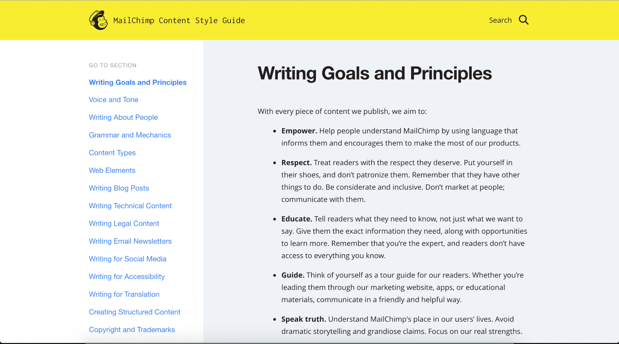
Set Guidelines
The reality is that, without set guidelines, enforcing and promoting any consistency through microcopy will be difficult. A key step should be to create a content style guide devoted to writing and microcopy, to help keep the language consistent. This should not be confused with a design style guide (i.e. modules, pattern libraries), but both could co-exist in the same space. It also need not be complicated to begin with. Perhaps initially focus on labelling and capitalization, call-to-action labels, data formats, and a word bank or brand dictionary of terms to use and/or to avoid.
Start small and build incrementally, especially if other contributors are pressed for time or unsure. You probably won’t get it quite right at first, so simply start to write, experiment, test and iterate. The goal is to promote consistency in the microcopy but, more importantly, to remove the mundane elements from the decision-making and writing process. This is ever so important if you expect others to contribute and buy in. Allow people to focus on the non-standard elements, leaving some room for creativity.
Keep It Fresh And Current
So, you’ve established a central content style guide, containing guidelines for colleagues and teams to follow. You could be forgiven for thinking “Job done!” But the next challenge is to actively maintain and manage the guide, and to ensure that others follow the guidelines. Ideally, the content style guide should be maintained by a team of content specialists — experienced copywriters, people who can liaise with other teams and departments.
Unfortunately, despite the best of intentions, style guides and pattern libraries tend to be neglected over time more so when newly defined workflows are dependent on people retrospectively and/or manually updating the relevant modules. This is somewhat idealistic. The time, effort and resources required, especially for rapidly changing design systems, can be significant and, not to mention, leave room for error. People are usually pressed for time and have other duties; adding to that workload will not help.
One solution is automation. When we develop design systems at Creative Nights, we essentially create, design and iterate modules, and over time so do our clients. Whenever we discover a repeatable object in the UI, it becomes a (parameterized) module pattern. One module, one file. Essentially, our version of a style guide is a single page that pulls in module files from a dedicated folder, each containing a real-life example, comments and a direct link to the code base. It’s a seamless process considering the style guide gets updated when teams work on and commit changes to the modules. There is simply no need for additional effort or maintenance.
A similar approach could also be adopted for certain elements of microcopy, particularly headings, buttons, form labels, links, feedback and error messages. Whenever there is a repeatable instance of microcopy (as well as a one-off instance), it becomes a parameterized module of microcopy which can then be hooked into live systems. Better yet, why not then use the content style guide to centrally manage and push microcopy into live systems? This may resemble a content management system, but the idea is simply to manage certain content at a more granular level and to introduce a form of publishing control and consistency for microcopy. As with design systems, rather than designing pages, we want to design and write with components and modules in mind.
In adopting such an approach, it should then become easier to apply updates to key copy, while removing the mundane elements from the decision-making and writing process. Should new elements be identified, they can simply be added to the content style guide to create the necessary hooks. As for labelling and capitalization, abbreviations, data formats and allowable terms, you could introduce a checklist for other teams to follow and sign off on, or over time provide an editing tool that has the formatting rules built in.
The idea outlined above is just one potential approach, though most teams should be able to achieve some form of automation. However, automation alone does not guarantee success. It can take time and be a challenge as much culturally as technically, as attested to by the teams for GOV.UK and Lonely Planet. That being said, an approach that works for one organization would not necessarily work for another. It’s imperative to be realistic, to find an approach which complements the workflows of the individuals and teams; otherwise, the initiative will likely fail before it has even started.
3. Discover Your Voice
Stop and think for a moment. If we were to remove all of the interactive elements from a page, only hyperlinks and words would be left. Therefore, should a user still be able to make sense of the words and page structure and, more importantly, be able to complete the task(s) at hand? Yes of course, even if the experience is not perfect. We talk a lot about progressive enhancement: Why not take a similar approach to words by setting a baseline experience through natural language, one that can be refined and improved with additional visual features and interactions.
When words are not considered a part of the design process, you effectively design without a defined voice and tone for large parts of the process — and that will show. The general result will be microcopy that is inconsistent, bloated, robotic in tone, uninspiring and devoid of imagination and creativity.
By injecting the personality of the organization, you will differentiate yourself from the competition. The branding agency Larsen talks about creating the right brand voice, one that defines the tone of communication and the style of writing. Essentially, you want to communicate with the same voice, but adapt the tone to the audience and context. If you are unsure of where to start, consider Nesta’s Creative Enterprise Toolkit to help define your key values.
4. Hire A Copywriter
For the same reasons your organization hires specialist designers and developers, why not also hire specialist copywriters — professionals who can bring life and meaning to your experiences through words. Assuming the budget and/or resource is available, not only would a copywriter bring in valuable expertise and skills to the organization but it would also allow the stakeholders and teams to focus on their areas of expertise.
More recently, the role of the UX writer has started to emerge as a standalone discipline, especially among the likes of Amazon, Dropbox, Google and Nordstrom. Google, in particular, views UX writers as people who can shape product experiences by crafting copy that helps users complete the task at hand. So, does the role of a UX or even technical writer differ in any way from that of a copywriter? In truth, probably not; the primary function of both is to write effective copy. Whether you agree with the title of UX writer, it would appear the role of the classic copywriter is expanding; one which now requires an additional sub-set of skills. It too suggests that organizations are starting to recognize the value of copy by having dedicated specialists embedded in the user experience and design process.
Nevertheless, bringing in hired hands for words will not guarantee immediate success. Sure, they’ll provide guidance where necessary, but writing copy must still be considered a part of the design process. Therefore, copywriters shouldn’t work in isolation; they should work with and be regarded as part of the wider design team. They’re an investment in the future of the organization too; they’ll need time to understand the organization, including its culture, ethos and products / services. Even if a copywriter is not required long term, they can ultimately help build up skills and capabilities in the organization for the long term.
5. Set Expectations For The Experience
We have expectations for almost every interaction we have, while some are set exclusively by service providers. For instance, when placing a food order, the general expectation is that the food will be served or delivered within 20 to 30 minutes. If a train is scheduled for 16:25, the expectation is that it will arrive at that time, give or take a minute. Ordering via Amazon Prime, you expect the order to arrive within one business day. We expect products to work from the start and to be intuitive to use. We expect data to be backed up and personal information to be secure. Expectations are always present; it’s human nature.
It should be no different on the web. Setting clear expectations through effective microcopy and delivering on those expectations will drive conversions and improve the overall experience, both in the short and long term. A user shouldn’t have to second-guess what will happen next; set expectations and allow users to plan for the task ahead.
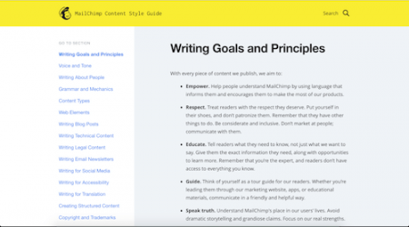
Consider the food-delivery service provider Deliveroo. When ordering food via their native mobile app, expectations are set from the start. First they establish whether delivery is available in a specified location.
When delivery to a location is unavailable, the user is told quickly; the microcopy used is also relatively straightforward and written in the active voice. Even if a first-time user is left disappointed, being able to vote for delivery in an area is a nice touch. But it would be helpful for Deliveroo to indicate whether and when delivery to that area can be expected.
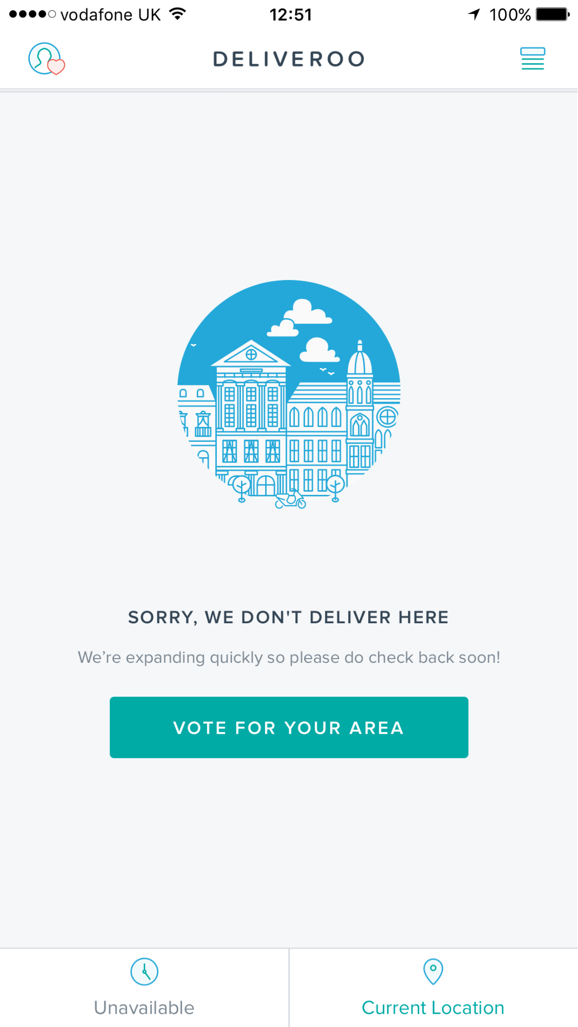
If the user sees a list of restaurants then it is apparent delivery is available; no specific microcopy is required. However, Deliveroo quickly sets expectations for this stage of the order experience too.
Not only is it clear to the user what stores are available and open, but the inclusion of the delivery time microcopy allows the user to make an informed decision early on. Simple but rather effective. While the purpose of the delivery time microcopy is to assist the user, it also enables Deliveroo to build trust with its customers whenever they’re able to meet or exceed the set delivery targets.
Don’t Forget About Web Forms
Setting expectations with a web form is just as important, considering that whenever we ask users to provide information or follow a process, it’s done via some type of form control. A user’s natural instinct is to initially scan the web form to determine the time and effort required to fill it out and complete the task at hand. It’s about finding the right balance between simplicity and usability. If the web form is too short and vague or even too long the likelihood is the user will abandon.
Consider a registration form. A user has one clear expectation: to successfully fill it out as quickly as possible. They’ll also probably want to know how many steps there are and how long will it take? When nothing is explicitly mentioned, as is often the case, it appears there is only one step. Hence, I’m always left somewhat bemused when, after submitting, I’m told that I’ll now be required to verify my registration or provide further information. In making constant additional requests for information or only highlighting rules when the user focuses on a field you will simply slow the user down. You mishandle their expectations.
Set expectations early on, and clearly highlight any business rules that apply. Tell the user why certain information is required and how you’ll use it. If the reason is buried somewhere in the terms and conditions, why not bring it out, reduce the cognitive load on the user and build trust?
Ideally, such informative microcopy shouldn’t be hidden behind a tooltip either (although a tooltip is better than nothing) because then the user can easily scan the page, see what’s required and set expectations for the task ahead. Take The Guardian’s media and tech network registration form for instance; they make it clear why certain information is required, even adopting a gentle humorous tone too.
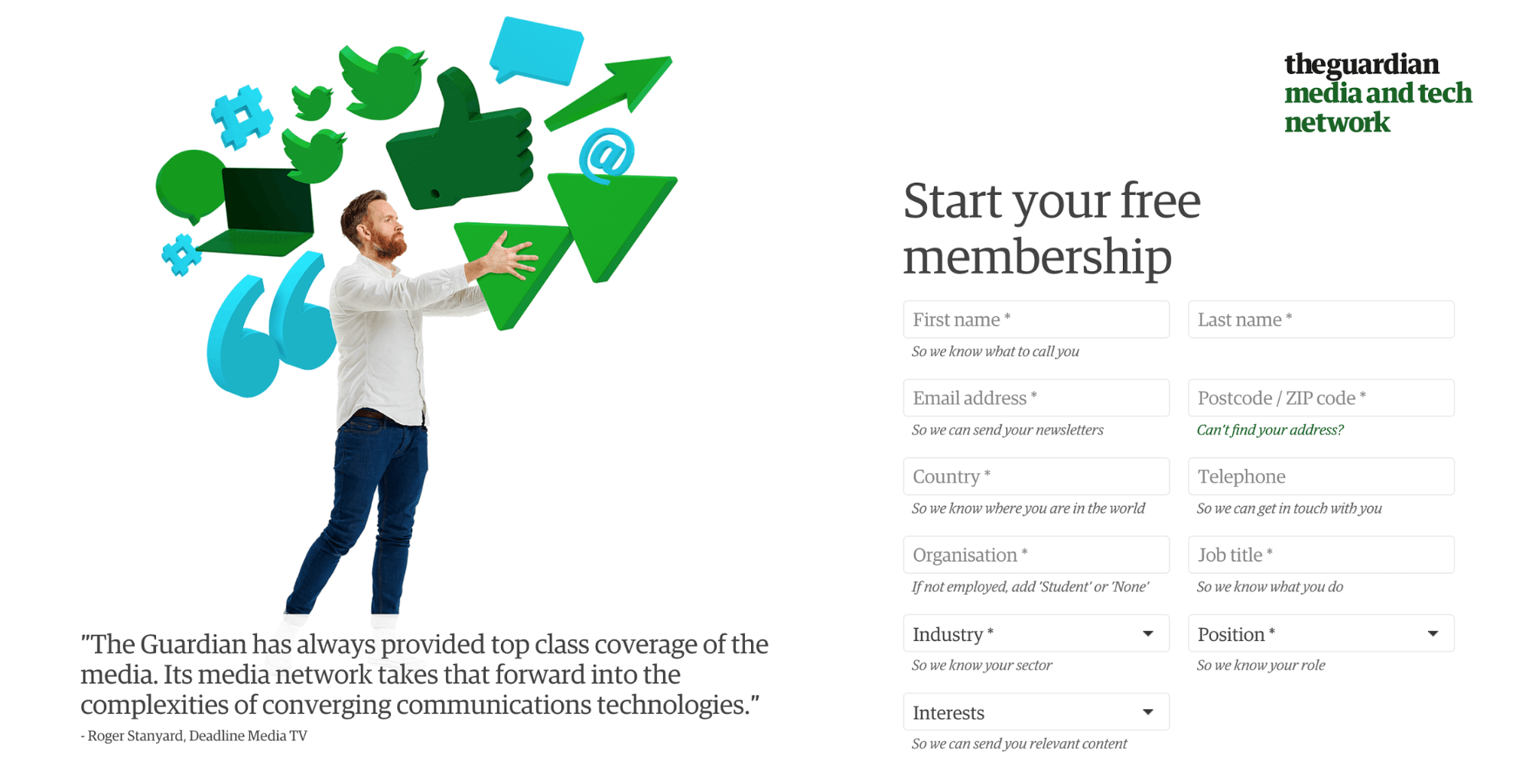
Perhaps not every field warrants an explanation, considering some are self explanatory (i.e. name), nevertheless the microcopy and humorous tone do make a difference.
6. Be Direct Without Being Overwhelming
When designing an experience, we want users to take actions towards a particular goal. For this, write microcopy in the active voice, whereby the subject (user or service provider) is always promoted to perform the expressed action. This results in more customer-focused microcopy that is direct, concise and to the point, while the active voice usually requires fewer words to convey an action in comparison to the passive voice. More importantly, when writing in the active voice I also find it helps to clearly establish ownership for an expressed action.
With user interface microcopy, there is a tendency to gravitate towards the passive voice when starting sentences with “You,” “You can,” “You will” or “Your.“ While it might feel more natural to converse with users this way, it makes the copy less concise, too formal and devoid of ownership. Consider the following examples, found in many interfaces. Let’s see how they can be transformed from the passive voice to the active voice.
Example 1
Passive: Your password couldn’t be changed.Active: We couldn’t change your password because it contains…
While the passive version is clear in its point, it lacks ownership: It doesn’t say who was unable to make the change or why. The active version does; it conveys that the service provider was unable to make the change and hints as to why with the beginnings of an adaptive message. When working on error-handling microcopy, use adaptive messages whenever possible: Provide a reason for why an error has occurred and, if applicable, how it can be rectified. Whether you’d want to provide specific adaptive error microcopy in a sign-in form or anything else that is security sensitive is up for debate, so be sure to carefully consider where and how you apply adaptive error microcopy.
Example 2
Passive: You will need to verify your email address before using your account.Active: We need to verify the email address used to register your account.
The passive version doesn’t say who is doing the verifying, just that the user is having it done to them. The active version does; it shows the service provider is asking for the verification to be done as well as taking ownership. Scenarios such as these are ideal opportunities for service providers to show and build trust with customers.
Lastly, don’t overuse the word “please” in your microcopy. You would rarely say it repeatedly in conversation, given you then risk coming across as being needy or insincere, so avoid doing so when writing microcopy. The same goes for words such as “very” and “extremely” often used to add additional emphasis to a request or highlight the result of an action.
7. Build For Success And Failure
Designing for success is in our nature. We highlight success because it promotes and enhances the user experience. However, we also need to recognize failure as part of the experience. The reality is that the user’s experience will be interrupted at some point in time. How you respond to failure using microcopy can therefore make or break the experience.
Jeffrey Zeldman provides a great, albeit personal, example of a service provider who didn’t fully account for failure. In attempting to sign in to the service, Jeffrey was repeatedly told that his password was incorrect, even though the service was unavailable (unbeknownst to Jeffrey). Despite this, he was able to submit password reset requests (to no effect) and was even able to start the process of creating a new account. It wasn’t until he submitted the request for the new account that he was told:
"Due to a system issue, we are currently unable to process your request. Try again later."
As if the situation wasn’t frustrating enough (he clearly should’ve been informed from the start that there were system issues), the error microcopy itself is of little help. It lacks clarity as well as empathy and shows a distinct lack of ownership, putting the onus on the user to take any follow-up action. As Marko Dugonjić points out, these things don’t happen because no one involved gave it any thought; they happen because they were not on anyone’s to-do list.
Try to anticipate all potential successes and failures by providing microcopy that is relevant to each given scenario. Consider using a microcopy table. Identify all key events or tasks for a particular feature (registration, sign in, password recovery, etc.), define what constitutes success and failure for each event or task, and provide relevant copy adjusting the tone as necessary. If it helps, you can also use a flowchart to visualize the various steps between events / tasks.
To rectify the scenario faced by Jeffrey, highlighting the service interruption earlier in the customer journey would obviously have been a good start. Admitting there is a problem isn’t necessarily a demonstration of weakness (although if it happens regularly, that is a different issue altogether). An alternative to the error microcopy above could be this:
"We’re experiencing an issue with [X] service right now. Our engineers are investigating and will restore the service at the earliest opportunity. Service status updates are available via our [support] feed …"
Pushing notifications to users who have experienced the interruption would be an even nicer touch. The error microcopy is now written in the active voice and makes clear that the service provider is aware of the issue and has taken ownership. It is to the point, explains what’s happening, provides some reassurance, and suggests what further steps can or will be taken.
8. Avoid Detailed Instructional Microcopy
Microcopy cannot fix a user interface that has fundamental usability issues. If a user is unable to ascertain what needs to be done or how to proceed, providing overly detailed instructional microcopy, explaining each feature or step in the process, is unlikely to help. Doing so will only increase the cognitive load on the user; not only will they need more time to read and interpret the instructions, but they’ll then need to map all of those instructions back to the interface. Worse, the interface risks coming across as being unintuitive with the service provider also potentially displaying a lack of confidence in a user’s ability.
Remember, the purpose of microcopy is to provide helpful cues as needed and guide the user through a process. If you must provide microcopy to highlight a particular feature, business rule or option, keep it to a single short sentence. More importantly, ask whether the intended microcopy truly succeeds in assisting the user. If you find that you have to explain multiple features or steps in a process, reconsider the design.
9. Avoid Contextual Terms
While we are always looking to simplify microcopy to the bare essentials (the thinking being simple is always better), it can also be counterproductive, especially when there is no associated context. We see this often with buttons, navigation, form labels and links.
Words such as “continue,” “next,” “back,” “view” and “cancel” are prime examples. While succinct and seemingly clear, each can potentially have different meanings depending on the situation a user find themselves in. In these scenarios, such words are considered to be contextual. The Baymard Institute goes so far as to say that contextual words are usability poison. The only solution is to avoid using contextual words altogether in links, buttons etc. Instead, opt for alternatives that provide sufficient context which also relate directly to the task at hand.
10. Clearly Highlight Business Rules
Business rules influence the online experience. Whenever we ask users for information, we are applying business rules. For instance, users might be required to specify a business address for invoicing or a telephone number with an international dialing code. Rules might also be enforced due to a specific process or due to technical or resource constraints. Regardless of the rule type, users shouldn’t have to second-guess why one exists, nor be made aware of them once they’ve taken an action. That would simply result in confusion and possibly abandonment. The key, once again, is to set expectations from the beginning.
Start by clearly displaying any relevant rules, so that the user is clear of what is being asked of them. Next, provide microcopy which states why the rule exists and, if applicable, how the information will be used. For instance, if an interface assists the user in building an object state the relevance each field has to the final output. If a telephone number is required, explain why it is needed. Keep in mind, users often believe their privacy to be at risk if they are asked to provide personal information that they deem to be unnecessary, and as such are more likely to abandon a process.
If a rule exists due to a technical feature or limitation (for example, there is a limit on the result set), try to fix the issue first. If you can’t, then consider adding microcopy, but be forthright. If you get it right, you’ll probably increase user satisfaction and save time and resources with support enquiries.
11. Practice, Collaborate And Share
Copy is not always easy to come by. Yes, we all know how to write and structure words, sentences and pages. However, good copywriting, as with any other design-related activity, requires time. It comes naturally to some; for others, developing a comfortable writing style, tone and workflow takes time. As with any form of writing and storytelling, there should always be a beginning, middle and end. The end should be a call to action. Keep in mind, the first draft of any document is rarely perfect, so be prepared for some trial and error. I often follow and suggest three steps when writing any form of copy:
- Write down your initial ideas and thoughts. Draw an outline.
- Refine your ideas and the outline. Add substance with text.
- Polish the text and outline.
The writing process can be tiring, therefore, give yourself sufficient time and space between writing sessions (especially when drafting longer texts) and set a mental timeframe for each stage (a day, a week, whatever is appropriate). This will allow you to refocus after each session as well as make steady improvements to your work.
Writing in isolation for long periods can be somewhat counterproductive because there is always the temptation to endlessly refine. This can easily lead to frustration and could eventually stifle creativity. Therefore, seek out feedback from your peers early on and treat them as your initial testers. See whether you’re heading in the right direction and whether there are any areas that you overlooked or that require further explanation. Doing so will also help you to improve your writing skills and work. We always aim for perfection, but true perfection is only possible through collaboration and iteration. At some point, much like with design, you need to test and release.
Lastly, writing is about quality, not quantity. Unfortunately, quality is sometimes measured by quantity (word count) and it is somewhat indicative of the educational system today, especially in the UK. Be realistic and honest with yourself. Does your copy truly add value to the user experience or does it simply increase the cognitive load on the user? Remember, the more concise your copy is, the quicker users will be able to read it and complete the task at hand.
12. Test With Real Users
Peer feedback certainly helps, however, parts of your microcopy could still be susceptible to internal familiarity or jargon which users might find too ambiguous. Also, does the overall voice and tone meet with approval of the user base? Conduct some usability testing to find out.
Prior to undertaking usability testing, highlight key performance indicators, and clarify your goals. What does success and failure look like? Is your goal to increase conversions, improve user satisfaction, identify whether a redesigned process results in faster completions? Even if you wish to explicitly test the microcopy, keep in mind it is only one part of a user interface. The key question is whether the microcopy guides the user sufficiently for them to take the relevant actions in light of your goals. Hence, under no circumstances should you ask users to focus on the microcopy or ask any leading questions about it; you might influence what test subjects say or do, thus tainting your data.
Instead, ask users to complete a task in the user interface, observe closely what they do, how they react and listen to what they say. Record each session, too. If you observe that they have difficulty completing a task, then there are certainly problems afoot — perhaps with the microcopy.
While you could just test one version of a design, feature or element, the results would likely be meaningless and subjective unless you have some data to compare it against. This is where A/B testing can help. With A/B testing, you would simultaneously test two versions (A and B) of a design, feature or element to determine which is more effective in achieving your goal. An obvious test would be to run the existing version against the new version. If you’re launching a new product, you might want to experiment with the voice and tone and see which version, if any, resonates with users. Remember, multiple variations can be tested simultaneously, not just two.
When conducting an A/B test, you may wish to keep it simple by applying the same variant across both versions (i.e. by applying no segmentation to the user base). While you’ll obtain some helpful data, this might not tell the whole story, because certain elements being tested might be relevant to some segments of your user base more than others. For instance, some users will be existing customers, and others prospective. Some existing customers might spend more or use a product / service more frequently than others. You might also find the need to segment by demographic (gender, age), geography, browser type or device type, or even by source, behavior or outcome. Segment according to your needs, because user behavior and needs can vary by segment.
Because an A/B test will always point to one version being more effective than the other, always ask whether the goal being tested could affect other goals and whether there will be any lasting long-term impact on the business (positive or negative). Hence, consider measuring against multiple goals. As for which tools to use, numerous have been suggested to date; it just depends on the resources available.
Don’t Wait Around
Usability testing shouldn’t be left until the latter stages of a project or the development of a new feature. The risk of rejection simply increases the longer you wait, and resolving problems with quick fixes might not always be possible. In the worst case, the problems could prove to be too costly to rectify, making it more difficult to start over again. Instead, start testing early on and incrementally, when you feel there is sufficient direction and a good body of work as well as a good user base to test against. Allow users to inform you whether you’re heading in the right direction.
Where you conduct the sessions will depend on the project’s phase, circumstances and available budget. Inviting people to a location (on or off site) is good when testing early concepts. Once a product is being developed beyond the concept stage, my preference, if at all possible, is to conduct the tests remotely via screen sharing software or dedicated services. During these stages, I often find it more useful to observe how testers use a particular product in their natural environment, rather than in a controlled environment.
Be Open, Embrace Testing
A final point: Usability testing or dare I say — talking to users — shouldn’t be frowned upon. I’ve often been left surprised at how the mere mention of testing can strike fear in clients and organizations. I was once even told by a senior stakeholder, “We are [X], and we tell customers what they want.” No prize for guessing how customers reacted at launch.
Still, keep an open mind because there could be a multitude of reasons why stakeholders and clients have not pursued any usability testing. For a start, they simply might never have had a need to. They might be concerned that their work or product will be invalidated by the feedback received, and individuals might feel that any shortcomings will reflect badly on them. Perhaps they believe that past user research and testing is still relevant or that they know best or that, because they’ve hired you, you’re simply the go-to person for such matters. Regardless, persuading clients can be a challenge, and there is no single right approach. It very much depends on the situation. Nevertheless, it’s always worth having a go.
Get Writing!
Does writing microcopy need to be considered an essential part of the design process? Most definitely, yes. Words, for the most part, still form the backbone of communication on the web, even with the emergence of new technologies such as Voice User Interfaces (VUI). I’d even go so far as to suggest that some key principles of microcopy could be applied to VUI’s, but that is a discussion for another day.
As such, microcopy is more than just about writing words for interfaces — it can influence UX and usability, and as such deserves to be brought out from amongst the shadows. After all, as Bill Beard said “It’s the little text that can make or break your user experience.” So, get writing, and remember to practice, collaborate, share and test.
Further Reading
- The Personality Layer
- Quick Course On Effective Website Copywriting
- Designing The Words: Why Copy Is A Design Issue
- 50 Resources And Tools To Turbocharge Your Copywriting Skills


