A Beginner’s Guide To Progressive Web Apps

Email Newsletter
Weekly tips on front-end & UX.
Trusted by 182,000+ folks.
 Custom Web Forms for Angular, React, & Vue. Your backend.
 Celebrating 10 million developers


Progressive web apps could be the next big thing for the mobile web. Originally proposed by Google in 2015, they have already attracted a lot of attention because of the relative ease of development and the almost instant wins for the application’s user experience.
A progressive web application takes advantage of the latest technologies to combine the best of web and mobile apps. Think of it as a website built using web technologies but that acts and feels like an app. Recent advancements in the browser and in the availability of service workers and in the Cache and Push APIs have enabled web developers to allow users to install web apps to their home screen, receive push notifications and even work offline.
Progressive web apps take advantage of the much larger web ecosystem, plugins and community and the relative ease of deploying and maintaining a website when compared to a native application in the respective app stores. For those of you who develop on both mobile and web, you’ll appreciate that a website can be built in less time, that an API does not need to be maintained with backwards-compatibility (all users will run the same version of your website’s code, unlike the version fragmentation of native apps) and that the app will generally be easier to deploy and maintain.
Why Progressive Web Apps?
A study has shown that, on average, an app loses 20% of its users for every step between the user’s first contact with the app and the user starting to use the app. A user must first find the app in an app store, download it, install it and then, finally, open it. When a user finds your progressive web app, they will be able to immediately start using it, eliminating the unnecessary downloading and installation stages. And when the user returns to the app, they will be prompted to install the app and upgrade to a full-screen experience.
However, a native app is definitely not all bad. Mobile applications with push notifications achieve up to three times more retention than their counterparts without push, and a user is three times more likely to reopen a mobile application than a website. In addition, a well-designed mobile application consumes less data and is much faster because some resources reside on the device.
A progressive web application takes advantage of a mobile app’s characteristics, resulting in improved user retention and performance, without the complications involved in maintaining a mobile application.
Use Cases
When should you build a progressive web app? Native is usually recommended for applications that you expect users to return to frequently, and a progressive web app is not any different. Flipkart uses a progressive web app for its popular e-commerce platform, Flipkart Lite, and SBB uses a progressive web app for its online check-in process, allowing users to access their tickets without an Internet connection.
When assessing whether your next application should be a progressive web app, a website or a native mobile application, first identify your users and the most important user actions. Being “progressive,” a progressive web app works in all browsers, and the experience is enhanced whenever the user’s browser is updated with new and improved features and APIs.
Thus, there is no compromise in the user experience with a progressive web app compared to a traditional website; however, you may have to decide what functionality to support offline, and you will have to facilitate navigation (remember that in standalone mode, the user does not have access to the back button). If your website already has an application-like interface, applying the concepts of progressive web apps will only make it better.
If certain features are required for critical user actions but are not yet available due to a lack of cross-browser support, then a native mobile application might be the better option, guaranteeing the same experience for all users.
Characteristics Of A Progressive Web App
Before we jump into the code, it is important to understand that progressive web apps have the following characteristics:
- Progressive. By definition, a progressive web app must work on any device and enhance progressively, taking advantage of any features available on the user’s device and browser.
- Discoverable. Because a progressive web app is a website, it should be discoverable in search engines. This is a major advantage over native applications, which still lag behind websites in searchability.
- Linkable. As another characteristic inherited from websites, a well-designed website should use the URI to indicate the current state of the application. This will enable the web app to retain or reload its state when the user bookmarks or shares the app’s URL.
- Responsive. A progressive web app’s UI must fit the device’s form factor and screen size.
- App-like. A progressive web app should look like a native app and be built on the application shell model, with minimal page refreshes.
- Connectivity-independent. It should work in areas of low connectivity or offline (our favorite characteristic).
- Re-engageable. Mobile app users are more likely to reuse their apps, and progressive web apps are intended to achieve the same goals through features such as push notifications.
- Installable. A progressive web app can be installed on the device’s home screen, making it readily available.
- Fresh. When new content is published and the user is connected to the Internet, that content should be made available in the app.
- Safe. Because a progressive web app has a more intimate user experience and because all network requests can be intercepted through service workers, it is imperative that the app be hosted over HTTPS to prevent man-in-the-middle attacks.
Let’s Code!
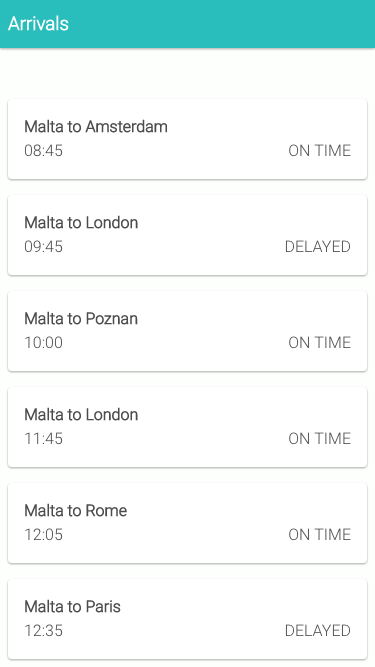
Our first progressive web app, Sky High, will simulate an airport’s arrivals schedule. The first time the user accesses our web app, we want to show them a list of upcoming flights, retrieved from an API. If the user does not have an Internet connection and they reload the web app, we want to show them the flight schedule as it was when they last downloaded it with a connection.
The Basics
The first characteristic of a progressive web app is that it must work on all devices and must enhance on devices and browsers that allow it. Therefore, we’ve built our website using traditional HTML5 and with JavaScript that simulates the retrieval of data from a mock API. Throughout the application, we are using small bits of Knockout to handle our Model-View-ViewModel (MVVM) bindings — a lightweight JavaScript framework that allows us to bind our JavaScript models to our HTML views. We chose to use Knockout because it is relatively simple to understand and does not clutter the code; however you may replace this with any other framework, such as React or AngularJS.
Our website follows Google’s material design guidelines, a set of principles that guide design and interaction. Material design not only serves as a unified standard across applications and devices, but also gives design meaning. We’ve used material design for Sky High’s arrivals view to give our progressive web app that native-app look and feel.
Finally, we tested our app to make sure it is jank-free and that scrolling is silky-smooth. Jank-free rendering has been shown to improve user engagement. Aim for a rendering of 60 frames per second.
For this demo, we will retrieve a static JSON file, instead of a real API. This is merely to keep things simple. In the real world, you would query an API or use WebSockets.
index.html
<!DOCTYPE html>
<html lang="en">

<head>
    <meta charset="utf-8">
    <meta name="viewport" content="width=device-width, initial-scale=1.0">
    <title>Sky-High Airport Arrivals</title>
    <link async rel="stylesheet" href="./css/style.css">
    <link href="https://fonts.googleapis.com/css?family=Roboto:300,600,300italic,600italic" rel="stylesheet" type="text/css">
</head>

<body>
    <header>
        <div class="content">
            <h3>Arrivals</h3>
        </div>
    </header>
    <div class="container">
        <div id="main" class="content">
            <ul class="arrivals-list" data-bind="foreach: arrivals">
                <li class="item">
                    <span class="title" data-bind="html: title"></span>
                    <span class="status" data-bind="html: status"></span>
                    <span class="time" data-bind="html: time"></span>
                </li>
            </ul>
        </div>
    </div>
    <script src="./js/build/vendor.min.js"></script>
    <script src="./js/build/script.min.js"></script>
</body>

</html>
The index.html file is relatively standard. We’ve created an HTML list and bound our View Model property arrivals to it using Knockout, through the attribute data-bind=“foreach: arrivals”. The View Model arrivals is declared in the page.js file below and exposed in the Page module. On our HTML page, for each item in the arrivals array, we’ve bound the title, status and time properties to the HTML view.
page.js
(var Page = (function() {

    // declare the view model used within the page
    function ViewModel() {
        var self = this;
        self.arrivals = ko.observableArray([]);
    }

    // expose the view model through the Page module
    return {
        vm: new ViewModel(),
        hideOfflineWarning: function() {
            // enable the live data
            document.querySelector(".arrivals-list").classList.remove('loading')
            // remove the offline message
            document.getElementById("offline").remove();
            // load the live data
        },
        showOfflineWarning: function() {
            // disable the live data
            document.querySelector(".arrivals-list").classList.add('loading')
                // load html template informing the user they are offline
            var request = new XMLHttpRequest();
            request.open('GET', './offline.html', true);

            request.onload = function() {
                if (request.status === 200) {
                    // success
                    // create offline element with HTML loaded from offline.html template
                    var offlineMessageElement = document.createElement("div");
                    offlineMessageElement.setAttribute("id", "offline");
                    offlineMessageElement.innerHTML = request.responseText;
                    document.getElementById("main").appendChild(offlineMessageElement);
                } else {
                    // error retrieving file
                    console.warn('Error retrieving offline.html');
                }
            };

            request.onerror = function() {
                // network errors
                console.error('Connection error');
            };

            request.send();
        }
    }

})();
This page.js file exposes the Page module, which contains our ViewModel vm and two functions, hideOfflineWarning and showOfflineWarning. The View Model ViewModel is a simple JavaScript literal that will be used throughout the application. The property arrivals on the ViewModel is Knockout’s observableArray, which automatically binds our HTML to a JavaScript array, allowing us to push and pop items onto our array in JavaScript and automatically update the page’s HTML.
The functions hideOfflineWarning and showOfflineWarning enable the rest of our application to call these functions to update the page’s UI that displays whether we are connected online. The showOfflineWarning adds a class of loading to our arrivals-list HTML element to fade the list, and then it retrieves the HTML file offline.html through XHR. Assuming that the file has been retrieved successfully (response.status === 200), we append this to our HTML. Of course, if we aren’t using service workers and the user is not connected to the Internet, then it would not be possible to retrieve offline.html, and so the user would see the browser’s offline page.
The business logic from where we retrieve the data from our API and bind it to our View Models and Views is found in arrivals.js and is standard MVVM functionality using Knockout. In the arrivals.js file, we simply initialize the services and View Models that we will be using throughout the application, and we expose a function — Arrivals.loadData() — that retrieves the data and binds it to the view model.
Web App Manifest
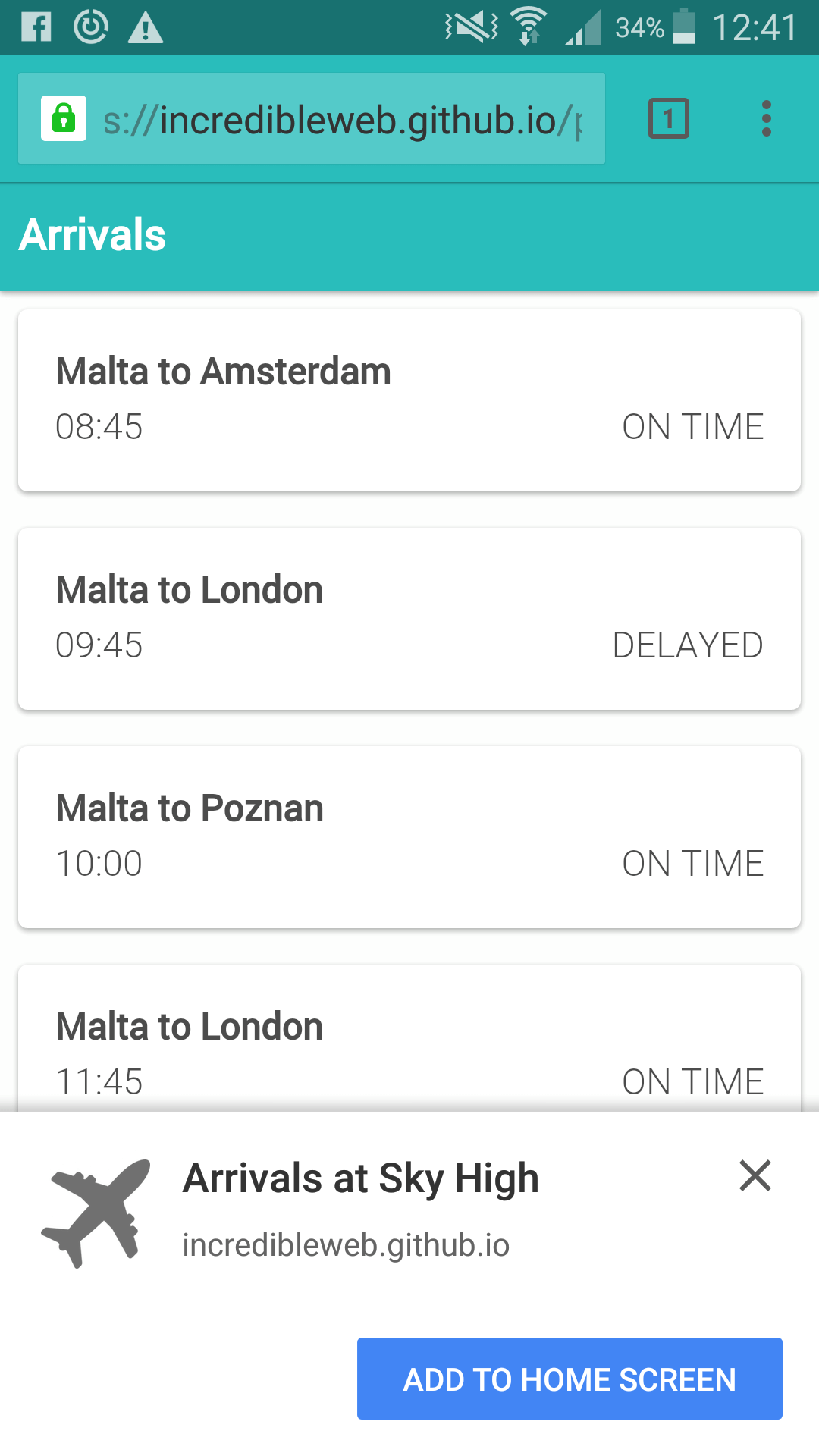
Let’s make our web app more app-like. A web app manifest file is a simple JSON file that follows the W3C’s specification. With it, it is possible to run the web app in full-screen mode as a standalone application, to assign an icon that will get displayed when the application is installed on the device, and to assign a theme and background color to the app. In addition, Chrome on Android will proactively suggest that the user install the web app, via a web app install banner. To display the installation prompt, your web app needs to:
- have a valid web app manifest file,
- be served over HTTPS,
- have a valid service worker registered,
- have been visited twice, with at least five minutes between each visit.
manifest.json
{
    "short_name": "Arrivals",
    "name": "Arrivals at Sky High",
    "description": "Progressive web application demonstration",
    "icons": [
        {
            "src": "launcher-icon.png",
            "sizes": "48x48",
            "type": "image/png"
        },
        {
            "src": "launcher-icon-96.png",
            "sizes": "96x96",
            "type": "image/png"
        },
        {
            "src": "launcher-icon-144.png",
            "sizes": "144x144",
            "type": "image/png"
        },
        {
            "src": "launcher-icon-192.png",
            "sizes": "192x192",
            "type": "image/png"
        },
        {
            "src": "launcher-icon-256.png",
            "sizes": "256x256",
            "type": "image/png"
        }
    ],
    "start_url": "./?utm_source=web_app_manifest",
    "display": "standalone",
    "orientation": "portrait",
    "theme_color": "#29BDBB",
    "background_color": "#29BDBB"
}
Let’s break down this manifest file:
short_nameis a human-readable name for the application. In Chrome for Android, this is also the name accompanying the icon on the home screen.nameis also a human-readable name for the application and defines how the application will be listed.descriptionprovides a general description of the web application.iconsdefines an array of images of varying sizes that will serve as the application’s icon set. In Chrome for Android, the icon will be used on the splash screen, on the home screen and in the task switcher.start_urlis the starting URL of the application.displaydefines the default display mode for the web application:fullscreen,standalone,minimal-uiorbrowser.orientationdefines the default orientation for the web application:portraitorlandscape.theme_coloris the default theme color for the application. On Android, this is also used to color the status bar.background_colordefines the background color of the web application. In Chrome, it also defines the background color of the splash screen.related_applicationsis not implemented in our example but is used to specify native application alternatives in the various app stores.
Add the manifest.json reference to the index.html file’s head tag:
<link rel="manifest" href="./manifest.json">Once a user has added the web app to their home screen, they will be able to re-engage with your application immediately from their device, without having to directly open the browser. You can see how this is much more than a web bookmark.
Add to Homescreen on Chrome for Android from Smashing Magazine on Vimeo.
Service Workers
One of the more exciting aspects of progressive web apps is that they can work offline. Using service workers, it is possible to show data that was retrieved in previous sessions of the app (using IndexedDB) or, alternatively, to show the application shell and inform the user that they are not connected to the Internet (the approach we’ve taken in this demo). Once the user reconnects, we can then retrieve the latest data from the server.
All of this is possible through service workers, which are event-driven scripts (written in JavaScript) that have access to domain-wide events, including network fetches. With them, we can cache all static resources, which could drastically reduce network requests and improve performance considerably, too.
Application Shell
The application shell is the minimum HTML, CSS and JavaScript required to power a user interface. A native mobile application includes the application shell as part of its distributable, whereas websites ordinarily request this over the network. Progressive web applications bridge this gap by placing the application shell’s resources and assets in the browser’s cache. In our Sky High application, we can see that our application shell consists of the top header bar, the fonts and any CSS required to render these elegantly.
To get started with service workers, we first need to create our service worker’s JavaScript file, sw.js, placed in the root directory.
sw.js
// Use a cacheName for cache versioning
var cacheName = 'v1:static';

// During the installation phase, you'll usually want to cache static assets.
self.addEventListener('install', function(e) {
    // Once the service worker is installed, go ahead and fetch the resources to make this work offline.
    e.waitUntil(
        caches.open(cacheName).then(function(cache) {
            return cache.addAll([
                './',
                './css/style.css',
                './js/build/script.min.js',
                './js/build/vendor.min.js',
                './css/fonts/roboto.woff',
                './offline.html'
            ]).then(function() {
                self.skipWaiting();
            });
        })
    );
});

// when the browser fetches a URL…
self.addEventListener('fetch', function(event) {
    // … either respond with the cached object or go ahead and fetch the actual URL
    event.respondWith(
        caches.match(event.request).then(function(response) {
            if (response) {
                // retrieve from cache
                return response;
            }
            // fetch as normal
            return fetch(event.request);
        })
    );
});
Let’s look more closely at our service worker. First, we are setting a cacheName variable. This is used to determine whether any changes have been made to our cached assets. For this example, we will be using a static name, meaning that our assets will not change or require updating.
self.addEventListener('install', function(e) {
    // declare which assets to cache
}
The install event fires during the installation phase of the service worker and will fire only once if the service worker is already installed. Therefore, refreshing the page will not trigger the installation phase again. During the installation phase, we are able to declare which assets will be cached. In our example above, we are caching one CSS file, two JavaScript files, our fonts file, our offline HTML template and, of course, the application root. self.skipWaiting() forces the waiting service worker to become active.
So far, we have declared our service worker, but before we see it kick into effect, we need to reference it in our JavaScript. In our application, we register it in main.js
// Register the service worker if available.
if ('serviceWorker' in navigator) {
    navigator.serviceWorker.register('./sw.js').then(function(reg) {
        console.log('Successfully registered service worker', reg);
    }).catch(function(err) {
        console.warn('Error whilst registering service worker', err);
    });
}

window.addEventListener('online', function(e) {
    // Resync data with server.
    console.log("You are online");
    Page.hideOfflineWarning();
    Arrivals.loadData();
}, false);

window.addEventListener('offline', function(e) {
    // Queue up events for server.
    console.log("You are offline");
    Page.showOfflineWarning();
}, false);

// Check if the user is connected.
if (navigator.onLine) {
    Arrivals.loadData();
} else {
    // Show offline message
    Page.showOfflineWarning();
}

// Set Knockout view model bindings.
ko.applyBindings(Page.vm);
We’ve also included two event listeners to check whether the session’s state has changed from online to offline or vice versa. The event handlers then call the different functions to retrieve the data through Arrivals.loadData() and to enable or disable the offline message through Page.showOfflineWarning and Page.hideOfflineWarning, respectively. Our application also checks whether the user is currently online, using navigator.onLine, and either retrieves the data or shows the offline warning accordingly. And in the last line of main.js, we apply the Knockout bindings to our View Model Page.vm.
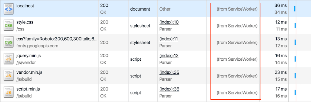
If we load our application for the first time (with Chrome Developer Tools), we will see nothing new. However, upon reloading, we will see that a number of network resource have been retrieved from the service worker. This is our application shell.
Offline Test
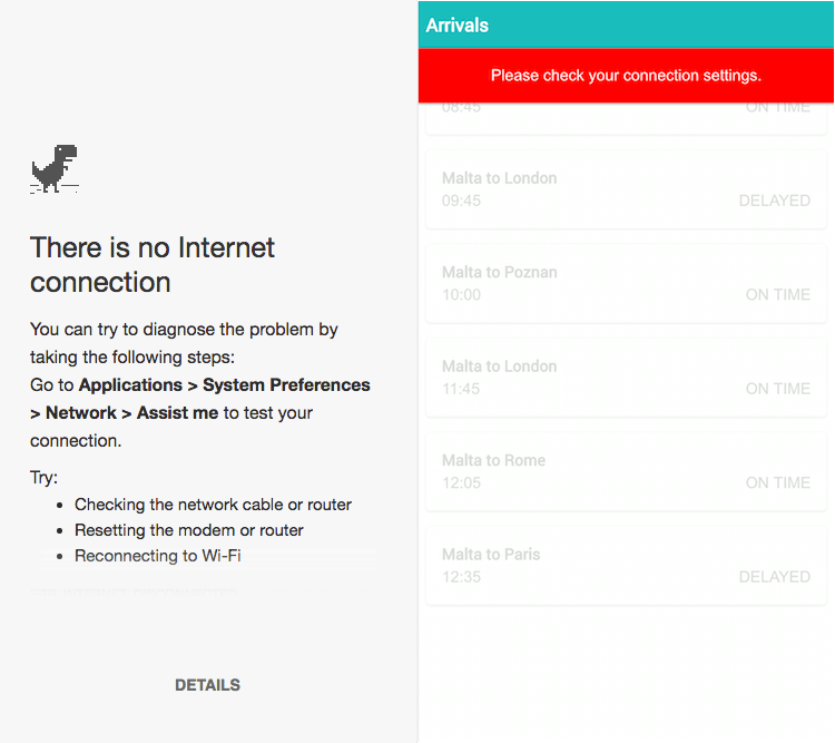
A user running the application without an Internet connection (assuming that they have already been on the page) will simply result in the application shell and the offline warning being displayed — an improvement over Chrome’s prowling t-rex. Once the user has established a network connection, we disable the warning and retrieve the latest data.
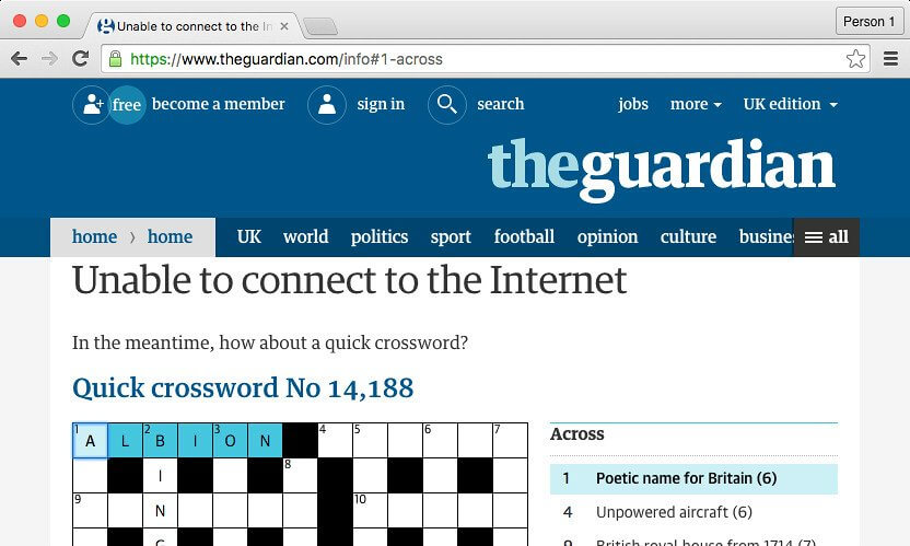
The Guardian takes a particularly interesting approach when offline users access its website, providing a crossword puzzle:
Push Notifications
Push notifications allow users to opt in to timely updates from applications they trust, helping them to re-engage with the apps. Push notifications on the web allow you to engage with your audience even when the browser is closed.
The Push API is supported in Chrome, Opera and Samsung’s browser and is under development in Firefox and Microsoft Edge. Unfortunately, there is no indication that the feature will be implemented in Safari.
Performance
One of the easiest wins with service workers is that we can improve performance with little to no effort. Comparing our website to itself before service workers were implemented, before we were retrieving over 200 KB upon page load; that is now reduced to 13 KB. On a regular 3G network, the page would have taken 3.5 seconds to load; now it takes 500 milliseconds.
These performance improvements are drastic because the application itself is very small and has limited functionality. Nevertheless, through the correct use of caching, it is possible to significantly improve performance and perceived performance, especially for users in places with low-connectivity.
Lighthouse
Google’s Chrome team has put together a tool for testing progressive web apps. Lighthouse runs in Node.js or as a Chrome plugin and can be found on GitHub, too.
To run a Lighthouse test, your website needs to be available online, meaning that you cannot test on localhost.
To start, download the npm package:
npm install -g GoogleChrome/lighthouseOnce that’s installed, run Chrome (version 52 onwards):
npm explore -g lighthouse -- npm run chrome
lighthouse https://incredibleweb.github.io/pwa-tutorial/
The output of the Lighthouse run will be visible in the command line and will grade your website according to the progressive web app features and properties you have implemented — for example, whether you are using a manifest.json file or whether your page is available offline.
Conclusion
This article is merely an appetizer for progressive web apps. We could do a lot more to create that app-like experience users are looking for, whether by supporting push notifications with the Push API, making the app re-engageable, or using IndexedDB and background syncing to improve the offline experience.
Cross-Browser Support
These are still early days for progressive web apps, and cross-browser support is still limited, especially in Safari and Edge. However, Microsoft openly supports progressive web apps and should be implementing more features by the end of the year.
- Service workers and Cache API. Supported in Chrome, Firefox, Opera and Samsung’s browser. In development in Microsoft Edge, expected to be available by the end of 2016. Under consideration for Safari.
- Add to home screen. Supported in Chrome, Firefox, Opera, Android Browser and Samsung’s browser. Microsoft seems to indicate that progressive web apps will be available as store listings. No plans for Safari as of yet.
- Push API. Mostly supported in Chrome, Firefox, Opera and Samsung’s browser. In development in Microsoft Edge. No plans for Safari as of yet.
If more developers take advantage of the features offered by progressive web apps — which are relatively easy to implement and provide immediate rewards — then users will prefer consuming these web apps in supported browsers, hopefully convincing the other browser vendors to adapt.
Source Code
The entire source code for this tutorial is available in a Github repository, and the demo is available on GitHub Pages.
Further Reading
- The Building Blocks Of Progressive Web Apps
- Conversational Design Essentials: Tips For Building A Chatbot
- Building A First-Class App That Leverages Your Website
- Creating A Complete Web App In Foundation For Apps
 (da, al, il, mrn)

