Upgrading CSS Animation With Motion Curves

Email Newsletter
Weekly tips on front-end & UX.
Trusted by 182,000+ folks.

 Custom Web Forms for Angular, React, & Vue. Your backend.
 Celebrating 10 million developers
transition-timing-function, which add some level of smoothness and realism, but they are very generic, aren’t they? Motion curves are primarily used by animators to create advanced, realistic animations. In this article, Nash Vail will show you how motion curves work. Let’s begin!There is UI animation, and then there is good UI animation. Good animation makes you go “Wow!” — it’s smooth, beautiful and, most of all, natural, not blocky, rigid or robotic. If you frequent Dribbble or UpLabs, you’ll know what I am talking about.
With so many amazing designers creating such beautiful animations, any developer would naturally want to recreate them in their own projects. Now, CSS does provide some presets for transition-timing-function, such as ease-in, ease-out and ease-in-out, which add some level of smoothness and realism, but they are very generic, aren’t they? How boring would it be if every animation on the web followed the same three timing functions?
One of the properties of transition-timing-function is cubic-bezier(n1, n2, n3, n4), in which you can pass four numbers to create your very own timing function. Towards the end of this article, you’ll know exactly what these four numbers represent — still, believe me, coming up with four numbers to capture the transition you are imagining in your head is nowhere close to being easy. But thanks to cubic-bezier and Ceasar, you don’t have to. These tools bring motion curves to the web.
Motion curves are primarily used by animators (for example, in Adobe After Effects) to create advanced, realistic animations. With cubic-bezier and Ceasar, you can simply manipulate the shape of a curve, and those four numbers (n1, n2, n3, n4) will be filled in for you, which is absolutely great! Still, to use and make the most out of motion curves, you need to understand how they work, and that’s what we’re going to do in this article. Let’s begin.
Understanding Motion Curves
A motion curve is nothing but a plot between any animatable property and time. A motion curve defines how the speed of an animation running under its influence varies over time.
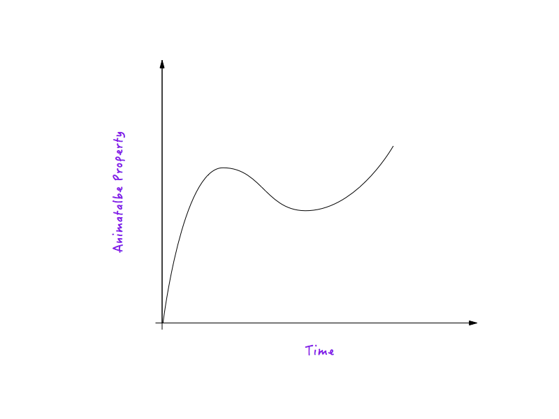
Let’s take distance (translateX) as an example of an animatable property. (The explanation holds true for any other animatable property.)
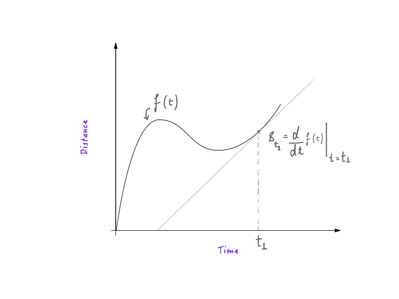
If you’ve had any experience with physics and basic calculus, you’ll know that deciphering speed from a distance-time graph is very simple. The first derivative of distance as a function of time, with respect to time, is speed, which means that an object following a distance-time curve would have greater speed in places where the curve is steep and lower in places where the curve is flatter. If you know how that works, great! You’re all set and can skip to the next section.
Now, I am aware that design and development is a diverse field, and not everyone has the same background. Perhaps the two paragraphs above were all jargon to you. Don’t fret. We’ll keep going and make sense of the jargon.
Consider the red box below. Let’s get a little callow here and call the red box “Boxy”; it’ll be easier to refer to it that way. All right, so Boxy is going to move from one edge of the screen to the other in a linear fashion, and we are going to analyze its motion.
One of the presets of transition-timing-function is linear. To make Boxy move, all we do is add the following class.
 .moveForward {
    transform: translateX(1000px);
}
To control the animation, we would set the transition property for Boxy as follows:
#boxy {
    width: 200px;
    height: 200px;
    background: red;
    transition-property: transform;
    transition-duration: 1s;
    transition-timing-function: linear;
}
That’s a very verbose way to specify transition. In reality, you will almost always find transition written in its shorthand form:
#boxy {
    width: 200px;
    height: 200px;
    background: red;
    transition: transform 1s linear;
}
Let’s see it go.

Robotic, isn’t it? You could say that this motion feels robotic because it’s linear, which is a perfectly plausible answer. But could you explain why? We can see that setting linear results in robotic motion, but what exactly is happening behind the scene? That’s what we’ll figure out first; we’re going to get to the innards and understand why this motion feels robotic, blocky and not natural.
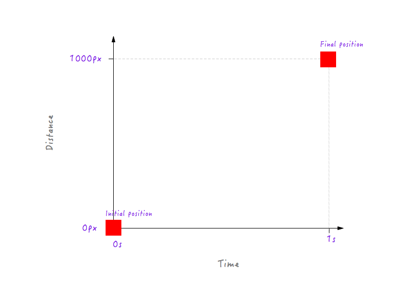
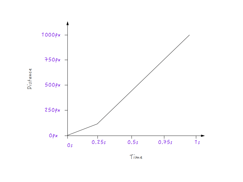
Let’s start by graphing Boxy’s motion to see if we can gain some insight. Our graph will have two axes, the first being distance, and the second time. Boxy covers a total distance of 1000 pixels (distance) in 1 second (time). Now, don’t get scared by all the math below — it’s very simple.
Here is our very simple graph, with the axes as mentioned.
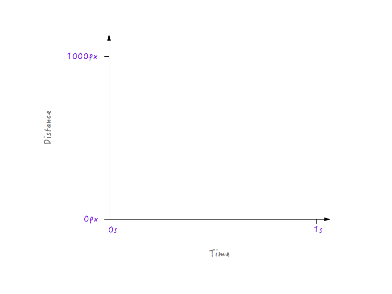
Right now, it’s empty. Let’s fill it up with some data.
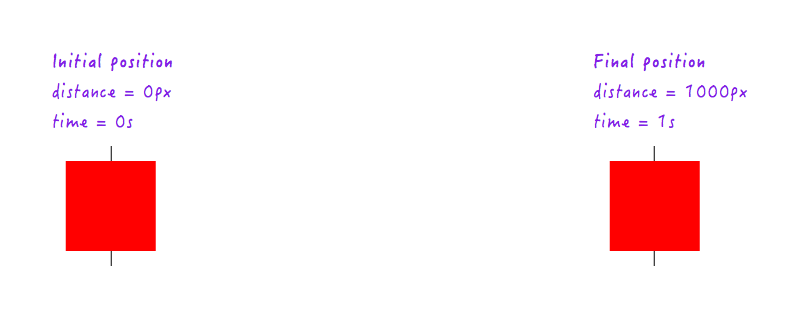
To start off with, we know that at 0 seconds, when the animation has not yet started, Boxy is in its initial position (0 pixels). And after 1 second has passed, Boxy has travelled a total of 1000 pixels, landing at the opposite edge of the display.
Let’s plot this data on the graph.
So far so good. But two data points are not enough — we need more. The following figure shows the positions of Boxy at different points of time (all thanks to my high-speed camera).
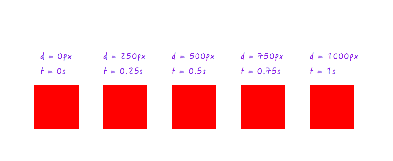
Let’s add this data to our graph.
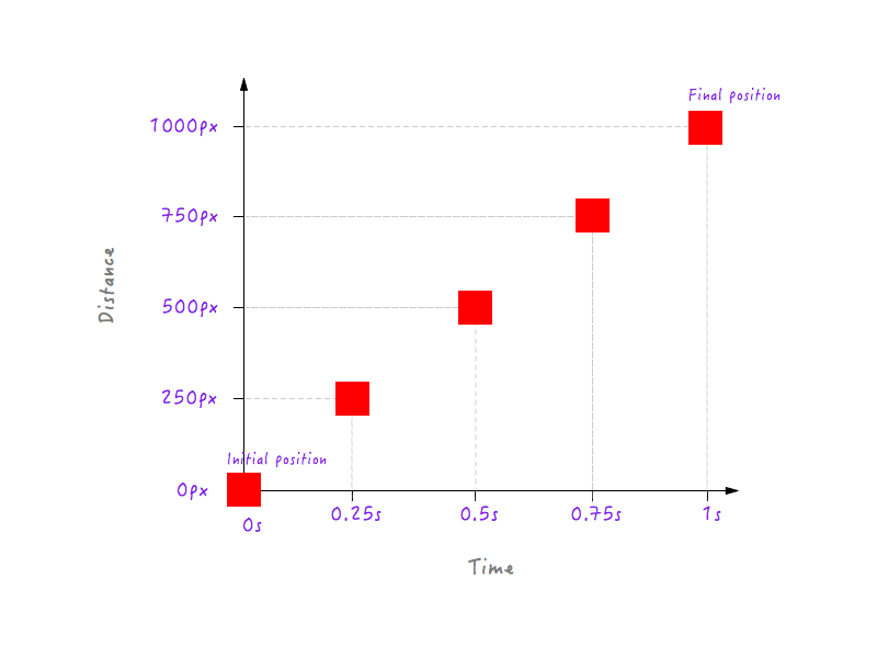
You could, of course, have many more data points for different times (for example, 0.375 seconds, 0.6 seconds, etc.) but what we have is enough to complete our graph. By joining all of the points, we have completed the graph. High five!
Cool, but what does this tell us? Remember that we started our investigation with the goal of understanding why Boxy’s linear motion feels unnatural and robotic? At a glance, this graph we’ve just constructed doesn’t tell us anything about that. We need to go deeper.
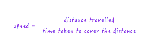
Keep the graph in mind and let’s talk for a minute about speed. I know you know what speed is — I’d just like to put it in mathematical terms. As it goes, the formula for speed is this:
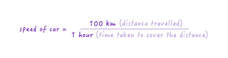
Therefore, if a car covers a distance of 100 kilometers in 1 hour, we say its speed is 100 kilometers per hour.
If the car doubles its speed, it will start covering double the distance (200 kilometers) in the same interval (1 hour), or, in other words, it will cover the original distance of 100 kilometers in half the time (0.5 hours). Make sense?
Similarly, if the car halved its speed (that is, slowed down by half), it would start covering a distance of 50 kilometers in the same interval (1 hour), or, in other words, it would cover the original distance of 100 kilometers in twice the time (2 hours).
Great! With that out of the way, let’s pick up where we left off. We were trying to figure out how the graph between distance and time can help us understand why Boxy’s linear motion feels robotic.
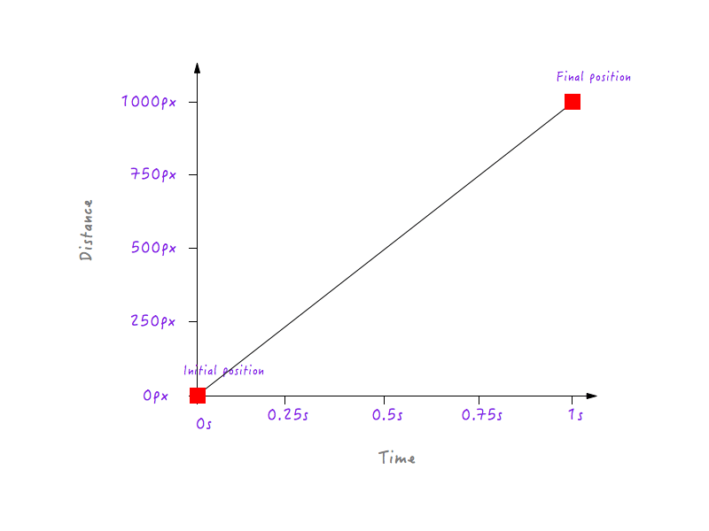
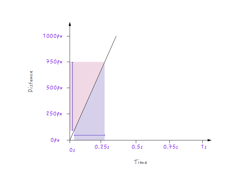
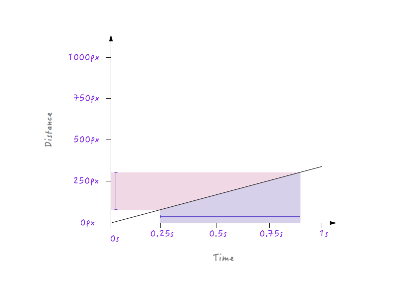
Hey, wait a second! We have a graph between distance and time, and speed can be calculated from distance and time, can’t it? Let’s try to calculate Boxy’s speed at different time intervals.
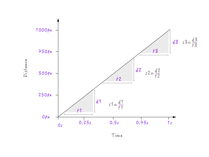
Here, I’ve chosen three different time intervals: one near the start, one in the middle and one at the end near the final position. As is evident, at all three intervals, Boxy has exactly the same speed (s1 = s2 = s3) of 1000 pixels per second; that is, no matter what interval you choose in the graph above, you will find Boxy moving at 1000 pixels per second. Isn’t that odd? Things in real life don’t move at a constant speed; they start out slowly, gradually increase their speed, move for a while, and then slow down again before stopping, but Boxy abruptly starts with a speed of 1000 pixels per second, moving with the same speed and abruptly stopping at exactly the same speed. This is why Boxy’s movement feels robotic and unnatural. We are going to have to change our graph to fix this. But before diving in, we’ll need to know how changes to the speed will affect the graph drawn between distance and time. Ready? This is going to be fun.
Let’s double Boxy’s speed and see how the appearance of the graph changes in response. Boxy’s original speed, as we calculated above, is 1000 pixels per second. Because we have doubled the speed, Boxy will now be able to cover the distance of 1000 pixels in half the time — that is, in 0.5 seconds. Let’s put that on a graph.
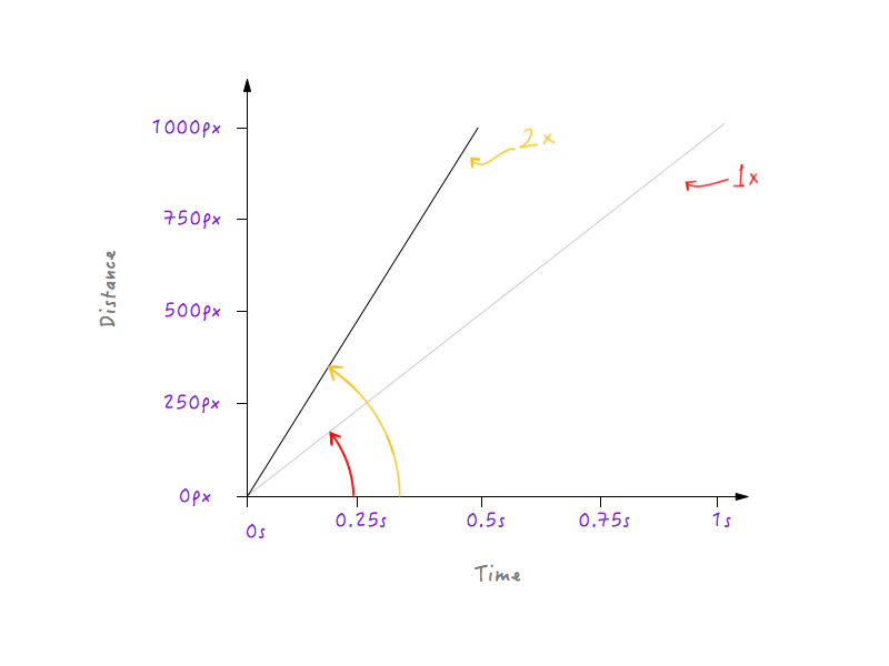
What if we tripled the speed? Boxy now covers 1000 pixels in one third of the time (a third of a second).
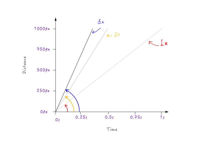
Hmm, notice something? Notice how, when the graph changes, the angle that the line makes with the time axis increases as the speed increases.
All right, let’s go ahead and halve Boxy’s speed. Halving its speed means that Boxy will be able to cover only 500 pixels (half the original distance) in 1 second. Let’s put this on a graph.
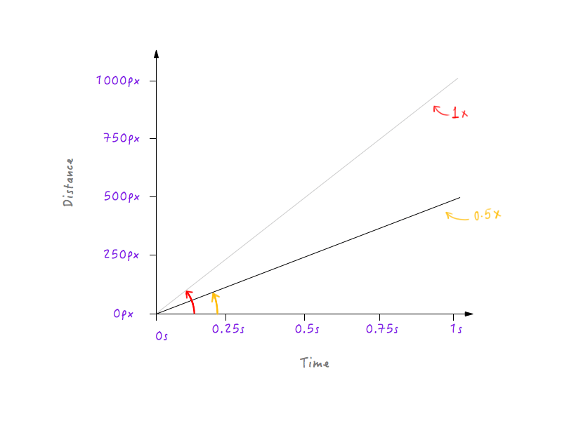
Let’s slow down Boxy a little more, making the speed one third of the original. Boxy will be able to cover one third of the original distance in 1 second.
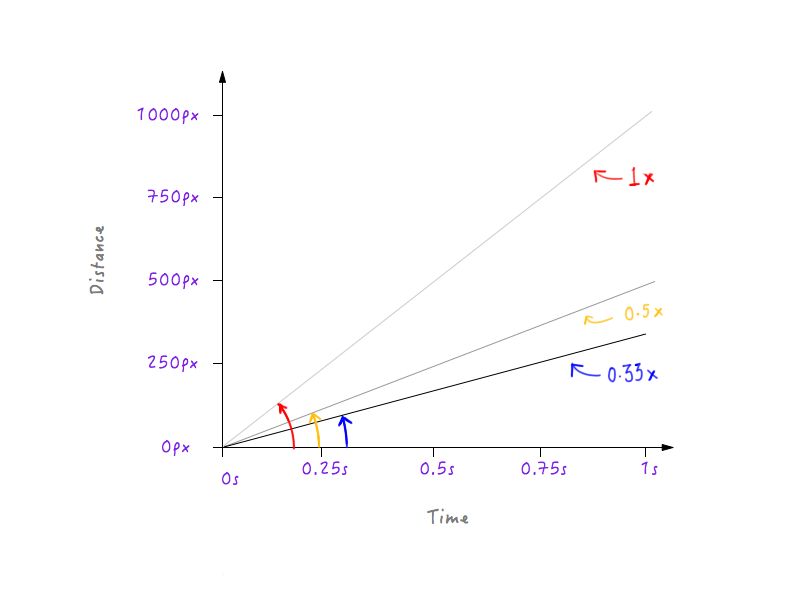
See a pattern? The line gets steeper and steeper as we increase Boxy’s speed, and starts to flatten out as we slow Boxy down.
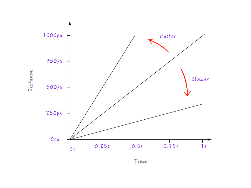
This makes sense because, for a steeper line, a little progress in time produces a much higher change in distance, implying greater speed.
On the other hand, for a line that is less steep, a large change in time produces only a little change in distance, meaning a lower speed.
With all of the changes we have made, Boxy is still moving in a linear fashion, just at different speeds. However, with our newly gained knowledge of how changes to distance versus time can affect speed, we can experiment and draw a graph that makes Boxy move in a way that looks natural and realistic.
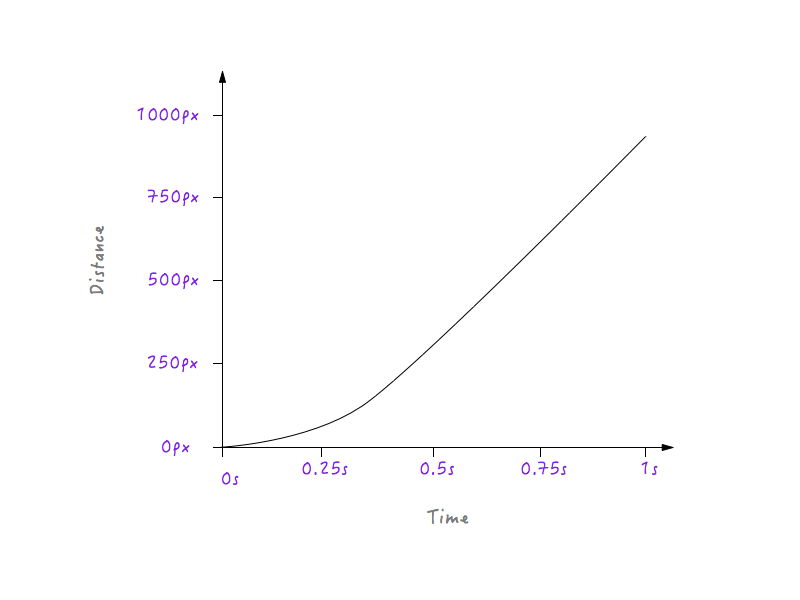
Let’s take it step by step. First, things in real life start out slow and slowly increase in speed. So, let’s do that.
In all of the iterations of the graph shown below, you will notice that the points at opposite corners remain fixed. This is because we are not changing the duration for which the animation runs, nor are we changing the distance that Boxy travels.
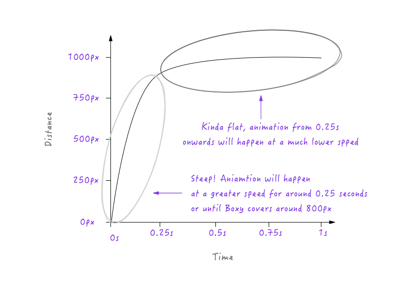
If Boxy is to follow the graph above, it will move at a slower speed for 0.25 seconds, because the line is less steep starting from 0 to 0.25 seconds, and then it will abruptly switch to a higher speed after 0.25 seconds (the reason being that the line in the graph gets steeper after 0.25 seconds). We will need to smoothen this transition, though; we don’t want any corners — it’s called a motion curve, after all. Let’s convert that corner to a curve.
Notice the smooth transition that Boxy undergoes from being at rest to gradually increasing in speed.

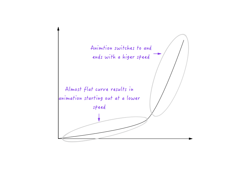
Good! Next, objects in real life progressively slow down before stopping. Let’s change the graph to make that happen. Again, we’ll pick up a point in time after which we would like Boxy to start slowing down. How about around 0.6 seconds? I have smoothened out the transition’s corner to a curve here already.
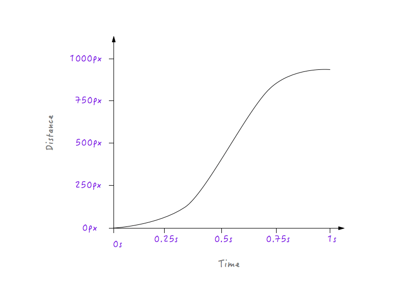
Look at Boxy go! A lot more natural, isn’t it?

The curve we drew in place of the corner is actually a collection of many small line segments; and, as you already know, the steeper the line on the graph, the higher the speed, and the flatter the line, the slower the speed. Notice how in the left part of the image, the line segments that make up the curve get steeper and steeper, resulting in a gradual increase in speed, and progressively flatten out on the right side, resulting in the speed progressively decreasing?
With all of this knowledge, making sense of motion curves becomes much easier. Let’s look at a few examples.


Using Motion Curves In UI Animation
The next time you have to animate a UI element, you will have the power of motion curves at your disposal. Whether it’s a slide-out bar, a modal window or a dropdown menu, adding the right amount of animation and making it look smooth and natural will increase the quality of your user interface greatly. It will make the user interface just feel good. Take the slide-out menu below:
See the Pen nJial by Nash Vail (@nashvail) on CodePen.
Clicking on the hamburger menu brings in the menu from left, but the animation feels blocky. Line 51 of the CSS shows that the animation has transition-timing-function set to linear. We can improve this. Let’s head on over to cubic-bezier and create a custom timing function.
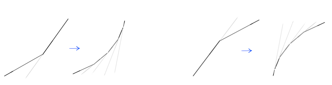
If you’re reading this, it’s safe to assume that you’re a designer or a developer or both and, hence, no stranger to cubic bezier curves; there’s a good chance you’ve encountered them at least once. Bezier curves are a marvel. They are used primarily in computer graphics to draw shapes and are used in tools such as Sketch and Adobe Illustrator to draw vector graphics. The reason why cubic bezier curves are so popular is that they are so easy to use: Just modify the positions of the four different points, and create the kind of curve you need.
Because we always know the initial and final states of the animated object, we can fix two of the points. That leaves just two points whose positions we have to modify. The two fixed points are called anchor points, and the remaning two are control points.
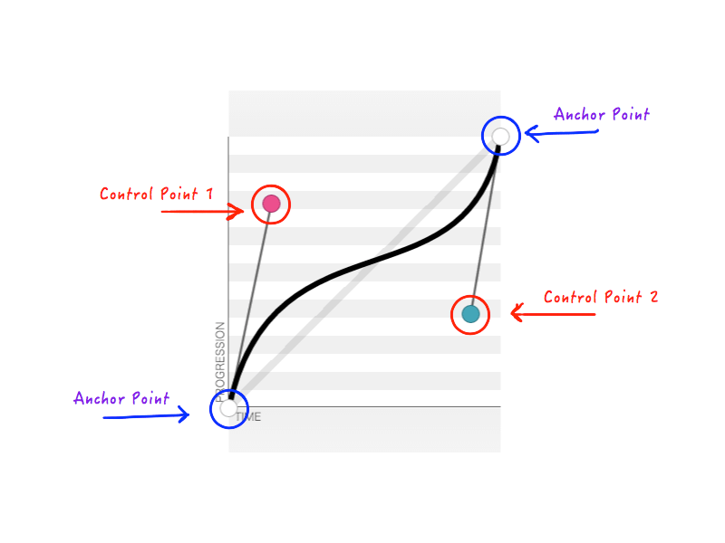
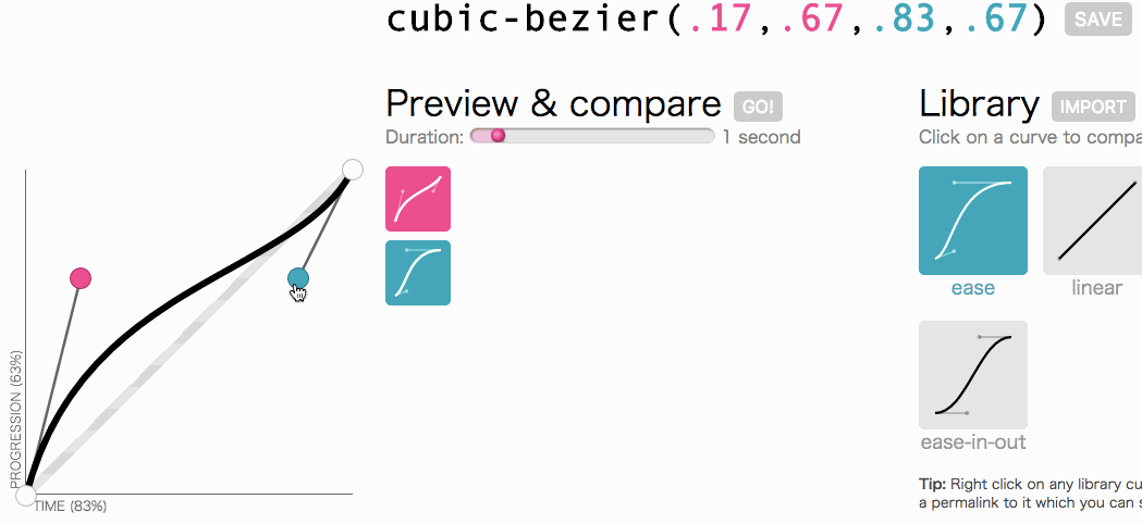
As you remember, cubic-bezier accepts four numbers (n1, n2, n3, n4) when you create a custom transition-timing-function. These four numbers represent nothing but the positions of the two control points: n1, n2 represents the x and y coordinates of the first control point, and n3, n4 represents the coordinates of the second control point. Because changing the position of the control points will change the shape of the curve and, hence, our animation overall, the result is the same when any or all of n1, n2, n3, n4 is modified. For example, the figure below represents cubic-bezier(.14, .78, .89, .35):
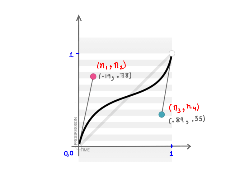
(.14, .78, .89, .35) (View large version)The math behind these seemingly simple curves is fascinating.
All right, all right, let’s get back to where we were going with cubic-bezier: creating a custom transition-timing-function. I want the kind of animation in which the menu slides in very quickly and then gracefully slows down and ends:
This looks good. The animation will start out fast and then slow down, rather than move at a constant speed throughout. I am simply going to copy cubic-bezier(.05, .69, .14, 1) from the top of the page and replace linear with it.
See the Pen nJial by Nash Vail (@nashvail) on CodePen.
See the difference? The second iteration feels much more natural and appealing. Imagine if every animation in your UI followed a natural timing function. How great would that be?
As we’ve seen, motion curves aren’t tricky at all. They are very easy to understand and use. With them, you can take your UI to the next level.
I hope you’ve learned how motion curves work. If you were going through a lot of trial and error to get motion curves to work the way you want, or if you were not using them at all, you should now be comfortable bending them to your will and creating beautiful animations. Because, after all, animation matters.
Further Reading
- SVG and CSS animations with clip-path
- Practical Animation Techniques
- Creating ‘hand-drawn’ Animations With SVG
- The new Web Animation API


