Experience Design Essentials: Animated Microinteractions In Mobile Apps

Email Newsletter
Weekly tips on front-end & UX.
Trusted by 182,000+ folks.


 Celebrating 10 million developers
 Register Free Now
 SurveyJS: White-Label Survey Solution for Your JS App
Dariel Fitzkee, the famous magician, once said, “Magic is both in the details and in the performance.” Interaction design is just like that. Designers love to get the big picture right, but if the details aren’t handled properly, the solution will fail. The magic is all in the details. That’s why well-designed microinteractions make experiences feel crafted.
To get a better understanding of how your design benefits from microinteractions, it will help to sketch out your app ideas. Adobe introduced a new design and wireframing app called Experience Design (or Adobe XD) which lets you design wireframes and make them interactive. You can download and test Adobe XD for free.
Show System Status
Jakob Nielsen’s first heuristic for UI design states, “The system should always keep users informed about what is going on, through appropriate feedback in a reasonable time.” This means that the user interface should keep the user abreast of what is happening by providing feedback. The app shouldn’t keep the user guessing — it should tell the user what’s happening, and microinteractions can help you make that known via appropriate visual feedback.
Data uploading and downloading processes are great opportunities for creative animated microinteractions.
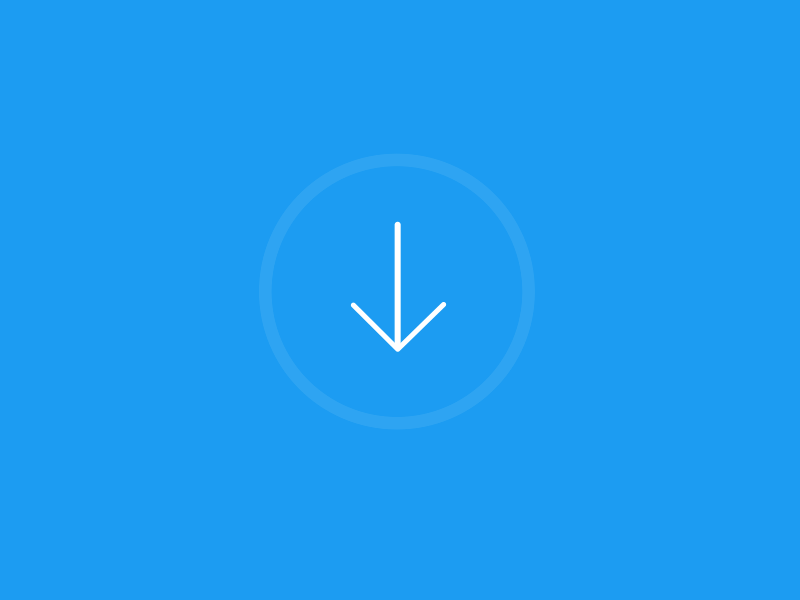
Another well-known animation for this group is “pull down to refresh,” which initiates a process of content updates on mobile devices. A cheerful refresh animation can make users chuckle.
Takeaway: Animation provides real-time notification of an app’s process status, enabling the user to quickly understand what is going on.
Make Buttons And Controls Tangible
User interface elements such as buttons and controls should appear tangible, even though they are behind a layer of glass. Visual and motion cues can bridge this gap by acknowledging input immediately and animating in ways that look and feel like direct manipulation. UI buttons can mimic interaction with common physical objects. Simply put, you can add clarity through visual responses to the user’s input.
Takeaway: Visual feedback works because it appeals to the user’s natural desire for acknowledgement. It just feels good to click through an app and always feel like you know what’s happening.
Build Meaningful Transitions
You can use animation to smoothly transport users between navigational contexts, to explain changes in the arrangement of elements on a screen or to reinforce an element’s hierarchy.
Icons can morph from one shape to another, serving dual functions at different times.
Motion design can effectively guide the user’s attention in ways that both inform and delight. This is especially good for mobile devices and smartwatches because it’s impossible to fit a lot of information on those screens.
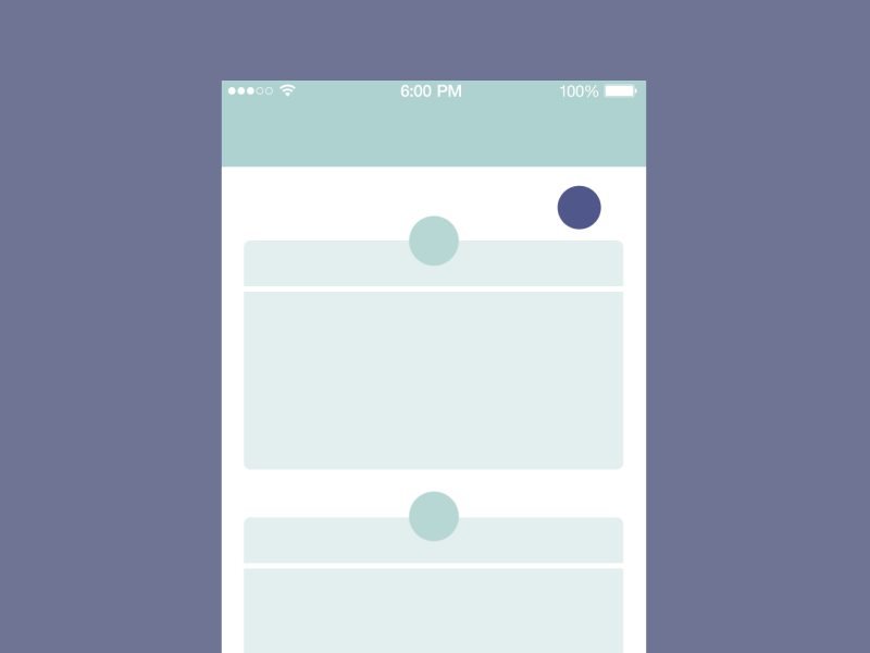
Apple’s iOS UI is a good example of meaningful transitions. In the example below, the user selects a folder or app and is zoomed into its detailed view (or directly to the app’s main screen).
Another good example is animation that creates visual connections between two states through color and persistent elements. This makes transitions smooth and effortless.
Takeaway: Microinteractions can establish a visual connection between pages and add clarity to the UI.
Help The User Get Started
Microinteractions are very helpful during onboarding. Flawless UX and animations in the onboarding flow can have a tremendous impact on how first-time users engage with the app. They guide and educate users after the launch of an app by highlighting the most important features and controls.
Takeaway: Microinteractions reveal information and help the user to efficiently reach their goal.
Highlight Changes In The UI
Microinteractions can direct the user’s attention. In many cases, animation is used to attract their attention to an important detail (such as a notification). However, be sure that the animation serves a functional purpose and is appropriate to your users.

Takeaway: Microinteractions can be good visual cues for the user.
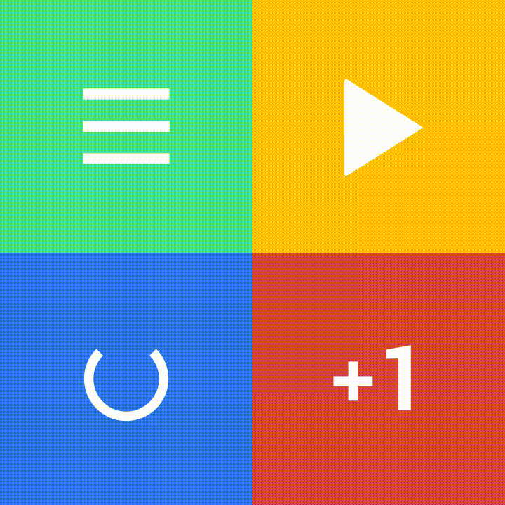
Add Delightful Details
The most basic use of a microinteraction animation is in transitions. However, an app can truly delight users when animation is used in ways beyond the standard scope of actions. The button below seamlessly changes states and serves dual functions: to inform the user and to create a moment of wonder.

Takeaway: Focus on user emotions, which play a huge role in UI interactions.
What To Consider When Designing Microinteractions
When you create a visual design containing the elements discussed above, keep a few things in mind:
- Make microinteractions almost invisible and completely functional.
Make sure the animations fit a functional purpose and do not feel awkward or annoying. For frequent and minor actions, the response can be modest, while for infrequent and major actions, the response should be more substantial. - Keep longevity in mind.
Microinteractions must survive long-term use. What seems fun the first time might become annoying after the hundredth use. - Follow the KISS principle.
Over-designing a microinteraction can be lethal. Microinteractions shouldn’t overload the screen and cause a long process of loading. Rather, they should save time by instantly communicating valuable information. - Don’t start from zero.
You will almost always know something about your target audience and their context. Use that knowledge to make your microinteractions more precise and effective. - Create visual harmony with the other UI elements.
Microinteractions should match the general style of the application, supporting a harmonious perception of the product.
Conclusion
Microinteractions show that attention to small details can deliver big and powerful results. As Charles Eames once said, “The details are not the details. They make the design.” Every element of the design matters. Details make your app stand out from the competition because they can be either practical and forgettable or impressive, useful and unforgettable.
Always design with care, and don’t forget that a great design has to happen full-stack, from the functional parts down to the microinteractions.
"This article is part of the UX design series sponsored by Adobe. The newly introduced Experience Design app is made for a fast and fluid UX design process, as it lets you sketch out ideas, create interactive prototypes, test and share them all in one place.
You can check out more inspiring projects created with Adobe XD on Behance, and also visit the Adobe XD blog to stay updated and informed. Adobe XD is being updated with new features frequently, and since it's in public Beta, you can download and test it for free."
Further Reading
- How Functional Animation Helps Improve User Experience
- Best Practices For Animated Progress Indicators
- How To Design Error States For Mobile Apps
- How To Create Icons With Adobe XD
- Useful Prototyping Tricks in Adobe XD
- How We Use Prototyping, And How It Made Us More Efficient


