Pixel-Perfect Specifications Without The Headaches

Email Newsletter
Weekly tips on front-end & UX.
Trusted by 182,000+ folks.
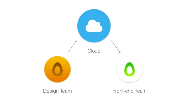
 Custom Web Forms for Angular, React, & Vue. Your backend.
 Celebrating 10 million developers


Designers, developers and managers often work with compressed timeframes and multiple projects simultaneously. A team must be able to respond quickly to feedback on their product from clients, project managers and developers. Each minor revision in the UI or UX needs to be reflected in the documentation, so that designers and developers always have the latest information.
A style guide ensures that your project doesn’t encounter serious problems when you implement the initial design. Making sure that all specifications are accurate to their designs is critical, because an inaccurate specification means that developers will have to either rely on guesswork when building the app or go to the design source to get answers to their questions. Transferring all of this information manually to the developers can be a headache and usually takes significant time, depending on the extensiveness of the designs.
In this article, we’ll review the process of creating a style guide, the process of handing off a design, and collaboration across the whole team. We’ll also walk through an example workflow, demonstrating how developers and designers can improve cross-team communication and drastically reduce iteration time.
A Project’s Team
A project consists of designers, developers and project managers, and each area has its own particular needs.
Designers
When a designer prepares a design, they hand it over to the developer. What they usually do is export some PNGs and prepare a specification with all of their annotations. Specifications can be stressful in a big project, and the design of an interface layout can change quite often. Thus, a traditional style guide will pretty much get outdated almost immediately.
Preparing specifications is tedious — we know that. Manually doing it is time-consuming, and every designer does it a little differently. Most designers spend more time making specifications than actually designing. And they often have to manually export all of their assets for developers. I can tell you that every designer is tired of that.
If you want to save the designer’s time, just tell them to forget about that and focus on the actual design process instead. Every minute a designer spends revising documentation is a minute lost that they could be spending really nailing the visuals, experience and interactions.
Developers
Inspecting specifications is painful. Developers will usually ask the designers for every little detail contained in the design or, worse, are forced to do it themselves in Photoshop or Sketch. In most cases, they need to manually convert all sizes of the assets according to the platform’s requirements (for example, converting pixels to density-independent pixels, scale-independent pixels, points, etc.). They often don’t have enough detailed information about the visual design and have to guess, resulting in visual inconsistencies.
Even when the developer has successfully implemented the design, there is still the possibility that the designer will make a change, at which point the developer would have to manually inspect the design again and figure out what exactly has changed. Not flexible at all!
Managers
Project managers are always trying to find ways to improve collaboration between designers and developers, because everyone on the team should be on the same page for every design change. If you’re working with a remote team, you’re probably going to need some online space to collaborate and meet, a single channel of communication. Modern communication tools such as Slack make that possible, but the project managers still need to track progress and provide feedback on what has changed and where. They are well familiar with messy email attachments and feedback coming from multiple places.
They also need to figure out the current state of the product very quickly. They need to stay on top of the design process by reviewing changes, comparing versions visually side by side, and discussing them in real time in one place.
Syncing Designers And Developers With Less Hassle
Creating design specifications involves identifying colors, x and y values, fonts, text weights, distances, positions and a number of other characteristics of the assets. Each asset carries certain characteristics that need to be recorded.
You need a tool to bridge the gap between the design and coding stages of development, a tool that simplifies and speeds up the specification and development process, a tool that provides a single entry point for all design-related stuff, so that you (the designer, developer or manager) don’t have to think about where to find the latest version of the design. This will result in products getting built and shipped faster.
Thankfully, tools exist out there to help with this. Each of them takes in Photoshop or Sketch documents and produces a specification for developers, including code snippets and image assets. These tools also track changes between versions of the design.
How They Work
This is where Avocode, Sympli, and Zeplin enter the scene. These are collaboration tools for UI designers and front-end developers. They are built for the process of going from Photoshop or Sketch to code. You can upload designs and turn them into specifications and guidelines that are tailored to the platform you are working on. Using these tools, you can:
- inspect designs from Photoshop or Sketch without using the original app, and quickly get measurements appropriate to the platform you’re working on;
- get instant access to image assets, colors, fonts and even dimensions;
- export resource files for any kind of element, whether text, button or something else;
- add notes and notify team members about design changes instantly.
Last but not least, designers and developers will essentially work in a shared workspace, where elements such as sizes, distances, fonts and icons move seamlessly back and forth, without requiring a large design file annotated with what the designer needs.
However, as I’ve said, these tools are for inspecting, not editing or interactive prototyping. This is important. These are not image editors, and they don’t allow you to create designs or prototypes. You still need to create and edit your files in Photoshop or Sketch and then open the files for inspection in one of these tools.
Avocode
Avocode is one of these tools that bridge the gap between web designers and developers. The process of creating a website starts with designing in Photoshop or Sketch; however, when the designer is finished and the front-end developer has to implement the design, the design file is broken down into images, colors, sizes, CSS, etc.
First Steps
Before doing anything in Avocode, you need to create an account. A free two-week trial of the application is available on the website.
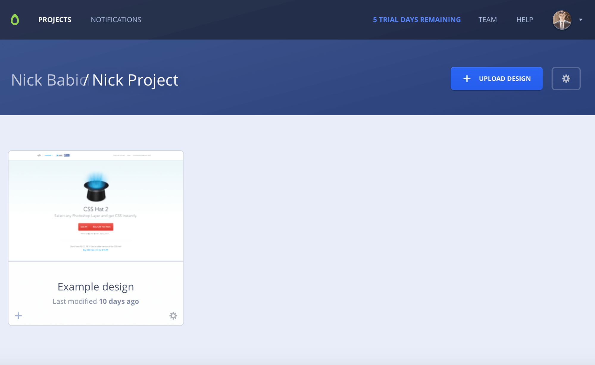
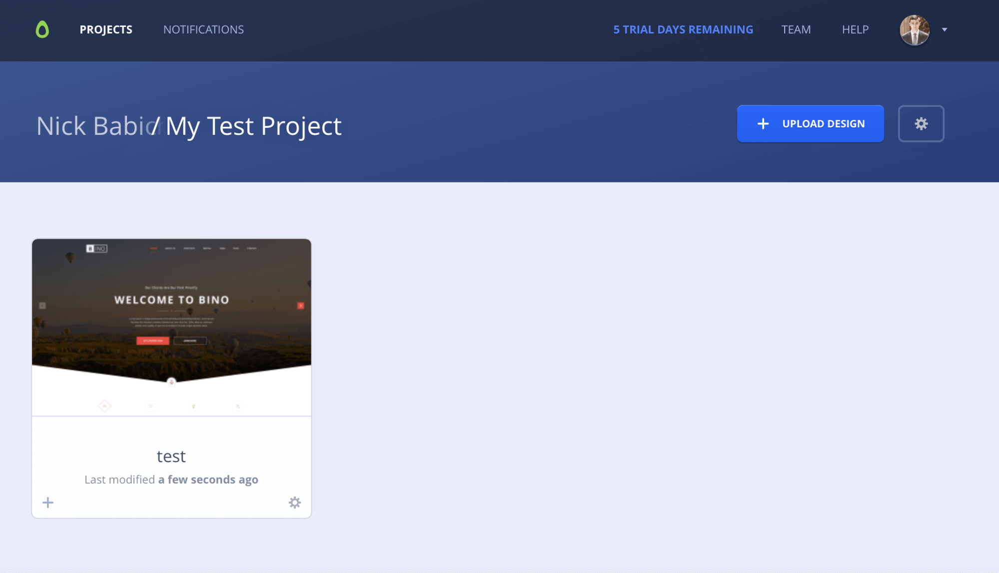
Avocode contains two parts: a web-based manager and a desktop application. It works based on projects, and you need to create a project to get started. A sample web project (a landing page) is provided to help first-time users understand what features are available.
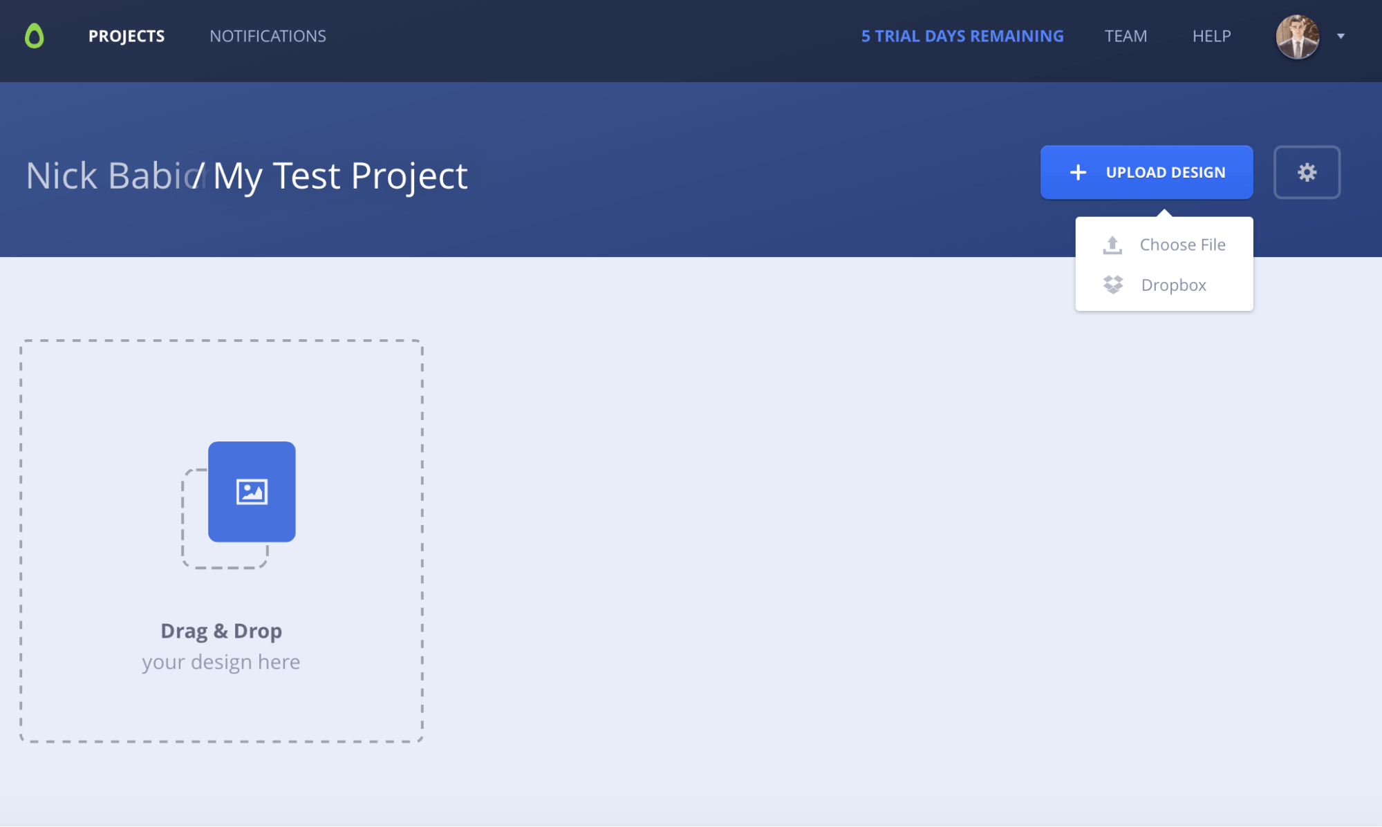
Upload Design
After creating a project, you need to upload your design. You can use Dropbox or manually drag and drop files from your local system.
User Interface Overview
After creating a project and uploading your designs, you need to install the desktop application to inspect them. The web app only has previewing and commenting features and doesn’t allow you to inspect a design in detail.
So, let’s dig into the details of the desktop app! Avocode feels like a powerful and professional application. The UI looks very similar to Photoshop — same color scheme and typefaces. The dark Photoshop-like interface makes Avocode look and feel really slick. If you’re an intermediate Photoshop or Illustrator user, the learning curve is close to none.
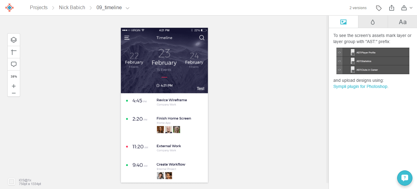
The main tab you’ll be focusing on and working with most of the time is “Project Designs.” It shows each of your projects in the form of a thumbnail, title and activity indicator.
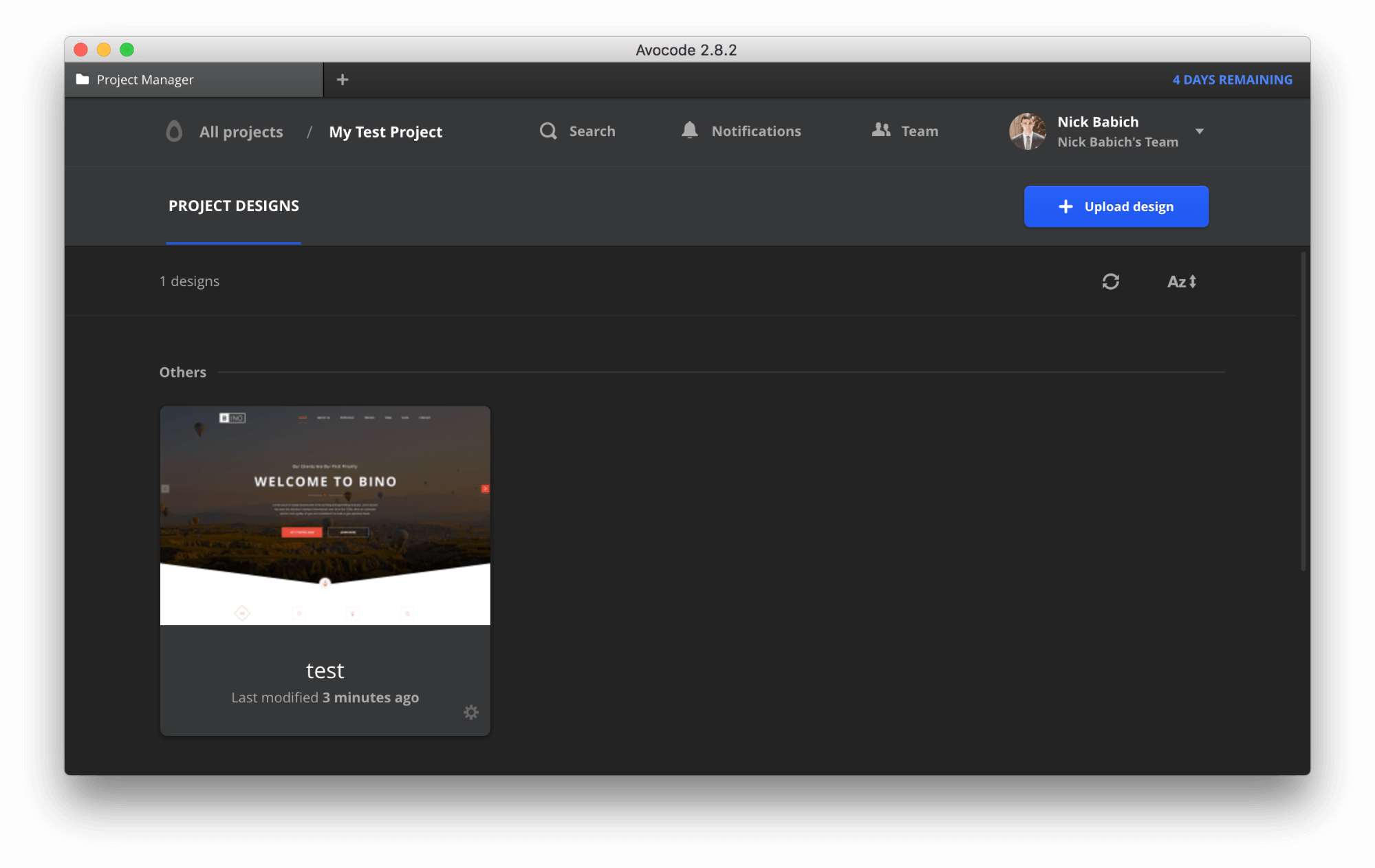
If you double-click on a thumbnail, you’ll immediately see a screen with a full list of groups and layers, exactly like Photoshop. On the bottom is a set of Avocode tools. The first one we will use is the Select tool. With it, you can select individual layers, or multiple layers, and see its properties on the right side. You will notice that the inspector’s content changes based on which item is selected.
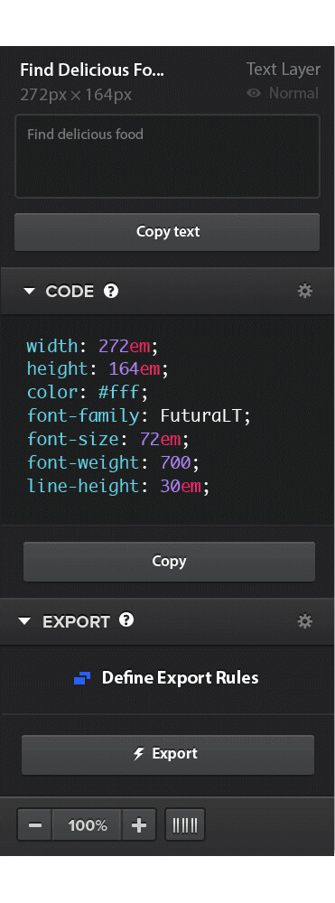
Below, the layer for the call-to-action button is selected. When you select an item in your PSD, the sidebar shows the CSS for that item. As a bonus, Avocode also gives you the option to copy LESS or Sass code:
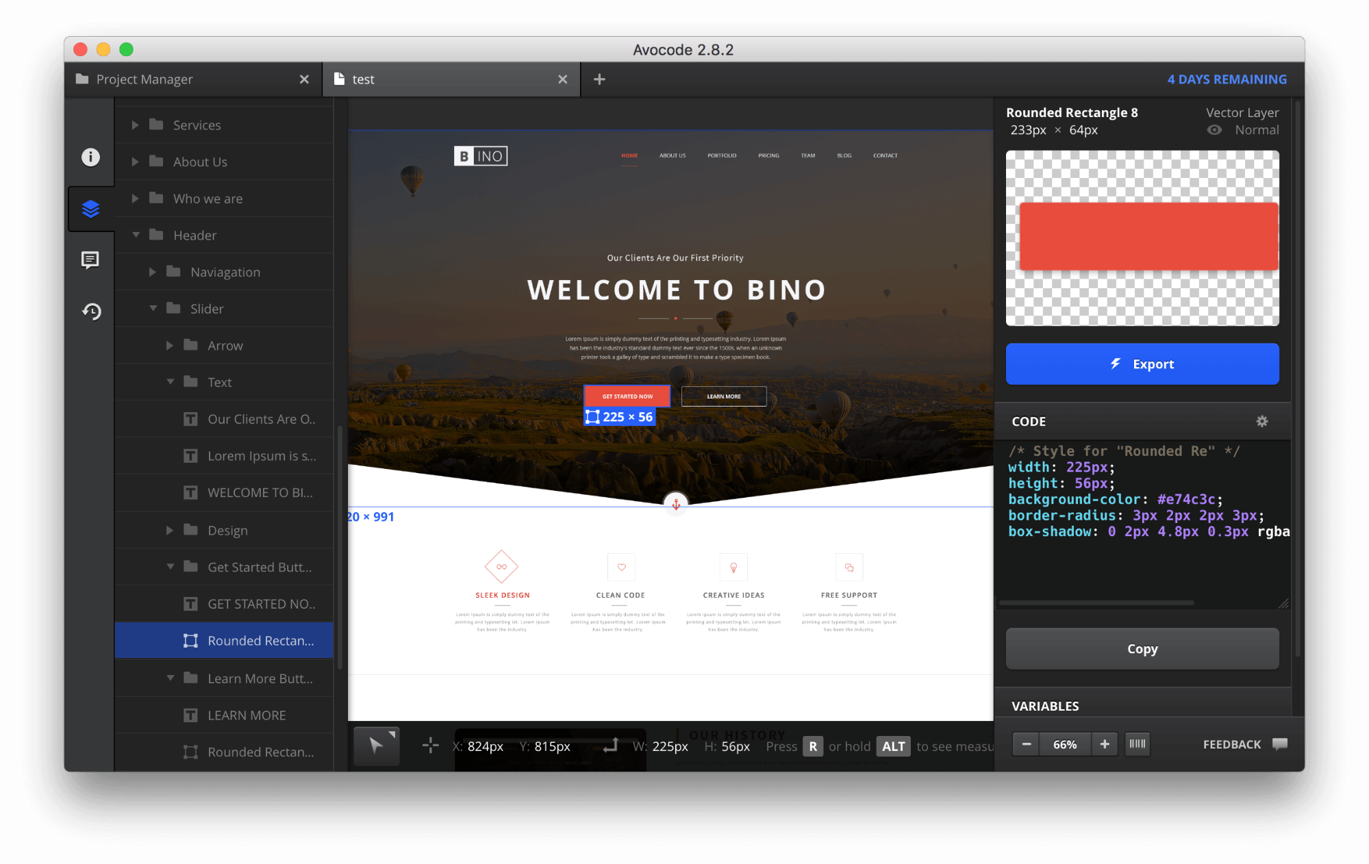
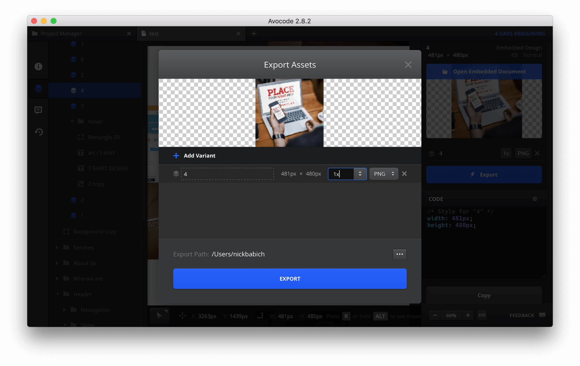
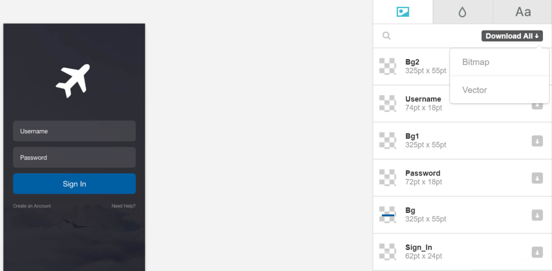
You can select an image and see its dimensions. The image-exporting options in Avocode are really nice, too. You can set up different rules that allow you to export all of your images in any number of configurations, including JPG, PNG and SVG formats, as well as with the right proportions (“1x” means the original size).
The info panel has all of the important information about the design. You can even get a public link to share the design with anyone. What’s best is that this panel lists all of the fonts used, with links to Typekit and Google Web Fonts so that you can easily use them in your project.
Tools
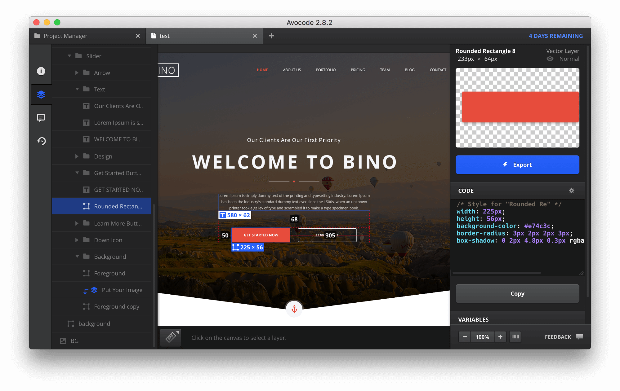
The Measure tool is useful. Select a layer and then hover over other layers to see their positions relative to the first layer. Below is a selected layer with a “Get started now” button, and its relative position to the top, left and right.
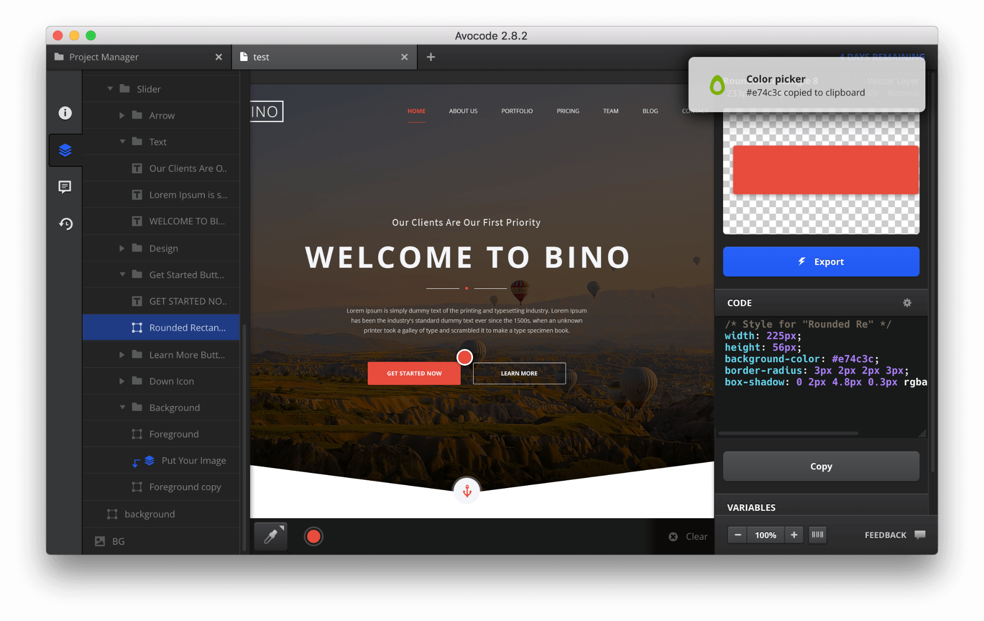
The next one is a color picker, which basically takes a color and copies its hex value to your clipboard. You can add this color as a variable to your design. With this tool, you can quickly create a color scheme for your design.
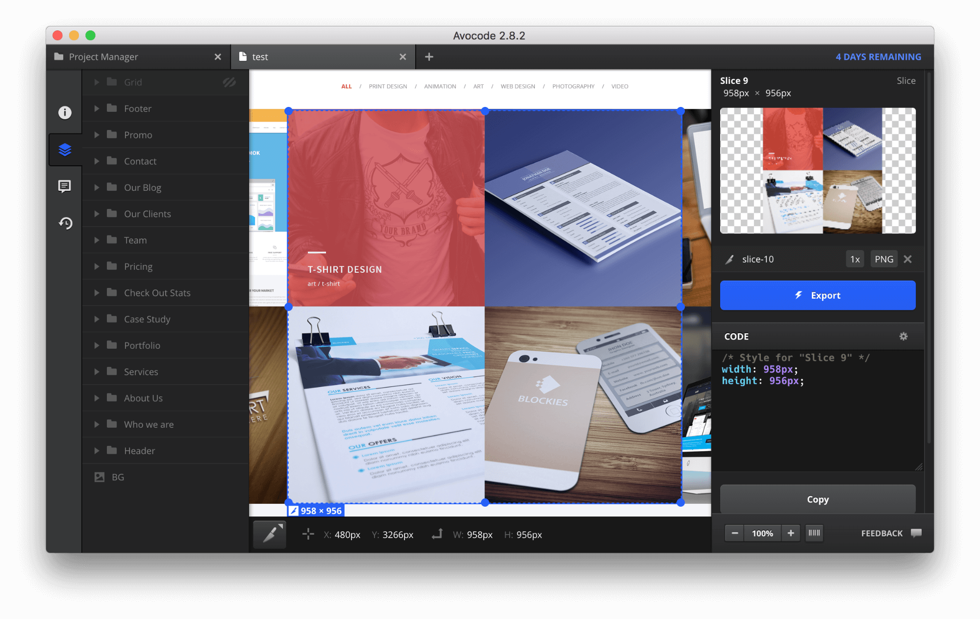
The final tool is Slice, which makes it possible to export a selected part of the design as an image or style scheme.
The good thing is that each tool has a hotkey combination, which is handy for users who use the keyboard to quickly switch between options.
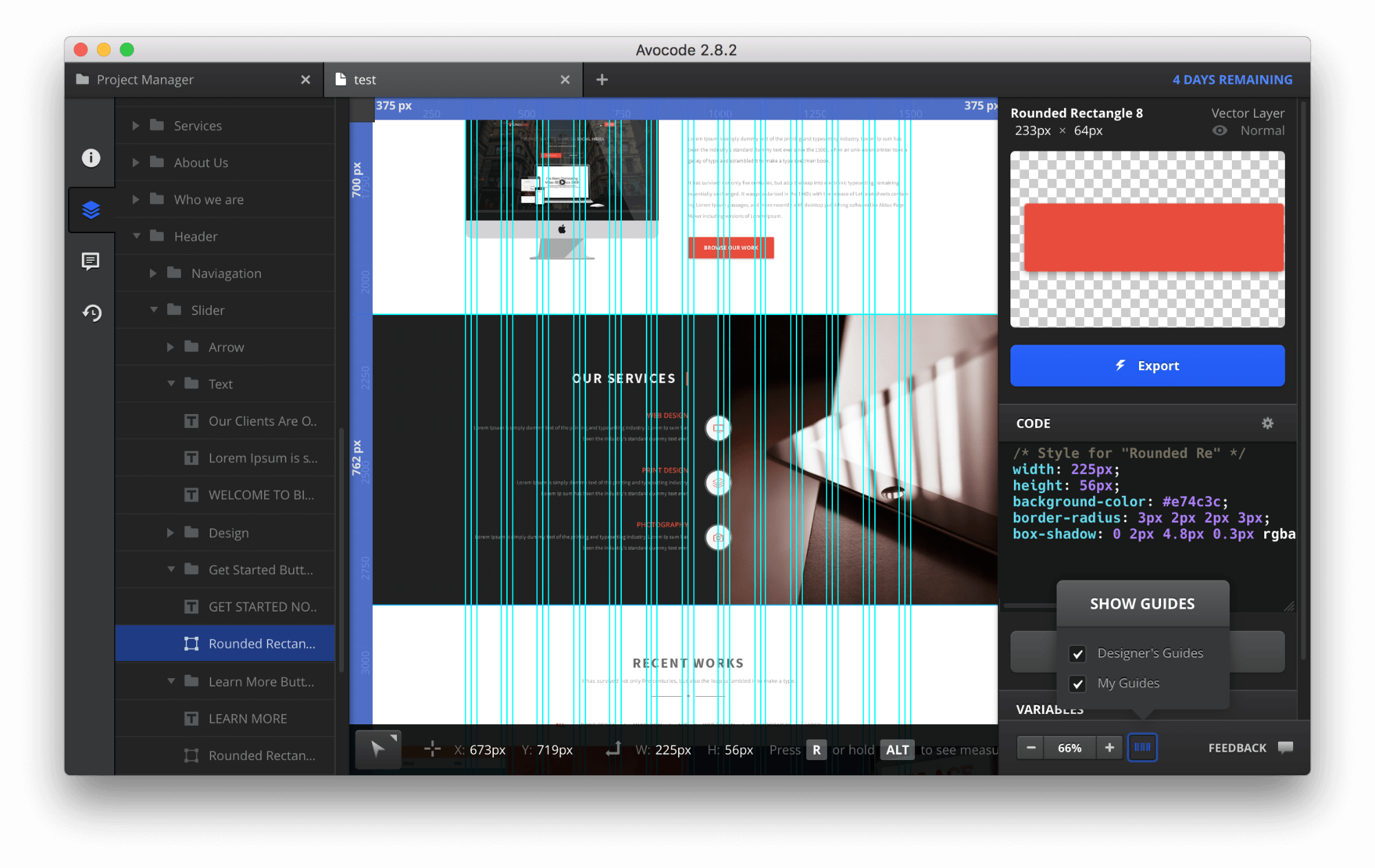
Another cool feature of Avocode is the use of guides. However, a first-time user might wonder whether this option is available because the feature is hidden behind a little button in the bottom-right area of the screen. Avocode supports both user-created guides as well as designed guides that have already been made in Photoshop or Sketch. So, if your Photoshop document has guides, they will show up in Avocode.
Using Avocode, you can visually compare revisions of designs easily. You can access this feature in the “design detail” of your project in the web app:
Collaboration
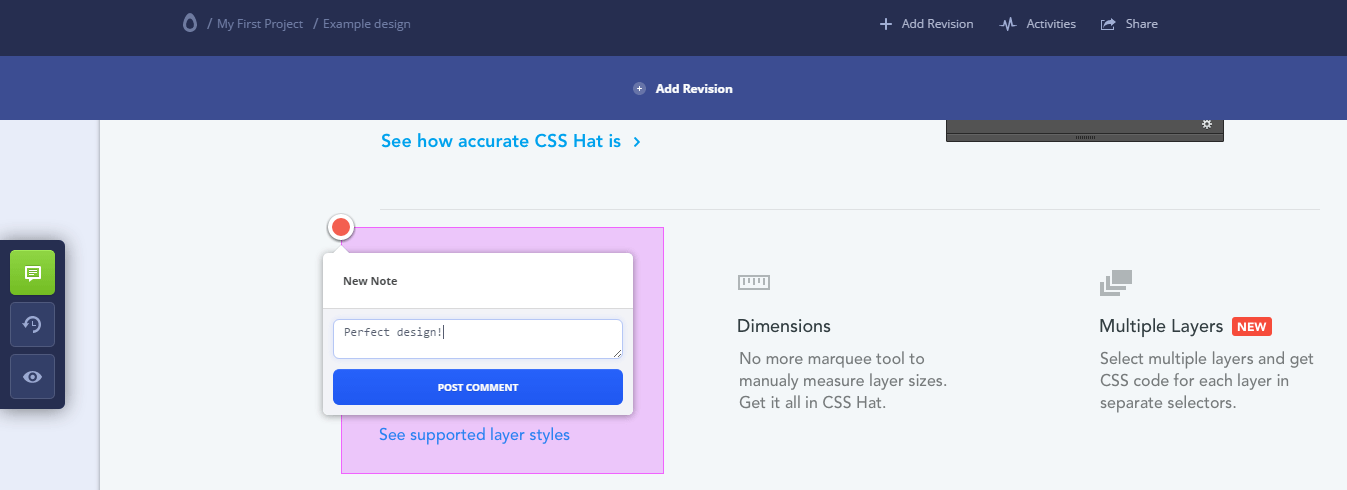
Avocode lets you leave notes in a specific area in the design, allowing you to discuss design changes with anyone in one place instantly.
Simply click or drag anywhere in the design to highlight the area you want to talk about, then write your message, and hit the submit button. Everyone will instantly get a notification:
Cost
Avocode charges $10 per month per user for the business plan, which has integration with Slack and permissions management. If your team consists of one to three people and you don’t need permissions management, you can choose the “Garage” plan, which costs $7 per month per user.
Pros
- Multi-platform support (Mac, Windows, Linux)
- A great Photoshop-like UI and a deep and thoughtful toolset
Cons
- Currently only supports the web
- No free plan (after the trial, you have to subscribe with a regular paid plan)
- Unlike Sympli or Zeplin, doesn’t support detail inspection in the web app (the desktop app is required)
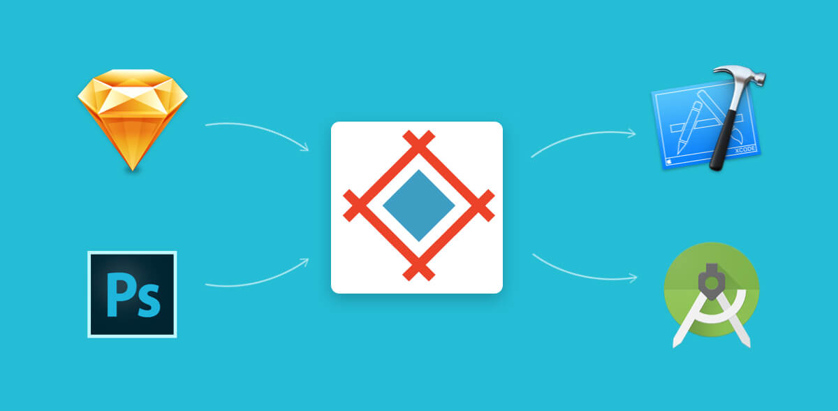
Sympli
Sympli isn’t just a design handoff or collaboration tool — it’s a complete collaboration platform that covers the entire product design team, including design handoff features for designers coming from Photoshop (Adobe XD coming soon) and Sketch, as well as automated implementation features and tools for developers in its Android Studio and Xcode plugins. Recently launched this spring, it’s a great tool that has done a lot to speed up the design and development process.
One of the biggest reasons to use Sympli is its integration with Xcode and Android Studio, making it a tool for the whole team because it goes beyond design handoff to help developers with automated implementation.
First Steps
When users visit the Sympli website, they are immediately oriented with the “How it works” section, which tells the user what they need to know to get started and familiarizes them with the product. First, sign up and create a new project. Select the project type (Sympli supports web, Android and iOS projects) and the resolution (@1x, @2x or @3x). After that, you will be able to upload you designs.
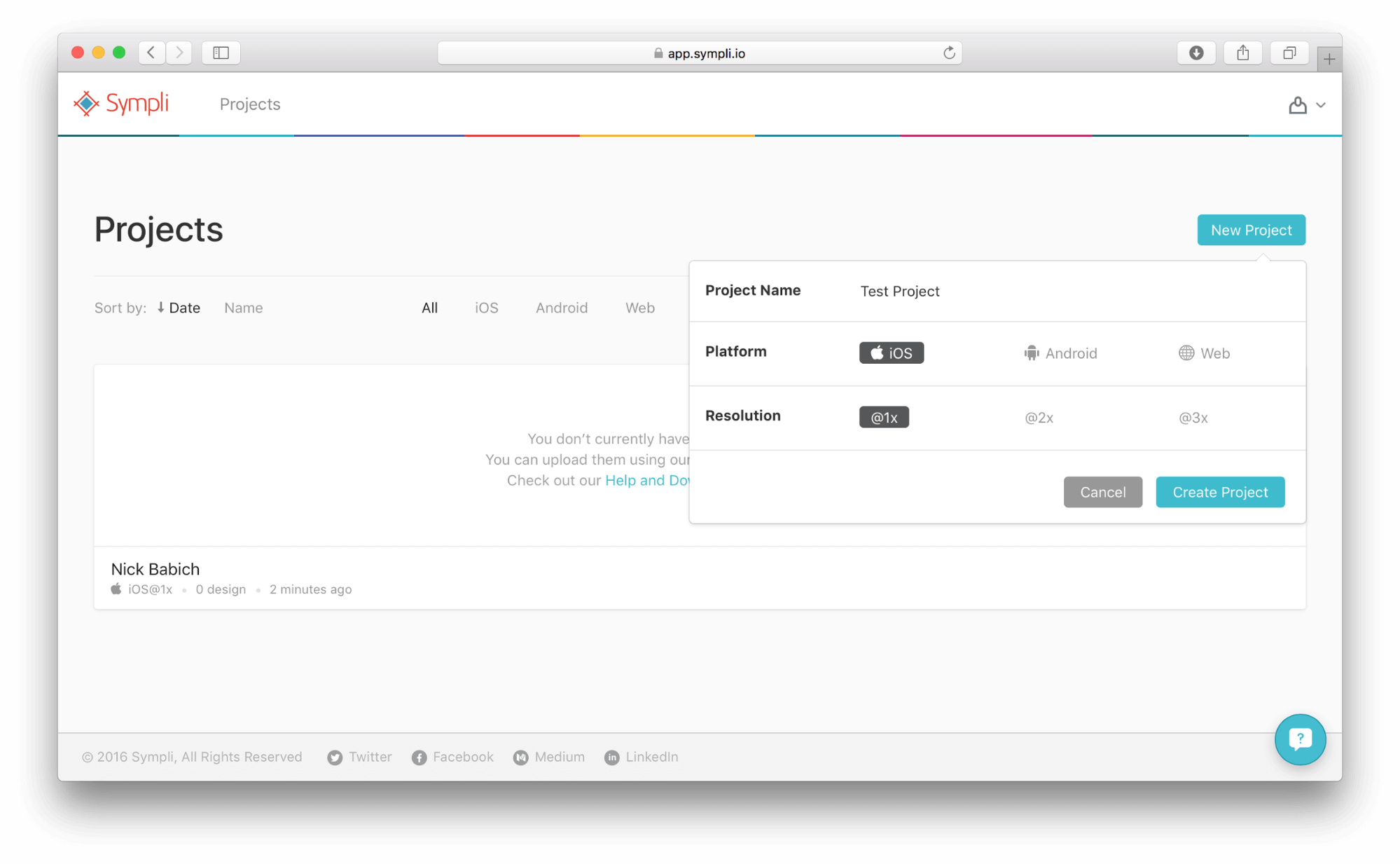
Upload Design
Sympli works as a plugin in Photoshop or Sketch; however, like in Zeplin, you can’t directly upload native design files. Sympli is cloud-based, so it works across platforms. And for those security-conscious companies that prefer not to use the cloud, Sympli offers enterprise options for on-premise setup.
Compared with Avocode and Zeplin, Sympli has an interesting option for exporting assets.
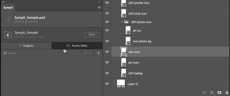
Sympli for Sketch is a native plugin, which has some additional benefits, such as the ability to export hidden assets (in case you have multiple states of the same control on the artboard) and validation of asset names to conform with the destination platform’s requirements. This means Sympli not only will generate assets with all of the required formats and sizes in platform-specific units for the marked layers or groups, but will also validate all specified names, handle asset name duplicates, export hidden assets and even help you to stay within the asset-naming requirements for Android or iOS.
Developers can also apply naming-convention rules for their assets, so that renaming rules get applied every time a designer sends assets.
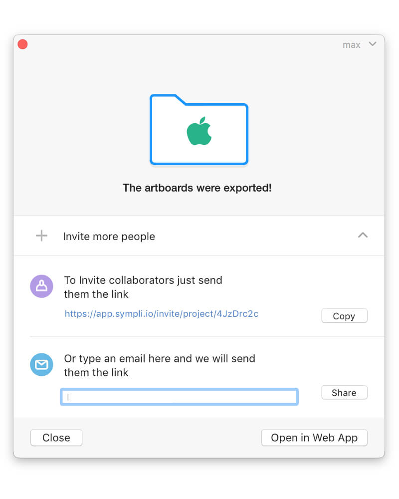
Collaboration in Sympli starts before the design handoff. Several designers can work on a project at the same time and can export screens to the same project. Once the designs are uploaded, the project owner invites people using a shareable link or sends it directly to the team members’ inboxes. If you are updating an existing project that has already been shared, the team will be notified about the updates.
User Interface Overview
Sympli doesn’t have a separate desktop application; the powerful web app has all of the required functionality. Mockups are accessible via IDE extensions (Xcode or Android Studio). You can always access the latest version of the design mockups, and designers can send links to particular screens, rather than files, so that recipients don’t have to dig up those screens themselves.
Sympli automatically stores all colors and fonts in a project’s “Summary” section. It finds multiple instances of the same color or font used in multiple layers, groups them in an expandable list of styles, and generates the names for them automatically. It also allows users to rename colors and sync the changes.
Sympli not only specs the fonts used, but also shares font files through its Brandbooks feature. Designers can attach font files to a project to be made available to developers right away, along with collections of company-named colors. Font files can be attached to multiple projects.
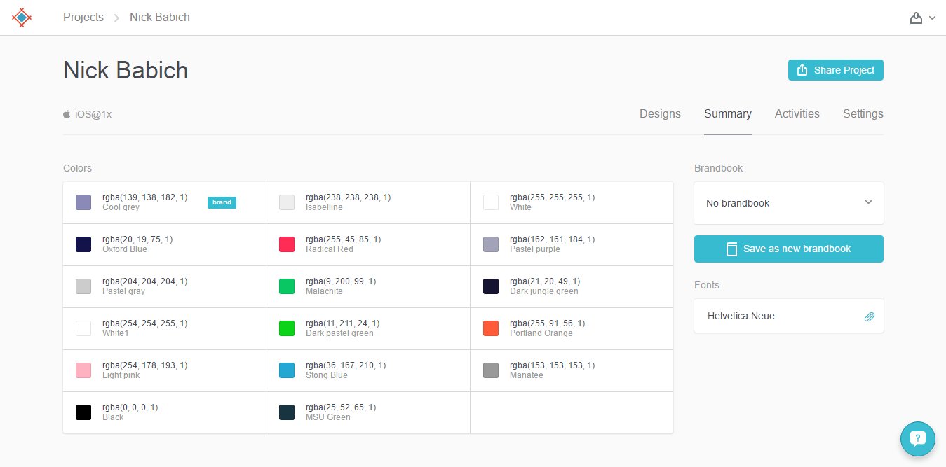
All colors and fonts are presented in platform-specific notation, so that you don’t have to change them manually. Also, Sympli provides access to assets in bitmap or vector format; the developers chooses which, and both formats are generated on the fly, automatically.
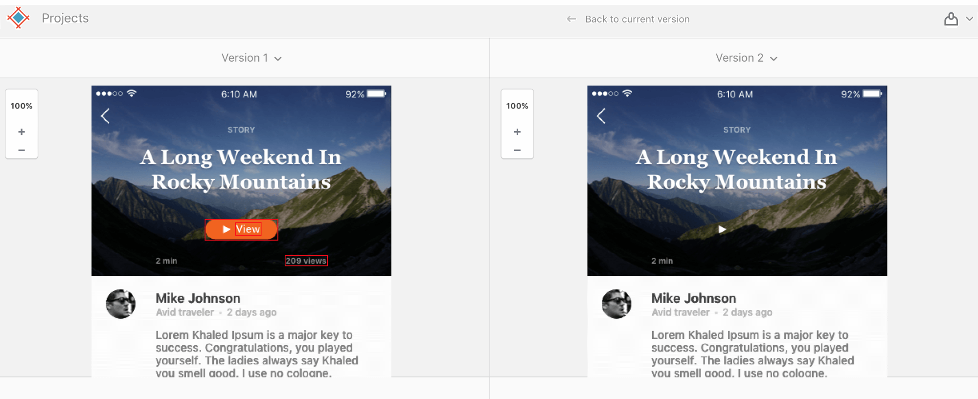
You can visually compare revisions of designs easily. To access this feature, open the design detail in Sympli and click the “Version” link. However, a new mechanism for comparing versions is coming soon, which will highlight changes and show versions side by side.
Tools
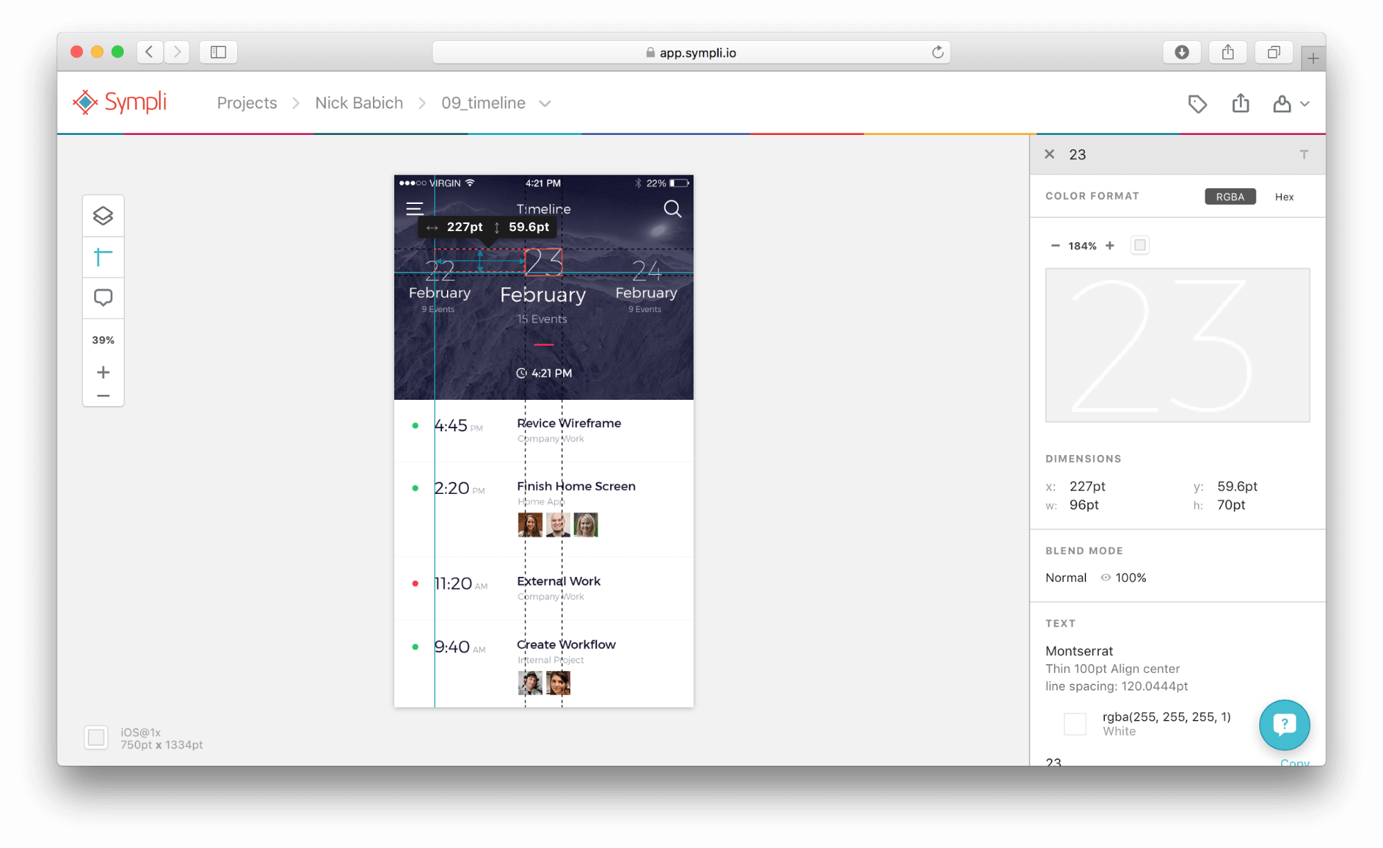
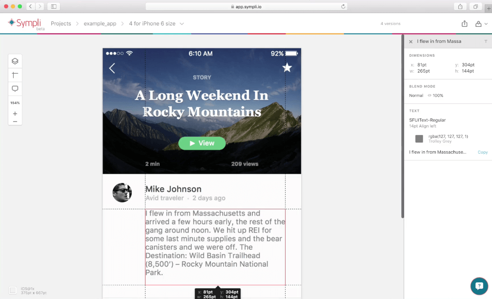
The first tool we will look at is Layers. With it, you can select individual layers or multiple layers and review properties on the right side. You will notice that the inspector’s content changes based on which item is selected.
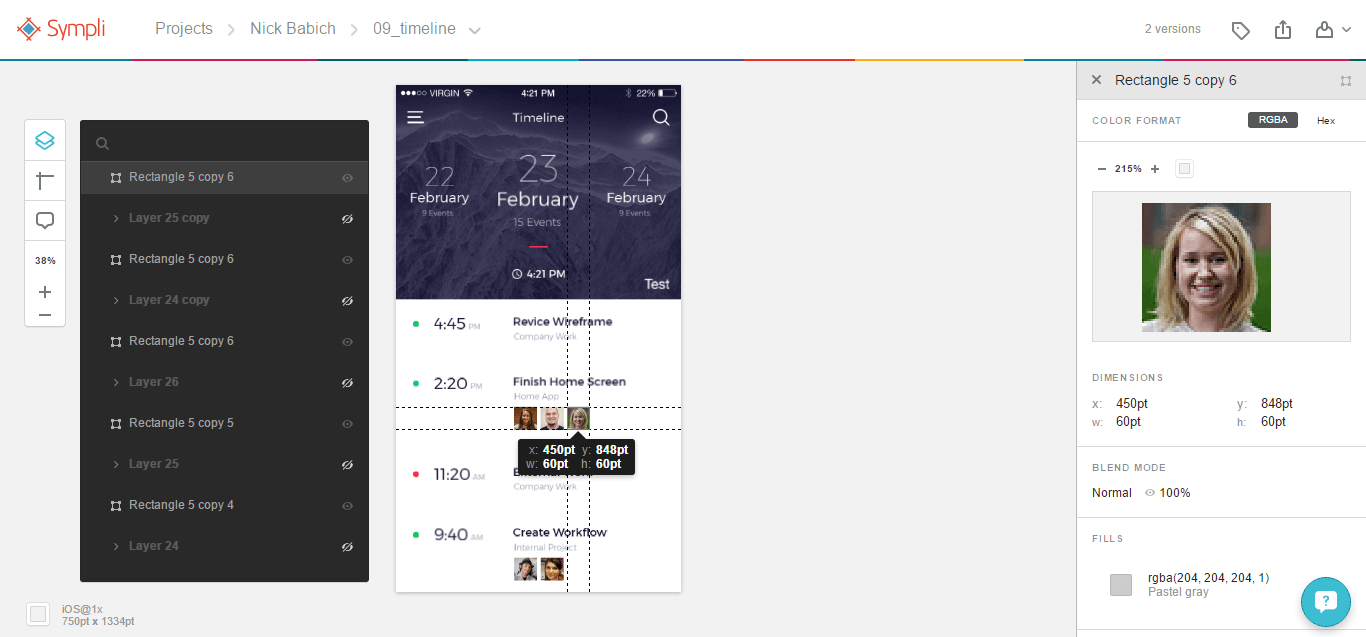
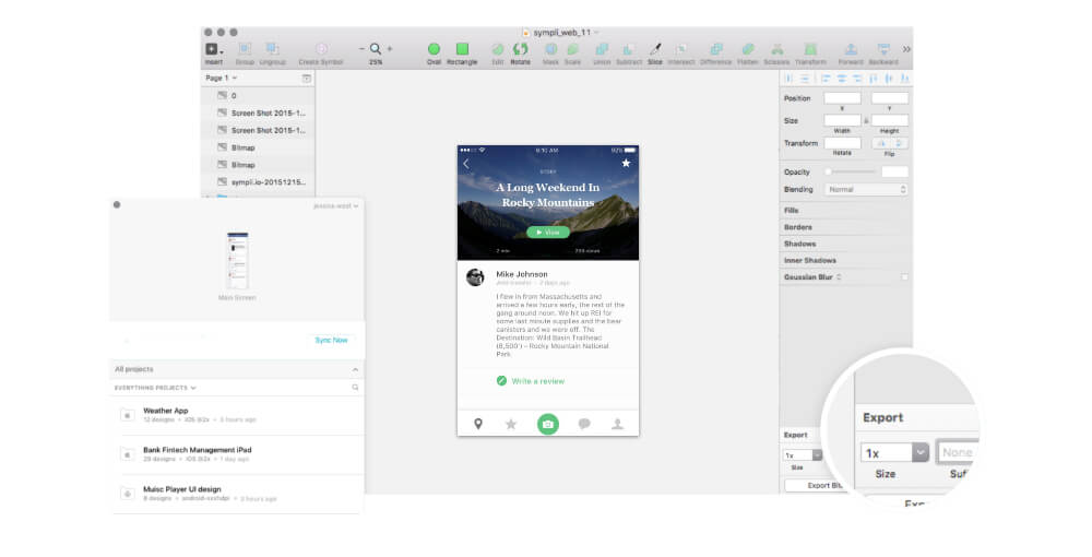
One of the best features of Sympli is the Ruler, a very useful measurement tool. Click on any element in the layout and track its relative position to the other elements. The measurements are presented in platform-specific units (depending on the destination: points for iOS, density-independent pixels for Android, and pixels for web projects).
Collaboration
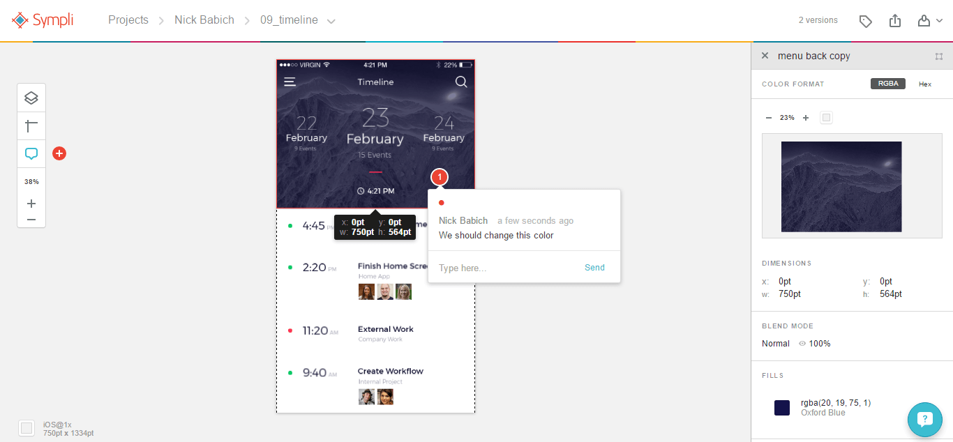
Sympli has a commenting tool, named Spots, that facilitates collaboration and helps to clarify points of confusion late in the design process.
Sympli seamlessly integrates with Slack. Whenever someone leaves a note or updates the design, a notification is posted to the Slack channel.
Bonus: Happy Developers
As mentioned, a big difference with Sympli is its extensions for the Android Studio and Xcode development environments. Sympli integrates fully with both IDEs, allowing you to bring designs and mockups from Photoshop and Sketch right into the environment where developers are working.
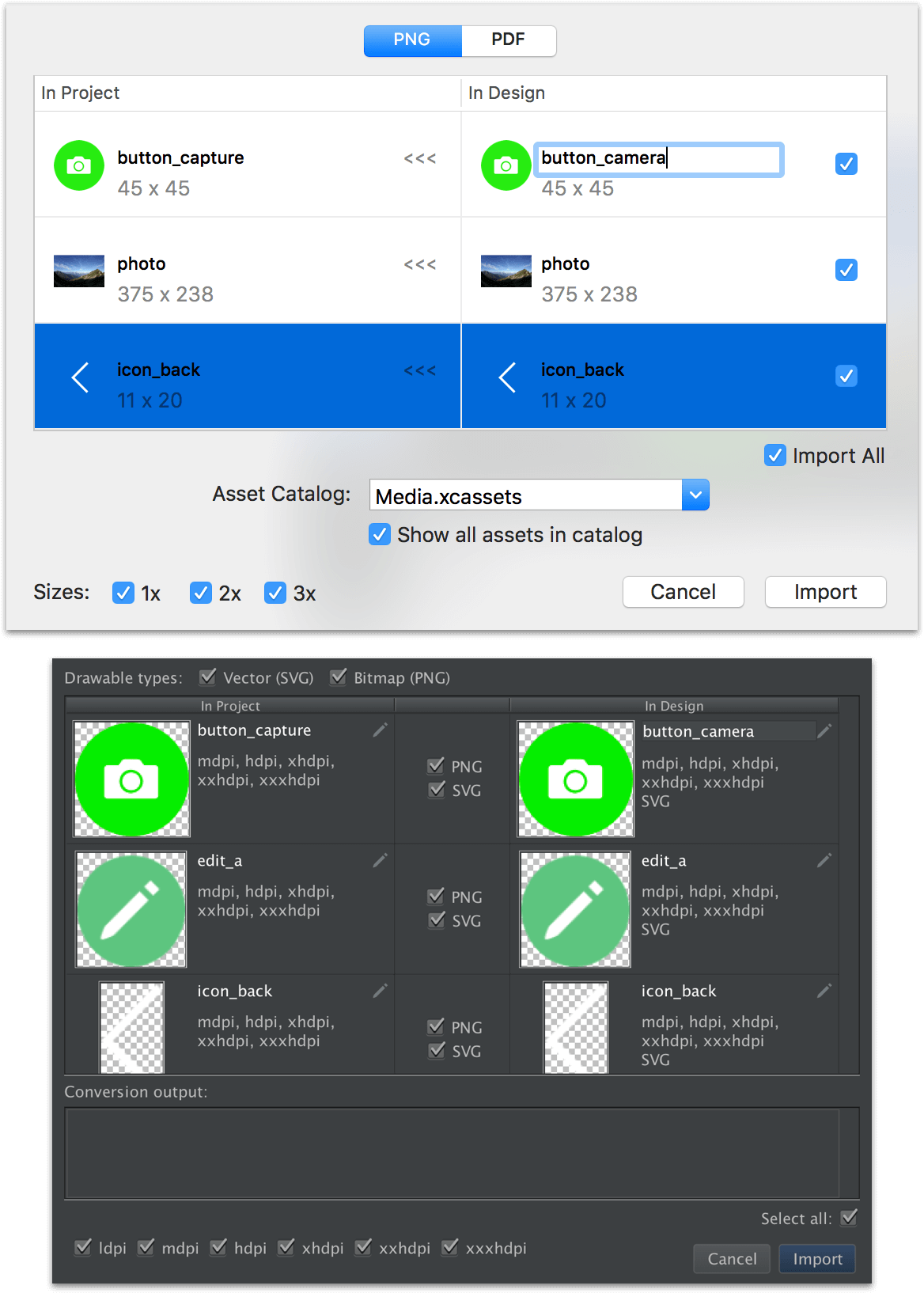
The IDE extensions provide several cool features, such as smart asset synchronization, which is a visual dialog that makes it possible to merge assets, showing you what is currently in the project and what you’ll have after the assets are synchronized. You can include or exclude individual assets.
A mind-blowing feature is the visual implementation of designs as storyboards. Basically, developers can drag and drop designs from mockups into interface-builder views, and the views will be styled in exactly the same way as the mockups, including both configuration and runtime properties:
You can even drag and drop styles from a design mockup right into a storyboard.
While Sympli automates code and tasks, it doesn’t introduce any third-party dependencies into a project, nor does it introduce any changes in the technical process. So, developers aren’t forced to use any frameworks or introduce any libraries into their projects.
Cost
Sympli charges based on the number of projects. The free plan covers one active project. The “Pro” plan is most common, with a price of $25 per month, which allows eight active projects to be run simultaneously. Each paid plan includes an unlimited number of collaborators and archived projects, along with great tech support.
Pros
- No desktop app (the rich web application has everything)
- Supports web and mobile app design (iOS and Android)
- The Xcode and Android Studio extensions take designs smoothly to development, giving developers some cool automation tools.
- Powerful collaboration features, such as Brandbooks (reusable style guides), company management features, and versioning
Cons
- UI is too minimal (it could definitely use a human touch and more personality).
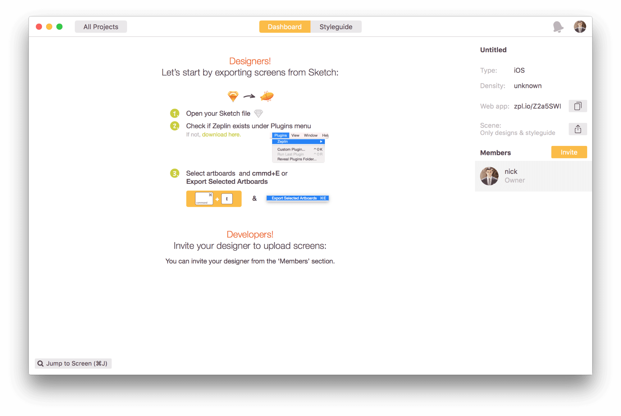
Zeplin
Zeplin is the last collaboration tool for UI designers and front-end developers we’ll be looking at. When a designer exports Photoshop or Sketch files to Zeplin (by selecting the artboard and pressing Command + E), all of the styles are communicated to the developers. In other words, the specification sheet is automated, similar to Sympli.
First Steps
When you enter the Zeplin website, you’ll immediately notice delightful details, such as the fun cartoon zeppelin logo. Little details like these provide visual stimulation and delight.

Onboarding consists of a basic tutorial video, which users see upon signing up. The video has enough information to get you started.
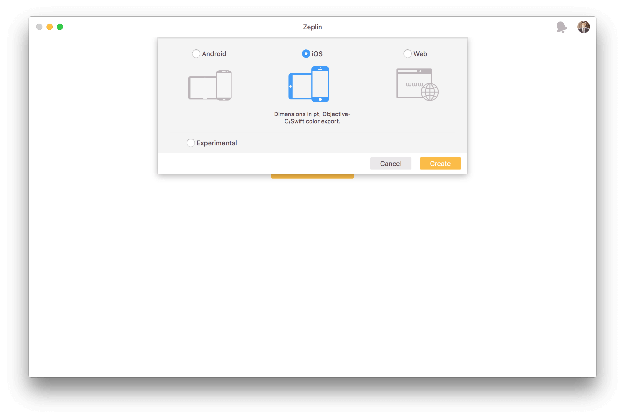
As with Avocode, users have to install a desktop application. Then they are asked what type of project they would like to create. Unlike Avocode, Zeplin supports not only web projects, but also Android and iOS. Let’s choose iOS.
Now it’s time to upload some designs. Zeplin has a powerful and delightful empty state, telling you what to do next.
Upload Design
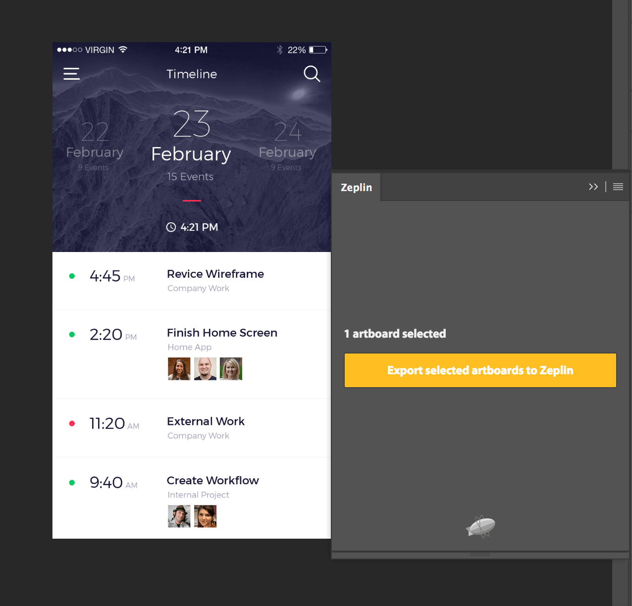
Zeplin doesn’t allow you to directly upload designs, and it works only as a plugin within Photoshop or Sketch, again similar to Sympli. Normally when you launch Zeplin, the plugin should be installed automatically, so uploading designs is only a couple of clicks away. In Photoshop and Sketch, you can export a whole design or individual objects.
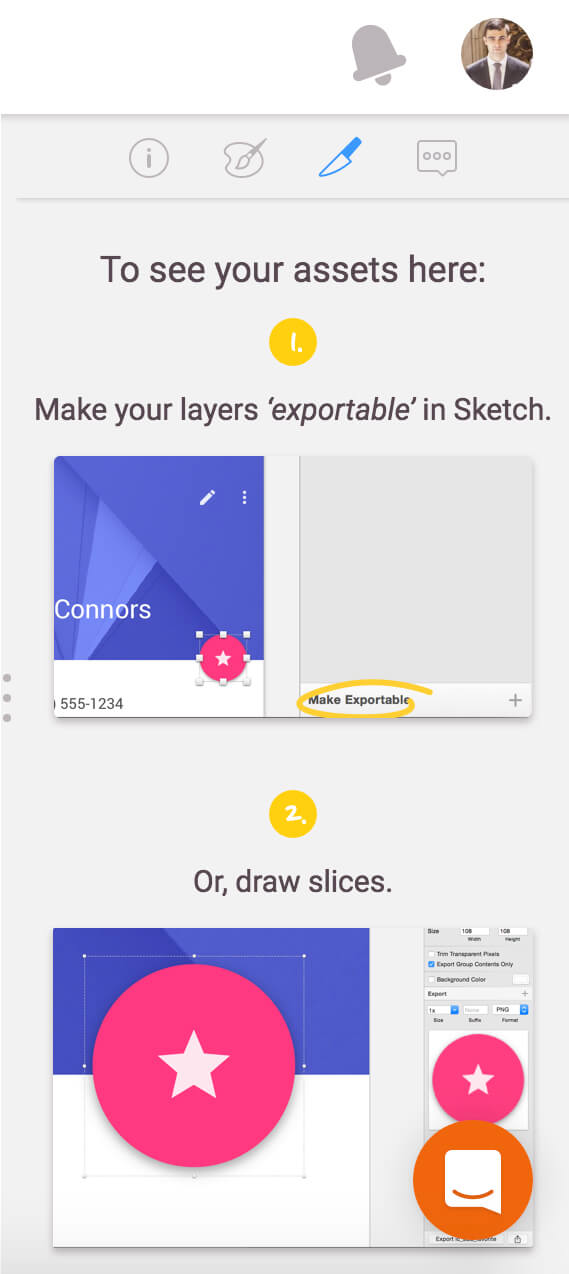
To see your assets in Zeplin, mark the layers as “exportable.” Again, the empty state will guide you step by step:
Once the designs have been uploaded, the project owner can invite people using a shareable link or send the link directly to the team members’ inboxes.
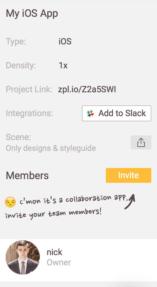
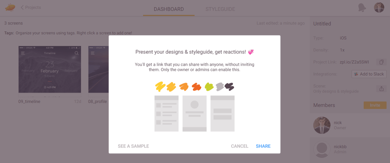
If you want some feedback on your designs or style guide, you can also use the sharing icon, next to the “Scene” menu item. You’ll see a dialog like the one below, which clearly explains how it works and even links to sample data.
User Interface
Productivity apps tend to be dry and lack any sort of personality. But Zeplin has managed to make the boring process of coordinating feedback somehow enjoyable. As soon as you upload your designs, they are turned into specifications and guidelines tailored to the platform you are working on (in our case, iOS).
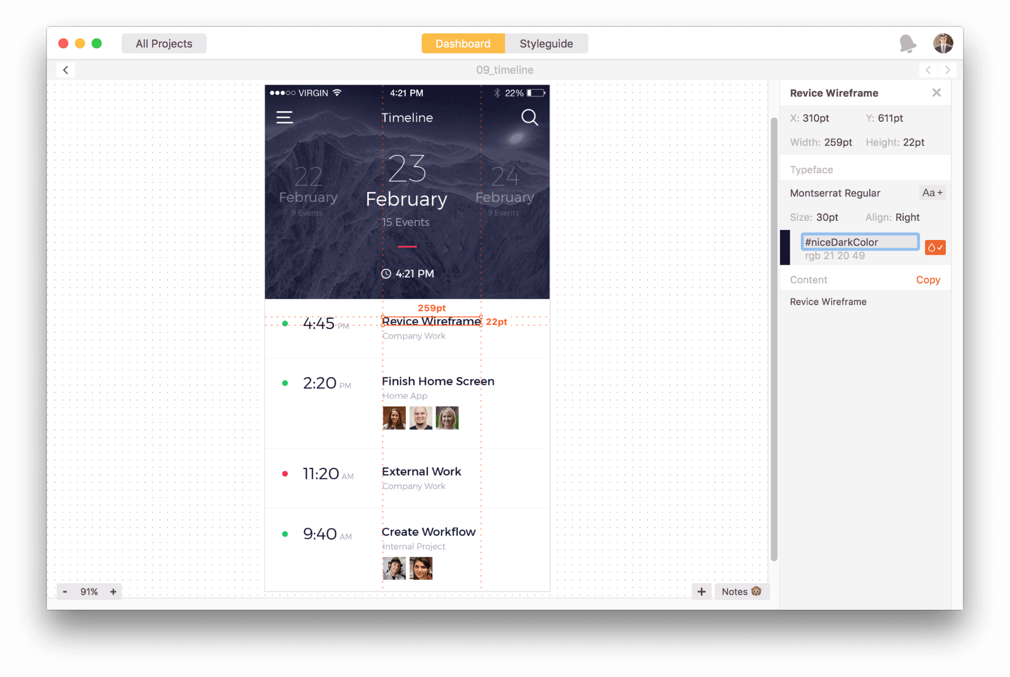
Unlike Avocode and Sympli, Zeplin doesn’t have a special set of tools for working with a design. It’s more of a viewing app, with asset-exporting capabilities and team-collaboration features. Developers can select a layer and see its size and all other necessary information (in the case of a text field, you would see the font’s name, size and color).
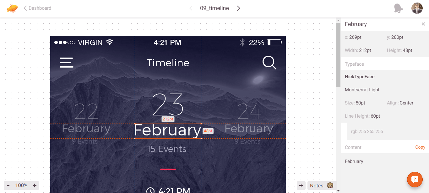
As you can see, all measurements are displayed in points (which iOS developers require). Also, all projects in Zeplin have a color palette, allowing you to name the selected colors.
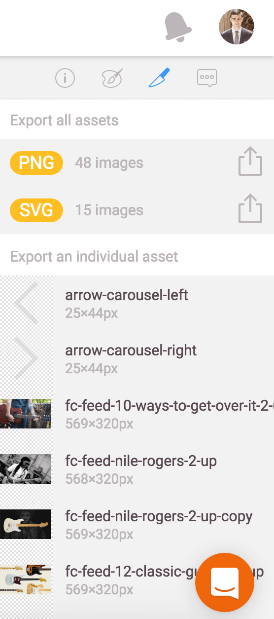
If you’ve made image assets exportable in Sketch, you’ll see them in “Assets” in Zeplin:
The colors and fonts used in a project are displayed in the “Styleguide” tab. You can rename these colors and export them if you plan to use them in your project. In general, this makes designing for iOS and Android Studio way more pleasant!
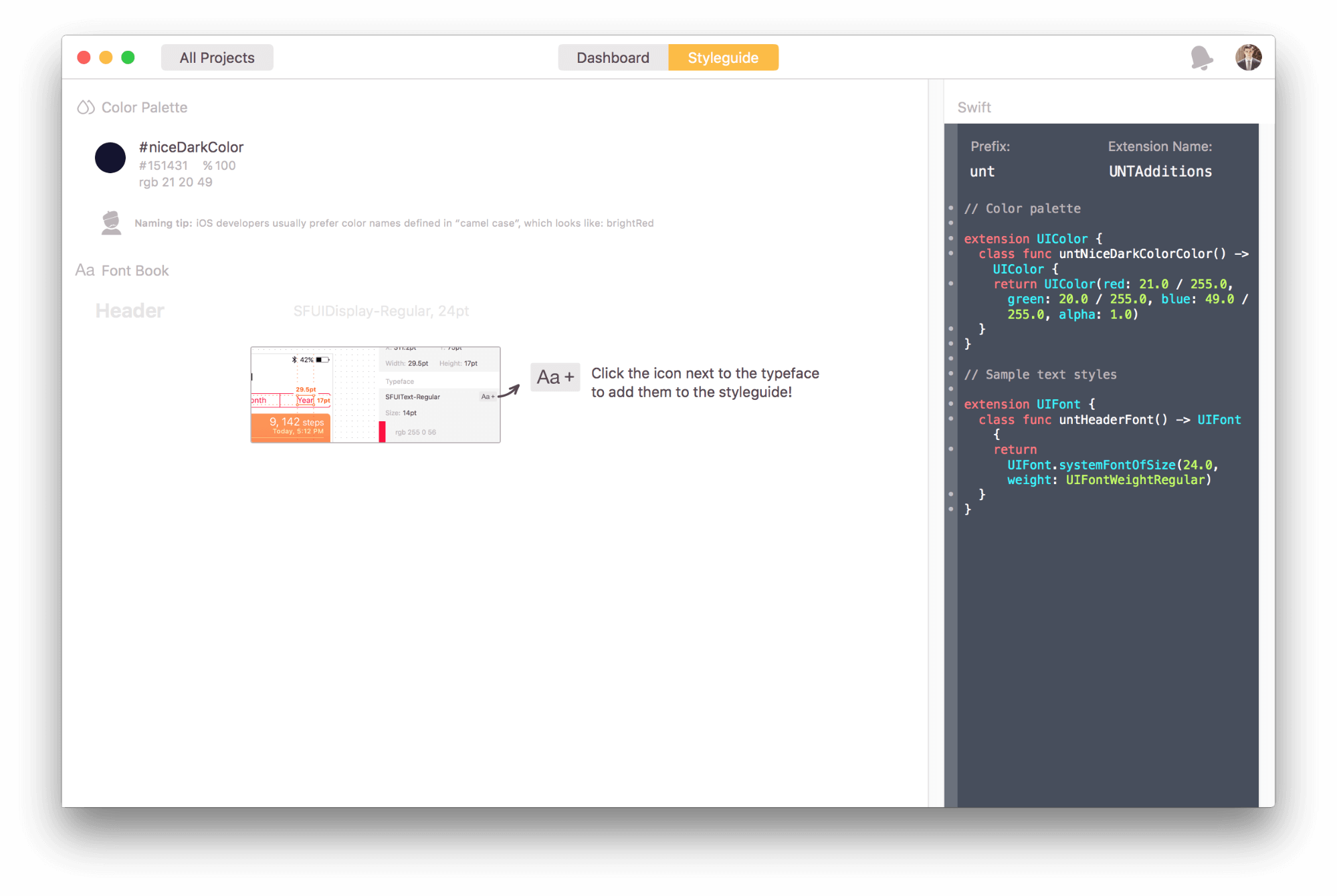
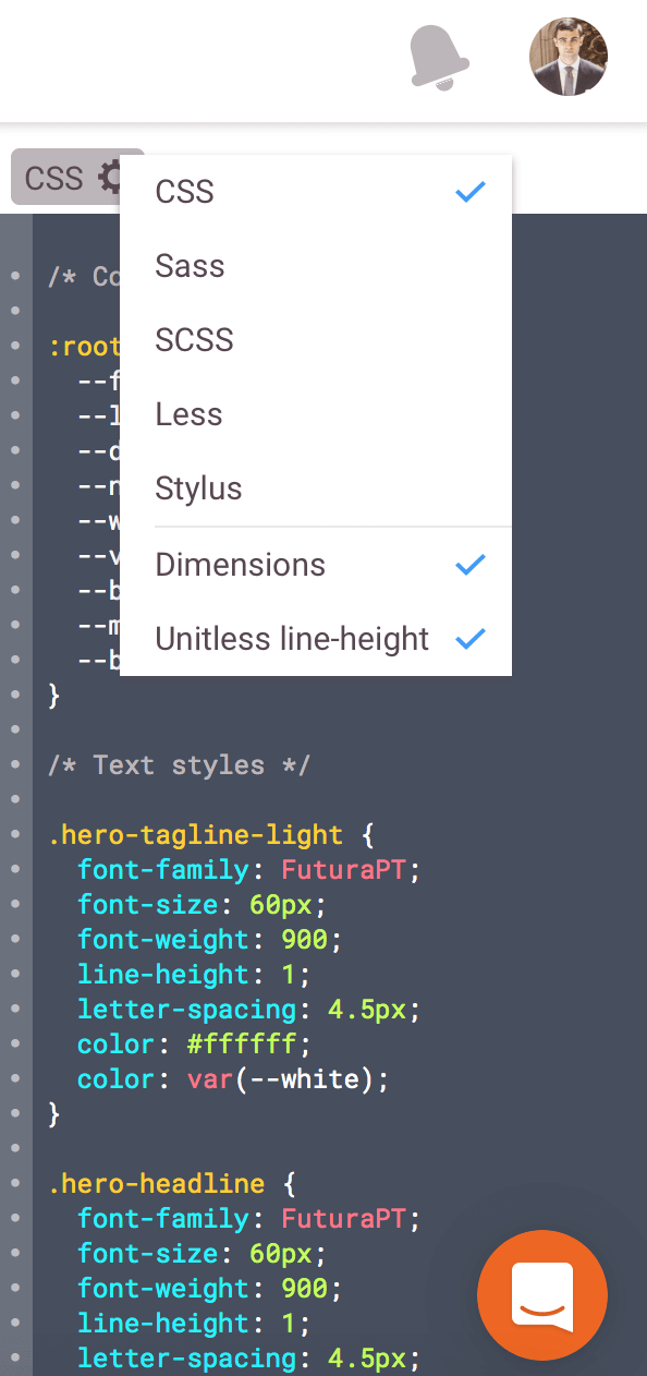
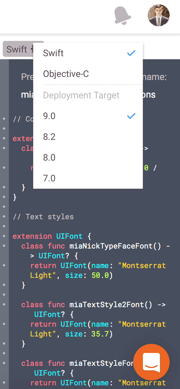
Developers can see, copy or download the CSS for web projects, the XML resources for Android projects, and the UIFont and UILabel extensions for iOS, both for the color variables and text styles, in the “Styleguide” section. Below are two examples:
Collaboration
Because its available as a standalone app as well as a web app, you can access Zeplin pretty much anywhere. Every screen in Zeplin has a link, which you can find in the right panel of the screen. So, if a team member has not installed the desktop app, they will still be able to see the project in the web application.
Last but not least, the tool’s annotation features allow team members to comment on parts of the app and use the result as a road map. This also helps to clear up any confusing parts of the specification process and preserves a record of the notes taken for anyone to review.
This streamlined process makes life so much easier for everyone involved.
Cost
Zeplin’s price is based on the number of projects. A free plan is available for single projects. The most common plan is “Growing business,” with a price of $25 per month to run eight active projects simultaneously. All plans include unlimited team members.
Pros
- The UI is minimalist, intuitive, friendly and just playful enough to make you grin.
- Supports web and mobile app design (iOS and Android)
Cons
- No measurement tool
- No versioning (or visual comparison) for designs
- You still need to export assets from Zeplin and then manually copy and paste or import the design specifications and styles to an IDE such as Xcode or Android Studio.
Tips On Selecting The Right Tool
Selecting the right product is always difficult, especially when you have several good options (as we do). All of the tools we’ve looked at are amazing, and I believe you’d enjoy using any. That being said, here are some tips to help you select the most suitable one:
- Avocode is great for web development projects. If you are in mobile app development, then go with either Sympli or Zeplin.
- Consider Sympli if you focus on web or mobile app development and would like full integration with Xcode and Android Studio to generate layouts (even from imported assets) for your initial designs. Sympli is great for large teams because of the corporate plans, version control and other features. There is also a lot of public information about updates and upcoming features, so you’ll be able to know what’s coming up in Sympli.
- You might be better off with Zeplin if your mobile app development projects are relatively small and you don’t frequently change a design, require detailed visual comparison between versions, or need color and font collections that can be used in other projects. Zeplin has a user-friendly and intuitive UI, which is important for team collaboration, especially first-time users.
Conclusion
All three tools focus on the pain points that designers and developers experience when working together. The tools cater to those two very different types of users with different functionality. But each balances those needs beautifully and helps teams iterate quickly by providing living, breathing, interactive specifications.
Say no to clunky, difficult-to-understand, flat specifications that take forever to generate. We now have tools to easily and accurately translate the vision for an app into the measurements needed to code it. This interactive approach to specifications allows teams to spend more time on what’s important: creating beautiful and functional designs and giving users the best possible experience.
Further Reading
- Not An Imposter: Fighting Front-End Fatigue
- A Front-End Developer’s Ode To Specifications
- Talks To Help You Become A Better Front-End Engineer In 2013
- An Actionable And Reliable Usability Questionnaire With Only 7 Items: Inuit
 (il, al, mrn)

