Ways To Reduce Content Shifting On Page Load

Email Newsletter
Weekly tips on front-end & UX.
Trusted by 182,000+ folks.
 Custom Web Forms for Angular, React, & Vue. Your backend.
 Celebrating 10 million developers


Have you ever opened a website, started reading and, after some time had passed and all assets had finished loading, you found that you’ve lost your scroll position? I undergo this every day, especially when surfing on my mobile device on a slow connection — a frustrating and distracting experience.
Every time the browser has to recalculate the positions and geometries of elements in the document, a reflow happens. This happens when new DOM elements are added to the page, images load or dimensions of elements change. In this article, we will share techniques to minimize this content shifting.
Media
When a website loads, it takes some time until the images are loaded and the browser is able to calculate the space needed. The following GIF, recorded with the throttling set to 3G, demonstrates the effect.
One way to avoid this is to set a fixed width and height for all images, but this isn’t practical for responsive websites because we want images and videos to adapt to the available space.
Intrinsic Ratio
With intrinsic ratios, also referred to as the padding-bottom hack, we can define the sizes that our media will occupy.

The formula for getting the value for padding-bottom is this:
(height of the asset / width of the asset) * 100(%)
If we have an image with a width of 1600 pixels and a height of 900 pixels, then the value would be this:
(900 / 1600) * 100(%) = 56.25%
Here is a Sass mixin we can use to define the aspect ratios of our images, videos, iframes, objects and embedded content.
@mixin aspect-ratio($width, $height) {
  position: relative;
  padding-bottom: ($height / $width) * 100%;
  img,
  video,
  iframe,
  object,
  embed {
    position: absolute;
    top: 0;
    left: 0;
    right: 0;
    bottom: 0;
  }
}
.ratio-sixteen-nine {
  @include aspect-ratio(1600, 900);
}
<figure class="ratio-sixteen-nine">
  <img src="waterfall.jpg" alt="Waterfall in Iceland">
</figure>
To make the experience even better, we can style the placeholder by adding a background to the wrapper.
figure {
  background: #ddd url(camera-icon.svg) no-repeat center center;
}
For images, we can use an icon to indicate to users that an image will appear. By implementing aspect-ratio placeholders, the user can decide whether to wait for the image or continue reading, all without losing their current scroll position.

Widgets
In addition to media content, your website might be using widgets or third-party content that is added via JavaScript and that would also shift content if not handled carefully.
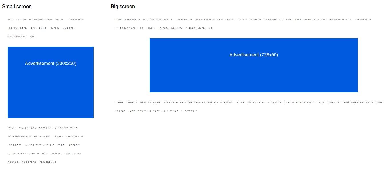
Advertisements
Although a lot of websites are responsive these days, most ads still have a fixed size. For a responsive website, we can use placeholders in our HTML, in which we load the predefined ads if they match the specified screen size.
/* On small screens show 320x250 banner */
@media all and (max-width: 500px) {
  .ad-container-s {
    width: 320px;
    height: 250px;
  }
}

/* On medium screens show 728x90 banner */
@media all and (min-width: 800px) {
 .ad-container-m {
   width: 728px;
   height: 90px;
 }
}
In our example, we have one medium rectangle (300 × 250) and one leaderboard (728 × 90). On small screens, we would show the rectangle, while on bigger screens we would show the leaderboard. By setting fixed dimensions for the placeholder, the loading of the ads won’t trigger a content shift.
Many people will never see the ads, but only the empty placeholder, because they will be using an ad blocker, or the advertisement won’t show up for other reasons. Therefore, you should style the placeholder to indicate that there is normally an ad. If you are already using an ad-blocker detection script, you can replace the placeholder with a message or a promotion of your products.
Users might even rethink the use of an ad blocker on your website if the ads have one less disadvantage — that distracting jump effect.
Dynamic Content
For other widgets, we might not know their exact sizes beforehand, but we can define the minimum heights the widgets will require.
.widget {
  min-height: 400px;
}
By using min-height, we will reserve enough space for most cases and avoid a big jump if the widget needs more space.
Finding the right size for min-height takes some time, but users will be thankful that their reading experience has not been abruptly interrupted.
Web Fonts
Fonts have different x-heights. Therefore, our fallback font and web font will take up a different amount of space.
Currently, one best practice for loading web fonts is to use the Font Face Observer script to detect when a font has loaded so that it can be applied in the CSS afterwards.
In this example, we are applying the webfont-loaded class to the html element once the web font is ready to use.
var font = new FontFaceObserver('Lato');

font.load().then(function () {
  document.documentElement.className += " webfont-loaded";
});
In the CSS, we apply the web font once it has successfully loaded.
p {font-family: sans-serif;}

.webfont-loaded p {font-family: 'Lato', sans-serif;}
When the web font finally finishes loading, we will notice a quick jump. To minimize this, we can modify the x-height of the fallback font to match the web font as closely as possible, thus reducing the jump.
font-size-adjust
The font-size-adjust property allows you to specify the optimal aspect ratio for when a fallback font is used. For most fonts, the ratio is between 0.3 and 0.7.
To find the right aspect ratio for your web font, I recommend setting up your browser to show two paragraphs side by side, one with the web font and the other with the fallback font, and then adjust the property with your browser’s developer tools.
p {
  font-size-adjust: 0.5;
}
Because font-size-adjust is currently supported only in Firefox and Chrome (behind a flag), we can use a combination of letter-spacing and line-height to adjust the size of the fallback font in other browsers.
p {
  font-family: sans-serif;
  font-size: 18px;
  letter-spacing: 1px;
  line-height: 0.95;
}

/* Older browsers */
p {
  letter-spacing: 1px;
  line-height: 0.95;
}

/* If browser supports font-size-adjust, use this */
@supports (font-size-adjust: none) {
  p {
    letter-spacing: 0;
    line-height: 1;
    font-size-adjust: 0.59;
  }
}

/* Once the web font has loaded, apply this */
.webfont-loaded p {
  font-family: 'Lato', sans-serif;
  letter-spacing: 0;
  line-height: 1;
}
Here, we are defining letter-spacing and line-height as a fallback first, and we are using @supports to feature-detect and then apply font-size-adjust if it is supported.
We won’t get a perfect solution for all fonts, but it will minimize the distraction when the typeface changes.
Layout
Until now, we have covered media, widgets and fonts, but the content could also shift when the CSS for the main layout gets applied.
Flexbox Vs. Grid
Flexbox can cause horizontal shifting, as shown by Jake Archibald.
With flexbox, the content controls how the layout is displayed, whereas with grid layouts, the layout is displayed according to the grid definition. Therefore, using grid for the main layout is better.
You probably won’t see the content shift if you’re developing on a fast machine with a great Internet connection, but users who are surfing on a slow connection will.
.wrapper {
  display: flex;
}

.sidebar {
  flex: 1 1 30%;
}

.content {
  flex: 1 1 70%;
}

/* Use grid instead of flexbox if supported */
@supports (display: grid) {
  .wrapper {
    display: grid;
    grid-template-columns: 30% 70%;
  }

  .sidebar {
    grid-column: 1;
  }

  .content {
    grid-column: 2;
  }
}
Support for CSS grid layouts isn’t very good at the moment, but it will increase in the next month when Safari 10 ships, and Firefox and Blink-based browsers will probably enable it by default. To be future-proof, we should use flexbox as our foundation and enhance the experience with a grid layout if it is supported.
Little Big Details
Changing CSS properties based on user interaction can often cause horizontal shifting. This can be avoided by using alternative CSS properties.
text-shadow For Bold Text
When changing the font weight of text, the size of the element will change and a content shift will occur.
a:hover,
a:focus {
  font-weight: bold;
}

@supports (text-shadow: none) {
  a:hover,
  a:focus {
    font-weight: normal;
    text-shadow: 1px 0 0 currentColor;
  }
}
Redrawing text-shadow can be computationally more intensive than changing font-weight, but it is the only way to prevent the jump effect when changing to a heavier weight of text.
Once again, we are using feature-detection to apply text-shadow, instead of font-weight, upon interaction from the user. Because @supports is supported by fewer browsers than text-shadow, we could also consider using Modernizr to detect the feature and apply the improvement in all supported browsers.
Small details will often make a good experience great. Your users will appreciate every content shift that is avoided.
Scroll Anchoring
Now that you’ve learned about ways to avoid content jumps, you might be wondering why browsers can’t prevent content jumps more efficiently.
The Chrome team recently introduced scroll anchoring, which does exactly that.
Scroll anchoring is a proposed intervention that adjusts the scroll position to reduce visible content jumps.
At the moment, scroll anchoring is only available behind an experimental flag in Chrome, but other browser vendors have shown interest and will hopefully implement it in future.
Conclusion
As you can see, there are many solutions for avoiding the jump effect on page load. Yes, implementing all of these techniques would take some time, but it is totally worth it — until scroll anchoring is supported in more browsers.
If you take the time to avoid jumps by using the techniques mentioned above — defining placeholders, reserving space and preparing for fallbacks — then users will have a less annoying experience and will be able to enjoy your content without interruption.
How do you minimize content shifting on your websites? Have you discovered any particular tricks or techniques to prevent the jump effect?
Front page image credits: Rayi Christian W.
Further Reading
- The State Of Responsive Web Design
- How To Create An Embeddable Content Plugin For WordPress
- Content Security Policy, Your Future Best Friend
- Getting Started With Neon Branching
 (il, al, mrn)

