Building Social: A Case Study On Progressive Enhancement

Email Newsletter
Weekly tips on front-end & UX.
Trusted by 182,000+ folks.
 Register for Free


 Celebrating 10 million developers
 Custom Web Forms for Angular, React, & Vue. Your backend.
We talk a lot about progressive enhancement and how it improves backwards compatibility. But how straightforward is it to apply progressive enhancement concepts to a real-life project? When designing a rich interactive experience, it can be difficult to determine what can be implemented purely using HTML and CSS and what absolutely requires JavaScript.
Through this case study on redesigning the Building Social website, we’ll share some simple yet often overlooked front-end techniques that defer the use of JavaScript as much as possible, while providing some neat JavaScript enhancements, too.
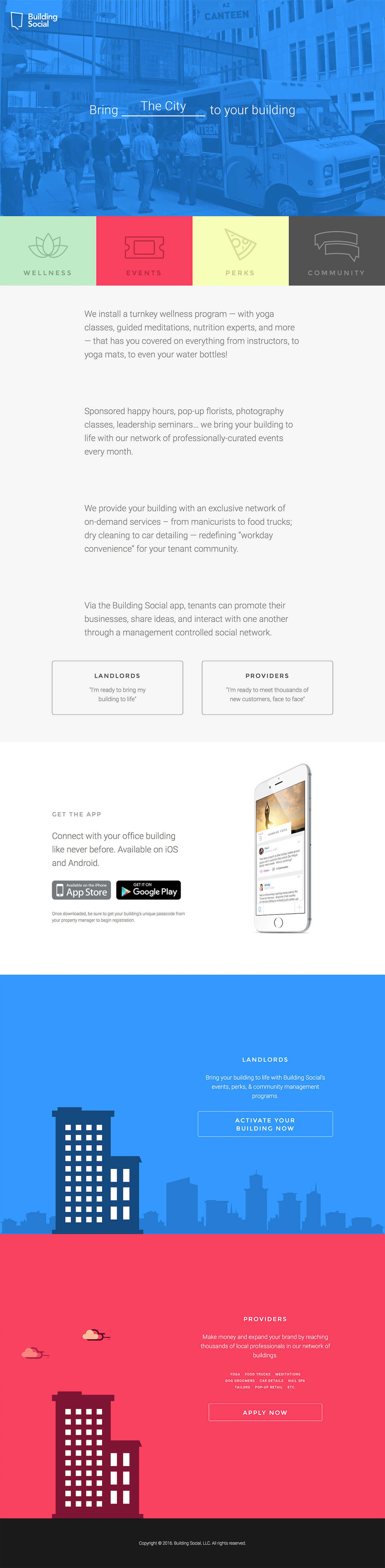
Introducing Building Social
Building Social is an invitation-only app that connects people who share an office building — who might otherwise never meet — into a building-specific social media platform. People are able to access building events, conversations, likes, replies, trivia contests, a marketplace, and one-click reporting to and from the building’s management, as well as receive emergency and general information notifications.
The initial one-page design concept for the Building Social website was art directed by Patrick Riley and Paul Stanton from their New York office. We were handed a static mock-up of the design concept, along with a video mock-up of how various elements should move. Our job was to experiment with the design further and, more importantly, to bring it to life in the browser.
Considering that the project was relatively small in size, there was no need to establish a specific design or development strategy — unlike, for instance, with the SGS project. This meant we were able to focus predominantly on the implementation and a number of specific progressive enhancement challenges, including:
- automated versus synced string swapping;
- static versus dynamically blended section backgrounds;
- manual versus scroll position-based animation toggling;
- pure-CSS modal-box forms enhanced with JavaScript.
Everything Except HTML Is An Optional Extra
Our first task was to set a baseline experience by applying properly structured and semantic HTML to all of the design elements. Considering that Patrick and Paul wanted to make use of video content, we also had to ensure there was a fallback for video content.
Challenge 1: Automated Vs. Synced String Swapping
At first glance, the header appears to be just pure decoration. However, it actually contains usable content, promoting several key features of the Building Social service. Patrick and Paul wanted to include a video feature in the header, too, with each video scene associated with a specific service feature.
Progressive enhancement summary:
- Mark up key service features in an HTML unordered list to provide a baseline experience should the video, JavaScript and/or CSS fail to load.
- Animate service features via CSS keyframe animations.
- When the video loads, swap out each service feature after each subsequent scene change, while keeping it in sync with the video playhead.
Having established the baseline HTML experience, we tried simply to animate the list of service features independent of the video using CSS keyframe animations, as each scene lasts for 3 seconds (21 seconds in total). Below is our original CSS snippet:
.list-options li { animation: animate_options 21s linear infinite; }
.list-options li:nth-child(1) { animation-delay: 0s; }
.list-options li:nth-child(2) { animation-delay: 3s; }

/* … and so on. We actually used a Sass
snippet that specifies the animation delay
value for each item:

@for $i from 1 through 7 {
  .list-options li:nth-child(#{$i}) {
    animation-delay: #{($i*3)-3}s;
  }
}
*/
*/
@keyframes animate_options {
    /* 0s   */  0%      { opacity: 0; bottom: -10vw; }
    /* 0.3s */  1.4%    { opacity: 1; bottom: 0; }
    /* 1.5s */  7.1%    { opacity: 1; bottom: 0; }
    /* 2.7s */  12.6%   { opacity: 1; bottom: 0; }
    /* 3s   */  14%     { opacity: 0; bottom: -10vw; }
    /* 21s  */  100%    { opacity: 0; bottom: -10vw; }
}
Perhaps not the most elegant CSS snippet you’ll ever see, but it certainly did the job. However, we were fully aware that there might be times when the video fails to load altogether or when JavaScript fails to initiate properly. In such instances, a static background image is displayed with each service feature, swapped out according to the keyframe timings seen in the CSS snippet above.
When the video fully loads, we then have to ensure that each service feature remains in sync after every scene change:
While we could have simply relied on CSS keyframe animations, the risk was that the animated list would quickly get out of sync should the video finish loading after the other assets. The solution: synced string swapping and a small snippet of JavaScript to keep track of the playhead position.
When the JavaScript loads, it begins to track the video’s playhead position, with the service feature string being swapped out depending on the retrieved value. This is done by listening to the timeupdate event in JavaScript (with jQuery) and toggling the class name for the respective element whenever the video’s currentTime matches the condition:
$('video').on('timeupdate', function() {
  var ct = $('video')[0].currentTime;
    var j = Math.floor(ct + 0.9);
    var k = Math.floor(ct / 3);
    if (j > 0 && j % 3 == 0) {
        $('.list-options li').removeClass('current');
    } else {
        $('.list-options li').eq(k).addClass('current');
    }
});
You may have also noticed that we used a factor of 0.9 to toggle the class before the actual scene change? This allows enough time for the animation to execute properly, while the animation itself is still controlled via CSS:
.list-options li { bottom: -10vw; opacity: 0; transition: all .3s ease; }
.list-options li.current { bottom: 0; opacity: 1; }
Challenge 2: Static Vs. Dynamically Blended Section Backgrounds
By default, each page section has a designated background color, along with one or more background images. Nothing too extravagant there, except that the New York team really wanted the section backgrounds to smoothly blend into each other as the user scrolls down the page.

Progressive enhancement summary:
- Set static background colors by default for each page section.
- Apply enhanced background blending via JavaScript.
Blended backgrounds aren’t something you see or work on every day. Nevertheless, some interesting examples are already out there; for instance, the website for the design agency ustwo. To create this effect consistently when the user scrolls, we had to use JavaScript, but only as a progressive enhancement. After researching and testing a number of promising JavaScript-based libraries, we settled on Scroll Magic for two reasons:
- It is well documented, with plenty of examples that could be applied to what we needed.
- It is lightweight, weighing in at 8 KB.
Our initial idea was to detect the position of each successive page section in order to apply the relevant CSS background gradient. However, it soon became apparent that no gradient was being applied whenever we stopped scrolling! Because only a single solid background color was applied to the body element, the gradient was indeed an optical illusion created by the scrolling:
Upon realizing that we had been the victims of an optical illusion up to that stage, we discarded the gradient idea. Instead, we decided simply to create a motion tween between the solid background colors of the adjoining page sections whenever the user scrolls down the page:
var bodyBackground = function() {

    // TRANSITION FROM GRAY TO WHITE
    var overviewHeight = parseInt($('#overview').height());
    new ScrollMagic.Scene({
    triggerElement: '#overview',
        offset: overviewHeight,
        duration: overviewHeight / 2
    })
    .setTween('body', { backgroundColor: ‘white' })
    .addTo(controller);

    // TRANSITION FROM WHITE TO BLUE
    var theAppHeight = parseInt($('#the-app').height());
    new ScrollMagic.Scene({
        triggerElement: '#the-app',
        triggerHook: 1,
        offset: theAppHeight,
        duration: theAppHeight / 2
    })
    .setTween('body', { backgroundColor: ‘blue' })
    .addTo(controller);

    // TRANSITION FROM BLUE TO RED
    var audiencesHeight = parseInt($('#providers').height());
    new ScrollMagic.Scene({
        triggerElement: '#audiences',
        offset: audiencesHeight,
        duration: audiencesHeight / 2
    })
    .setTween('body', { backgroundColor: ‘red' })
    .addTo(controller);

}
Having established that this approach works, we then adopted a similar configuration, using Scroll Magic again, to trigger scene animations that are tied to the scroll position. But before we attempted to do that, we had to make sure that these animations could be triggered without having to rely on JavaScript.
Challenge 3: Manual Vs. Scroll-Position-Based Animation Toggling
We really wanted to incorporate the idea of movement whenever the user scrolls down the page, but at the same time ensure that it isn’t overwhelming (as is often the case with a lot of websites that contain the parallax effect).
Progressive enhancement summary:
- Use a CSS
:hoverpseudo-class to toggle animations by default. - Toggle animations based on the scroll position using JavaScript.
For simple animations that are not central to the content, the animation options available in CSS are more than sufficient. For instance, the animation length and timing functions, coupled with some of the animatable CSS properties such as positioning, margins and opacity, go a long way. Furthermore, if any elements in a single scene don’t require any specific independent interaction, then only a single event is needed to trigger all of the animation elements.

:hover pseudo-class (View large version)In our case, because the sections were 100% wide, we were able to trigger the animation in each section by using the :hover pseudo-class. Doing so gave us a quick and unobtrusive way to trigger the animations without having to use JavaScript. However, this method doesn’t work on touch-enabled devices, and considering that animations are, for the most part, visual enhancements, we decided to discard them for small viewports.
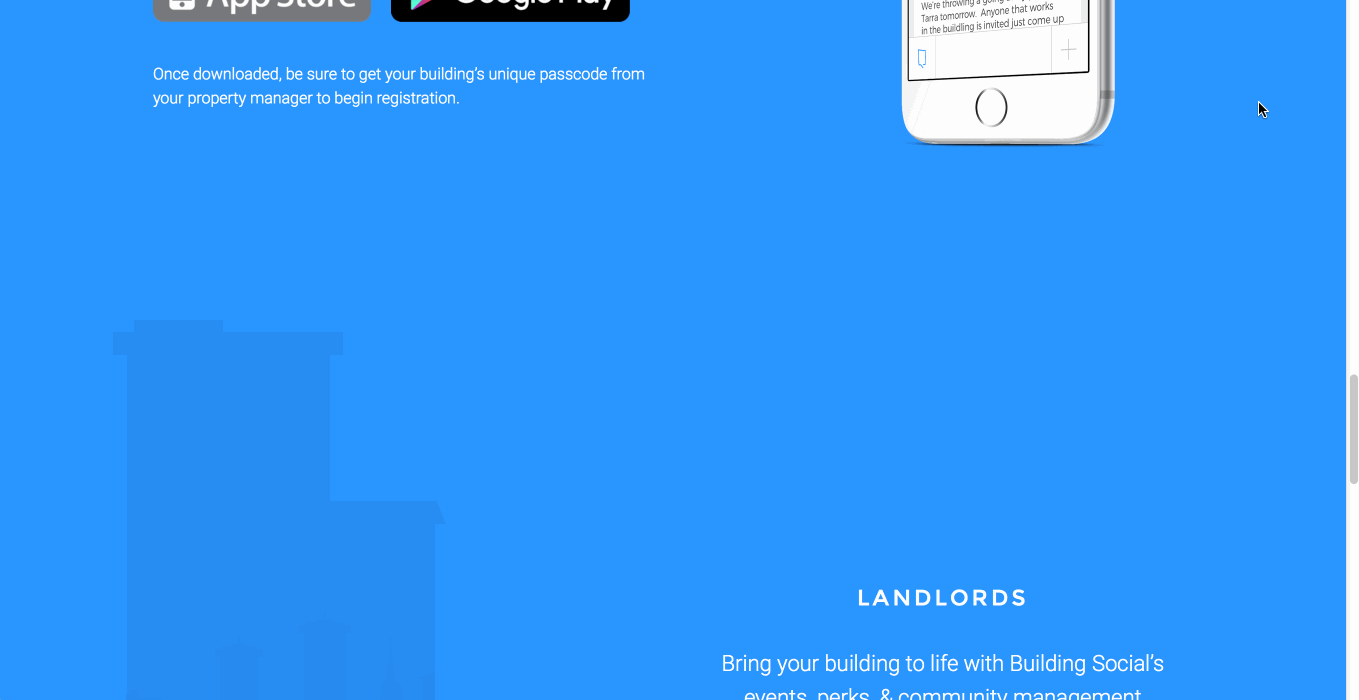
Upon detecting that the JavaScript has fully loaded, we trigger the animations based on the scroll position. By also including background elements in the animations and by separately adjusting the timings for each, we are able to control each individual scene more precisely, thus enhancing the overall experience.
Challenge 4: Pure-CSS Modal-Box Form Enhanced With JavaScript
Considering that the initial concept was a one-page design, with two distinct calls to action (i.e. for landlords and “providers”), we really wanted to ensure that the user isn’t taken away from the page. Furthermore, due to the floating text on the right, progressively disclosing any subsequent contact forms below each call to action would not have been ideal. Therefore, modal boxes were the best solution.
Progressive enhancement summary:
- Toggle modal boxes by default using only semantic HTML and CSS.
- Enhance the experience by introducing inline validation and form submission that does not require page reloading via JavaScript.
Toggling elements on and off is very easy when you write semantic HTML, meaning that elements can be progressively enhanced without polluting the actual code. For instance, by ensuring that each toggled element has a semantic id attribute and anchor link (one that points to the same id), we were able not only to provide hooks to support interesting interactions, but also to dramatically improve the accessibility and usability of the unstyled page.
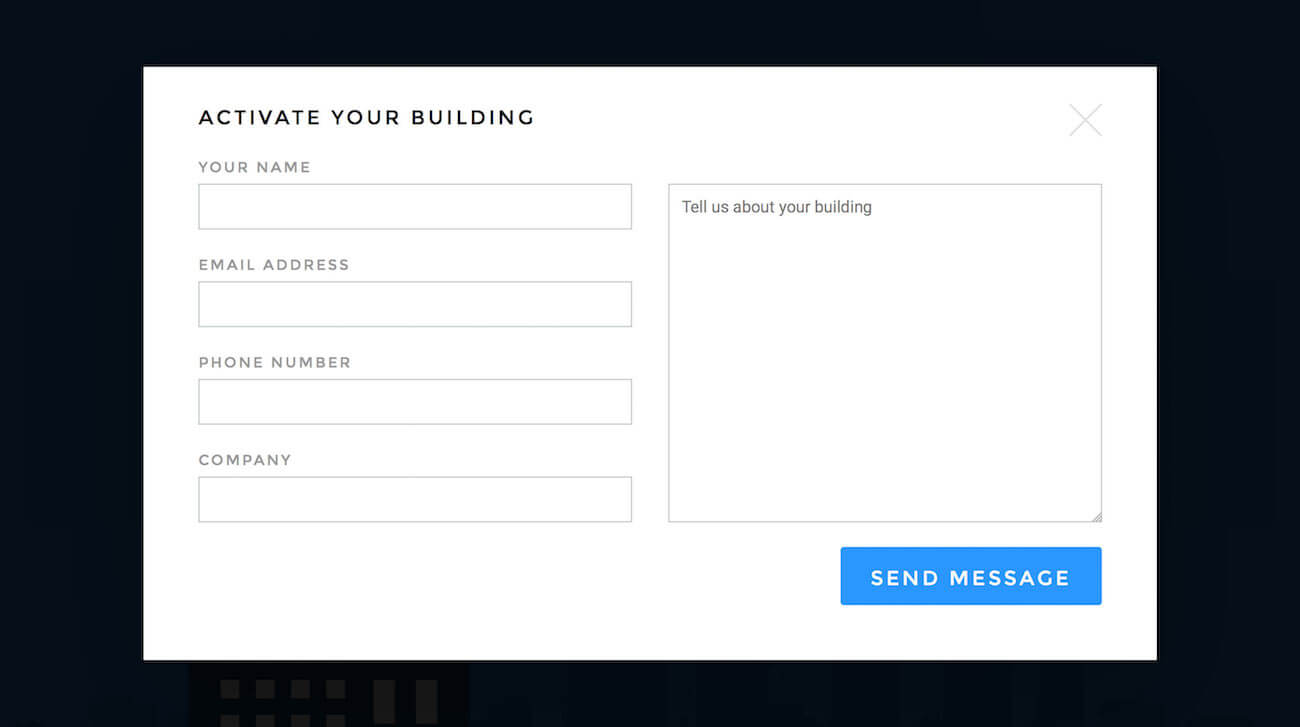
But how exactly can anchor links toggle modal boxes? CSS :target pseudo-class to the rescue! Whenever an element’s id matches the hash string in the browser’s address bar, the :target pseudo-class gets triggered, meaning that the element can also be styled differently. Furthermore, the CSS is quite simple:
/* E.g. URL https://yoursite.com/ */
#modal-contact { display: none; }

/* E.g. URL https://yoursite.com/#modal-contact */
#modal-contact:target { display: block; }
If you’re aware of the :target pseudo-class technique (after all, it has been around for quite some time now), then you will have probably used it already to toggle elements without having to rely on JavaScript.
When you also include a second anchor link that refers back to the initial anchor element (or its parent), you’re then able to use it as a “close” link. This is because the :target pseudo-class, which matches the modal box’s id, is no longer active when the “close” link is clicked. Here’s a quick example:
<div id="section-01">
  <a href="#modal-contact">Contact us</a>
</div>
<div id="modal-contact">
  <!-- contact form -->
  <a href="#section-01">Close</a>
</div>
In addition, when you anchor to the element from which the modal was initially toggled, it will set the page precisely back to its position before the user activated the modal.
We can push the use of the :target pseudo-class even further. Let’s say the modal box contains a web form, and we want to display the result of the form submission in that same modal box (for instance, as a confirmation message).
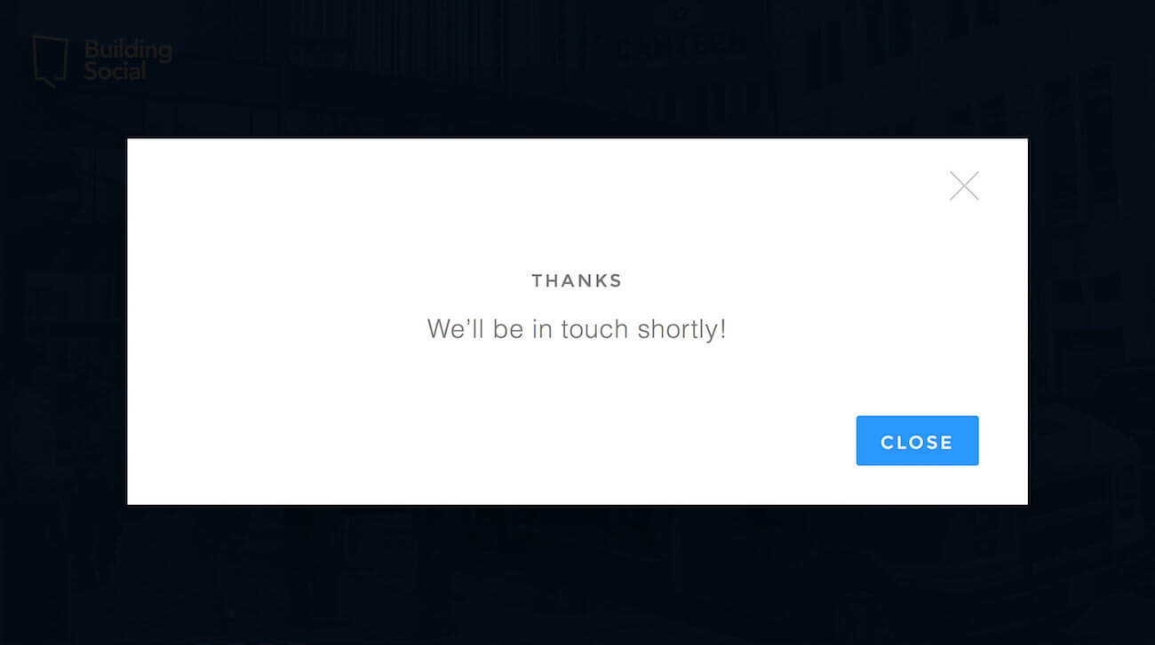
To do so, we simply need to add a hash id (an id identical to the modal box’s id) to the resulting URL — the same one we send to the user after they have submitted the form. Here is a simple example using a header redirect in PHP:
<? header('Location: https://yoursite.com/#modal-contact'); ?>
On a really fast Internet connection, it will appear as if the browser has never reloaded the page. On a slow connection or a less-capable device, instead of reloading the page and positioning it towards its head, the browser will automatically skip to the confirmation message, thus dramatically improving the user experience.
With this basic functionality in place, we can enhance it further with JavaScript by introducing inline validation and form submissions that do not require full page reloads (using a good ol’ XML HTTP request (XHR), otherwise known as AJAX). Doing so not only will shave off a bit of time, but will make the experience more convenient if there happen to be any input errors.
Lastly, why not provide support for closing the modal box with the Escape key? Following the same principle of toggling classes and anchoring to different elements, the code required to do so is relatively simple:
$(document).on('keyup', function(e) {
    // If there is a visible modal, i.e. .md-show…
    if (e.keyCode == 27 && $('.md-show').length) {

        // Store the target from the modal's close link…
        var newTarget = $('.md-show .md-close').attr('href');

        // Hide the modal
        $('.md-show').removeClass('md-show');

        // Position the page to the stored target
        document.location.hash = newTarget;
    };
});
Taking everything we have discussed into account, below is a list of progressive enhancement options for the modal-box contact form:
- Toggle and close the model box purely with CSS — JavaScript not required.
- Enable basic HTML5 validation using the
requiredattribute and proper input types (for instance,type="email", which will validate the entry against the correct email address pattern) — JavaScript not required. - Fully reload a form submission, automatically opening the form in a modal box, and returning a confirmation message or a server-side-validated error message — JavaScript not required.
- Validate input fields inline — requires JavaScript and duplicate validation logic on both the client side and server side, which could prove difficult to maintain.
- Submit forms via XHR and return a confirmation message or a server-side-validated error message without reloading the page or closing the modal box.
- Additional enhancements are possible — for instance, closing the modal box with the Escape key.
If the form is relatively simple and sent to the server using XHR, then step 4 can be skipped; otherwise, depending on the project, this will create unnecessary maintenance overhead. However, as you’re probably aware, forms should always be validated server-side, even if you implement client-side validation.
Bonus Tip: The Illusion Of Randomness
What do you think of first when you need to randomize something on the client side? Does it involve JavaScript’s Math.random() by any chance?
For this project, we wanted to randomize the clouds in the “Providers” section (the red section), to mimic real cloud movement in nature. Clouds generally sit at different heights, but move more or less in the same direction. Also, from the viewer’s perspective, clouds often appear to travel at different speeds relative to each other.

This resulted in an animation that uses the same traveling distances but is set at different durations:
.cloud-01 { animation: clouds 7s linear infinite; }
.cloud-02 { animation: clouds 5s linear infinite; }
.cloud-03 { animation: clouds 10s linear infinite; }

@keyframes clouds {
    0%  { opacity: 0; margin-left: 0; }
    50%     { opacity: 1; margin-left: -100px; }
    /* By hiding the cloud at 80%, we provide a break during which the cloud is hidden. */
    80%     { opacity: 0; margin-left: -200px; }
    100%    { opacity: 0; margin-left: -200px; }
}
The technique above proves that sometimes there is no need to use JavaScript. If we step back and revisit the problem and goal, we can achieve the same result simply by using readily available and widely supported technologies but in a much smarter way.
Conclusion: It Can Be Done!
Some of the aforementioned techniques can also be readily applied to other UI elements, such as tabs, tables and dropdowns. By using native HTML functionality, coupled with pseudo-selectors and CSS animation, you can provide relatively simple yet engaging interactive experiences, requiring little effort on your part.
While there’s certainly nothing wrong with using JavaScript to enhance an experience, considering that Javascript-based animation can be just as fast as CSS-only animation, do think about semantics, accessibility and performance before diving head first into any solution. Semantic HTML in particular, which has been widely evangelized for many years, reinforces the meaning of content through markup rather than through its presentation. Therefore, investigate multiple options — in most cases, you’ll be able to identify the least complex solution.
Finally, by being creative and using the basic tools at your disposal, you can improve performance and accessibility, as well as simplify code maintenance. Keep in mind that no two projects are ever quite the same, and each is likely to have specific use cases in terms of performance and accessibility. As such, metrics and data may vary. For instance, the UK’s Government Digital Service determined that 1.1% (or 1 in 93) of its users miss out on JavaScript enhancements. In attempting to show that progressive enhancement is faster, Jake Archibald ran a series of convincing tests, although, as he points out, “the uncertainty of real life” can affect the fairness of any test. But the point, as always, is that by getting content on the screen as soon as possible, you will improve the user experience, and in doing so, you will earn a few extra karma points along the way. Everybody wins!
Further Reading
- Progressive Enhancement Is Faster
- Progressive Enhancement: What It Is, And How To Use It?
- Reimagining Single-Page Applications With Progressive Enhancement
- Getting Started With Neon Branching
 (vf, il, al, mrn)

