How To Design Error States For Mobile Apps

Email Newsletter
Weekly tips on front-end & UX.
Trusted by 182,000+ folks.
(This is a sponsored article.) To err is human. Errors occur when people engage with user interfaces. Sometimes, they happen because users make mistakes. Sometimes, they happen because an app fails. Whatever the cause, these errors and how they are handled, have a huge impact on the user experience. Bad error handling paired with useless error messages can fill users with frustration, and can lead to users abandoning your app.
In this article, we’ll examine how the design of apps can be optimized to prevent user errors and how to create effective error messages in cases when errors occur independently of user input. We’ll also see how well-crafted error handling can turn a moment of failure into a moment of delight. Adobe introduced a new design and wireframing app called Experience Design (Adobe XD) that lets you design interactive wireframes and error states. You can download and test Adobe XD for free.
What Is An Error State?
An error state is a screen that is shown when things go wrong. It is an example of a situation where the user is getting something other than their desired state. Since errors can occur in surprising combinations, these states can include anything from incompatible user operations (such as invalid data input), to the inability of an app to connect to the server, or even the inablity to process a user request.
Every error, regardless of cause, becomes a point of friction for your users and blocks them from moving forward in their experience. Luckily, well-designed error handling can help reduce that friction.
Prevention Is Better Than Cure
If you design apps, you should be familiar with the most common in-app interactions that could lead to the error state (error-prone conditions). For example, it’s usually hard to correctly fill out a form on the first attempt, or it’s impossible to properly sync data if the device has a poor network connection. You should take these cases into account to minimize the possibility of errors. In other words, it’s better to prevent users from making errors in the first place by offering suggestions, utilizing constraints, and being flexible.
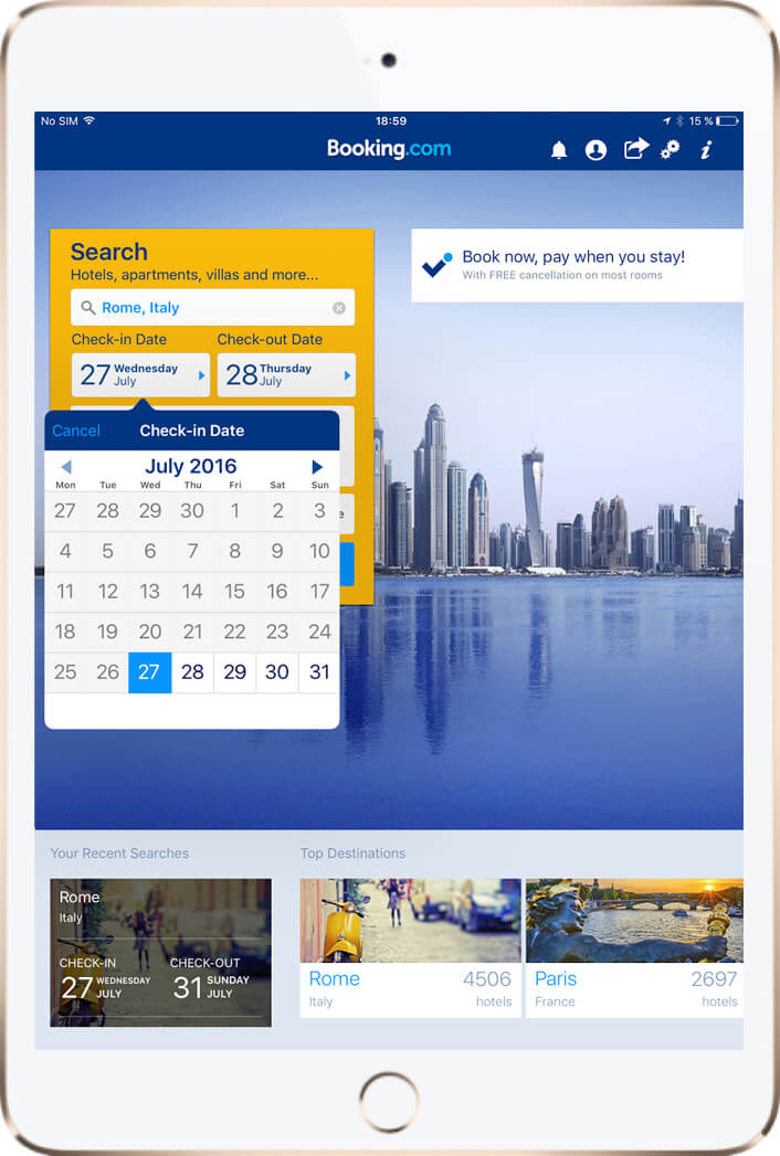
For instance, if you’re allowing people to search for a hotel reservation, why make past dates available and display an error if users select dates that are in the past?
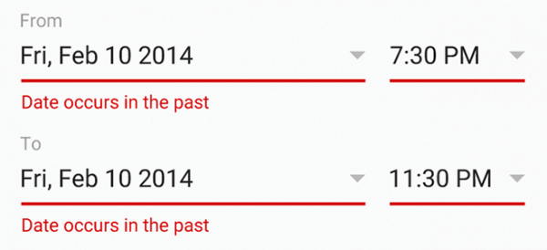
As shown in the Booking.com example, you can simply use a date selector that allows users to only choose today’s date or dates in the future. This will force users to pick a date range that fits.
Error Screen For Form Validation
A form is a conversation. Like any conversation, it should be represented by a consistent communication between two parties — the user and your app. Validation plays an essential part of this conversation. Form validations are meant to have conversations with users and guide them through the difficult times of errors and uncertainty. When done right, it can turn an ambiguous interaction into a clear one. Generally speaking, there are four important elements that good form validation consists of:
- Right time of informing about errors (or success)
- Right place for validation output
- Right color for the message
- Clear language for your message
Right Time (Inline Validation)
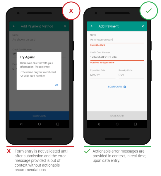
Form validation errors are inevitable and are a natural part of a user’s data input (since user’s input is error-prone). Yes, error-prone conditions should be minimized, but validation errors won’t ever be eliminated. So, the most important question is, “How do you make it easy for the user to recover from form errors?”
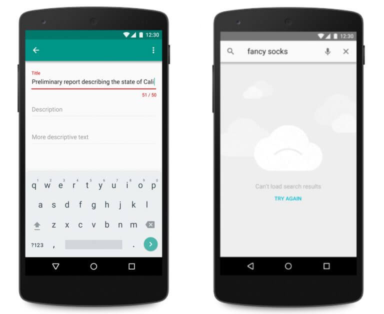
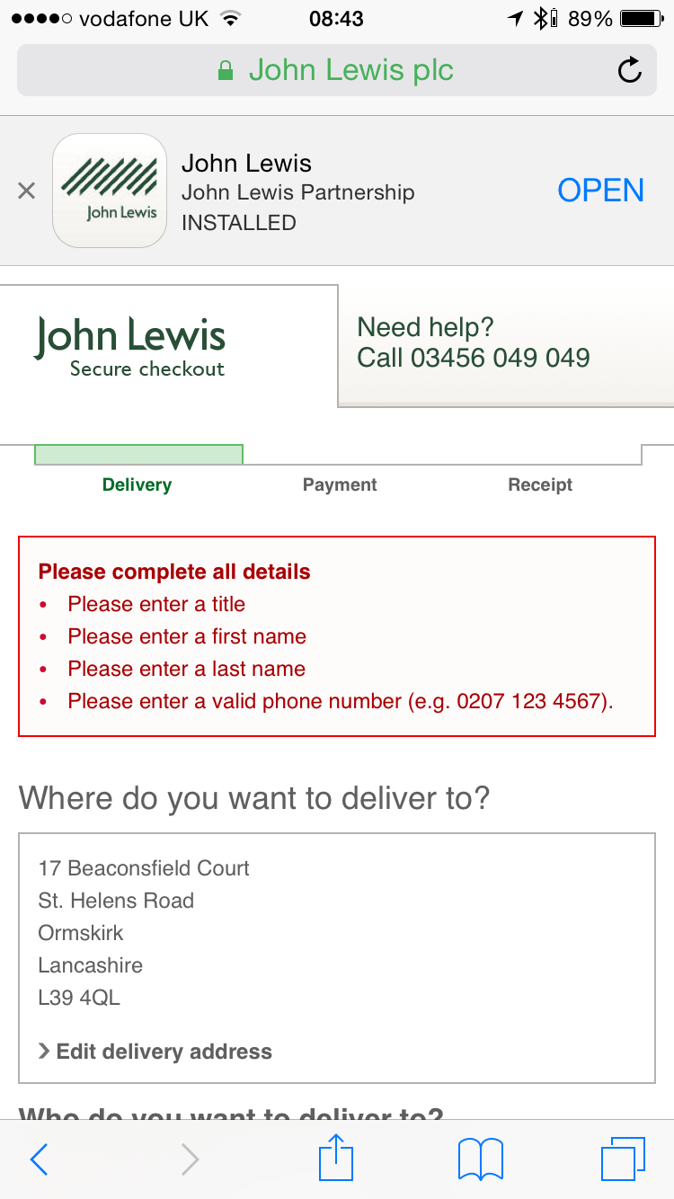
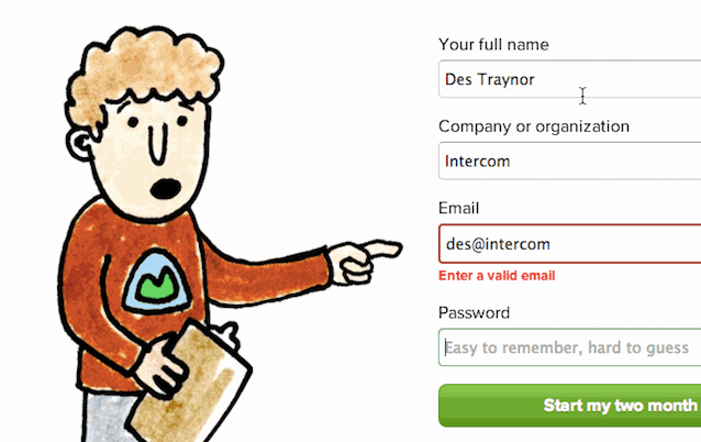
Users dislike going through the process of filling out a form, only to find out at submission that they’ve made an error. It’s especially frustrating when you complete a long form and once you’ve pressed submit, you are rewarded with multiple error messages. And it’s even more annoying when it isn’t clear what errors you’ve committed, and where.
Validation should immediately inform users about the correctness of a provided answer right after the user has submitted the data. The primary principle of good form validation is this: “Talk to the users! Tell them what is wrong!” and real-time inline validation immediately informs users about the correctness of provided data. This approach allows users to correct the errors they make faster without having to wait until they press the submit button to see the errors.
However, avoid validating on each keystroke because, in most cases, you simply cannot verify until someone has finished typing their answer. Forms that perform the validation during the data entry punish the users as soon as they start entering the data.
On the other hand, forms that perform validation after the data entry are not informing the user soon enough that they fixed the error.
Mihael Konjević in his article “Inline validation in forms — designing the experience” examined different validation strategies and propose a hybrid validation strategy: reward early, punish late.
Right Place
Proximity is another important tool. When you’re wondering what place to choose for your validation messages, follow this rule of thumb — always put the message in the context of action. If you want to inform the user about an error occurring in a particular field — show it next to the field. Instant validation is best positioned to the right-hand side of the input, or failing that, immediately below.
Right Color (Intuitive Design)
Color is one of the best tools to use when designing validation. Because it works on an instinctual level, adding red to error messages, yellow to warning messages, and green to success messages is incredibly powerful. But, make sure that colors in your digital interface are accessible for your users. It’s a crucial aspect of a well-executed visual design.
Clear Message
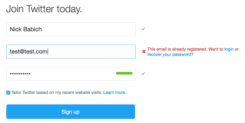
A typical error might state, “the email is invalid,” without telling the user why it’s invalid. (Is it a typo? Is it occupied?) Straightforward instructions, or guidelines, make all the difference. There is no guessing for the user who receives this error, and also no confusion or frustration. You can see in the example, the form informs the user that this email is already in use. It then offers some options (either to login or recover my password).
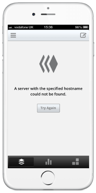
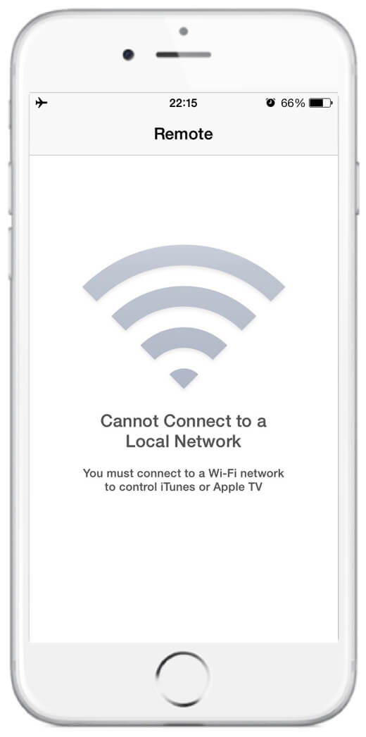
Okay, it’s time to display an error page to indicate that something has gone wrong. As an example, let’s take a situation when connectivity is down and a user is on a screen that is only available online. You should use this opportunity to make people aware that you know what is happening and follow the model of immediate helpfulness — your error message should be a helping hand for your users. That’s why you should never show:
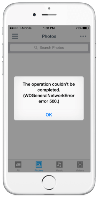
- A raw error message. Messages which contain an app’s internal error codes or abbreviations such as “an error of type 2 has occurred” are cryptic and scary.
- A dead-end error message. Simply because, such error states don’t provide any helpful information for users.
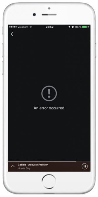
- A vague error message. The error screen in the example below gives users the same amount of information as the previous one. Users won’t have any clue what it means and what to do next.
Don’t scare users with errors. Also, don’t assume people know about the context of a message or assume they are tech-savvy enough to figure things out. Instead, tell people what’s wrong in plain language. To achieve this, you should avoid using technical jargon and express everything in the user’s vocabulary.
Make your error message both readable and helpful — error states must include concise, polite, and instructive copy that clearly states:
- What went wrong and possibly why.
- What’s the next step the user should take to fix the error.
Incorporate Imagery And Humor Into Error States
Error states are an excellent opportunity to utilize icons and illustrations, because people respond better to visual information than plain text. But, you can go further and incorporate unique imagery that is branded to match your app, yet still be helpful for your users. It’s a good way to both humanize your message and communicate the app’s personality.
Humor is the spice of life. A bit of humor never hurts and can help diffuse the frustration of an error. You can find plenty of great examples of humorous error messages at Littlebigdetails. Here are some of my favorites:
- Basecamp: when there is a form field error, the character on the left makes a surprising facial expression.

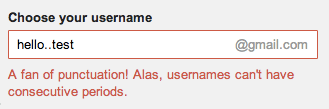
- A cheeky error message is displayed when you type too many full-stops when creating a new account in Gmail.
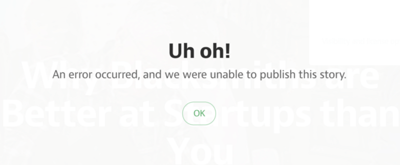
However, be careful with humor because it may not always be appropriate to use in your error message; it really depends on the severity of the error. For instance, humor is good for a simple validation problem such as a “404 Page Not Found” error. But when a user is losing a significant amount of time due to a failure saying “Uh oh!” is entirely inappropriate.
Comprehensive Checklist Of A Perfect Error Page
Perfect error pages are a helping hand for your users and should have the following six qualites:
- Error messages occur dynamically, just as the problem appears. This immediately informs users about the problem.
- Keep all user input safe. Your app shouldn’t undo, destroy, or delete anything entered or uploaded by user in the event of an error.
- Speak the same language as the user. It should clearly state what went wrong and possibly why; what’s the next step the user should take to fix the error?
- Don’t shock or confuse users. (The message shouldn’t be dramatic).
- Don’t hijack control of the system. (If problem isn’t critical, the user should be able to interact with as much of the rest of the app as possible).
- Use a little sense of humor to humanize the problem.
Solutions For The Most Popular Error States
404 Not Found Error
The main goal of 404 page is to direct your user to the page they were looking for as quickly as possible. Your 404 page should offer a few key links and directions your user can choose between. A safe bet is to have a “Home” link as a primary action on the 404 page — a quick and friendly way to start over. You can also place “Report this Page” to quickly report that the page is broken, but make sure that the primary action (link to the “Home” page) carries a stronger visual weight.
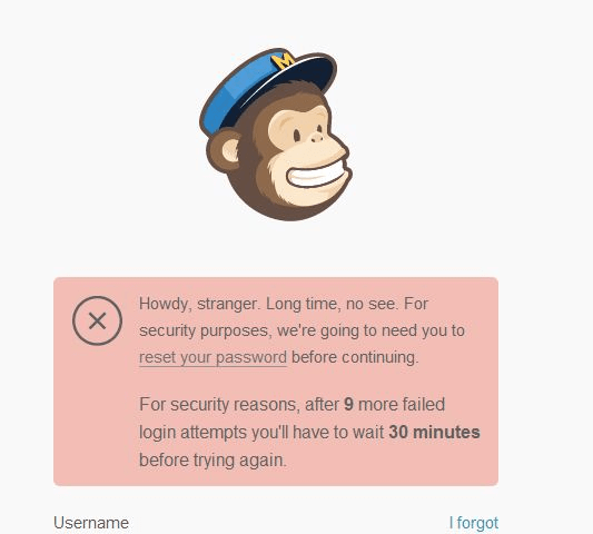
Cannot Login
Login screens are usually relatively minimal, with a field for a username and another for a password. But, minimal doesn’t always equal simple. There are many reasons why a user might be stuck on the login screen. The main rule for a login page is very simple - don’t make the user guess.
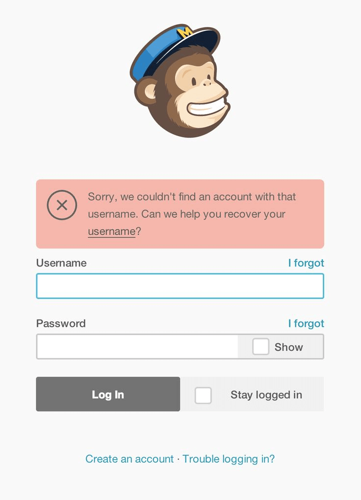
Let’s propose solutions for the most common problems using examples from MailChimp, which does a great job with error messaging.
- User forgets his username. If you detect that the problem is an unknown username, you should offer a link to let the user fix it. Tell users where they can get it (e.g. “check email from us”) or provide a link to the username recovery.
Users make multiple attempts to log in using an incorrect password. To prevent brute force attacks, user accounts are often temporarily locked after too many failed login attempts. This is a necessary security practice, but be sure to warn users before their account is locked.
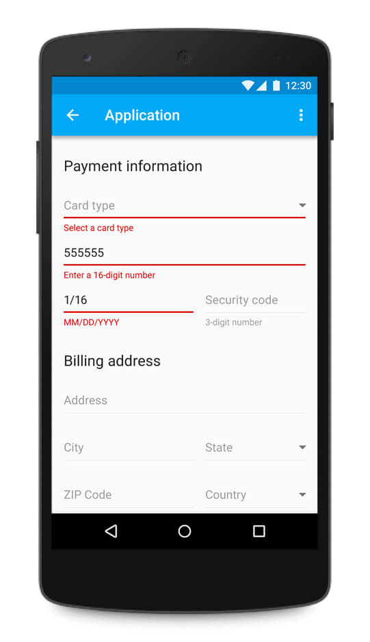
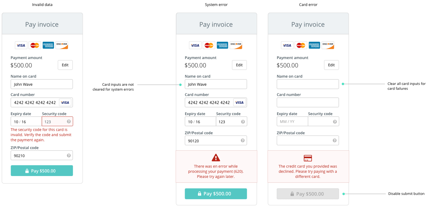
Credit Card Rejection
Credit card rejection error page can be caused by (1) errors in the data formatting (typo or missing data) or (2) a card can be declined (expired card or fraud). Gabriel Tomescu in his article “The anatomy of a credit card form,” suggested the following strategy for both error states:
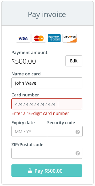
For the first problem, you should follow standard real-time inline validation practice and visually indicate an error:
However, when a card is declined by the payment network for some reason, it usually looks like fraud. You need to clear the data entered by the user. Even then, you still need to notify the user what has happened; the error message should be as clear as possible.
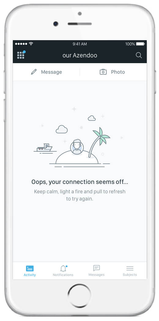
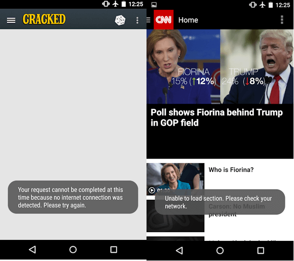
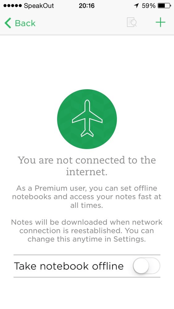
Connectivity Is Down
Internet access is not ubiquitous, and offline support should be a crucial consideration for nearly every modern app. When connectivity is down, you should try to provide a rich offline experience. Users should be able to interact with as much of the rest of your app as possible. This means the app should have cached content to provide a good offline experience.
Daniel Sauble in his article provides perfect insight on how social, mapping, and productivity apps function offline. It’s totally clear why he suggests that it’s better to cache a little of everything than a lot of some things and nothing of others. Because, when a user opens an app, they expect to see content, regardless of whether they’re connected to the internet or not. If the content isn’t there, they’ll get frustrated and switch to a different app which does a better job of caching the information they want to see.
Make sure your app functions offline as well as it possibly can. Here is some practical advise from Robert Woo that can be incorporated almost in every app on the market.
Save the last state. Below you can see two apps made for content delivery. The CNN app provides a better user experience by caching the last view and providing users with the headlines for the articles that were last loaded.
Provide offline functionality and features. There are features on every app that can (and should) work without an internet connection. Let’s take Evernote as an example. The app is entirely functional offline: you can edit existing notes or write a new one, and the app will sync everything up with the cloud once you’re connected again.
Conclusion
The best error message is the one that never shows up. It is always better to prevent errors from happening in the first place by guiding users in the right direction ahead of time. But, when errors do arise, well-designed error handling not only helps teach users how to use the app as you intended, but also prevents users from feeling ignorant. Of course, the error state is one of the least-desirable states to design for. However, if you put a lot of effort into this state, your product will be infinitely more enjoyable to use.
Recommended Materials
- The Ultimate UX Design of Form Validation by Marcin Treder
- Inline Validation in Web Forms by Luke Wroblewski
- Improve Validation Errors with Adaptive Messages by Jamie Appleseed
- How to write a great error message by Thomas Fuchs
"This article is part of the UX design series sponsored by Adobe. The newly introduced Experience Design app is made for a fast and fluid UX design process, as it lets you go from idea to prototype faster. Design, prototype and share — all in one app.
You can check out more inspiring projects created with Adobe XD on Behance, and also visit the Adobe XD blog to stay updated and informed. Adobe XD is being updated with new features frequently, and since it's in public Beta, you can download and test it for free".
Further Reading
- Animated Microinteractions In Mobile Apps
- How To Create Icons With Adobe XD
- Useful Prototyping Tricks in Adobe XD
- How Prototyping Made Us More Efficient
 (ms, il, at, mrn)