Redesigning SGS’ Seven-Level Navigation System: A Case Study

Email Newsletter
Weekly tips on front-end & UX.
Trusted by 182,000+ folks.
 Celebrating 10 million developers

 Custom Web Forms for Angular, React, & Vue. Your backend.
SGS (formerly Société Générale de Surveillance) is a global service organization and provider of inspection, verification, testing and certification services across 14 industries. SGS’ website (along with 60 localized websites) primarily promotes the organization’s core services, as well as provides access to a multitude of useful services, supplementary content and tools. Our goal was to transform sgs.com from being desktop-only to being responsive.
This presented a unique set of challenges, especially around the legacy navigation system, which in areas was up to seven levels deep (divided into two parts) and which consisted of some 12,000 individual navigable items.
Our natural reaction upon seeing and using SGS’ navigation system for the first time was that surely the information architecture (IA) had to be simplified because of the sheer volume of navigable links and content. However, considering the navigation had already been optimized for search engines and the IA prior to this project and considering that SGS offers a wide selection of services across many industries (reflected in the volume of content), it was evident that refactoring the IA would not be a part of the solution.

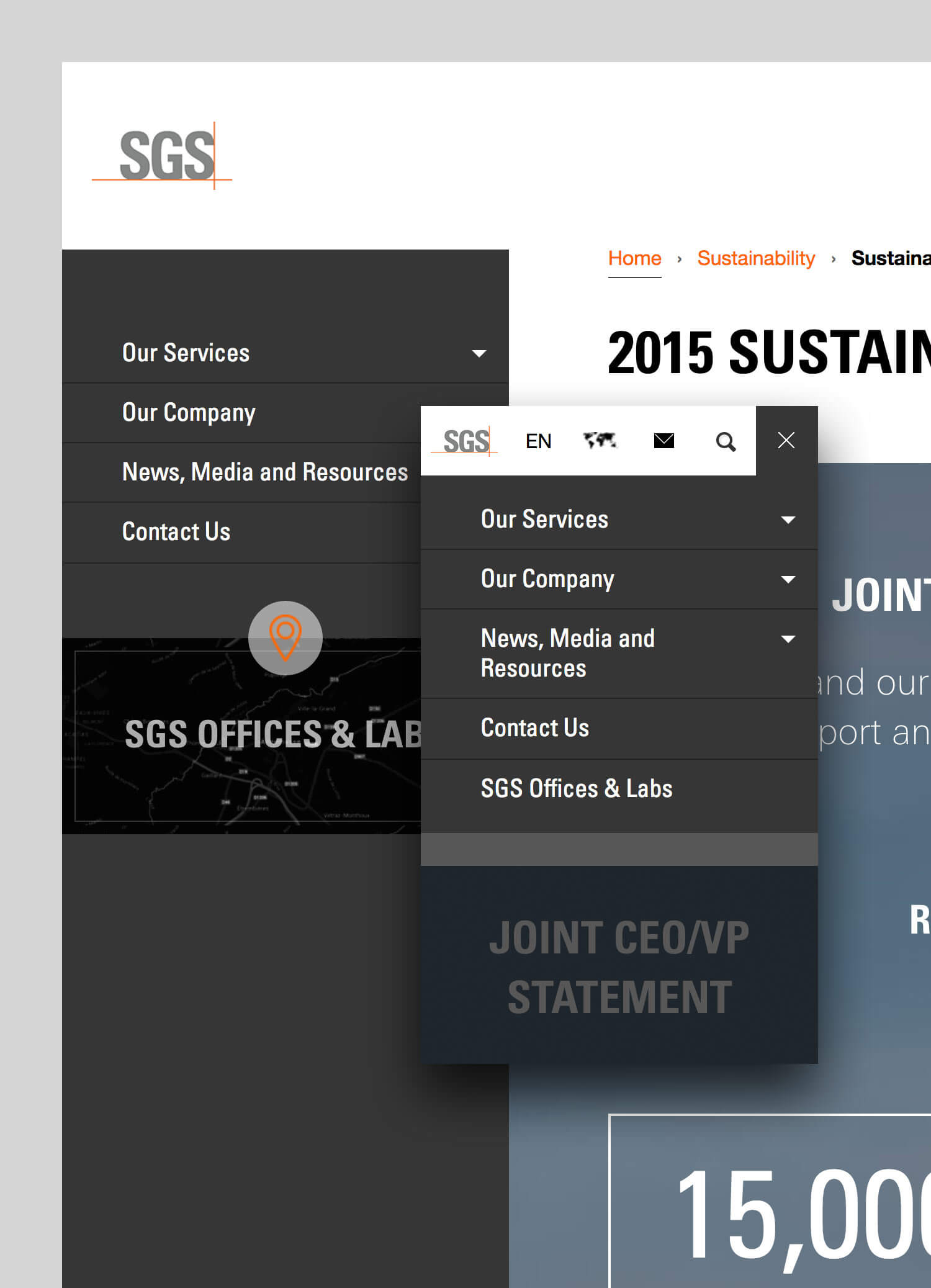
Simply put, the navigation tree’s structure had to remain intact. Even so, that didn’t prevent us from making some minor adjustments to the IA. For instance, “News, Media & Resources” and “SGS Offices & Labs” were moved to the top level, for greater visibility. With the former, it was important to more clearly reflect that SGS regularly publishes news and hosts events. With the latter, it was vital that it, along with the contact page, were easily reachable from anywhere in the website’s structure. Therefore, the key question was how could such a behemoth of a navigation system be made to easily transition between different viewports while still being usable?
Establishing Project Policies
A healthy client-designer relationship is essential to the success of every project. Setting clear expectations as well as providing effective guidance ensures not only that key stakeholders remain focused throughout, but also that trust develops between all parties as the project progresses. This was definitely the case with this project; the collaboration between all parties and the mutual appreciation of each other’s roles and expertise were truly remarkable.
However, to ensure that all parties remained focused, we established at the kick-off meeting a number of important guidelines and requirements within which we could also exercise creativity (some of which we insisted on, others insisted on by the client):
- Content parity. Content should be accessible on every device and platform and under no circumstances should be hidden on mobile.
- Performance. The website should perform at least 20% faster than competing websites. This was particularly useful when deciding how much information should go on each page.
- Accessibility. The website must adhere to WCAG 2.0 level-AA accessibility guidelines. We succeeded in achieving this target, aside from a borderline color-contrast issue, due to the company’s branding.
- Usability. The in-house team had to extensively validate concepts and conduct in-person and remote usability testing.
- Uninterrupted business. The redesign shouldn’t disrupt the company’s business at all. Clearly, the task was not to optimize the company’s services, but rather to optimize the website, taking into account established business processes. For instance, we had the freedom to optimize web forms, but the structure of the data in the CRM had to remain intact.
The Three Major Challenges
With key guidelines established and knowing the navigation’s redesign wouldn’t require a significant overhaul of the IA, we subdivided the redesign into three key yet interdependent sets of activities:
- Layout placement. This was handled mostly by the in-house team, with us suggesting improvements and making sure any decisions wouldn’t have radical implications for other aspects of the new responsive design.
- Interaction and usability. These were worked on collaboratively with SGS’ design team. Ideas were exchanged via email and in on-site workshops and were regularly validated against users, stakeholders and the overall business requirements.
- Performance. This was dealt with solely by us, because it was more of a technical challenge and didn’t require any strategic decision-making other than for us to make the new responsive website fast.
Layout Placement
Navigation is a fundamental element of page layout, regardless of the size or complexity of the website. While an off-screen pattern might seem appealing when you’re dealing with such a large-scale navigation system, remember that there can be issues when the navigation is not visible to the user.
SGS’ design team had initially tested a variety of concepts, because they had to not just evaluate the navigation interaction, but also create the right balance with the rest of the page and avoid clutter.
Deciding On The Concept
Given the complexity of the website, it was vital that the navigation always remain visible and inform the user where they are within the tree structure. Rather than divide the navigation into two parts in the UI, we wanted the new navigation system to be seamless (from the top level right through to the bottom levels). Therefore, it had to enable the user to easily browse up and down the navigation tree, as well as sideways across the main sections.
To test and validate all of these combinations, we developed a prototype for each of the eight initial navigation concepts. The prototypes confirmed what the in-house team already suspected: The most viable option in terms of usability, maintenance, cross-screen experience, visual clutter and appeal was for the navigation to be placed in the sidebar on large screens and to appear as a dropdown menu on small screens. Essentially, the navigation module would be functionally and visually self-contained, regardless of screen size.
While we will focus on specific interaction decisions in a minute, it’s worth pointing out that interactive prototypes don’t necessarily have to be discarded once a prototyped concept has been tested and validated.
Prototyping Smart
We always develop prototypes directly in HTML, CSS and JavaScript using semantic, accessible and robust markup, because we are then often able to reuse the initial prototypes later in the design process. This meant that our initial prototype for the new navigation system became the cornerstone for the eventual full website prototype, which included all of the page templates and modules.
In delivering the full prototype, we also ensured the style guide was generated automatically for the SGS team. By getting SGS’ design team to think in terms of designing and developing modules, rather than complete pages, the generated style guide would require little ongoing maintenance. The style guide itself refers to all of the distinctive modules used, with each module containing a precise description, code example and automatically generated link to the page template where it is used. Our technology of choice for automating tasks and features is PHP, but automation can be achieved using any server-side language, as long as the output is semantic HTML. (We developed a specific file-system framework for our prototypes, but that’s a topic for another occasion.) Later on in this article, we will explain how server-side scripting helped us to maintain and test multiple versions of the navigation.
Even though starting with semantic, accessible and robust HTML is vital, the principle of “content-first, navigation-second” is just as important because it helps you to account for any possible future exceptions. There was one exception to the “content-first, navigation-second” rule in this project: the home page. We discovered, based on analytics, that the navigation was viewed as the most important element on the home page, which meant it had to come before any core content on the page.
Interaction And Usability
Once the decision was made to design and develop a self-contained, screen-size-agnostic navigation module, it was time to focus on navigation interactions. Considering that we had adopted a mobile-first approach to designing the navigation, the navigation module itself not only would naturally function as expected in small viewports, but would easily scale to work in large viewports, too.
Three Interactive Versions
Due to the size of the navigation and the potential number of nested levels, we had to eliminate some of the more common mobile navigation patterns as options — for instance, select dropdowns and the priority+ pattern. We focused on prototyping three interactive versions of the navigation: a slider, an accordion, and an accordion and slider. Each has its pros and cons, which naturally influenced our decision.
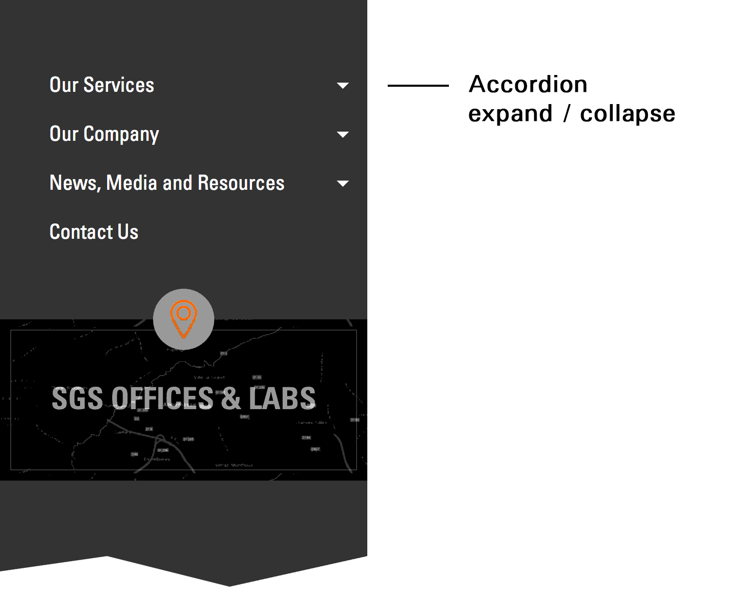
Accordion
The accordion is probably the most common pattern on mobile. It discloses progressively, revealing more detailed information as the user progresses through the topic or action. It also ensures the user does not get overwhelmed, which is why we wanted to use it as a baseline solution.
Here are the accordion’s pros:
- Users are familiar with it.
- Users can expand the entire navigation tree to preview multiple options (seven levels of navigation can be a little overwhelming, after all).
- It works without JavaScript, using the
:targetpseudo-class. - Developing it is easy.
And the accordion’s cons:
- The expanded ancestors of a deep-level category would push the current scope too far away from the top of the screen, thus requiring a lot of scrolling.
- Seven levels of navigation requires seven degrees of the chosen visual cue, whether it be seven shades of a basic color (gray), seven levels of typographic hierarchy or seven levels of indentation.
Slider
This was initially our favorite solution, but it misses one important element: allowing truly sideways browsing across the main sections. It wouldn’t be such a problem if the user always starts browsing from the home page, because they would become increasingly familiar with the main sections. However, for users who land on a page deep in the navigation tree, it definitely would have been a usability problem. For instance, users who land on the third, fourth or fifth level would have to traverse up the tree in order to reach the contact page. Traversing seven levels is no fun, no matter how motivated the user might be.
Slider pros:
- The hierarchy is clear.
- The animation is slick.
- It follows mobile conventions.
- It is relatively easy to develop.
Slider cons:
- Browsing sideways is not possible.
- The animation is not performant.
Hybrid (accordion and slider)
We really wanted to maintain the attractiveness of the slider, while still allowing sideways browsing. Therefore, we developed of a hybrid solution combining the best elements of the two navigation patterns. Incidentally, it was also the solution we settled on.

Hybrid pros:
- Sideways browsing is possible.
- The animation is slick.
- The hierarchy is clear.
Hybrid cons:
- It requires some initial learning.
- It is complex to develop, with many moving parts to consider.
- It has some performance issues.
As mentioned, the user should be able to browse up and down the navigation tree, always aware of where they have come from and where the navigation will take them next. However, that’s just the baseline interaction — we had to address quite a few additional issues in order to develop a usable navigation system.
Eight Distinctive Types Of Links
Apart from current and ancestor navigation items being distinct in design (which is now, thankfully, a well-established practice), we further improved the navigation and general usability by helping the user to understand where they are and what they’re exploring. Helping the user to understand the current page and its parents, as well as any relevant children relationships, was far from enough. Other important actions were required:
- being able to go directly to the parent page;
- being able to preview both parent and children levels, all while staying at the original URL;
- quickly understanding their current browsing position, while being able to explore the navigation.
- quickly understanding their current position on the page.
Note: We used breadcrumbs to ensure that the current page position is always clear to the user. Because we wanted to avoid skipping levels altogether, the information in the breadcrumbs and the navigation had to match one to one, even with pseudo-levels (i.e. levels that don’t have an actual page).
The user requirements above resulted in five types of semantically different navigation items, with additional helper links that would allow the user to traverse up and down the tree without having to leave the current page. You can imagine the complexity and interdependencies that come with so many moving parts.
Animation Details
All elements in the navigation are animated using CSS, with each animation having two distinct parts:
- horizontally animated levels,
- vertically animated wrappers.
First, the different tree levels in the slider are toggled by changing the class of the master wrapper. For example, the closed navigation wrapper has a class of .depth-0. When a top-level item is expanded, the class changes to .depth-1. When a second-level item from within that top-level item is selected, the class changes to .depth-2, and so on. This results in a fairly simple set of CSS rules that get applied to a single element — the topmost-ordered list in a slider:
.depth-1 .l-0.nav-open > ol {
    left: 0;
}
.depth-2 .l-0.nav-open > ol {
    left: -100%;
}
.depth-3 .l-0.nav-open > ol {
    left: -200%;
}
In the example above, .l-0 corresponds to a zero-level list item, and .nav-open is toggled whenever the accordion is set to open. This means that the ordered list of a direct child in an open accordion list item is absolutely offset to the negative-left position.
Secondly, considering that each level contains a variable number of list items, the transition between any two adjacent levels has to be smooth.
To achieve this, we made sure there is always sufficient vertical room for the horizontal animation to run smoothly. The height is calculated and applied on the fly by retrieving the vertical offset of the element about to enter the screen. This means we had to account for a total of four possible scenarios, but really only needed to resolve two, each with a slightly different order of execution:
- Short list item to a longer list item. The horizontal and vertical animation start at the same time.
- Long list item to a shorter list item. After the navigation stops sliding horizontally, the vertical animation starts.
Both animations are initiated at the same time, but the second animation gets initiated after a 300-millisecond delay, which is exactly the duration of the first animation (specified in CSS using the transition-duration property). The reason for this is suboptimal animation performance on less-capable devices when multiple layers overlap before disappearing “behind the curtain.” The simplified code looks like this:
if (newHeight < oldHeight) {
    heightTimeout = 300;
} else {
    heightTimeout = 0;
}

setTimeout(function() {
    $('.l-0.nav-open').css('height', newHeight);
}, heightTimeout);
Further Improvements
Already faced with a complex set of interdependencies, we realized upon testing the navigation that there was room for improvement.
First, because web fonts sometimes load a little later than the rest of the page, some strings of text in the navigation that are meant to be on one line would expand to a second line before the web font had fully loaded. For instance, the top-level section link “News, Media and Resources” falls onto two rows when rendered in the fallback font.

Because everything had to be really compact (since we had to use absolute positioning for the sliding animation), the only solution was to reset the height of the affected element after the web font had loaded. This was done using Web Font Loader, developed by Bram Stein for Adobe Typekit and Google Fonts.
WebFont.load({
    custom: {
        families: ['FONT_NAME_1', 'FONT_NAME_2']
    },
    active: function() {
        // recalculate things here
    },
    timeout: 5000
});
Note: Did you notice how we used a 5-second timeout? In our testing, we found this to be the sweet spot that made it work on our baseline “good 2G” (450 KB per second) connection!
Secondly, because we decided to conditionally load the navigation nodes in order to improve initial loading performance (more on that in the next section), we wanted the user to be kept aware of how many navigation items are available, in case there is a delay in loading a branch of the navigation tree. We did this by repeating a placeholder background image that resembles a string of text.

Finally, we appended the placeholder code in the DOM with JavaScript before requesting the navigation branch. This keeps the DOM as clean as possible.
element.append('<ol class="nav-loading"><li class="nav-placeholder"></li></ol>');

$.get('NAVIGATION_BRANCH_URL', function(data){
    // replace the loader with the branch
    element.find('ol').replaceWith(data);
});
Performance
If you recall, one of our key targets in the project was for the website to perform at least 20% better than competitors’ websites. Not only did we achieve this target, but in doing so we helped SGS to significantly reduce overall page weight and loading times. Take a look at the following before-and-after statistics:
| HTTP requests | File size: total | File size: HTML | |
|---|---|---|---|
| Original SGS home page | 40 | 1,500 KB | 72 KB |
| Original SGS industry page | 60 | 2,200 KB | 50 KB |
| New responsive home page | 17 | 960 KB | 42 KB |
| New responsive industry page | 20 | 680 KB | 40 KB |
Did You Know That 12,000 Links Equals 3 MB Of HTML?
That’s correct! When we rendered the full navigation tree for the first time in our prototype, it amounted to 3 MB of bare HTML. No header, no footer and no content — just the navigation tree consisting of 12,000 individual links.
Prior to the redesign, every page contained the core navigation tree, and each industry page also included an industry-specific navigation tree, implemented as a separate module. However, the desktop-optimized design made the core or industry-specific navigation not only difficult to use on small viewports, but difficult to maintain, too. That’s why one of the key goals of the redesign was to consolidate the tree into a single and easy-to-maintain module.
Exploring Options To Improve Performance
To thoroughly test each of the three interactive versions of the navigation, as well as evaluate their performance, a flexible testing environment was essential. This would enable us to make changes quickly, as well as to maintain concurrent versions so that we could easily compare them against each other.
Considering the size of the complete navigation tree (up to seven levels deep and 12,000 navigable links), being able to test parts of the navigation tree as well as the full tree itself was important. SGS’ in-house developers were able to export the full navigation tree as a CSV file from their content management system, which allowed us to create an easily configurable PHP function to output either the full tree or part of it, depending on what we needed to test.
Our PHP function also simplified the HTML maintenance of the navigation tree’s structure, because the aforementioned link markup and class names could be easily changed in a single place. Using a server-side language to avoid having to repeat code might sound obvious, but creating this type of environment was not just a welcome addition, but was actually mission critical, because it was the prerequisite to agile experimentation and testing.
Conditionally Loading Links
We mentioned that we had to conditionally load the navigation nodes to improve initial loading performance. The question that then needed answering was, How much of the navigation tree should be loaded initially and how much should be loaded later, and when? After testing and comparing the weights and sizes of the different navigation tree branches, as well as studying user behavior on the existing live website, a few interesting conclusions emerged.
First, visitors who were interested in only one type of industry rarely visited other industries. Once browsing their selected industry category, each visitor would typically go on to explore just a couple of other pages.
Secondly (and as we had initially thought), the industry-specific branches caused the majority of performance overhead. When we removed the industry branches altogether, the HTML was reduced to 70 KB, which is a lot better than 3 MB! Still, it meant that each of the 14 industry branches weighed between 300 and 500 KB. When we fragmented each service branch further, we found that each subsequent level would weigh around 24 KB on average.
While we were aware that the HTML could be further reduced by optimizing the class names and adding DOM nodes via JavaScript (more on that in a minute), we still had to determine whether it was best to initiate a single HTTP request at around 300 to 500 KB or to initiate an HTTP request of around 24 KB at each level. Initially, it seemed that sending a 24 KB request each time the user progressed further down the navigation tree would be more beneficial. However, this would have resulted in multiple HTTP requests being sent over the network, which was far from ideal, considering that network latency is often one of the biggest bottlenecks for website performance. It also didn’t make sense to predict the loading of any industry branches either, except when the user showed intent by hovering over an industry link.
Due to the complexity of the navigation and the quantity of links, the following arrangement offered by far the best compromise:
- Load the first three levels by default in HTML.
- Load the industry navigation with JavaScript when intent is shown, detected using the
mouseoverevent. - Cache loaded branches to speed up loading on consecutive page loads.
The logic for deeper pages was somewhat different, because the navigation needs to be accessible without JavaScript enabled. Therefore, if a user (or even a search engine bot) lands on a deep page, the following would happen:
- Render the first three levels and the current page’s ancestor branch and page siblings in HTML, thereby allowing the user to easily access the parent, ancestor and sibling pages, while also being able to access other parts of the website following the same logic.
- Load the current branch with JavaScript, and replace the initially loaded current page’s ancestor branch.
Optimizing HTML
If you truly want to optimize your HTML, all non-essential items have to be offloaded to CSS and JavaScript. We rigorously pruned everything except the ordered list, its list items and their respective links. All non-essential links (i.e. navigation aids) were also removed from the HTML and are reinserted back in the DOM using JavaScript (because they are ineffective without JavaScript anyway). These non-essential links enable the user to do a couple of things:
- open the next level (internally, we called these “expanders”);
- go up a level (we named these “backers” — showing a lack of imagination).
While the resulting DOM was still immense, the navigation aids no longer needed to be transferred individually over the network.
Finally, the last piece of optimization we undertook was to reduce the number of classes, as well as to shorten the length of class names; for example, .very-long-class-name became .v-l-c-n. While the latter yielded the biggest gains, such optimization is difficult to justify because it usually doesn’t significantly trim the size of the HTML file, and, more importantly, it reduces the clarity of the code, thus possibly making maintenance more difficult. However, shaving off even a single byte from each of the 12,000 list items made it a worthwhile exercise and an acceptable trade-off.
The result? A whooping 40 KB or so of initial HTML (8 to 9 KB when compressed and transferred over the network), and 200 to 300 KB of HTML for each industry (15 to 25 KB when compressed and transferred).
Conclusion: Marginal Gains Matter
We like to use an analogy from the sports world: Improving every tiny thing by 1% dramatically improves performance. This applies to what we did in the SGS project and its intricate navigation. By focusing on the finer details, improving each detail by a tiny bit, we significantly reduced the complexity of the navigation and improved loading times, while keeping the navigation appealing and engaging for users. What could have been a nightmare and a tough nut to crack turned into a technically and interactively relevant solution, flexible enough to accommodate further improvement.
Most of all, the design process of continually prototyping, investigating options and refining the best solutions proved to be extremely effective — so much so that it has provided a strong case for the in-house team to apply the same fundamental principles when developing other products in the organization, not to mention that it will help the team to continue refining and optimizing the new navigation system. No web project is ever truly complete; there are always a few more things on the to-do list. That’s perfectly fine, as long as we keep on testing, refining and providing the best experience for users.
Further Reading
- Designing Case Studies: Showcasing A Human-Centered Design Process
- Adapting To A Responsive Design
- Product Design Unification Case Study
- 75 Instructive Case Studies – This Is How We Built It
 (vf, il, yk, al, mrn)

