Reducing Cognitive Overload For A Better User Experience

Email Newsletter
Weekly tips on front-end & UX.
Trusted by 182,000+ folks.
 Celebrating 10 million developers
 Custom Web Forms for Angular, React, & Vue. Your backend.


If the user experience design does what it’s supposed to do, the user won’t notice any of the work that went into it. The less users have to think about the interface or design, the more they can focus on accomplishing their goal on your website. Your job, as a designer, is to give them a straight path to their goal by clearing out the obstacles beforehand.
“Getting in the way of a speeding freight train usually doesn’t end well. It takes a lot of effort to shift the course of something with that much momentum. Rather than forcing people to divert their attention from their primary task, come to where they are.”
—Luke Wroblewski, Product Director at Google
After all, consider the alternative. Complicated and confusing interfaces force users to find solutions to problems that shouldn’t be there in the first place. A user who feels confused by the options, the interface, the navigation and so on will likely feel overwhelmed in their thinking process. Even momentary pauses are enough to rip users back into the reality that they’re sitting in front of their computer.
This excessive thinking is called cognitive overload, and here we’ll explain how you can avoid it. First, we need to explain what exactly in our brains is at risk of being overloaded.

The Scientific Roots Of Cognitive Overload
Cognitive load refers to the total amount of information your working memory can handle. Cognitive overload happens when your working memory receives more information than it can handle comfortably, leading to frustration and comprised decision-making.
But what does that mean, really? What exactly is working memory? And what does this have to do with design? The first step is to understand the origin of cognitive load theory.
John Sweller And Cognitive Load Theory
While the study of cognition dates back centuries, it wasn’t until the 1980s that Australian educational psychologist John Sweller applied the research to instructional design. Sweller sought to discern the best conditions for learners of any kind to retain the information they were taught. In other words, what are the best strategies for making a lesson stick?
Sweller’s work culminated in the 1988 publication of “Cognitive Load Theory, Learning Difficulty, and Instructional Design” (PDF), reworked and republished later in 1994. His work incorporated the data organizational constructs known as schema and outlined both effective and ineffective teaching methods, but his findings on the limitations of working memory are what designers tend to find most useful.
In many ways, Sweller’s work expanded on the information processing theories of George Miller, a cognitive psychologist and linguist of the 1950s who tested the limits of short-term memory. Miller’s research has since ingrained itself in digital design, especially the technique of chunking, discussed later in this article. Miller was also responsible for the paper “The Magical Number Seven, Plus or Minus Two” (PDF), which prompted many designers to limit menu items to between five and nine — although this technique has since been demoted in digital design.
While these strategies were originally intended for the field of education, they apply equally to user experience (UX) design. As we’ll explain, the same techniques that enhance memorability and learning also reduce user annoyance.
Working Memory
What if every time you wanted to open the fridge, you had to answer a Sphinxian riddle like, “What walks on four feet in the morning, two in the afternoon and three at night?”
It would get old after a while, right? But according to cognitive load theory, that’s the same kind of frustration users feel with poor UX design.

To understand cognitive load theory, you have to understand working memory, the brain activity used to complete a task in the moment. Working memory must sort through all external stimuli and short-term memory items, as well as draw from long-term memory if needed. Think of working memory as computer RAM and long-term memory as the hard drive.
Working memory and short-term memory are often used interchangeably, but they are slightly different. Working memory handles the processing of information, whereas short-term memory is more like a scratch pad for information that’s important but not important enough for long-term memory.
Let’s look at this very article to explain the differences. As you’re reading, you might come across an unfamiliar concept in blue text. Your working memory needs to know what the concept in blue text means in order to comprehend the greater meaning of the article. Your long-term memory knows that blue text means a link, so your working memory knows to click the link for more information. At the same time, your short-term memory remembers your place in the article, so that you’re not lost when you return from the external page — but by tomorrow morning, that location will have been forgotten.

Applications In Design
The influential writer Steve Krug is the one who popularized the application of cognitive load theory to web design. His book Don’t Make Me Think is considered a seminal work by many designers.
Among the many valuable lessons in the book, here are some of our favorites:
- Every page should be self-explanatory, because users are just as likely to enter your website from the middle as from the home page.
- Users tend to “satisfice” — that is, take the first or easiest solution to their problem, instead of the best. Moreover, as creatures of habit, users will continue to use that same solution over and over, without ever considering a better option.
- Usability is adequate when a person of average ability or experience can use the system to accomplish their goals.
- Much of web usage is motivated by a desire to save time. So, users will frequently adopt a shark’s “keep moving or die” mentality.
- The back button is the most-used feature of web browsers.
- Even if it’s never used, a home button visible on the screen gives users a sense of reassurance.
Besides Krug, many others have elaborated on the role of cognitive load theory in design, including the usability gurus at Nielsen Norman Group.
To summarize, every time the user has to pause to think while browsing a website — even for an instant — their working memory is weighed down. Questions like “Is this clickable?,” “Where’s the home button?” and “How do I save?” can ruin the user’s experience.
The Most Common Causes Of Cognitive Overload
Many design variables have the potential to tax the user’s brain, and many more variables in the user’s external life and environment are beyond your control. A user could be worried about a work presentation the next day, or there could be loud construction right outside their window — these things will drain their working memory, regardless of how simple your website design is.
And let’s not forgot that each user has a different capacity for working memory. Easygoing users will be able to focus on your website better than those who stress about every little thing. Users who don’t regularly go online will have to think more than experienced web users.
While we can’t universally quantify cognitive overload, we can isolate the design mistakes that mostly commonly cause it. Below, we’ve categorized the most prevalent types found in web design, along with the best practices for avoiding them.
1. Unnecessary Actions
Every step the user takes adds to their cognitive load. Too many unnecessary actions will derail the user’s train of thought or irritate them. Because the user’s working memory is focused on accomplishing specific goals, unnecessary actions force the user to put in more effort, which entails dedicating more working memory to the task, for no good reason. At the very least, these unnecessary steps will test the user’s patience.
Speed and pacing are essential considerations for minimizing cognitive load. Users want to accomplish their task at a brisk, purposeful pace, so remove any lag beforehand.
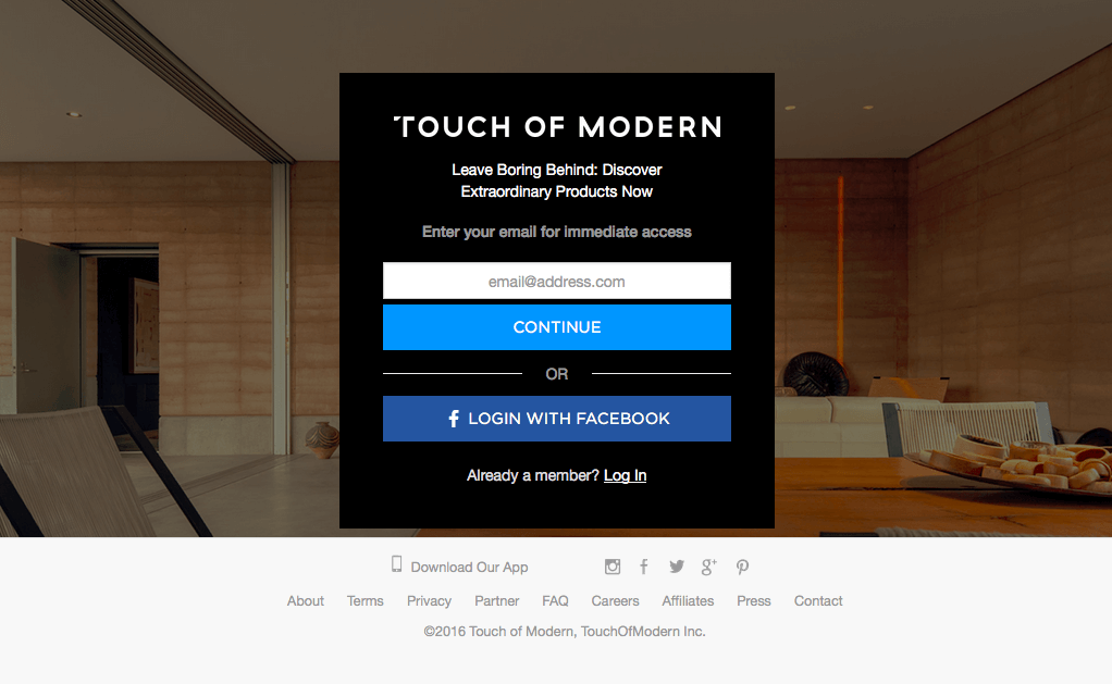
Users like to know what they’re getting into before submitting their email address, but Touch of Modern’s gatekeeper demands registration before… anything! This first mandatory and unnecessary action will scare away a sizeable chunk of potential users.
Solutions
Here’s a great exercise for finding unnecessary actions: List every step a user must do to complete a task. For example, sending an email might look like this:
- Click the email icon.
- Click in the “Send to” input field.
- Type the email address.
- Click in the “Subject” input field.
- And so on.
Now, rescan the list and look for redundancies. Get any ideas?
You could remove step 2 entirely by having the cursor start in the “Send to” field automatically. This will save the user the trouble, however slight. Every step you eliminate is a win.
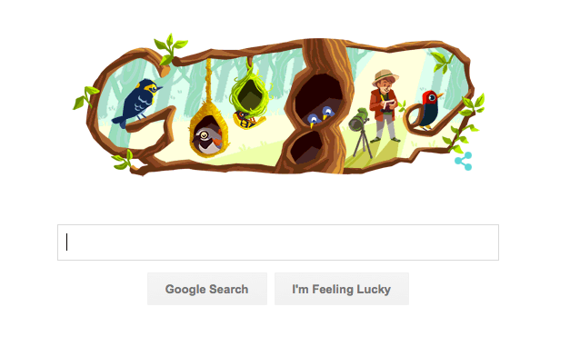
Let’s consider Google’s home page. The cursor starts in the search field, so all the user has to do is start typing. These micro-interactions add up over the entire experience, so don’t ignore them.
2. Overstimulation
Cluttered, chaotic and otherwise distracting interfaces can derail a user from their task at hand. Just like it’s hard to focus when several people are talking to you at once, on the web it’s hard to focus when too many images, animations, icons, ads, text types and bright colors are fighting for your attention.
Remember that one’s working memory must sort through external stimulus as it moves forward to its goal. Every distraction, especially a visually domineering one, demands a piece of the user’s attention.
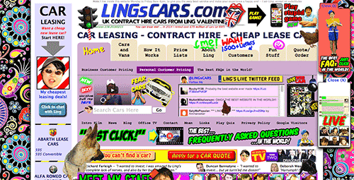
LINGsCARS might be an extreme example, but you can see how quickly the competing elements, such as bright colors and motion, attack the senses. Even two simultaneous animations in two different areas of the screen threaten to overstimulate the user.
Solutions
For starters, get rid of everything that’s not essential. Keeping only what’s necessary is advantageous in general, reducing loading times and streamlining the experience. Even more important, a study on how aesthetics affect a website’s first impression (PDF) found that users prefer simple websites over visually complex ones.
You can also diversify your content for balance. Too much of one type (say, text or images) is overbearing. Use a fair mix of visual content — images, videos, infographics, etc. — to create harmony on the page and make it easy for the user to comprehend.
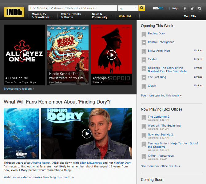
The film and TV website IMDb could have easily leaned heavily on visual content, but instead it balances it with equal amounts of textual content.
Once you’ve boiled down a page to its necessities, organize those elements in a way that’s instantly comprehensible to the user. Layouts with symmetry or constructive asymmetry display information in a way that’s quicker to understand, which is to say, in a way that demands less effort of the brain. Not only are symmetry and smart asymmetry pleasing to the eye, but their structure makes the interface easier to interact with.
See how Groupon offsets its vertical menu of text categories (middle left) with a text description of the featured frozen yogurt deal (middle right)? The use of photos and color blocks creates a structured and satisfying hourglass shape, pinched in the middle by text.

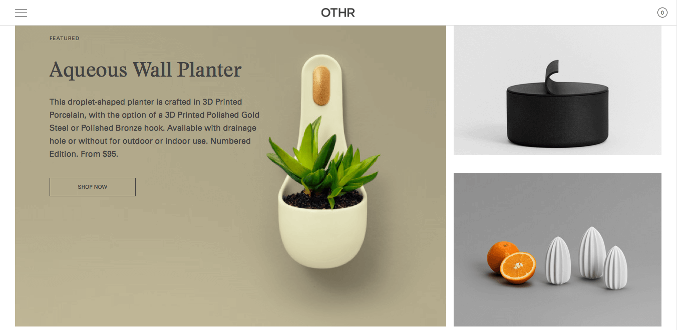
Symmetry is more than just about putting identical layouts on both sides of the screen. It’s about balancing visual weight and visual direction. In this way, asymmetrical screens can still appear organized, as OTHR shows below.
Reducing your page to only simple and non-competing elements is just half the battle against overstimulation. Don’t neglect to present these elements in a straightforward layout.
3. Too Many Options (Hick’s Law)
It’s a bit of a paradox: Users want a lot of options, but too many options will overload their brain.
Hick’s Law (or decision paralysis) tells of the phenomenon: The more options a user has, the more time they will take to make a decision. While William Hick and Ray Hyman first tested their theory in the 1950s, in the last decade their findings have been redefined for digital design. Not only have behavioral studies (PDF) confirmed Hick’s Law, but recently the phenomenon’s effects on the brain have been documented in a 2015 MRI study.
To understand Hick’s Law as a designer, think of each option as a bright flashing light. Too many bright flashing lights will overstimulate the user, as demonstrated above.
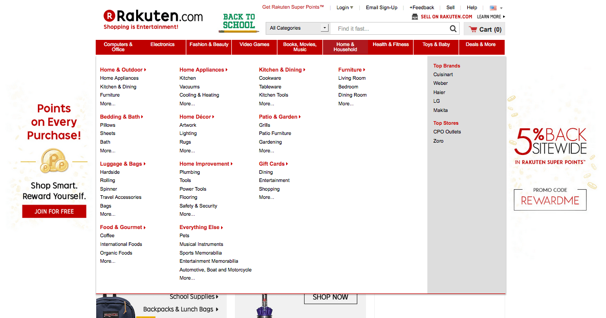
Even the makers of popular websites, like Rakuten’s, make this mistake because they don’t properly understand the principle. It’s the difference between giving users what they want and giving them what they think they want.
Solutions
Assuming you’ve already gotten rid of unnecessary and redundant options, you can group multiple options in umbrella categories. You see this a lot on department store websites, which have the widest product selections.
It’s not necessarily about too many options, just too many options at one time. If you can hide some of those choices in hidden menus, drawers and pullouts, you get the best of both worlds. These mega-menus still give the user many options, but in digestible doses that won’t overburden them.
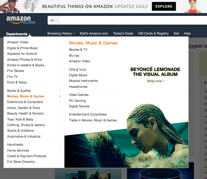
However, hidden navigation menus limit discoverability, so designers in industries such as e-commerce and news must be careful. You can minimize the drawbacks of hidden menus by complementing the page with out-of-the-way links to other products (such as Amazon’s “Related purchases” banner). Or you can simply do away with hidden menus by generalizing the header categories until they fit in a single navigation menu (as Apple and CNN do).

You’ll also want to be careful about how you organize the website’s navigation as a whole. A lot of issues with Hick’s Law can be handled by managing the information architecture (IA), which we’ll discuss below in the “Hard-to-Find Pages and Features” section.
4. Too Much Content
Just like the problems of overstimulation and too many options, offering too much content will pull your user’s working memory in too many different directions.
You obviously want to display only the content that’s essential, but for some robust websites, everything is essential. If you have too much content, you must learn how to organize it so that you don’t strain users.
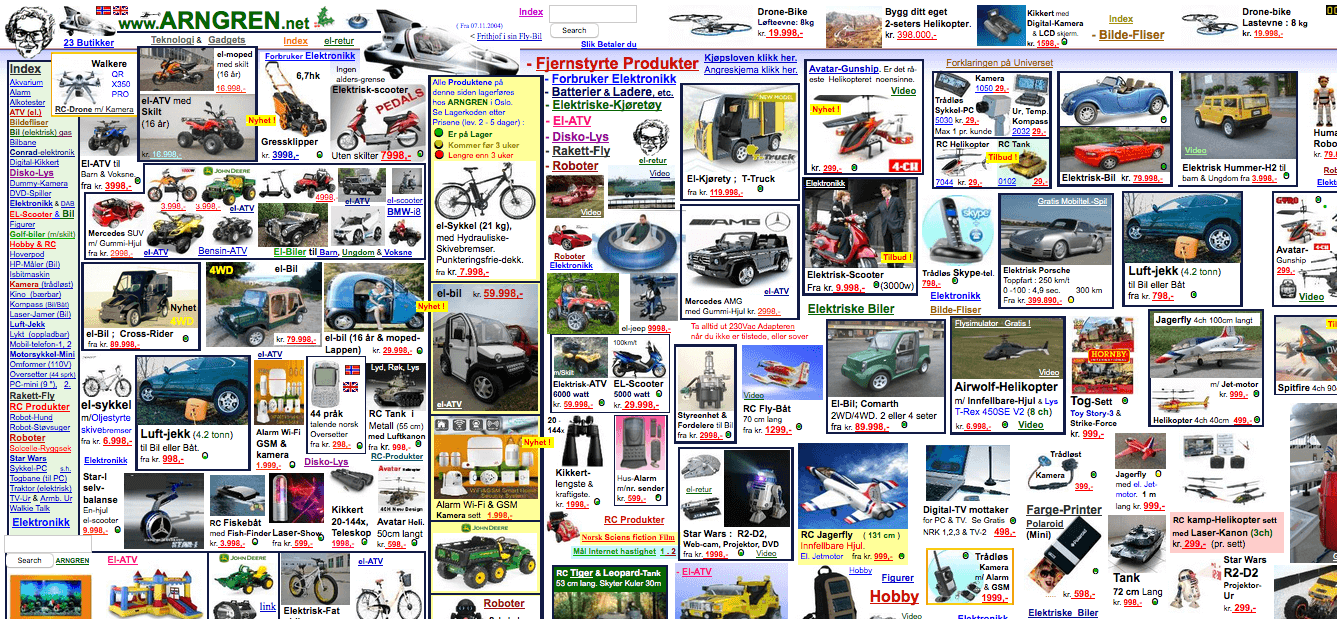
The problem with Arngren isn’t that it offers too many products, but that it offers too many products at the same time. A little more structure and organization would do wonders for the look of the website.
Solutions
As explained above, George Miller’s tactic of chunking is effective at presenting copious amounts of content in a manageable way. It’s the skill of grouping data to make it easy to remember. A phone number is broken into country code, area code, a set of three digits, and a set of four digits — a string of 11 or more numbers would be too hard to memorize.
Do you want to feature a lot of product images on the home page of your online store? Instead of listing them all in separate rows and columns, display them in groups based on their type. Etsy is able to display more products on its home page by grouping them in chunks according to seller.
Chunking in text involves short paragraphs, adequate use of headings and subheadings, and ample empty space.
For long-winded form fields in which all of the data is necessary, try a multi-step form. Long forms can appear intimidating and sometimes even cause website abandonment. Break up the form’s information into separate pages, or at least separate sections, to make it less imposing. Just be sure to include a progress marker so that users know how many pages to expect.
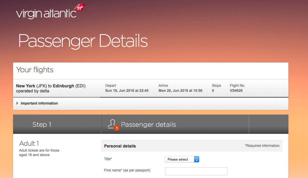
Buying a plane ticket always involves filling in a lot of data, none of which is expendable. Virgin Atlantic improves an otherwise tedious experience by breaking it up into individual steps on individual pages: selecting the flight, filling in passenger information, entering payment details, etc. Putting all of that on a single long page would overwhelm some users and increase abandonment.
5. Ambiguous Interface
The biggest culprit in cognitive overload is confusing UIs. The user should never have to spend long figuring out how to complete the action they want, nor waste brain power deciphering an icon.
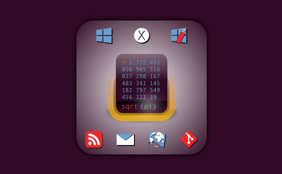
Not all users are tech-savvy enough to comprehend SpeedCrunch’s vague icons. Even if they know enough about computers to recognize the Windows and Mac OS X symbols at the top, those two icons in the bottom-right corner would take even Alan Turing a moment.
Solutions
Don’t reinvent the wheel: Use visual cues that users already know from other websites. Users rely on common affordances and signifiers to learn controls, even on websites they’ve never been on before.
If that’s too stifling, you could give the familiar pattern a unique spin with your brand’s identity. Home Depot uses common icons but gives them the brand’s telltale orange.

The same applies to microcopy. Buttons with standard labels like “Contact” and “Submit” are more recognizable than unconventional labels like “Address” or “Go.” Commonly known labels facilitate the user’s browsing experience, while uncommon ones make the user pause to wonder what the button does. Don’t sacrifice clarity for individuality.
On the other hand, what if you have a feature never seen before? In that case, make it self-explanatory by using a real-life representation. Skeuomorphism, as it’s called, bridges the gap between reality and the digital equivalent. For example, early Internet pioneers chose an envelope to represent email because envelopes are an obvious emblem of the mail system.
Also, avoid vague symbols, especially if they could be mistaken for something else or are otherwise confusing. Below, some of Issuu’s icons are familiar, but others are not. If the user has to click an icon to discover its function, they will be knocked off course.

Run your designs through a fresh set of eyes to make sure you’re not missing anything obvious.
Check out Denis Kortunov’s list of 10 common icon mistakes for details on what not to do — for example, icons being too similar to each other or being too complex individually.
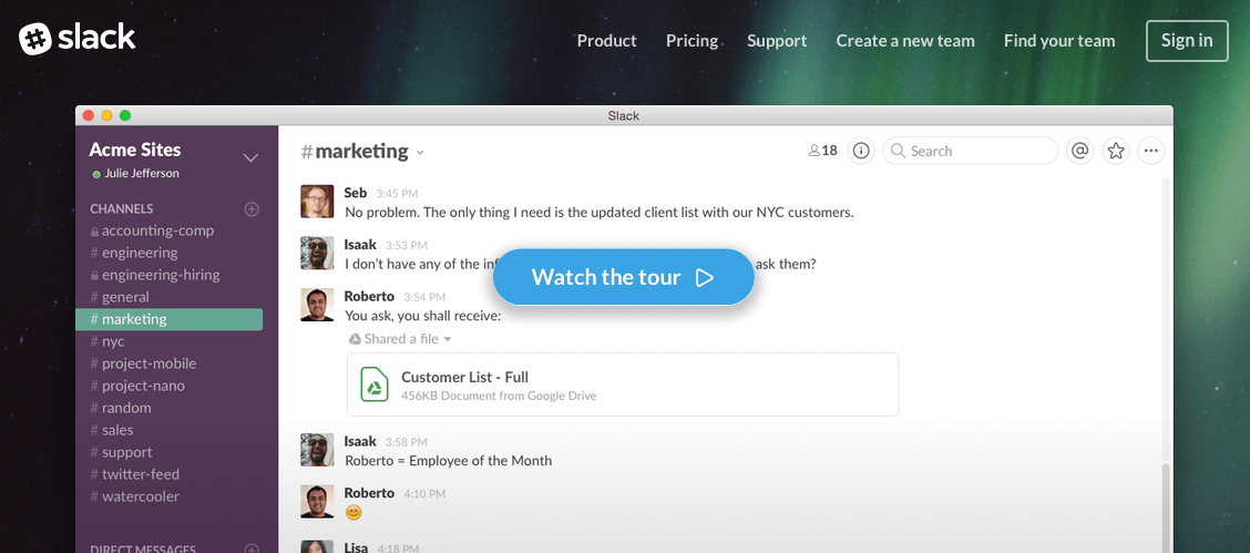
Any interface that isn’t completely obvious should include onboarding to instruct the user on how the UI works. Simple websites can get away with just a single window, especially if a memorable graphic explains the function. New and unique interfaces, though, require a more hands-on tutorial. For instance, Slack gives a complete video tour, with narration explaining what’s going on.
6. Hard-To-Find Pages And Features
Even if the user has everything they need, they still might not be able to find it. That’s no better than if the feature were broken. The bottom line is that the user is wasting brainpower trying to figure out what to do.
As an irreplaceable component of every user experience, navigation should be easy and stress-free. Website navigation should feel intuitive and should give the user confidence to roam freely without worrying about getting lost. Not only does this require extra work in the IA, but careful application is required to make it appear more simple than it actually is.
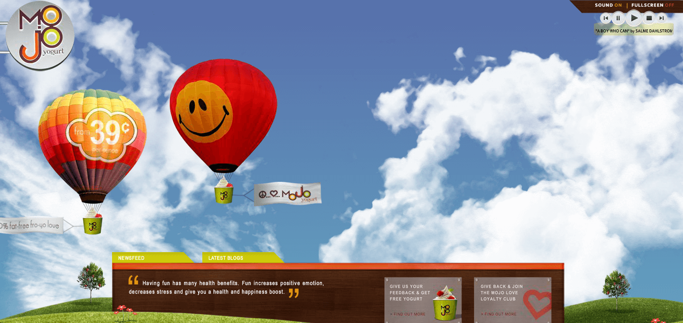
If you think hamburger icons are bad, Mojo Yogurt requires you to hover over the logo in the upper-left corner to reveal the navigation menu.

To its credit, a small animation reading “Navigation” orbits the logo. But with all of the color and movement on the screen, that one vague cue is not enough.
Solutions
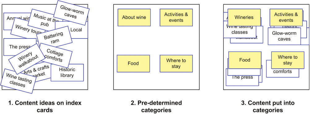
Straighten out your IA according to the preferences of your users. Your target user group might not think the way you do, so learn from them how to organize the website. A card-sorting test reveals how your users would categorize certain pages and topics. A tree test evaluates how well your current or proposed structure is understood by real users.
For a crash course in IA, read Dan Brown’s “Eight Principles of Information Architecture” (PDF). In just five pages, his overview explains the eight hard-and-fast rules every designer should know about IA, such as the principle of multiple classification (i.e. using a few different methods of categorization to accommodate users’ different modes of thinking) and the principle of disclosure (i.e. showing only enough information so that users know what to expect).
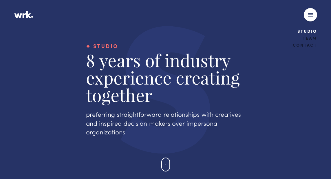
You’ll also want to get rid of redundancies by combining pages or menu items. For example, you don’t need one page for executive bios and another for individual team members — they can go on the same page. The design studio Waaark simplifies its navigation by merging its studio introduction, team member bios and contact information as three screens on a single page.
If certain functions or features are more important than others, use visual techniques to draw attention to them. Increasing the size, adding animation, and using a flashy or contrasting color can attract the user’s eye. Display information in a novel way, especially with a corresponding graphic, and make sure that, above all, it’s comprehensible.
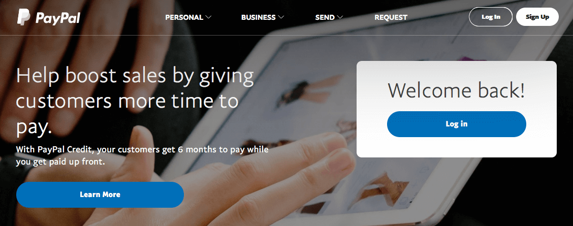
PayPal expects more returning users than new ones and caters to the former by setting the log-in button apart with an attention-grabbing white block background.
7. Internal Inconsistency
Let’s say the home page of a website uses the standard blue and underlined text to indicate a link, but that another page uses only blue and no underline. Even if the user never activated the first link, they might pause on the second page to think, “Is that still a link, even though it’s not underlined?” They might not even care about the link, but the split second they were distracted by the inconsistency bruises the overall UX.
Typos and grammatical errors work the same way. Remember that the best UX is unseen, but mistakes like that are often noticed.
It doesn’t matter whether an element is inconsistent with the rest of the website, with other websites (when it shouldn’t be, as with UI patterns) or with the user’s knowledge of language and grammar. In all of these instances, the user must take a moment to consider and process, which uses up working memory.
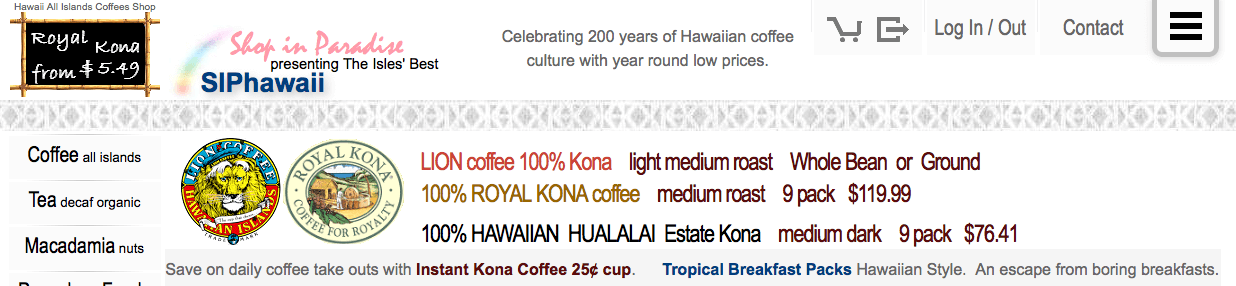
SIPhawaii is all over the place with capitalization, font size and the inclusion of prices. And you don’t even want to know what happens when you click the hamburger icon — suffice it to say, it’s certainly not consistent with other websites’ hamburger icons.
Solutions
Keep a consistent format throughout the website. This is a lot easier to say than to do, however, because mistakes of this nature are often unintentional.
A style guide can work wonders for consistency. It collects all of the global design decisions in one easily accessible place for quick access whenever the designer needs them. Details like the code value for the background color, the dimensions of images or the typography for headings can be easily forgotten, so making them readily available would be helpful.
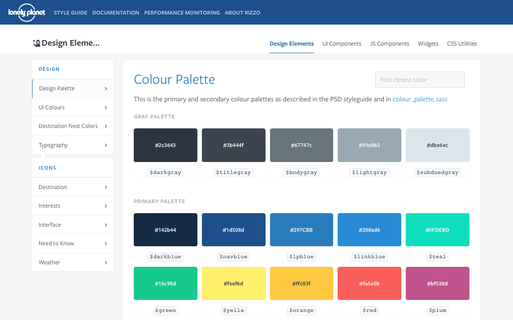
For more information on building a style guide, read our in-depth overview and an actual case study on creating one.
As for typos and grammatical errors, don’t just rely on the spell-checker. Always go through your content one final time before publishing. The free app Grammarly can help you spot harder-to-see errors.
A good example of both visual and functional consistency is Pinterest. No matter the style of picture in your feed, the format remains the same.
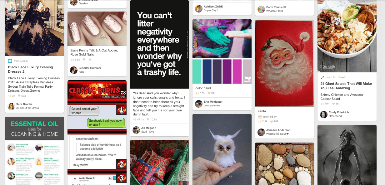
Titles, descriptions, authors, websites, pins and activity are all displayed with the same text size and typography, in the same location on each card. This dedication to consistency gives Pinterest the freedom to stagger the rows for more visual appeal, without confusing the user. If you can understand one card, you can understand them all.
Takeaways
Steve Krug famously exclaimed, “Don’t make me think,” which could more or less be the battle cry of the user as far as UX is concerned. Skilled UX design is aerodynamic. Any bumps on the way — such as excessive cognitive load — will drag the whole plane down. Designers need to cater to their users any chance they get, so don’t make them think any more than they have to.
Was that too much information to take in at once time? Here’s a summary of the takeaway points so that you don’t get overloaded:
- Cognitive load is any information that taxes the working memory. Cognitive overload happens when too much information hinders decision-making and the experience in general.
- Use a range of content types and structured page composition to avoid visual clutter.
- Hidden menus help users manage the number of options available at one time, but at the cost of discoverability.
- Tactics such as chunking and step forms safeguard against cognitive overload.
- Recognizable UI elements and microcopy draw on users’ existing knowledge, so that they don’t have to think too hard. New and unique features can be explained by onboarding.
- Build your IA around how your users actually think. Usability tests like card sorting and tree testing can reveal the most intuitive navigation schemes for your target group.
- Inconsistencies in visuals and functions, as well as typos and grammatical mistakes, will distract users from their overarching task.
- Remove redundancies wherever you can. Also, keep an eye out for ways to minimize the number of steps users must take or the amount of effort they must expend.
(By the way, the answer to the Sphinx’s riddle is “man”: crawling as a baby, walking as an adult and using a cane as an elder.)
Other Resources
- “Cognitive Load Theory, Learning Difficulty, and Instructional Design” (PDF), John Sweller This is the original scientific paper on Sweller’s research for the advancement of instructional design. It’s a bit academic but explains the internal processes of human thought and memory well.
- Don’t Make Me Think, Steve Krug Here is the book that began the conversation on how the scientific principles of cognitive load can be applied to web design.
- “The Magical Number Seven, Plus or Minus Two: Some Limits on Our Capacity for Processing Information” (PDF) George A. Miller As long as you don’t take everything he says literally (the theory has been debunked for web design), this scientific paper offers beneficial insight into how people think and the limits of human memory.
- 100 Things Every Designer Needs to Know About People, Susan Weinschenk If you like getting inside your users’ heads, this former behavioral psychologist lays out some observations about human thought patterns that designers could apply directly.
Further Reading
- Creating A Lasting Impression
- What Is User Experience Design? Overview, Tools And Resources
- How To Design For Experiences That Last
- Why User Experience Cannot Be Designed
 (ah, yk, al, il, mrn)

