WordPress Responsive Images With Art Direction

Email Newsletter
Weekly tips on front-end & UX.
Trusted by 182,000+ folks.
 Celebrating 10 million developers
 Custom Web Forms for Angular, React, & Vue. Your backend.


Support for responsive images was added to WordPress core in version 4.4 to address the use case for viewport-based image selection, where the browser requests the image size that best fits the layout for its particular viewport.
Images that are inserted within the text of a post automatically get the responsive treatment, while images that are handled by the theme or plugins — like featured images and image galleries — can be coded by developers using the new responsive image functions and filters. With a few additions, WordPress websites can accommodate another responsive image use case known as art direction. Art direction gives us the ability to design with images whose crop or composition changes at certain breakpoints.
In this article, I’ll show you how to set up a WordPress website for art direction by going through three progressive examples:
- WordPress’ automatic support for responsive images within posts
- a variable-width banner image in a page template
- an art-directed hero image in a page template
In the art direction example, we’ll be adding some PHP, a polyfill and a cropping plugin to the website.
Automatic Support For WordPress Responsive Images Within Posts
Support for responsive images is all about options: We provide a well-described array of image files to the browser, and the browser applies its knowledge of the width and pixel density of the viewport to request the file with the most appropriate resolution. The workhorse here is the srcset attribute, which can be used with img and source tags. Similar to, but more informative than, its older cousin, the src attribute, srcset is essentially a “set of sources” — that is, a list of image files available for downloading. For detailed background on the srcset attribute, I recommend Eric Portis’ article on responsive images.
Since version 4.4, WordPress automatically adds a srcset attribute to any image that is run through the_content filter. In other words, when WordPress is creating the HTML for your web page, it scans the post or page’s text for img tags and adds a srcset attribute to any tags that don’t already contain one. You won’t see the srcset in the post editor (unless you explicitly add one, although you should generally let WordPress take care of it), but it will be present in the page’s HTML source.
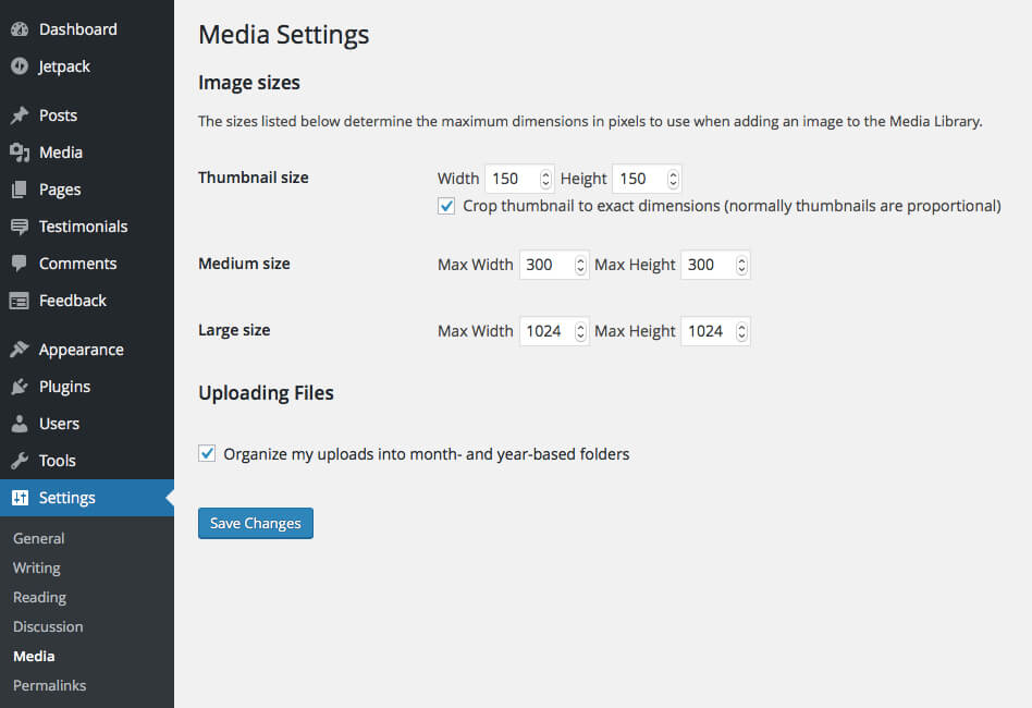
To offer multiple image sizes in the srcset, WordPress leverages its standard behavior of automatically creating several smaller versions of your image files when you upload them to the “Media Library.” You can find these sizes listed on the “Media Settings” screen (under the “Settings” menu in the WordPress administration interface), along with their default values; not listed is the new “medium_large” image size (768 pixels wide, with no height limit), the size of which can be changed by a theme or plugin but not through the administration interface.
By default, the autogenerated “medium,” “medium_large” and “large” image sizes are soft-cropped — that is, they maintain the same aspect ratio as the original file. (I refer to these as “scaled” versions.) In these cases, the width given on the “Media Settings” screen is the constraining parameter. In contrast, the “thumbnail” size is hard-cropped to a 150 pixel square, so it most likely has a different aspect ratio than its bigger brothers. WordPress relies on aspect ratio to determine which image sizes should be included in a srcset, and we’ll be seeing this play out in each of our examples.
Let’s say that you upload a 1400 × 952-pixel image to the WordPress media library and keep the image sizes at their default values. Behind the scenes, WordPress creates the following versions of the original image:
| Size | Width (px) | Height (px) | Cropping | Aspect ratio (w/h) |
|---|---|---|---|---|
| full (original) | 1400 | 952 | soft | 1.47 |
| large | 1024 | 696 | soft | 1.47 |
| medium_large | 768 | 522 | soft | 1.47 |
| medium | 300 | 204 | soft | 1.47 |
| thumbnail | 150 | 150 | hard | 1 |
If you then insert the “large” (1024 pixels wide) version into a post and view the HTML source for the published web page, you’d see something like this:
<img src="sample-1024x696.jpg" width="1024" height="696"
    class="alignnone size-large"
    srcset="sample-300x204.jpg 300w,
        sample-768x522.jpg 768w,
        sample-1024x696.jpg 1024w"
    sizes="(max-width: 1024px) 100vw, 1024px"
    alt="A meaningful sample image">
WordPress has generated a srcset for us using the “medium,” “medium_large” and “large” sizes because these images all share the same aspect ratio. The “thumbnail” version wasn’t included, which makes sense because we want those images to look the same in every viewport.
Two other bits of information are also included in the HTML above. First, the w descriptors within the srcset tell the browser the actual pixel widths of the files; without these, the browser would need download the images to find out their dimensions. Secondly, WordPress’ default value for the sizes attribute tells the browser how wide the image is intended to be in this particular layout. Here, for viewports narrower than 1024 pixels, the image should fill and scale with the size of the viewport; otherwise, the image should be displayed at its default width of 1024 pixels and not any wider. With these final pieces to the puzzle, the browser can now make an intelligent image request, whether it be to display a high-resolution file on a “Retina” display or a low-resolution file on a small phone.
A Variable-Width Banner Image In A Page Template
Now that we understand how WordPress leverages the standard image sizes to build a srcset, it’s time to get acquainted with WordPress core’s new responsive image functions by applying viewport-based image selection to a theme. For this example, we’ll look at a full-width banner image that appears on a static front page.
Let’s assume that we have an existing website using the current version of WordPress and that support for post thumbnails is enabled in our theme. (Support for post thumbnails allows us to add featured images to posts and pages.) Let’s also assume that the banner image is pulled from the featured image for the front page. If our front page template uses WordPress’ the_post_thumbnail() template tag to generate the HTML for the banner, then we are all set: This function already outputs an img tag that includes srcset and sizes attributes. That’s one reason why it is good to use WordPress template functions when they are available!
Maybe, though, our page template builds the HTML for the banner image piece by piece, as you might need to do if your banner is actually part of a third-party carousel. To make this image responsive, we ask WordPress explicitly for srcset and sizes attributes, using the wp_get_attachment_image_srcset() and wp_get_attachment_image_sizes() functions, respectively:
<?php if ( has_post_thumbnail() ) : ?>

    $id = get_post_thumbnail_id();
    $src = wp_get_attachment_image_src( $id, 'full' );
    $srcset = wp_get_attachment_image_srcset( $id, 'full' );
    $sizes = wp_get_attachment_image_sizes( $id, 'full' );
    $alt = get_post_meta( $id, '_wp_attachment_image_alt', true);

    <img src="<?php echo esc_attr( $src );?>"
        srcset="<?php echo esc_attr( $srcset ); ?>"
        sizes="<?php echo esc_attr( $sizes );?>"
        alt="<?php echo esc_attr( $alt );?>" />

<?php endif; ?>
Here, we’ve based srcset and sizes on the original image size by passing the full keyword to our functions. If that image is 1280 × 384 pixels, and if we keep the standard image sizes at their default values, then the HTML output would look like this:
<img src="banner.jpg"
    srcset="banner.jpg 1280w,
    banner-300x90.jpg 300w,
    banner-768x231.jpg 768w,
    banner-1024x308.jpg 1024w"
    sizes="(max-width: 1280px) 100vw, 1280px"
    alt="Front page banner alt text">
In this case, as in the last, the value that WordPress gives us for the sizes attribute is acceptable for our hypothetical layout. In general, WordPress’ default value for sizes works fine for full-width images, but for any other layout, you are going to need to write the value yourself. Some layouts are more complicated than others: The sizes attribute for a responsive image grid (see Eric Portis’ example) is pretty straightforward, but layouts that change at different breakpoints, such as pages with a sidebar column, require more thought. For the latter case, Tim Evko uses the Twenty Sixteen theme as an example of applying the wp_calculate_image_sizes filter to make the sizes value match the layout’s CSS breakpoints.
An Art-Directed Hero Image In A Page Template
Let’s momentarily revisit the HTML in the banner example and take note of the size of the smallest image in srcset: It’s only 90 pixels tall and probably difficult to discern. The aspect ratio is fixed by the original image, so, realistically, we’ll be looking at a 96-pixel stripe across a 320-pixel phone.
Themes currently get around the “banner stripe” problem by displaying the banner image as the CSS background of a flexible div and adjusting its height and background-size in media queries. This solution is responsive in terms of appearance, however, it is not a true responsive image solution. Enter art direction, the ability to provide different image sources at different viewport widths directly in HTML. With this technique, we can avoid the banner stripe problem by resetting the proportions of an image below a breakpoint to give the smallest resizes better dimensions; we can also use art direction to emphasize a particular area of an image at different sizes or orientations.
In our art direction example, we will use the 1400 × 952-pixel image from our first example to create a responsive hero image. On large viewports, the hero image will look like this (albeit much larger):

But for smaller viewports, we will crop the image within WordPress so that it looks like this:

This approach gives us two images for the price of one — a full-sized and a cropped — each with its own srcset.
Setting up our WordPress environment for art direction takes four steps. As in the previous example, the hero image will be the featured image for the website’s home page, and we’ll be editing the front-page template. I assume that you are making changes to an existing theme and, thus, have created a child theme to work in.
1. Include The PictureFill Script
We are going to code our hero image by wrapping it in HTML5’s picture element. The picture element allows us to provide multiple sources for an image, along with media queries to determine when a source will be used. As of this writing, picture is supported globally by 62% of browsers, so we will need to rely on the Picturefill polyfill to implement this element in non-supporting browsers. The Picturefill project is maintained by the Filament Group, and the Picturefill JavaScript file can be downloaded from GitHub.
To include the PictureFill script in the head of our pages, we’ll place the script file in our child theme directory and add the following code to our child theme’s functions.php file:
// adds Picturefill to 'js' subdirectory inside child theme

function theme_add_javascripts() {
    wp_enqueue_script( 'picturefill-js', get_stylesheet_directory_uri() .
        '/js/picturefill.min.js', '', '', false );
}

add_action( 'wp_enqueue_scripts', 'theme_add_javascripts' );
2. Plan The Breakpoint And Configure The Image Sizes
To plan our srcsets, we need to decide on three things:
- the breakpoint at which we will switch from the cropped to the full-sized hero image,
- the aspect ratio of the cropped hero.
- one or more scaled-down sizes for the cropped image in small viewports.
Let’s deal with each in turn:
The breakpoint
For our example, let’s say that the couple in the rearview mirror become hard to recognize in images narrower than 768 pixels; perhaps some overlaid text that we are using with this image no longer fits beneath the mirror at this point as well. We’ll set our breakpoint at 768 pixels, which means that we’ll also be able to keep the “medium_large” and “large” image sizes at their default values.
The aspect ratio
This simple implementation of art direction in WordPress doesn’t require us to upload multiple featured images or to type in a value for the breakpoint. Still, we need a way to keep the srcset for the full-sized image from overlapping with the srcset of the cropped image, and for this we will rely on the fact that the wp_get_attachment_image_srcset() function only selects image files with the same aspect ratio as the size we pass to it. We’ll pick a 5:3 (1.67) aspect ratio for the cropped hero image, which differs from the 1.47 aspect ratio of the original.
The image sizes
Based on our breakpoint and aspect ratio, the size of the cropped hero image will be 767 × 460 pixels. The cropped hero won’t be completely responsive, however, unless we define additional image sizes to crop along with it. Applying a performance budget approach to our hypothetical theme, we’ll create custom sizes that are 560 and 360 pixels wide, giving us a roughly 20 KB difference in file size between the three cropped versions. (Because the file size of a compressed image depends its color variation and level of detail, I established this size relationship empirically with WordPress’ default 90% JPEG compression.) The custom image sizes will be created by adding the following code to our child theme’s functions.php file:
// cropped hero
add_image_size( 'mytheme-hero-cropped', 767, 460, true );

// scaled-down cropped hero 1
add_image_size( 'mytheme-hero-cropped-smaller', 560, 336, true );

// scaled-down cropped hero 2
add_image_size( 'mytheme-hero-cropped-smallest', 360, 216, true );
The fourth parameter in the add_image_size function specifies whether the image version can be hard-cropped, which we set to be true; many cropping plugins (which we’ll look at in step 3) will not let us hard-crop an image unless this is set.
Overall, we’ll have the following image versions available to work with:
| Size | Width (px) | Height (px) | Aspect ratio (w/h) |
|---|---|---|---|
| Full-sized hero: | |||
| full (original) | 1400 | 952 | 1.47 |
| large | 1024 | 696 | 1.47 |
| medium_large | 768 | 522 | 1.47 |
| medium (not needed) | 300 | 204 | 1.47 |
| Cropped hero: | |||
| mytheme-hero-cropped | 767 | 460 | 1.67 |
| mytheme-hero-cropped-smaller | 560 | 336 | 1.67 |
| mytheme-hero-cropped-smallest | 360 | 216 | 1.67 |
| Thumbnail: | |||
| thumbnail (not needed) | 150 | 150 | 1 |
3. Install A Third-Party Image-Cropping Plugin And Crop The Images
WordPress’ built-in image editor does allow us to hard-crop an image, but the change is applied to all image sizes (or just to the “thumbnail”), whereas we need to crop only three. For greater control, we’ll install a third-party cropping plugin from the WordPress directory.
While any cropping plugin should work with our art direction scheme, the ideal plugin would be able to crop multiple versions of an image at the same time, provided that they all had the same aspect ratio. I came across two plugins that are able to do this: Crop-Thumbnails and Post Thumbnail Editor. Testing both of these plugins with our custom image sizes, I found that the Crop-Thumbnails plugin (version 0.10.8) recognized only two of the three sizes as having the 5:3 aspect ratio, meaning that I would need to go through the cropping process two times. (The “mytheme-hero-cropped” size was left out because of a rounding issue: An exact 5:3 aspect ratio would require the width to be 460.2 pixels, instead of 460.) The Post Thumbnail Editor plugin (version 2.4.8) allowed me to crop all three sizes at once.
4. Code The Hero Image Using The Element
Now that our images are ready, we can add the code for the hero image to a copy of the front-page template in our child theme. HTML5’s picture element can hold an img tag and one or more source tags. For our example, the single source element will contain the media query and srcset for the full-sized image, and the img tag will contain the srcset for the cropped image; the cropped image will serve as the default image when the breakpoint condition is not met.
<?php if ( has_post_thumbnail() ) : ?>

    $id = get_post_thumbnail_id();
    $alt = get_post_meta( $id, '_wp_attachment_image_alt', true);

    /* get the width of the largest cropped image to
       calculate the breakpoint */
    $hero_cropped_info =
        wp_get_attachment_image_src( $id, 'mytheme-hero-cropped' );
    $breakpoint = absint( $hero_cropped_info[1] ) + 1;

    // pass the full image size to these functions
    $hero_full_srcset =
        wp_get_attachment_image_srcset( $id, 'full' );
    $hero_full_sizes =
        wp_get_attachment_image_sizes( $id, 'full' );

    // pass the cropped image size to these functions
    $hero_cropped_srcset =
        wp_get_attachment_image_srcset( $id, 'mytheme-hero-cropped' );
    $hero_cropped_sizes =
        wp_get_attachment_image_sizes( $id, 'mytheme-hero-cropped' );

  <picture>
    <source
        media="(min-width: <?php echo $breakpoint; ?>px)"
        srcset="<?php echo esc_attr( $hero_full_srcset ); ?>"
        sizes="<?php echo esc_attr( $hero_full_sizes ); ?>" />
    <img srcset="<?php echo esc_attr( $hero_cropped_srcset ); ?>"
        alt="<?php echo esc_attr( $alt );?>"
        sizes="<?php echo esc_attr( $hero_cropped_sizes ); ?>" />
  </picture>
<?php endif; ?>
There are two additional points of interest in this code. First, notice that we are not hardcoding the breakpoint width, even though we know that it should be 768 pixels in this case. Because we calculate the breakpoint using the width of the largest cropped image, we can now change the image sizes in future without needing to go back to edit the template. Secondly, in contrast to the banner image example, the img tag here does not get a src attribute. This is an artifact of using a polyfill to support the picture element: A non-supporting browser would preload the file given in the src attribute, resulting in a double download for this image.
The HTML that we get is shown below:
<picture>
    <source media="(min-width: 768px)" srcset="hero.jpg 1400w,
        hero-300x204.jpg 300w, hero-768x522.jpg 768w,
        hero-1024x696.jpg 1024w"
        sizes="(max-width: 1400px) 100vw, 1400px">
    <img srcset="hero-767x460.jpg 767w, hero-560x336.jpg 560w,
        hero-360x216.jpg 360w"
        alt="Front page hero alt text"
        sizes="(max-width: 767px) 100vw, 767px">
</picture>
We could finish here, but we could make one refinement to our HTML output. Notice that the 300-pixel-wide “medium” image has been included in the srcset for the full-sized image. This image file will never be used, so we can add a wp_calculate_image_srcset filter to remove it from the srcset. The following code, which goes in the child theme’s functions.php file, looks only at the potential srcset (the $sources array) for the full-sized hero image; it loops through the images and removes those with widths narrower than the breakpoint.
add_filter( 'wp_calculate_image_srcset',
    'mytheme_remove_images_below_breakpoint', 10, 5 );

function mytheme_remove_images_below_breakpoint( $sources, $size_array,
    $image_src, $image_meta, $attachment_id ) {

    if ( is_front_page() && has_post_thumbnail() ) {

        // check if we're filtering the featured image
        if ( $attachment_id === get_post_thumbnail_id() )  {

            // get cutoff as width of the largest cropped image size
            // (in HTML, breakpoint = cutoff + 1 )
            $cutoff =
                $image_meta['sizes']['mytheme-hero-cropped']['width'];

            // check if our version is the full-sized version by
            // comparing its width to the cutoff
            if ( $cutoff < $size_array[0] ) { // for each element in tentative srcset foreach ( $sources as $key => $value ) {

                    // if image width is at or below cutoff,
                    // we don't need it
                    if ( $cutoff >= $key ) {
                        unset( $sources[ $key ] );
                    }
                }
            }
        }
    }

    return $sources;

}
Final Thoughts
We have just set up a WordPress theme to support art direction in a simple manner. This method relies on WordPress’ standard administration interface as much as possible, and it requires only a single image to be uploaded. Simplicity comes at a cost, however, and this method has its limitations: The sizes for the cropped hero images are hardcoded in the theme, only one breakpoint is assumed, and the aspect ratios of the full-sized and cropped heros must be different.
Programmatically, it is entirely possible to give a website’s content creator complete control over all aspects of art direction, because the wp_calculate_image_srcset filter can process images by width, size keyword or any other bit of meta data that a theme or plugin wants to save. Multiple images could even be selected from the media library and incorporated in the art-directed version. The challenge lies in making the administration interface — the theme customizer or the plugin settings page — simple to use for content creators who may want no options, a few options or the kitchen sink.
Finally, we can’t end an article on responsive images in 2016 without mentioning browser support. While we do have a very effective polyfill for the picture element, if a browser that does not natively support the srcset attribute has JavaScript turned off (or encounters a JavaScript error), a visitor will only see our hero image’s alt text. Global support for the picture element did increase earlier this year when new versions of Safari for Mac and iOS were released, but we are still waiting for the picture element to come to UC Browser and for older browsers — namely, Internet Explorer 11 — to die out.
Further Reading
- The Responsive Image Breakpoints Generator
- Introducing The Responsive Image Breakpoints Generator
- Responsive Images Done Right: A Guide To
And srcset - Responsive Images Now Landed In WordPress Core
 (vf, al, il, mrn)

