The Thumb Zone: Designing For Mobile Users

Email Newsletter
Weekly tips on front-end & UX.
Trusted by 182,000+ folks.
 Register for Free
 Custom Web Forms for Angular, React, & Vue. Your backend.
 Celebrating 10 million developers


Have you ever interacted with a mobile website or app that simply didn’t play nice with your thumbs? Perhaps you’ve had to stretch to get to an important menu, or swiping turned into a battle with multiple swiping elements. Mishaps such as these reveal poor consideration of the thumb zone.
In this article, I will share the knowledge I’ve acquired about the thumb zone and how to apply its rules to navigation, cards and swipe gestures.
Learning From The Best
As mentioned, Steven Hoober researched and wrote about the thumb zone in Designing Mobile Interfaces. This is where I first encountered the notion that it might be important to consider thumbs while developing.
Along with Hoober, Josh Clark has recorded in-depth information on how people hold their devices in his book Designing for Touch. You can read an excerpt on A List Apart.
Using Hoober and Clark’s study of how thumbs interact on devices, I performed user testing on wireframes that varied the location of design elements. My tests ran with navigation elements on the top and bottom of the screen, cards with buttons in different locations, and gesture areas outside and inside the thumb zone.
My test results validated Hoober and Clark’s research, while providing solid evidence of what works and what doesn’t in design. Below, I’ll share my findings on the design elements I tested. Let’s get started!
Thumbs Vs. Touchscreens
Opposable thumbs are nice to have, aren’t they? In addition to making us way cooler than jellyfish, thumbs are also key to how we interact with our mobile touchscreen devices. Hoober’s research shows that 49% of people hold their smartphones with one hand, relying on thumbs to do the heavy lifting. Clark took this even further and determined that 75% of interactions are thumb-driven.
With this understanding of hand placement, we can conclude that certain zones for thumb movement apply to most smartphones. We’ll define them as easy-to-reach, hard-to-reach and in-between areas.
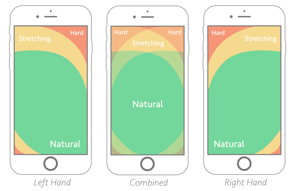
The trick is to design for the flow of the thumb zone. This provides a framework for making better design decisions, creating human-friendly experiences and getting fewer headaches. Through user testing and experimentation, I’ve discovered a few ways to use this knowledge in everyday development.
Problems With Navigation
We all remember a time when mobile navigation was simply a dropdown list of links. It wasn’t pretty, but it got the job done. Today, we see endless examples of navigation patterns. What’s the best fit for the thumb zone?
The natural movement of the user is the first thing I learned to take into account. Ask questions: “Does my app have a long list of links?” “Do I need to mix menus?” “What goes well with my website design?” The answers to these questions will help you determine where to place navigational triggers and hooks.
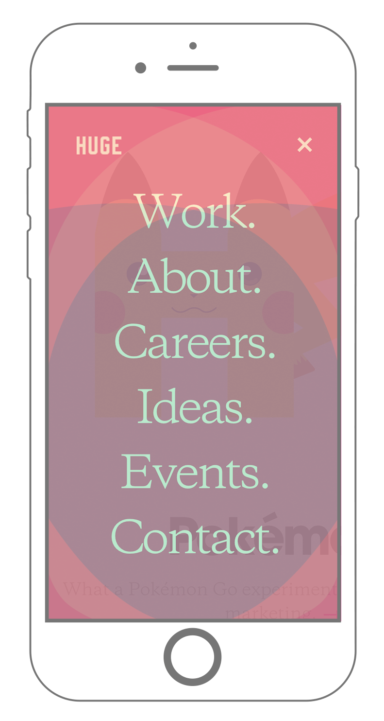
If your app has a long list of links, then you’ll probably want to use a full-screen overlay menu. This type of menu affords space for you to organize the list, social buttons and other useful content. The pattern scales well between desktop and mobile devices, and the menu provides an opportunity to align clickable elements within the thumb zone.
Huge has always made great use of full-screen overlay menus on mobile devices:
On the flip side, if your app does not have a long list of links, then a sticky menu might be best. This type of menu attaches to the top or bottom of the screen and provides real estate for many links, depending on the design.
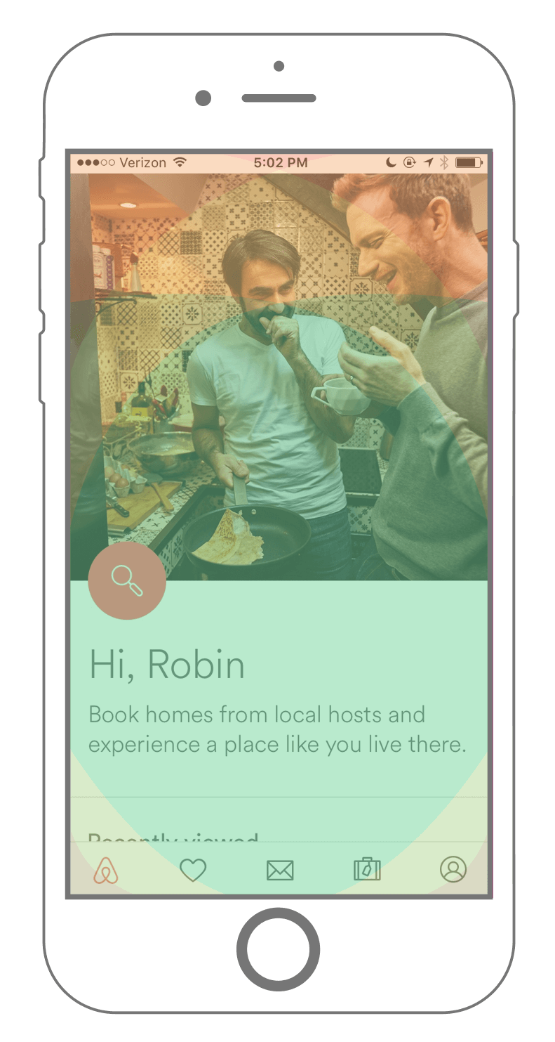
Airbnb’s mobile app has a sticky menu, attached to the bottom of the screen, providing easy access to important booking, messaging and listing information:
If you have a large website, mixing menus might work. Because mixing menus can get complex, it’s helpful to prioritize menu links based on their importance in the app. Sticky menus are great for commonly visited links, whereas full-screen and drawer menus come in handy for important but not high-priority links.
Consider Facebook’s mobile app:
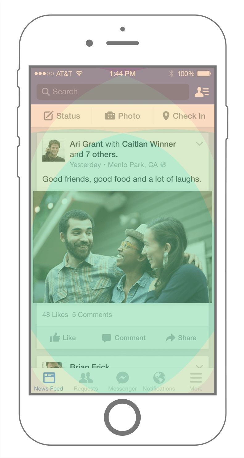
Facebook mixes menus based on the size of content within them. In the screenshot above, we see two sticky menus, each containing valuable links for the user. The top sticky menu is in the stretch zone, but just low enough on the page that it feels natural. The bottom sticky menu items are organized to provide comfortable tapping of popular links.
By gathering user data, practicing good design and leveraging the thumb zone, Facebook is owning sticky menus. The next time you’re trolling your friend’s posts, remember the series of decisions that have made your trolling experience that much better.
Remember that in addition to keeping important navigation items within the thumb zone, placing links outside of the friendly zone is acceptable at times. The general rule is to keep frequently used links in the easy-to-reach zone and to keep infrequently used links in the hard-to-reach zone.
Keeping Cards Friendly
Next, we’re going to review how a well-designed card pattern can work for your app. The card pattern has been widely used for a while now. Cards are quick, easy and predictable; they provide bursts of information in small doses, making it easy to deliver the right content at the right time.
Often, we couple cards with actions: send, save, done, close, etc.
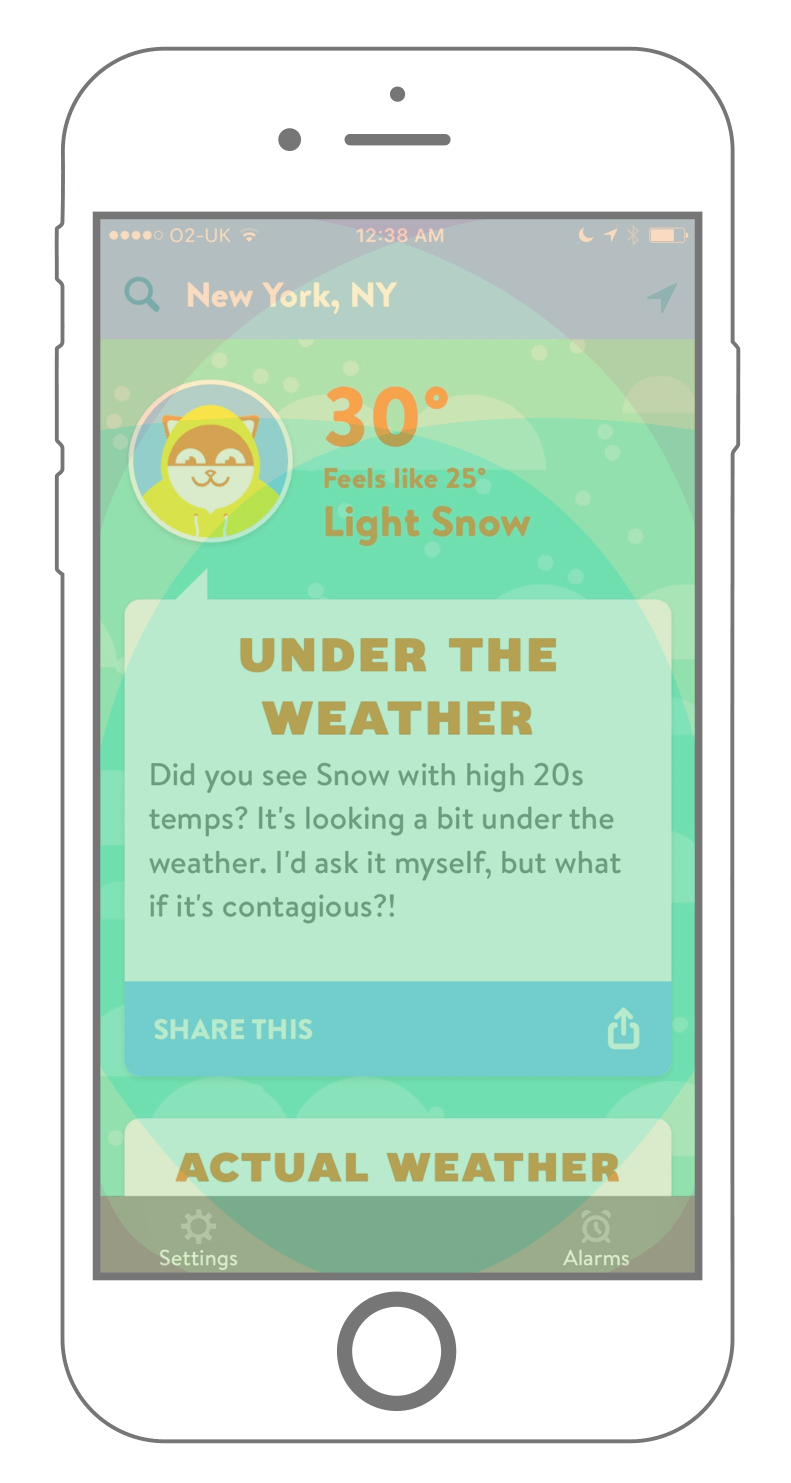
In this example we see the Poncho: Wake Up Weather app. This is a great example of placing actionable links within a card: The weather report doesn’t require a thumb tap, so it’s placed way inside the unreachable zone. The action item — in this case, a share button — is placed directly in the natural zone.
On the other side, Poncho places its “location search” and “use current location” links far inside the hard-to-reach zone. This is acceptable: A user would use those features infrequently, because the app remembers your location from the last time it was open.
On the flip side, there are times when card patterns don’t utilize the thumb zone. A prime example of this is Etsy’s mobile app. During checkout, Etsy provides a form in a popup card for the user to enter their shipping information:
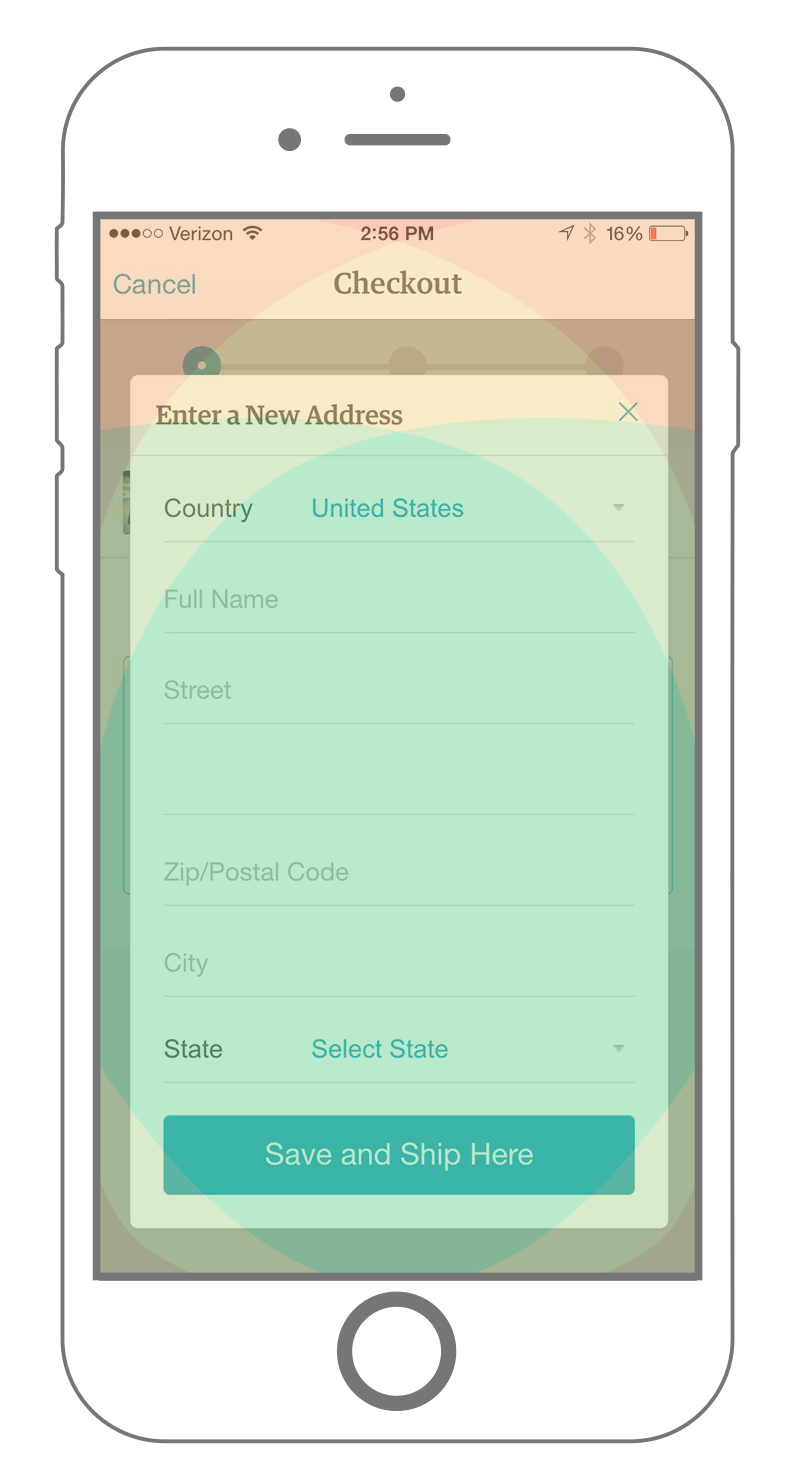
At first glance, this use of a card seems appropriate and design-savvy. Digging deeper, we see flaws. The first problem is the “Cancel” link in the top-left corner. Does that link close the card or cancel the checkout process (if I’m confused, others surely will be, too). Also, The “x” is at the edge of the thumb zone, forcing the user to stretch to reach it.
Here’s a dilemma: Adding a close button to a top corner of a card is a common pattern, but it goes against the thumb zone rubric. If you’re breaking out of the thumb zone to meet a user’s expectations, look for an alternative solution. We could experiment by adding a close button at the bottom of the card, or — since cards are best when delivering short bursts of content — we could try limiting the length of content in cards.
As the card design fad takes hold, it’s a good idea to run designs through the thumb zone map to ensure that most elements are easily accessible and not confusing. Avoid following trends; instead, make human-oriented decisions throughout the design and development of your app.
Gestures And Movement
The gesture: tap, double-tap, swipe, drag, pinch and press. These are the icing on the smartphone cake. Gestures enable us to engage with technology through our sense of touch.
You might be able to guess where this going. Keep gestures within the thumb zone. More importantly, allow the user to perform gestures naturally. This seems obvious, but to really pull off a comfortable experience, it’s important to calculate where the gesture should happen.
Let’s focus on the swipe interaction. Through swipe-tracking scripts, I found some really interesting movement data.
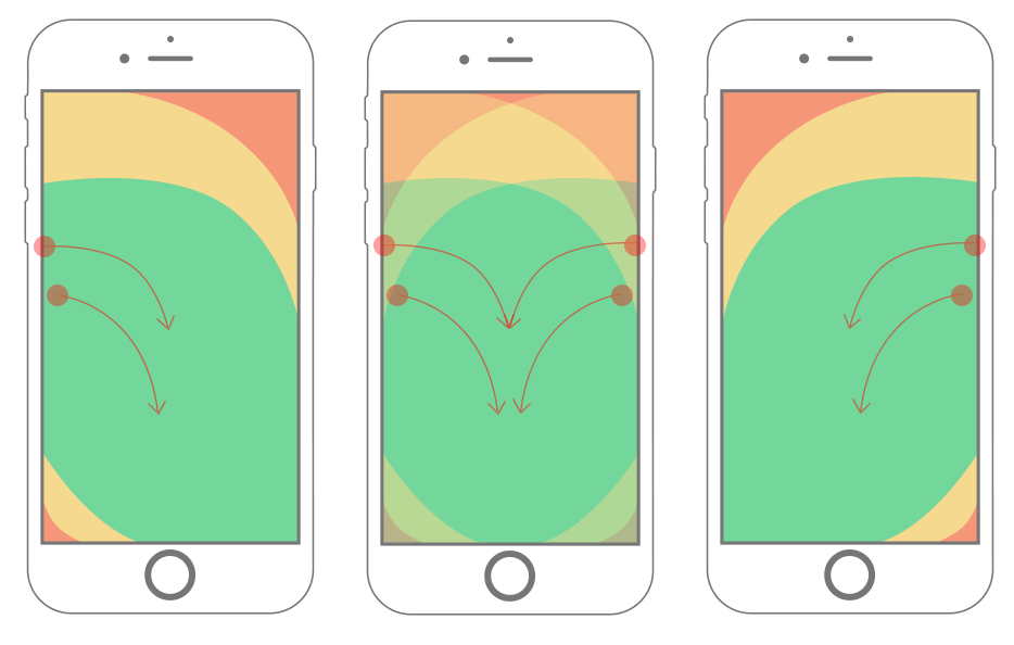
In the map above, circles represent taps, and arrows represent swipes. The data that I collected from tests show that users usually swipe somewhere from the device’s edge towards the middle, diagonally downward. I also found that users generally swipe in the natural area of the thumb zone.
Originally, I had the misconception that users swipe horizontally across, which created problems when measuring thumb areas for swipe gestures. My design specifications did not provide enough room to swipe without triggering another swipe area simultaneously. As with most mobile design elements, consider the thumb space required for swiping. I’ve found an appropriate size of swipe areas to be at least 45 pixels tall and wide.
With all of this information, we can conclude that it’s better to place swipe-gesture actions in easy-to-reach areas, while also allowing enough space to prevent accidental inputs.
A great example of the swipe gesture is Google’s Inbox app.
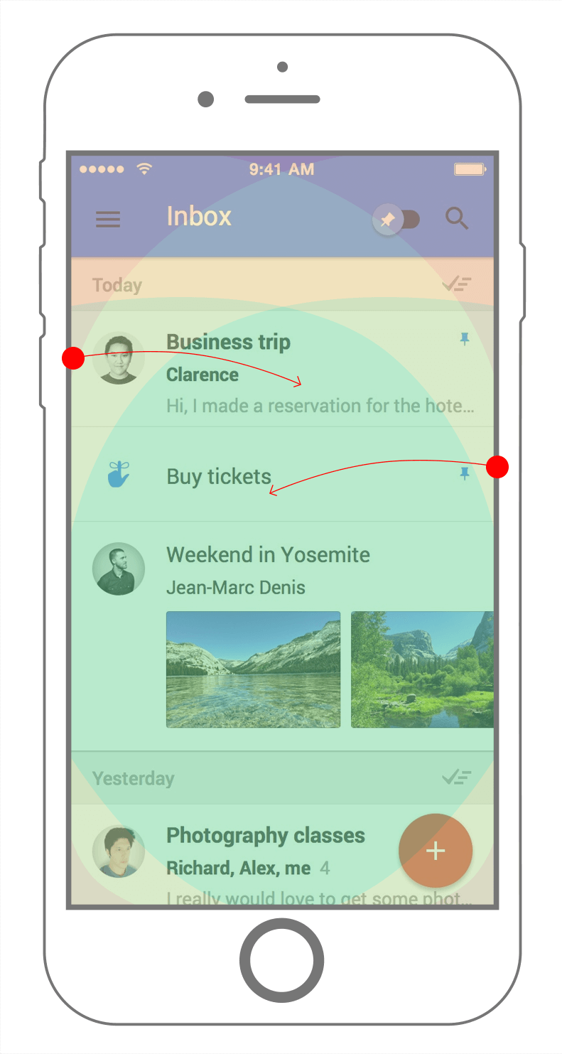
The smart decisions here are:
- keep swipe gestures out of hard-to-reach areas;
- provide enough tapping space;
- allow swipes to start anywhere in each email block element.
With all of this, gestures feel natural and comfortable, making email management faster and less complicated. Keep on keepin’ on, Google!
Summary
What have we learned? Hopefully, you better understand why the thumb zone is important. Remember these points:
- Mobile devices and languages will change, but as long as there are touchscreens, the thumb zone will remain a critical part of design.
- Navigational design is thumb-friendly when important links are in the easy-to-reach zone and unimportant links are in the hard-to-reach zones.
- Cards are a powerful design asset when content and actions are thumb zone-friendly.
- Determining swipe gesture areas becomes simpler when we consider how a person thumb swipes against a glass screen.
Useful Links
I’ll leave you with this: Keep reading! There is much to learn from other people in the industry. Below are a few links on the subject of designing for humans:
- Thumb zone template (PSD)
- Designing for Touch, Josh Clark
- Designing Mobile Interfaces Steven Hoober
- “Designing for Thumbs – The Thumb Zone,” Oliver McGough
- Check the thumb! Nicolás J. Engler & Antonela Debiasi
- “One-Handed Mobile Interface,” Konstantin Savchenko, Medium
- “How Do Users Really Hold Mobile Devices?,” Steven Hoober, UXmatters
- “Facebook Paper’s Gestural Hell” Scott Hurff
- “Designing for Large Screen Smartphones,” Luke Wroblewski
Further Reading
- Mobile-First Is Just Not Good Enough: Meet Journey-Driven Design
- Designing Card-Based User Interfaces
- Beyond The Button: Embracing The Gesture-Driven Interface
- Testing Sites And Apps With Blind Users: A Cheat Sheet
 (da, yk, al, il, mrn)

