How To Build Honest UIs And Help Users Make Better Decisions

Email Newsletter
Weekly tips on front-end & UX.
Trusted by 182,000+ folks.


 Celebrating 10 million developers
 Custom Web Forms for Angular, React, & Vue. Your backend.
Many apps today, such as Google Now, Spotify and Amazon, make assumptions about user preferences based on personal data. They may even use this information to make decisions on our behalf, without any direct input from us. For example, Facebook tailors your news feed and Amazon recommends products — both hiding “irrelevant” information and only showing what they think you will like.
This type of design pattern, where user choice is removed, has recently been coined “anticipatory design”. Its aim is to leverage data on user behavior to automate the decision-making process in user interfaces. The outcome lowers the excessive number of decisions people currently make, thereby reducing decision fatigue and improving decisions overall.
Despite the good intentions imbued in anticipatory design, though, automating decisions can implicitly raise trust issues — especially at a time when trust has been eroded through the use of dark patterns in user interfaces. Therefore, in contrast to the deceitful dark patterns that are meant to trick users, this article will look at how we can give people confidence in the decisions made for them by using “light patterns,” which ensure that user interfaces are honest and transparent, while even nudging users to make better decisions for themselves.
First, Why Decide For Your User?
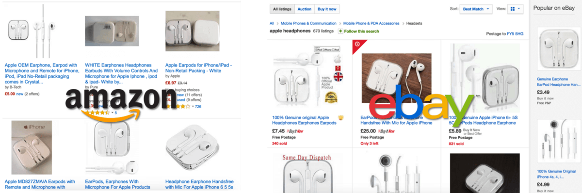
In today’s online world, consumers face more options than ever before. For example, consider shopping in marketplaces such as Amazon and eBay. Even when we know exactly what we want (replacement Apple headphones, for example), the choice can still be overwhelming:
Another example is all-you-can-eat music services, such as Spotify, which put huge amounts of music at our fingertips, with no extra cost to listen to more. The additional choices quickly add up:
While more choice is welcome, too much can create a daunting experience for the user, because then actually making a decision becomes difficult. This problem has been highlighted extensively before, most notably by Barry Shwartz’s paradox of choice and Hick’s Law:
- Barry Shwartz’s paradox of choice
“Lots of choice makes people less likely to choose anything, and less happy when they do choose.” - Hick’s law
“Every additional choice increases the time required to take a decision.”
Both studies suggest that by reducing the amount of choice in a user interface, we can improve a user’s ability to make decisions, thereby reducing frustration and making the user experience better.
Articles about “decision fatigue” back this up, stating that making high numbers of decisions can cause people to be less effective at making the important decisions in life. That’s why Mark Zuckerberg wears the same style of clothes every day:
"I really want to clear my life to make it so that I have to make as few decisions as possible about anything except how to best serve this community."
How To Reduce Choice
Reducing the number of choices for a user has, therefore, become the focus for many of today’s apps. This has been done in a number of ways, two of which we’ll discuss now.
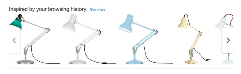
Make Options More Relevant
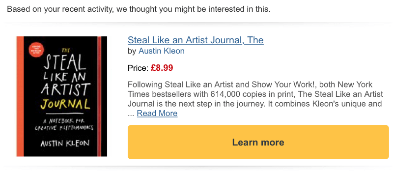
Many products are personalized to individual preferences, limiting options only to those deemed relevant to the current user. This has been done famously by Amazon, both on its website and through tailored email recommendations based on data collected on customers:
Anticipate Decisions
Recommendations such as those above might not be enough to reduce the difficulty of choice, because users are still faced with the many relevant options that have been filtered through. This is where products can go a step further by making decisions on the user’s behalf, totally removing the burden of choice.
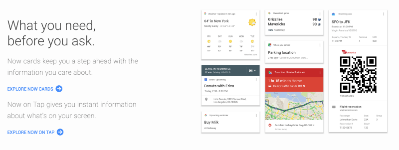
For example, apps such as Google Now are increasingly carrying out actions for users, without any direct user input:
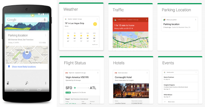
Google Now makes a lot of decisions in the background, from finding out where you’ve parked your car to searching for football scores — and notifying you at the right time without even having to be asked:
Spotify shows another instance of this type of assumptive approach by creating playlists for users before they even think to:
"It's like having your best friend make you a personalised mixtape every single week."

The task of searching for new music and deciding which tracks to add to a playlist are carried out for you.
This notion of making decisions for users has been called “anticipatory design” and has become a topic of debate because of the ethics involved in making decisions on behalf of users.
Creating Trust In Anticipatory Design
In the process of reducing choices and making decisions for people using the approaches outlined above, one could be accused of being presumptuous about what users want. This can create distrust if the app doesn’t do what the user expects, especially at a time when many apps have been exposed for exhibiting dark patterns, tricking users into doing things they don’t want to do.
Consequently, the higher the number of decisions an app makes for users, the more transparent it should be in order to maintain trust. This can be done by avoiding certain dark behaviors and instead favoring transparency through “light patterns,” which keep users informed and in control, even when anticipatory design is used. Let’s explore a few light patterns.
Avoid Limiting Information
When options are filtered away to show users more of what they might like (through app personalization and recommendation systems), an inherent problem can be created whereby users begin to see more and more of the same type of content:
This can making discovery of new things tricky. It is evident not only on e-commerce websites such as Amazon, but also on social media websites such as Facebook. As Time magazine states:
"Facebook hopes to show more links to people who click lots of links, more videos to people who watch lots of videos and so forth."
Many users might not be happy with this because they don’t want brands to determine what they see. For instance, Joel Spolsky, CEO of Stack Overflow, accuses Facebook of hiding information:
"Facebook is not showing all posts. It is choosing what to show you. An interesting question is to what extent does the Facebook algorithm tend to reinforce your preconceptions? Because that's what it has been trained to do."
Give The User Control
One way to avoid limiting information is to make it easier for users to improve the assumptions that are made about them, through feedback mechanisms.
This can be done in different ways, from obvious (and, therefore, easier) mechanisms to less obvious ones:
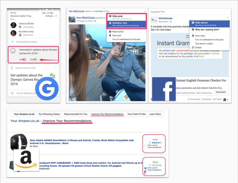
- Google Now (top left) prompts users directly underneath its Now cards to check that the information shown is relevant.
- Facebook (top right) is slightly less obvious, employing a dropdown caret in the top right of each news item. Clicking the caret reveals options to hide news you don’t want to see.
- Amazon (bottom) makes it even more difficult to tailor recommendations. You need to navigate to “Your Account” → “Your Recommendations” → “Improve Recommendations” to adjust what it shows you.
Of these three examples, Google offers the most transparent feedback mechanisms, giving multiple obvious interactions for users to provide feedback on cards, ensuring that the user is in control:
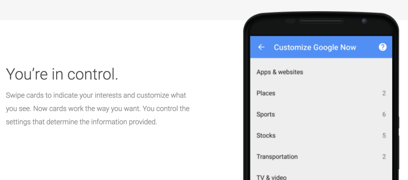
As well as swiping cards, you can also access customization settings from the menu icon on each card:

In the case of Facebook and Amazon, even though users can provide feedback to tailor what they see, the underlying news feed and recommendation algorithms have greater control, as outlined by Joel Spolsky.
Avoid Disguising Ads As Content
Disguising ads as content is a common dark pattern, and it can happen when actions are carried out without the user’s explicit consent.
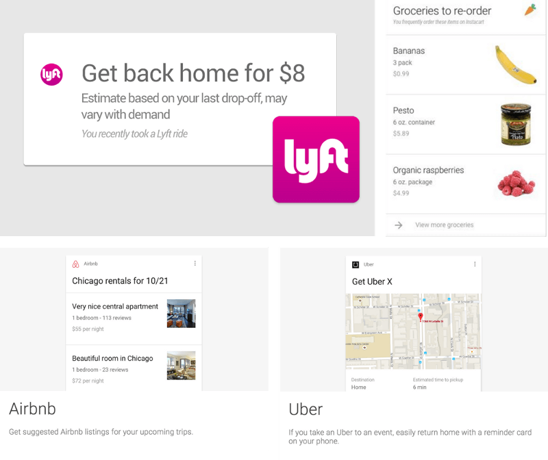
As an example, Google Now recently partnered with brands such as Lyft, Airbnb, Uber and Instacart to prompt users with services available from those apps, at the time it thinks you need them. While cards from third-party services can be useful, when the cards are for paid services, it can almost seem like another form of advertising:
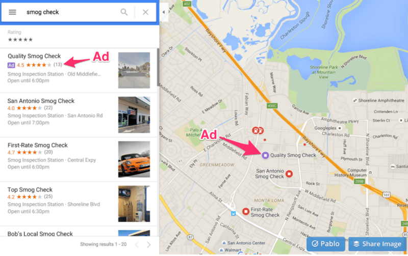
When similar dark shades of design can be seen in related products, the motivation behind anticipatory decisions becomes more suspect. Google Maps is a good example of this, appearing to disguise ads as pins on map search results:
Make Use Of Existing User Input
When making assumptions about users, it’s important that they be accurate. A tried and tested way to do this is to make use of previous user input, as seen in web browsers features such as pre-populated forms, or by remembering credit-card details and passwords in anticipation of future use:
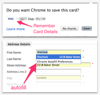
This saves users from having to repeat the same tasks. The same principle can be applied when making more complex assumptions that combine multiple streams of data. Campaign Live highlights an example of this when it discussed how the taxi service Hailo’s “Now card” combines time, geolocation and previous user input to rebook taxis in Google Now:
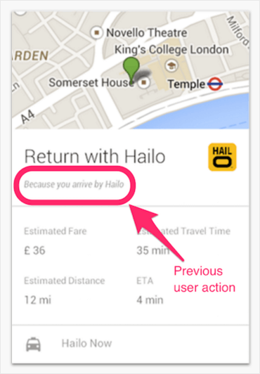
"Let's say you come into London and you book a Hailo cab, and you go into a particular area between 7am and 10am. If you're still there at 5pm, there's an assumption you may want to leave and that's when the Google Now card would prompt you to book a cab."
The assumption is likely to be more accurate in this case (and will appear less like a disguised ad) because the offer is based on a previous booking made by the user via the same service, within a reasonable time period:
Let Users Opt Out
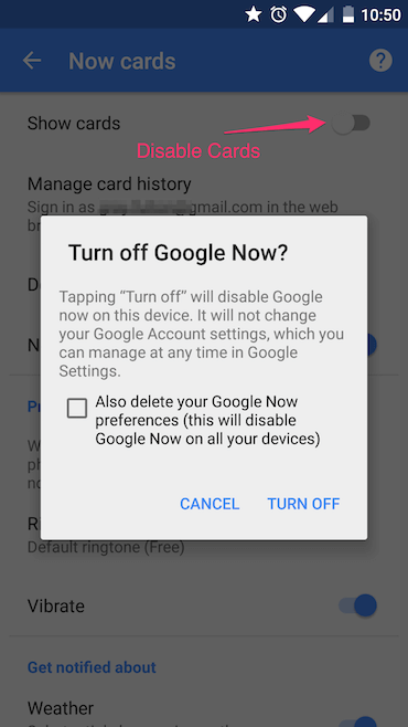
Despite being able to customize the recommendations given to them, sometimes people don’t want apps to make decisions for them at all. In this case, opting out must be easy. Even though you can’t delete the Google Now app, you can disable Now cards in the settings:
In contrast, there is no way to turn off Amazon recommendations, unless you log out completely — which makes sense (for Amazon) because 35% of product sales are a result of recommendations, according to Venture Beat.
A question remains, therefore, as to whether features that record and make use of user data in these ways should be opt-in by default. There is a big difference between opt-in by choice and presumed consent, as shown in this example of organ donors from Dark Patterns:
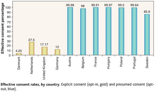
Basically, when opt-in is the default, consent to be an organ donor is nearly 100%, whereas when the decision to opt-in is not presumed, the consent percentage is very low.
Use Dark Patterns To Help People
It’s evident that companies use dark patterns to advance their own agendas, and it’s even easier today with the tools that help companies make decisions on behalf of users. However, what if similar methods could be used to help people make better decisions for themselves? Currently, many of us make poor decisions due to human frailties such as lack of self-control or a focus on short-term gains.
Nudge People To The Right Option
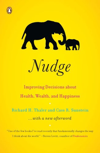
In their book Nudge: Improving Decisions About Health, Wealth, and Happiness, Richard Thaler and Cass Sunstein suggest creating an ethical “choice architecture” that nudges the user towards choosing the best overall option in the long run.
In this vein, the techniques we have seen being used to create dark patterns can also be used to form light patterns that nudge users to make better choices.
Auto-Enrolment
For example, as life expectancy has increased, it’s become important for people to save for old age through pension plans such as the US’ 401(k). However, as explained by Thaler and Sunstein, even though these plans offer “free money,” many people still don’t choose to enroll. Possibile solutions suggested by Thaler and Sunstein to help people save for old age include:
- automatically enrolling people (similar to the organ donor example),
- forcing people to make a simple yes or no decision on whether to enroll.
These approaches are examples of light patterns because they serve to benefit users, pushing people to take action and to make good long-term decisions. Even though the latter approach forces people to decide, it simplifies the decision to an easy binary choice, which encourages people to participate.
Create Good Behavioral Patterns
Alan Shapiro suggests that anticipatory apps could actually encourage behavioral patterns in users. By being constantly advised where to go and what to buy, people could become conditioned by app notifications and the decisions made on their behalf.
This could make for some scary scenarios, such as when a company is primarily interested in selling you products, because it’s more likely to instill behavior that favors impulse purchases and the use of its services. For instance, Amazon’s new Prime Pantry service is full of shady patterns, starting with its Pantry Boxes, which encourage people to buy more than they intended:
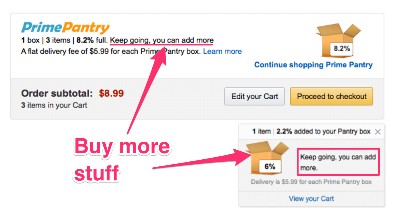
As put by Matt Crowley, head of product at Circadia:
"Amazon has shifted the conversation away from "do I need this?" to "what else do I need to fill up this box?""
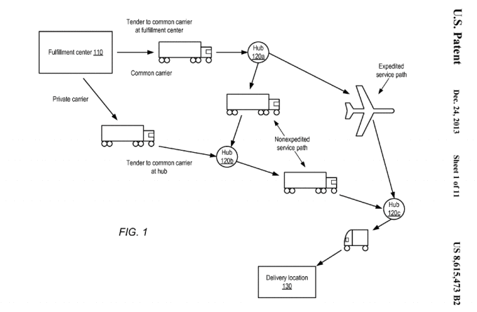
Amazon has even gone as far as filing patents for a system that leverages user data to predict and deliver products before the customer has even placed an order. Amazon calls it anticipatory shipping:
Putting these motives aside, what if the same tactics could be used to help people form good behaviors and habits? There are plenty of examples of this today, with the emergence of many self-improvement and habit-forming apps.
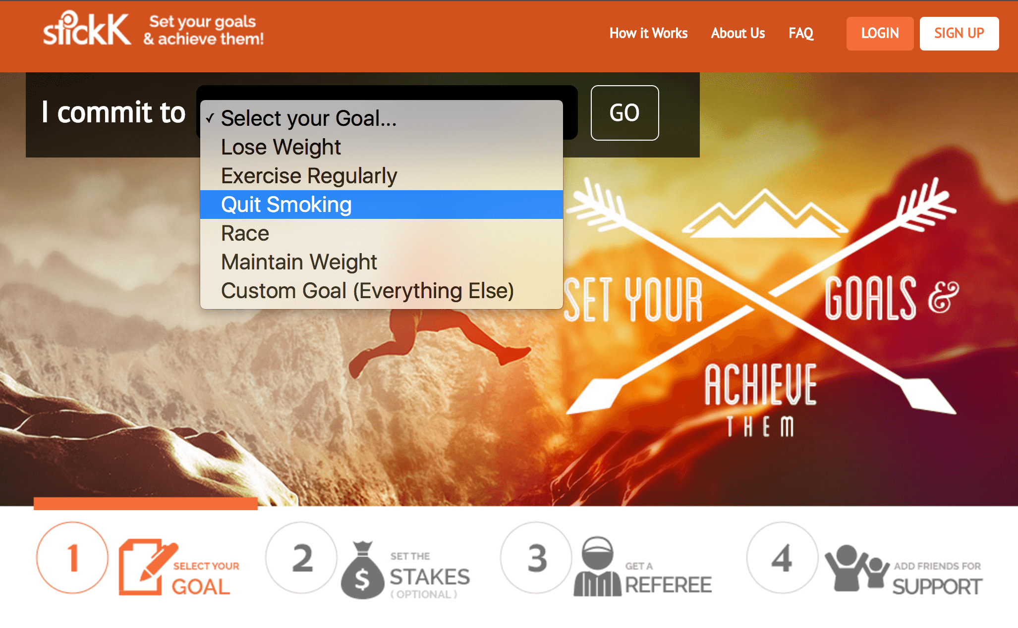
For example, stickK helps you kick bad habits by using “the psychological power of loss aversion and accountability to drive behavior change.”
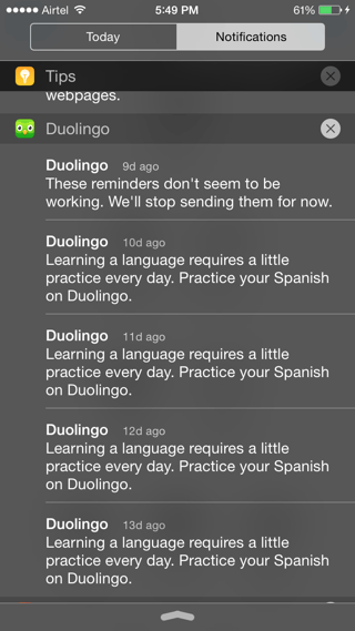
Duolingo reminds you to practice your new language every day, helping you to form a beneficial habit.
From what we see above, the benefits people get from decisions being made on their behalf in anticipatory design are largely determined by the ethics of the company behind the app. How willing is a company to exploit customer data for its own purposes, and how much data are users willing to trade for convenience?
As explained throughout, giving users control and staying transparent are key to maintaining trust. What do you think about dark patterns used in anticipatory design? Do light patterns really exist, and who is in control when design assumptions are made?
Further Reading
- Why User Experience Cannot Be Designed
- Effectively Planning UX Design Projects
- 25 User Experience Videos That Are Worth Your Time
- Better User Experience With Storytelling
- 10 Principles Of Effective Web Design


