How To Poison The Mobile User

Email Newsletter
Weekly tips on front-end & UX.
Trusted by 200,000+ folks.


One of the most popular children’s television heroes here in the Czech Republic is The Little Mole, an innocent, speechless and cheerful creature who helps other animals in the forest.
TV heroes often fight against people who destroy their natural environment. When watching The Little Mole with my kids, I sometimes picture him as a mobile website user. Do you want to know why?
We, as web designers, often treat our users the same way the “bad guys” treat The Little Mole, especially on mobile websites.
One episode of the series is particularly dramatic. An old man tries to get rid of the mole in the garden by any means and eventually tries to poison him. Web designers do the same thing when they make it difficult to use the mobile version of a website and try to “poison” the user, eventually making them leave the website.
So let’s be a little sarcastic today and try to poison the mobile user. How does that sound? Just follow my instructions.
Let’s make a slow website, disable zooming, hide the navigation and fill up the page with fixed-positioned elements. I’ll bet the poor mobile user won’t be able to survive this.
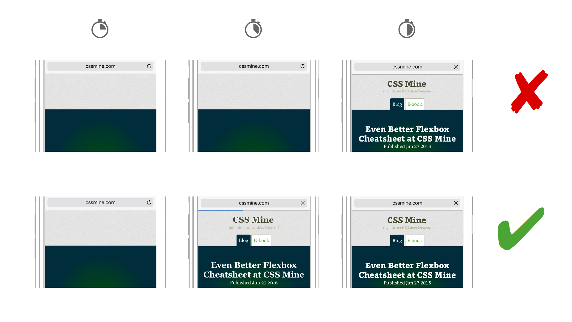
1. Make The Website Load Slowly
Making the website load slowly is the best weapon against the mobile user. Can the visitor go to and return from the post office before the website has finished loading? Then you’re doing a great job! You are poisoning the mobile user effectively.
Now, let’s be serious. The transmission speed of mobile networks is slow, and even though speeds are increasing to 3G and 4G, the networks aren’t everywhere, and they just can’t compete with wired ones.
Various test and surveys show that the website speed has a significant impact on conversions and a website’s overall effectiveness. The user shouldn’t have to wait more than a couple of seconds for a website to render, even when using an EDGE connection.
Moreover, don’t forget that website speed is one of the criteria that Google considers for search results and AdWords campaigns. Therefore, it affects not only conversions but also whether users will land on your website at all.
The solution is quite simple: Think about speed when you are developing a website’s concept. Start with a performance budget.
Optimizing speed is not that complicated. Let me share with you some best practices from Google:
- Minimize data transmission.
- Don’t block rendering.
- Optimize the back end.
Don’t have time to read this now? I completely understand. Save the text for later. Fortunately, tools are available to tell you what is wrong with your website. First, test your website with PageSpeed Insights, and then continue to WebPagetest.
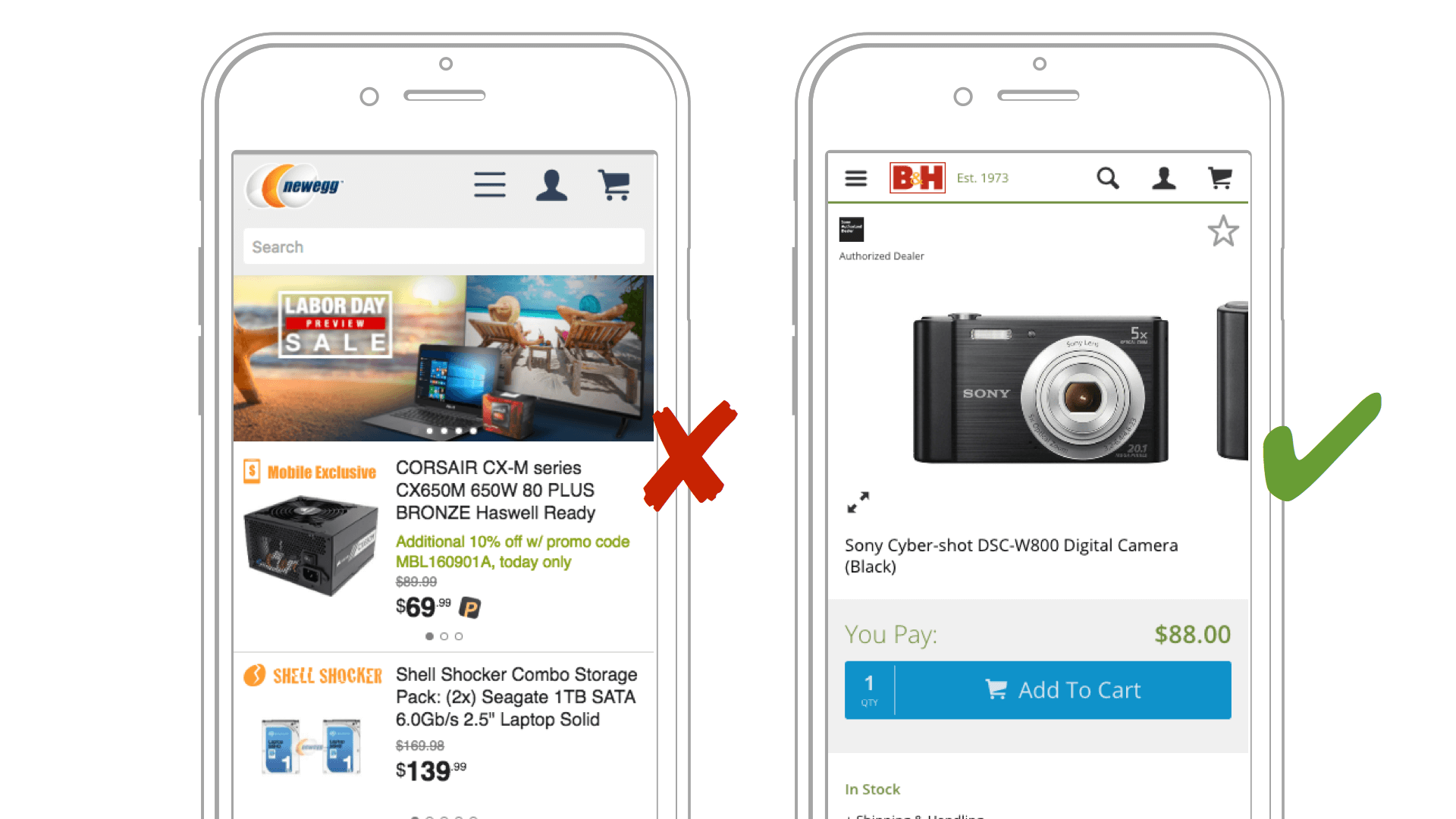
2. Design Your Carousel Poorly
The user will never come back.
It is true that various studies on carousels do not explicitly say they are inappropriate. However, carousels are complicated both in implementation and for the user experience. So, using them is risky.
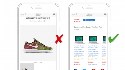
It is highly probable that, by using carousels, you will be hiding some content, instead of promoting it. According to some surveys, the vast majority of users see only the first image, and banner-based carousels are usually just ignored because of “banner blindness”.
If you plan to use a mobile carousel, make sure it meets the following criteria:
- Don’t use the carousel just as eye candy or to hide unnecessary content.
Carousels are great at advertising secondary content that is related to the main content. - Use the first slide to announce the other slides.
The main purpose of that first slide is entice the user to view the second and third slides. - Make the navigation usable on small phones.
Those small dots used as navigation on the desktop do not count as “usable” on mobile phones! - Make sure custom gestures don’t conflict with default browser gestures.
Are you using the swipe gesture? Make sure it does not conflict with a built-in browser gesture. - Don’t slow down the website.
This has to do primarily with data demand and implementation of the carousel.
3. Hide The Menu Under A Hamburger Icon
Make the navigation easily accessible? Come on, get serious! You could end up with thousands of users.
When you hide the menu on a website, people will stop using it. In a recently published study, Nielsen Norman Group found that hidden navigation on mobile has a negative effect on content discoverability, task completion and time spent on task.
If there is something important in the navigation, and you can display it, do it. If you can’t show the whole menu, then simplify it, or at least show the important parts of it. For this reason, I tend to recommend the “priority plus” navigation pattern.
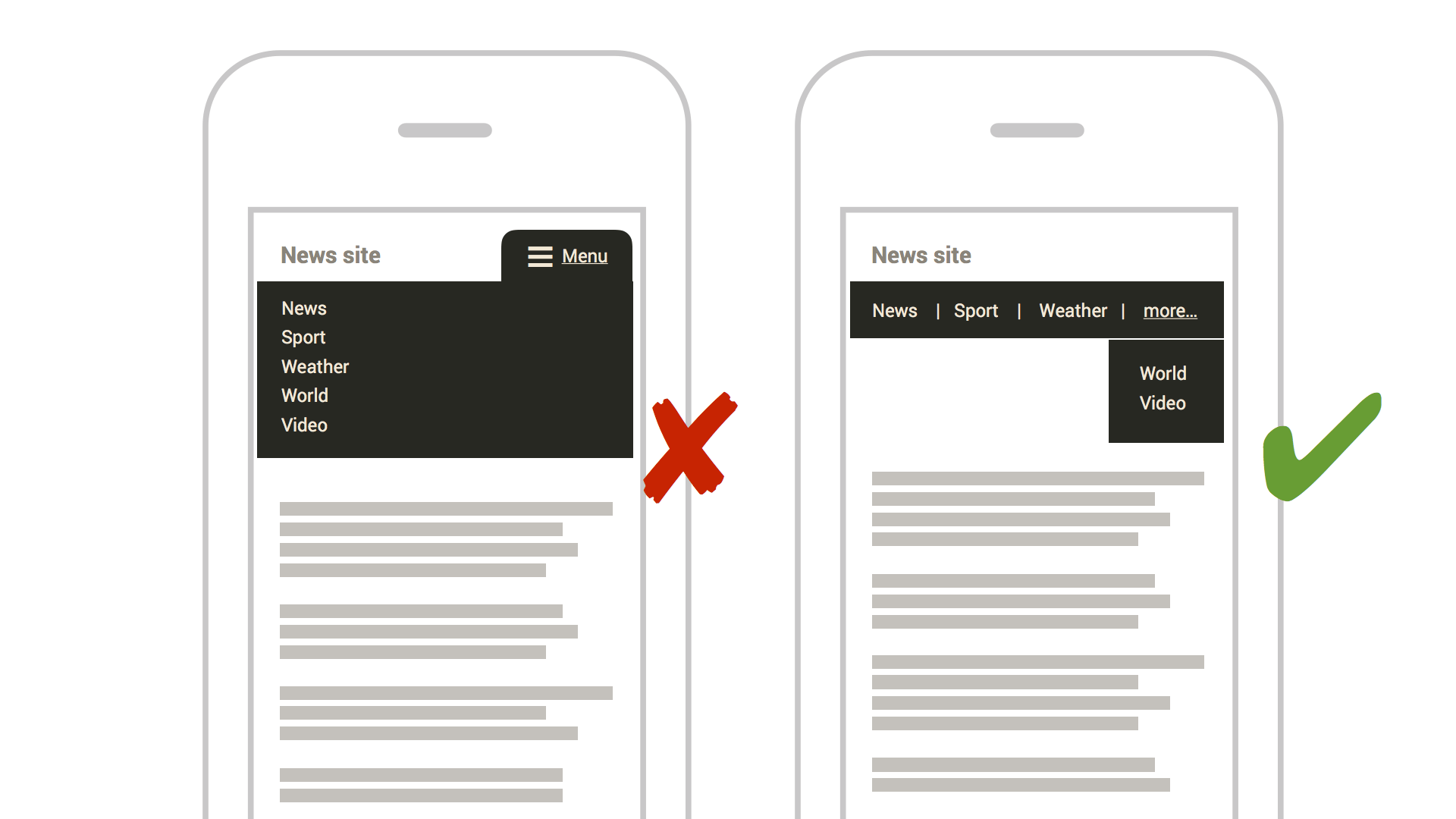
What if you can’t show the important items? OK, then, hide it under a hamburger icon, label it “Menu”, and make sure users can use the website without the menu.
4. Always Rely On The Swipe Gesture
Swipe away all users with the swipe gesture.
I regard less common gestures to be risky for a mobile UI, for two reasons:
- Custom gestures might conflict with the browser’s default gestures.
If your carousel supports swipe gestures, for example, the user might accidentally perform an “edge swipe” (a gesture very similar to a regular swipe), which some mobile browsers interpret as a command to navigate the browsing history. - Less common gestures are unknown to many users.
Therefore, you’ll have to teach the user. This makes sense if we are talking about daily-used apps, but not about websites.
Using a carousel does not have to be such a problem. However, I have seen news websites support swipe gesture for navigation between articles. For the user, this is unusual and confusing.
The swipe gesture is not the only problem here. Tapping the bottom part of the Safari browser on iOS will reveal a hidden menu. Therefore, if you stick navigation elements at the bottom, the user might be forced to tap twice.
Before using any uncommon gesture, test that it doesn’t conflict with any browser’s built-in gestures.
5. Make All Tap Targets Nice And Small
One millimeter is good enough.
OK, let’s be serious. Are your tap targets big enough that a basketball player could easily hit them with their thumb?
In his book Designing For Touch, Josh Clark refers to a study by Steven Hoober and Patti Shank. The researchers found that, if placed at the center of the mobile screen, a tap target can be as small as 7 square millimeters; however, if placed at the top or bottom, it should be at least 11 square millimeters.
However, millimeters are rather impractical for web use. We use pixels, right? So, how do we deal with the variety of DPIs on mobile devices? Probably to most readers’ surprise, Josh Clark says in his book:
"Nearly all mobile browsers now report a device-width that sizes virtual pixel at roughly the same pixel density: 160 DPI is the de facto standard for touchscreen web pixels."
Again, all you need to do is set the viewport meta tag correctly:
<meta name="viewport" content="width=device-width, initial-scale=1">There is one more step: Use em or rem units that best suit the responsive design. The default font size for most browsers is 16 pixels, so we can use the following conversion:
/* 7mm = 44px = 2.75rem */
.touch { height: 2.75rem; }
/* 11mm = 69px = 4.3125rem */
.touch-big { height: 4.3125rem; }
That’s it, folks. Don’t forget to provide a fallback for old browsers. And if you are into details, I suggest you buy Josh’s book.
6. Make It Responsive, But Only For Certain Resolutions
Force users to leave your website. Make them go buy a phone that has the “correct” resolution.
We are faced with an enormous variety of screen resolutions on mobile devices. Before, only the Android platform was affected, but now Apple devices are, too.
We can’t assume that smartphone screens are around 320 pixels, that tablets are around 768 pixels and that desktops are over 1024 pixels. A page should seamlessly adjust to screens that are 768 pixels and lower.
So, what resolutions should we take into account? All of them, my friend.
In my development career, I have been testing responsive websites from 240 to approximately 2600 pixels wide. I admit that making all sizes look perfect is sometimes not humanly possible, but the bottom line is that the layout should not fall apart — assuming your intention is not to scare away mobile users.
Like most of you, I simply expand the browser window (or use the developer tools’ responsive mode) from the smallest size to full width. It is a kind of “Hay! mode”, found in the Brad Frost’s testing tool.
Also, Don’t Change The Design When The Phone Switches From Portrait To Landscape Mode
I think that users expect the same, or at least a very similar, look when browsing a website, regardless of how they hold their phone. I remember one of my lecture participants telling me a story. When his company redesigned a website, a lot of people started calling the support desk. They were all complaining about a particular error: The website menu was disappearing. After a while, they discovered that these were tablet users. When they viewed the website in landscape mode, the menu was there. If the tablet was rotated into portrait mode, the menu was hidden under a “hamburger” icon.
7. Don’t Make Phone Numbers Tappable
Make the user angry. Prevent them from calling phone numbers directly from the website.
Contacting you can be a piece of cake for mobile users. Just set phone numbers as links that open a phone call. It is similar to activating FaceTime, SMS and Skype on Apple devices.
We have a problem, though. People usually can’t make calls from a desktop browser. However, instead of ignoring phone links, desktop browsers open an incomprehensible dialog box that invites the user to select an app to make the call. In most cases, no such app is available.
Dear friend, we don’t want to poison desktop users either. So, on this rare occasion, I recommend using device detection and inserting an active link for mobile users only.
In the HTML, the phone number would be inactive. We’ll just wrap it in a span tag and apply Javascript later:
Phone: <span class="phone-number">123456789</span>
Using jQuery and the isMobile detection library, we’ll replace the element with a phone-number class and a link:
if(isMobile.phone) {
  $('.phone-number').each(function() {
    $(this).replaceWith(
      $('<a href="tel:' + this.innerHTML + '">' + this.innerHTML + '</a>')
    );
  });
}
On smartphones, the markup looks like this:
Phone: <a href="tel:123456789" class="phone-number">123456789</a>
8. Disable Zooming
Disable the zoom if you really want to stick it to users. It’s inhumane — and very effective.
But seriously, by disabling zooming, you are not only making life a little more complicated for users with poor eyesight. Even users with good eyesight zoom on mobile devices, for various reasons:
- to see an image up close,
- to more easily select text,
- to magnify content with low contrast.
Zooming is actually disabled on a sizeable proportion of mobile websites. Consider the importance of viewing image details in an online store. Zooming is disabled on 40% of e-commerce websites tested by the Baymard Institute. Mind-boggling, isn’t it?
Just as desktop users can’t do without the back button and scrolling, so too do mobile users need zooming.
The WCAG’s accessibility guidelines tell us that users must be able to increase text size by 200%.
Sure, there are cases when you have to disable zooming — for fixed elements, for example. But zooming is sometimes disabled by accident, such as by insertion of the wrong meta viewport tag. The one below is the only correct one, whereas incorrect tags contain parameters such as maximum-scale=1 and user-scalable=no.
<meta name="viewport" content="width=device-width, initial-scale=1">
9. Set * { user-select: none }, And All Is Good
Some users will visit your beloved website and copy all of the text. This is shocking and must be stopped.
Dear friends, setting the user-select property to none can be useful, but only in parts of an interface that you expect users to interact with, where selection might do no good.
Therefore, I recommend using user-select: none for the following elements only:
- icon navigation items,
- carousels with overlaid text,
- control elements such as dropdowns and navigation.
Please, never ever disable the selection of static text and images.
10. Load Web Fonts Incorrectly
If the user lives to see the page load, kill them for good by making the font flicker or hide the content completely.
Using web fonts is not wrong, but we have to make sure they are the first elements of the website to load. Some browsers wait for web fonts to load before displaying the content. This is known as a flash of invisible text (FOIT). Other browsers (Edge and Explorer) show a system font right where you least want it, known as a flash of unstyled text (FOUT).
There is a third possibility, flash of faux text (FOFT). Here, content is rendered with a regular cut of the web font, and then bold and italic cuts are displayed right after that.
My projects are usually content-based websites, so I prefer to display the content as quickly as possible using a system font (FOUT). This is when I like Microsoft browsers. I also use a small library named Font Face Observer. Let’s look at the code. First, the JavaScript:
var font = new FontFaceObserver('Webfont family');
font.load().then(function () {
  document.documentElement.className += ' webfont-loaded';
});
And here is the CSS:
body {
  font-family: sans-serif;
}

.webfont-loaded body {
  font-family: Webfont Family;
}
Every website requires something different. Refer to Zach Leatherman’s “Comprehensive Guide to Font-Loading Strategies.”
11. Clutter The Page With Social Media Buttons
If you can’t poison them with your own concoction, use your neighbor’s.
Facebook, Twitter and Google buttons are uncomfortable for mobile users, for two reasons:
- They download a huge amount of data and slow the loading and rendering of websites.
Tests show that when the official social sharing buttons are used, visitors will download 300 KB more over more than 20 requests. - They are usually useless. Social sharing is often integrated in the operating system.
A Moovweb study carried over the course of one year across 61 million mobile sessions showed that only 0.2% of mobile users do any social sharing.
The vast majority of social buttons are useless, even on desktop. Sharing is particularly useless in an online store, because a low sharing count is demotivating for the buyer. But let’s not go there. We are trying to poison the mobile beast.
If you don’t want to poison the mobile user but you need social sharing buttons, try using social sharing URLs or a plugin such as Social Likes, which implements them with less impact on loading speed.
12. Faulty Redirection From Desktop To Mobile
A “killer” developer who has an m-dot version of a website has one more way to poison the user. Hooray!
We see faulty redirects on practically every other website with an m-dot version.
The correct implementation looks something like this:
- If a mobile visitor goes to
www.example.com/example, the server detects their device and redirects them tom.example.com/example(not tom.example.com). The same happens on a mobile version accessed from a desktop. - If that URL does not exist, then leaving the user on the desktop version is better than redirecting them to the m-dot home page.
- Let search engines know about the two versions of the website by using
<link rel="alternate">or by indicating it in thesitemap.xmlfile. A detailed guide is in Google’s help section for webmasters.
13. Hide The Content Well
Hide content from the mobile user. They don’t need it anyway.
Whether you like it or not, people visit websites to see the content. Yes, we are forced to live among such spiteful creatures.
Unfortunately, a lot of websites hide content, for reasons I don’t understand. Perhaps the content is not worthwhile, but I find that hard to believe. Numerous elements can cause content to be hidden:
- Cookie bar.
Some European websites are obliged to show the unfortunate cookie consent notification. And we can do nothing about it. However, this doesn’t mean that a cookie bar should be fixed and take up half the screen. - Online chat window or newsletter subscription ad.
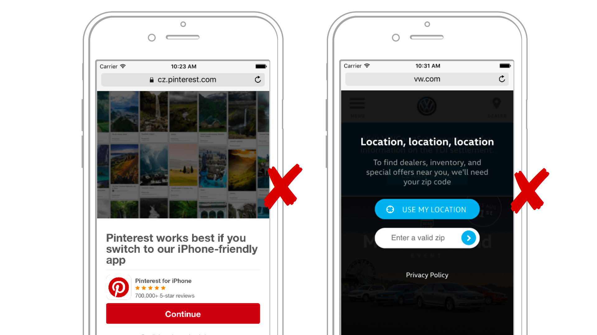
Positioning elements as fixed is very unfortunate on mobile devices. You are hiding content that the user came to see and are displaying content that they are not interested in. Using these elements is OK, but avoid fixing their position on mobile devices. - App-download interstitials.
These are painful. Some websites invite you to install the accompanying app, instead of showing you the content. But users came to see the website! Instead, use smart app banners on iOS or native app install banners on Android to advertise your native app.
Google has decided that, effective January 2017, overlapping content on mobile websites will be penalized:
"[Content that is visually obscured by an interstitial] can frustrate users because they are unable to easily access the content that they were expecting when they tapped on the search result. Pages that show intrusive interstitials impair the user experience more than pages whose content is immediately accessible."
For the record, Google will not penalize websites that show interstitials, such as cookie bars or age confirmations on adult websites.
How Many Mobile Users Have You Poisoned Today?
That’s about it. Now, let’s be serious. There wasn’t anything “new” above, was there?
All the more reason to be sorry that the vast majority of responsive websites poison the mobile user.
Let’s summarize the critical information in a short checklist:
- Does your website render quickly enough on mobile?
Do less important elements block more important ones? Have you chosen the optimal strategy to render web fonts? Are third-party plugins (such as for social media) slowing down the website? - Are you hiding content?
Are fixed elements getting in the way? Are you hiding content for particular resolutions or in landscape or portrait mode? - Is the UI mobile-friendly?
Are the tap targets large enough? Are complex UI elements such as carousels implemented correctly on mobile? Are phone numbers clickable? Does content selection remain enabled? Do you make navigation visible wherever possible? - Do you respect the native browser?
Have you disabled zooming by accident? Do you support gestures that conflict with browser defaults? - Is your redirection implemented correctly (if you’re using an m-dot version)?
Be kind to mobile users. Do not be the wicked old man who tries to get rid of The Little Mole in his yard. Do you want to know how the fairy tale ends? The Little Mole survives, laughs at the old man and moves to another garden.
Further Reading
- Managing Mobile Performance Optimization
- The Thumb Zone: Designing For Mobile Users
- How To Make Your Websites Faster On Mobile Devices
- Mobile-First Is Just Not Good Enough: Meet Journey-Driven Design
 (da, yk, al, il, mrn)

