Taking The Pattern Library To The Next Level

Email Newsletter
Weekly tips on front-end & UX.
Trusted by 182,000+ folks.
 Register for Free
 Custom Web Forms for Angular, React, & Vue. Your backend.


 Celebrating 10 million developers
No thorough conversation about the front end today can end without mention of pattern libraries. Sometimes a pattern library appears in the form of a living style guide, or as a design system, or as the outcome of an atomic design process, or as an all-knowing user interface framework. In all of these cases, designers and developers seek the right strategy to approach the complexity of the web with a modular, components-based approach.
However, finding the right way to architect a lasting pattern library and to integrate it into an existing workflow seems to be a challenging task and one that most design and development teams eventually give up on.
In this article, I’d love to highlight some practical techniques and strategies to establish a lasting pattern library that will be actively and consistently used by the entire team. These tips might help you get on the right track when you set out to build your next style guide, assets library or design language.
Pattern Libraries Aren’t Just The Front End
The concept of a pattern library is simple: Break down an interface into reusable building blocks, arrange and group them, name them, establish rules between them, generate an overview of all components, and make them available for the entire team to build and design with. The benefits are tangible and practical, including consistency in code and design, a shared vocabulary, and better, more efficient maintenance.
Pattern libraries usually emerge within design teams that, faced with inconsistency in an existing interface, seek to normalize the UI (and code base) by discovering and establishing standardized components and interaction patterns and formulating a unified design language. Although the effort is often coming from designers, because these libraries are built by front-end developers, they tend to reflect how the code base is organized and the front-end team works internally.
No wonder, then, that in many pattern libraries atomic design metaphors such as “molecules” and “organisms” are invoked to structure and group components. The naming of components is often technical and mirrors the naming convention of the front end. In fact, the building blocks are often presented as an almost never-ending list of these components, with snippets of code, markup, styles and eventually JavaScript snippets and usage hints. A pattern library is closely tied with the code base because it is often generated from the code base itself with tools for living style guides.
Now, in some companies, front-end engineers and designers make up a small segment of the team; so, however shiny and comprehensive a new pattern library might be, it’s often considered to be “their thing”; consequently, other employees in the organization have no vested interest to use it or be actively involved in its development. So, copywriters will create separate voice and tone style guides for the interface copy; visual designers will maintain a large Sketch or Photoshop master file with the main interface screens; and marketing managers will keep nifty cheat-sheet PDFs with ad sizes and marketing material in a shared Dropbox folder.
There’s a good reason for this. If you’ve never stumbled upon a modular design methodology or never explored a front-end folder’s structure or its naming conventions or just don’t understand the underlying code, you will have a very hard time making effective use of a pattern library in your day-to-day work. In fact, if you spend most of your time designing interface screens in Sketch, you’re more likely to use your master file (however outdated it might be), rather than a library of HTML and CSS components, simply because that environment is far more familiar to you and comfortable for you.
In order for a style guide to be used, it has to be valuable and comfortable to use, yet most style guides are not tailored for anybody not closely familiar with the front end. It’s not that front-end style guides are special in that regard; branding and marketing guidelines, carefully crafted by designers for copy editors and marketing managers, aren’t really valuable to front-end developers either. No wonder that style guides are rarely used and eventually start to decay: They already evolve in silos by their nature.
Focusing On Components Isn’t Good Enough
One of the main problems with pattern libraries is that, while they provide an overview of components, they often leave a lot open to interpretation. Components can be combined in a variety of ways, consistently and inconsistently. It’s great to be able to see what button variants and iconography are available and what kinds of tables and pricing tags one may use, but what if you need to design or build an interface that contains all of these components at once — and perhaps another that doesn’t yet exist in the library? Displaying combinations of the usual suspects is helpful, but covering all possible variations is hardly feasible. A list of modules alone wouldn’t convey any context or any specifics on how the modules should (and should not) be used. (Of course sometimes room for interpretation is left deliberately open to enable designers to flexibly combine components and devise new ones (see the quite general and non-opinionated “Brand Sweden” design system, for example), but more often than not, that’s not really the desired outcome.)
That’s also the main challenge I (and my colleagues) see companies struggle with when using an atomic or modular design approach. Often there seems to be a reluctance towards higher-level components, even ones dictated by business needs. Over time, naming conventions seem to fail consistently across the board, while the distinction between molecules and organisms or between modules, components and blocks appears too arbitrary for designers and product owners. Even when components of an interface are so carefully crafted and grouped and systematized and arranged and named, it’s often difficult to see the big picture when combining them on a screen. Designing the components in isolation often feels like a surefire recipe for a design that is generic, flat or lacking in a strong point of view. A strong design is informed by a view of the big picture, an understanding of the context, and strong art direction — even at the cost of consistency or time.
That’s not the fault of atomic design, though. It is by no means a methodology that encourages designers to design components in isolation and eventually pull them together to produce a final mockup. Atomic design is a mental model that enables designers to create both the parts and the whole of a UI design system concurrently. It is not a rigid system that dictates a particular process, but rather a framework for building design systems efficiently and consistently.
Design doesn’t emerge by skinning or theming components; it needs a perspective and a point of view — it desperately needs creative guidance. However, I can’t help but notice that when we are building these lovely pattern libraries and design systems and style guides using fantastic tools such as Pattern Lab and living style guides, we tend to settle on a single shared view of how a pattern library should be built and how it should appear. Yet that view doesn’t necessarily result in a usable and long-lasting pattern library.
Making A Pattern Library Usable
So, how do we make a pattern library more likely to be used throughout an organization, then? Perhaps by shifting the focus away from the modular methodology and towards a more general big-picture view of components. Instead of displaying a list of components, we could display a list of interface screens to facilitate exploration of those components in different contexts.
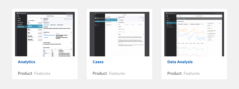
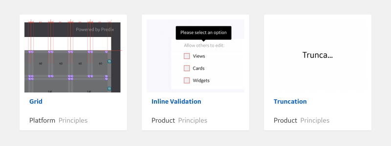
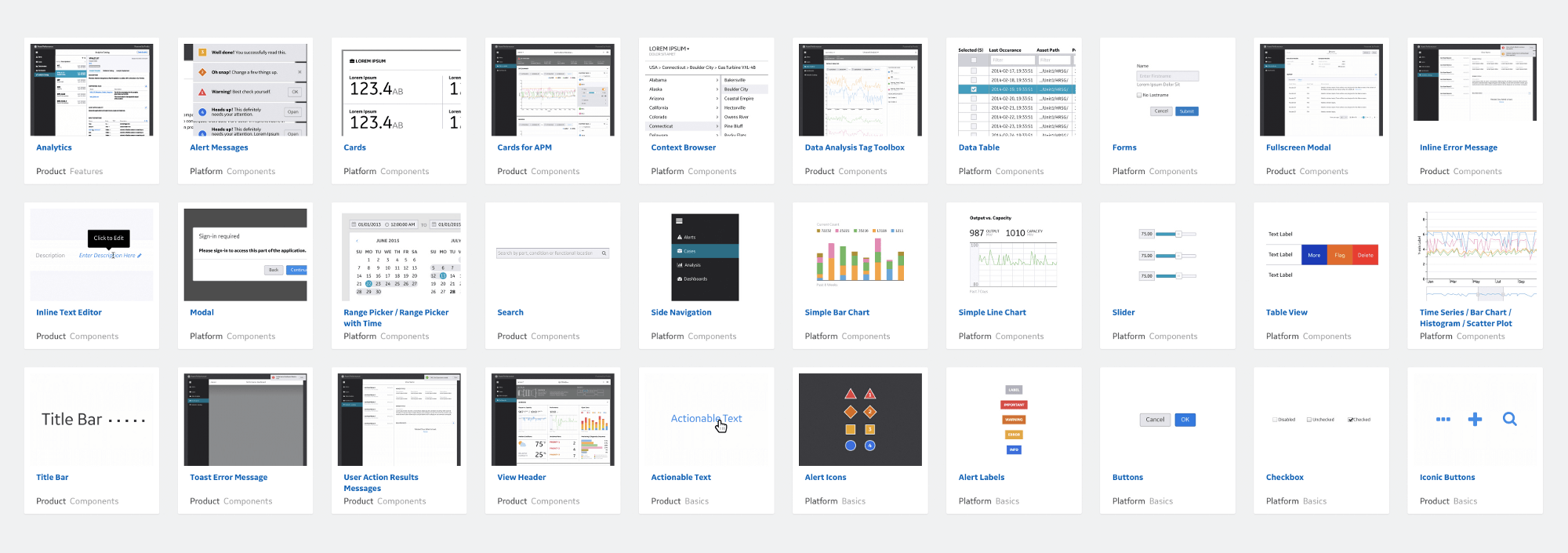
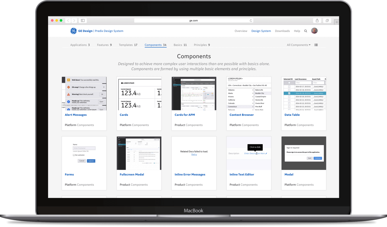
An interesting example of a design system designed in this way is General Electric’s Predix design system. Faced with a lack of use for complex patterns, the designers chose to extend the atomic design methodology with two levels of abstraction: principles and applications.

The principles document the guiding principles within the interface — for example, the proper use of infinite scrolling instead of pagination, or how text truncation should operate. They provide a solid foundation for the design process, but they don’t provide any actual code.
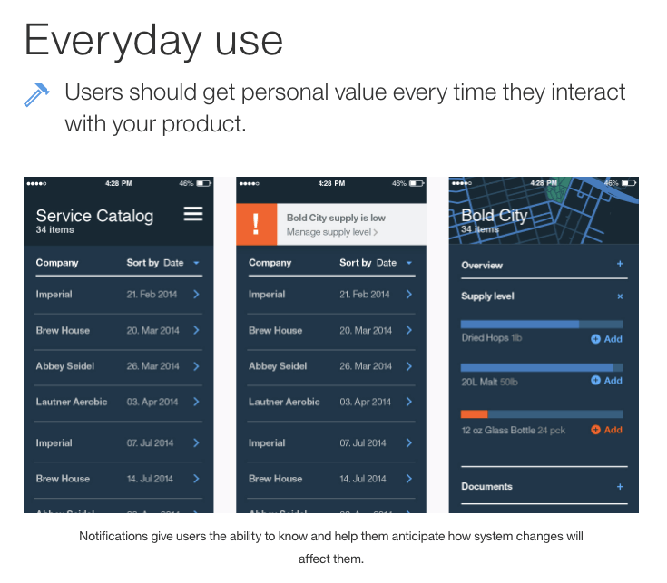
The applications are basically case studies that highlight various interfaces, explaining each problem and how it meets customers’ needs — thus, defining the context. What’s particularly interesting about the applications level is that it can serve as the main entry point to the design system. Whenever an employee accesses the design system, rather than seeing a list of all available components, they could first be prompted to choose an application or product built using the design system. They could then dive into the specific features and modules of the interface, but they always see how the component is used in the actual interface. Different teams might have different views of what the entry point should be, though: Some will be more familiar with page templates or front-end components; so, allowing them to switch to the preferred view might be critical, too.
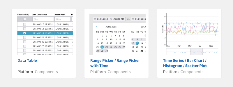
Now, not every pattern library has to become a sophisticated design system, but maybe every pattern library could benefit from some of the critical features that large-scale design systems have? The idea behind the Predix design system is very interesting. In fact, wouldn’t it be more useful for all parties involved — designers, developers, marketing managers, copywriters, SEO specialists — to be able to zoom into the interface, study the components and visually choose their component of interest? This way, the pattern library wouldn’t just document a standalone front-end component, but would also show examples of where and how the component should be placed, which buttons and iconography are to be used with it, and how other components, such as tables, are to be aligned within the actual screen.
When accessing the pattern library, the employee could choose an application first (maybe the one that is most similar to the project they are currently working on — for example “online banking”) and then choose a particular feature (“transactions”) and then choose a component of interest (“mobile PIN verification”). Once they have selected a component is selected, they could be presented with a downloadable Sketch or Photoshop mockup, an HTML and CSS snippet or an API call and be able to use it right away. Furthermore, we could create a bookmarklet, so that the employee can see the context of the actual website and see which patterns are used where, with optional links to the pattern library and other live instances of that pattern.
Maintenance of such a pattern library could still happen the “normal” way. We would define documentation in the code, embed the actual “live” interface, use a living style guide tool to generate the anchor points to explore the interface, and then use a tool such as Leaflet to generate callouts and prompt a window that highlights that pattern and all related details. Technically speaking, for every single component we could have a one-to-one mapping between the name of the component in front-end, its name in Photoshop/Sketch. For every single component, we’d additionally define a plain text “config” file with its “properties”, maybe conveniently stored as a JSON/Markdown file — this file would document all the properties and relationships of that component. Among these properties could be the tags associated with it, isolated view for the component (for QA), a link to the Dropbox-file containing the Photoshop/Sketch version of the module and people responsible for that family of components, as well as other relationships. Updating such an isolated file would be easy both for developers and designers which is a big advantage over regular front-end pattern libraries which are often “locked” for designers.
So because the relationships between patterns would be defined, the pattern library could be updated and regenerated automatically with every deployment. You could also build an index for your code by using “signature” tags and classes defined for patterns in the code base. Of course, this would require too much effort for a small team, but it could be a way to align the design and development process for a mid-sized or large website with multiple teams.
Obviously, different teams might have different interests, preferences and business requirements that would determine what’s possible. For example, a designer might have a pretty good guess of what component they need but not know how exactly it is to be used across a set of existing products. Wouldn’t it be helpful to be able to choose a component and see all representative examples of it in use across all products, instead of having to go through all interface screens and manually search for the component as it is used in different states, sizes and contexts? I think it would. It would enable you not only to build components on top of existing components consistently, but also to see where and how a component is used and which cases you would have to cover when redesigning some portion of the website.
To make it work, you would need to establish some sort of connection between modules and applications — perhaps with something as simple as tags or subtle hints or links to practical examples, assigned to every single component, and with a link directly to the interface screen containing it. For these cases, it would again be a good idea to allow employees to switch views — for example, to jump straight into the front-end view (the components level) when entering the pattern library or to quickly move over to the examples view (the applications level) once a component has been selected. One view could be for exploration, and the other for implementation, showing code and implementation guidelines where required. Of course, the applications level could live on top of a live, functional page, unless it’s available only within a native app or locked in the intranet. I’d argue that in some cases, having tags for every component might work better than a detailed documentation that ends up getting outdated and not read by most team members.
Probably the main advantages of extending the pattern library in this way are better clarity and practical examples. Concrete interface examples drastically limit room for interpretation and misunderstanding. These examples shouldn’t be seen as the only solutions to a given problem, though. We can think of the applications view as inspiration for designers who would like to derive visual consistency from existing interfaces.
Additionally, teams could draw upon design patterns that have been used in other products; and by adding a less technical and more general view, the pattern library would become useful for all parties involved. You could even go so far as to add a copywriting style guide, marketing reference material, SEO guidelines, ad units, keyboard shortcuts and reusable customer-support text snippets to the “principles” — all living within a single, ultimate source of truth, slowly becoming a system rather just a set of patterns used throughout the interface.
Now, thinking of the scope of such a pattern library, it might sound quite unrealistic at first. For this approach to work, the library would have to be closely integrated with the core business logic of the website (or application), and it would pull data from and push data to the knowledge base that customer support representatives usually consult when assisting customers. The undertaking to make it work would be nothing short of huge, but once it is in place, many of the common pain points and bottlenecks might fade away naturally.
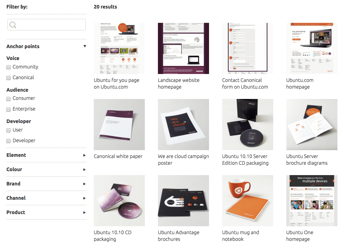
General Electric is not the only one that follows this approach, though. The “Examples” on Ubuntu Design serve a similar purpose, allowing designers and developers to define “anchor points” to filter screen interfaces by type and tags (that is, specifying the context). Furthermore, users can apply filters for the visual design of elements, colors and products. Another take on the same idea: adding concrete interface screens on top of existing patterns and design elements.
Is this approach good enough to make a pattern library be actively used? Perhaps. However, it’s hardly enough to ensure the pattern library is actively maintained by the entire team. That requires more than just a more usable interface: It requires changes in the way teams work within the company.
Turning The Table
Nathan Curtis noted correctly: Every time we, as a community, see a large company release a brand new pattern library, we get excited and fascinated by the work done by internal teams to make it happen — simply because we know how hard it is to achieve. It’s an exercise in patience, tough design decision-making, resolution of bureaucratic issues and hard work. A brand new style guide is an unlocked achievement, and a vivid manifestation of a company’s design-driven leadership and desire for consistency. That’s something to be applauded.
However, having a style guide is never the end goal. Pattern libraries are created to make it easier for designers and developers working in a company to iterate on a product or to maintain a website in a consistent way. The end goal is to have an up-to-date style guide that is consistently used by both designers and developers in an organization, thereby getting results faster.
Many companies tirelessly invest in crafting a unified user experience but fail to ensure that their libraries don’t turn into zombie style guides, as Jina Bolton has called them, decaying and becoming outdated within weeks of release. The libraries either get abandoned and gather dust or get pulled in different directions because members of different teams keep adding patterns and variants inconsistently, without unified creative direction. Of course, it’s common to use a living style guide and to use Trello, JIRA, Slack and GitHub to sync and broadcast changes in the pattern library automatically, so that both designers and developers always have the most up-to-date version of it.
However, I’ve yet to see a pattern library that has emerged from a mid-sized team with limited resources and that has remained up to date six months after its initial release. That’s the ultimate test, which, unfortunately, most style guides fail at; the ones that succeed are clearly prioritized by managers to be kept up to date, which means a dedicated team is in place and effort is made to make it work. But what if that’s not the case or you can’t afford to assign resources to this task? At the end of the day, someone has to refine those lovely design components and send those long-awaited pull requests.
Not every company needs a pattern library. There, I said it. Given the complexity of the web today, it might seem obvious that every organization would benefit from a well-documented pattern library. Many organizations would. Yet depending on the organization, creating one might require a custom-tailored strategy or might prove to be an almost impossible task. In fact, a pattern library might not be worth the effort, because it would never be used anyway.
Qualities Of A Lasting Pattern Library
To establish a long-term pattern library within an organization, you need to do a bit more than just convince your fellow designers and developers to invest in a unified design language. As mentioned above, the goal of the pattern library is longevity and practical value for the entire team. How do you know that you are on the right track? Well, certain qualities and indicators make the effort slightly more likely to succeed.
Get Approval From The Top
Why does the type of organization matter? Because getting a pattern library to succeed will be difficult if there isn’t a green light from management to keep it alive and up to date. You’ll also need that endorsement if you want other teams to use the pattern library as a part of their product development. Guerilla tactics might plant a seed in the organization, but if it’s not a priority at the management level, other tasks and projects will eventually push it to the sideline. By securing approval, a budget and time for the pattern library, you ensure that it always keeps floating to the top of the list.
A pattern library isn’t tangible, which is why getting that approval from mid- to top-level management is very difficult in the first place. Often you’ll see both team members and management just not seeing enough value in the work and time invested in a library — after all, shouldn’t developers be working on the actual website instead? It’s critical to get a shared understanding that a pattern library is a mid-/long-term investment, and it will show results over time, not immediately.
Here is a little trick that works quite well. Every product or website has very particular pain points, issues that come up frequently in customer logs or user research, things that tend to annoy or distract most people in the company. Chances are high that these issues have bubbled up to management already. A good way to identify these pain points is by interviewing customer support and by looking into customer feedback logs and the backlog of the designers and developers. Present the pattern library as a solution to severe pain points — which it often will be anyway — and explain how the entire company would benefit from it.
On top of that, arguing based on hard data and return on investment is always a safe bet. As unspectacular and predictable as it sounds, highlighting that a pattern library would drastically minimize complexity, save time and resources, reduce errors in code, design and communication, and keep product quality up might help. Argue that customers expect a unified user experience across all websites and apps; and if an experience seems messy or inconsistent compared to that of competitors, the customer is likely to go there instead. Better yet, show that competitors have recently built a shiny new pattern library and explain how incredibly successful it has been.

I could not find many case studies that go into detail about how a company has benefitted long term from a pattern library, but Airbnb’s and Anna Debenham’s research (see slides 49 to 69) are instructive.
Appoint A Federated Design Team
On every design team there is a person so excited about a pattern library that they volunteer to become the style guide master, overlooking the maintenance and development of the library and keeping it up to date. Eventually, this person becomes a bottleneck, slowing down the product’s entire life cycle. According to Nathan Curtis, a federated design team, with members from different internal teams (both designers and developers as well as UX specialists), works better to keep the pattern library evolving long term. In this model, every team promotes a team member to contribute to the library. Changes may be proposed by every member of every team, and then those changes are reviewed, shared and refined by the federated team for action.
A common problem that appears with federated design teams is that the designers aren’t clearly aligned on what constitutes an actual design pattern and on when it should (and shouldn’t) be added to the library. A common (and rather unexciting) way to manage this issue is by establishing some universal criteria required for a pattern to be added. Sometimes designers will require a very strong use case for a new pattern to be added: In fact, adding patterns is often considered to be the exception, rather than the norm. The idea is that a pattern library should be kept minimal and lean and should, therefore, be quite restrictive in the patterns it accepts.
However, in such cases, designers will quickly get frustrated and be reluctant to propose changes regularly because they don’t want to be the ones to initiate lengthy discussions or have to prove their standpoint over and over again. So, instead of the pattern library being a living organism, it becomes a rigid, restrictive steam engine powering the entire website, with a few influential gatekeepers shielding it from external influence. For a team consisting of many designers, this doesn’t work particularly well.
Keeping the pattern library more adaptive and open to change is usually the better route. In such cases, the approval process for the pattern library will be pragmatic and might even allow for errors and inconsistencies. For FutureLearn, Alla Kholmatova has proposed the uniqueness of a component’s purpose as a criterion. If a proposed pattern has a purpose not shared by any other pattern and if a real-life use case for it exists — that is, it’s not just a component that might be needed at some point in the future — then it should be considered for inclusion in the library. The only exception is when it could be merged or morphed into an existing pattern, by extending an established family of components.
Automate Updates
Manually updating a pattern library at every major release is error-prone and eventually leads to a growing gap between the website itself and the pattern library and, hence, to a decay in consistency. A pattern library has to be an integral part of the design and build process. Whenever a Grunt or Gulp task runs, it should ping the pattern library to prompt an update. Ideally, the pattern library would reference exactly the same HTML, CSS and JavaScript files that are used in the live environment, so that there is a one-to-one mapping between the components in the style guide and the ones used in production. In fact, the pattern library — the engine that provides the code snippets, usage hints, interface examples, and the tagging and organization of patterns — could be seen as a layer living on top of the production code, pulling code snippets and interface screens from it, rather than the other way around.
How do we make it work? One way is to use a living style guide tool. With the documentation living in the actual code, we could run a task to generate and then automatically regenerate the pattern library every time the code is changed. If the component preview pulls and renders the actual code from the production server, it won’t get out of date either. So, every time a change is made and you run the task runner, it could force an update in the pattern library as well, reflecting the state of the actual website. Pattern Lab 2, the grunt-styleguide task, Fractal, SourceJS, KSS and dozens of other tools can be used to achieve this. Out of the box, they might not be as flexible as a custom-built pattern library, but they get the job done in many cases.
Most importantly, being up to date is better than having thorough documentation. That’s why being too rigid in accepting code (or not accepting it without proper documentation) will slow down the entire workflow unnecessarily. The updates have to be automated, but they don’t have to be perfect.
Start Out Slowly, Grow Progressively
Building a pattern library is a lot of work. Whenever there is consensus that a pattern library should be built, it’s a good idea to start small, with just a lightweight overview of the main patterns and modules, without documentation, and maybe even with screenshots instead of live code examples. Once you have a good simple foundation, you can progressively refactor and improve the pattern library over time by adding features that the team might need. Aiming for the ultimate pattern library that solves all problems at once might turn out to be a year-long project without immediate, tangible benefits. So, what would be a good strategy to get usable results quickly?
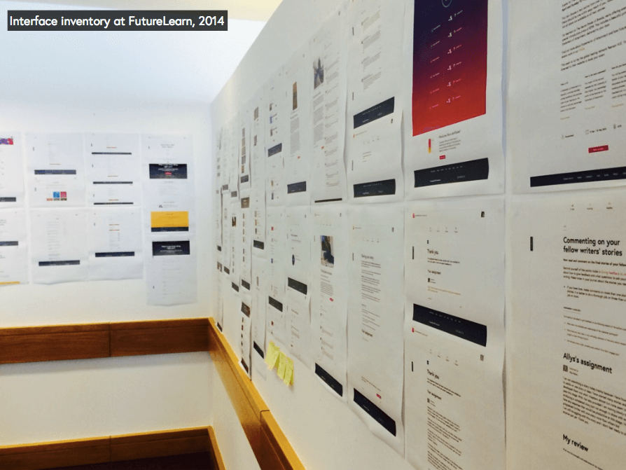
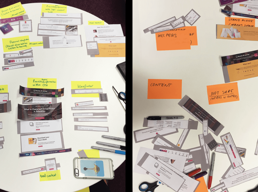
Start with the basics. Maybe you could start with an interface inventory and a simple list of the components you’ve found. Focus on the parts that will be used repeatedly or that at least have the potential to be used again. Print out the mock-ups, cut up the components, group them and name them. Think about the needs of the teams involved in the design process. What do the designers need? Ask them. What do the developers need? Seek them out. What naming convention would work best for all parties involved? Try to find common ground. Once you’ve got consensus, turn your list into a static overview of commonly used, named patterns with code snippets.
At this point, some members of the teams would likely find value in the library you are producing. Find the people who are most interested and engaged; they might help you set up a good group of people to look after the library. Bonus points if you’ve found a designer who is willing to take ownership of the library. Double bonus points if you’ve managed to get a product manager on your side.
Now might be a good time to keep improving the value of the pattern library for everyone involved. Identify pain points, the most inconsistent design areas, and tackle them with a consistent set of components in the pattern library. Add structure and usage hints for the important components. Refactor the library and introduce families of components and larger components.
At this point, consider discussing how new patterns would be added and how they would be maintained by the team. Set up a connection to the pattern library and make it accessible everywhere in your organization — be it in the CMS, in the customer support documentation or by the water cooler. At some point, you could even extend the library with visual context, tags and the people responsible for certain families of components.
This might be perfectly enough already, and you could just refocus on maintenance, rather than on growing the library. The important things to keep in mind here is that the pattern library, first, should be kept up to date and, secondly, should deliver real, tangible benefits to all parties involved. As long as these goals are clearly prioritized over perfect documentation, you’re probably on the right track. By starting slowly, you are much more likely to end up with a usable library, rather than with documentation that decays faster than it was developed.
Do Memorable Names Trump Functional Names?
While establishing extensible functional names for the components might be tempting, are they ever easy to remember for the entire company? Could you imagine a marketing manager, or even a visual designer, recalling the name of the Navigation–Global__collapsible component on the spot? Hardly.
The problem is that, quite often, functional names aren’t precise, nor are they delightful. Implementation details are likely to change over time. If you have a standard website with a few levels of navigation and a mega-dropdown menu, then the navigation bar in the upper part of the page might be header, navigation-bar, drop-down, mega-navi, mega-box, global-navigation or that-thing-at-the-top-with-major-navigation-items. So, what if we try to abstract away from purely functional names and reflect the function and importance of a component in a more delightful way?
Here’s an idea that might work well for small and mid-sized companies: Pick a metaphor that is known to the entire team — Star Wars, The Simpsons, Monopoly — something known to every single person. Then, look into the components of your user interface, group them, and apply the metaphor to them. Can you map the characters or names from the metaphor onto the components? You probably can.
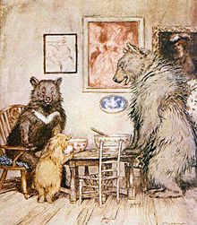
For instance, let’s choose Robert Southey’s Goldilocks and the Three Bears fairy tale as a metaphor. The tale recounts a small girl, Goldilocks, who enters the forest home of three bears — Papa, Mama and Baby Bear — while they are away. She sits in their chairs, eats some of their porridge and falls asleep in one of their beds. When the bears return and discover her, she starts up, jumps out the window and is never seen again.
Let’s look at The Guardian, for example. Very much like any other website, The Guardian has news boxes of different sizes (one with a large image, one with a small image and simple text blocks). It also contains extensive navigation at the top, sections throughout the page (“Headlines,” “Highlights,” “Sport,” “Opinion,” etc.), a “Popular” section, category tags and the omnipresent footer.
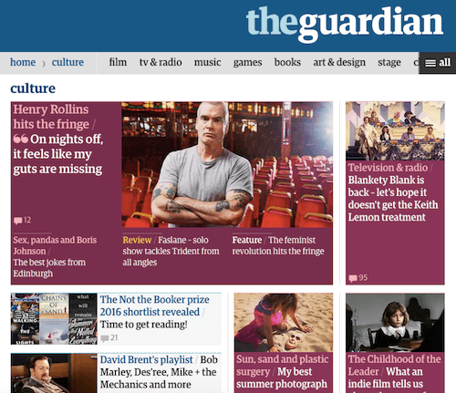
How can we possibly apply the fairy tale to these interface components? Well, the main characters of The Guardian’s website are the news blocks. There are three of them, and the largest one could be called “Papa Bear,” the smaller one “Mama Bear” and the smallest one “Baby Bear.” The entire front page could be the house, and each section (“Headlines,” “Highlights, “Sport, “Opinion”) could be a room, very much like a newsroom in an editorial environment. The sections form an accordion not unlike that of some fairy tale books.
Are we abstracting the naming of the pattern library too far for it to be widely accepted by different teams? Maybe. If you asked the designers and developers around you, they would unanimously argue for the critical importance of functional naming, and rightfully so. However, that doesn’t mean we can’t apply metaphors to them as well. Think about it for a second: The article you are reading right now is published on Smashing Magazine; it was named for a reason, but it doesn’t really communicate the purpose or function of the website. So, maybe exact wording isn’t that important after all — as long as everybody is on board with what feels right.
Perhaps, instead of defining a component, designing it, building it and then naming it, we could flip it around by defining it, naming it and then designing and building it. The name would then inform the file name for the Sass file that relates to it and the main class name used for that component (which is definitely a good idea regardless of whether the naming happens early or late). By the time QA is running the final unit tests over that shiny new component, the name might already have been deeply engraved in the entire team’s consciousness without anybody having noticed it.
Back to Goldilocks. We could take it one step further and extend the metaphor. That important component that the marketing managers keep talking about — let’s say, the membership box? It could be the honey jar. And the individual articles could be the porridge, while those nasty comments could be the salt — they should be taken with a grain of salt, after all.
Obviously, such a metaphor might not work for a very complex interface, but if the metaphor maps well, then it will be much easier to remember and much more delightful to refer to. If we introduce a few bookshelves into our Goldilocks metaphor, the navigation menus could be the bookshelves, with each section being a book, such as the “fashion book,” the “tech book” and so on. So, each book would contain articles (or stories) — often with the same structure and with many reusable components, such as the lead, related stories, etc. As you can see, with enough creativity, a metaphor could flow into the functional view of the interface, too.
The main disadvantage? Onboarding. A new member of the team would need to learn the new metaphors and understand what’s going on in the interface. But the learning curve doesn’t have to be too steep if the metaphor makes sense and easy to understand.
The main advantage? Go back to The Guardian now: You’ll be able to name (at least some of) these components consistently and effortlessly. And that’s the purpose of naming.
Make The Pattern Library A Part Of The Culture
Because the very purpose of the pattern library is to be used throughout the team, make sure it remains valuable and impossible to overlook. People should run into it frequently, whether they want to or not. For example, print out the components and put them on a wall. Hardcode the “File a request for the pattern library” button into the CMS, CRM and spreadsheets. Establish a strong connection between the library and the team.
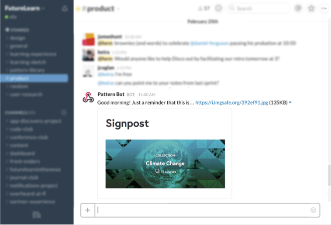
You could also create a dedicated Slack channel to chat with the team about new components, naming and the library in general, and also to provide support if any questions come up. Invite the entire team to join in, and create a Slackbot that picks a module of the day, highlights it and its relationships and showcases a related GIPHY image. As Alla Kholmatova shares in one of her talks, the FutureLearn team set up a Slack channel just like this to discuss and name new components.
That’s why we always try to include SEO guidelines and ad units and shortcuts in a “pattern library” (which is becoming more than just a pattern library at this point) — hence, why we create a guide for the entire team, rather than as a reference for the front-end team. We always try to give everybody on the entire team a good reason to see and use the library. So, go ahead and announce the library and post interface screens by the kitchen counter, and showcase components next to the coffee machine. Not everybody will agree to the names, but everybody will have a hard time forgetting what they stand for.
The Building Blocks Of A Pattern Library
Having a clear idea of how to identify, name, organize and maintain components is critical, but it still leaves one piece of the puzzle a bit fuzzy. What would make for an (almost) most useful presentation of a component in a pattern library? That is, what details do we need to include for every standalone component to ensure that the pattern library remains useful and usable long term, rather than fade into oblivion like a zombie style guide PDF, tucked deep in a Dropbox folder?
Well, we need to achieve a few goals. We need to clearly communicate the purpose of a component and how it should be used. We also need to establish clear relationships between modules and provide examples of how they are to be used in the product. The list below could serve as a checklist for, well, pretty much everything you might want to add to a given component in your pattern library.
Anatomy Of A Pattern: A Checklist
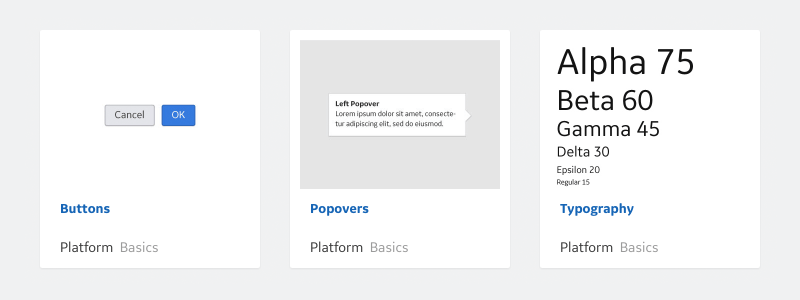
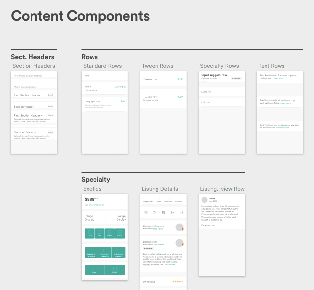
- Name The component’s unique name, potentially using a well-known metaphor. Should indicate the family of components it belongs to (e.g. with hyphens, BEM-style).
- Description Description of the component and its purpose, with a hint of the global rules that apply to it (e.g. “Use only with primary buttons”) and its role (e.g. “Use only for logged-in users”).
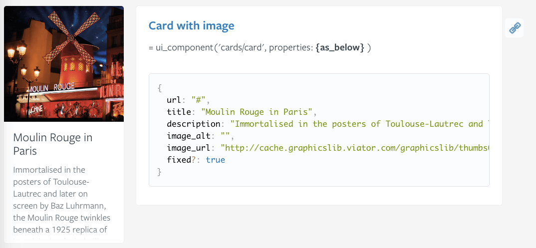
- Responsive preview A real-life, resizable preview of the component, using the actual snippet of code being used in production. Alternatively, just a screenshot. Often lends itself to being organized as part of a tabbed interface, with options for implementation details, API docs, people responsible, etc.
- Permalink A jump link to the pattern, for easy sharing within the team.
- Code sample This is the HTML markup, WordPress shortcut, widget hook, (S)CSS/LESS, JavaScript or CoffeeScript, even potentially the CodePen embed. Consider adding a “copy” button, so that users can copy and paste the code snippet quickly, as well as the path to the file (SCSS, template file, JavaScript, etc.), so that developers know exactly where it is located.
- Dynamic API calls Or examples of the pattern library API calls, with variables and a dynamic preview, if customizable.
- Show and hide code snippets Tabs or an accordion allow users to see code snippets when necessary and hide them by default (or the other way around). Helps to avoid unnecessarily long pages. Also, consider a code tester, a tool that allows designers and developers to edit the sample code and see a live preview — like a small CodePen in your pattern library.
- Tags or categories The assigned tags or categories for the component. Helps users navigate from a tag to real-life examples of the pattern in action — even on the production website. Could be interesting to let users tag components on their own (developers could tag their components with “in use,” “needs refactoring,” etc.).
- Isolated page Link to the component on a standalone page. Easier for debugging, visual regression testing and refactoring later on.
- Fallback and print previews Link to the fallback and print previews of a pattern (e.g. when a web font hasn’t loaded or JavaScript isn’t available).
- Downloadable assets Link to downloadable assets (e.g. color swatches, icons, fonts, ad templates). Gives designers a reason to visit the pattern library and keep it up to date. Better yet, consider an HTML-to-Sketch generator that would paste the pattern as a Sketch symbol in your clipboard. This allows designers to copy and paste patterns from the library directly into Sketch.
- Related patterns A quick overview of related components or the family of components that a given component belongs to. Could be implemented with tags as well, with an accordion or tabs, and could include links to API docs (as Atlassian’s style guide does). Could use an explanation of when to use a component, when not to, and why.
- Usage guide As an extension of related patterns, you could also provide some guidance in how designers or developers should prioritize one over the other one? E.g. when should a toggle be used instead of a group of radio buttons, or segmented controls instead of a
<select>drop down. - Performance impact Indicator of performance severity. A carousel, social media buttons and video backgrounds likely affect performance way more than a lightbox or even infinite scrolling. Could be extended to a “warning signs” section, outlining not only performance impact, but also any common mishaps when pattern is used incorrectly.
- Visual impact Indicator of visual loudness, to signify which components may be visually impactful (call-to-action buttons) and which may not (“Read more” buttons).
- Versioning and legacy If the pattern library supports a product and the product gets major upgrades, some components might benefit from documented changes in the API or UI elements, relative to previous versions. The same goes for obsolete elements (and their replacements).
- SEO impact Indicator of SEO impact and hints required for a component. A video might benefit from a transcript and subtitles; images might benefit from alternate text; and the design of URLs as well as a number of external links might matter, too.
- Accessibility implications Indicator of accessibility requirements. Some components might require more work to maintain accessibility, especially if they interact with other components.
- Team members involved or responsible Clearly states the ownership of the (family of) components and which team members have been actively developing it. Helpful for maintenance and further development.
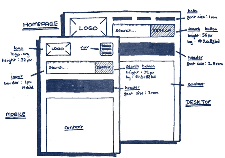
- Flags If the pattern library is supposed to be a reference not only for a responsive website, but also for native platforms, or if you have to maintain desktop and mobile websites, some components might be shared but be applied differently between platforms. Considering adding visible flags to distinguish between them, like “mobile” and “desktop.”
- Further resources An overview of useful resources and references for a given pattern (e.g. responsive email patterns or email frameworks, or an overview of responsive table solutions).
Brad Frost also published the Anatomy Of A Pattern In A Pattern Library, a comprehensive article featuring some of the details that should be displayed alongside each pattern, with a few good examples of it done well.
Obviously, few pattern libraries need all of these details and features for their components. The nature of your project, its requirements and your time constraints will define what’s needed and what should be omitted. Keep the overhead for adding and maintaining patterns low. Said it once, will say it again: Perfect documentation invariably becomes the enemy of up-to-dateness.
Design System Components Checklist
Now that the standalone components are taken care of, what about the global features? Below you’ll find an overview of the features that an extended pattern library or a design system might have. Your library doesn’t necessarily need all of them, but by running down the list, you probably won’t overlook something critical. Just keep in mind that there’s no reason to build the ultimate pattern library, because some of the points listed below won’t address problems you’re facing. The list might come in handy when you are running an inventory of interface components as well.
- Design principles
Provide “philosophical continuity” for the design and code — not only for manifesto-like fundamentals (such as openness and performance-first), which IBM Design does a very good job of, but also for practical notes on proper use of things like infinite scrolling over pagination, forgiving inputs, onboarding strategy or how text truncation should operate.
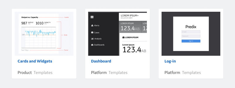
- Interface screens
A global view of the interface, segmented into individual features and applications, allowing users to dive into a specific part of the application and preview the component in action first. Preferably lives on top of the existing production code. Ubuntu Design’s “Examples” page allows users to define anchor points to filter screen interfaces by type and tag. - Global elements
Includes the containers, CSS normalizer, padding, margins and universal rules applied throughout the interface. - Links
Covers the different states of links, including regular links, links in theactive,focusandhoverstates, and links with icons (arrows, PDF documents, ZIP archives, videos, “read more” links, links to external websites). - Navigation
Includes accordions, breadcrumbs, dropdowns, footers, pagination, progress indicators, checkout steps, “back to top” shortcuts, tags, etc. - Typography
Includes headings, body copy, secondary copy, pull quotes, side notes, footnotes, bylines, standfirsts, article labels, product descriptions, testimonials, coupon codes, related items, keyboard shortcuts, labels, image and table captions, reviews, comments, emails, and any unique notes (e.g. stock availability). - Buttons
Includes primary and secondary buttons in regular,hover,active,focusanddisabledstates. - Colors
Primary and secondary colors, often with named variables and, potentially, palettes recommended for particular types of pages. - Icons
Responsive iconography, social media icons, payment icons, avatars, badges, recurring visuals and the logo design system.
- Media objects
Variations in size and position. - Image types
Including hero images, thumbnails, formats, product images, size thresholds and responsive behavior. - Data visualization
With bar charts, pie charts, graphs or even activity timelines — both static and animated. See the Sunlight Foundation’s “Data Visualization Guidelines” (PDF) as an example. - Embedded content
With maps,iframes and embedded third-party widgets. - Web forms
Form elements including input fields, textarea fields, radio buttons, checkboxes, quantity steppers, option tiles and file uploading. Also, extensions for specific use cases (e.g. currency selector, language switcher). - Alert messages
Including validation behavior, styling of success and error messages, warnings, tooltips, and validation markers. - Grid
A grid overlay for quick preview and testing. Starbucks’ style guide allows users to add a grid overlay, preview breakpoints and view the baseline, among other things (available in the upper-right corner). - Tables, calendars and data grids
Includes front-end validation of data and dates, with features such as sorting or filtering. - Layouts, presets and templates
With common layout options and possible arrangements of those layouts. - Components and families of components
Many components will likely be reused in slightly different ways. Consider extensions or variants of components to avoid duplicates. For example, a “price” could have many modifiers, such as “retail price,” “regular price,” “sale price,” “campaign price.” See Price section on Walmart Labs and Pricebox on Envato, with various scenarios for displaying pricing. - Multimedia content
For dealing with photography guidelines, audio, video, including accessible media players, subtitles, captions and transcript. - PDFs
Guidelines for presenting PDFs (e.g. displaying well-compressed PNG thumbnails for page previews and allowing users to download full PDFs for printing). - Interactive JavaScript components
Reusable components that require JavaScript (e.g. lightboxes, FAQ accordions, popovers, expanders, toggles, add-to-cart functionality, date pickers, tabs, carousels, product comparisons, dynamic ratings, autosuggestion, country selectors. - Social Media Buttons
The design and behavior of sharing buttons, including the usage patterns — e.g. when should the “Like” button be preferred over “Share on Facebook” link, or when the Twitter count should be displayed. - Accessibility
Notes and refinements, especially for interactive components. Some components might need special attention depending on the level of accessibility compliance (e.g. multimedia content). See Vox Media’s “Accessibility Checklist.” - Motion, transitions and animations
Featuring skeleton screens, loading behavior (spinners), responsive animation and details about the speed and nature of animations (see the “Motion” section of Salesforce’s Lightning Design System, the “Animation Design Guidelines” on IBM Design and “Material Motion” on Google’s Material Design). - Performance strategy
A guide on the loading behavior on the website, priorities of scripts, tracking pixels and A/B testing scripts. Obviously useful only in a developer’s view. - Performance monitoring
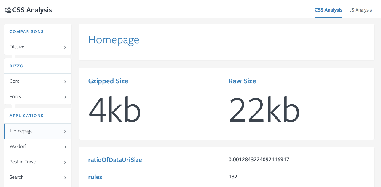
Data collected on the performance of a pattern or family of patterns, featuring the pattern whose impact on performance is the most severe. See “Performance Monitoring” on Lonely Planet, which also plots the growth of CSS and JavaScript on a graph for every pattern, application and landing page, with detailed CSS and JavaScript reports for each. Again, useful only in a developer’s view.
- Edge cases
Test for extreme use cases, including copy with too many and too few words, as well as images too narrow and too wide, zooming behavior, deactivated JavaScript, and an (extremely) slow Internet connection. - Error pages and maintenance pages
The ol’ 404 page, but also payment validation recovery and transactional emails. - Broken and empty states
Identify hidden problems with the markup. Also, could be used to address onboarding by providing assistance to users when they don’t know what to do next (e.g. on “zero results” pages). - Localization issues
Preview of critical components in different languages, including styling for right-to-left languages and technical configuration details for CSS and the templating language. - Messaging
Copywriting notes, voice and tone guide, guidelines for customer support, shared text shortcuts and email templates. See Envato Tuts+’ style guide and MailChimp’s content style guide as references. - Content creation guidelines
Content managers could use clear guidance on how to keep the presentation of content consistent. This section could include things to keep in mind when producing content for the product or website at hand. For example, Dynatrace’s assets library provides introductions on how screenshots should be made, prepared and optimized for use on the website. It could also include documentation and communication between designers (e.g. internal details on how to structure icons and illustrations). - Optimization for touch and large screens
Could include quick inline editing of addresses for touch, action overflows, push notifications via Facebook Messenger, segmented controls, visual touch feedback, as well as responsive upscaling to accommodate larger screens. - Optimization for native apps
A website rarely exists in isolation. Some parts of the interface will likely be reused in the native app. Guidelines on how to use the patterns consistently in the native app, with interface examples, would be helpful. See Atlassian’s native apps guidelines. - Dynamic adjustments
What happens on a change of orientation or when the user switches to offline mode or to the print view or when the battery is low? This is critical for games (e.g. you could pause the action) and any other kind of real-time experience. In e-commerce, data could be saved tolocalStoragefor future use, just in case. - Branding and third-party assets
Includes guidelines on how the brand identity could be used for print and on partner websites. Explains what the brand stands for and, more importantly, what it doesn’t stand for. Also, could include partner assets for affiliate programs. See OpenTable’s “Partner Assets.” - Advertising units and constraints
Advertising often poses constraints on design, code and loading behavior. Documenting it early on helps down the road. - Change log
As mentioned, pushing changes and updates to the entire team and keeping everybody in sync is critical. Designers and developers could subscribe to updates, and you could automate announcements of updates in a shared Slack channel. Providing versioning, pattern status and compatibility information (e.g. the dependencies required to use the pattern) is helpful. - Anti-patterns
Includes common responses to recurring problems that are usually ineffective and risk being highly counterproductive. Could include forcing links to open in a new tab,tabindex-itis and ambiguous labels. See “The Anti-Patterns” on eBay’s MIND Patterns website. - Variables, mixins and debugging utilities
Common implementation details and tools used by developers and QA teams, such as how to run a monkey testing script, visual regression commands and debugging.
- Legacy patterns
Includes components that will be deprecated soon, and new alternatives for them, potentially with versioning (see Salesforce’s Sass Deprecate mixin). - Checklist feature
You could enable users of the pattern library to turn the checkpoints in your style guide into a Markdown file to be copied and pasted and shared with the team. See Vox Media’s “Accessibility Guidelines.” - Internal tags, categories and search
For providing better navigation through the pattern library. A sidebar navigation might be annoying because the pattern won’t be seen at full width. Search with autosuggest might work better. If you’re using Sketch, you could use Zeplin to organize screens with tags. - Helpful resources
References to useful resources for the team, both for quick look-ups and communication — e.g. a style guide and boilerplate patterns spreadsheet or a Slack channel where delegated team members propose, discuss and submit new patterns. If necessary, maybe even with an FAQ section.
This might seem like overkill, and it surely is. Think of this overview as comprehensive inspiration for things you might want to consider when designing and building a pattern library. Again, chances are high that you might not need all of them.
Also, certain websites will require additional sections. An e-commerce style guide might require a section on password recovery, credit-card input, generation of PDF invoices, as well as details on how the checkout flow should work for higher conversions (see Envato Market’s “Existing User Flow”). Any website that offers customizable products will include a product builder, with the major components in their various states.
Summary
When building a pattern library, we tend to focus too much on the modules, providing a structural view of the system, rather than showing how it can be used effectively — thereby undermining its usefulness to most team members. One solution to give a pattern library a better chance of surviving the onslaught of future changes is by changing how patterns are presented.
Instead of focusing only on the structure, subatomic particles, molecules and organisms, focus on the context: Show examples of how components are used in different scenarios, and let the designers, engineers, copywriters and marketing managers explore them and dive deep into each component and build on top of the established convention.
Sacrificing consistency for usability is fine. A slightly open-ended, inconsistent but heavily used pattern library is better than a perfectly consistent pattern library that is never used. Come up with usable metaphors that everyone can relate to, name your modules accordingly, and establish them as part of the daily culture. Before you know it, the pattern library will become an integral part of your work routine, serving the purpose for which it was intended — which is to enable designers and developers to get consistent results, faster.
Huge thanks to Marko Dugonjić, Sara Soueidan, Jina Bolton (SalesForce), Alla Kholmatova (FutureLearn), Daniel Mall, Jeremy Keith, Brad Frost and Anna Debenham for taking the time to conduct research, provide feedback, share and validate ideas, and suggest improvements to this article. Also, a kind thank you for review and constructive feedback to Andreas Weiss, hud Halberstam, Tim Baxter, Mariusz Ciesla, John Fischer, James Murphy, Jonathan Bowman, Ehud Halberstam, Sarah Drasner, Wolf Bruening (OTTO), Jan Toman, Ian Feather (Lonely Planet and Buzzfeed), Pelle Bjerkestrand, Molly Finkle (Yelp), Inayaili de Leon (Ubuntu), Thomas Piribauer, Shaun O’Connell, Frederick Hoffman (Lexware), A.J. Kandy, Ian Devlin, Jan Toman, Nate Baldwin, Stefan Baumgartner (Ruxit), Matthias Ott, Brian Greene (General Electric), Lee Moody (Graze), Elyse Holladay (RetailMeNot) and Matt West. Your support shows how truly incredible this little community of ours is.
Further Reading
- An In-Depth Overview Of Living Style Guide Tools
- Rethinking Mobile Tutorials: Which Patterns Really Work?
- Smart Responsive Design Patterns
- The Case For Brand Systems: Aligning Teams Around A Common Story
 (il, al, mrn)

