How To Design Better Buttons

Email Newsletter
Weekly tips on front-end & UX.
Trusted by 182,000+ folks.


 Celebrating 10 million developers
 Custom Web Forms for Angular, React, & Vue. Your backend.
Buttons are a common element of interaction design. While they may seem like a very simple UI element, they are still one of the most important ones to create.
In today’s article, we’ll be covering the essential items you need to know in order to create effective controls that improve user experience. If you’d like to take a go at prototyping and wireframing your own designs a bit more differently, you can download and test Adobe XD for free.
Make Buttons Look Like Buttons
How do users understand an element is a button? The answer is simple. Visual cues help people determine clickability. It’s important to use proper visual signifiers on clickable elements to make them look like buttons.
Shape
A safe bet is to make buttons square or square with rounded corners, depending on the style of the site or app. Rectangular shaped buttons were introduced into the digital world a long time ago, and users are very familiar with them.
You can, of course, be more creative and use other shapes, (circles, triangles, or even custom shapes), but keep in mind unique ideas can prove to be a bit riskier. You need to ensure that people can easily identify each varying shape as a button.
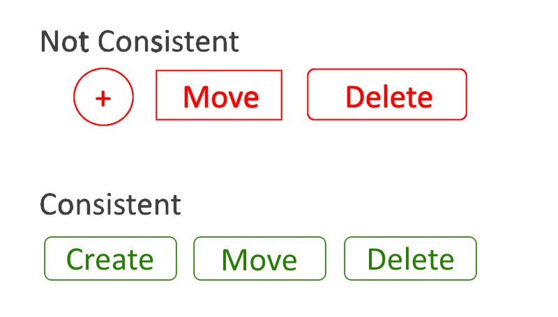
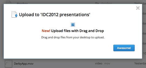
No matter what shape you choose, be sure to maintain consistency throughout your interface controls, so the user will be able to identify and recognize all UI elements as buttons.
Why is consistency so important? Well, because users remember the details, whether consciously or not. For example, users will associate a particular element’s shape as the “button.” Therefore, being consistent won’t only contribute to a great-looking design, but it’ll also provide a more familiar experience for users.
The picture below illustrates this point perfectly. Using three different shapes in one part of your app (e.g. system toolbar) is not only confusing to the user, it’s incorrect design practice.
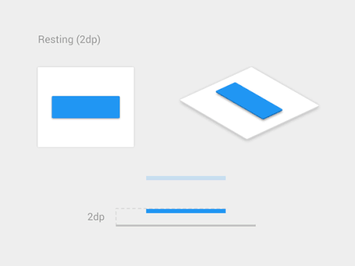
Shadows And Highlights
Shadows are valuable clues, telling users at which UI element they are looking. Drop-shadows make the element stand out against the background and make it easily identifiable as a tappable or clickable element, as objects that appear raised look like they could be pressed down, (tapped or clicked). Even with flat buttons (almost flat, to be exact), there are still places for these subtle cues.
Clearly Label Buttons
Users avoid interface elements without a clear meaning. Thus, each button in your UI should have a proper label or icon. It’s a good idea to base this selection on the principles of least astonishment: If a necessary button has a label or icon with a high astonishment factor, it may be necessary to change the label or icon.
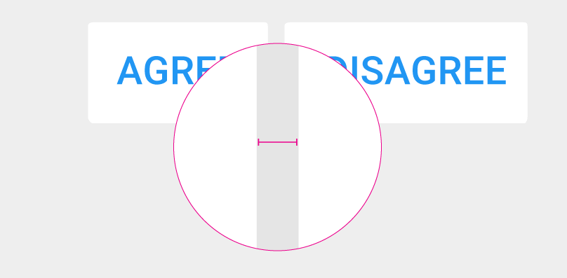
Clear And Distinct Labels
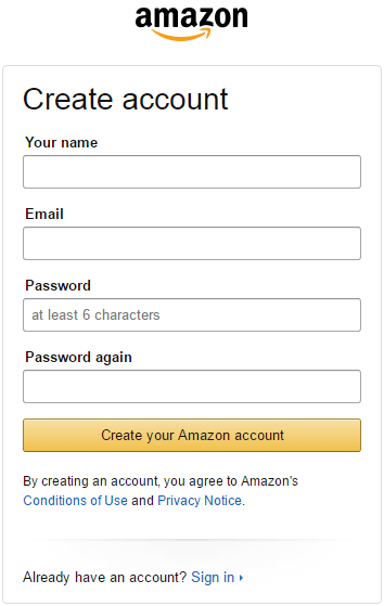
The label on actionable interface elements, such as a button, should always tie back to what it will do for the user. Users will feel more comfortable when they understand what action a button does. Vague labels like ‘Submit,’ or abstract labels like in the example below, don’t provide enough information about the action.
The action button should affirm what that task is, so that users know exactly what happens when they click that button. It’s important to indicate what a button does using action verbs. For example, if a user is signing up for an account, a button that says, ‘Create Account,’ tells them what the outcome will be after pressing the button. It’s clear and specific to the task. Such explicit labels serve as just-in-time help, giving users confidence in selecting the correct action.
Put Buttons Where Users Can Find Them
Don’t make users hunt for buttons; put buttons where users can easily find them or expect to see them.
Location And Order
If you’re designing a native app, you should follow platform GUI guidelines when choosing a proper location and order for buttons. Why? Because applying consistent design that follows user expectations saves people time.
In the case of web-based apps, you should think about which placement truly works best for your users. The right way to determine this is by testing.
If you design mobile navigation it’s worth paying attention to the best practices for buttons location. The article The Golden Rules Of Bottom Navigation Design covers this topic.
Make It Easy For Users To Interact With Buttons
The size and visual feedback of buttons, play key roles in helping users interact with them.
Size And Padding
You should consider how large a button is in relation to the other elements on the page. At the same time, you need to ensure the buttons you design are large enough for people to interact with.
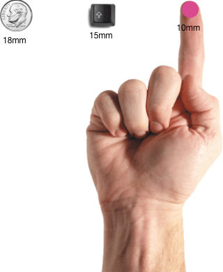
When a tap is used as a primary input method for your app or site, you can rely on the MIT Touch Lab study to choose a proper size for your buttons. This study found that the average size of finger pads are between 10–14mm and fingertips are 8–10mm, making 10mm x 10mm a good minimum touch target size. When a mouse and keyboard are the primary input methods, button measurements can be slightly reduced to accommodate dense UIs.
You should consider the size of button elements, as well as the padding between clickable elements, as padding helps separate the controls and gives your user interface enough breathing space.
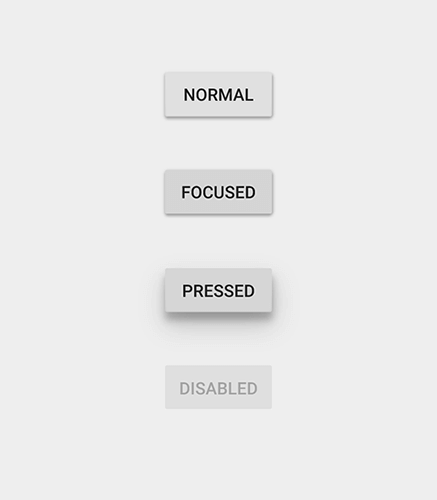
Provide Visual Feedback
This requirement isn’t about how the button initially looks to the user; it’s about interaction experience with the UI element. Usually, a button isn’t a one-state object. It has multi-states, and providing visual feedback to users to indicate the current state should be a top priority task. This helpful illustration from Material Design makes it clear how to convey different button states:
Visually Highlight The Most Important Buttons
Ensure the design puts emphasis on the primary or most prominent action. Use color and contrast to keep user focus on the action, and place the button in prominent locations where users are most likely to notice it.
Call-To-Action Button
Important buttons, (such as CTAs,) are meant to direct users into taking the action you want them to take. To create an effective call-to-action button, one that grabs the user’s attention and entices them to click, you should use colors with a high contrast in relation to the background and place the button in the path of a user.
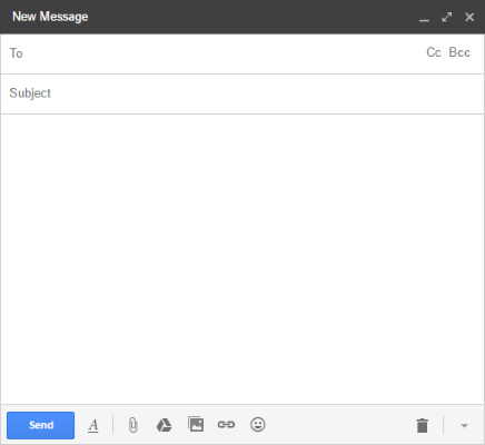
If we look at Gmail’s UI, the interface is very simple and almost monochromatic, with the exception of the ‘Send’ button. As soon as users finish writing a message, they immediately notice this nice blue button.
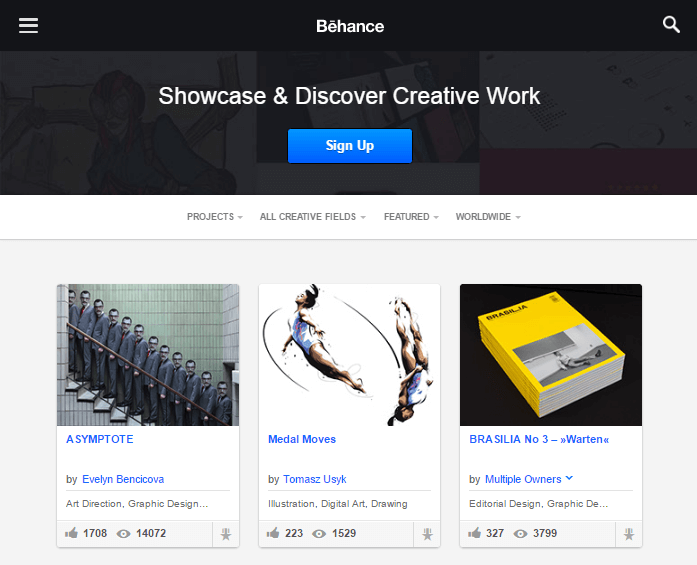
The same rule works for websites. If you take a look at the Behance example below, the first thing that will catch your attention is a “Sign Up” call-to-action button. The color and the position, in this case, is more important than the text.
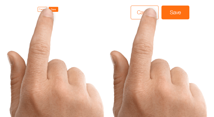
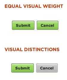
Visual Distinctions For Primary And Secondary Buttons
You can find another example of grabbing the user’s attention with buttons in forms and dialogues. When choosing between primary and secondary actions, visual distinctions are a useful method for helping people make solid choices:
- The primary positive action associated with a button needs to carry a stronger visual weight. It should be the visually dominant button.
- Secondary actions, (e.g. options like ‘Cancel’ or ‘Go Back’,) should have the weakest visual weight, because reducing the visual prominence of secondary actions minimizes the risk for potential errors, and further directs people toward a successful outcome.
Button Design Checklist
While every design is unique, every design also has a set of items in common. That’s where having a good design checklist comes in. To ensure your button design is right for your users, you need to ask a few questions:
- Are users identifying your element as a button? Think about how the design communicates affordance. Make a button look like a button (use size, shape, drop-shadows and color for that purpose).
- Does a button’s label provide a clear message as to what will happen after a click? It’s often better to name a button, explaining what it does, than to use a generic label, (like “OK”).
- Can your user easily find the button? Where on the page you place the button is just as important as its shape, color and the label on it. Consider the user’s path through the page and put buttons where users can easily find them or expect them to be.
- If you have two or more buttons in your view, (e.g. dialog box), does the button with the primary action have strongest visual weight? Make the distinction between two options clear, by using different visual weight for each button.
Conclusion
Buttons are a vital element in creating a smooth user experience, so it’s worth paying attention to the best essential practices for them. A quick recap:
- Make buttons look like buttons.
- Label buttons with what they do for users.
- Put buttons where users can find them or expect them to be.
- Make it easy for the user to interact with each button.
- Make the most important button clearly identifiable.
When you design your own buttons, start with the ones that matter most, and keep in mind that button design is always about recognition and clarity.
Other Resources
- “7 Basic Best Practices for Buttons,” UXmatters
- “The Evolution of Buttons in UX Design,” Adobe
- “How Button Placement Conventions Reinforce User Habits,” UX Movement
- “Visual Weight of Primary and Secondary Action Buttons,” UX Movement
- “The Golden Rules Of Bottom Navigation Design”, Smashing Magazine
- “11 Characteristics Of Persuasive Call-To-Action Buttons”, UserTesting
"This article is part of the UX design series sponsored by Adobe. The newly introduced Experience Design app is made for a fast and fluid UX design process, creating interactive navigation prototypes, as well as testing and sharing them — all in one place. You can check out more inspiring projects created with Adobe XD on Behance, and also visit the Adobe XD blog to stay updated and informed. Adobe XD is being updated with new features frequently, and since it's in public Beta, you can download and test it for free."
Further Reading
- More Than Just Pretty: How Imagery Drives User Experience
- Better Interface Design: Logins, Menus, Toggles …
- Design Patterns: When Breaking The Rules Is OK
- An Actionable And Reliable Usability Questionnaire With Only 7 Items: Inuit
 (ms, il, aa, mrn)

