The New Layout Standard For The Web: CSS Grid, Flexbox And Box Alignment

Email Newsletter
Weekly tips on front-end & UX.
Trusted by 182,000+ folks.

 Celebrating 10 million developers


 Custom Web Forms for Angular, React, & Vue. Your backend.
Layout on the web is hard. The reason it is so hard is that the layout methods we’ve relied on ever since using CSS for layout became possible were not really designed for complex layout. While we were able to achieve quite a lot in a fixed-width world with hacks such as faux columns, these methods fell apart with responsive design.

Thankfully, we have hope, in the form of flexbox — which many readers will already be using — CSS Grid Layout and the box alignment module.
In this article, I’m going to explain how these fit together, and you’ll discover that by understanding flexbox you are very close to understanding much of grid layout.
New Values For Display
Both grid and flexbox are new values for the display property. To make an element a flex container, we use display: flex; to make it a grid container, we use display: grid.
As soon as we do so, the immediate children of our flex or grid container become flex or grid items. Those immediate children take on the initial values of flex or grid items.
display: flex
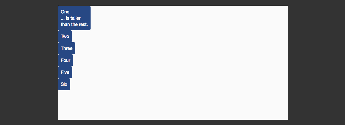
In the first example, we have three elements in a wrapper element set to display: flex. That’s all we need to do to start using flexbox.
Unless we add the following properties with different values, the initial values for the flex container are:
flex-direction: rowflex-wrap: no-wrapalign-items: stretchjustify-content: flex-start
The initial values for our flex items are:
flex-grow: 0flex-shrink: 1flex-basis: auto
We’ll look at how these properties and values work later in this article. For now, all you need to do is set display: flex on a parent, and flexbox will begin to work.
See the Pen Flexbox defaults by rachelandrew (@rachelandrew) on CodePen.
display: grid
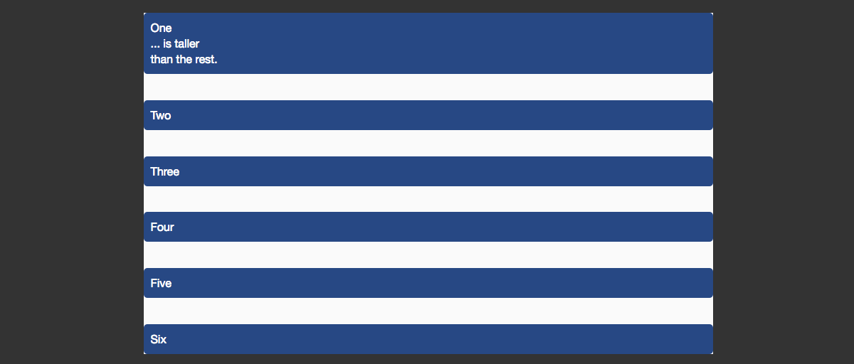
To lay out items on a grid, we use display: grid. In order that we can see the grid’s behavior, this example has five cards to lay out.
Adding display: grid won’t make a dramatic change; however, our child items are all now grid items. They have fallen into a single-column track grid, displaying one below the other, the grid creating implicit row tracks to hold each item.
See the Pen Grid defaults by rachelandrew (@rachelandrew) on CodePen.
We can take our grid a step further and make it more grid-like by creating some columns. We use the grid-template-rows property to do this.
In this next example, I’ve created three equal-width column tracks using a new unit that has been created for grid. The fr unit is a fraction unit signifying the fraction of available space this column should take up. You can see how our grid items have immediately laid themselves out on the grid, one in each created cell of our explicitly defined columns. The grid is still creating implicit rows; as we fill up the available cells created by our columns, new rows are created to hold more items.
See the Pen Grid columns by rachelandrew (@rachelandrew) on CodePen.
Once again, we have some default behavior in evidence. We haven’t positioned any of these grid items, but they are placing themselves onto our grid, one per cell of the grid. The initial values of the grid container are:
grid-auto-flow: rowgrid-auto-rows: autoalign-items: stretchjustify-items: stretchgrid-gap: 0
These initial values mean that our grid items are placed one into each cell of the grid, working across the rows. Because we have a three-column track grid, after filling the grid cell of the third column, a new row is created for the rest of the items. This row is auto-sized, so will expand to fit the content. Items stretch in both directions, horizontal and vertical, filling the grid area.
Box Alignment
In both of these simple examples, we are already seeing values defined in the box alignment module in use. “Box Alignment Module Level 3” essentially takes all of the alignment and space distribution defined in flexbox and makes it available to other modules. So, if you already use flexbox, then you are already using box alignment.
Let’s look at how box alignment works in flexbox and grid, and the problems that it helps us solve.
Equal-Height Columns
Something that was very easy to create with old-school table-based layouts, yet fiendishly difficult using positioning and floats, is equal-height columns. In the floated example below, our cards contain unequal amounts of content. We have no way of indicating to the other cards that they should visually take on the same height as the first card — they have no relationship to each other.
See the Pen Floated columns by rachelandrew (@rachelandrew) on CodePen.
As soon as we set the display property to grid or flex on a parent, we give the children a relationship to each other. That relationship enables the box-alignment properties to work, making equal-height columns simple.
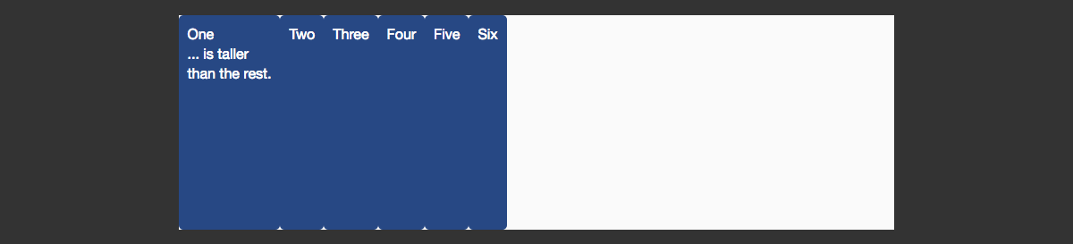
In the flex example below, our items have unequal amounts of content. While the background on each lines up, it doesn’t sit behind the content as it would for floated elements. Because these items are displayed in a row, the property that controls this behavior is align-items. Creating equal-height columns requires that the value be stretch — the initial value for this property.
See the Pen Flexbox equal-height columns by rachelandrew (@rachelandrew) on CodePen.
We see the same with grid layouts. Below is the simplest of grid layouts, two columns with a sidebar and main content. I’m using those fraction units again; the sidebar has 1 fraction of the available space, and the main content 3 fractions. The background color on the sidebar runs to the bottom of the content. Once again, the default value of align-items is stretch.
See the Pen Grid equal-height columns by rachelandrew (@rachelandrew) on CodePen.
Alignment In Flexbox
We’ve seen how the default value of align-items for both grid and flexbox is stretch.
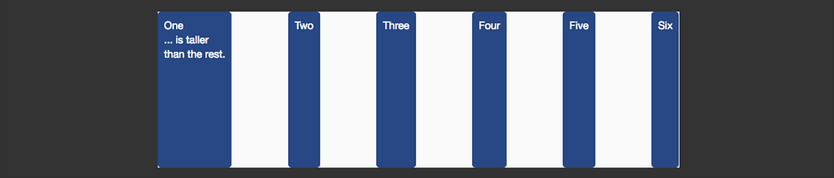
For flexbox, when we use align-items, we are aligning them inside the flex container, on the cross axis. The main axis is the one defined by the flex-direction property. In this first example, the main axis is the row; we are then stretching the items on the cross axis to the height of the flex container. The height of the flex container is, in this case, determined by the item with the most content.

I could give the wrapper a height, and in this case the height of the flex container would be defined by that height.
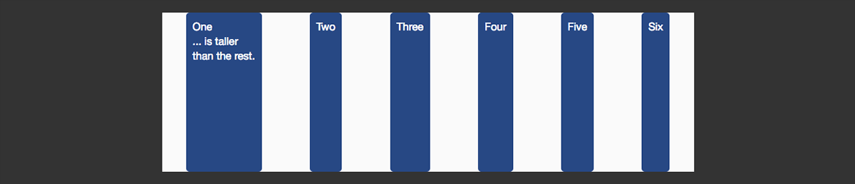
We can use other values, instead of the default stretch:
flex-startflex-endbaselinestretch
To control the alignment on the main axis, use the justify-content property. The default value is flex-start, which is why our items are all aligned against the left margin. We could instead use any of the following values:
flex-startflex-endcenterspace-aroundspace-between
The space-between and space-around keywords are especially interesting. With space-between, the space left over after the flex items have been displayed is distributed evenly between the items.
Using space-around is similar except that the space left over is distributed on both sides of the items. You get a half-sized gap on each end.
You can see these properties and values in the CodePen below.
See the Pen Flexbox align and justify on a row by Rachel (@rachelandrew) on CodePen.
See the Pen Flexbox alignment flex-direction: row by rachelandrew (@rachelandrew) on CodePen.
We can display flex items as a column rather than a row. If we change the value of flex-direction to column, then the main axis becomes the column, and the cross axis is along the row — align-items is still stretch by default, and so stretches the items across row-wise.
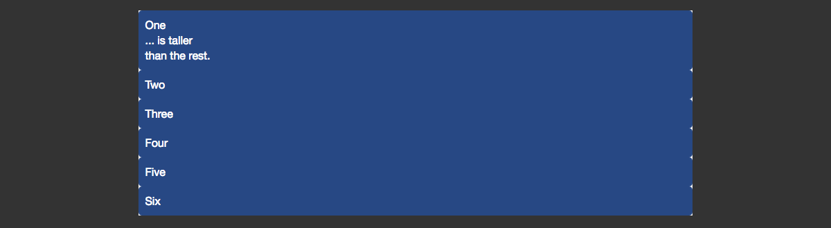
If instead we want them to align to the start of the flex container, we use flex-start.
We can use justify-items, too, including space-between and space-around. The container needs to have enough height for you to see each in action, though!
See the Pen Flexbox alignment flex-direction: column by rachelandrew (@rachelandrew) on CodePen.
Alignment In Grid Layout
In a grid layout, the behavior is similar, except that we are aligning items within the defined grid area. In flexbox, we talk about the main and cross axis; with grids, we use the terms “block” or “column axis” to describe the axis defining our columns, and “inline” or “row axis” to describe the axis defining our rows.
We can align content inside a grid area using the properties and values described in the box alignment specification.
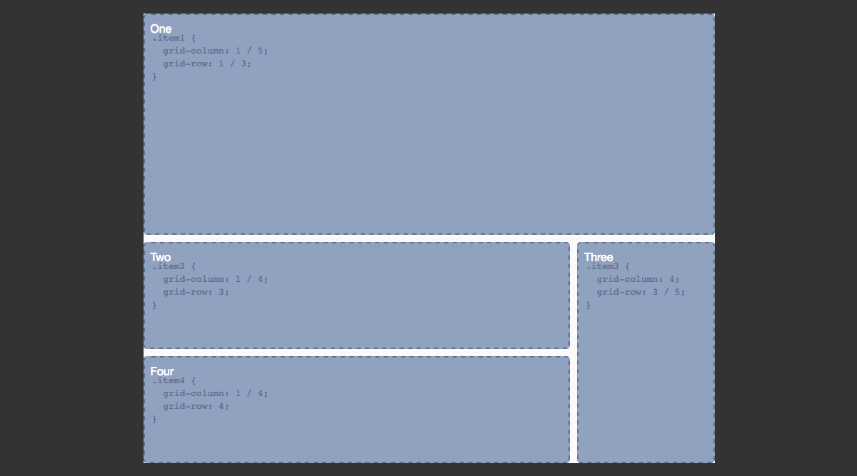
A grid area is one or more grid cells. In the example below, we have a four-column and four-row track grid. The tracks are separated by a grid gap of 10 pixels, and I have created three grid areas using line-based positioning. We’ll look at this positioning properly later in this guide, but the value before the / is the line that the content starts on, and the value after where it ends.
See the Pen Grid alignment: align-items and justify-items by rachelandrew (@rachelandrew) on CodePen.
The dotted border is on a background image, to help us see the defined areas. So, in the first example, each area uses the defaults of stretch for both align-items on the column axis and justify-items on the row axis. This means that the content stretches to completely fill the defined area.
In the second example, I have changed the value of align-items on the grid container to center. We can also change this value on an individual grid item using the align-self property. In this case, I have set all items to center, but item two to stretch.
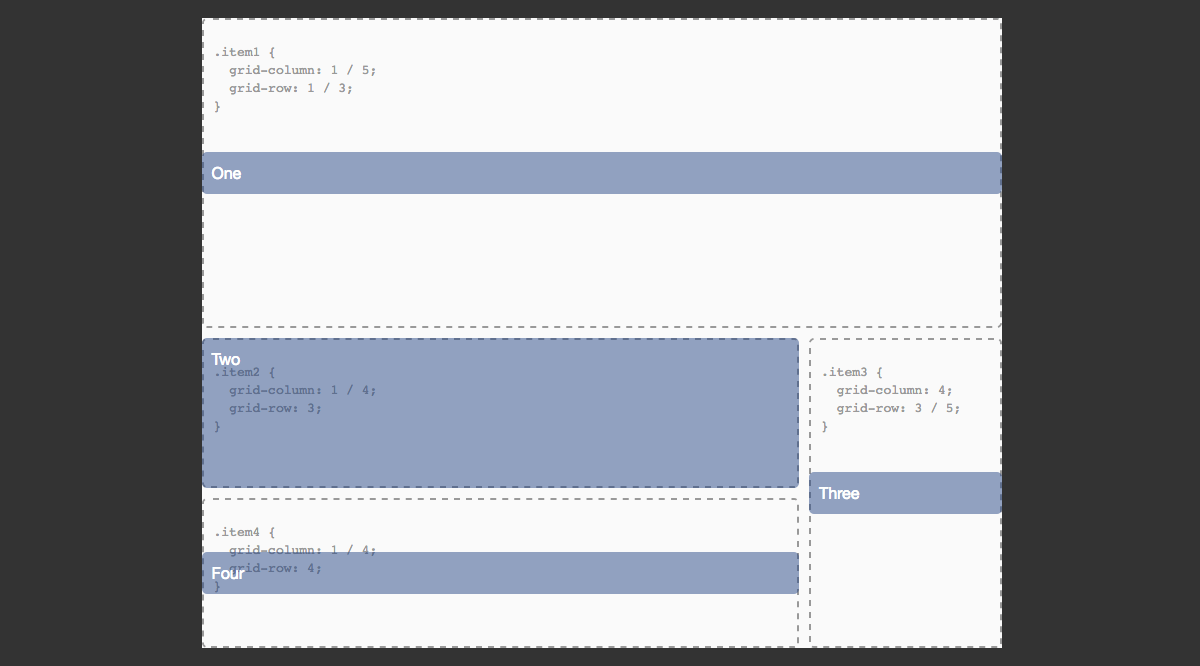
In the third example, I have changed the value of justify-items and justify-self again, setting these to center and stretch.
In all of the examples above, I have aligned the content of the grid areas, the areas defined by the start and end grid lines.
We can also align the entire grid inside the container, if our grid tracks are sized so that they take up less space than the container that has been set to display: grid. In this case, we use the align-content and justify-content properties, as with flexbox.
See the Pen Grid alignment: aligning the grid by rachelandrew (@rachelandrew) on CodePen.
In the first example, we see the default alignment of a grid where the columns and rows have been defined in absolute units and take up less space than the fixed-sized wrapper allows for. The default values for both are start.
To move the tracks to the bottom right, we change the values to end.
Just as with flexbox, we can use space-around and space-between. This might cause some behavior that we don’t want as the grid gaps essentially become wider. However, as you can see from the image below and in the third example in the CodePen, we get the same space between or around the tracks as we see with flexbox.
The fixed-sized tracks will gain additional space if they span more than one track. Element two and four in our example are wider and three is taller because they are given the extra space assigned to the gap they span over.
We can completely center the grid by setting both values to center, as shown in the last example.
We have very nice alignment abilities in both flexbox and grid, and they work in a generally consistent way. We can align individual items and groups of items in a way that is responsive and prevents overlap — something the web has lacked until now!
Responsive By Default
In the last section, we looked at alignment. The box-alignment properties as used in grid and flexbox layouts are one area where we see how these specifications have emerged in a world where responsive design is just how things are done. Values such as space-between, space-around and stretch allow for responsiveness, distributing content equally among or between items.
There is more, however. Responsive design is often about maintaining proportion. When we calculate columns for a responsive design using the target ÷ context approach, we maintain the proportions of the original absolute-width design. Flexbox and grid layouts give us far simpler ways to deal with proportions in our designs.
Flexbox gives us a content-out approach to flexibility. We see this when we use a keyword value of space-between to space our items evenly. First, the amount of space taken up by our items is calculated, and then the remaining space in the container is divided up and used evenly to space out the items. We can get more control of content distribution by way of properties that we apply to the flex items themselves:
flex-growflex-shrinkflex-basis
These three properties are more usually described by the shorthand flex property. If we add flex: 1 1 300px to an item, we are stating that flex-grow should be 1 so that items can grow, flex-shrink should be 1 so that items can shrink, and the flex-basis should be 300 pixels. Applying this to our cards layout gives us the example below.
See the Pen Flexbox: flex properties by rachelandrew (@rachelandrew) on CodePen.
Our flex-basis here is 300 pixels, and we have three cards in a row. If the flex container is wider than 900 pixels, then the remaining space is divided into three and distributed between the items equally. This is because we have set flex-grow to 1 so that our items can grow from the flex-basis. We have also set flex-shrink to 1, which means that, where we don’t have space for three 300-pixel columns, space will be removed equally.
If we want these items to grow in different proportions, then we can change the flex-grow value on one or more items. If we would like the first item to get three times the available space distributed to it, we would set flex-grow to 3.
See the Pen Flexbox: flex properties by rachelandrew (@rachelandrew) on CodePen.
The available space is distributed after the amount needed for flex-basis has been taken into account. This is why our first item is not three times the size of our other items, but instead gets a share of three parts of the remaining space. You will see a bigger change by setting the value for flex-basis to 0, in which case we wouldn’t have a starting value to remove from the overall container. Then, the entire width of the container could be distributed in proportion to our items.
See the Pen Flexbox: flex properties by rachelandrew (@rachelandrew) on CodePen.
A very useful tool to help you understand these values is Flexbox Tester. Pop the different values into the tester, and it calculates the actual sizes at which your items will end up, and explains why they end up at that size.
If you use auto as your flex-basis value, it will use any size set on the flex item as the flex-basis value. If there is no size, then it defaults to be the same as the value of content, which is the content’s width. Using auto is, therefore, very useful for reusable components that might need to have a set size on an item. You can use auto and be sure that if the item needs to be around a size defined on it, flexbox will respect it.
In the next example, I have set the flex-basis on all cards to auto. I then gave the first card a width of 350 pixels. So, the flex-basis of that first card is now 350 pixels, which is used to work out how to distribute space. The other two cards have a flex-basis based on their content’s width.
See the Pen Flexbox: flex properties by rachelandrew (@rachelandrew) on CodePen.
If we go back to our original flex: 1 1 300px, add more items to our example and set flex-wrap: wrap on the container, the items will wrap in order to maintain as near as possible the flex-basis value. If we have five images and three fit onto one row, then the next two will wrap onto a new row. As the items are allowed to grow, they both grow equally, and so we get two equal-sized items on the bottom row and three in the row above.
See the Pen Flexbox: wrapping by rachelandrew (@rachelandrew) on CodePen.
The question then asked is often, “How can I get the items on the bottom row to line up with the ones on the top, leaving a gap at the end?” The answer is that you don’t, not with flexbox. For that kind of behavior you need a grid layout.
Keeping Things In Proportion With Grid Layout
Grid layouts, as we have already seen, have a concept of creating column and row tracks into which items can be positioned. When we create a flexible grid layout, we set the proportions when defining the tracks on the grid container — rather than on the items, as with flexbox. We encountered the fr unit when we created our grids earlier. This unit works in a similar way to flex-grow when you have a flex-basis of 0. It assigns a fraction of the available space in the grid container.
In this code example, the first column track has been given 2fr, the other two 1fr. So, we divide the space into four and assign two parts to the first track and one part each to the remaining two.
See the Pen Simple grid showing fraction units by rachelandrew (@rachelandrew) on CodePen.
Mixing absolute units and fr units is valid. In this next example, we have a 2fr track, a 1fr track and a 300-pixel track. First, the absolute width is taken away, and then the remaining space is divided into three and assigned three parts to track 1 and one part to track 2.
See the Pen Grid: Mixing absolute and fraction units by rachelandrew (@rachelandrew) on CodePen.
What you can also see from this example is that our items fit into the defined tracks — they don’t distribute across the row, as they do in the flexbox example. This is because, with grid layouts, we are creating a two-dimensional layout, then putting items into it. With flexbox, we get our content and work out how much will fit in a single dimension in a row or column, treating additional rows or columns as entirely new flex containers.
What would be nice, however, is to still have a way to create as many columns of a certain size as will fit into the container. We can do this with grid and the repeat syntax.
In the next example, I will use the repeat syntax to create as many 200-pixel columns as will fit in our container. I am using the repeat syntax for the track listing, with a keyword value of auto-fill and then the size that I want the repeated tracks to be.
(At the time of writing, this was not implemented in Chrome, but works in Firefox Developer Edition.)
See the Pen Grid: As many 200-pixel tracks as will fit by rachelandrew (@rachelandrew) on CodePen.
We can go a step further than that and combine fraction units and an absolute width to tell the grid to create as many 200-pixel tracks as will fit in the container and to distribute the remainder equally.
See the Pen Grid: As many 200-pixel tracks as will fit, distributing remaining space evenly by rachelandrew (@rachelandrew) on CodePen.
In this way, we get the benefits of a two-dimensional layout but still have flexible quantities of tracks — all without using any media queries. What we also see here is the grid and flexbox specifications diverging. Where flexbox ends with distributing items in one dimension, grid is just getting started.
A Separation Of Source Order And Visual Display
With flexbox, we can’t do a lot in terms of positioning our flex items. We can choose the direction in which they flow, by setting flex-direction to row, row-reverse or column, column-reverse, and we can set an order, which controls the visual order in which the items display.
See the Pen Flexbox: order by rachelandrew (@rachelandrew) on CodePen.
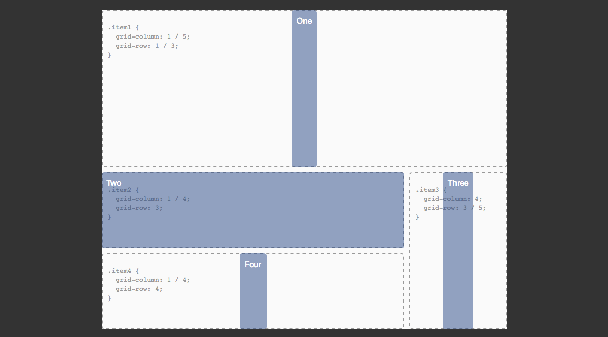
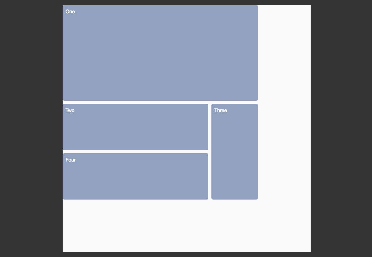
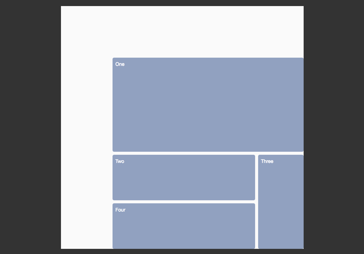
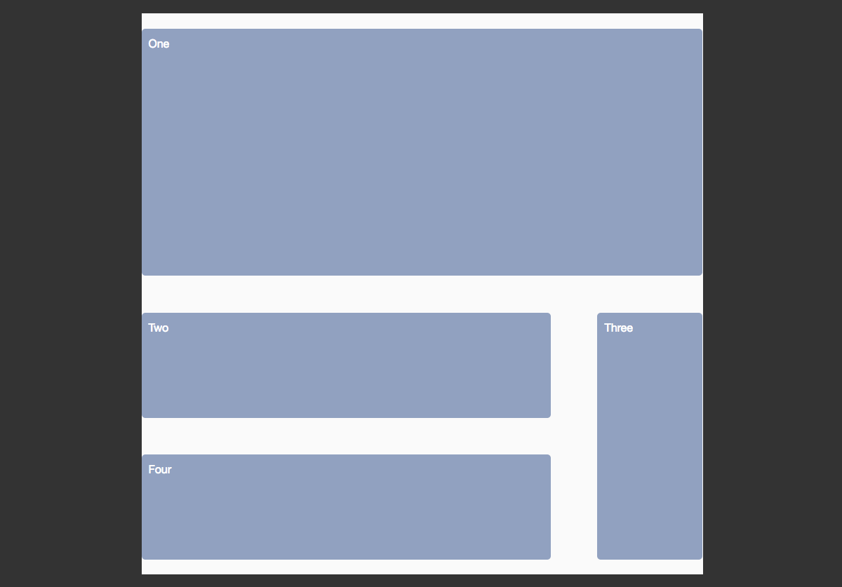
With grid layouts, we get to properly position child items onto the grid we have defined. In most of the examples above, we have been relying on grid auto-placement, the rules that define how items we have not positioned are laid out. In the example below, I am using line-based positioning to position the items on the grid.
The grid-column and grid-row properties are a shorthand for grid-column-start, grid-row-start, grid-column-end and grid-row-end. The value before the / is the line that the content starts on, while the value after is the line it ends on.
See the Pen Grid: line-based positioning by rachelandrew (@rachelandrew) on CodePen.
You can also name your lines. This happens when you create your grid on the grid container. Name the lines in brackets, and then position the items as before but using the names instead of the line index.
See the Pen Grid: line-based positioning, named lines by rachelandrew (@rachelandrew) on CodePen.
You can have multiple lines with the same name, and then target them by line name and index.
You can use a span keyword, spanning a number of lines or, for example, to the third line named col. This type of positioning is useful for creating components that sit in various places in the layout. In the example below, I want some elements to span six column tracks and others to span three. I am using auto-placement to lay out the items, but when the grid encounters an item with a class of wide, the start value will be auto and the end value will be span 2; so, it will start on the line it would normally start on based on the auto-placement rules, but span two lines.
See the Pen Grid: multiple lines with the same name by rachelandrew (@rachelandrew) on CodePen.
Using auto-placement with some rules in this way will likely leave some gaps in our grid as the grid encounters items that need two tracks and has space for only one. By default, the grid progresses forward; so, once it leaves a gap, it doesn’t go back to place things in it — unless we set grid-auto-flow to a value of dense, in which case, the grid will actually backfill the gaps left, taking the content out of DOM order.
See the Pen Grid: grid-auto-flow: dense by rachelandrew (@rachelandrew) on CodePen.
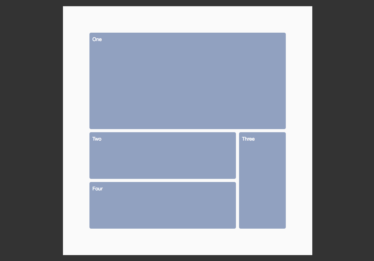
There is also a whole different method of positioning items using the grid layout — by creating a visual representation of our layout right in the value of the grid-template-areas property. To do this, you first need to name each direct child of the grid container that you want to position.
We then lay the items out in this ASCII art manner as the value of grid-template-areas. If you wanted to entirely redefine the layout based on media queries, you could do so just by changing the value of this one property!
See the Pen Grid: template areas by rachelandrew (@rachelandrew) on CodePen.
As you can see from the example, to leave a cell empty, we use a full stop or a series of full stops with no white space between them. To cause an element to span a number of tracks, we repeat the name.
Accessibility Implications Of Reordering
For flexbox and even more so for grid layouts, we need to take great care when using these methods to reorder content. The specification for flexbox states:
"Authors must use order only for visual, not logical, reordering of content. Style sheets that use order to perform logical reordering are non-conforming."
For grids, we are warned:
"Grid layout gives authors great powers of rearrangement over the document. However, these are not a substitute for correct ordering of the document source. The order property and grid placement do not affect ordering in non-visual media (such as speech). Likewise, rearranging grid items visually does not affect the default traversal order of sequential navigation modes (such as cycling through links)."
In both cases, as currently defined, the reordering is only visual. It does not change the logical order of the document. In addition, we need to take great care in considering sighted keyboard users. It would be incredibly simple to cause someone tabbing through the document to tab along the navigation at the top and then suddenly be taken to the bottom of the document due to a grid item that appears early in the source being positioned there.
A New System For CSS Grid Layout
I’ve not covered every aspect of Grid and Flexbox in this guide - my aim being to show the similarities and differences between the specifications, and to throw Box Alignment into the mix. To demonstrate that what these specifications are bringing us is a new layout system, one that understands the kind of sites and applications we are building today.
Do play with the examples in the article, and there is a whole host of other stuff detailed in the resources below. I would be especially interested in use cases that you can’t achieve with these layout methods. If you find one let me know, I’m interested in finding the edges of the specifications we have so welcome a challenge.
Watch My Talk
Resources
Here are some resources to help you explore these specifications further.
- Grid by Example, Rachel Andrew
- “Laying Out The Future With Grid And Flexbox” (video), Rachel Andrew, Mozilla Hacks
Further Reading
- A Few Ways CSS Is Easier To Write In 2023
- How To Animate Along A Path In CSS
- A Primer On CSS Container Queries
- How To Build A Magazine Layout With CSS Grid Areas
 (ms, vf, ml, rb, al, il, mrn)

