How To Create Dramatic Vector Illustrations

Email Newsletter
Weekly tips on front-end & UX.
Trusted by 182,000+ folks.


 Custom Web Forms for Angular, React, & Vue. Your backend.

 Celebrating 10 million developers
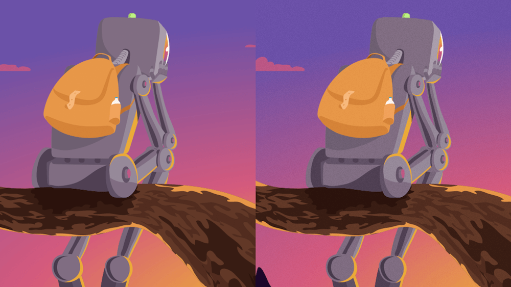
I have been drawing desktop wallpapers for Smashing Magazine’s monthly collections for over a year now, and every time it’s a very fun and challenging mission. In this article, I would like to share how I approach all stages of the process and provide general techniques for creating vector illustrations in Adobe Illustrator. Hopefully, you will find these techniques useful.
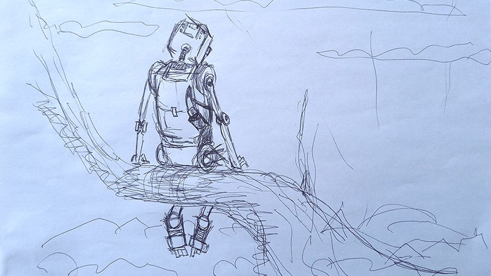
While referring to a particular drawing — the illustration for the “Understand Yourself” desktop wallpaper, which was featured in May’s wallpaper collection this year — I’ll also highlight key takeaways from my experience as an illustrator and designer.

The idea for “Understand Yourself” derived from my curiosity about the future relationship between robots and human beings (artificial intelligence has become a thing recently). How would a robot go about understanding human emotions? By doing the same things that people do, of course. Hence, a pensive robot staring at the sunset.
Let’s take a closer look at it and see how it was made.
Things To Consider Before Getting Started
- Resolution. Although vector artwork is scalable without compromising quality, you have to decide on the ratio. I prefer 4:3 and 16:9 because these are fairly common standards for most screens. Also, bear in mind that, despite the perfect scalability of vector graphics, working with curve anchors and colors in small areas is sometimes onerous.
- Composition. Rules are made for breaking. But we should know which are supposed to get broken, right? One that I really like is the rule of thirds. It is easy and it works well. The key idea is that main objects should be located at the intersections of the grid lines. If you are willing to learn more about composition, I can’t recommend anything better than the book Framed Ink.
- Depth. To make an illustration look more natural, create depth. You can achieve this by placing some objects closer to the viewer and some farther.
- Framing. Don’t fret that some of your artwork will get trimmed; account for it while drawing. The rule of thumb is to think of your illustration as a clipping from a much bigger picture. While drawing, don’t try to squeeze all objects into the canvas; let them hang out. This is even more relevant if you are planning to turn your artwork into a wallpaper with multiple versions.
- Detail. Adding detail is a great way to make your illustration more attractive. The more thorough the work is, the more one will want to explore it, and the more truthful it will look. On the other hand, adding detail might (and most of the times does) take a lot more time than creating a decent illustration that you are satisfied with.
- Perfection. Don’t be afraid to make mistakes. There is always someone (future you, as well) who is better at composition and coloring. Your drawing won’t be flawless, and over time you will notice a lot of things you didn’t pay attention to or just missed. At the same time, the only way to learn something is to make mistakes. That’s how it works.
It’s All About Storytelling
Since the dawn of the human race, storytelling has been one of the most exciting forms of communication. It teaches, it captivates, it makes us think.
An illustration might look static, but it doesn’t have to be. Creating a story within a still image is easier than you might think. All you have to do is to imagine that your artwork is a middle frame of a movie. Technically, a movie is a sequence of images played at high speed, so that the eye doesn’t notice the change of frames.
Think about what happened before the frame you are working on and what might happen after. Let’s think about what’s happening at the moment as well. What led to our frame? What are the causes and consequences?
The art of storytelling is not about what you tell the viewer, but rather how people perceive what you are telling. A good story sources its power from people’s emotions and memories; it resonates with the viewer.
As a quick example, below is one of my wallpapers featured in the August wallpapers collection.
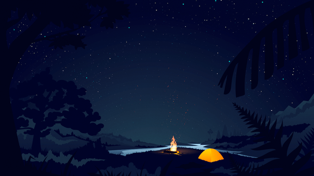
And this is a message I received shortly after it was published, from Paweł Montwiłł in Poland:
"I have recently been to a campsite with my children and we spent some time in a tent, so it perfectly matches my mood."
Chances are, what genuinely interests you will be appreciated by others, too.
Generating Ideas
In my opinion, the most important part of the idea-generation process is doodling. This fun and simple activity creates plenty of ideas fast. Of course, you have to sift through them later, but quantity is what matters at this point. All you have to do is start drawing random things. The beauty of doodling is that you don’t have to think hard — your subconscious does all the work. Almost all of my illustrations, logo concepts and comic strips have evolved from doodles.
Try not to tie your artwork to a specific topic if it’s not absolutely necessary. Strong illustration works on its own. In our case, while the concept is connected to the nice weather in May and the beginning of a new season, it could easily be deprived of that context without losing its meaning.
Observe the world around you; get inspired. Think outside the box, because every new idea is a combination of old ones. Jack Foster’s How to Get Ideas is a wonderful read on the topic.
Sketching
A paper sketch will capture your initial idea (materialize it, if you will). A loose paper sketch will help you to evaluate proportions and composition as well. I prefer not to trace my sketches later but to draw, peeking at the sketch from time to time. If you do not stick to the sketch 100%, you will have more freedom to experiment with details and to see where the illustration takes you.
Background
The background is extremely important because it sets the mood and affects the colors you will pick later for the hero and the surroundings.
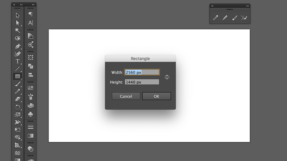
Open Adobe Illustrator, and create a new document by hitting Cmd/Ctrl + N. Type 2560px in the “Width” field and 1440px in the “Height” field. Choose RGB color mode, because we are creating an illustration that will be used on digital screens only. (Note: Shift + O activates the artboard editing mode, so you can change the dimensions of the artboard if you want to alter them or in case you typed them in wrong.)
Hit M to select the Rectangle tool, and click anywhere on the artboard. Type in the same width and height values as your artboard’s (2560px and 1440px).
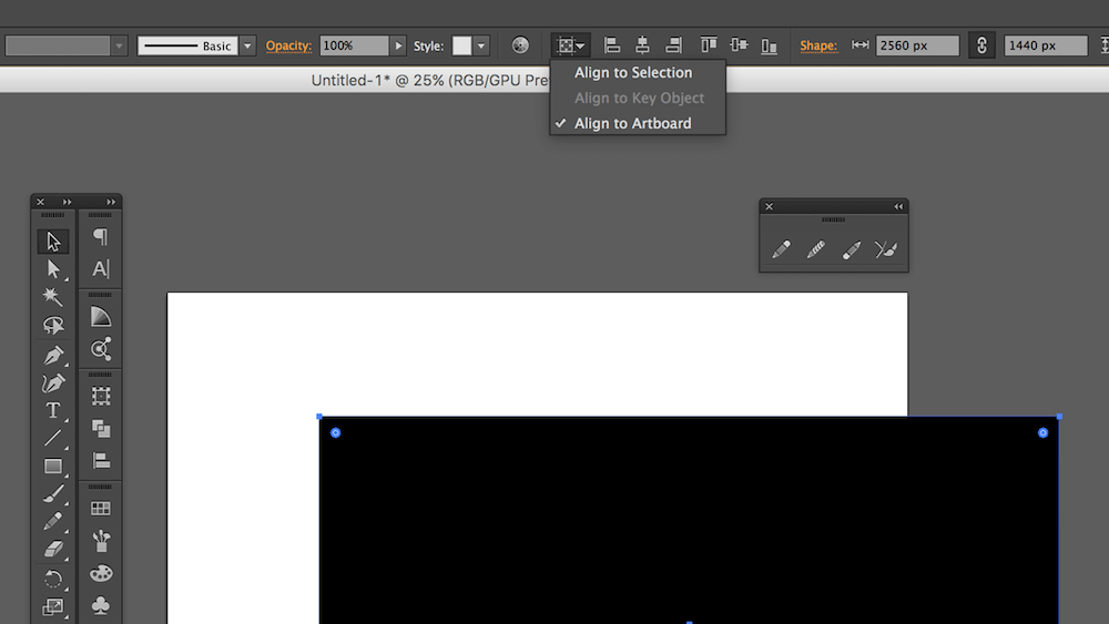
The safest way to align our rectangle is to use the “Align to Artboard” option from the dropdown menu in the top control bar. Alternatively, you can move the rectangle around and wait for the live guides to help you align it.
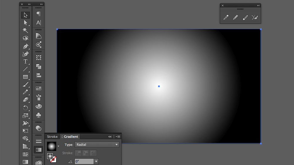
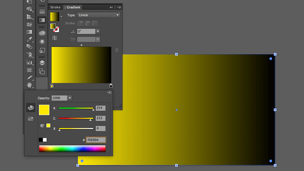
Let’s use a gradient as the background to represent the sky. Select the Gradient tool from the toolbar (if the Gradient tool is missing in the toolbar, go to the top menu and select Window → Gradient). By default, a gradient is white to black.
If you would like your colors to look more real, go ahead and search for some reference pictures of your subject. Get some insight into perspective, lighting, composition, depth and everything else. Pick the colors from the image, and play around with them until you are satisfied with the result.
Let’s see what Unsplash has to offer:

Set the first color stop of our gradient to FEE904:
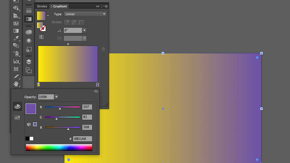
And set the last color stop to 6B51A8.
If you add an in-between color stop, the gradient will be richer and smoother. Let’s warm up our gradient with a pink D65A7C:
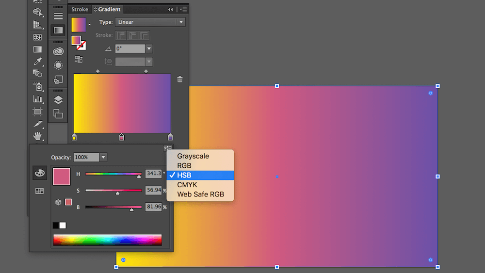
You can adjust the colors by selecting the respective peg located right under the gradient preview in the Gradient panel. I prefer HSB color mode because it enables me to control the hue, saturation and brightness more predictably than RGB or CMYK do.
Select “Radial” as the gradient type from the “Type” dropdown list located at the top of the Gradient panel.

Gradient shape values can be modified by hitting G. Stretch, resize and move the gradient around until the desired effect is reached. In our illustration, I want the sunlight to go from the bottom-right corner all the way to the top-left in a circular manner.

I recommend hitting Cmd/Ctrl + 2 as soon as you are fine with the values, so that we lock the background graphic and don’t accidentally select it later. Plus, we can select multiple objects on the artboard much more easily by clicking and dragging the cursor over these objects.
Once the background is in place, we can move on to adding more objects to the scene. Using an iterative approach, we’ll start by “blocking” colors of our shapes. Then, we’ll gradually add more and more detail.
Tip: Save versions of your artwork. It will help you to track your progress and even to revert if you got stuck at some point.
Drawing Shapes
In Adobe Illustrator, you can choose between several drawing tools. I recommend drawing with the Pencil tool (N) and modifying paths with the Pen tool (P). The Pen tool is more precise and enables you to add, delete and convert anchor points on a path.
I always start by drawing shapes and filling them with a plain color. This technique is called blocking. Blocking colors within shapes gives you a rough idea of how the illustration will look color-wise. Also, with the primary color in place, it’s much easier to determine which colors to use for highlights and shadows.
Let’s add some mountain peaks to our scene. As we know from sourcing reference images, objects that are closer to us are darker. I am going to make them not black, though, but dark-blue instead. We’ll save black for objects that are even closer.
Why don’t we put some greenery in front of the mountains to create more depth? Well, our “greenery” will be black.
If you hold Shift while drawing with the Pencil tool (N), the line will be perfectly straight. Let’s draw a cloud and see how a straight line is helpful sometimes. I will use BD5886 for the cloud. Playing around with an object’s opacity is all right, but I prefer to adjust the color manually. (In most cases, lowering the opacity is not enough because real objects tend to reflect colors around them.)
I am always tempted to clone already drawn shapes, but this is a bad habit. Try to avoid copying and pasting as much as you can. Copying the same type of object (another cloud for instance) seems like a quick win. But you won’t save a lot of time, and viewers will spot the clone and smirk. We don’t need that.
In some cases, though, cloning is acceptable. Drawing each leaf independently to create foliage, for example, can be painful. Instead, create as many leaves as you can, and then resize, flip or rotate copies to make them look different.

For the robot’s body, let’s pick cold colors. But keep in mind that the overall atmosphere is warm, so we’ll mix cold gray with a bit of red.

Hit Ctrl + G to group multiple layers belonging to the same object (like a head or foot). It will be easier to rotate, resize or change their position later if required. Send groups to the back or bring them to the front using Cmd/Ctrl + [ or Cmd/Ctrl + ], respectively.
Working With Bézier Curves And Anchors
As I mentioned, the Pencil tool is a great simulation of a real pencil (especially if you are using a graphic pen tablet). And the Pen tool comes in handy for tweaking curves.
Another helpful tool is the Smooth tool, which enables you to smoothen curves.
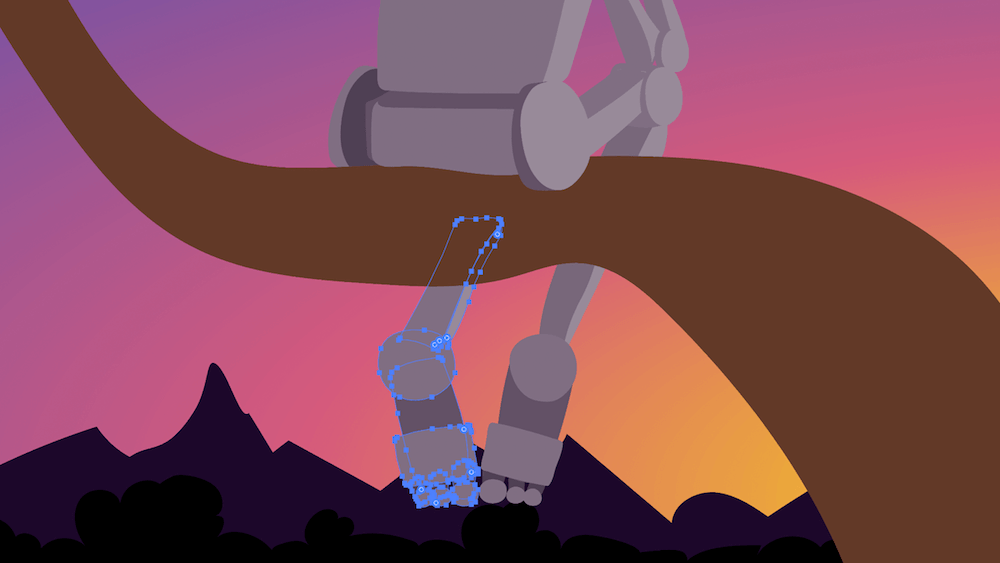
Arm yourself with the Pen tool (P), hold Alt, hover over the curve, and drag it. This will create an arch between the nearest anchors.
Select an anchor on the curve using the Direct Selection tool (A), hold Alt, and you will be able to control the direction points independently.
Another nice thing about the Pencil tool (N) is that you can easily modify an existing path simply by drawing on top of the curve. This feature is very helpful for closing an open path, smoothening corners and adding areas without having to draw an additional shape.
Shadows
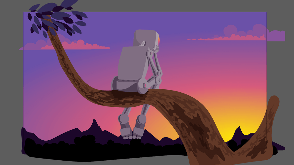
To make objects more realistic, let’s add shadows (darker areas), where the light barely reaches the surface. Obviously, some tree bark and some leaves on the branch will need to be darker than the rest of the foliage.
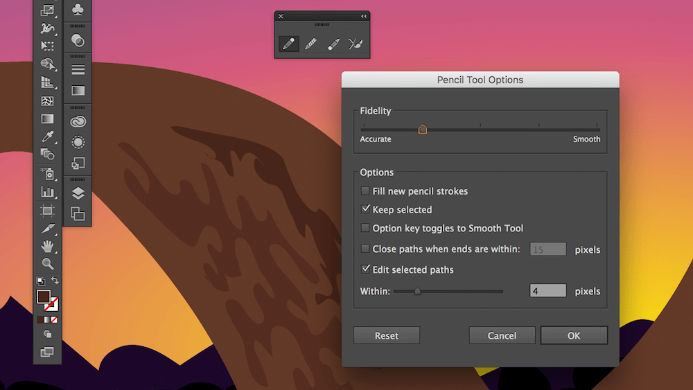
Let’s draw some shapes that simulate tree bark.
Did you notice that the drawn path automatically becomes smoother? You can adjust the smoothness by double-clicking on the Pencil tool. This will show a dialog containing “Fidelity” and some other options.
Add more shadows along the branch shape, the robot’s body and the foliage, using the same drawing technique.
Highlights
Highlights (i.e. areas where light reflects off the surface of an object) are just as important as shadows. Let’s add some bright patches along the curve of the tree branch.
Draw a shape along the branch. Hit Cmd/Ctrl + C to copy the branch shape and Cmd/Ctrl + Shift + V to paste the shape in the same place on top of all other objects. Now, select both shapes (the branch and the highlight), go to the Pathfinder panel, and hit “Unite.” “Unite” merges two shapes into one where they overlap. Thus, we’ll have the exact same curve where the highlight follows the branch shape. Holding Shift while using the color picker allows you to pick a single color from a gradient. If you are not holding Shift, the shape will be filled with a gradient of the source object.
We’ll use the same technique for every highlight or shadow that “touches” the border of the shape beneath it. This effect can be achieved using masks; however, masks keep both shapes intact. Selecting masked shapes later might be difficult if you have multiple shapes with the same mask (in our case, the branch is a mask, and the highlights and shadows are masked shapes).

Details
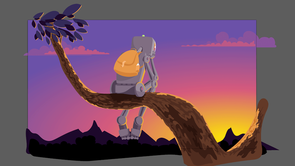
It’s time to add details such as a backpack, a green light on the robot’s head and a reflection on his face. We can also fine-tune some shapes and lines, remove leftovers, and fix inconsistencies. As soon as you like the look of your illustration, stop.
The Final Touches
Sometimes I’ll put some grain on top of an illustration by making a layer with monochrome noise in Adobe Photoshop. It adds a little texture to the illustration and smoothens the gradients. It’s especially useful when gradients have noticeable step wedges.
To import your vector art to Adobe Photoshop, select all of your graphics by hitting Command + A, and drag and drop them into Photoshop. Embed as a “Smart Object,” which will enable you to scale the vector artwork up and down without losing quality.
Create a new layer with Command + Shift + N, and fill it with white color. Then, go to Filters → Noise → Add Noise in the main menu. Set the noise level to 100%, and hit “OK.” In the layers panel, set the “Blending mode” to “Overlay” and the “Opacity” to your liking (I usually go with 3 to 5%).
Now we can correct the colors. Hit Cmd/Ctrl + M in Photoshop to open the dialog for curves. Select the “Red,” “Green” or “Blue” channel from the dropdown and play around with the curves.
Shower Thoughts
Style Vs. Solution
While most artists, designers and illustrators are eager to develop their own distinctive style, always think of the purpose, the objective, the “why.” Style is merely a means of achieving your objective. Style sells, no doubt — clients will recognize you by your style. At the same time, it will limit the viewer’s expectations of you as an artist, designer or illustrator.
Neon Vs. Light
While picking colors from a real image is sometimes reasonable, it depends greatly on the style you’re going for. Black and white with acid color spots here and there? Pale and subdued? Each style demands its own approach to color. What works for a book cover (catchy and provocative) might not work for a wallpaper (imagine staring at extremely bright colors every day).
Idea Vs. Execution
I always run into the dilemma of which is more important: the idea or the execution of the idea. Your illustration might contain an interesting idea, yet if it’s poorly drawn, it won’t be compelling enough. On the contrary, if your artwork is superb and rich in detail but lacks an idea, is it doing its job? Is it moving people?
Perfection Vs. Progress
Nothing is perfect except pizza, so don’t get stuck in pursuit of perfection. Let the dust settle, and return to your artwork a day or two after finishing it. But don’t leave it unseen for too long. Would you prefer to get it done and move on, or meticulously improve it pixel by pixel?
Conclusion
Illustration is a great way to boost many of your skills and to experiment with drawing techniques, colors and composition. These skills will make you a better specialist in any creative field (such as animation and web design, to name a couple). Just remember that a solid illustration requires patience and is rarely done quickly. The good news is that it pays off.
Further Reading
- The Power Of Pen And Paper Sketching
- Solving Media Object Float Issues With CSS Block Formatting Contexts
- Mid-Century Modern Illustration: Creating A Cover Book With Illustrator And InDesign
- Meet Penpot, An Open-Source Design Platform Made For Designers And Developers Alike


