The Golden Rules Of Bottom Navigation Design

Email Newsletter
Weekly tips on front-end & UX.
Trusted by 182,000+ folks.
 Celebrating 10 million developers

 Custom Web Forms for Angular, React, & Vue. Your backend.
Design is more than just good looks – something all designers should know. Design also covers how users engage with a product. Whether it’s a site or app, it’s more like a conversation. Navigation is a conversation. It doesn’t matter how good your site or app is if users can’t find their way around.
In this post, we’ll help you better understand the principles of good navigation for mobile apps, then show you how it’s done using two popular patterns. If you want to take a go at prototyping your own navigation, you can download and test Adobe’s Experience Design CC for free and get started right away.
Let’s Get Started
Navigation UI patterns are a shortcut for good usability. When you examine the most successful interaction navigation designs of recent years, the clear winners are those who execute fundamentals flawlessly. While thinking outside the box is usually a good idea, there are some rules that you just can’t break. Here are four important rules for creating a great mobile navigation:
Simple
First, and most importantly, a navigation system must be simple. Good navigation should feel like an invisible hand that guides the user. An approach to this is to prioritize content and navigation for mobile apps according to the tasks a mobile user is most likely to carry out.
Visible
As Jakob Nielsen says, recognizing something is easier than remembering it. This means that you should minimize the user’s memory load by making actions and options visible. Navigation should be available at all times, not just when we anticipate a user needs it.
Clear
Navigation function must be self-evident. You need to focus on delivering messages in a clear and concise manner. Users should know how to go from point A to point B on first glance, without any outside guidance. Think of the shopping cart icon; it serves as an identifier to check out or view items. Users don’t have to think about how to navigate to make a purchase; this element directs them to the appropriate action.
Consistent
The navigation system for all views should be the same. Don’t move the navigation controls to a new location on different pages. Do not confuse your user — keep words and actions consistent. Your navigation should use “The Principle of Least Surprise.” Navigation should inspire users to engage and interact with the content you are delivering.
Design With Thumbs In Mind
In his research on mobile device usage, Steven Hoober has found that 49% of people rely on one-thumb to accomplish things on their phones. In the figure below, the diagrams on the mobile phones’ screens are approximate reach charts, in which the colors indicate what areas of a screen a user can reach and interact with their thumb. Green indicates the area a user can reach easily; yellow, an area that requires a stretch; and red, an area that requires users to shift the way they’re holding a device.
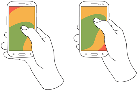
When designing, take into account that your app will be used in several contexts; even people who prefer to use a two-handed grip will not always be in a situation where they can use more than one finger, let alone both hands to interact with your UI. It’s very important to place top-level and frequently-used actions at the bottom of the screen. This way, they are comfortably reached with one-handed and one-thumb interactions.
Another important point — bottom navigation should be used for the top-level destinations of similar importance. These are destinations that require direct access from anywhere in the app.
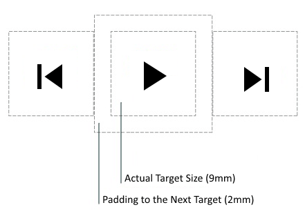
Last but not least, pay attention to the size of targets. Microsoft suggests you set your touch target size to 9 mm square or greater (48×48 pixels on a 135 PPI display at a 1.0x scaling). Avoid using touch targets that are less than 7 mm square.
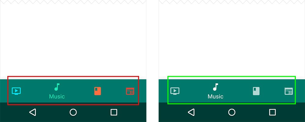
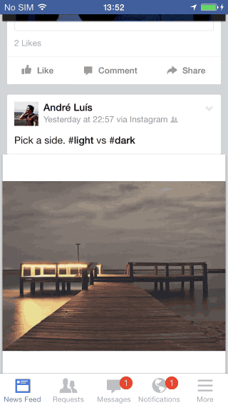
Tab Bar
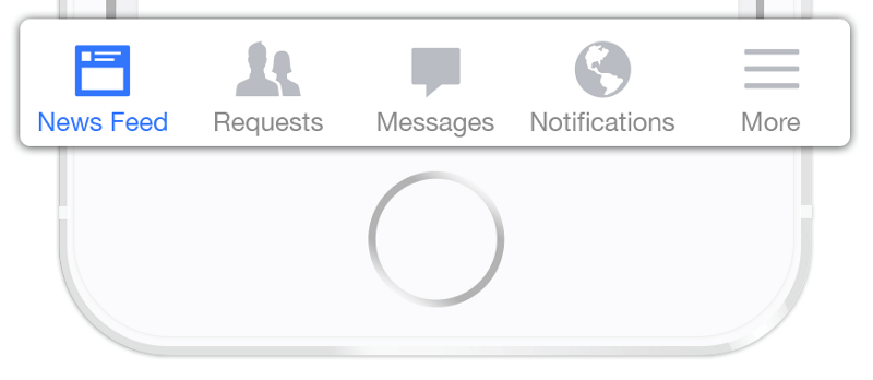
Many apps use the tab bar for an app’s most important features. Facebook makes main pieces of core functionality available with one tap, allowing rapid switching between features.
Three Crucial Moments For Bottom Navigation Design
Navigation is generally the vehicle that takes users where they want to go. Bottom navigation should be used for the designated top-level destinations of similar importance. These are destinations requiring direct access from anywhere in the app. Good bottom navigation design follows these three rules.
1. Show Only The Most Important Destinations
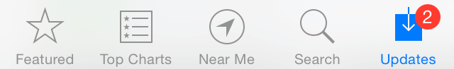
Avoid using more than five destinations in bottom navigation as tap targets will be situated too close to one another. Putting too many tabs in a tab bar can make it physically difficult for people to tap the one they want. And, with each additional tab you display, you increase the complexity of your app. If your top-level navigation has more than five destinations, provide access to the additional destinations through alternative locations.
Avoid Scrollable Content
Partially hidden navigation seems to be an obvious solution for small screens — you don’t have to worry about the limited screen estate, just place your navigation options into a scrollable tab. However, scrollable content is less efficient, since users may have to scroll before they’re able to see the option they want, so it is best to avoid if at all possible.

2. Communicating The Current Location
The single most common mistake seen on app menus is failing to indicate the user’s current location. “Where am I?” is one of the fundamental questions users need to answer to successfully navigate. Users should know how to go from point A to point B based on their first glance and without any guidance from the outside. You should use the proper visual cues (icons, labels, and colors), so the navigation doesn’t require any explanation.
Icons
Bottom navigation actions should be used for content that can be suitably communicated with icons. While there are universal icons that users know well, mostly they are representing functionality like search, email, print and so on. Unfortunately “universal” icons are rare. Unfortunately, app designers often hide functionality behind icons that are actually pretty hard to recognize.
I’ve highlighted this problem in the article Icons as Part of a Great User Experience.
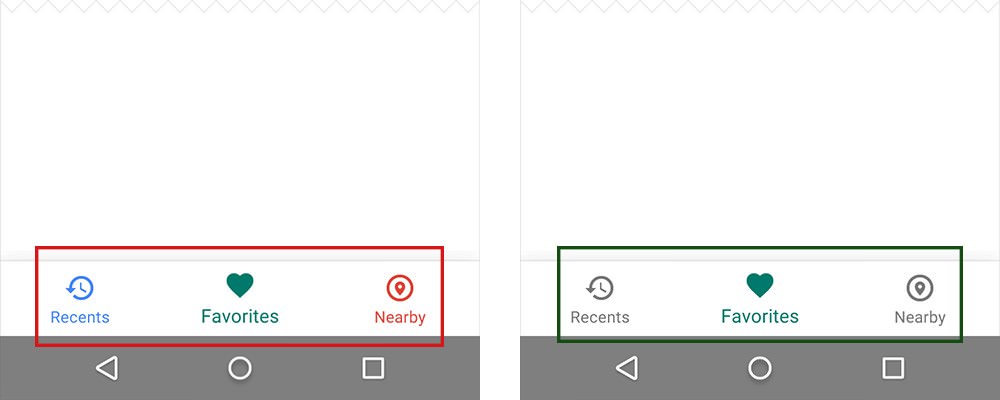
Color
Avoid using different colored icons and text labels in your bottom tab bar. Instead, follow this simple rule-tint the current bottom navigation action (including the icon and any text label present) with the app’s primary color.
Text Labels
Text labels should provide short and meaningfully definitions to navigation icons. Avoid long text labels as they do not truncate or wrap.
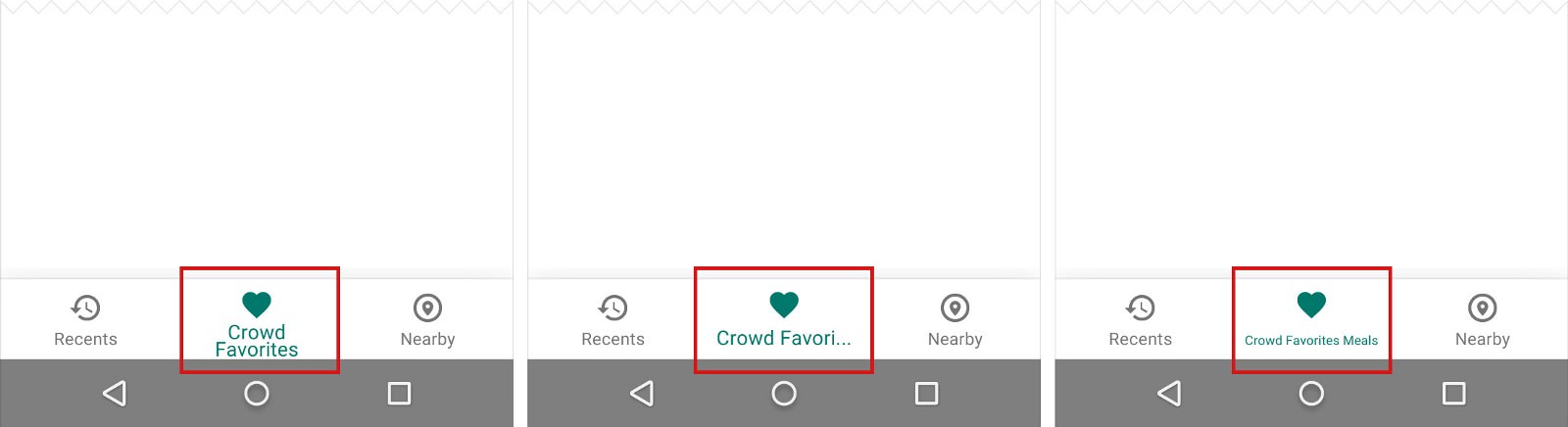
Menu elements should be easy to scan. Users should be able to understand what exactly happens when they tap on an element.
Target Size
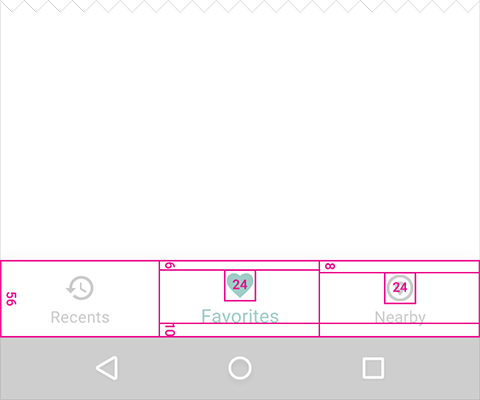
Make targets big enough to be easily tapped or clicked. To calculate the width of each bottom navigation action, divide the width of the view by the number of actions. Alternatively, make all bottom navigation actions the width of the largest action.
Android guidelines suggest following dimensions for the bottom navigation bar on mobile.
### Badge On A Tab You can display a badge on a tab bar icon to indicate that there is new information associated with that view or mode.
3. Make Navigation Self-Evident
Good navigation should feel like an invisible hand that guides the user along their journey. After all, even the coolest feature or the most compelling content is useless if people can’t find it.
Behavior
Each bottom navigation icon must lead to a target destination, and should not open menus or other pop-ups. Tapping on a bottom navigation icon should guide a user directly to the associated view, or refreshes the currently active view. Don’t use a tab bar to give users controls that act on elements in the current screen or app mode. If you need to provide controls, use a toolbar instead.

Strive For Consistency
As much as possible, display the same tabs in every orientation. It’s best when you can give users a sense of visual stability.
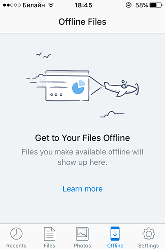
Don’t remove a tab when its function is unavailable. If you remove a tab in some cases but not in others, you make your app’s UI unstable and unpredictable. The best solution is to ensure that all tabs are enabled, but explain why a tab’s content is unavailable. For example, if the user doesn’t have offline files, the Offline tab in the Dropbox app displays a screen that explains how to obtain them. This feature called Empty state.
Hiding The Tab Bar Upon Scrolling
If the screen is a scrolling feed, the tab bar can be hidden when people are scrolling for new content and revealed when they start heading back to the top.
Visual Delight
Avoid using lateral motion to transition between views. Transitioning between active and inactive views should use a cross-fade animation.
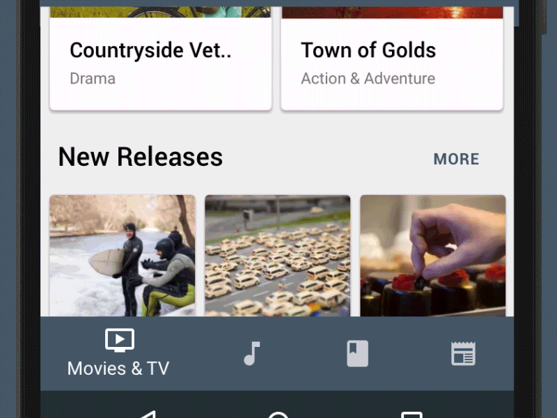
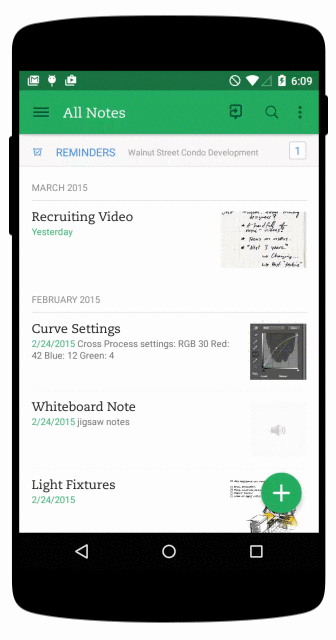
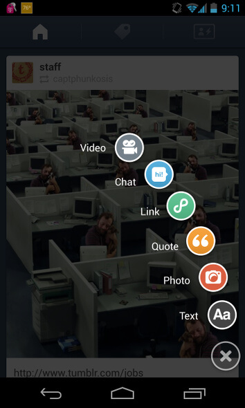
Pictorial Icons: Creative Navigation
The size of the display is a major challenge in communicating your point to the user. Using pictorial icons as menu elements is one of the most interesting solutions to the problem of saving mobile screen space. The shape of the icon explains where it will take you, making them more space-efficient. They can make navigation simple and easy-to-use, but still with enough freedom to separate you from others.
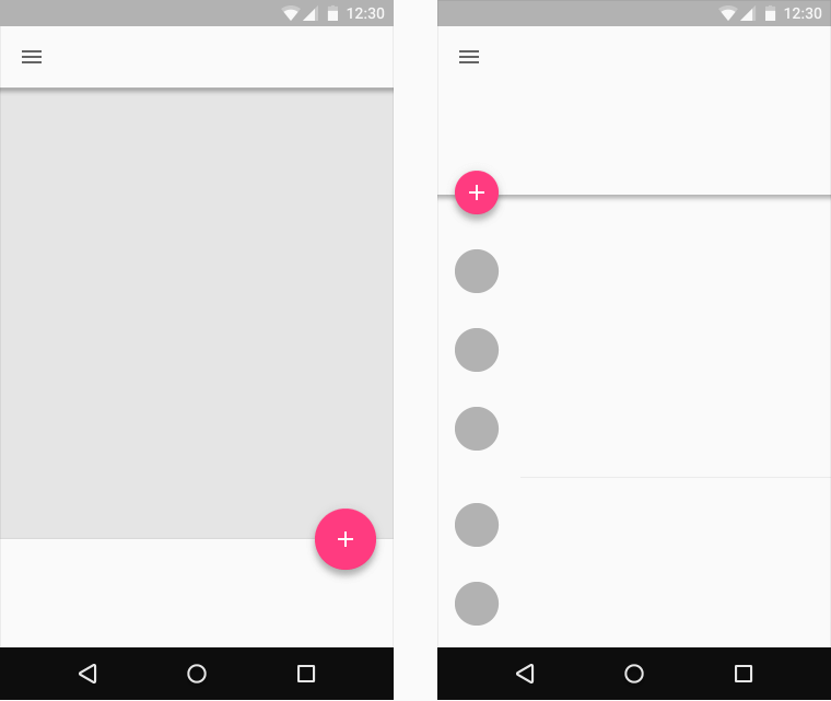
However, this pattern has one major downside — the floating action button conceals content. From a UX point of view, users shouldn’t have to take an action to discover what other actions they can take.
Also, many researchers have shown that icons are hard to memorize and are often highly inefficient. Only universally understood icons work well (e.g. print, close, play/pause, reply, tweet). That’s why it’s important to make your icons clear and intuitive, and introduce text labels next to your icons.
Conclusion
Navigation is generally the vehicle that takes users where they want to go. Always think about your user persona, and the goals they have when using your app. Then, tailor your navigation to help them meet those goals. You’re designing for your users. The easier your product is for them to use, the more likely they are to use it.
"This article is part of the UX design series sponsored by Adobe. The newly introduced Experience Design app is made for a fast and fluid UX design process, creating interactive navigation prototypes, as well as testing and sharing them — all in one place. You can check out more inspiring projects created with Adobe XD on Behance, and also visit the Adobe XD blog to stay updated and informed. Adobe XD is being updated with new features frequently, and since it's in public Beta, you can download and test it for free."
Further Reading
- The Thumb Zone: Designing For Mobile Users
- How To Use Shadows And Blur Effects In Modern UI Design
- More Than Just Pretty: How Imagery Drives User Experience
- The Accessibility And Usability Journey Of Drupal’s Primary Navigation
 (ms, aa, mrn)

