Wireframing: The Perfectionist’s Guide

Email Newsletter
Weekly tips on front-end & UX.
Trusted by 200,000+ folks.
 Flexible CMS. Headless & API 1st
 Register!

When I was a developer, I often had a hundred questions when building websites from wireframes that I had received. Some of those questions were:
- How will this design scale when I shrink the browser window?
- What happens when this shape is filled out incorrectly?
- What are the options in this sorting filter, and what do they do?
These types of questions led me to miss numerous deadlines, and I wasted time and energy in back-and-forth communication. Sadly, this situation could have been avoided if the wireframes had provided enough detail.
Now that I am a UX designer, I notice that some designers tend to forget that wireframes are equally creative and technical. We are responsible for designing great ideas, but we are also responsible for creating product specifications. I admit that there can be so many details to remember that it’s easy to lose track. To save time and energy for myself, I gathered all of my years of wireframing knowledge into a single checklist that I refer to throughout the process. And now I am sharing this knowledge with you, so that you can get back to being creative.
Navigating The Guide
If you’re starting fresh on a wireframing project, I recommend going through each section’s guidelines like a checklist. If not, feel free to jump to the appropriate section.
Considerations
Note: These guidelines are more appropriate for wireframes — and prototypes, to an extent — during a production life cycle (i.e. preparing your product to be built). By this point, the main idea has been established, the features have been fairly locked down, and the core layouts are not going to dramatically change. That being said, some guidelines, like in the first section, can be used for conceptual wireframes in a discovery phase. Just be wary of getting too detailed, because your designs might drastically change, and you will have wasted time.
Finally, onto the guide!
Decisions To Consider Before Wireframing
These guidelines ensure that you ask the difficult but crucial questions early on and establish a foundation for a smooth wireframing process.
Device Support
Usually, the stakeholders will dictate which devices to support, but sometimes you will have a reasonable suspicion that it will be cross-platform or responsive. Other times, you might have to select the best devices to use with your product. In either case, here’s a list of reference devices:
- desktop browsers
- mobile website (browser)
- native mobile app: Android, iOS, Windows
- tablet
- smartwatch: Android Wear, Watch OS(iOS), WebOS, Band (Microsoft)
- smart TV: Android TV, Tizen OS (Samsung), Firefox OS (Panasonic), WebOS (LG)
- Facebook applications
- virtual reality: HTC Vive, Oculus Rift, Samsung Gear VR, Playstation VR
- kiosks
- console gaming: Xbox One, Playstation 4, Wii U, Steam
Confirm Devices Expected To Be Supported
More often than not, responsive mobile wireframes are requested later in the process or are suddenly included by the client. These late requests can cause massive design reworking when you have already started on the wireframes. So, ensure the following:
- Align with your team’s expectations.
- Make sure you have client approval in writing, or refer to a statement of work.
- While they are not devices, content management systems are frequently forgotten.
Match Features To Context Of Use
While composing a review for a product would work in a desktop browser, it might be seldom done on a mobile phone. Review your features one by one and determine whether your users will get added value from each device. If a feature does not match the user’s goals, either change it to be more device-specific or cut it out completely for the device in question. Reducing the design will save you time and money.
Verify Design Differences On Multiple Devices
A common scenario is building a desktop application with a mobile and tablet component. Discuss the following with your team and stakeholders:
- Will the layout be identical (responsive) or completely separate?
- Are features shared across all experiences, or will there be subsets?
- Which operating systems are being supported? For instance, Android and iOS apps follow different design patterns.
Maintain documentation on differences in layouts and features, so that you can easily design for them later in your wireframes.
Consider Implications Of Screen Orientation
For mobile and tablet, designs can appear different in portrait and landscape modes.
- Left alone, a landscape layout will appear like the portrait version but with the width stretched out and less horizontal viewing space.
- Screens can be locked to an orientation. Tread carefully around design layouts that are exclusive to portrait or landscape, because you are forcing users to work a certain way. If in doubt, conduct a usability test.

Scaling The Design
A layout and its UI elements can scale in a variety of ways when the window’s size changes. The most popular scaling patterns are:
- Fixed or static
Remains the same no matter what. - Fluid or liquid
Incrementally shrinks or stretches with each pixel. - Adaptive
Layout changes at certain breakpoints in the window’s width. - Responsive
Follows a mix of fluid and adaptive behavior.
Liquidapsive is an interactive tool for visualizing how each scaling pattern affects the layout when the window’s size changes.
Get Team Consensus
First discuss with your team the best approach, because this will have an impact on the time for you, the developers and the visual designers. Users expect most websites to have desktop and mobile versions, although they don’t always have to share the same set of features.
Align With Your Developer On Mechanics
Consult with your developers on how the design should scale. Also, discuss breakpoints and the scaling behavior for layouts and UI elements that you are unsure of.
Prepare For Many Sets Of Wireframes
Responsive and adaptive layouts will need many sets of screens; so, let your project managers know it will require extra time. I usually add an extra 50 to 75% of the total time for each set.
Default Screen Size Resolution
Establishing a default screen size is important for everyone on your team because they will need to know what to develop and design for. You also want to avoid accidentally starting too large and then realizing you need to shrink it down.
Start Small And Prepare For A Large Size
1024×768 pixels for desktop and tablet and 320 × 480 for mobile are generally safe resolutions to work with. Anything higher can be risky to begin with. It is prudent to start with a low resolution and then scale up so that the design still looks adequate when the window is larger.
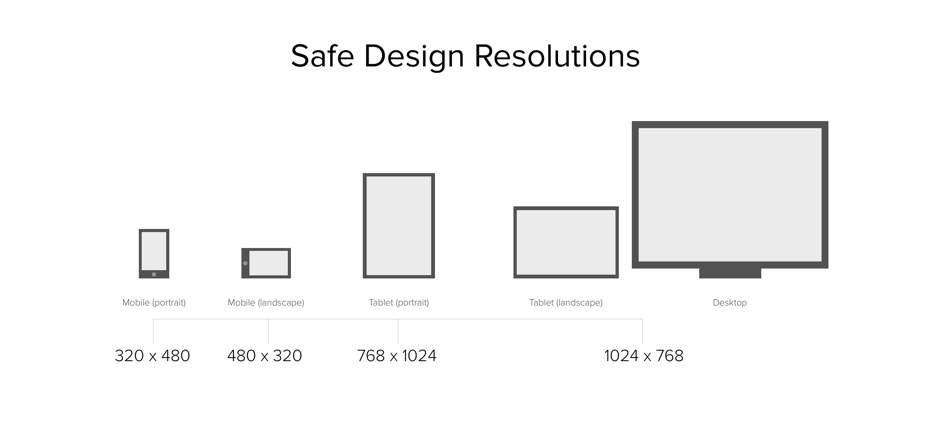
Additionally, consider that many people do not maximize their browser window, so their view of the layout will be even smaller.
Use Analytics To Guide Your Decision
Analytics for screen resolutions can reveal interesting trends, which can help you make an informed decision. You might need the data to convince your client of the resolution you are pushing for as well. Remember that it’s better to be inclusive than exclusive.
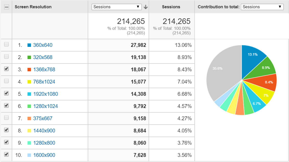
Going for that larger, prettier resolution might cut off a chunk of your audience. To help with your analysis, here are some scenarios I have seen before:
- The most popular resolution can sometimes be safe if it shows a trend of continued growth over many years, while the lower resolutions are declining.
- A group of small resolutions with a low percentage of use could add up to a sizeable population — in which case, choose the lowest resolution.
- For a large variation in resolutions, go with the lowest one.
- If at least 5% of users have a a low resolution, such as 1024 × 768, I would err on the side of caution and select that.
- Viewing trends for the past year is sometimes better than viewing trends since the beginning, because the latter could include resolutions that are no longer relevant. Sanitize your data by removing old data and mobile and tablet resolutions — trends will be easier to identify.
Know Your Audience And Usage Environment
Although 1366×768 is the most common resolution for the desktop (as of May 2016, according to StatCounter and W3Counter), think about your audience’s context of use. For instance, 1024 × 768 makes sense if you’re dealing with users who are on old computers and can’t change their equipment (usually corporate environments).
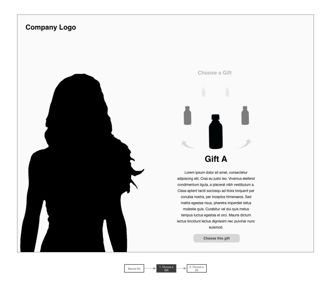
Levels Of Fidelity
Be clear on your definitions of fidelity because it can mean different things to different people. Below is how I define wireframe fidelity:
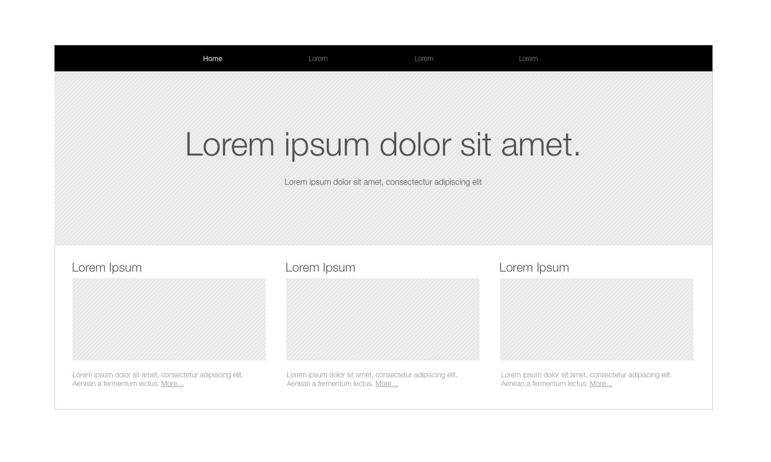
Low fidelity has these elements:
- Focuses on layout and high-level interactions and concepts.
- UI elements and content can be represented as boxes or lines, with or without label descriptions.
- Gray-scale.
- Can be paper sketch.
High fidelity has these elements:
- Emphasizes visual aesthetics and branding, such as tone, colors, graphics and font style.
- Can include realistic images and copy.
- UI elements look realistic and might include aesthetic touches such as textures and shadows.
- Sometimes known as a mockup.
Medium fidelity has these elements:
- Varies between low and high fidelity.
- More realistic UI elements, but not styled.
- Filler images and copy.
- Gray-scale.
- Has some visual design (such as hierarchical typography).
Indulge Your Stakeholders
Observe your stakeholders’ behavior to figure out what makes them happy, or have a discussion with them to determine what they expect.
- Are they the type to hone in on minor irrelevant details? Start with low fidelity, and iterate on that until they are satisfied. Then, move up to medium or high fidelity. Gradually building fidelity over multiple check-ins will make approvals easier, while saving precious design time.
- Are they the type to react to something flashy? Go with high fidelity, but create only a couple at first, so that the stakeholders get an idea of what to expect.
- If in doubt, medium fidelity is always a safe bet, although it takes a bit more time.
Confirm The Expectations Of Fidelity
Whichever fidelity you decide on, make sure your team and stakeholders are on the same page — consider giving examples to be sure. It is scary to walk into a meeting with low-fidelity designs when “low fidelity” in people’s mind is actually “medium fidelity”.
Grid Systems And Alignment
When used in a wireframe tool, a grid system saves you time by easily aligning your UI through snap-to-grid features. This feature basically keeps your designs looking aligned and polished.
Using a grid system will also help you maintain consistency in the layout and balance the design’s hierarchy. The article “All About Grid Systems” does a great job of briefly explaining the theory behind grid systems and the key advantages to using them.
For design inspiration, I have used the article “Using Layout Grids Effectively” for examples of grid layouts and patterns.
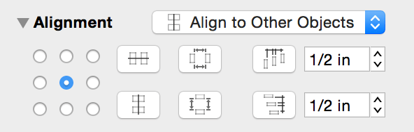
Know Your Alignment And Spacing Features
I achieve pixel-perfection by using the alignment and space-distribution features of many wireframe tools. Learn to use the most common keyboard shortcuts, such as centering, space distribution, grouping and ungrouping. It will save you from having to manually polish your layouts.
Perform Visual Checks
Your visual designer and developer will end up doing most of the actual pixel-pushing, but you’ll want to get it as close as possible; a sloppy design will lose the trust of your user. The key to saving time and cleaning up a design is to stand back a bit from the design and see if any misalignments are visible to the naked eye.
Now that you have checked off all of the pre-wireframing activities, you can start designing the actual wireframes. The next section will focus on polishing the design.
Detailing The Design Elements
Once you have completed the bulk of your main designs, it’s time to include all of the cumbersome details. Go through each of your screens and use the guidelines below as a checklist to fill in anything missing.
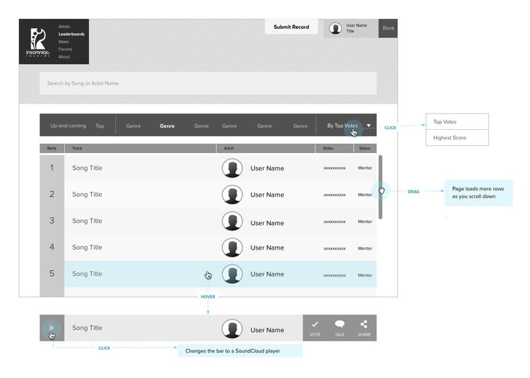
Interaction Feedback
For any action that a user executes, there should always be feedback to let them know what happened or what the next step is.
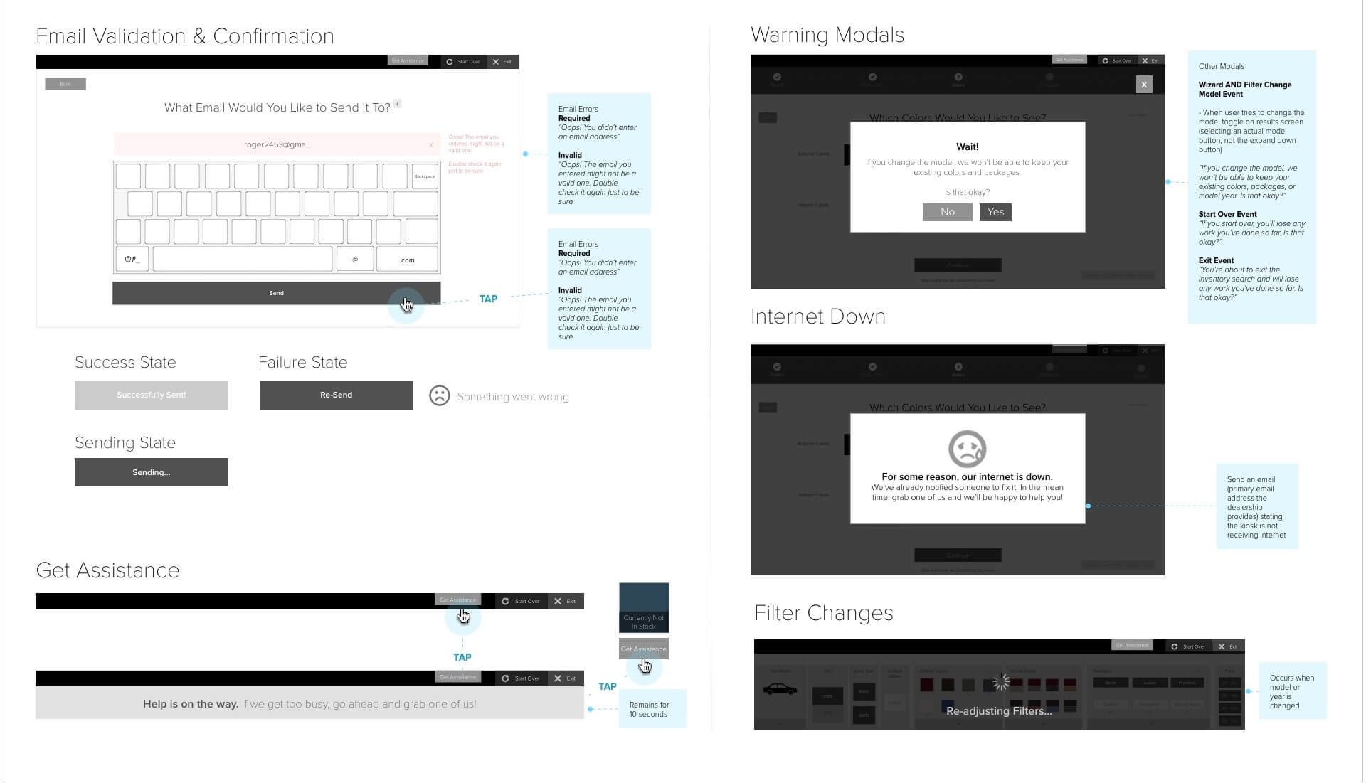
Validate Forms
Forms will usually have one of these validation responses:
- Invalid syntax: For email address, phone number, area code, URLs and credit-card numbers.
- Incorrect login: Include a message for the username or password being incorrect, but also include one for both being wrong.
- Empty form fields.
- Required check boxes: For agreeing to terms of service.
- Age requirement: Dropdown to fill in birth date.
Intermediary Messages And Modals
Many user actions will generate some form of UI to inform the user of what is happening or to ask them to do something. These can include:
- confirmation
- warning or alert
- success
- failed action
- error
- long-term progress indicator: This is when the user might have to wait for a long behind-the-scenes process to complete (even days long).
- progress indicator or bar: Include states for zero progress, in progress, completion and failure.
- spinner: For indeterminate time estimations or short operations.
Write User-Friendly Messages
No one likes to read an obscure error message like “Exception 0xc000000933” or a generic one like “Login error”. And unless you have a technical writer on the team, you are actually the most qualified person to write user-friendly messaging.
For consistency, I follow these criteria when writing messages:
- Include the specific problem if possible.
- Mention the next step to resolve the issue.
- Keep it brief and concise, about one to two sentences.
- Explain in colloquial terms.
- Avoid technical jargon.
- Maintain a positive and apologetic tone. Pretend you’re a down-to-earth customer service rep.
- Enhance with the brand’s tone, if there is one.
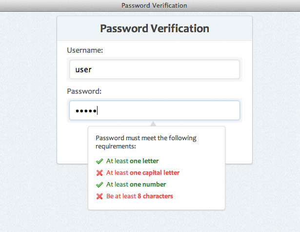
Implement Supportive Form-Input Techniques
Your developer will know clever tricks to show users error messages immediately or to support users with input fields. Below is a list of common techniques to think about:
- “Remember me” checkbox for logging in.
- Links for forgotten password or username. Don’t forget the extra screens such as for “Send a reset password to email” and confirmation that the reset was successfully sent.
- Suggested results upon typing keywords in a search.
- Validating each keyboard character entered.
- Character limit, with a counter or some visual representation when reaching a character limit.
- Dropdown lists that auto-filter items when typing. Select2 is a great plugin for combo boxes.
- Letting a user know when they have entered an old password.
- A checklist for password strength or password syntax that marks off syntax requirements as the user types.
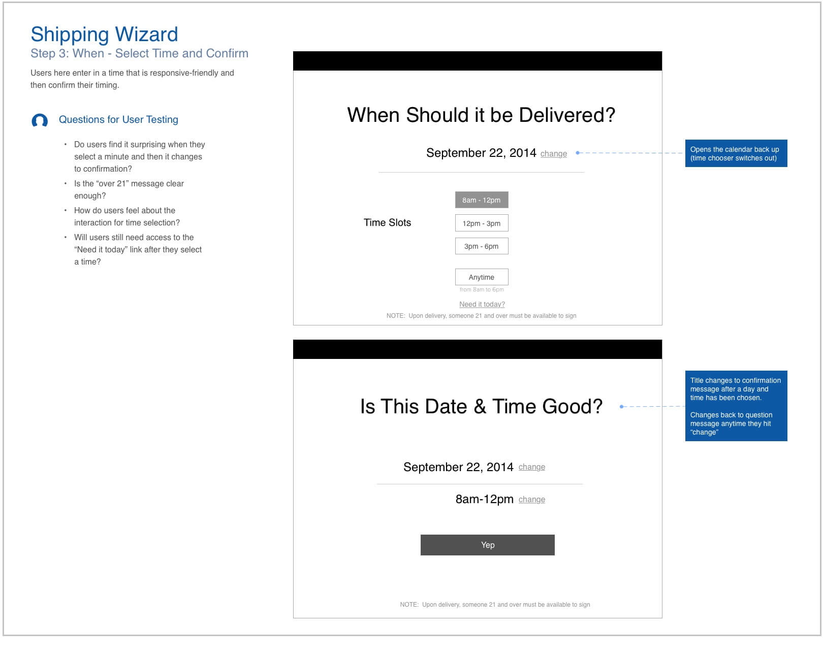
Interaction States
Walk through each of your UI components, and design for best- and worst-case scenarios, as well as any other potential states.
Dropdown Lists
While the closed state will already be in your design, include the expanded state in your annotations or on a separate page. Do you have any of the following types of dropdowns?
- navigation menu
- combo box (states, date, age)
- filter
- sorting
- context menu
Titles, Labels And Names
Account for all cases in which the text is exceptionally long in a confined space and can’t break to a new line (for example, in a table). Try to shorten the text as below, and then include the full-length text in a tooltip.
- Ellipsis: “Deoxyribo”
- Truncation: “Deoxy”
- Abbreviations: “DNA”
- Names: “G. Washington or George W.”
- Numbers: “100K”, “50M”, “140+”
Dynamic Content
Your developers will need to know how content population scales or behaves in different situations:
- Pagination: search result listings, forums, news articles
- Scrolling and loading content
- Brief paragraph text or tags
- Galleries: image, video and banner carousels
- Trees: nested file or folder directories
- Comments and posts
These states are commonly associated with dynamic content:
- First, middle and last pages: Pagination controls can sometimes appear different depending on where the user is, and final pages can include a “next step” action to fill in empty space.
- Standard content length: This is default.
- Empty or unpopulated content: Empty space can look awkward, so consider a friendly message or a subtle background image to fill the void.
- Overflowing content: Try using “More” links or a form of truncation.
- Nested posts: Stack Exchange has a forum thread with a variety of suggestions to nest infinite posts.
Icons With Numbers
Icons sometimes include values such as how many notifications or emails the user has. You will want to include states for the following:
- zero items
- typical items: double or triple digits
- large numbers: depending on the design, it could go up to hundreds or thousands, but indicating “100K” or “2000+” is also acceptable.
Form Fields
Forms will typically have a few states:
- enabled: This is the default.
- disabled: For fields that appear unusable in certain conditions.
- corrected: Optionally have a different style for fields whose validation error has been corrected.
- validation error: Some designers place error messages adjacent to the relevant field and/or provide an error list.
Tooltips
Consider adding a tooltip (a brief one to two sentences) for any interactions that fit these criteria:
- New or uncommon interaction pattern: Helpful text for interactions that users wouldn’t intuitively understand at first glance. Think of different design solutions before using this as a fallback.
- Advanced areas and actions: Common with programs such as Photoshop and Word, in which advanced functionality improves the user’s productivity or work quality.
- Less frequent actions: Actions that rarely occur will need help text to jog the user’s memory.
- Keyboard shortcuts.
- Shortened content: Abbreviated or truncated text that needs a fully written version.
- Content preview: Text or images that include previews of content. This is common with listings where users would want to peek at the content before committing to an action that would take them off the page.
- Reference information: Extra details that quickly support the user with a task (for example, the security number on a credit card).
File Uploads
When the user uploads a file in the browser, there are a few states to design for:
- File upload dialog: Usually provided by default in the OS or browser, but include your custom design if you have one.
- Upload progress bar.
- Upload completion bar: For having reached 100%.
- Canceling in-progress upload: Cancelling an upload in progress can take time.
- Success: Appears after the progress bar goes away. Include the file name that was uploaded and a way to remove the file.
- Remove confirmation: Confirmation to remove the uploaded file.
Gestures
There is typically one way your users will physically interact with your UI, but there can also be multiple gestures per interaction, as with a responsive design or buttons with keyboard shortcuts. For each user action, look for the other gestures below and note the differences in your annotations later.
- click
- double-click
- right-click
- swipe or flick
- pinch and spread
- press
- hover
- drag and drop
- keyboard input
- keyboard shortcut
- link to external website
- link to default application: email, phone number, map.
Be sensitive to cross-device interaction. If you are working on a responsive website, be aware of gestures that will not translate smoothly:
- Hovering: Some designers replace this with a touch gesture. But watch out for actions that already use touch for something else.
- Dragging and dropping: An alternative design is best.
- Uploading files: Not a common mobile task; consider removing it for mobile.
Supplementary Areas And Pages
Aside from your core design, other miscellaneous areas tend to be forgotten, such as:
- 404 error page
- Internet or service down
- Logging in: Include CAPTCHA and social log-ins if necessary.
- Forgotten username or password: Do not forget the successful “we sent you an email to reset” message.
- Settings and configuration
- Terms and conditions
- Privacy policy
- Email: Such as confirming the creation of an account or resetting the password.
User Types
You may have users who see a different design or receive an interaction specifically for them. Include extra wireframes to show what each user sees.
- New users: Users who just created an account.
- Guests: Users who have no account yet.
- First-time visitors: You might have a screen that is only seen once.
- Returning visitors
- Existing or logged-in users
- Admins and super-users
- Other roles
Copy
Consider how much time you have and what would be useful to your audience. You can also mix and match styles, like using real text for the home-page banner but filler for other areas. Listed below are various styles, with their key advantages.
Lorem ipsum (such as the kind produced by Dummy Text Generator) is great for:
- previewing how short or long paragraphs will appear,
- showing a page with filled-in content,
- when you have no budget for copywriting.
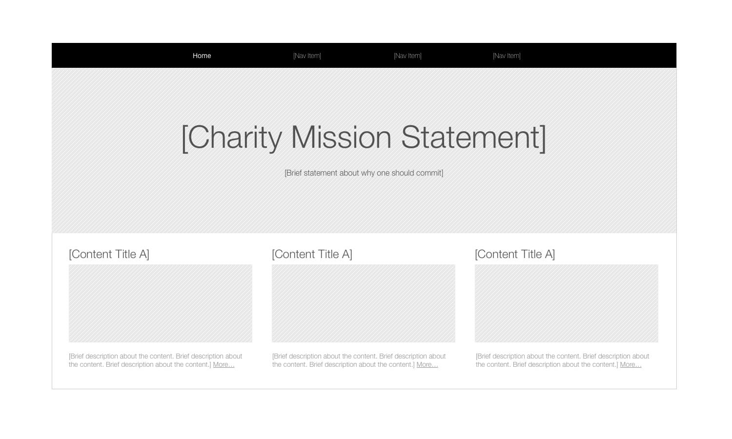
Generic labels that describe the final copy are good for:
- knowing what it should say but not having time to write it out,
- giving direction to your writer,
- avoiding political battles with branding team members or stakeholders,
- steering stakeholders away from nitpicking about copy.
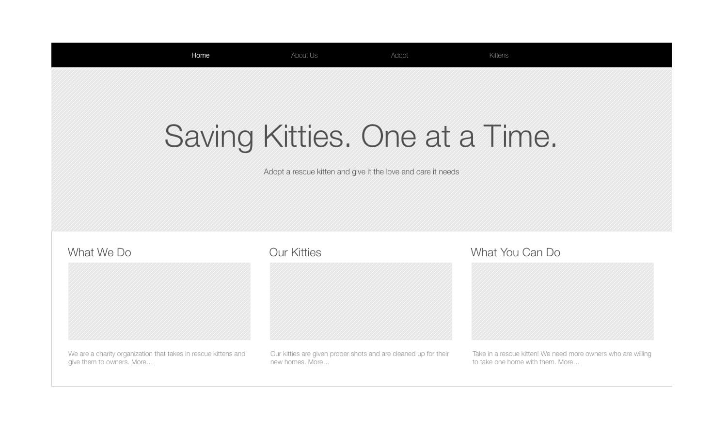
Realistic copy that closely reflects the content’s intent is helpful for:
- increasing the fidelity and realism of a polished design.
- showing the proper language and tone to use in the final copy.
- conducting usability tests on the home page design.
Demonstrations
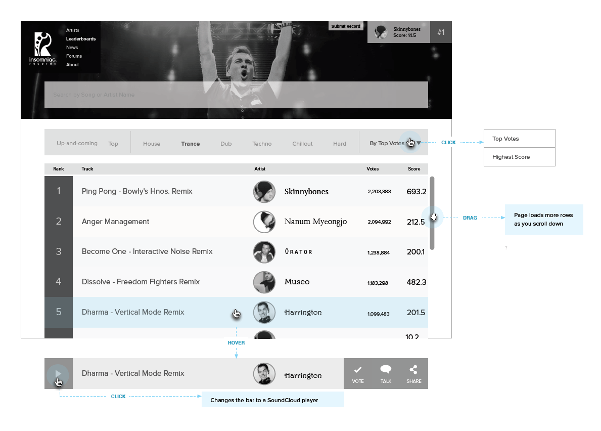
Demonstrating how an interaction works will reduce miscommunication with the developer and ensure that it is technically feasible. Typically, the developer will feel more confident about deciding which plugin or implementation to use. But if you feel technically savvy, then it would be really helpful for you, as the architect, to take the first step. Below are some useful tips.
Search For Plugins
If you are working online, you can often find the latest and trusted plugins being used by the development community on GitHub. Search for something like “accordion” to browse through accordion plugins. If you are working on other devices, such as Android mobile or Apple Watch, search the web for official design guideline documentation.
Select Relevant Plugins
Developers consider community approval, constant updates and framework compatibility to be important when selecting a plugin. On GitHub, you can sort for “most stars” and “recently updated”. Also, look for demo links in the documentation or website to see how it will work, and then share it with your developer to see if it is viable.
Build A Demonstration
If you are building a custom interaction or flow that does not yet exist, think about using prototyping tools or coding it yourself if you are technically savvy. Some prototyping tools with motion design features include Principle, Flinto and Axure. Some that might require a bit of programming knowledge are Origami and Framer.
If you can actually code, then CodePen is useful for building something quickly and easily.
Once you feel content with the level of polish in your design, finish up with annotations.
Annotating The Wireframes
At this point, most of your design will be complete, and you are ready to annotate your work.
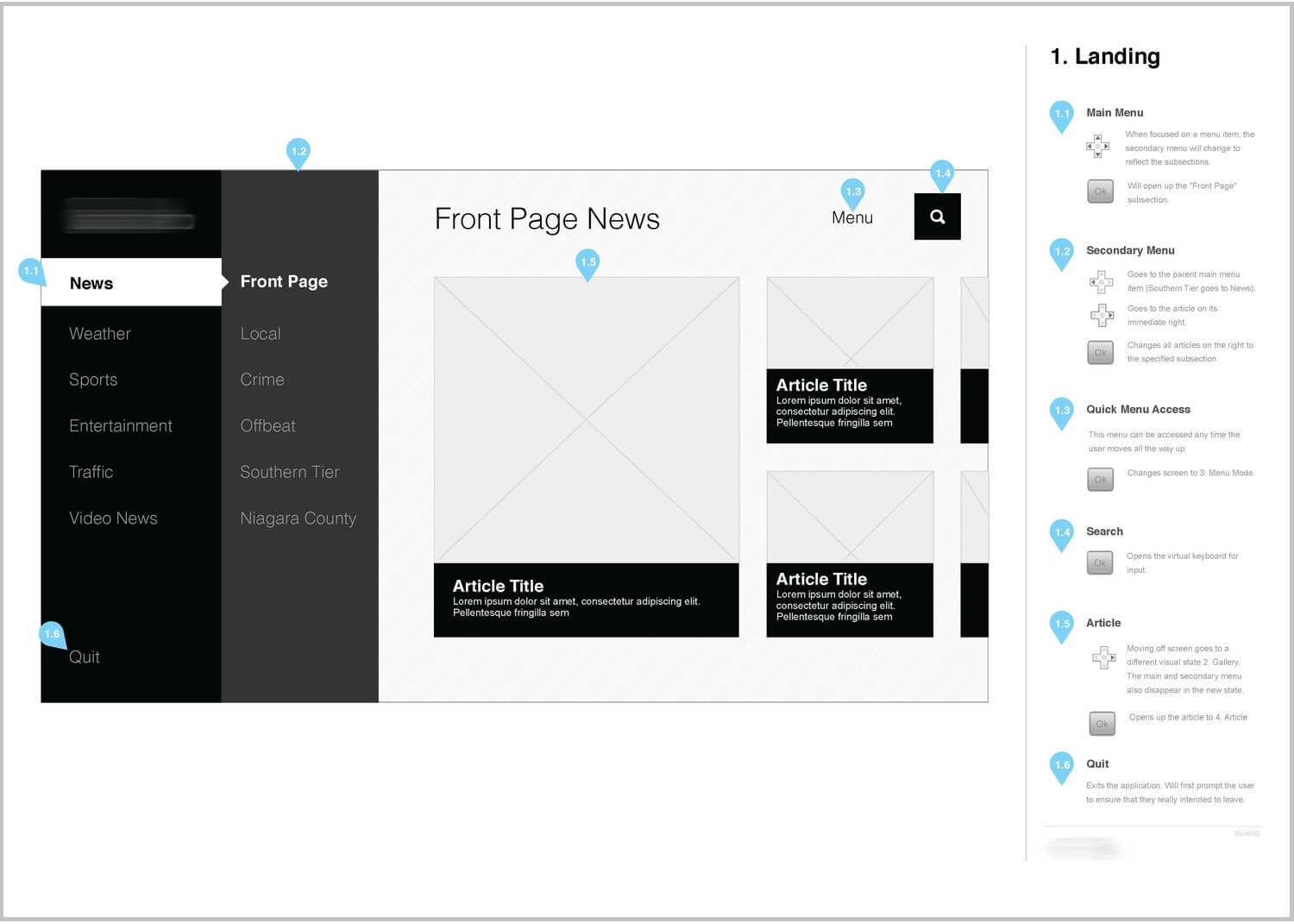
Placing Annotations
Being strategic in where and how you place your annotations on the page can improve your workflow and overall quality.
Determine A Location
There are different advantages to where you place annotations. See which style below would be most useful to you:
- Left or right column: Allows the reader to focus on the design or on reading the annotations.
- Inline: Promotes a more connected reading experience by linking explanations directly to UI elements.
- Marked tooltips: Similar to inline annotations. Prototyping software such as Axure allows you to place markers directly in the design that can be clicked on to reveal the annotation.
- Separate page: Gives ample, dedicated space to view the design and annotations.
Load In Wireframe Images
Designing for a large resolution can leave little space for annotations. Instead, you could wireframe your layouts with the accurate resolutions, and have another document where you drop the same wireframe images into a fixed-size container. This gives you consistent space for annotations, without having to worry about how big the design is.
I’ve created a template (Zip, 1.51 MB) that enables you simply to export wireframe images to the image folder and then drag and drop the same images to an annotated InDesign document. As long as you use the same file names for your export, you can continually overwrite the old wireframe images, and they will automatically update in the InDesign document.
Writing Annotations
Follow these technical writing rules when revising your annotations:
- Avoid being wordy. Be direct and concise. Excise words and sentences that do not add any information or that are redundant. Your team and stakeholders want to quickly and easily get the information they need.
- Avoid figures of speech and metaphors if your audience might be foreign.
- Stick to simple vocabulary so that everyone can understand, but use technical terms if the audience would understand them.
- Favor the active voice over the passive voice to cut down wordiness and to be clearer in your explanations. Purdue OWL has an article showing examples of the active and passive voice.
Write For Developers
Although stakeholders will enjoy story-driven annotations, developers will prefer straightforward, technical explanations. Be extremely detailed about how an interaction works, and include values if necessary. Write your annotations so that anyone could take the design and build it without needing to talk to you.
To compare and contrast, the annotation below is written for a stakeholder who is working on conceptual wireframes (notice the second-person usage and descriptive wording):
"As you scroll toward the bottom of the page, you will seamlessly receive more search results so that you can continue reading without needing to perform another action."
Here is the same example written for a developer:
"When scroll bar reaches last search result (about 25% height from bottom):
- Dynamically load 10 more search results below current list.
- If end of search results is reached, remove “Load more” button.
- Show spinner when loading; remove when finished.
- Use fade-in and fade-out animation when loading results."
List Multiple Gestures, States And Demos
For each action, indicate the gesture(s), label each annotation by its state, and include demo links if available. If there are multiple states, define their conditions or business logic.
UX Integration
One of the most common challenges for UX designers is convincing other people of your design decisions. There is a tendency among people to feel that your decisions are arbitrary. If you can muster the time, I have found it helpful to connect previous UX work to a finished design. It goes a long way to reminding your team or stakeholders of the evidence that supports your design.
Site Map
In each wireframe, show where this particular screen lives in your site map. Don’t show the entire site map, though, just the immediate parents, siblings and children. You can also refer to page IDs if you are using them in your site map.
Personas And User Goals
Include a label of the persona and the major user goals, tasks or behaviors that the screen is targeting. Alternatively, include user story statements and/or features from a feature priority matrix.
User Flows
Show the reader which step in the flow they are looking at. Include a portion of the user flow (enough for context), as opposed to the entire flow.
User Research Findings
Include user research findings (as bullet points) that directly support your design decisions. These could come from user interviews, ethnographic studies, analytics, competitive analysis, surveys, focus groups or usability tests.
Open Questions
If you still need more information from stakeholders, developers or subject-matter experts, provide a list of questions under the annotation to give the reader context. Putting questions in the wireframe has several advantages:
- reader will see that you are thinking deeply about the design.
- promotes iteration and reduces anxiety about finalizing the design.
- convenient for bringing up in presentations.
Usability Testing Questions
Your designs are not always going to be perfect from the first iteration. Minimize design “paralysis analysis” by choosing a hypothetical direction and then conducting usability tests to guide your design changes. List your user-testing questions so that people can see your thought process and so that you can keep track of contentious topics for your usability test plan.
Wireframe Meta Data And Versioning
Inevitably, you will iterate through many versions of your wireframes. Including wireframe meta data and keeping track of changes will be helpful not only to other people, but also to you in the long run. Forming this habit takes time, but it’s well worth it.
Include a table of contents. A table of contents is especially important in production wireframes because there will be many pages. Also, InDesign can re-update your table of contents based on any new page changes. Setting up header styles can be finicky, so feel free to use my template if you need a quick start.
Add A Footer
The footer is the best place to include ancillary information about your wireframes. It also keeps your document together in case you print the wireframes and pages go missing. Consider including the following information:
- Document name: Could simply include the project’s name, deliverable type and version number.
- Page number
- Confidential labels: Some companies require that you label documents “Private” or “Confidential”.
Track Wireframe Revisions
It can be difficult for readers to know what has changed when your wireframes have over 100 pages. So, ahead of your table of contents, include a table of revisions containing the following details:
- date,
- name of the person who made the revisions,
- brief notes or bullet points about what has changed.
Maintain File Versioning
Every time you work on a new batch of wireframes (i.e. sending it out to people), create a copy of the previous file before working on the new one. Then, rename it and include at least these details:
- Brand or client’s company name: Optional if it doesn’t make sense or if the file name gets too long.
- Project name
- Type of deliverable: wireframes, in this case.
- Version number: lead with two 0’s for proper file sorting, because “1” can get incorrectly sorted with “10” and “100”.
- Your name or initials: If you expect to collaborate with another designer
- Delimiters: Use underscore or hyphen, instead of a space, which sometimes causes issues with file systems.
It could look like this: Google_Youtube_Wireframes_001.graffle.
Or, if you’re collaborating, it could look like this: Apple-iTunes-Wireframes-EL-001.sketch.
Final Thoughts
Striving for perfection is a great goal, but be practical with your time, too. Most real-world projects don’t have ample timelines, so figure out your priorities, and use the guidelines that make sense.
My goal is to help fill in the gaps of every UX designer’s wireframing process with all of the knowledge I’ve gained over the years. I hope it helps you to perfect your wireframes.
I love to help people out, so let me know in the comments below or contact me if you have questions. Also, please share and spread the love if you’ve found this helpful!
Resources
- StatCounter
A website that tracks currently used screen resolutions. - W3Counter
Another website that tracks popular screen resolutions. - Purdue Online Writing Lab
Guidelines for technical writing techniques. - “All About Grid Systems”, Rachel Shillcock, Envato Tuts+
An article on the theory behind grid systems. - “Using Layout Grids Effectively”, Designers Insights
A brief article on some example layout grids and how to use them. - Plugin search, GitHub
A well-known source-code repository host that you can use to search for popular UI plugins. - Principle
A prototyping tool for the Mac that enables you to fine-tune animations and transitions. - Flinto
Similar to Principle but a bit simpler with its motion design features. - Axure
A comprehensive prototyping tool that closely mimics what can be done with JavaScript. - Origami
A prototyping tool that works from iOS and Android code. - Framer
A prototyping tool that gives you greater control over the code for your transitions. - Codepen
A pure online code editor where you can quickly and easily test HTML, CSS and JavaScript animations.
Further Reading
- “Creating Content Wireframes For Responsive Design,” Tom Green
- “The Skeptic’s Guide To Low-Fidelity Prototyping,” Laura Busche
- “Beyond Wireframing: The Real-Life UX Design Process,” Marcin Treder
- “A Comprehensive Guide To Wireframing And Prototyping,” Christopher Murphy
 (al, il, mrn)

