Breaking Out Of The Box: Design Inspiration (December 2016)

Email Newsletter
Weekly tips on front-end & UX.
Trusted by 182,000+ folks.
 Try ProtoPie AI free →
 Celebrating 10 million developers
 SurveyJS: White-Label Survey Solution for Your JS App
 Register Free Now

Time moves pretty fast. A new year will be upon us soon, and most of us probably haven’t even realized it. So while we’re almost ready to leave the autumn season (and 2016!) behind, let’s refuel our inspiration for another month and start working on our New Year’s resolution list. Observe closely at the following techniques used, and how the colors have been applied to add contrast and character. As always, there is a lot to learn.
I hope that these illustrations and photographs will inspire you to get creative and get ideas which you can apply in your own projects. Go ahead, don’t let anything come in your way, and let your artistic juices flow so you can create something beautiful and unique yourself.
Let’s begin.
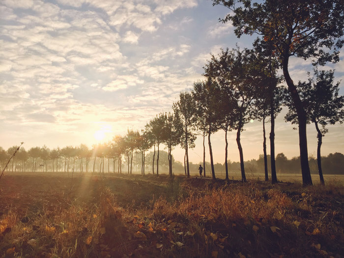
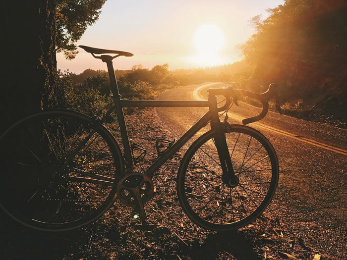
Go Outside & Run
One of my own shots taken while I was out riding my bicycle. Fall usually has these foggy mornings; when the sun peaks through, you can get lucky and discover a scene just like this one.
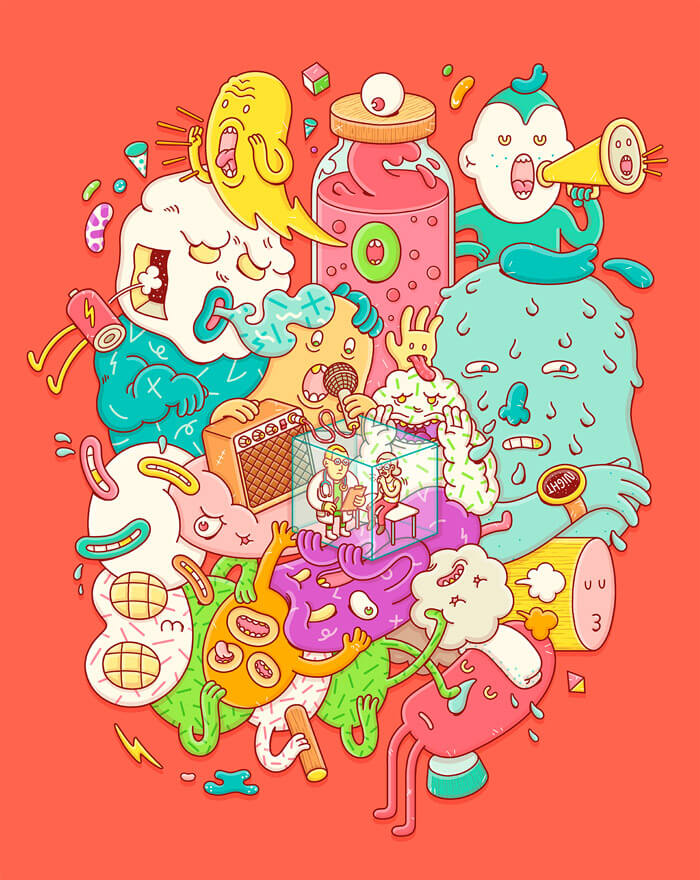
Nobody Could Hear It
I love discovering the many layers of imagination and humor in the work of the Spanish brothers operating under the monicker Brosmind.
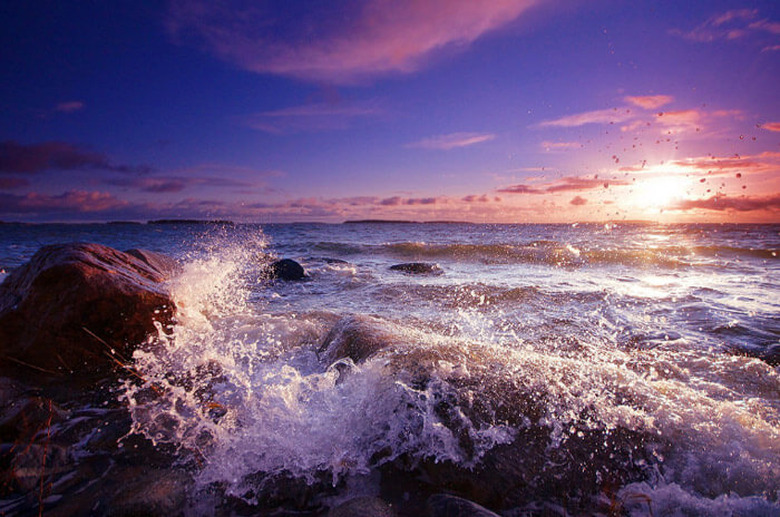
Windy Morning
Magnificent shot of a sea view at sunrise in Finland. Great light and perfect timing with the waves breaking on the rocks.
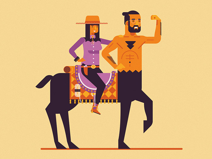
Centaur Realness
Some great details in this one. Such as the markings on the chest and how the saddle is done.
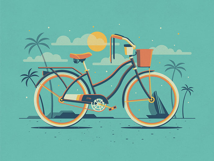
Explorers Club: Malibu
Another one from the Explorers Club’s bikes series. This time a proper beach bike called ‘Malibu’. Admire those details and perfect color choice!
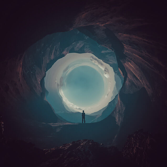
Falling: Round Things
New startup image for the Photoshop CC 2017 update. In case you are wondering how it is done here’s a tutorial explaining it all. I love the feeling of being drawn into this round hole into the light.
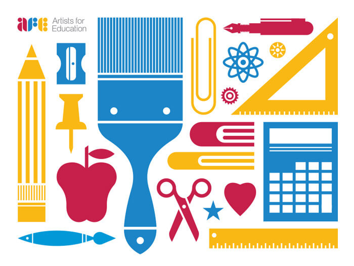
Artists For Education
Some lovely brand assets. Curious to see how the Artists for Education further evolves.
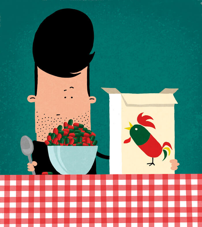
Voedingssupplement
Illustration to accompany an article in a newspaper about food supplements. It’s always refreshing to see how an illustrator translates it. Love the shape of the rooster.
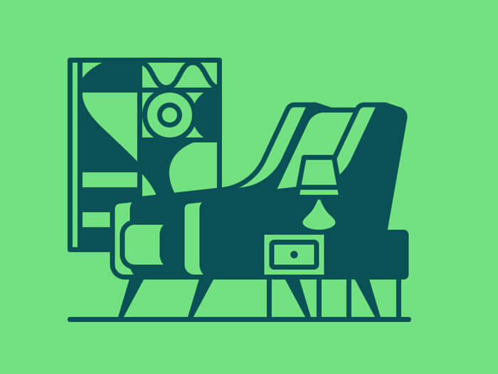
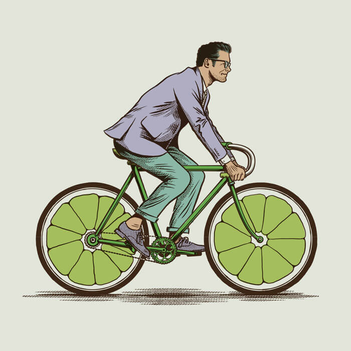
A Place For Your Butt
I adore the mid-century feel to this great example of what can be accomplished with just a couple of colors and strong lines.
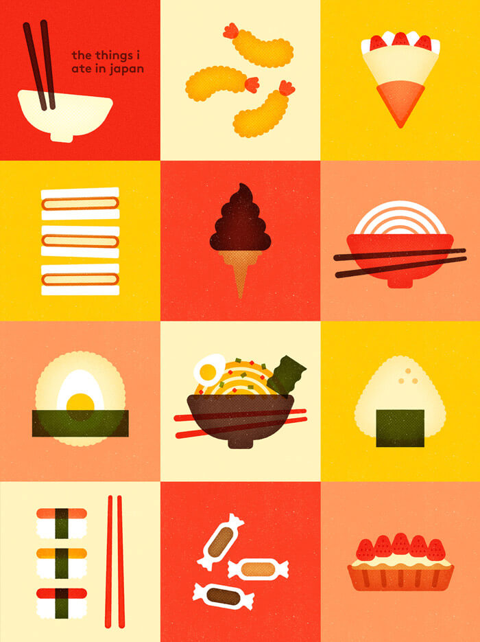
The Things I Ate In Japan
A beautiful simplification of what you can eat in Japan. Bright colors used, but still refined enough.
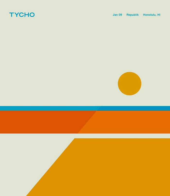
Tycho: Honolulu
The design system is working nicely with every concert poster Tycho releases.
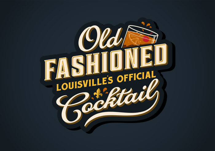
Old Fashioned
The typography on this design to celebrate the Old Fashioned, Louisville Kentucky’s official cocktail is ace.
Caffe Demetré
Orginal menu cover illustration with some inspirational shadows, textures and patterns. Some fun and interesting shapes and details in, too.
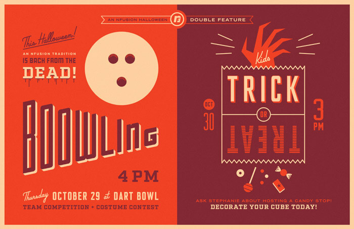
NFusion Halloween
Loving the color and lay-out. It has some really slick typography going on.
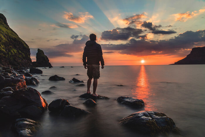
Scotland: Joshua
Wish I was the person enjoying this beautiful sunset. The spectacle that nature puts up still amazes me every time.
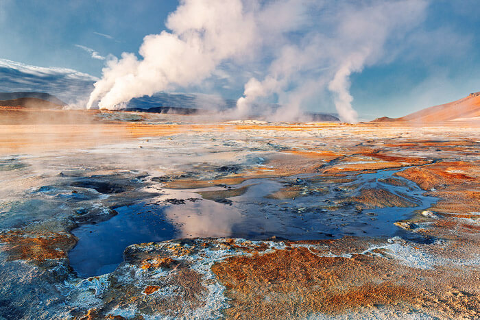
Exploring Iceland II
The colors in this photo are amazing. Taken in beautiful Iceland. Be sure to watch the 4K drone video.
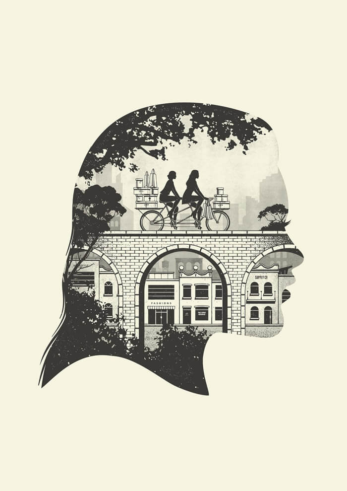
Insider Guides II
Part of several heads series that covers various aspects of student life in Australia, from adventure to food, nightlife to fashion. Love the half-tone textures.
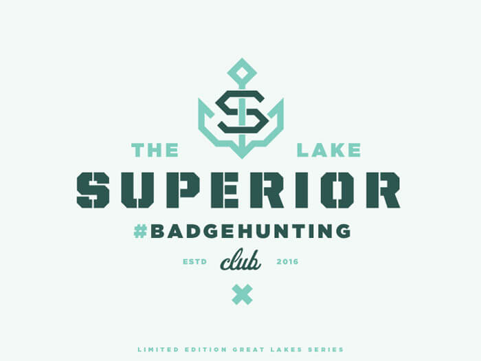
The Lake Superior #Badgehunting Club
I’m a fan of badges and I’m glad I can feature one this month. Badges are a great exercise to play with typography and color. Allan Peters is a master in this field.
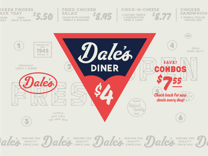
Dale’s Diner
Tough aesthetic to do right without being cheesy. This definitely strikes a nice balance.
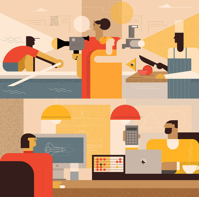
Milestone Institute Illustrations
Loving the style of these illustrations for the Milestone Institute. Great to analyze the use of simple shapes. Great colors, too!
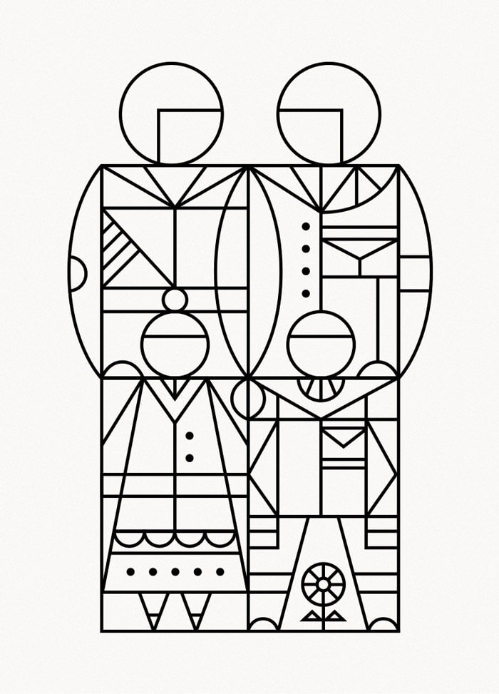
Familia
Great concept. It’s a family united by the line. Not easy to keep everything recognizable.
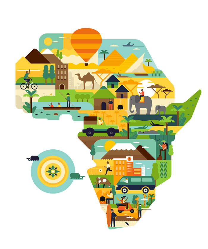
Africa Is Awesome
Just looking at this makes me happy. Something to get the travel bug going. It’s all fun discovering everything that’s in there.
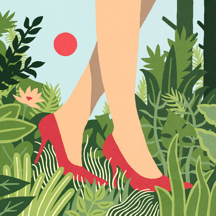
The Less I Know The Better
2016 cover art submission for the Secret 7 exhibition for Tame Impala’s “The Less I Know The Better”. The cover was inspired by Henri Rousseau’s jungle paintings.
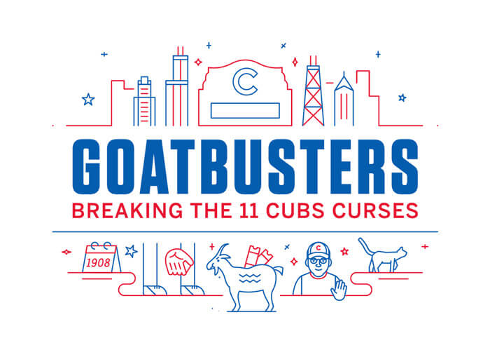
ESPN: Goatbusters
Nice duotone work. That goat is just so adorable. Be sure to go see the animated version. You’ll not regret it.
{% ad-panel-leaderboard %}}
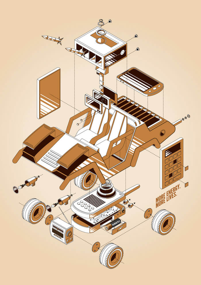
More Energy. More Lives.
The details in this illustration for Duracell are amazing. The imagination of the illustrator is powerful.
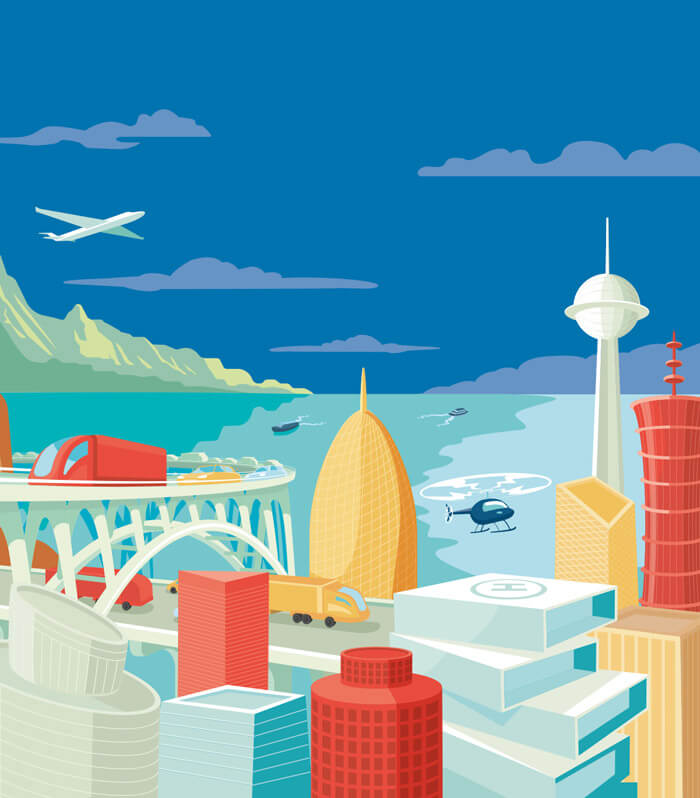
New York Times Editorial
Editorial illustration for the New York Times. A complete different style so it’s inspiring to see how the buildings and vehicles are done.
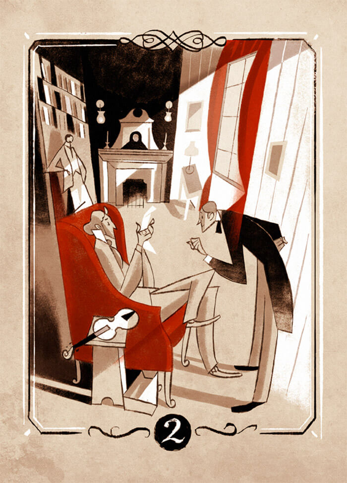
A Study In Scarlet
Riccardo Guasco is a regular on my inspiration hunting expeditions. The geometry and use of light and shadow make these so dynamic.
Secret 7s
Collage with several interesting pieces.
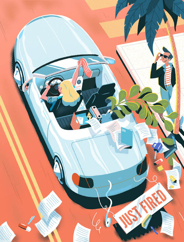
Just Fired
This one made me laugh. Funny interpretation of the traditional “Just Married” signs. Only here’s it is “Just Fired”. Great colors and lovely style.
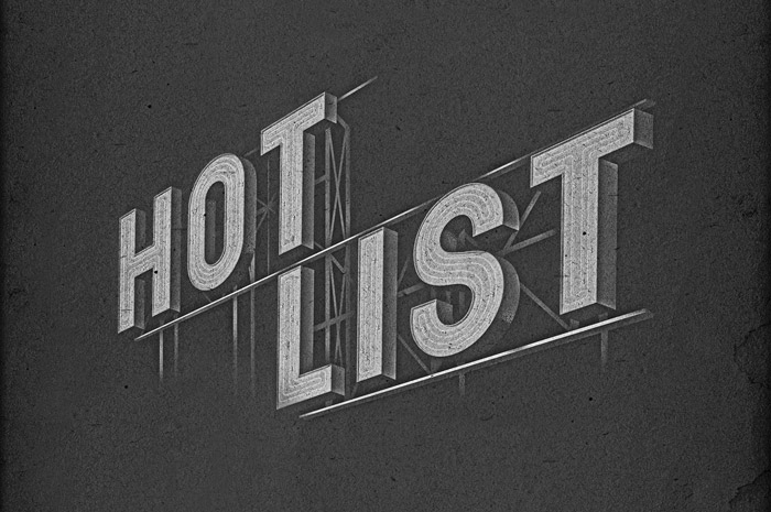
Hot List
These 3D letters are gorgeous! The texture and inside structure is beautifully executed. Such perfection!
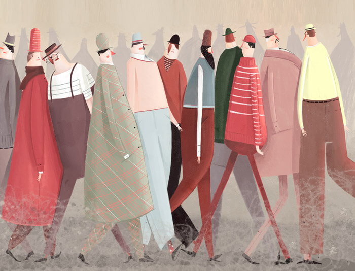
Los Caminantes
This is so wonderful! The colors, the faces, the cloths, the subtle shadow behind them… When I see something like this, it itches and I want to start illustrating just right away.
Golden Glow
When the mind needs cleaning there’s always this friend you can count on. Lovely golden glow!
Woolworths Metro
Great style and inspring usage of textures. Part of a flexible suite of imagery to be used primarily as murals and point of sale in each of Metro’s inner city, urban and beachside stores. See them all here.
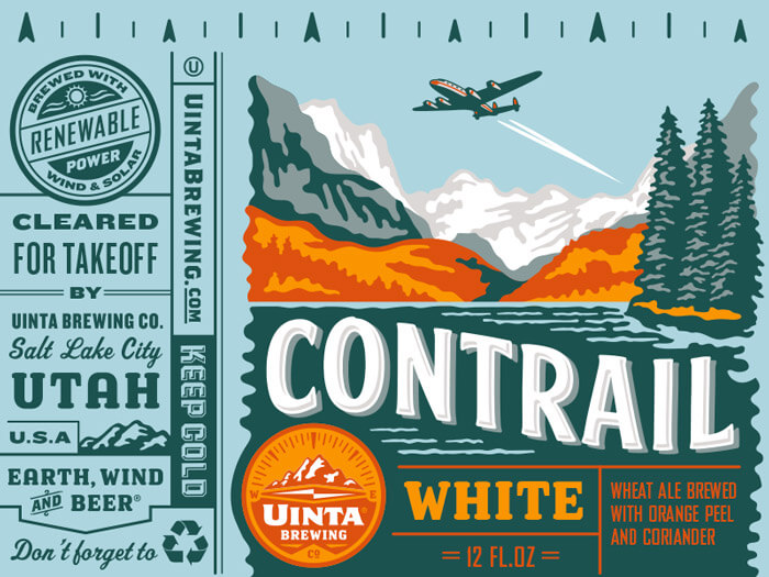
Uinta Contrail White Beer
A well-done concept for a brewery. Perfect mix between illustration and typography.
Adobe Illustrations
Admiring the not-so-common color palette. The perspective used in this illustration is also quite inspiring.
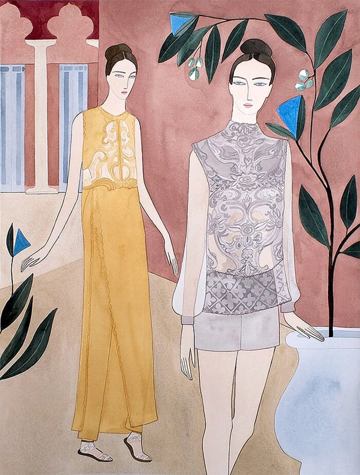
Elie Saab SS16 Couture
This illustration for fashion is so wonderful. Just look at those patterns on the dresses. Those details!
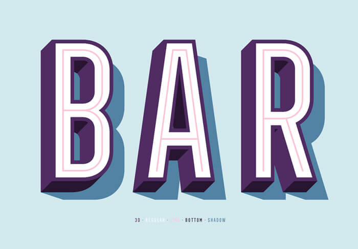
Bar
Who needs a drink? Beautiful colors, perfect depth and hard-edged drop shadows.
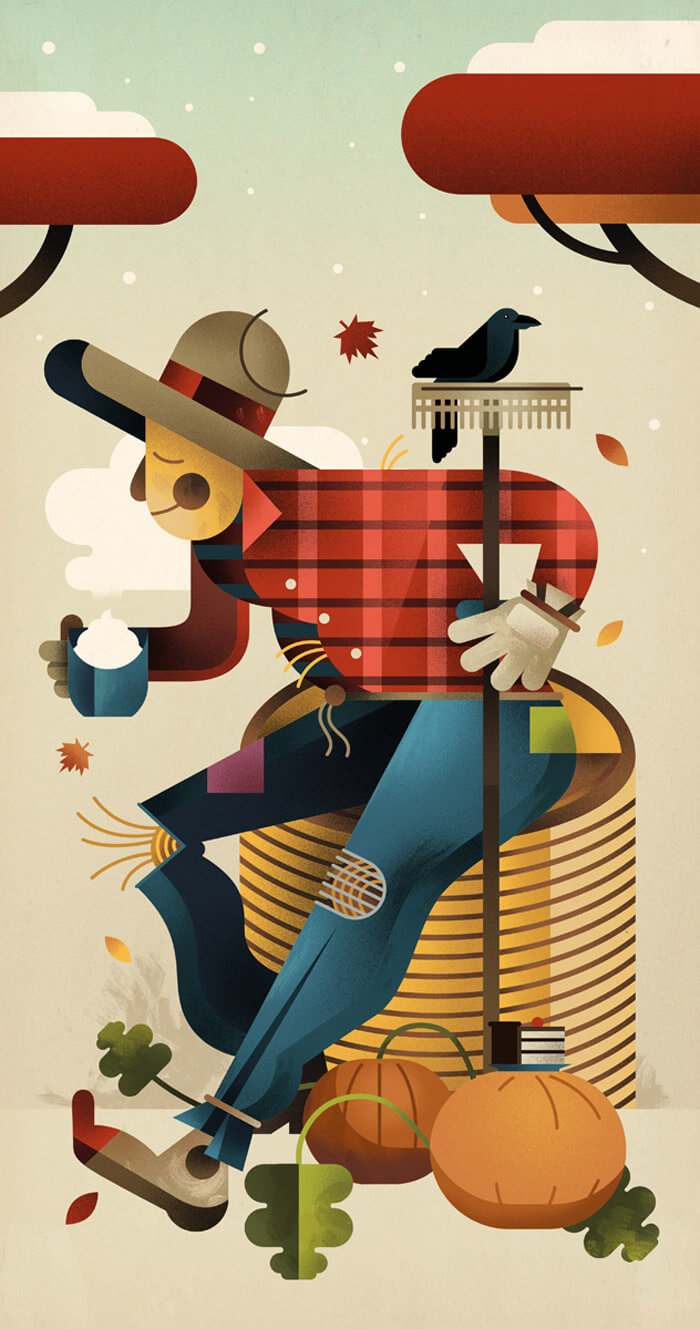
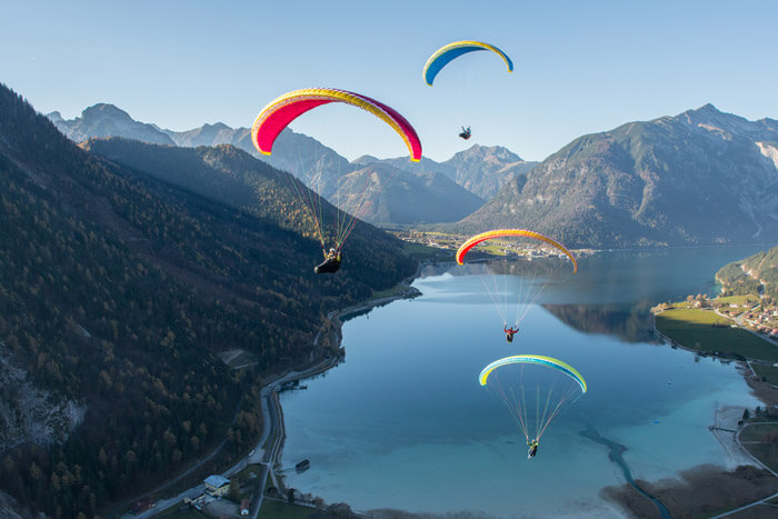
Autumn Paragliding
Wouldn’t mind being up there enjoying the view. Lovely touches of bright colors.
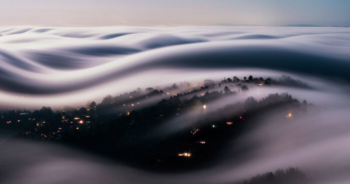
Iconic Fog
San Francisco’s iconic fog sure looks stunning from above. You would almost think it isn’t real.
Kajak & Mountains
Such beautiful scenery! I love the pastel color palette in this photo.

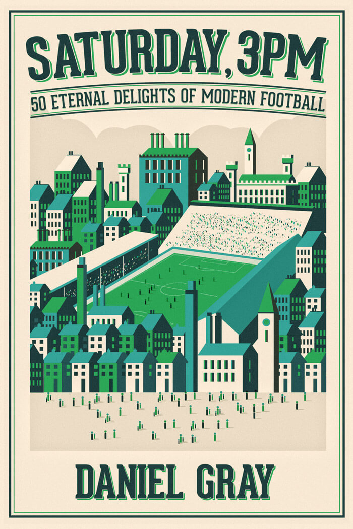
Saturday, 3PM
Inspiring combination of illustration and typography.
Directory Of Illustration #33
Great interpretation of a Greek god. Great lines!
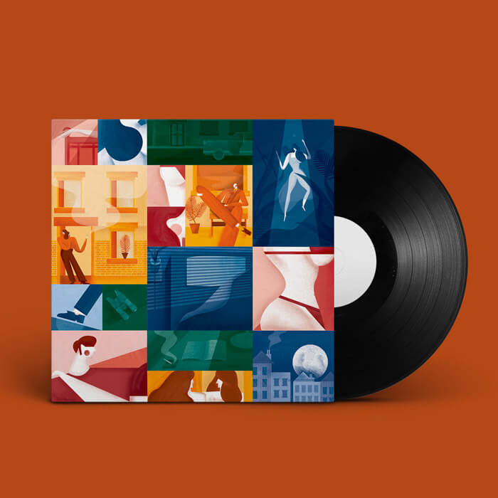
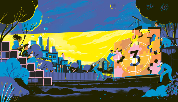
100 Things To Do Over The Weekend
A super-duper color palette to begin with and loads to discover in this editorial illustration for the Wall Street Journal. With all this action going on, you won’t be able to stop looking at it.

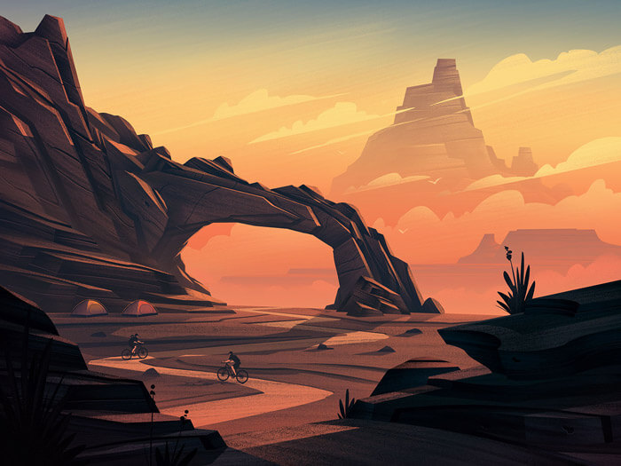
REI End Of Summer
Beautiful illustration celebrating those special skies that you get to see during autumn. Be sure to read how the piece came together.
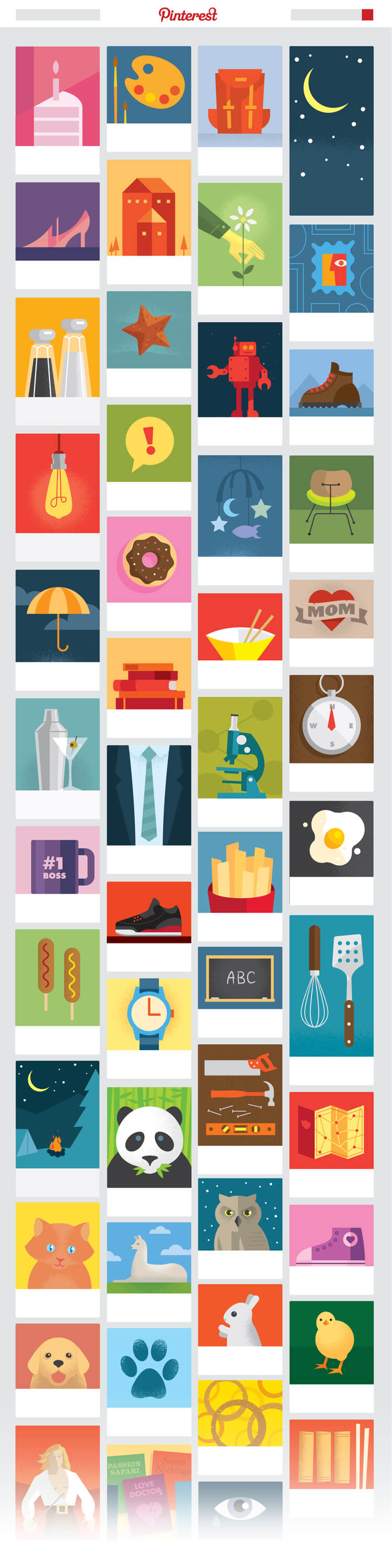
Pinterest / What Is A Pin?
Illustration that is part of a 3-month project to create an inspiring and informative motion piece named “What is a Pin?”. Love the style and colors.
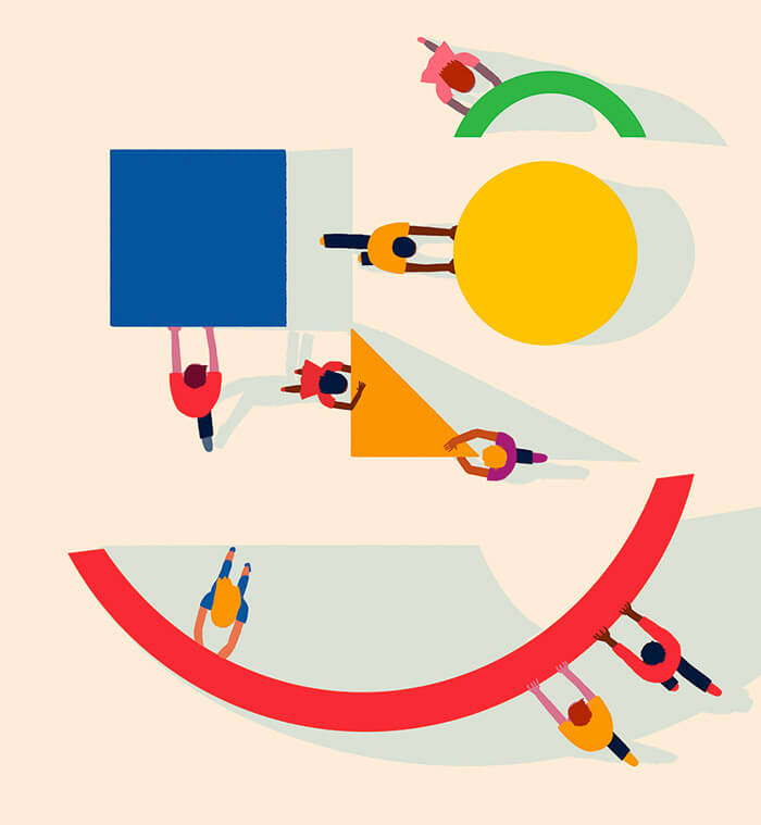
Bar Graph Exploded View
Lovely metaphor of analyzing a bar graph.

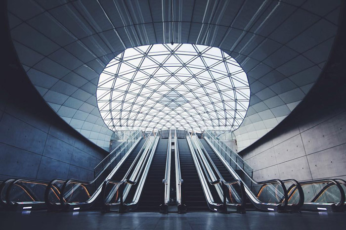
Triangeln Station
What’s not to like about this? Look at all those overlapping lines in perfect symmetry with the escalators.
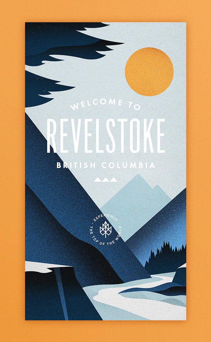
Revelstoke BC II
Love the trees particularly. Textures and very subtle gradients are on point, too.
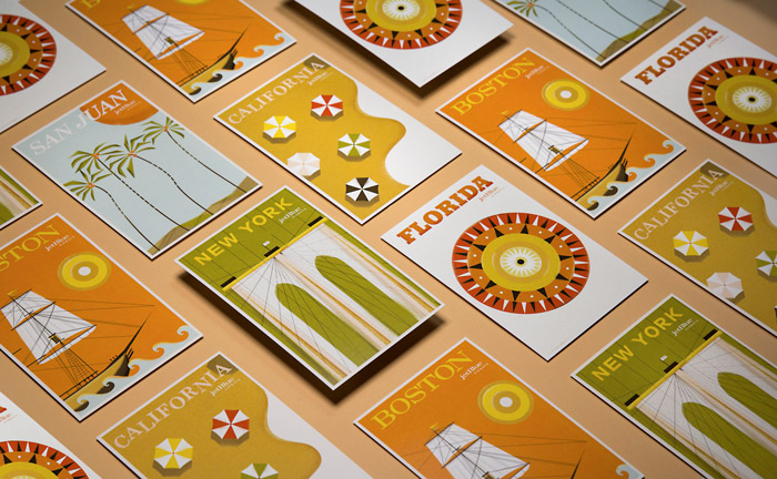
RetroJet Postcards
These postcards are so tasty! Imagining what Jetblue would have been like if it existed during the golden age of travel.
Using Design Principles To Find Happiness
Beautiful color palette, and interesting drop shadows. Something that I can relate to.
{% ad-panel-leaderboard %}}
Further Reading
- Beautiful Photoshop Illustrations By Artists Around The World
- Pop Art Is Alive: Classics and Modern Artworks
- Inspirational PDF Magazines
- Plasticine Art Showcase: Shape Your Imagination


