CSS GPU Animation: Doing It Right

Email Newsletter
Weekly tips on front-end & UX.
Trusted by 182,000+ folks.

 Custom Web Forms for Angular, React, & Vue. Your backend.


 Celebrating 10 million developers
Most people now know that modern web browsers use the GPU to render parts of web pages, especially ones with animation. For example, a CSS animation using the transform property looks much smoother than one using the left and top properties. But if you ask, “How do I get smooth animation from the GPU?” in most cases, you’ll hear something like, “Use transform: translateZ(0) or will-change: transform.”

These properties have become something like how we used zoom: 1 for Internet Explorer 6 (if you catch my drift) in terms of preparing animation for the GPU — or compositing, as browser vendors like to call it.
But sometimes animation that is nice and smooth in a simple demo runs very slowly on a real website, introduces visual artefacts or even crashes the browser. Why does this happen? How do we fix it? Let’s try to understand.
One Big Disclaimer
The most important thing I’d like to tell you before we dive deep into GPU compositing is this: It’s a giant hack. You won’t find anything (at least for now) in the W3C’s specifications about how compositing works, about how to explicitly put an element on a compositing layer or even about compositing itself. It’s just an optimization that the browser applies to perform certain tasks and that each browser vendor implements in its own way.
Everything you’ll learn in this article is not an official explanation of how things works, but rather a result of my own experimentation, accompanied by a little common sense and knowledge of how different browser subsystems work. Some things might be just plain wrong, and some things could change over time — you have been warned!
How Compositing Works
To prepare a page for GPU animation, we have to understand how things work in the browser, not just follow some random advice from the Internet or from this article.
Let’s say we have a page with A and B elements, each with position: absolute and a different z-index applied to it. The browser will paint it from the CPU, then send the resulting image to the GPU, which will display it on screen.
<style>
#a, #b {
 position: absolute;
}

#a {
 left: 30px;
 top: 30px;
 z-index: 2;
}

#b {
 z-index: 1;
}
</style>
<div id="#a">A</div>
<div id="#b">B</div>
We’ve decided to animate the A element by moving it with the left property and CSS animation:
<style>
#a, #b {
 position: absolute;
}

#a {
 left: 10px;
 top: 10px;
 z-index: 2;
 animation: move 1s linear;
}

#b {
 left: 50px;
 top: 50px;
 z-index: 1;
}

@keyframes move {
 from { left: 30px; }
 to { left: 100px; }
}
</style>
<div id="#a">A</div>
<div id="#b">B</div>
In this case, for every animation frame, the browser has to recalculate the element’s geometry (i.e. reflow), render the image of the page’s new state (i.e. repaint) and then send it again to the GPU to display on screen. We know that repainting is very performance-costly, but every modern browser is smart enough to repaint only the changed area of the page, instead of the entire page. While browsers can repaint very fast in most cases, our animation is still not smooth.
Reflowing and repainting the entire page at each step of the animation (even incrementally) sounds really slow, especially for a large and complex layout. It would be much more effective just to paint two separate images — one for the A element and one for the entire page without the A element — and then simply offset those images relative to each other. In other words, composing the images of cached elements would be faster. And this is exactly where the GPU shines: It’s able to compose images very quickly with subpixel precision, which adds a sexy smoothness to animations.
To optimize the compositing, the browser has to ensure that the animated CSS property:
- does not affect the document’s flow,
- does not depend on the document’s flow,
- does not cause a repaint.
One might think that the top and left properties, along with the positions absolute and fixed, don’t depend on an element’s environment, but that’s not so. For example, a left property may receive a percentage value that depends on the size of .offsetParent; also, em, vh and other units depend on their environment. Rather, transform and opacity are the only CSS properties that meet the conditions above.
Let’s animate with transform instead of left:
<style>
#a, #b {
 position: absolute;
}

#a {
 left: 10px;
 top: 10px;
 z-index: 2;
 animation: move 1s linear;
}

#b {
 left: 50px;
 top: 50px;
 z-index: 1;
}

@keyframes move {
 from { transform: translateX(0); }
 to { transform: translateX(70px); }
}
</style>
<div id="#a">A</div>
<div id="#b">B</div>
Here, we’ve described our animation declaratively: its start position, end position, duration, etc. This tells the browser ahead of time which CSS properties will be updated. Because the browser sees that none of the properties would cause a reflow or repaint, it can apply a compositing optimization: painting two images as compositing layers and sending them to the GPU.
What are the pros of such optimization?
- We get a silky smooth animation with subpixel precision that runs on a unit specially optimized for graphics tasks. And it runs very quickly.
- The animation is no longer bound to the CPU. Even if you run a very intensive JavaScript task, the animation will still run quickly.
Everything seems pretty clear and easy, right? What problems could we run into? Let’s see how this optimization really works.
It might surprise you, but the GPU is a separate computer. That’s right: An essential part of every modern device is actually a standalone unit with its own processors and its own memory- and data-processing models. And the browser, like any other app or game, has to talk with the GPU as it would with an external device.
To better understand how this works, think of AJAX. Suppose you want to register a website visitor with data they’ve entered in a web form. You can’t just tell a remote server, “Hey, just take the data from these input fields and that JavaScript variable and save it to the database.” The remote server doesn’t have access to the memory in the user’s browser. Instead, you’d have to collect the data from the page into a payload with a simple data format that can be easily parsed (such as JSON) and send it to the remote server.
Something very similar happens during compositing. Because the GPU is like a remote server, the browser has to create a payload first and then send it to the device. Sure, the GPU isn’t thousands of kilometers away from the CPU; it’s right there. However, whereas the 2 seconds required for a remote server request and response would be acceptable in many cases, the extra 3 to 5 milliseconds for a GPU data transfer would result in janky animation.
What does a GPU payload look like? In most cases, it consists of layer images, along with additional instructions such as for the layer’s size, offset, animation parameters, etc. Here is roughly what making a payload and transferring data with the GPU looks like:
- Paint each compositing layer to a separate image.
- Prepare the layer data (size, offset, opacity, etc.).
- Prepare shaders for the animation (if applicable).
- Send the data to the GPU.
As you can see, every time you add the magical transform: translateZ(0) or will-change: transform property to the element, you start the very same process. While repainting is very performance-costly, here it’s even slower. In most cases, the browser is unable to incrementally repaint. It has to paint the area that was previously covered with a newly created composite layer:
Implicit Compositing
Let’s get back to our example with the A and B elements. Earlier, we animated the A element, which sits on top of all other elements on the page. This resulted in two compositing layers: one with the A element and one with the B element and the page’s background.
Now, let’s animate the B element instead:
We’ve run into a logical problem. Element B should be on a separate compositing layer, and the final page image for the screen should be composed on the GPU. But the A element should appear on top of element B, and we haven’t specified anything about A that would promote it to its own layer.
Remember the big disclaimer: a special GPU-compositing mode isn’t a part of the CSS specification; it’s just an optimization that the browser applies internally. We must have A appear on top of B exactly in that order, as defined by z-index. And what will the browser do?
You guess it! It will forcibly create a new compositing layer for element A — and add another heavy repaint, of course:
This is called implicit compositing: One or more non-composited elements that should appear above a composited one in the stacking order are promoted to composite layers — i.e. painted to separate images that are then sent to the GPU.
We stumble upon implicit composing much more often than you might think. A browser will promote an element to a compositing layer for many reasons, just a few of which are:
- 3D transforms:
translate3d,translateZand so on; <video>,<canvas>and<iframe>elements;- animation of
transformandopacityviaElement.animate(); - animation of
transformandopacityvia СSS transitions and animations; position: fixed;will-change;filter;
More reasons are described in the “CompositingReasons.h” file of the Chromium project.
It seems like the main problem of GPU animation is unexpected heavy repaints. But it’s not. The bigger problem is…
Memory Consumption
Another gentle reminder that the GPU is a separate computer: It’s required not just to send rendered layer images to the GPU, but to store them as well for later reuse in animation.
How much memory does a single composite layer takes? Let’s take a simple example. Try to guess how much memory is required to store a 320 × 240-pixel rectangle, filled with a solid #FF0000 color.
A typical web developer would think, “Hm, it’s a solid-colored image. I’ll save it as a PNG and check its size. It should be less than 1 KB.” And they’d be absolutely right: The size of this image as a PNG is 104 bytes.
The problem is that PNGs, along with JPEGs, GIFs and so on, are used to store and transfer image data. To draw such an image to the screen, a computer has to unpack it from the image format and then represent it as an array of pixels. Thus, our sample image would take 320 × 240 × 3 = 230,400 bytes of computer memory. That is, we multiply the image’s width by its height to get the number of pixels in the image. Then, we multiply it by 3, because every pixel is described by three bytes (RGB). If the image contains transparent areas, we’d multiply it by 4, because an additional byte is required to describe transparency: (RGBa): 320 × 240 × 4 = 307,200 bytes.
The browser always paints compositing layers as RGBa images. It seems that there’s no efficient way to determine whether an element contains transparent areas.
Let’s take a more probable example: a carousel with 10 photos, each measuring 800 × 600 pixels. We’ve decided to smoothly transition between images upon a user interaction, such as dragging, so we add will-change: transform for every image. This will promote the images to composite layers ahead of time, so that the transition begins immediately upon the user’s interaction. Now, calculate how much additional memory is required just to display such a carousel: 800 × 600 × 4 × 10 ≈ 19 MB.
19 MB of additional memory is required to render a single control! And if you’re a modern web developer who is creating a website as a single-page application, with a lot of animated controls, parallax effects, high-resolution images and other visual enhancements, then an additional 100 to 200 MB per page is just the beginning. Add implicit compositing to the mix (admit it — you’ve never even thought about it before), and you’ll end up with a page filling all available memory on the device.
Moreover, in many cases, this memory would be wasted, displaying the very same result:
This might not be an issue for desktop clients, but it really hurts mobile users. First, most modern devices have high-density screens: Multiply the weight of composite-layer images by 4 to 9. Secondly, mobile devices don’t have as much memory as desktops. For example, a not-so-old-yet iPhone 6 ships with 1 GB of shared memory (i.e. memory used for both RAM and VRAM). Considering that at least one third of this memory is used by the operating system and background processes, another third by the browser and the current page (a best-case scenario for a highly optimized page without a ton of frameworks), we’re left with about 200 to 300 MB for GPU effects, at most. And the iPhone 6 is a pretty expensive high-end device; more affordable phones contain much less memory on board.
You may be asking, “Is it possible to store PNG images in the GPU to reduce the memory footprint?” Technically, yes, it’s possible. The only problem is that the GPU draws the screen pixel by pixel, which means it has to decode an entire PNG image for every pixel again and again. I doubt that an animation in this case would be faster that 1 frame per second.
It’s worth nothing that GPU-specific image-compression formats do exist, but they are not even close to PNG or JPEG in terms of compression ratio, and their usage is limited by hardware support.
Pros And Cons
Now that we’ve learned some of the basics of GPU animation, let’s sum up its pros and cons.
Pros
- The animation is fast and smooth, at 60 frames per second.
- A properly crafted animation works in a separate thread and is not blocked by heavy JavaScript calculations.
- 3D transforms are “cheap.”
Cons
- Additional repainting is required to promote an element to a composite layer. Sometimes this is very slow (i.e. when we get a full-layer repaint, instead of an incremental one).
- Painted layers have to be transferred to the GPU. Depending on the number and size of these layers, the transfer can be very slow, too. This could lead to an element flickering on low-end and mid-market devices.
- Every composite layer consumes additional memory. Memory is a precious resource on mobile devices. Excessive memory use could crash the browser.
- If you don’t consider implicit compositing, then the chances of slow repainting, extra memory usage and browser crashes are very high.
- We get visual artifacts, such as with text rendering in Safari, and page content will disappear or get distorted in some cases.
As you can see, despite some very useful and unique advantages, GPU animation has some very nasty issues. The most important ones are the repainting and excessive memory usage; so, all optimization techniques covered below will address these very problems.
Browser Setup
Before we start optimizing, we need to learn about the tools that will help us examine the composite layers on the page and that provide clear feedback about optimization efficiency.
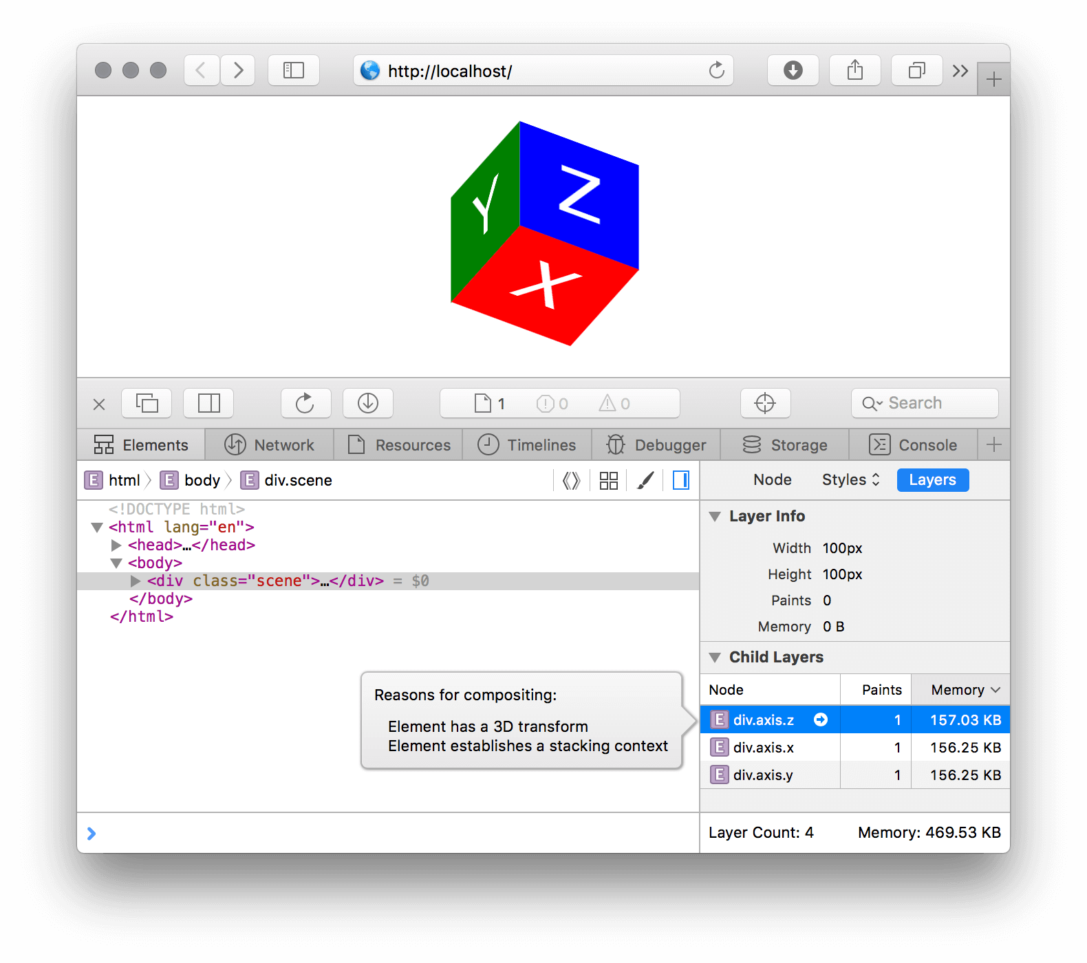
Safari
Safari’s Web Inspector has an awesome “Layers” sidebar that displays all composite layers and their memory consumption, as well as the reason for the compositing. To see this sidebar:
- In Safari, open the Web Inspector with
⌘ + ⌥ + I. If that doesn’t work, open “Preferences” → “Advanced,” turn on the “Show Develop Menu in menu bar” option, and try again. - When the Web Inspector opens, select the “Elements” tab, and select “Layers” in the right sidebar.
- Now, when you click on a DOM node in the main “Elements” pane, you’ll see an information layer for the selected element (if it uses compositing) and all descendant composite layers.
- Click on a descendant layer to see the reason it was composited. The browser will tell you why it decided to move this element to its own compositing layer.
Chrome
Chrome’s DevTools has a similar panel, but you have to enable a flag first:
- In Chrome, go to
chrome://flags/#enable-devtools-experiments, and enable the "Developer Tools experiments" flag. - Open DevTools with
⌘ + ⌥ + I(on a Mac) orCtrl + Shift + I(on a PC), and then click on the following icon in the upper-right corner and pick the "Settings" menu item.
- Go to the "Experiments" pane, and enable the "Layers" panel.
- Reopen DevTools. You should now see the "Layers" panel.
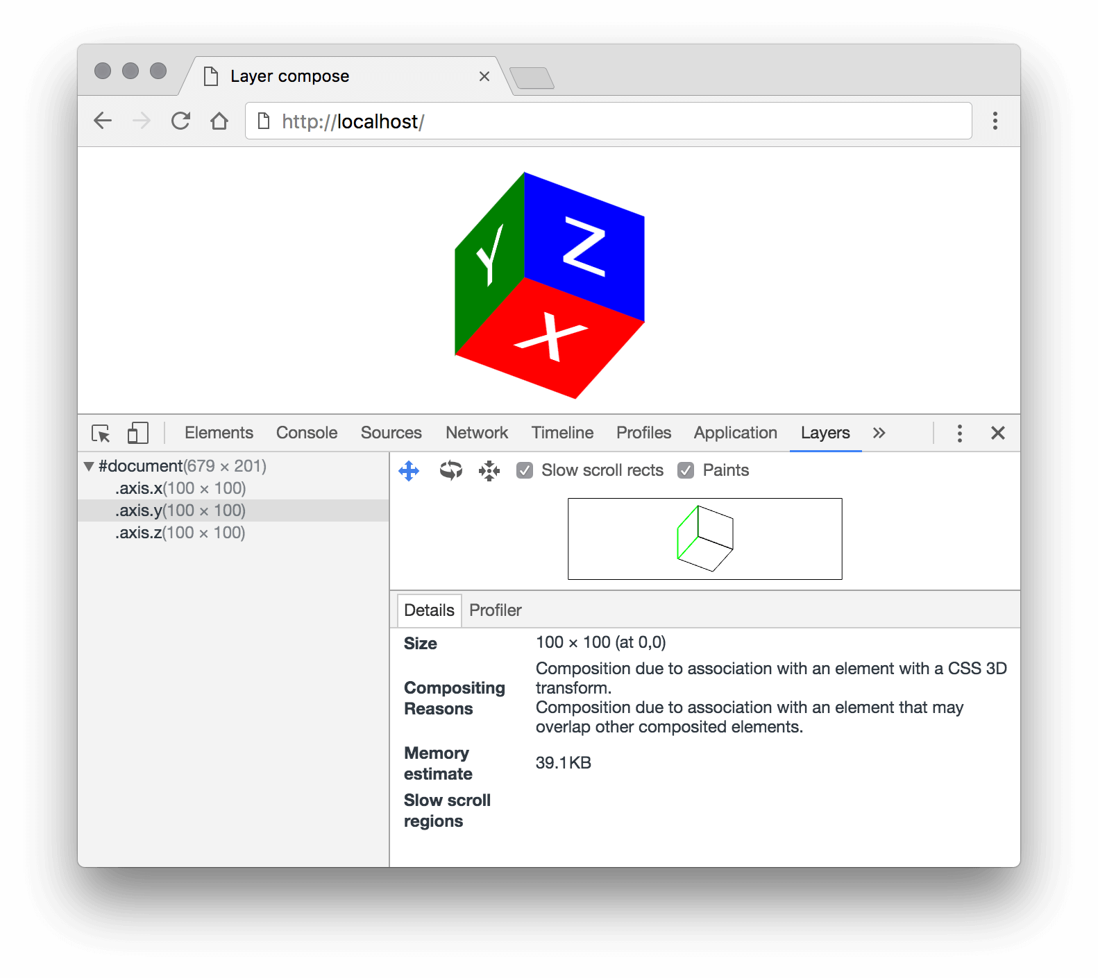
This panel displays all active compositing layers of the current page as a tree. When you pick a layer, you’ll see information such as its size, memory consumption, repaint count and reason for being composited.
Optimization Tips
Now that we’ve set up our environment, we can start optimizing the compositing layer. We’ve already identified two main problems with compositing: extra repaints, which causes data transfer to the GPU as well, and extra memory consumption. So, all optimization tips below will focus on these very problems.
Avoid Implicit Compositing
This is the simplest and most obvious tip, yet very important. Let me remind you that all non-compositing DOM elements above one with an explicit compositing reason (for example, position: fixed, video, CSS animation, etc.) will be forcibly promoted to their own layers just for the final image composition on the GPU. On mobile devices, this might cause the animation to start very slowly.
Let’s take a simple example:
The A element should be animated upon a user interaction. If you look at this page in the “Layers” panel, you’ll see that there are no extra layers. But right after clicking the “Play” button, you’ll see a few more layers, which will be removed right after the animation finishes. If you look at this process in the “Timeline” panel, you’ll see that the animation’s start and end are accompanied with repaints of large areas:
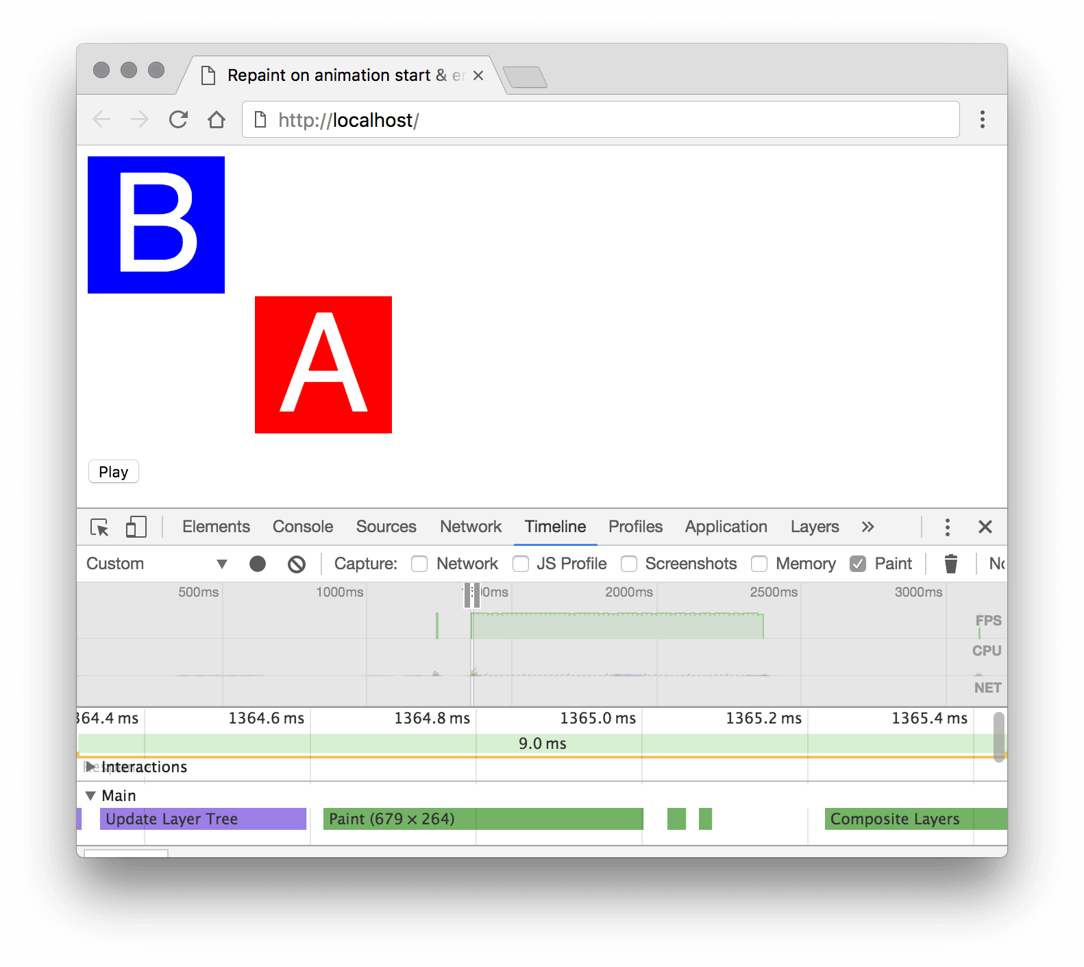
Here’s what browser did, step by step:
- Right after the page loads, the browser doesn’t find any reason for compositing, so it picks the optimal strategy: painting the page’s entire contents on a single background layer.
- By clicking the “Play” button, we’re explicitly adding compositing to element
A— a transition with thetransformproperty. But the browser determines that elementAis below elementBin the stacking order, so it promotesBto its own compositing layer, too (implicit compositing). - Promotion to a compositing layer always causes a repaint: The browser has to create a new texture for the element and remove it from the previous layer.
- New layer images must be transferred to the GPU for the final image composition that the user will see on screen. Depending on the number of layers, the texture’s size and the complexity of content, repainting and data transferring could take a significant amount of time to perform. This is why we sometimes see an element flicker as an animation starts or finishes.
- Right after the animation finishes, we remove the reason for compositing from
Aelement. Once again, the browser sees that it doesn’t need to waste resources on compositing, so it falls back to the optimal strategy: keeping the page’s entire contents on a single layer, which means it has to paintAandBback on the background layer (another repaint) and send the updated texture to the GPU. As in the step above, this could cause flickering.
To get rid of implicit compositing issues and to reduce visual artifacts, I recommend the following:
- Try to keep animated objects as high as possible in the
z-index. Ideally, these elements should be direct children of thebodyelement. Of course, this is not always possible in the markup when an animated element is nested deep inside the DOM tree and depends on the normal flow. In such cases, you could clone the element and put it in thebodyfor animation only. - You can give browser a hint that you’re going to use compositing with the
will-changeCSS property. With this property set on an element, the browser will (but not always!) promote it to a compositing layer in advance, so that the animation can start and stop smoothly. But don’t misuse this property, or else you’ll end up with a tremendous increase in memory consumption!
Animate transform And opacity Properties Only
The transform and opacity properties are guaranteed to neither affect nor be affected by the normal flow or DOM environment (that is, they won’t cause a reflow or repaint, so their animation can be completely offloaded to the GPU). Basically, this means you can effectively animate movement, scaling, rotation, opacity and affine transforms only. Sometimes you might want to emulate other animation types with these properties.
Take a very common example: a background color transition. The basic approach would be to add a transition property:
<div id="bg-change"></div>
<style>
#bg-change {
 width: 100px;
 height: 100px;
 background: red;
 transition: background 0.4s;
}

#bg-change:hover {
 background: blue;
}
</style>
In this case, the animation would work entirely on the CPU and cause a repaint at each step of the animation. But we can make such an animation work on the GPU: Instead of animating the background-color property, we would add a layer on top and animate its opacity:
<div id="bg-change"></div>
<style>
#bg-change {
 width: 100px;
 height: 100px;
 background: red;
}

#bg-change::before {
 background: blue;
 opacity: 0;
 transition: opacity 0.4s;
}

#bg-change:hover::before {
 opacity: 1;
}
</style>
This animation would be much faster and smoother, but keep in mind that it could cause implicit compositing and require additional memory. Yet memory consumption can be reduced greatly in this case.
Reduce Size Of Composite Layer
Look at the images below. Notice any difference?
These two composite layers are visually identical, but the first weighs 40,000 bytes (39 KB), and the second just 400 bytes — 100 times smaller. Why? Look at the code:
<div id="a"></div>
<div id="b"></div>

<style>
#a, #b {
 will-change: transform;
}

#a {
 width: 100px;
 height: 100px;
}

#b {
 width: 10px;
 height: 10px;
 transform: scale(10);
}
</style>
The difference is that the physical size of #a is 100 × 100 pixels (100 × 100 × 4 = 40,000 bytes), whereas #b is only 10 × 10 pixels (10 × 10 × 4 = 400 bytes) but upscaled to 100 × 100 pixels with transform: scale(10). Because #b is a composite layer, due to the will-change property, the transform now occurs entirely on the GPU during the final image paint.
The trick is pretty simple: Reduce the physical size of the composite layer with the width and height properties, and then upscale its texture with transform: scale(…). Of course, this trick reduces memory consumption significantly for very simple, solid-colored layers only. But, for example, if you want to animate a large photo, you could downsize it by 5 to 10% and then upscale it; users might not see any difference, and you would save a few megabytes of precious memory.
Use CSS Transitions And Animations Whenever Possible
We already know that animation of transform and opacity via CSS transitions or animations automatically creates a compositing layer and works on the GPU. We could also animate via JavaScript, but we’d have to add transform: translateZ(0) or will-change: transform, opacity first in order to ensure that the element gets its own compositing layer.
JavaScript animation happens when each step is manually calculated in a requestAnimationFrame callback. Animation via Element.animate() is a variation of declarative CSS animation.
On the one hand, creating a simple and reusable animation via a CSS transition or animation is very easy; on the other, creating complex animation with fancy trajectories is much easier with JavaScript animation than with CSS. Also, JavaScript is the only way to interact with user input.
Which one is better? Could we just use a universal JavaScript library to animate everything?
CSS-based animation has a very important feature: It works entirely on the GPU. Because you declare how an animation should start and finish, the browser can prepare all of the required instructions ahead of the animation’s start and send them to the GPU. In the case of imperative JavaScript, all that the browser knows for sure is the state of the current frame. For a smooth animation, we’d have to calculate the new frame in the main browser thread and send it to the GPU at least 60 times per second. Besides the fact that these calculations and sending of data are much slower that CSS animation, they also depend on the workload of the main thread:
In the illustration above, you can see what happens when the main thread gets blocked by intensive JavaScript calculations. The CSS animation is unaffected because the new frame is calculated in a separate thread, whereas the JavaScript animation has to wait until the heavy calculation is complete and then calculate a new frame.
So, try to use CSS-based animation as much as possible, especially for loading and progress indicators. Not only is it much faster, but it won’t get blocked by heavy JavaScript calculations.
A Real-Word Optimization Example
This article is the result of my investigation and experimentation in developing the web page for Chaos Fighters. It’s a responsive promo page for a mobile game with a lot of animations. When I started its development, the only thing I knew was how to make GPU-based animation, but I didn’t know how it works. As a result, the very first milestone page caused the iPhone 5 — the latest Apple phone at the time — to crash in a few seconds right after the page loaded. Now, this page works fine, even on less powerful devices.
Let’s consider, in my opinion, the most interesting optimization of this website.
At the very top of the page is a description of the game, with something like red sun rays spinning in the background. It’s an infinitely looping, non-interactive spinner — a great candidate for simple CSS animation. One’s first (misguided) attempt would be to save the image of the sun rays, place it as an img element on the page and use infinite CSS animation:
Seems like everything works as expected. But the weight of the sun image is pretty heavy. Mobile users won’t be happy.
Take a closer look at the image. Basically, it’s just a few rays coming from the center of the image. The rays are identical, so we can save an image of a single ray and reuse it to create the final image. We’ll end up with a single-ray image, which is an order of magnitude smaller than the initial image.
For this optimization, we’ll have to complicate the markup a bit: .sun will be a container for elements with the ray images. Each ray will be rotated at a particular angle.
The visual result will be the same, but the amount of network-transferred data will be much lower. Still, the size of the composite layer remains the same: 500 × 500 × 4 ≈ 977 KB.
To keep things simple, the size of the sun rays in our example is pretty small, only 500 × 500 pixels. On a real website, serving devices with different sizes (mobile, tablets and desktops) and pixel densities, the final image would be about 3000 × 3000 × 4 = 36 MB! And that’s just a single animated element on the page.
Look at the page’s markup once again in the “Layers” panel. We’ve made it easier on ourselves to rotate the entire sun container. So, this container was promoted to a compositing layer and painted into a single large texture image, which was then sent to the GPU. But because of our simplification, the texture now contains useless data: the gaps between the rays.
Moreover, the useless data is much larger in size than the useful data! That’s not the best way to spend our very limited resource of memory.
The solution to this problem is the same as with our optimization of the network transfer: Send only the useful data (i.e. the rays) to the GPU. We can calculate how much memory we’ll save:
- entire sun container: 500 × 500 × 4 ≈ 977 KB
- twelve rays only: 250 × 40 × 4 × 12 ≈ 469 KB
Memory consumption will be reduced by two times. To do this, we have to animate each ray separately, instead of animating the container. Thus, only the images of the rays will be sent to the GPU; the gaps between them won’t take up any resources.
We’d have to complicate our markup a bit to animate the rays independently, and CSS would be more of an obstacle here. We’ve already used transform for the initial rotation of rays, and we have to start the animation from exactly the same angle and make a 360-degree turn. Basically, we’d have to create a separate @keyframes section for every ray, and that’s a lot of code for network transferring.
It would be much easier to write a short JavaScript that takes care of the initial placement of rays and that allows us to fine-tune the animation, the number of rays and more.
The new animation looks the same as the previous one but is twice as small in memory consumption.
That’s not all. In terms of layout composition, this animated sun isn’t the main element, but rather is a background element. And the rays don’t have any crisp contrasting elements. This means we can send a lower-resolution ray texture to the GPU and upscale it afterwards, which allows us to reduce memory consumption a bit.
Let’s try to reduce the texture’s size by 10%. The physical size of the ray will be 250 × 0.9 × 40 × 0.9 = 225 × 36 pixels. To make the ray look like 250 × 20, we’ll have to upscale it by 250 ÷ 225 ≈ 1.111.
We’ll add a line to our code — background-size: cover for .sun-ray — so that the background image automatically resizes to the element’s size, and we’ll add transform: scale(1.111) for the ray’s animation.
Note that we’ve only changed the size of the element; the size of the PNG image remains the same. A rectangle made by a DOM element will be rendered as a texture for the GPU, not the PNG image.
The sun ray’s new composition size on the GPU is now 225 × 36 × 4 × 12 ≈ 380 KB (it was 469 KB). We’ve reduced memory consumption by 19% and gotten very flexible code in which we can play around with downscaling to get the optimal quality-to-memory ratio. As a result, by increasing the complexity of an animation that appears to be so simple at first, we’ve reduced memory consumption by 977 ÷ 380 ≈ 2.5 times!
I guess you’ve already noticed that this solution has a significant flaw: The animation now works on the CPU and can be blocked by heavy JavaScript calculations. If you want to get more familiar with optimizing GPU animation, I propose a little homework. Fork the Codepen of the sun rays, and make the sun ray animation work entirely on the GPU, yet be as memory-efficient and flexible as in the original example. Post your example in the comments to get feedback.
Lessons Learned
My research into optimizing the Chaos Fighters page made me completely rethink the process of developing modern web pages. Here are my main principles:
- Always negotiate with the client and designer about all animations and effects on the website. It could affect the page’s markup greatly and make for better compositing.
- Watch out for the number and size of composite layers from the very beginning — especially ones created by implicit compositing. The “Layers” panel in your browser’s development tools is your best friend.
- Modern browsers make heavy use of compositing not just for animation but to optimize the painting of page elements. For example,
position: fixedand theiframeandvideoelements use compositing. - The size of compositing layers is likely be more important than the number of layers. In some cases, the browser will try to reduce the number of composite layers (see the “Layer Squashing” section of “GPU Accelerated Compositing in Chrome”); this prevents so-called “layer explosion” and reduces memory consumption, especially when layers have large intersections. But sometimes, such optimization has a negative impact, such as when a very large texture consumes much more memory than a few small layers. To bypass this optimization, I add a small, unique
translateZ()value to each element, such astranslateZ(0.0001px),translateZ(0.0002px), etc. The browser will determine that the elements lie on different planes in the 3D space and, thus, skip optimization. - You can’t just add
transform: translateZ(0)orwill-change: transformto any random element to virtually improve animation performance or to get rid of visual artifacts. GPU compositing has many drawbacks and tradeoffs to be considered. When not used sparingly, compositing will decrease overall performance at best, and crash browsers at worst.
Allow me to remind you of the big disclaimer: There is no official specification for GPU compositing, and each browser solves the same problems differently. Some sections of this article may become obsolete in a few months. For example, Google Chrome developers are exploring ways to reduce the overhead of CPU-to-GPU data transfers, including use of special shared memory with zero copy overhead. And Safari is already able to delegate the drawing of simple elements (such as an empty DOM element with a background-color) to the GPU, instead of creating an image of it on the CPU.
In any case, I hope this article has helped you better understand how the browser uses the GPU to render, so that you can create impressive websites that run quickly on all devices.
Further Reading
- Hardware Hacking With JavaScript
- Let’s Play With Hardware-Accelerated CSS
- Prioritizing Devices: Testing And Responsive Web Design
- Creating Accessible UI Animations
 (rb, vf, il, yk, al, mrn)

