How Creating A Design Language Can Streamline Your UX Design Process

Email Newsletter
Weekly tips on front-end & UX.
Trusted by 182,000+ folks.
 Custom Web Forms for Angular, React, & Vue. Your backend.
 Celebrating 10 million developers


Around a year ago, while working at a digital agency, I was given the objective of streamlining our UX design process. Twelve months later, this article shares my thoughts and experiences on how lean thinking helped to instill efficiencies within our UX design process.
The Challenge
When I arrived at the agency, wireframes were already being created and utilized across a variety of projects. Winning advocates for the production of wireframes was not the issue. All stakeholders (both internally and externally) understood the purpose of wireframes and appreciated their value in shaping and modeling digital experiences.
However, up until this point, rather than dictate a promoted “way of working,” the agency had encouraged UX designers to “do things their way.” While this increased autonomy had once allowed UX designers to work at speed, using their preferred tools and processes, it was now starting to create problems.
When you stepped back and looked across past projects, you could see the different tools and processes in action, ranging from low-fidelity wireframing tools such as Balsamiq and Moqups.com, to mid-high fidelity outputs from tools such as Axure and UX Pin.
For clients undertaking multiple projects, the lack of consistent wireframe deliverables was confusing and disorientating, with the client having to remember multiple URLs and logins while also learning how to navigate the various outputs.
Meanwhile, for the agency, the absence of a standardized UX design process was costly both in time and money. The lack of a shared file structure across projects meant, if resource patterns changed across a project, which they often did, it was hard for new UX designers to pick up where their counterparts had left off. At the same time, many routine tasks were unnecessarily repeated across multiple projects.
It was clear we needed to establish some rules and guidelines to create a more cohesive approach. We needed to set a new direction, and now was the time to start.
A New Direction
Before introducing a new company-wide process to wireframing, I needed to highlight to the UX team where the lack of process was causing us issues and how establishing a standardized process could help.
To ensure buy-in from the wider stakeholder group, I gathered the UX team together and presented them with the challenge:
"How can we establish a standard wireframing process that allows us to work at speed, while also improving cross-project consistency?"
As the team discussed the issue, I quickly mapped out each key milestone in the wireframing process on a whiteboard. We discussed the potential enhancement opportunities for each milestone. For an enhancement to be accepted, it had to deliver against one of the following criteria:
- Save the UX designer time.
- Improve wireframe consistency.
- Facilitate rapid working.
The enhancements we decided on were as follows:
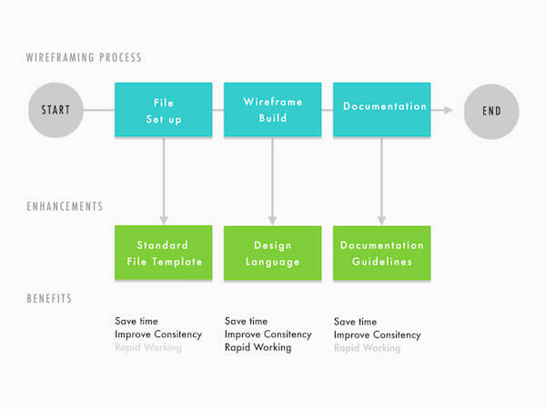
Creating A Standard File Template
Benefits: Save time, improve consistency.
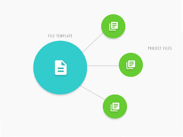
By introducing a template file, we felt we could help save the UX designer time during a project’s initial set-up. The template file would save the UX designer from having to complete the routine tasks that come with setting up a new project (creating responsive views, grid systems, document structures, changelogs, and so on).
We also felt that creating a template file would define a baseline for what a working project file should look like. We believed the file template would establish a core foundation and structure for the wireframe document and therefore promote cross-project consistency.
The standard wireframe file template we created included elements such as:
- Introductory page. To welcome stakeholders to the wireframe, explaining how to navigate the wireframe document and introduce the changelog.
- Component master. List of all components and pages grouped into categories, with direct links to lower level pages and components (signposting, forms, and so on).
- Document structure. Folders for each type of wireframe page, helping stakeholders easily distinguish page layouts from components and user journeys from sitemaps.
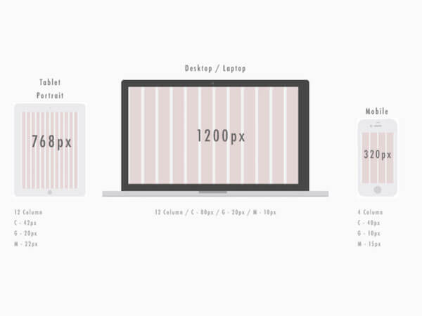
- Preset breakpoints and grid systems. Standard responsive wireframe breakpoints and grid systems.
Agreeing on a set of common breakpoints for our template file was perhaps the hardest task to accomplish. After some lengthy debates with the UX team and other internal stakeholders, we came to the following conclusion:
- The wireframe’s purpose is to communicate page functionality, visual hierarchy, and interactions. It is not to provide a pixel-perfect representation of the end product.
- Project stakeholders are most interested in seeing how the layout would respond across desktop, tablets and mobile devices.
- The breakpoints demonstrated within the wireframes would only be representative, and considered again later within the design phase.
After coming to this shared agreement, we collectively decided we would produce wireframes to represent the three common breakpoints stakeholders were interested in (desktop, tablet and mobile). The final breakpoints would then be explored throughout the design phase, as we considered browser trends and the client’s current web analytics data.
We settled on the following grids and breakpoints for our template file:
Introducing A Design Language
Benefits: Save time, improve consistency, facilitate rapid working.
The next and most significant enhancement we identified was the idea to introduce our own wireframe design language.
For those of you who are new to design languages, a design language provides a unified set of UX and design rules which promote harmony across various media outputs. Unlike a style guide that creates rules for acceptable fonts, colors, imagery, and tone of voice, a design language, creates rules for UI patterns providing guidance on layout, user input, animation and feedback.
In recent years, design languages have become more popular thanks to the introduction of Google’s Material Design. However, companies such as the BBC and IBM have been developing digital assets that adhere to well establish design languages for some time.
Typical elements you would expect to see in a design language are:
- Grid systems
- Accessibility guidelines
- Layout principles
- Typography and iconography
- Interaction guidelines
- UI components
By introducing a design language, we believed we could ensure a consistent look and feel across our wireframes while also reminding UX designers of common responsive UI patterns.
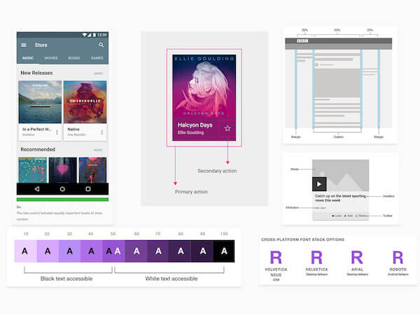
To make it easy for UX designers to align with the design language we wanted to turn our design language into a responsive wireframe library UX designers could use as they work, allowing them to build responsive wireframes at speed.
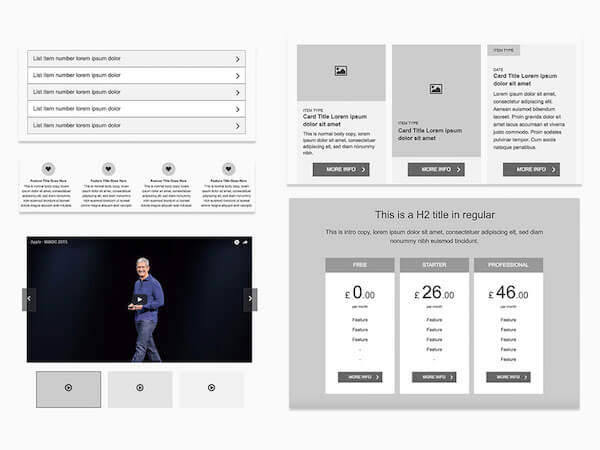
To define our design language, we slowly started to pull together a list of the commonly used UI patterns across our last four major projects. We then aligned these with our new responsive grid system and built it into a responsive wireframe library.
Our responsive wireframe library quickly became our living and breathing design language. We initially started with a small set of 30 components, however, over time, this has now expanded contain over 100+ responsive UI elements some of which you can see below.
Creating Your Own Design Language
If you are looking to create your own wireframe design language, I would highly recommend getting your whole team involved as early as possible. Taking people’s input early-on in a venture like this can help justify and shape the proposition. It will also assist to ensure the result is a collaborative effort where all UX designers support the end solution.
The key thing to remember here, the objective for a design language is to assist and support UX designers on projects by reminding them of common UI patterns fit for the medium in which content is being digested. Its purpose is not to set hard and fast rules that all projects must follow. Otherwise, all projects would end up looking too similar.
Running A Design Language Workshop
To run a “design language” workshop session, block out a day in your team’s calendar, gather everyone together with some Sharpies, snacks, Post-it notes, Blu-Tack, and paper.
Introduction
Start the day with the following introduction to the problem:
As a UX Team we need to establish a design language so that we can work at speed and ensure wireframe consistency.
Exploration
Demonstrate examples from around the web such as:
Working In Teams
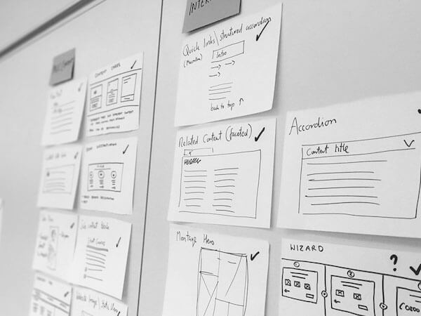
Depending on the size of your audience, split into groups of four to six. Armed with pens and Post-its, sketch out common UI elements you have used on recent web projects, adding a suitable name to your component as you go.
Once you have sketched each component, place it up on the wall. When everyone has completed their components, take some time to sort them into common themes, (i.e. Navigation, Experience, Conversion, Browse) removing any duplicates as you go.
Review
Once you have your list of UI components, bring the group together and refocus on each item to encourage conversations such as:
- Where should we use it?
- How does it work?
- How should it be styled?
- What information will it contain?
- What is its key functionality, constraints, and limitations?
- How should it behave at smaller screen sizes?
Prioritize, Prioritize, Prioritize
At the end of the workshop, you should have a list of common UI components you can use to build your design language. Initially, try to keep this list concise, with around 20 to 30 components maximum.
From here, you will need a medium to capture your components into a shared location the whole team can access, and allow them to collaborate further and feed in new requirements.
We used a Trello board to communicate all the components we had captured from our workshop and displayed them within their groupings. An additional “Ideas” column was created to provide a space where new components could be added by any team member and would be discussed in upcoming team meetings.
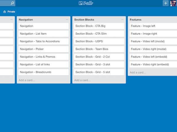
Being able to see things in a consolidated view within our Trello board allowed us to discuss and prioritize which components we would build into our design language. Anything which was not a core requirement was moved to a later phase.
The key thing we communicated to the UX team was that our design language would become a ‘living library’ that extends over time. Therefore, the initial phases of our design language would be an MVP where we would use feedback from the UX team to shape the library when moving forward.
Note: Trello is a great lightweight tool for managing and assigning tasks across small teams. However, if your organization has a JIRA account, I would recommend using this as your primary tool to manage this process. JIRA has a lot more functionality than Trello, allowing access to features such as development reports and components requested and added. You can also monitor time spent on jobs which may prove useful for reporting your progress up the management chain.
Building Your Design Language
It was always our intention to build our design language into a UI kit that UX designers could utilize throughout the creative process. To achieve this, we transformed our design language into a “Responsive Axure Widget Library.”
When it comes to selecting the wireframing tool that is right for your business, there are a number factors to consider:
- Ease of use. How easy is it for beginners to grasp? Will any training be required? If so, what support and training resources are available?
- Accessibility/Scalability Does it allow multiple UX designers to work in collaboration on a single document? How does it handle large documents with multiple page revisions?
- Features. What built-in features does it have? Can you create responsive wireframes, sticky headers, and parallax scrolling?
- Fidelity. What does a typical output look like? For example, sketch-based page layouts or high-fidelity interactive prototypes?
We selected Axure as our wireframing tool due to its rich feature set, ability to handle large documents, collaboration capabilities and ability to support third-party widget libraries. Not to mention, all UX designers had experience using the tool.
However, Axure may not be the best choice for your business due to its steep learning curve and licensing arrangement. The key message is when selecting your wireframing tool you should consider your business needs.
Most wireframing tools now support the inclusion of custom libraries UXPin, Justinmind and Sketch to name but a few. Sadly Adobe XD does not support custom libraries yet, however this feature is expected to make an appearance in the near future, according to Adobe’s Blog.
Standardizing Documentation And Annotations
Benefits: Save time, improve consistency.
The final enhancement for our new process was to create some guidelines for documentation and annotations. In the past, various approaches had been taken to produce documentation depending on the size, scale, and timelines for the project. For example:
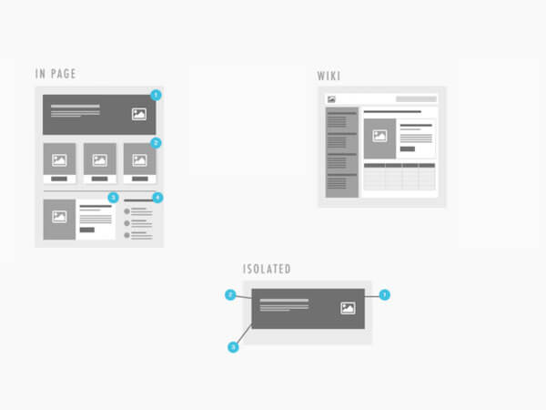
- In-Page (High-level functionality annotations). Each page of the wireframe should clearly describe the role of the component(s) within.
- Isolated (Low-level functional specification annotations). Describe each atomic component to the minute detail (what information CMS editors can edit or update, along with limitations, restrictions and responsive behaviours).
- Wiki (Functional specifications). Create wikis that document the entire project from a functional perspective. Include all page and component functionality along with rules around other items, such as web analytics, browser support, roles, permissions, and governance.
When discussing annotations as a team, we felt, despite “low-level functional specification annotations” within the wireframes being seen by project managers as a way to reduce documentation timelines, this often created more problems than it solved.
For a start, it meant the only member of the project team who could access and update the specification was the UX designer who had access to the wireframing tool. Secondly, the document didn’t allow for cross-team collaboration (such as input from other teams, i.e. QA, or Project Management).
After discussing as a team, we agreed when moving forward:
- We would only ever use in-page annotations within wireframes to communicate the role of the component.
- Atomic, component level specifications would always be delivered via the Functional Specification in a Wiki format.
- We would agree on a common structure for our functional specification wikis.
The structure we settled on for our Functional Specification Wiki’s was as follows:
1. Introduction This is where we introduce stakeholders to the project and explain what content can be found throughout the specification. Typical sub-pages within this section would contain the role of the project, scope of the project, sitemap, and changelong.
2. Page Templates
This is where we grouped all page templates together and identified static versus dynamic pages. For example, content pages versus search results pages or product pages. For each page template, we would describe the role of the page and page-specific functionality as well as a full-page screen grab and a link to the wireframes.
Where a page template used a common component, (i.e., Site Navigation, Breadcrumb, Hero) we would simply link to the component page rather than re-document the component multiple times. Not only did this reduce the documentation, it also allowed stakeholders reviewing the document to dip in and out of the content they needed to review easily.
3. Components
This is where we grouped all UI components together. For each component, we then identified what content fields were available to the CMS user, whether content was manual or automated, and defined validation rules as well as interaction behaviors.
4. Special Considerations
This is where we listed out all other wider topics related to the project that needed to be documented but were not specific to any given page. Typical topics which lived in this section were:
- Analytics requirements
- SEO requirements
- Third-party tools
- Taxonomy and tagging content
- Content types
- Breakpoints
- Browser support
- Roles and permissions
- Workflow
Looking Back
Rethinking our UX workflow from the ground up allowed us to deliver both time and cost savings across the UX team. By introducing key templates wherever possible, we were able to relieve our UX designers from some of the more tedious routine tasks they need to perform on each project, while at the same time, promote cross-project consistency.
An integral part of the new workflow was the introduction of our design language, which has transformed the way we wireframe projects. Introducing the design language has allowed us to work lean, enabling us to build responsive wireframes at speed.
Being able to establish 60%-70% of page layouts more quickly has meant concepts can be demonstrated to stakeholders for feedback much earlier, providing UX designers with more time to obsess over the intricate details of the project that surprise and delight. It is often those little details that get sacrificed when demanding project deadlines loom.
Final Thoughts
Scared of complete standardization? Don’t be!
The design language should be used to help shape pages and components in the early phases of a project rather than dictate all component functionality in its entirety.
Each project is unique in its own right. It comes with its own set of users, requirements, expectations, and challenges. In any web project, the early phases bring a lot of uncertainty. The earlier we produce artifacts such as wireframes, the quicker we learn from stakeholders what works, what doesn’t, and more importantly why. It’s this understanding that helps to direct and steer future adaptations along with the end product.
Furthermore, your design language isn’t a “set it and forget it” tool. Your design language should be a living part of the UX design process that changes and adjusts over time as technology changes and new interaction patterns emerge. For this reason, your design language should always adapt over time based on feedback from your UX designers, clients, and users.
Examples
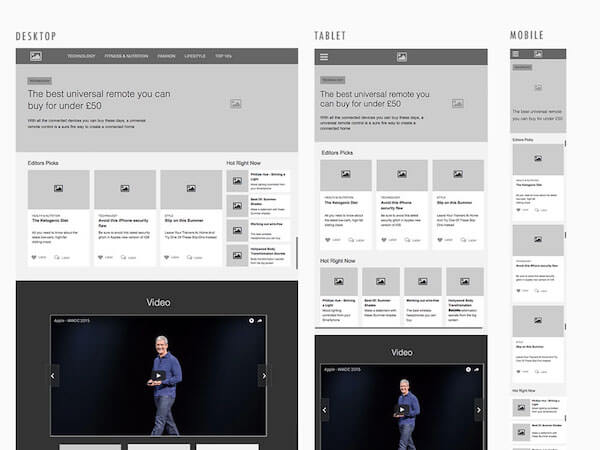
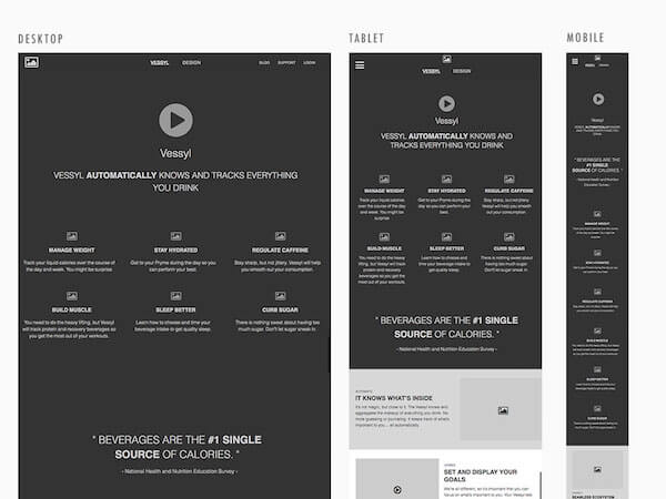
Below you can see concepts for a homepage of a news site and landing page of a product focused website (based on Vessyl). Both concepts were produced as responsive wireframes using Axure RP 8.
Being able to leverage the Responsive Axure Library (built as part of introducing a design language) meant these concepts that had previously taken a day to complete could be produced in just one and a half hours. Not only that, they now look consistent, utilizing the same visual presentation for elements, such as images and video.
Being able to produce artifacts rapidly means more time can be spent with the client to discuss initial thoughts on look, feel, layout, and the responsive treatment of components. You can also spend time on smaller details such as like versus commenting functionality, taxonomy, content prioritization, (manually curated vs. automated feeds) and so on.
Homepage Example
This is a concept for a news and media-based site that produces article based content across a number of categories, from technology to health and nutrition. The aim of this site is to drive engagement and loyalty, with users expected to return to this site multiple times throughout the week. As such, keeping content fresh and relevant to the end user is key to drive repeat engagements.
Landing Page Example
This concept is a simplified version of the landing page displayed on Vessyl. The role of this page is to educate and build interest in the Vessyl product. Remember, this may be the first page users see for the product (as they may be linking from various news or PR sites). Therefore, this page should utilize story-telling principles, as well social proofing, to bring the product to life and make users aware of how using the product will benefit their daily lives.
Other Resources
For more information on design languages and Establishing Standardized UX workflows please see the following materials:
- “Google Material Design”, Google
- “BBC GEL”, BBC’s Global Experience Language (GEL), 2016
- “IBM Design Language”, IBM’s Design Language
- “Designing Spotify’s Design Language System”, Stanley Wood, Medium, 2016
- “Best Practices From 5 Years of Distributed Design”, Marcin Treder, 2016
Further Reading
- Efficient Responsive Design Process
- Incorporating More Quiet Into The UX Design Process
- On Design Systems: Sell The Output, Not The Workflow
- Using Sketch For Responsive Web Design
 (cc, il, aa, mrn)

