How To Design An Effective Mobile Landing Page

Email Newsletter
Weekly tips on front-end & UX.
Trusted by 182,000+ folks.
 Register for Free


 Celebrating 10 million developers
 Custom Web Forms for Angular, React, & Vue. Your backend.
When designing a landing page to promote a product or service online, you’re ultimately pointing users toward one goal. That goal most often relates to generating business via sales or leads. You may want users to purchase a product immediately, or you may simply want them to sign up for a mailing list. Whatever the goal, you want to ensure that every piece of the user experience works toward fulfilling that goal.

If you don’t yet have goals in mind, start by defining goals. Are you seeking to generate a 10% increase in qualified leads? Are you looking to build sales by 20%? Establishing clear key performance indicators based on what will benefit your business will ultimately help you understand how to properly approach a landing page.
Every goal should tie to a clear business outcome. For example, let’s say you run a software-as-a-service company and have determined that 100 new customers would provide the income you need to meet your revenue goals for the year. If you’ve established proper analytics and are carefully tracking results from your website, you might know that 10% of people who sign up for your mailing list are likely to become paying customers. So, you establish a goal of getting 1,000 new email registrations, which would likely result in your end goal of 100 new customers.
For more on establishing realistic goals and correlating those to online goals, see Avinash Kaushik’s article “Web Analytics 101: Definitions: Goals, Metrics, KPIs, Dimensions, Targets.” Start with a foundation of being able to track the right data, and build from there to establish metrics you can seek to improve.
Ultimately, the best way to convert a user on a mobile landing page is to provide a clear description of what you’re offering, along with obvious ways to contact you. Be clear in describing what your product does and how you’re solving your target customer’s problems. For instance, “Best vacuum ever” says less than “Breathe more easily with a vacuum that removes 99% of allergens.” Clear contact options include simple, prominent forms and visible phone numbers, so that visitors don’t have to struggle to find out how to reach you.
Get to the point of what you’re selling and show the user how to buy it or contact you. Lack of any distractions, whether from a content or technical standpoint, will help to ensure the page supports your goal of converting users.
Sadly, too often businesses design landing pages without clearly thinking through every context in which users will be viewing the page, including what devices they’ll be on. Creating landing pages with mobile users in mind will help you to focus on how best to convert people on smartphones.
Choosing Your Tools
To create a landing page that follows the guidelines we’ll be talking about, you’ll need to pick the right tools to build and host it. If you have the right coding expertise, of course, you could build a page from scratch. However, a number of platforms exist to streamline the creation of landing pages. While the primary purpose of this article is to help you plan the elements and structure of a landing page, here are some brief suggestions of tools to build one.
First, if you already have a hosting service, then WordPress offers an excellent starting point for building a responsive landing page that easily integrates with plugins for forms and other elements. You will find a number of pre-built templates on websites such as ThemeForest.
Next, several other tools allow you to create and host pages on their platforms. Unbounce and Wishpond are two popular platforms that enable you not only to build pages but also to implement A/B testing, which we’ll discuss in the last section. Neil Patel has a detailed overview of various platforms for landing pages.
Consider The Content
A quick Google search will give you thousands of articles recommending various optimal lengths for landing page content. One source says to include at least 500 words, while another recommends up to 1,000 words. In reality, the ideal length will depend on what you’re selling and who your audience is, and you can test to determine the length that converts best. However, once the content has been condensed into a mobile format, you’ll need to especially consider how much your users will be willing to read and how far they’ll scroll before you lose the opportunity for a conversion. You can test pages with more or less content (for instance, testing a 500-word page against a 1,000-word page) with an A/B testing tool (discussed in more detail later), monitoring conversion rates to determine whether users are more likely to contact you with more or fewer words to read through.
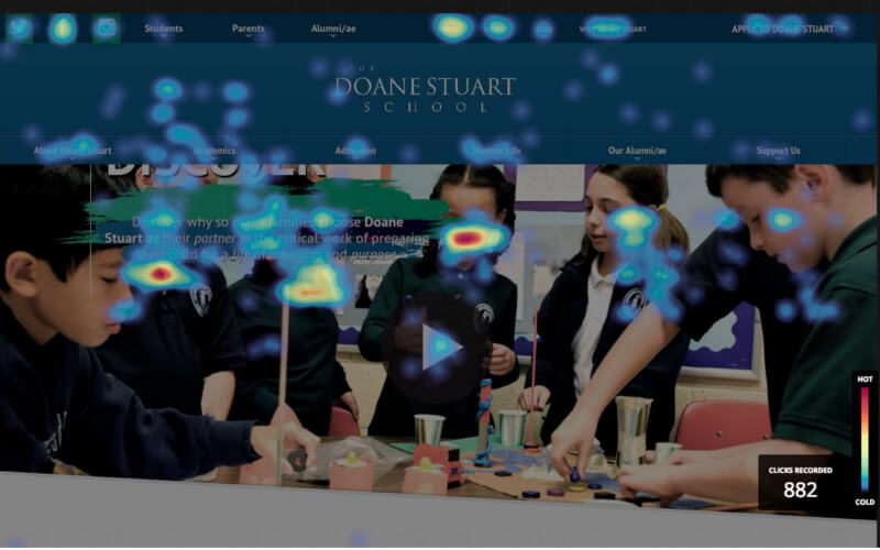
To identify what content lengths are ideal for your users, you can test to see how long, on average, they’re scrolling through the content. In addition to scrolling, you should factor in how likely people are to engage with content by watching videos, clicking links or filling out forms. Measuring this activity is possible using a heatmapping tool, which we’ll also talk about more in depth later in this article.
In addition, you may start with some assumptions, such as thinking that most mobile users stop at “the fold” of the bottom of their screen. However, several studies show that most website visitors will naturally scroll as long as the page provides a user-friendly interface for doing so. For instance, a Time article shares that 66% of activity on a page happens below the fold. With this in mind, still keep important content and elements visible as high as possible, but don’t shy away from providing more detail in the copy.
If you’re looking to generate leads for an air-conditioning repair business, people are more likely to want to get right to the point of calling or filling out a form. If someone’s air-conditioning unit is broken on a 90-degree day, they likely won’t want to read a 2,000-word writeup on the inner workings of an air conditioner. They’ll probably be turned off by having to scroll through lengthy text before reaching a section containing contact information. They’ll want to reach right out to someone who can come to fix their unit, and feel assured that the person they contact can arrive quickly to take care of the problem.
However, if you’re selling luxury gold watches for $5,000 each, you’ll likely be better off including a detailed explanation of what sets your watches apart. In this case, you’re targeting a niche wealthy audience who will want to read and visualize details about your products in order to make a purchasing decision. They’re not so likely to make a purchasing decision on a whim with limited information: They’ll want to see pictures showing all angles of the luxury watch, a video about how each watch is handcrafted from the finest-quality materials, and a writeup about a lifetime guarantee.
Whatever the content’s length, take care that individual paragraphs don’t become excessively long when viewed on a mobile device. While a paragraph may stretch to only four lines of text on a desktop screen, the same paragraph might take up ten lines when compressed to a mobile screen size. More frequent paragraphs break will improve legibility.
Focus On Conversions
Whether promoted via paid search or a social media campaign, a landing page should keep a focus on converting users into sales or leads. In the midst of ensuring brand integrity and writing copy to present a product or service, don’t let this main goal fall by the wayside. Especially in the limited amount of space available on a mobile device, you’ll have a brief window in which to grab the user’s attention and, ultimately, to get them to convert.
For a service-related business looking to generate leads, like the air-conditioning repair example, you should feature a phone number prominently across all devices. When users are looking to fix a problem right away, especially when browsing on a phone, they often prefer to place a call for service. Make sure to include click-to-call functionality on the mobile version of the page.
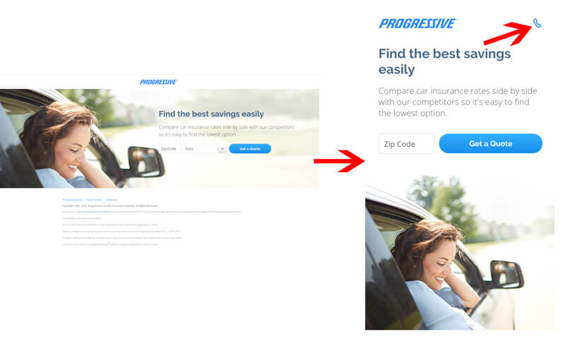
For instance, look at the landing page above used for paid search. In a desktop format, the only conversion option is a quote form. However, once the page shrinks to a mobile size, a phone icon appears in the upper-right corner, giving the option to click to call. This change provides a positive conversion focus for mobile, since users searching for insurance from a smartphone would likely want to speak with an agent.
In addition to a phone number, ensure that a form features prominently on mobile. Some responsive design templates that include a form might shrink to the point where the form no longer shows up at a mobile size. This will more than likely result in fewer leads.
Make sure the form’s fields are large enough to be tapped easily with a finger. While a form might work perfectly at a desktop size, the fields might shrink to the point where they’re difficult to select on a phone. For more on designing landing page forms that will aid the conversion process on mobile and not turn off users, see UserTesting’s article covering form usability resources.
Avoid User Experience Barriers
When creating a mobile landing page, a marketing mindset too often leads to one overlooking the user experience. In the process of introducing every possible piece of content or way of presenting a signup form, you could end up turning off users who might have otherwise taken time to read the page and converted. Before launching any campaign, review your landing page on multiple devices with multiple users to determine possible issues to fix. Below are a few examples of potential barriers.
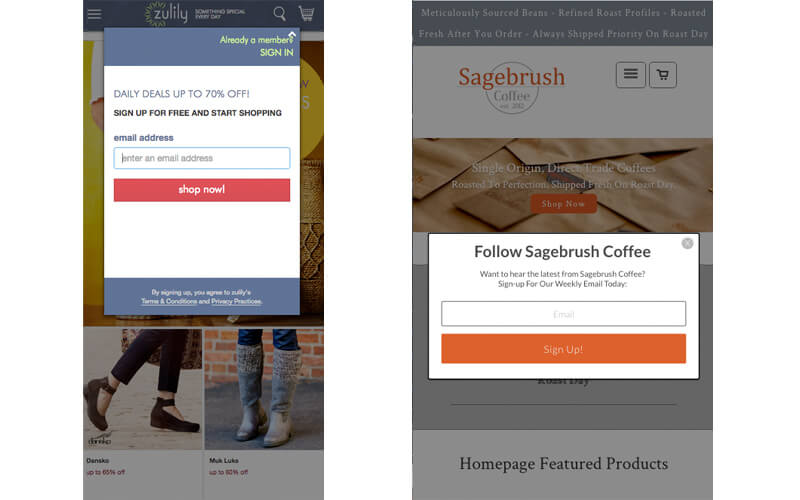
Interstitial Forms
Interstitial forms are a tempting option to “force” users to convert. However, they tend to create a higher number of annoyed users than converted users, especially on mobile. For instance, a Google study reveals that an interstitial ad promoting a Google+ app download resulted in 69% of users immediately leaving the page without engaging.
While an interstitial newsletter signup form might be easy to close on desktop, the same popup on a phone might shrink to the point that the “x” is painful to tap. Be careful especially of such conversion tactics that turn into a frustrating barrier for mobile users. Ironically, people can be turned away by the very elements intended to add an extra chance of conversion. For instance, according to a study cited in VentureBeat, “viewers were 2X as likely to have a negative emotional response to a full page interstitial ad than to a rewarded, opt-in ad.” Also, note that Google recently began penalizing websites for some obtrusive interstitial formats.
Responsive Design Flaws
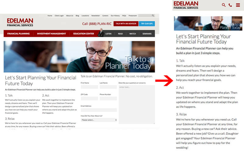
In addition, think about how responsive design factors into the mobile experience. In theory, the idea of responsively stacking elements to fit a screen size works well. This setup could, however, result in a user having to scroll excessively to get to a form, if you don’t carefully plan out how elements will stack at a mobile size. A templated website might stack a form at the bottom, but you should readjust the layout to place the form higher on the page or include a clear “Contact” button that scrolls with the user’s activity and leads directly to the form when clicked.
Text Considerations
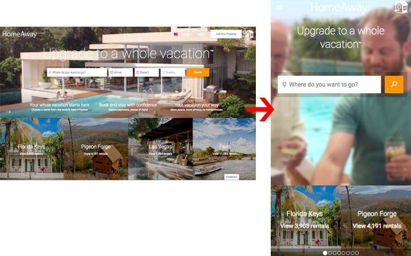
Also, think about how text will look when compressed to a mobile size. Will it be too small? Does the color allow for easy legibility? For instance, the white text for the page below looks fine over a dark background at a large size but blends with the light-blue background at a mobile size. However, on a positive note, see how the form fields go from four to one, making the process of completing the form simpler on mobile.
Additionally, don’t keep the user captive on the landing page. While you do want to focus on conversion and don’t necessarily need your website’s full navigation bar, you also don’t want to frustrate a user who’s looking for more information about your brand. Make your logo clickable back to your primary website, or provide footer links back to it.
Test The Experience
To better identify what elements of the website are and aren’t working, test the experience of the website on mobile devices. Enlist people using different phone models across both Android and iOS, either finding people you know or using a website such as UserTesting.
With the launch of a page, you can A/B test the placement of elements on the website using a tool such as Optimizely or Google Analytics’ free Content Experiments. For instance, in the case of pricier products sold to a niche audience, you might want to test if these people will indeed respond to a form they see immediately or if they will need to read through content and view imagery before deciding to convert. For more ideas and tips, see Shopify’s “Beginner’s Guide to Simple A/B Testing.”
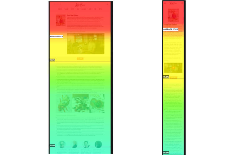
In addition, install a heatmapping tool such as Crazy Egg or Hotjar to measure clicking and scrolling activity via a tracking script inserted in your website. This data will allow you to look more closely at how people are scrolling and what elements of the page they’re interacting with. In this way, you can determine how far into the content the average user is likely to read, as well as what buttons and form configurations are likely to produce a response.
Be sure to look at heatmaps specific to mobile. While desktop heatmaps might show no issues, mobile might show a different story. Of course, data will vary from website to website, but you might find that a larger percentage of your desktop users scroll through an entire page than mobile users (or vice versa). Or you might find that desktop users are more inclined to fill out a lengthier form, whereas mobile users fill out the first two fields and then drop out due to faulty functionality on mobile. In the example below, see how users scroll through more of the content on desktop than on mobile. Based on this data, the developer would be wise to take out some of the lengthy content on the mobile version of the page.
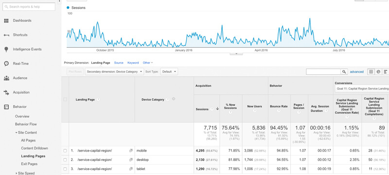
In addition, use Google Analytics to review mobile performance on your landing page. Segment by device when looking at the data to identify specific issues with mobile use. For instance, in the example shown below, we’ve selected a specific landing page under the “Behavior” → “Landing Pages” report, and used the “Secondary Dimension” dropdown menu to break out performance by device category. Here, we can see that mobile sessions resulted in a significantly lower conversion rate than desktop (0.65% versus 2.35%), indicating a potential flag of a poor user experience.
Understand Perceived Performance
While page-loading speed is crucial for any website on any device, you should especially consider how quickly a page appears to load on mobile. One extra second of time spent waiting for an image to load could mean that an impatient mobile user gives up. In order to keep the user’s attention, make sure that resources load as quickly as possible in the user’s eyes.
One useful solution involves preloading resources on a landing page. You can use HTML5 prefetch to fetch some assets that will be used on a page that appears when the user clicks a call-to-action button on a landing page. In addition, you could also dynamically inject resource hints that tell the browser to download the required resources ahead of time. For more on this topic, see Denys Mishunov’s series on “Why Performance Matters” (including part 2 and part 3) and CSS-Tricks’ article on prefetching.
Conclusion
Here’s a recap of what to keep in mind when designing a landing page:
- Define your goals to determine what to say on the page and what action you want users to take.
- Describe your product or service as concisely as possible to grab the attention of users.
- Break content into brief, readable paragraphs.
- Exclude distracting elements, such as large navigation bars and excessive external links.
- If appropriate, show imagery and/or video related to what you’re selling.
- Place conversion elements such as forms and phone numbers in highly visible sections.
- Test landing-page performance via analytics, heatmapping and A/B testing tools to determine changes to content length and page elements to include.
When building a landing page for any online campaign, take special care to consider the mobile experience. Review the presentation of content, as well as the prominence of contact information. Solicit the opinions of multiple users to identify issues, and test with analytics data to determine usability. With a clear plan in place for mobile, you’ll better convert users coming from multiple devices.
Further Reading
- Elements Of A Viral Launch Page
- Stop Designing Pages And Start Designing Flows
- The Ultimate Guide To A/B Testing
- All You Need To Know About Customer Journey Mapping
 (da, il, yk, al, vf, mrn)

