Styling Web Components Using A Shared Style Sheet

Email Newsletter
Weekly tips on front-end & UX.
Trusted by 182,000+ folks.
 Celebrating 10 million developers
 Custom Web Forms for Angular, React, & Vue. Your backend.


Web components are an amazing new feature of the web, allowing developers to define their own custom HTML elements. When combined with a style guide, web components can create a component API, which allows developers to stop copying and pasting code snippets and instead just use a DOM element. By using the shadow DOM, we can encapsulate the web component and not have to worry about specificity wars with any other style sheet on the page.
However, web components and style guides currently seem to be at odds with each other. On the one hand, style guides provide a set of rules and styles that are globally applied to the page and ensure consistency across the website. On the other hand, web components with the shadow DOM prevent any global styles from penetrating their encapsulation, thus preventing the style guide from affecting them.
So, how can the two co-exist, with global style guides continuing to provide consistency and styles, even to web components with the shadow DOM? Thankfully, there are solutions that work today, and more solutions to come, that enable global style guides to provide styling to web components. (For the remainder of this article, I will use the term “web components” to refer to custom elements with the shadow DOM.)
What Should A Global Style Guide Style In A Web Component?
Before discussing how to get a global style guide to style a web component, we should discuss what it should and should not try to style.
First of all, current best practices for web components state that a web component, including its styles, should be encapsulated, so that it does not depend on any external resources to function. This allows it to be used anywhere on or off the website, even when the style guide is not available.
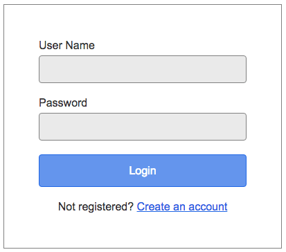
Below is a simple log-in form web component that encapsulates all of its styles.
<template id="login-form-template">
  <style>
    :host {
      color: #333333;
      font: 16px Arial, sans-serif;
    }

    p {
      margin: 0;
    }

    p + p {
      margin-top: 20px;
    }

    a {
      color: #1f66e5;
    }

    label {
      display: block;
      margin-bottom: 5px;
    }

    input[type="text"],
    input[type="password"] {
      background-color: #eaeaea;
      border: 1px solid grey;
      border-radius: 4px;
      box-sizing: border-box;
      color: inherit;
      font: inherit;
      padding: 10px 10px;
      width: 100%;
    }

    input[type="submit"] {
      font: 16px/1.6 Arial, sans-serif;
      color: white;
      background: cornflowerblue;
      border: 1px solid #1f66e5;
      border-radius: 4px;
      padding: 10px 10px;
      width: 100%;
    }

    .container {
      max-width: 300px;
      padding: 50px;
      border: 1px solid grey;
    }

    .footnote {
      text-align: center;
    }
  </style>

  <div class="container">
    <form action="#">
      <p>
        <label for="username">User Name</label>
        <input type="text" id="username" name="username">
      </p>
      <p>
        <label for="password">Password</label>
        <input type="password" id="password" name="password">
      </p>
      <p>
        <input type="submit" value="Login">
      </p>
      <p class="footnote">Not registered? <a href="#">Create an account</a></p>
    </form>
  </div>
</template>

<script>
  const doc = (document._currentScript || document.currentScript).ownerDocument;
  const template = doc.querySelector('#login-form-template');

  customElements.define('login-form', class extends HTMLElement {
    constructor() {
      super();

      const root = this.attachShadow({mode: 'closed'});
      const temp = document.importNode(template.content, true);

      root.appendChild(temp);
    }
  });
</script>
Note: Code examples are written in the version 1 specification for web components.
However, fully encapsulating every web component would inevitably lead to a lot of duplicate CSS, especially when it comes to setting up the typography and styling of native elements. If a developer wants to use a paragraph, an anchor tag or an input field in their web component, it should be styled like the rest of the website.
If we fully encapsulate all of the styles that the web component needs, then the CSS for styling paragraphs, anchor tags, input fields and so on would be duplicated across all web components that use them. This would not only increase maintenance costs, but also lead to much larger download sizes for users.
Instead of encapsulating all of the styles, web components should only encapsulate their unique styles and then depend on a set of shared styles to handle styles for everything else. These shared styles would essentially become a kind of Normalize.css, which web components could use to ensure that native elements are styled according to the style guide.
In the previous example, the log-in form web component would declare the styles for only its two unique classes: .container and .footnote. The rest of the styles would belong in the shared style sheet and would style the paragraphs, anchor tags, input fields and so on.
In short, the style guide should not try to style the web component, but instead should provide a set of shared styles that web components can use to achieve a consistent look.
How Styling The Shadow DOM With External Style Sheets Used To Be Done
The initial specification for web components (known as version 0) allowed any external style sheet to penetrate the shadow DOM through use of the ::shadow or /deep/ CSS selectors. The use of ::shadow and /deep/ enabled you to have a style guide penetrate the shadow DOM and set up the shared styles, whether the web component wanted you to or not.
/* Style all p tags inside a web components shadow DOM */
login-form::shadow p {
  color: red;
}
With the advent of the newest version of the web components specification (known as version 1), the authors have removed the capability of external style sheets to penetrate the shadow DOM, and they have provided no alternative. Instead, the philosophy has changed from using dragons to style web components to instead using bridges. In other words, web component authors should be in charge of what external style rules are allowed to style their component, rather than being forced to allow them.
Unfortunately, that philosophy hasn’t really caught up with the web just yet, which leaves us in a bit of a pickle. Luckily, a few solutions available today, and some coming in the not-so-distant future, will allow a shared style sheet to style a web component.
What You Can Do Today
There are three techniques you can use today that will allow a web component to share styles: @import, custom elements and a web component library.
Using @import
The only native way today to bring a style sheet into a web component is to use @import. Although this works, it’s an anti-pattern. For web components, however, it’s an even bigger performance problem.
<template id="login-form-template">
  <style>
    @import "styleguide.css"
  </style>

  <style>
    .container {
      max-width: 300px;
      padding: 50px;
      border: 1px solid grey;
    }

    .footnote {
      text-align: center;
    }
  </style>

  <!-- rest of template DOM -->
</template>
Normally, @import is an anti-pattern because it downloads all style sheets in series, instead of in parallel, especially if they are nested. In our situation, downloading a single style sheet in series can’t be helped, so in theory it should be fine. But when I tested this in Chrome, the results showed that using @import caused the page to render up to a half second slower than when just embedding the styles directly into the web component.
Note: Due to differences in how the polyfill of HTML imports works compared to native HTML imports, WebPagetest.org can only be used to give reliable results in browsers that natively support HTML imports (i.e. Chrome).
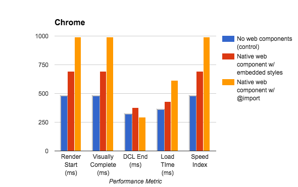
@import causes the browser to render up to a half second slower than when just embedding the styles directly into the web component.In the end, @import is still an anti-pattern and can be a performance problem in web components. So, it’s not a great solution.
Don’t Use The Shadow DOM
Because the problem with trying to provide shared styles to web components stems from using the shadow DOM, one way to avoid the problem entirely is to not use the shadow DOM.
By not using the shadow DOM, you will be creating custom elements instead of web components (see the aside below), the only difference being the lack of the shadow DOM and scoping. Your element will be subject to the styles of the page, but we already have to deal with that today, so it’s nothing that we don’t already know how to handle. Custom elements are fully supported by the webcomponentjs polyfill, which has great browser support.
The greatest benefit of custom elements is that you can create a pattern library using them today, and you don’t have to wait until the problem of shared styling is solved. And because the only difference between web components and custom elements is the shadow DOM, you can always enable the shadow DOM in your custom elements once a solution for shared styling is available.
If you do decide to create custom elements, be aware of a few differences between custom elements and web components.
First, because styles for the custom element are subject to the page styles and vice versa, you will want to ensure that your selectors don’t cause any conflicts. If your pages already use a style guide, then leave the styles for the custom element in the style guide, and have the element output the expected DOM and class structure.
By leaving the styles in the style guide, you will create a smooth migration path for your developers, because they can continue to use the style guide as before, but then slowly migrate to using the new custom element when they are able to. Once everyone is using the custom element, you can move the styles to reside inside the element in order to keep them together and to allow for easier refactoring to web components later.
Secondly, be sure to encapsulate any JavaScript code inside an immediately invoked function expression (IFFE), so that you don’t bleed any variables to the global scope. In addition to not providing CSS scoping, custom elements do not provide JavaScript scoping.
Thirdly, you’ll need to use the connectedCallback function of the custom element to add the template DOM to the element. According to the web component specification, custom elements should not add children during the constructor function, so you’ll need to defer adding the DOM to the connectedCallback function.
Lastly, the <slot> element does not work outside of the shadow DOM. This means that you’ll have to use a different method to provide a way for developers to insert their content into your custom element. Usually, this entails just manipulating the DOM yourself to insert their content where you want it.
However, because there is no separation between the shadow DOM and the light DOM with custom elements, you’ll also have to be very careful not to style the inserted DOM, due to your elements’ cascading styles.
<!-- login-form.html -->
<template id="login-form-template">
  <style>
    login-form .container {
      max-width: 300px;
      padding: 50px;
      border: 1px solid grey;
    }

    login-form .footnote {
      text-align: center;
    }
  </style>

  <!-- Rest of template DOM -->
</template>

<script>
(function() {
  const doc = (document._currentScript || document.currentScript).ownerDocument;
  const template = doc.querySelector('#login-form-template');

  customElements.define('login-form', class extends HTMLElement {
    constructor() {
      super();
    }

    // Without the shadow DOM, we have to manipulate the custom element
    // after it has been inserted in the DOM.
    connectedCallback() {
      const temp = document.importNode(template.content, true);
      this.appendChild(temp);
    }
  });
})();
</script>
<!-- index.html -->
<link rel="stylesheet" href="styleguide.css">
<link rel="import" href="login-form.html">

<login-form></login-form>
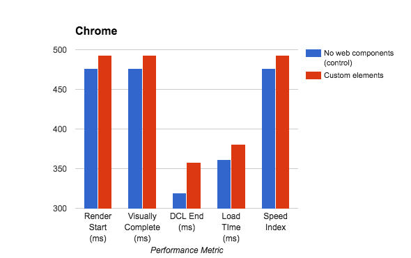
In terms of performance, custom elements are almost as fast as web components not being used (i.e. linking the shared style sheet in the head and using only native DOM elements). Of all the techniques you can use today, this is by far the fastest.
Aside: A custom element is still a web component for all intents and purposes. The term “web components” is used to describe four separate technologies: custom elements, template tags, HTML imports and the shadow DOM.
Unfortunately, the term has been used to describe anything that uses any combination of the four technologies. This has led to a lot of confusion around what people mean when they say “web component.” Just as Rob Dodson discovered, I have found it helpful to use different terms when talking about custom elements with and without the shadow DOM.
Most of the developers I’ve talked to tend to associate the term “web component” with a custom element that uses the shadow DOM. So, for the purposes of this article, I have created an artificial distinction between a web component and a custom element.
Using A Web Component Library
Another solution you can use today is a web component library, such as Polymer, SkateJS or X-Tag. These libraries help fill in the holes of today’s support and can also simplify the code necessary to create a web component. They also usually provide added features that make writing web components easier.
For example, Polymer lets you create a simple web component in just a few lines of JavaScript. An added benefit is that Polymer provides a solution for using the shadow DOM and a shared style sheet. This means you can create web components today that share styles.
To do this, create what they call a style module, which contains all of the shared styles. It can either be a <style> tag with the shared styles inlined or a <link rel="import"> tag that points to a shared style sheet. In either case, include the styles in your web component with a <style include> tag, and then Polymer will parse the styles and add them as an inline <style> tag to your web component.
<!-- shared-styles.html -->
<dom-module id="shared-styles">
  <!-- Link to a shared style sheet -->
  <!-- <link rel="import" href="styleguide.css"> -->

  <!-- Inline the shared styles -->
  <template>
    <style>
    :host {
      color: #333333;
      font: 16px Arial, sans-serif;
    }

    /* Rest of shared CSS */
    </style>
  </template>
</dom-module>
<!-- login-form.html -->
<link rel="import" href="../polymer/polymer.html">
<link rel="import" href="../shared-styles/shared-styles.html">

<dom-module id="login-form">
  <template>
    <!-- Include the shared styles -->
    <style include="shared-styles"></style>

    <style>
      .container {
        max-width: 300px;
        padding: 50px;
        border: 1px solid grey;
      }

      .footnote {
        text-align: center;
      }
    </style>

    <!-- Rest of template DOM -->
  </template>

  <script>
  Polymer({
    is: 'login-form'
  });
  </script>
</dom-module>
The only downside to using a library is that it can delay the rendering time of your web components. This shouldn’t come as a surprise because downloading the library’s code and processing it take time. Any web components on the page can’t begin rendering until the library is done processing.
In Polymer’s case, it can delay the page-rendering time by up to half a second compared to native web components. A style module that embeds the styles is slightly slower than a style module that links the styles, and embedding the styles directly into the web component is just as fast as using a style module.
Again, Polymer does nothing in particular to make the rendering time slower. Downloading the Polymer library and processing all of its awesome features, plus creating all of the template bindings, take time. It’s just the trade-off you’ll have to make to use a web component library.
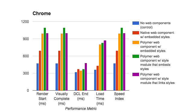
Results from performance tests show that, using Polymer, web components will render up to half a second slower than native web components.
The Promise Of The Future
If none of the current solutions work for you, don’t despair. If all goes well, within a few months to a few years, we’ll be able to use shared styles using a few different approaches.
Custom Properties
Custom properties (or CSS variables, as they’ve been called) are a way to set and use variables in CSS. This notion is not new to CSS preprocessors, but as a native CSS feature, custom properties are actually more powerful than a preprocessor variable.
To declare a custom property, use the custom property notation of –my-variable: value, and access the variable using property: var(–my-variable). A custom property cascades like any other CSS rule, so its value inherits from its parent and can be overridden. The only caveat to custom properties is that they must be declared inside a selector and cannot be declared on their own, unlike a preprocessor variable.
<style>
/* Declare the custom property */
html {
  --main-bg-color: red;
}

/* Use the custom property */
input {
  background: var(--main-bg-color);
}
</style>
One thing that makes custom properties so powerful is their ability to pierce the shadow DOM. This isn’t the same idea as the /deep/ and ::shadow selectors because they don’t force their way into the web component. Instead, the author of the web component must use the custom property in their CSS in order for it to be applied. This means that a web component author can create a custom property API that consumers of the web component can use to apply their own styles.
<template id="my-element-template">
  <style>
  /* Declare the custom property API */
  :host {
    --main-bg-color: brown;
  }

  .one {
    color: var(--main-bg-color);
  }
  </style>

  <div class="one">Hello World</div>
</template>

<script>
/* Code to set up my-element web component */
</script>

<my-element></my-element>

<style>
/* Override the custom variable with own value */
my-element {
  --main-bg-color: red;
}
</style>
Browser support for custom properties is surprisingly good. The only reason it is not a solution you can use today is that there is no working polyfill without Custom Elements version 1. The team behind the webcomponentjs polyfill is currently working to add it, but it is not yet released and in a built state, meaning that if you hash your assets for production, you can’t use it. From what I understand, it’s due for release sometime early next year.
Even so, custom properties are not a good method for sharing styles between web components. Because they can only be used to declare a single property value, the web component would still need to embed all of the styles of the style guide, albeit with their values substituted with variables.
Custom properties are more suited to theming options, rather than shared styles. Because of this, custom properties are not a viable solution to our problem.
@apply Rules
In addition to custom properties, CSS is also getting @apply rules. Apply rules are essentially mixins for the CSS world. They are declared in a similar fashion to custom properties but can be used to declare groups of properties instead of just property values. Just like custom properties, their values can be inherited and overridden, and they must be declared inside a selector in order to work.
<style>
/* Declare rule */
html {
  --typography: {
    font: 16px Arial, sans-serif;
    color: #333333;
  }
}

/* Use rule */
input {
  @apply --typography;
}
</style>
Browser support for @apply rules is basically non-existent. Chrome currently supports it behind a feature flag (which I couldn’t find), but that’s about it. There is also no working polyfill for the same reason as there is no polyfill for custom properties. The webcomponentjs polyfill team is also working to add @apply rules, along with custom properties, so both will be available once the new version is released.
Unlike custom properties, @apply rules are a much better solution for sharing styles. Because they can set up a group of property declarations, you can use them to set up the default styling for all native elements and then use them inside the web component. To do this, you would have to create an @apply rule for every native element.
However, to consume the styles, you would have to apply them manually to each native element, which would still duplicate the style declaration in every web component. While that’s better than embedding all of the styles, it isn’t very convenient either because it becomes boilerplate at the top of every web component, which you have to remember to add in order for styles to work properly.
/* styleguide.css */
html {
  --typography: {
    color: #333333;
    font: 16px Arial, sans-serif;
  }

  --paragraph: {
    margin: 0;
  }

  --label {
    display: block;
    margin-bottom: 5px;
  }

  --input-text {
    background-color: #eaeaea;
    border: 1px solid grey;
    border-radius: 4px;
    box-sizing: border-box;
    color: inherit;
    font: inherit;
    padding: 10px 10px;
    width: 100%;
  }

  --input-submit {
    font: 16px/1.6 Arial, sans-serif;
    color: white;
    background: cornflowerblue;
    border: 1px solid #1f66e5;
    border-radius: 4px;
    padding: 10px 10px;
    width: 100%;
  }

  /* And so on for every native element */
}
<!-- login-form.html -->
<template id="login-form-template">
  <style>
    :host {
      @apply --typography;
    }

    p {
      @apply --paragraph;
    }

    label {
      @apply --label;
    }

    input-text {
      @apply --input-text;
    }

    .input-submit {
      @apply --input-submit;
    }

    .container {
      max-width: 300px;
      padding: 50px;
      border: 1px solid grey;
    }

    .footnote {
      text-align: center;
    }
  </style>

  <!-- Rest of template DOM -->
</template>
Due to the need for extensive boilerplate, I don’t believe that @apply rules would be a good solution for sharing styles between web components. They are a great solution for theming, though.
In The Shadow DOM
According to the web component specification, browsers ignore any <link rel="stylesheet"> tags in the shadow DOM, treating them just like they would inside of a document fragment. This prevented us from being able to link in any shared styles in our web components, which was unfortunate — that is, until a few months ago, when the Web Components Working Group proposed that <link rel="stylesheet"> tags should work in the shadow DOM. After only a week of discussion, they all agreed that they should, and a few days later they added it to the HTML specification.
<template id="login-form-template">
  <link rel="stylesheet" href="styleguide.css">

  <style>
    .container {
      max-width: 300px;
      padding: 50px;
      border: 1px solid grey;
    }

    .footnote {
      text-align: center;
    }
  </style>

  <!-- rest of template DOM -->
</template>
If that sounds a little too quick for the working group to agree on a specification, that’s because it wasn’t a new proposal. Making link tags work in the shadow DOM was actually proposed at least three years ago, but it was backlogged until they could ensure it wasn’t a problem for performance.
If acceptance of the proposal isn’t exciting enough, Chrome 55 (currently Chrome Canary) added the initial functionality of making link tags work in the shadow DOM. It even seems that this functionality has landed in the current version of Chrome. Even Safari has implemented the feature in Safari 18.
Being able to link in the shared styles is by far the most convenient method for sharing styles between web components. All you would have to do is create the link tag, and all native elements would be styled accordingly, without requiring any additional work.
Of course, the way browser makers implement the feature will determine whether this solution is viable. For this to work properly, link tags would need to be deduplicated, so that multiple web components requesting the same CSS file would cause only one HTTP request. The CSS would also need to be parsed only once, so that each instance of the web component would not have to recompute the shared styles, but would instead reuse the computed styles.
Chrome does both of these already. So, if all other browser makers implement it the same way, then link tags working in the shadow DOM would definitely solve the issue of how to share styles between web components.
Constructable Style Sheets
You might find it hard to believe, since we haven’t even got it yet, but a link tag working in the shadow DOM is not a long-term solution. Instead, it’s just a short-term solution to get us to the real solution: constructable style sheets.
Constructable style sheets are a proposal to allow for the creation of StyleSheet objects in JavaScript through a constructor function. The constructed style sheet could then be added to the shadow DOM through an API, which would allow the shadow DOM to use a set of shared styles.
Unfortunately, this is all I could gather from the proposal. I tried to find out more information about what constructable style sheets were by asking the Web Components Working Group, but they redirected me to the W3C’s CSS Working Group’s mailing list, where I asked again, but no one responded. I couldn’t even figure out how the proposal was progressing, because it hasn’t been updated in over two years.
Even so, the Web Components Working Group uses it as the solution for sharing styles between web components. Hopefully, either the proposal will be updated or the Web Components Working Group will release more information about it and its adoption. Until then, the “long-term” solution seems like it won’t happen in the foreseeable future.
Lessons Learned
After months of research and testing, I am quite hopeful for the future. It is comforting to know that after years of not having a solution for sharing styles between web components, there are finally answers. Those answers might not be established for a few more years, but at least they are there.
If you want to use a shared style guide to style web components today, either you can not use the shadow DOM and instead create custom elements, or you can use a web component library that polyfills support for sharing styles. Both solutions have their pros and cons, so use whichever works best for your project.
If you decide to wait a while before delving into web components, then in a few years we should have some great solutions for sharing the styles between them. So, keep checking back on how it’s progressing.
Things To Keep In Mind
Keep in mind a few things if you decide to use custom elements or web components today.
Most importantly, the web component specification is still being actively developed, which means that things can and will change. Web components are still very much the bleeding edge, so be prepared to stay on your toes as you develop with it.
If you decide to use the shadow DOM, know that it is quite slow and unperformant in polyfilled browsers. It was for this reason that Polymer’s developers created their shady DOM implementation and made it their default.
Chrome, Opera and, recently, Safari are the only browsers that support the shadow DOM version 0. Firefox is still in development, although it has supported it behind an experiment since version 29. Microsoft is still considering it for Edge and has it as a high priority on its road map.
However, shadow DOM version 0 is the old specification. Shadow DOM version 1 is the new one, and only Chrome, Safari and Opera fully support it. Not to mention that custom elements version 0 went through the same upgrade, and only Chrome fully supports custom elements version 1, whereas Safari technical preview supports it as of version 17. Custom elements version 1 has some major changes in how web components are written, so be sure to fully understand what that entails.
Lastly, the webcomponentjs polyfill only supports the version 0 implementation of the shadow DOM and custom elements. A version 1 branch of the polyfill will support version 1, but it’s not yet released.
Further Reading
- Enforcing Best Practices In Component-Based Systems
- How To Use The LESS CSS Preprocessor For Smarter Style Sheets
- A Deep Dive Into Adobe Edge Reflow
- Building A Retro Draggable Web Component With Lit
 (il, vf, yk, al, mrn)

