Designing A Responsive Music Player In Sketch (Part 1)

Email Newsletter
Weekly tips on front-end & UX.
Trusted by 182,000+ folks.
 Register Free Now
 Celebrating 10 million developers
 SurveyJS: White-Label Survey Solution for Your JS App


Music plays a big role in my life. For the most part, I listen to music when I’m commuting, but also when I’m exercising or doing some housework. It makes the time fly, and I couldn’t imagine living without it.
However, one thing that has always bothered me is that the controls of music apps can be quite small and hard to catch. This can be a major issue, especially in the car, where every distraction matters. Another issue, in particular with the recent redesign of iOS’ Music app, is that you can’t directly like tracks anymore and instead need to open a separate dialog. And I do that a lot — which means one needless tap for me. Lastly, I’ve always wished for a “dark” mode in Apple’s app. I’ve tried to fix all of these issues in my own take on a music player interface. Let me walk you through the creation process in Sketch in this two-part series. The workflow is effective, and we’ll get to use keyboard shortcuts.
Note: You can download the editable Sketch file of the player. Feel free to modify or use it as a base for your own work.
Universally Usable
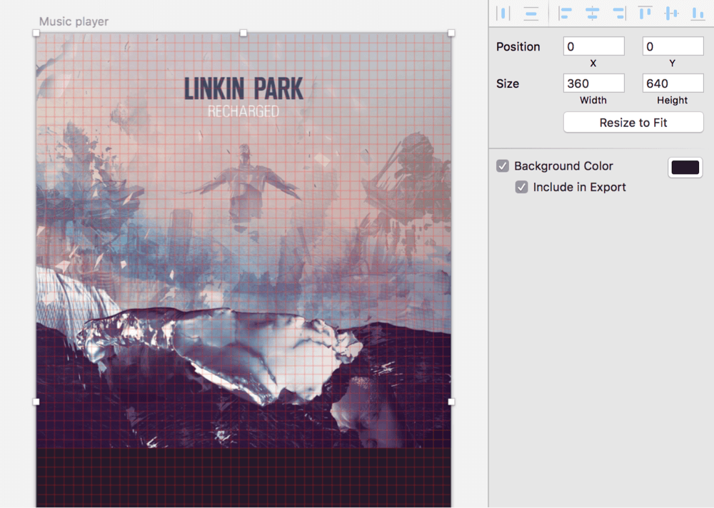
Though I’m a die-hard Apple fan, I wanted to keep the interface as universal as possible. Therefore, I stuck to a pretty common device size of 360 × 640 pixels, which can be found under “Mobile Portrait” in the “Material Design” category of the Inspector panel, after you have pressed A. It’s easy to adapt to other devices from the common ratio of 1:1.778, no matter which platform or size.
For a clean starting point, rename the new artboard to “Music player” using Cmd + R (confirm with Enter), and move it to an X and Y position of 0: Press Alt + Tab to jump to the X field, enter 0, press Tab to proceed to Y, and insert 0 again. Complete this action by pressing Escape twice, and bring the artboard back into view with Cmd + 1. You can read more about the usage (and advantages) of artboards in the official documentation.
Before we start designing, let’s set up an 8-pixel grid, which will provide some constraints for the layout. Think of it as an aid, providing some predefined positions to place elements. It will also make you think less about the dimensions of elements, because multiples of 8 will be the natural way to measure them. Lastly, you will be simplifying the implementation process for the developers, because they can rely on a grid system and will be able to make decisions on their own. (Spec has a guide about grids in general and about 8-point grids in particular.)
Go to “View” → “Canvas” → “Grid Settings” in the menu bar, enter “8px” for the “Grid block size” and “0” for the “Thick lines” and confirm with “OK.” This will present you with a grid, which you can toggle from now on using the Ctrl + G shortcut.
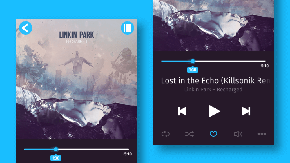
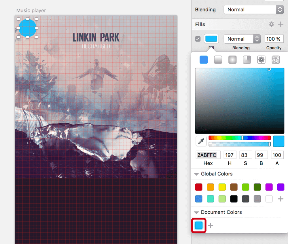
For the album cover, I didn’t have to think twice: Linkin Park has been my favorite band for a long time now, and I can’t stop listening to their remix album Recharged. Please note that all rights to the cover art are held by Linkin Park and Warner Bros. Records. Of course, you are free to use whatever cover you’d like — just make sure that it’s square. Drag it into Sketch (or copy and paste it), and move it to the top-left corner of the new artboard. To scale the image to the full width of the artboard, lock the aspect ratio first by clicking on the lock icon between the width and height fields. Then, enter “100%” in the width field, which will expand the cover to fill the whole width of the artboard. Rename it to “Cover.”
Because we want to go for a dark theme, select the artboard again, so that you are able to set the background color after you have checked the corresponding checkbox. I went for #251929, a very dark gray, with some color sprinkled in to make it less dull. Be sure that “Include in Export” is also checked for the artboard. This will ensure that the background color is maintained when you want to export the design later.
First Things First
The first element we’ll add is the back button in the top-left corner. Press O to switch to the Oval tool, hold Shift, and drag a circle. Let it snap to the grid with a diameter of “40.” Jump into the Inspector with Alt + Tab, so that you can move it to an X and Y position of “8.” Both the shape’s dimensions and position will adhere to the grid now. With #2abffc, I’ve chosen a rather bright color, which contrasts well with the cover. Be sure to pick a color that does the same for the type of cover you’ve chosen. Add it to the “Document Colors” in the color dialog (with a click on the “+” icon), so that we can reuse it later. Finally, get rid of the default gray border with B.
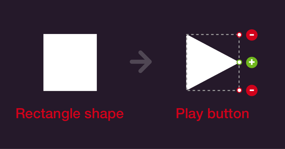
Let’s continue with the arrow itself. One’s first idea might be to use the Triangle tool, but I prefer a Rectangle. It has a keyboard shortcut assigned by default (R), and you don’t need to rotate the shape to set the direction of the arrow.
Start by zooming into the circle with Cmd + 2. (This might reveal another type of grid, the pixel grid, which visualizes every single pixel. We don’t need it in the course of this tutorial, so switch it off with Ctrl + X, which will toggle the pixel grid on and off.)
Now, press R for the Rectangle tool, and drag a rectangle on top of the circle with a size of 14 × 20 pixels. After that, enter vector point mode with Enter, and Cmd + click on the left side of the rectangle to add a point in the exact middle. Select the top-left point, then Shift + click on the bottom-left point, so that both are selected, and delete them. Leave vector point mode again with Escape (you need to press it twice).
This has brought us big step closer to the final appearance of the arrow, but we still need to delete the right side of the shape. To prepare for this step, make sure that it has a border applied, so that the change becomes more evident. Select the Scissors tool from “Layer” → “Paths” in the menu bar, then click on the right side of the triangle to remove that segment and create an open arrow. Dismiss the tool with Escape when you are done.
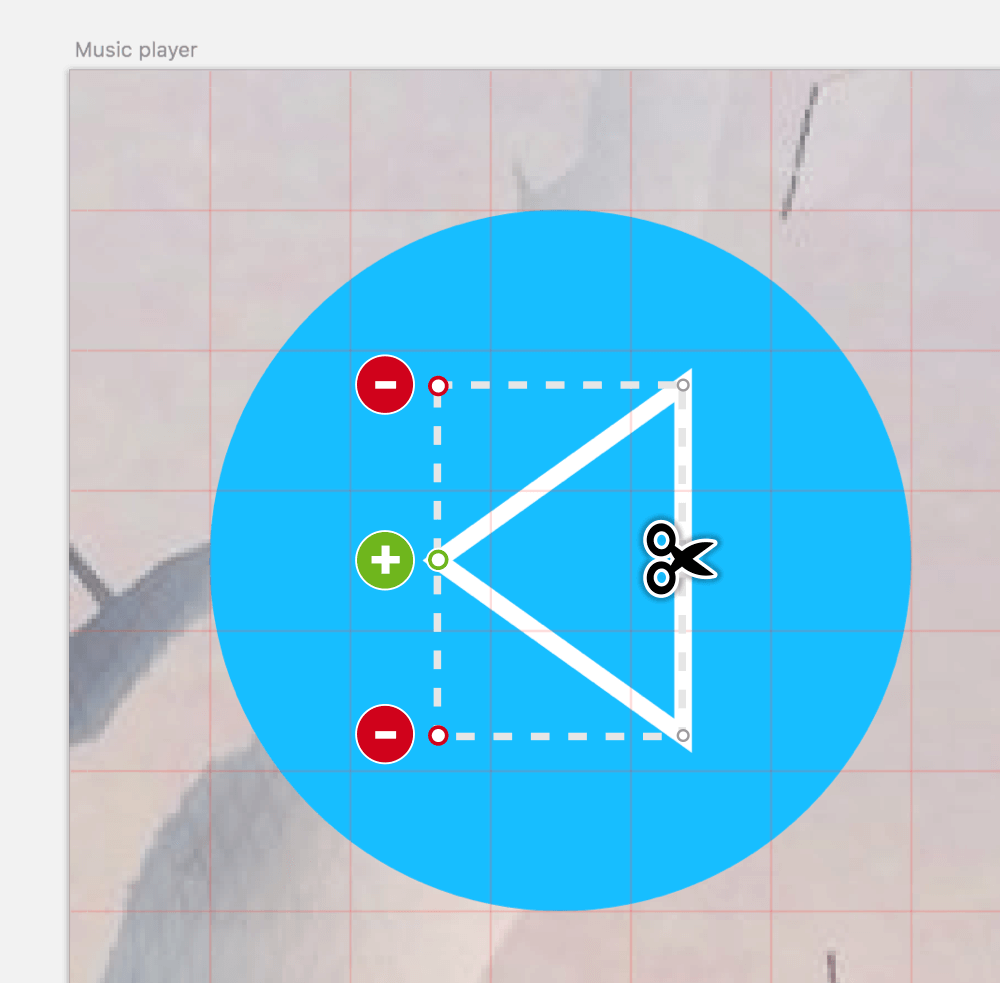
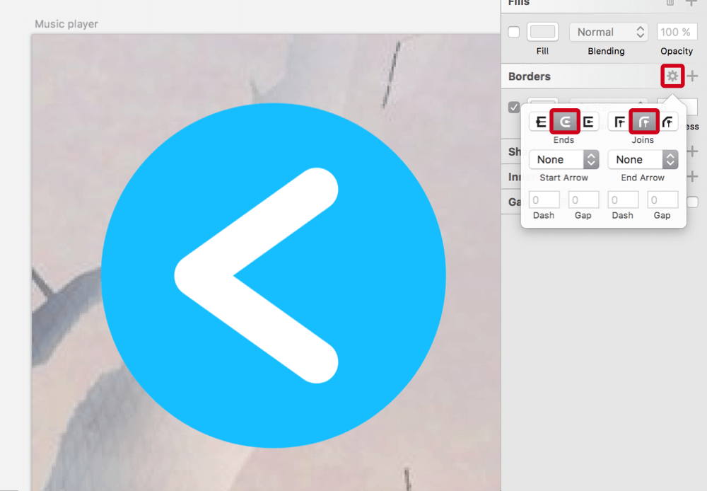
For the final look, set the border color to white, the position to “Center” and the thickness to “4.” Also, click on the gear icon above “Thickness” in the Inspector to open the border options, and set both the “Ends” and “Joins” to rounded (the middle icon for each). Finally, select both the circle and the arrow, right-click and pick “Align Middle,” followed by “Align Center”; after that, select just the arrow and move it a few pixels to the left to give it proper optical alignment and balance.
One To Many
This won’t be the last time we need an arrow of this kind, so convert it to a symbol for easy reusability using “Create Symbol” from the toolbar. Name it “Arrow,” and check “Send Symbol to ‘Symbols’ Page.”
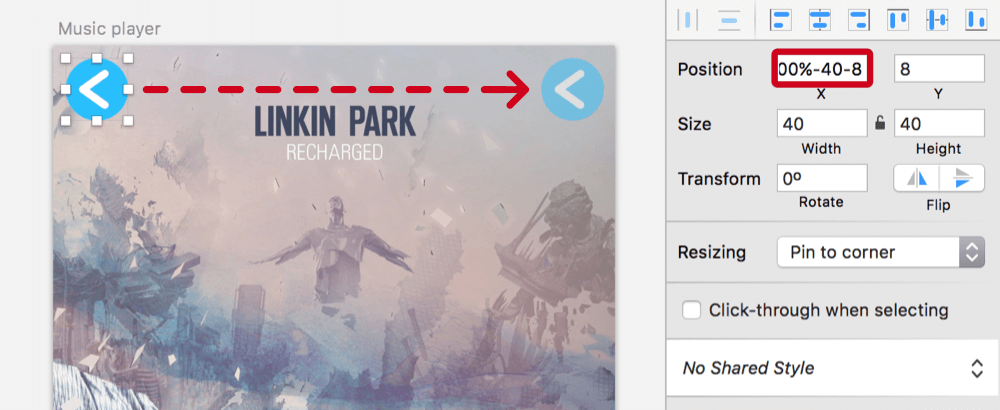
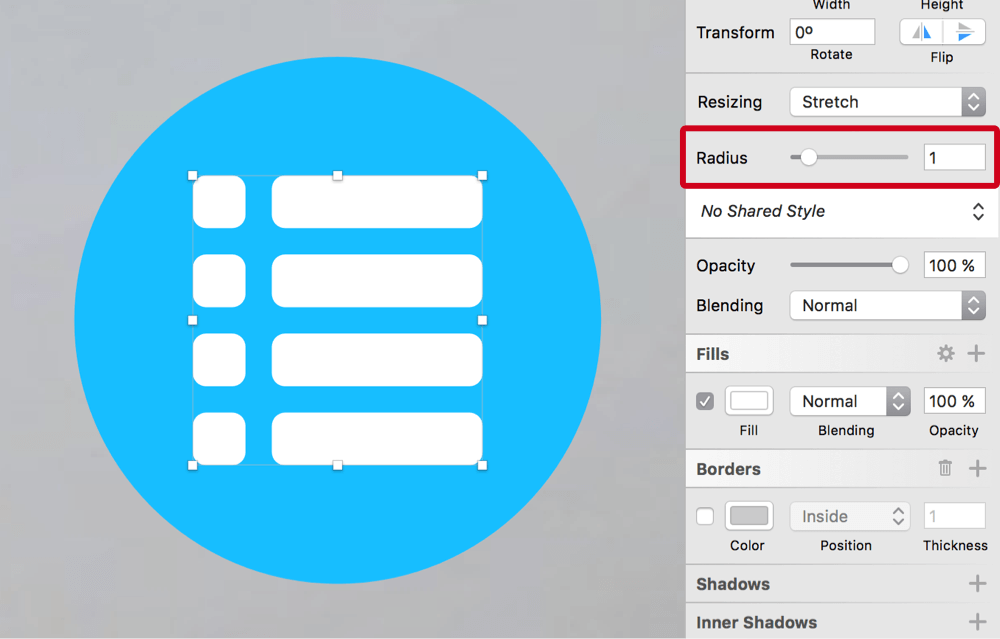
To bring some order to the layers list, rename the circle to “BG” with Cmd + R. Select the circle and the arrow, and create a new group with Cmd + G. Rename this group to “Back.” You can take this back button as a base for the other button in the top-right of the screen, the one to show the list of available tracks. Press Cmd + D to duplicate it, jump to the “X” field in the Inspector, and enter “100%-40-8”: This will move the group, which has a width of 40 pixels, to the right side of the artboard, but will leave a gap of 8 pixels. Center the canvas to it with Cmd + 2, and rename it to “List.” Now, select the arrow with a Cmd + click, delete it, but add a rectangle with a size of 4 × 4 pixels: This will be the base for all other shapes of the list icon.
Duplicate it, move it 6 pixels to the right with the arrow key on the keyboard (so that it has a gap of 2 pixels from the other rectangle), hold Cmd and press the right arrow key again until the shape has a width of 16 pixels. Make sure that the ratio isn’t locked or else you’ll get a square instead. You can also add Shift while holding Cmd to go in increments of 10 pixels. After that, select both rectangles, hold Alt and drag them down until they have a gap of 2 pixels (it might help to zoom in with Cmd + +). This will create copies of the shapes; if you press Cmd + D now, you will create more duplicates with the same spacing. Repeat until you have four lines in total.
Select all of the rectangles in the layers list so that you can combine them with a Union Boolean operation (press Alt + Cmd + U). This will allow you to set the fill color to white and the radius to “1” for all layers at once. Rename it to “Icon,” drag it into the “List button” group, and center it to the circle in both directions. You can center the artboard again with Cmd + 1.
Make Some Progress
Let’s turn to the first actual element of the player: the progress indicator below the cover. It can be created either with lines or with rectangles; the latter are a tad easier to handle because they always start on full pixels.
Author’s note (05/Jan/2017): By default, the tooltip with the time mark is displayed below the progress indicator (to have enough distance to the cover). As soon as the user interacts with it, the position of the tooltip is flipped, to be above the indicator. This prevents the element from being covered by a finger. Thanks for the comments pointing out this issue.
Use the grid to add one with a spacing of 24 pixels (3 grid units) to both the left and right sides of the artboard. This will result in a width of 312 pixels. The height doesn’t matter now because it will be easier to set it to 4 pixels in the Inspector afterwards. Be sure to align it to the grid in the vertical direction: It should be about three grid units (24 pixels) away from the cover and sit on a grid line. After you have set the color to white and dragged the radius slider all the way to the right, duplicate this shape for the progress bar itself. It is supposed to have a length of about 30%. Instead of resizing it manually, add *0.3 to the width in the Inspector, and confirm with Enter. For the fill, choose the bright color that we added to the document colors earlier when creating the buttons.
Zoom in to about 400% and overlay it with a circle of the same color. The dimensions should be 12 × 12. This shape will make the current position indicator of the song even more obvious. Drag it over to the colored bar until the circle’s center is aligned to the right side of the colored bar. (You might want to switch off the grid temporarily with Ctrl + G for this action.)
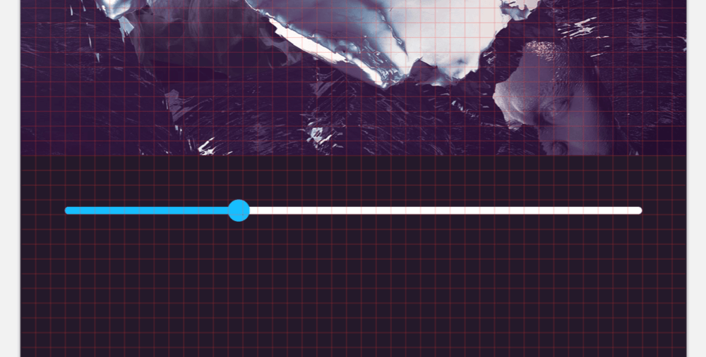
For a subtle effect, I’ve added a comet tail behind the circle: Create a square of the same size, at the same position, and resize it to 18 pixels from the center while holding Alt and Shift. Now, drag its left side out until it has a width of 28 pixels (ensure that the ratio isn’t locked in the Inspector). Instead of fully rounded corners on all edges, we just need them on the right side: Enter vector point mode with Enter or a double-click on the object, and drag a selection that includes just these two points. Move the “Corners” slider in the Inspector all the way to the right now, and leave vector point mode. After that, use the Transform tool from the toolbar (or press Shift + Cmd + T) to narrow the shape on the left side: Drag the top-left point down for that.
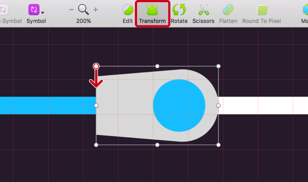
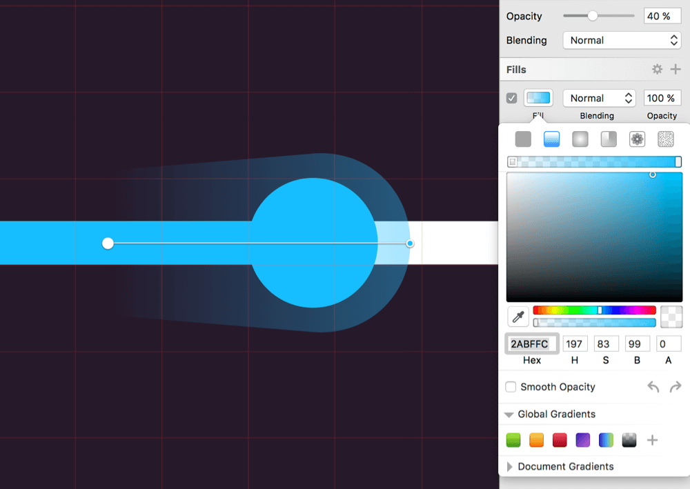
The fill of the comet’s tail should have the same color as the circle and fade to transparent on the left. Add a horizontal linear gradient (you can use the left-pointing arrow next to “Smooth Opacity” in the color dialog to rotate it), going from 0% alpha (the “A” value in the color dialog) on the left side to 100% on the right side. Use the color picker with Ctrl + C to take over the color from the circle for both color stops. Set the whole layer to 40% opacity with 4 on the keyboard after you have left the color dialog.
Time to rename all of the layers for proper recognition. Set the white bar in the back to “Bar,” the colored one to “Bar progress,” the circle to “Indicator” and the tail to “Comet’s tail.” All of them need to reside in a “Progress indicator” group. Move it to the very bottom of the layer hierarchy with Ctrl + Alt + Cmd + down arrow.
What would such a progress indicator be without time marks? For the length of the song, add a text layer with T at the end of the bar, reading “–5:10”. I have chosen the free typeface Fira Sans from Mozilla, because it works great for user interfaces. Use its bold weight, with a size of 12 pixels and a color of white. It should be about 1 grid unit away from the bar vertically and centered to the end point on the horizontal axis. Duplicate the layer for the current position indicator of the song, but set the contents to “1:30”. Move this second text layer below the circle. Now, drag a rectangle with the size of 32 × 16 pixels, and assign it the same color as the circle, as well as rounded corners of “2.” This rectangle will enlarge the tappable area and ensure that the position indicator of the song can be dragged more easily.
Move this shape behind the text with Alt + Cmd + down arrow, and center them in both directions. In addition to the rectangle, the background will consist of a triangle that ties it to the progress indicator. For this one, we can actually use a triangle (“Insert” → “Shape” → “Triangle” in the menu bar), with dimensions 10 × 5 pixels. Switch off the grid temporarily (with Ctrl + G), and drag the shape to the top of the rectangle, where you can align it with the help of smart guides. Use them in the same way to center the triangle to the rectangle horizontally. Create a combined shape with a Union Boolean operation from these shapes, and add it to another “Progress time” group, together with the text layer. Make sure that it is centered to the circle on the horizontal axis and has a gap of about 7 pixels from it. Ideally, its bottom will sit on a grid line. Finally, drag this new group into the “Progress indicator” group from before, together with the second text layer (the one with “–5:10”). Well done!

The Name Of The Game
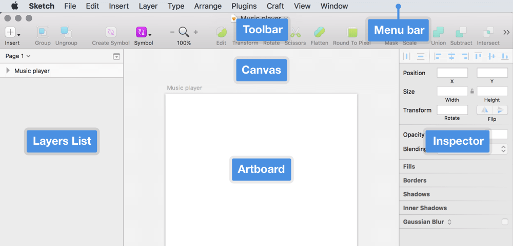
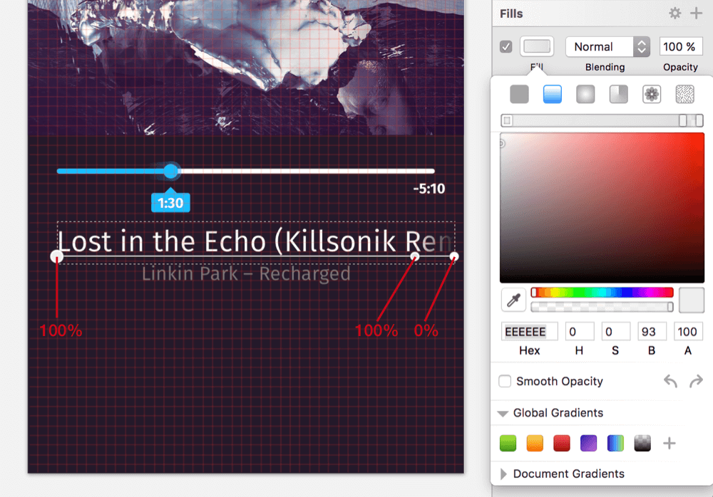
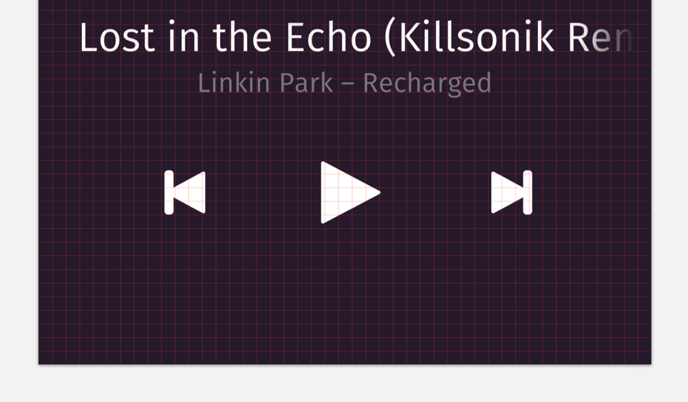
Now we’re onto the next task: the title, artist and album of the currently playing track. After you have zoomed out to the full size of the artboard again (press Cmd + 1), add a new text layer for the title, but don’t change the contents yet. To guarantee legibility, set the font size to 24 pixels, and for the weight, use “Book” (which equates to “Regular” in other fonts). Give it a spacing of 24 pixels (3 grid units) from the left edge of the artboard; in the vertical direction, almost no spacing is needed from the progress indicator. The baseline of the text itself (not of the text box) should just sit on a grid line. Be sure that the “Alignment” is set to left in the Inspector panel. The length of the current song’s title, “Lost in the Echo (Killsonik Remix)” (my favorite track on the album, by the way), prevents it from fitting on a single line, so it should fade out at the end and slide left and right while the track is playing to reveal the full title.
We could use a normal linear gradient for that, like for the comet tail, but let’s take an alternative approach. We can use an alpha mask.
Drag a rectangle that starts at the left edge of the text and goes almost to the right of the artboard, with spacing of just 1 grid unit; vertically, it should cover the whole text but be behind in the layer hierarchy (move it there with Alt + Cmd + down arrow). Select both elements (the rectangle and the text layer) and click on the “Mask” button in the toolbar. This will create a dedicated group.
Now, select the mask layer and add to it another horizontal linear gradient. Set the gradient on the left to 100% alpha (enter this value in the “A” field in the color dialog), add another stop on the canvas with a click on the gradient axis, and press 9 to move the stop to the 90% position there. (Note: If you are editing a gradient or have just added a gradient stop, then the number keys (1 to 9) will set the stop’s position.) Use 100% alpha again for this new stop. The color stop at the end should have a “0%” alpha value. Setting the mask layer to an alpha mask (“Layer” → “Mask Mode” in the toolbar) will give you the faded text.
Note: The colors of the stops in an alpha mask do not matter, just the opacity: 100% will fully reveal the masked content, while 0% will hide it.
In contrast, the artist and album name can be rather small. Duplicate the text layer of the title, set the size to 16 pixels, and tone it down to 40% opacity with 4 on the keyboard. Move it out of the mask group in the layers list, put it on a grid line below the title with reasonable spacing, and center it — both on the canvas and in the “Alignment” of the Inspector panel. For the latter, you could also press Cmd + | or go to “Type” → “Center” in the menu bar. The contents should certainly reflect the cover — in my case, this is “Linkin Park — Recharged.” Finally, push both text layers to the bottom of the layer hierarchy (with Ctrl + Alt + Cmd + down arrow).
Full Control
Now, on to the most important elements of the music player: the controls.
Let’s start with the play button. It is very similar to the arrow we used for the back icon, so we can take a similar approach. First, create a rectangle with dimensions of 36 × 38 pixels below the text layers we just set up. These dimensions should make the control big enough to easily spot (and tap), even from a quick glance.
After that, enter vector point mode with Enter, add a new point to the right side of the shape while holding Cmd key (so that it is created in the exact middle), and delete the points above and below. Also, select all points with Cmd + A, and change the “Corners” in the Inspector to “2.” Leave vector point mode with Escape (press it twice), and finish the arrow by removing the default border with B and setting the fill color to white. Move it 5 grid units (40 pixels) from the text layer above, and center it to the page. It also needs proper optical alignment, so move it about 4 pixels to the right with the respective arrow key on the keyboard.
This arrow can serve as a symbol for the remaining controls. Name it “Play,” and send it to the symbols page. Now, go to this very page with a double-click on the new symbol.
First, you’ll see… well, nothing — a white shape on a white background. Press Escape to select the play symbol itself (not the shape!), and set the background color to black in the Inspector panel; but uncheck “Include in Export” (otherwise, the background color — which is used here just for display purposes — would also be exported.)
Now you can duplicate this symbol and rename it to next. Delete the triangle shape, and insert another “Play” symbol at the same place. To finish this control button, add a rectangle on the right side with a full height, a white fill, a width of 8 pixels and a radius of “2.” This will create a nested symbol that takes the arrow from the play symbol but adds another element on top of it. The moment you change it, all instances of this symbol will be modified, too.
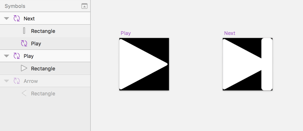
Return to the music player page with Fn + up arrow, and insert the new “Next” symbol to the right of the play button. Finish it by resizing it to 24 × 26 pixels. The symbol should be vertically centered to the play button and be spaced about 64 pixels from it. Duplicate it, flip it horizontally, rename it to “Previous” for the other control button, and move it to the left of the play button, this time with spacing of 68 pixels. If you try to change the color of the play symbol now or modify its shape on the Symbols page, you’ll see that these changes get propagated to the other controls. May the power of symbols be with you!
Finish the control buttons by moving them into a dedicated “Buttons” group, which should be at the bottom of the layers list.
Conclusion
This ends the first part of the tutorial. In the second part, I will show you how to create the icons at the bottom of the player and show the workflow to make the player responsive, so that it can be easily adapted to other device widths.
I hope you’ve enjoyed this first part and learned about using Sketch effectively for mobile app design. In the comments below, feel free to post your questions or to mention alternative approaches to making a certain part of the music player. You can also contact me on Twitter (@SketchTips) or visit my little side project, SketchTips, where I provide more great tips on using Sketch.
Further Reading
- Using Sketch For Responsive Web Design
- Sketch Vs. Figma: The Showdown
- Designing With Real Data In Sketch Using The Craft Plugin
- Sketch With Material Design
 (mb, al, il, mrn)

