MJML – How To Make Responsive HTML Email Coding Easy

Email Newsletter
Weekly tips on front-end & UX.
Trusted by 182,000+ folks.


 Celebrating 10 million developers

 Custom Web Forms for Angular, React, & Vue. Your backend.
Email is one of the best ways to engage with your users, especially during the holiday season. However, if you want to stand out, no matter how beautiful your emails are, you need to make sure they render correctly in your reader’s inbox, regardless of what email client they’re using. Creating responsive email is not an easy task, and there are various reasons for that.
First, there is no standard in the way email clients render HTML. This is true for email clients from different companies, such as Outlook and Apple Mail, but not only. Even different versions of Outlook, such as Outlook 2003, Outlook 2013 and Outlook.com, render HTML differently.
Then, while email clients render HTML, many of them have very limited support of it. Some email clients will just strip the head of your HTML file, including media queries, which is why inline styles are heavily recommended. On a good note, this is moving in the right direction with the Gmail update.
Now, there are a few techniques out there to help email developers. You might be familiar with some of them, such as the hybrid approach, the mobile-first approach or even the Fab Four technique by HTeuMeuLeu. But because of the reasons stated earlier, and especially the lack of a standard, none of these techniques will enable you to tame all email clients at once.
Abstracting Away The Complexity Of Responsive Email With MJML
MJML is an open-source framework that abstracts away the complexity of responsive email. The idea behind it is pretty simple. Just as jQuery normalizes the DOM and abstracts low-level interactions and animations, MJML abstracts the low-level hacks for responsive emails with an easy syntax. MJML is responsive by design. This means you can forget about nested tables and conditional comments and, more generally, about making your email responsive. MJML does it for you.
Leveraging a semantic syntax and high-level components such as the carousel (yes, you can display an interactive image gallery within an email!), MJML is really easy to learn for anyone. Responsive emails are no longer only accessible to a handful of experts anymore.
Being easy to use doesn’t mean that MJML is not powerful. It just enables experts to streamline their development workflow, while still giving them the flexibility they need with lower-level components such as tables.
For instance, our example email was coded in 788 lines of HTML and reproduced in fewer than 240 lines of MJML.
The Approach
MJML is built in React, a JavaScript library developed and maintained by Facebook, and it leverages the power of React’s components. The component names are semantic, starting with mj-, so that they are straightforward as well as easy to recognize and understand: mj-text, mj-image, mj-button, etc.
MJML will transpile to responsive HTML, following a mix of the mobile-first and hybrid coding approaches. Going mobile-first enables you to make sure that the most readable version is displayed by default in email clients that do not change the layout according to the device used.
For example, in Outlook.com, the mobile version will be displayed on both desktop and mobile (which is far more readable than a desktop version being displayed on mobile). The hybrid approach then enables the layout to change according to the device’s size wherever possible, using a mix of fallbacks, conditional comments, nested tables and media queries to target as many clients as possible. The layout degrades nicely, with multi-column layouts on desktop turning into single-column layouts on mobile.
Coding In MJML
Before we start the tutorial, let’s get ready to code in MJML. We have different ways to use MJML, such as running it locally or using the online editor. By choosing the online editor, you’ll be able to start immediately, but running it locally enables you to use MJML with your favorite code editor (with plugins for Atom, Sublime Text and Vim), task runners such as gulp-mjml and grunt-mjml and a lot more.
For this tutorial, the online editor is recommended because it doesn’t require any setup.
If you still want to use it locally, open your terminal and run npm install mjml -g (requires to have Node.js and npm installed).
Once MJML is installed, create a file named example.mjml (or any name you like) with some MJML and run mjml -r example.mjml in your terminal (make sure to be in the same folder as the file you’re rendering). It will render your MJML file in a file named example.html, with the responsive HTML inside. You can find all available options for the command line in the documentation.
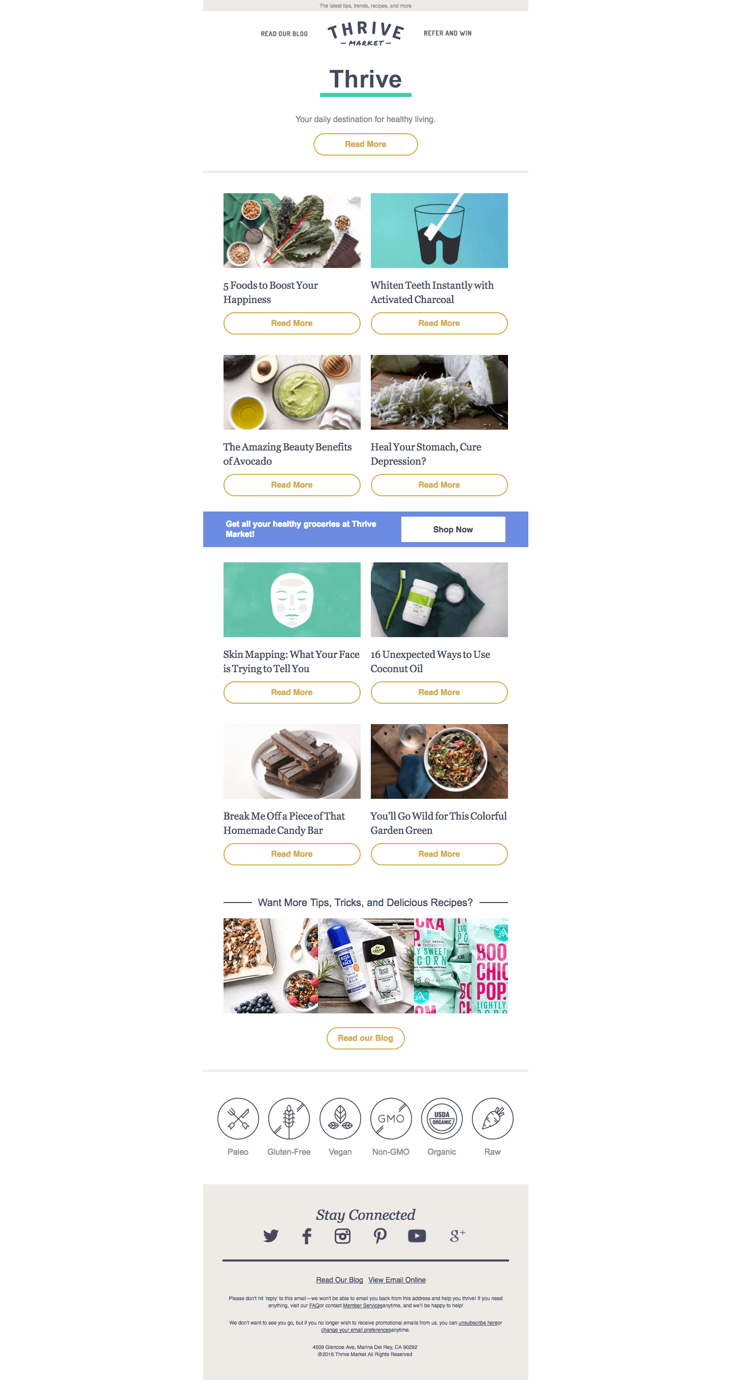
Creating Your First Newsletter With MJML
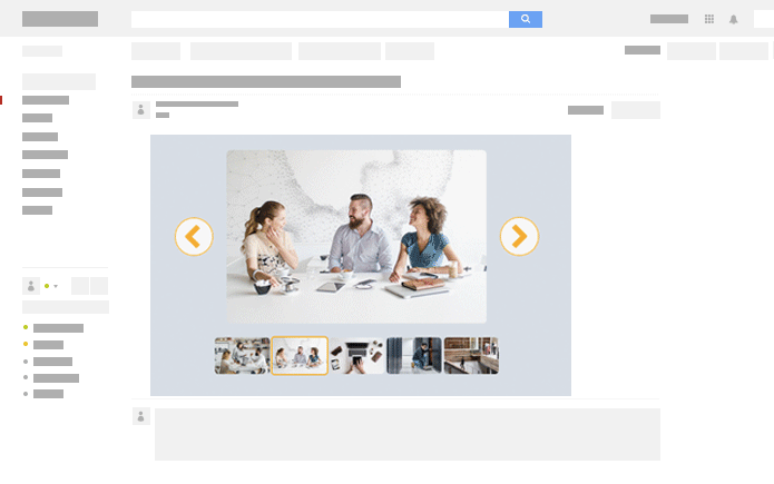
Now that you’re all set up, we can start creating a responsive newsletter together. To find inspiration, one of the best places around is ReallyGoodEmails. I found a great example of a newsletter by Thrive Market. Let’s recreate it with MJML!
(Brand names, logos and trademarks used herein remain the property of their respective owners, and their use does not imply any endorsement by or affiliation with Thrive Market.)
First, here is what the basic layout of an MJML document looks like:
<mjml>
    <mj-head>
        <!-- Head components go here: https://mjml.io/documentation/#standard-head-components -->
    </mj-head>

    <!-- All of the content of our email will go in mj-body -->
    <mj-body>
        <!-- mj-container defines the default styling of our email, including the default width, set to 600px but overwritable -->
        <mj-container>
            <!-- Body components go here (https://mjml.io/documentation/#standard-body-components) -->
        </mj-container>
    </mj-body>
</mjml>
Streamlining The Style
While inlining is the norm in HTML to ensure responsiveness, MJML also allows you to create custom MJML classes and MJML styles, which will then automatically be inlined from the head of your MJML file. In MJML, styles come as component attributes.
<mj-text font-size="20px" color="#F45E43" font-family="helvetica">
    Hello World
</mj-text>
To start, we’ll set a default sans-serif font family for text components, because sans-serif is used for most text here. Then, we’ll create classes for elements used repeatedly, so that we don’t have to manually set styles over and over again. We could have created more custom classes and styles, but the most useful styles will be for:
- buttons,
- image descriptions,
- text below the six icons in the footer.
Here, we’ll be leveraging head components in three ways:
- Set a default
paddingof0for every component, using<mj-all />. This defaultpaddingcan be overridden by manually specifying apaddingdirectly on the components we are using. - Override the default font family of
<mj-text>, using<mj-text />in the head. Each time we use<mj-text>, the default font family will besans-serif. We can still manually override this new default font by specifying a new one directly on the component. - Create classes using
<mj-class />and, more specifically, using the following mj-classes:pillThis is to design a nice button. Attributes worth noting are thebackground-colorset totransparentand theinner-padding, used to size the button as we want.descThis is to style the descriptions of the images in the two-column layout.icoThis is to style the text below the six icons just before the footer.
<mj-head>
    <mj-title>Discover the latest trends</mj-title>
    <mj-attributes>
        <mj-all padding="0" />
        <mj-text font-family="sans-serif" color="#8e8b85" />
        <mj-class name="pill" font-weight="700" color="#d5ad4b" border-radius="50" border="2px solid #d5ad4b" font-size="16px" line-height="16px" padding="8 20 20 20" inner-padding="10 75 10 75" background-color="transparent" />
        <mj-class name="desc" font-family="Georgia" font-size="20px" color="#45495d" padding="25 5 10 10" />
        <mj-class name="ico" font-family="Helvetica" font-size="14px" align="center" padding="0 0"/>
    </mj-attributes>
</mj-head>
(As you may have noticed, we have omitted the units on some attributes, such as padding. If you do so, MJML will output the attributes with px by default.)
Adding Content
Now that the styles are defined in the head (you can see here what your code should look like now), let’s start adding content to our email! MJML layouts are based on <mj-section> to create rows and <mj-column> to create columns inside rows, which is very practical for email design. Note that, except for high-level components such as <mj-hero> and <mj-navbar>, content should always be wrapped in a <mj-column>, which itself should go in a <mj-section>, even when there is only one column in a section.
Let’s see this with two examples, the preheader and the header of the email.
Preheader
There’s nothing very fancy here. We’re just creating a text preheader using the <mj-text> component, wrapped in a column, and giving it some MJML styles.
Hack: <mj-text> enables you to use HTML directly inside MJML, granting you full control over the content and allowing you to use the <span> and <a> tags you’re used to, for example.
<mj-section padding="0" background-color="#eeebe7">
    <mj-column>
        <mj-text padding="0 2" align="center" font-size="10px">
            The latest tips, trends, recipes, and more
        </mj-text>
    </mj-column>
</mj-section>
Header
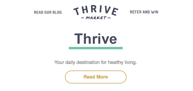
Three-Column Layout For Blog, Logo And Referral Link
The header is a bit fancier but very easy to achieve with MJML. All we have to do is create a section that we’ll split into three equal columns (because columns are equal, we don’t even have to manually set the width). We’ll use images as in the original email, leveraging the explicit component <mj-image>, which comes with the common attributes you would expect, including src, padding and border.
By default, columns will stack in the mobile version of our email. Here, because we want those three columns to stay side by side even on mobile, we’ll wrap them in an <mj-group> component, which will prevent the columns from stacking.
Hack: As noted in the documentation, due to a bug in iOS, you might have to use a minifier, or else the columns could stack on iPhone even if they’re wrapped in <mj-group>. The MJML command-line interface comes with a built-in minifier that you can use to run the -m option when rendering MJML.
<mj-section padding="0" background-color="#ffffff">
    <mj-group>
        <mj-column>
            <mj-image align="right" padding="40 0 0 0" width="100" href="https://thrivemarket.com/blog?uid=5019850&uaexptime=1778637862&uatoken=1462b977c1fa70b09b585f3a8943d79a7079ab314393fe89852fd83fd05b631e&ccode=KG6OCD3H&utm_content=lead_welcome&utm_medium=lifecycle&utm_campaign=day8&utm_source=sailthru"
                        src="https://i1044.photobucket.com/albums/b447/ngarnier/Thrive%20Market/blog_zpscedcgvla.jpg" alt="blog" title="blog" />
        </mj-column>
        <mj-column>
            <mj-image padding="15 0 0 0" href="https://thrivemarket.com/?uid=5019850&uaexptime=1778637862&uatoken=1462b977c1fa70b09b585f3a8943d79a7079ab314393fe89852fd83fd05b631e&ccode=KG6OCD3H&utm_content=lead_welcome&utm_medium=lifecycle&utm_campaign=day8&utm_source=sailthru"
                src="https://i1044.photobucket.com/albums/b447/ngarnier/Thrive%20Market/thrive-logo-250_zps4lonavha.jpg" title="logo" alt="logo" />
        </mj-column>
        <mj-column>
            <mj-image align="left" padding="40 0 0 0" width="100" href="https://thrivemarket.com/customer/account/login/referer/aHR0cHM6Ly90aHJpdmVtYXJrZXQuY29tL2ludml0ZT9jY29kZT1LRzZPQ0QzSCZ1YWV4cHRpbWU9MTc3ODYzNzg2MiZ1YXRva2VuPTE0NjJiOTc3YzFmYTcwYjA5YjU4NWYzYTg5NDNkNzlhNzA3OWFiMzE0MzkzZmU4OTg1MmZkODNmZDA1YjYzMWUmdWlkPTUwMTk4NTAmdXRtX2NhbXBhaWduPWRheTgmdXRtX2NvbnRlbnQ9bGVhZF93ZWxjb21lJnV0bV9tZWRpdW09bGlmZWN5Y2xlJnV0bV9zb3VyY2U9c2FpbHRocnU,/"
                src="https://i1044.photobucket.com/albums/b447/ngarnier/Thrive%20Market/refer_zpsnoo1uzvu.jpg" title="refer and win" alt="refer and win" />
        </mj-column>
    </mj-group>
</mj-section>
One-Column Layout For The GIF And CTA
We’ll create another section in which we’ll simply add an image, some text and a button. The only new component here is <mj-button>, which should be clear enough and which comes with the standard attributes. Please note that you must specify an href, or else the text of the button might not display in some email clients.
<mj-section padding="20">
    <mj-column>
        <mj-image padding="5 0 23 0" width="200px" src="https://i1044.photobucket.com/albums/b447/ngarnier/Thrive%20Market/566f6a67e871e_zpskalhjefi.gif" />
        <mj-text align="center" font-size="16px">
            Your daily destination for healthy living
        </mj-text>
        <mj-button padding="20 0 10 0" mj-class="pill" href="https://thrivemarket.com/blog?uid=5019850&uaexptime=1778637862&uatoken=1462b977c1fa70b09b585f3a8943d79a7079ab314393fe89852fd83fd05b631e&utm_content=lead_welcome&utm_medium=lifecycle&utm_campaign=day8&utm_source=sailthru">
            Read more
        </mj-button>
    </mj-column>
</mj-section>
Divider Between Body And Header
Yes, there’s a component for that, too! It’s a good practice to split different rows into different sections, instead of dumping everything into the same section, because that gives you more control over styling (especially through padding), and it also makes it easier to isolate any problems that occur.
<mj-section padding="0 0 20 0">
    <mj-column>
        <mj-divider border-width="5px" border-color="#EEEBE7" />
    </mj-column>
</mj-section>
We’ll use the same divider between the body and footer later.
Body
Now that we have a beautiful header, let’s start with what seems to be the complex part of this email.
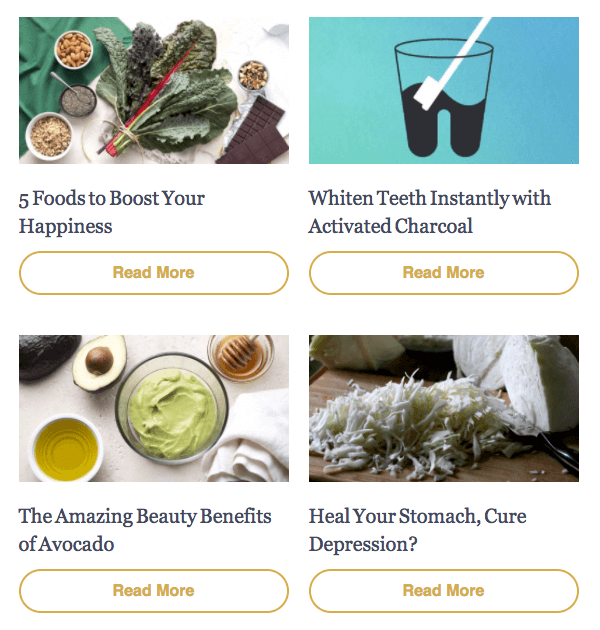
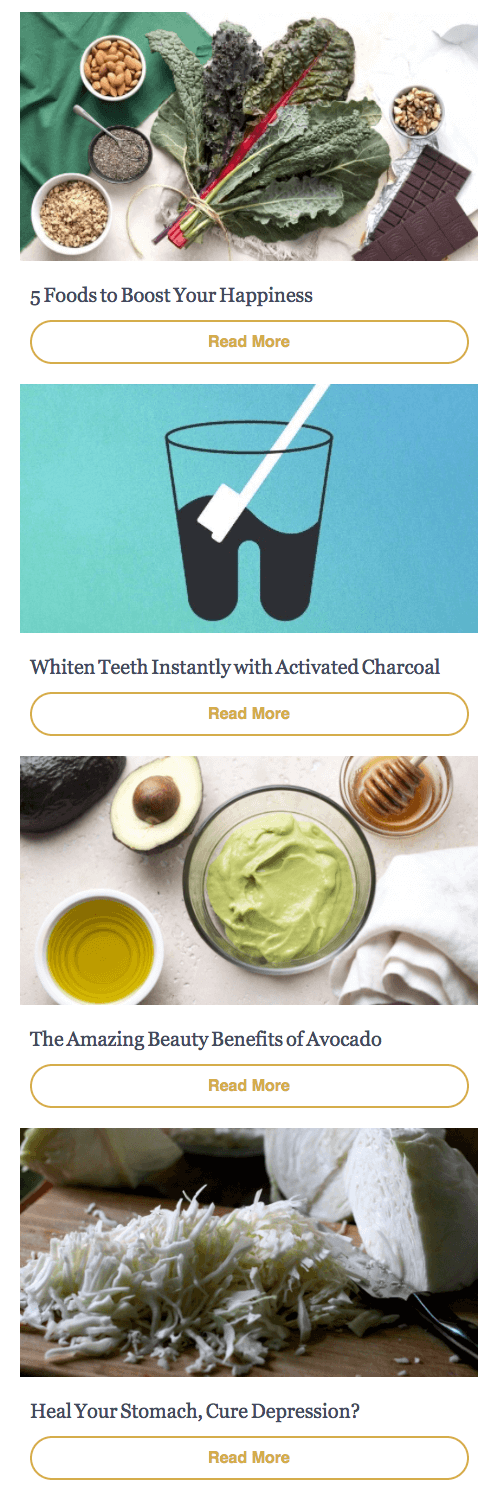
Two-Column Layout That Stacks On Mobile

Here, we’ll create a section for each two-column row. Each column will consist of an image, a piece of text and a button. The good news is that, thanks to MJML’s hybrid approach, we don’t have to do anything to make the images stack on mobile. It’s responsive by default!
Regarding the styling, we don’t have much to do because we’re leveraging the mj-classes pill and desc, which we created earlier. All we need to do is add some padding to match the style of the original email.
Hack: Due to an issue with Outlook 2000, 2002 and 2003 ignoring the set width, it’s a good practice in MJML to set images to the sizes you want them to display at in those clients.
<mj-section padding="20 10 0 10">
    <mj-column>
        <mj-image width="280px" href="https://thrivemarket.com/blog/foods-for-happiness?uaexptime=1778637862&uatoken=1462b977c1fa70b09b585f3a8943d79a7079ab314393fe89852fd83fd05b631e&uid=5019850&utm_campaign=day8&utm_content=lead_welcome&utm_medium=lifecycle&utm_source=sailthru"
            src="https://i1044.photobucket.com/albums/b447/ngarnier/Thrive%20Market/5-foods_zps9escvg7g.jpg" />
        <mj-text mj-class="desc">
            <a href="https://thrivemarket.com/blog/foods-for-happiness?uaexptime=1778637862&uatoken=1462b977c1fa70b09b585f3a8943d79a7079ab314393fe89852fd83fd05b631e&uid=5019850&utm_campaign=day8&utm_content=lead_welcome&utm_medium=lifecycle&utm_source=sailthru">
            5 Foods to Boost Your Happiness
            </a>
        </mj-text>
        <mj-button mj-class="pill" href="https://thrivemarket.com/blog/foods-for-happiness?uaexptime=1778637862&uatoken=1462b977c1fa70b09b585f3a8943d79a7079ab314393fe89852fd83fd05b631e&uid=5019850&utm_campaign=day8&utm_content=lead_welcome&utm_medium=lifecycle&utm_source=sailthru">
            Read more
        </mj-button>
    </mj-column>
    <mj-column>
        <mj-image width="280px" href="https://thrivemarket.com/blog/whiten-teeth-instantly-activated-charcoal?uaexptime=1778637862&uatoken=1462b977c1fa70b09b585f3a8943d79a7079ab314393fe89852fd83fd05b631e&uid=5019850&utm_campaign=day8&utm_content=lead_welcome&utm_medium=lifecycle&utm_source=sailthru"
            src="https://i1044.photobucket.com/albums/b447/ngarnier/Thrive%20Market/teeth_zpsr1sycjxi.jpg" />
        <mj-text mj-class="desc">
            <a href="https://thrivemarket.com/blog/whiten-teeth-instantly-activated-charcoal?uaexptime=1778637862&uatoken=1462b977c1fa70b09b585f3a8943d79a7079ab314393fe89852fd83fd05b631e&uid=5019850&utm_campaign=day8&utm_content=lead_welcome&utm_medium=lifecycle&utm_source=sailthru">
                Whiten Teeth Instantly with Activated Charcoal
            </a>
        </mj-text>
        <mj-button mj-class="pill" href="https://thrivemarket.com/blog/whiten-teeth-instantly-activated-charcoal?uaexptime=1778637862&uatoken=1462b977c1fa70b09b585f3a8943d79a7079ab314393fe89852fd83fd05b631e&uid=5019850&utm_campaign=day8&utm_content=lead_welcome&utm_medium=lifecycle&utm_source=sailthru">
            Read more
        </mj-button>
    </mj-column>
</mj-section>
Here, we can see that the default HTML style for links is applied. In addition to <mj-attributes>, you can also inline CSS right into MJML using <mj-style>. Let’s do just that by updating the head to overwrite the default style of links once and for all. We’ll also create a CSS class to apply to the <a> tags to give them the right color (we’re creating a class because the links in the email shouldn’t all have the same color).
    <mj-head>
        <mj-title>Discover the latest trends</mj-title>
        <mj-attributes>
          <mj-all padding="0" />
          <mj-text font-family="sans-serif" color="#8e8b85" />
          <mj-class name="pill" font-weight="700" color="#d5ad4b" border-radius="50" border="2px solid #d5ad4b" font-size="16px" line-height="16px" padding="8 20 20 20" inner-padding="10 75 10 75" background-color="transparent" />
          <mj-class name="desc" font-family="Georgia" font-size="20px" color="#45495d" padding="25 5 10 10" />
          <mj-class name="ico" font-family="Helvetica" font-size="14px" align="center" padding="0 0"/>
        </mj-attributes>
            <mj-style>
                a {
                    text-decoration:none;
                }
                .desc {
                    color: #45495d;
                }
            </mj-style>
    </mj-head>
Follow the same steps with the other two-column sections.
Blue Section With CTA

To create this section, we’ll use the components that we’re getting familiar with: <mj-section>, <mj-column> and <mj-button>.
First, we’ll add a background-color to our section and some padding so that it looks as expected. Then, we just have to create two columns, one wider than the other, leveraging the width attribute with percentages. As usual, columns will stack on mobile. Because the button is different from the others here, we won’t use the pill class, but rather will manually create a new style.
Hack: Because of poor support for shorthand HEX colors in Internet Explorer, we recommend using six-digit HEX colors. This is a hack that we’ll reintegrate in MJML at some point to make sure that three-digit HEX codes are turned into six-digit codes.
<mj-section background-color="#6d8be1" padding="15 40 10 40">
    <mj-column width="60%">
        <mj-text font-weight="bold" color="#ffffff" font-size="16px" padding="0 0 10 0">
            Get all your healthy groceries at Thrive Market!
        </mj-text>
    </mj-column>
    <mj-column width="40%">
        <mj-button background-color="#ffffff" color="#45495d" font-weight="800" font-family="sans-serif" font-size="16px" border-radius="2px" inner-padding="15 60">
            Shop Now
        </mj-button>
    </mj-column>
</mj-section>
Last Section Of The Body

To design the title, we’ll create a three-column layout. The columns will consist of the following, respectively:
- the dark blue line to the left of the title,
- the title
"Want More Tips, Tricks, and Delicious Recipes?", - the dark blue line to the right of the title.
Then, we will wrap the three columns in an <mj-group> so that it doesn’t stack on mobile.
We’ll start creating the lines, leveraging the <mj-divider> component, setting its border-width to 2px and adding some padding so that it looks the way we want. By default, the divider will fill the column it’s contained in, so that it looks consistent across devices. Therefore, we don’t need to explicitly set the width of the divider.
Then, we’re just using <mj-text> to add our title, leveraging the desc mj-class (because we want to inherit some of the styles set in this class) and overriding the font-family and align properties that are different from this class. We could have also manually set the style without using the desc mj-class.
Finally, we just have to use our button with the pill mj-class as we did before. We’re overriding the inner-padding because, according to the original design, this button is not as wide as the others.
<mj-section padding="40px 0 0 0">
    <mj-group>
        <mj-column width="12%">
            <mj-divider border-width="2px" padding="10 0 0 10" />
        </mj-column>
        <mj-column width="75%">
            <mj-text padding="0 0 20 0" mj-class="desc" font-family="Helvetica" align="center">
                <a class="desc" href="https://thrivemarket.com/blog?utm_content=lead_welcome&utm_medium=lifecycle&utm_campaign=day8&utm_source=sailthru">
                    Want More Tips, Tricks, and Delicious Recipes?
                </a>
            </mj-text>
        </mj-column>
        <mj-column width="13%">
            <mj-divider border-width="2px" padding="10 10 0 0" />
        </mj-column>
    </mj-group>
</mj-section>

<mj-section padding="5px">
    <mj-column>
        <mj-image src="https://img.thrivemarket.com/emails/images/img-18.jpg" href="https://thrivemarket.com/blog?utm_content=lead_welcome&utm_medium=lifecycle&utm_campaign=day8&utm_source=sailthru" />
    </mj-column>
</mj-section>

<mj-section padding="15px">
    <mj-column>
        <mj-button mj-class="pill" inner-padding="12 25" href="https://thrivemarket.com/blog?uid=5019850&uaexptime=1778637862&uatoken=1462b977c1fa70b09b585f3a8943d79a7079ab314393fe89852fd83fd05b631e&utm_content=lead_welcome&utm_medium=lifecycle&utm_campaign=day8&utm_source=sailthru">
            Read our Blog
        </mj-button>
    </mj-column>
</mj-section>
You can see what our MJML template should look like so far.
Footer

Title
We’re wrapping our title in a section and a column, as we’ve seen before, and we’re using the desc style that we created earlier. We need to alter only a few styles by manually setting a different align, font-size and font-style from our mj-class.
<mj-section background-color="#EEEBE7" padding="25">
  <mj-column>
      <mj-text padding-top="20px" mj-class="desc" align="center" font-size="28px" font-style="italic">
            Stay Connected
        </mj-text>
    </mj-column>
</mj-section>
Six-Icon Section
This section is made up of six icons, with accompanying text below. The icons display side by side on desktop and wrap to two lines of three icons on mobile. By now, you probably know that creating such layouts is easy if we leverage the <mj-column> component. To make the icons stack onto two lines, all we have to do is wrap the columns in two groups of three columns in an <mj-group>.
To design the text below the icons, we just have to use the ico mj-class that we created before. We’ll also create a CSS class named ico to apply to the a tags, like we did in the two-column layout section.
<mj-section padding="40 0">
    <mj-group>
        <mj-column>
            <mj-image padding="10" src="https://i1044.photobucket.com/albums/b447/ngarnier/Thrive%20Market/img-01_zpssvjtmopj.png" />
            <mj-text mj-class="ico"><a class="ico" href="https://thrivemarket.com/paleo?uid=5019850&uaexptime=1778637862&uatoken=1462b977c1fa70b09b585f3a8943d79a7079ab314393fe89852fd83fd05b631e&ccode=KG6OCD3H&utm_content=lead_welcome&utm_medium=lifecycle&utm_campaign=day8&utm_source=sailthru">Paleo</a></mj-text>
        </mj-column>
        <mj-column>
            <mj-image padding="10" src="https://i1044.photobucket.com/albums/b447/ngarnier/Thrive%20Market/img-02_zpshj3vgh1w.png" href="https://thrivemarket.com/gluten-free?uid=5019850&uaexptime=1778637862&uatoken=1462b977c1fa70b09b585f3a8943d79a7079ab314393fe89852fd83fd05b631e&ccode=KG6OCD3H&utm_content=lead_welcome&utm_medium=lifecycle&utm_campaign=day8&utm_source=sailthru"/>
            <mj-text mj-class="ico"><a class="ico" href="https://thrivemarket.com/gluten-free?uid=5019850&uaexptime=1778637862&uatoken=1462b977c1fa70b09b585f3a8943d79a7079ab314393fe89852fd83fd05b631e&ccode=KG6OCD3H&utm_content=lead_welcome&utm_medium=lifecycle&utm_campaign=day8&utm_source=sailthru">Gluten Free</a></mj-text>
        </mj-column>
        <mj-column>
            <mj-image padding="10" src="https://i1044.photobucket.com/albums/b447/ngarnier/Thrive%20Market/img-03_zpshvwomzpo.png" href="https://thrivemarket.com/vegan?uid=5019850&uaexptime=1778637862&uatoken=1462b977c1fa70b09b585f3a8943d79a7079ab314393fe89852fd83fd05b631e&ccode=KG6OCD3H&utm_content=lead_welcome&utm_medium=lifecycle&utm_campaign=day8&utm_source=sailthru"/>
            <mj-text mj-class="ico"><a class="ico" href="https://thrivemarket.com/vegan?uid=5019850&uaexptime=1778637862&uatoken=1462b977c1fa70b09b585f3a8943d79a7079ab314393fe89852fd83fd05b631e&ccode=KG6OCD3H&utm_content=lead_welcome&utm_medium=lifecycle&utm_campaign=day8&utm_source=sailthru">Vegan</a></mj-text>
        </mj-column>
    </mj-group>
    <mj-group>
        <mj-column>
            <mj-image padding="10" src="https://i1044.photobucket.com/albums/b447/ngarnier/Thrive%20Market/img-04_zpsyeczb1sp.png" href="https://thrivemarket.com/ingredients/gmo-free?uid=5019850&uaexptime=1778637862&uatoken=1462b977c1fa70b09b585f3a8943d79a7079ab314393fe89852fd83fd05b631e&ccode=KG6OCD3H&utm_content=lead_welcome&utm_medium=lifecycle&utm_campaign=day8&utm_source=sailthru" />
            <mj-text mj-class="ico"><a class="ico" href="https://thrivemarket.com/ingredients/gmo-free?uid=5019850&uaexptime=1778637862&uatoken=1462b977c1fa70b09b585f3a8943d79a7079ab314393fe89852fd83fd05b631e&ccode=KG6OCD3H&utm_content=lead_welcome&utm_medium=lifecycle&utm_campaign=day8&utm_source=sailthru">Non-GMO</a></mj-text>
        </mj-column>
        <mj-column>
            <mj-image padding="10" src="https://i1044.photobucket.com/albums/b447/ngarnier/Thrive%20Market/img-05_zpsryppwpok.png" href="https://thrivemarket.com/certifications/certified-organic?uid=5019850&uaexptime=1778637862&uatoken=1462b977c1fa70b09b585f3a8943d79a7079ab314393fe89852fd83fd05b631e&ccode=KG6OCD3H&utm_content=lead_welcome&utm_medium=lifecycle&utm_campaign=day8&utm_source=sailthru" />
            <mj-text mj-class="ico"><a class="ico" href="https://thrivemarket.com/certifications/certified-organic?uid=5019850&uaexptime=1778637862&uatoken=1462b977c1fa70b09b585f3a8943d79a7079ab314393fe89852fd83fd05b631e&ccode=KG6OCD3H&utm_content=lead_welcome&utm_medium=lifecycle&utm_campaign=day8&utm_source=sailthru">Organic</a></mj-text>
        </mj-column>
        <mj-column>
            <mj-image padding="10" src="https://i1044.photobucket.com/albums/b447/ngarnier/Thrive%20Market/img-06_zpsoq4ulmbq.png" href="https://thrivemarket.com/raw?uid=5019850&uaexptime=1778637862&uatoken=1462b977c1fa70b09b585f3a8943d79a7079ab314393fe89852fd83fd05b631e&ccode=KG6OCD3H&utm_content=lead_welcome&utm_medium=lifecycle&utm_campaign=day8&utm_source=sailthru" />
            <mj-text mj-class="ico"><a class="ico" href="https://thrivemarket.com/raw?uid=5019850&uaexptime=1778637862&uatoken=1462b977c1fa70b09b585f3a8943d79a7079ab314393fe89852fd83fd05b631e&ccode=KG6OCD3H&utm_content=lead_welcome&utm_medium=lifecycle&utm_campaign=day8&utm_source=sailthru">Raw</a></mj-text>
        </mj-column>
    </mj-group>
</mj-section>
Social Networks
Once again, this section is easy to achieve by leveraging the <mj-column> component, using one column per social network icon and wrapping all of the icons in an <mj-group> so that they don’t stack on mobile. The only trick here is to fine-tune the width of the images and the padding so that the result is consistent with the original design.
Divider And Text
Because this part is pretty simple, it’s OK to wrap the divider and the text in the same column and section, even though we could have separated the divider from the text. As we did before when styling the links, we’ll create a footer class so that our links have the proper color.
<mj-section background-color="#EEEBE7" padding="25 40">
    <mj-column>
        <mj-divider />
        <mj-text padding="30 0 0 0" align="center" font-size="14"><a class="footer" href="https://thrivemarket.com/blog?uid=5019850&uaexptime=1778637862&uatoken=1462b977c1fa70b09b585f3a8943d79a7079ab314393fe89852fd83fd05b631e&ccode=KG6OCD3H&utm_content=lead_welcome&utm_medium=lifecycle&utm_campaign=day8&utm_source=sailthru">Read Our Blog</a> <a class="footer" href="https://thrivemarket.com/">View Email Online</a></mj-text>
        <mj-text align="center" color="#45495d" font-size="10px" line-height="14px">
            <p>Please don't hit 'reply' to this email—we won't be able to email you back from this address and help you thrive! If you need anything, visit our <a class="footer" href="https://thrivemarket.com/faq?uid=5019850&uaexptime=1778637862&uatoken=1462b977c1fa70b09b585f3a8943d79a7079ab314393fe89852fd83fd05b631e&ccode=KG6OCD3H&utm_content=lead_welcome&utm_medium=lifecycle&utm_campaign=day8&utm_source=sailthru">FAQ</a> or contact <a class="footer" href="https://thrivemarket.com/faq/contact?uid=5019850&uaexptime=1778637862&uatoken=1462b977c1fa70b09b585f3a8943d79a7079ab314393fe89852fd83fd05b631e&ccode=KG6OCD3H&utm_content=lead_welcome&utm_medium=lifecycle&utm_campaign=day8&utm_source=sailthru">Member Services</a> anytime, and we'll be happy to help!</p>
            <p>We don't want to see you go, but if you no longer wish to receive promotional emails from us, you can <a class="footer" href="https://thrivemarket.com/">unsubscribe here</a> or <a class="footer" href="https://thrivemarket.com/">change your email preferences</a> anytime.</p>
            <p>4509 Glencoe Ave, Marina Del Rey, CA 90292 <br />@2016 Thrive Market All Rights Reserved</p>
        </mj-text>
    </mj-column>
</mj-section>
Rendering The HTML File And Testing
You should now have fewer than 240 lines of MJML (you can check the full code), whereas the original file was a bit less than 800 lines of HTML. Congrats! You’ve just created your first responsive email using MJML! How easy was that?
Testing how an email renders in different email clients is always a good practice, so let’s do just that using Litmus (Email on Acid is another great platform for email testing).
Go to Litmus (create an account if you don’t have one already), create a new project, and paste the HTML that we generated earlier in the code area. You’ll be able to see the results in various email clients by clicking “Instant Previews” in the right pane. You can see the results for major email clients, from Outlook 2003 to Inbox by Gmail.
Going Further
Now that you know how to use MJML to easily create a responsive email, why not try to create your own component? My tutorial will guide you through this step by step.
What did you think about your first experience with MJML? Feel free to reach out on Twitter and join the MJML community now by signing up to the Slack channel. You can also subscribe to the newsletter to keep up to date on the latest news.
Further Reading
- Design And Build Email Newsletters Without Losing Your Mind
- 18 Email Templates For Web Designers And Developers
- How To Improve Your Email Workflow With Modular Design
- How Marketing Changed OOP In JavaScript
 (rb, vf, yk, al, il, mrn)

