Paris Metro Map – The Redesign

Email Newsletter
Weekly tips on front-end & UX.
Trusted by 182,000+ folks.
 Register for Free
 Custom Web Forms for Angular, React, & Vue. Your backend.
 Celebrating 10 million developers


When I first visited Paris, it took me a while to get oriented and put together a route using the official map of the Paris metro. That’s all it took to spark the flame inside me to redraw it according to an entirely different set of principles. The goal was extremely ambitious, but why not try?
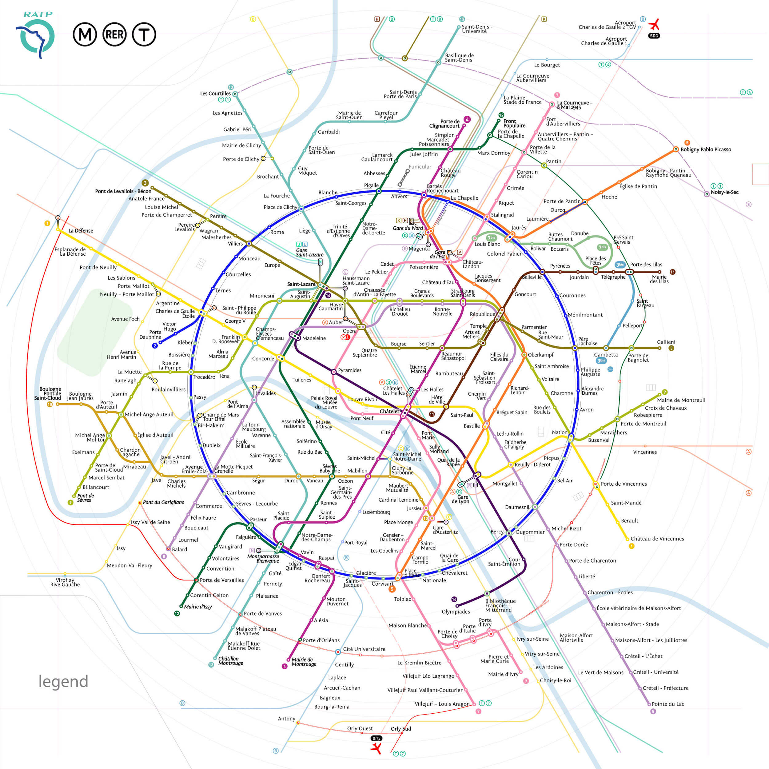
In this article, I will attempt to describe the principal solutions involved in the development of my own version of the Paris metro map. But for a moment, I’ll just jump ahead to the result:
I am unable to discuss the entire process that went into the creation of this new map, because it took me around two and a half years to complete, and an article of that length would bore even the most committed of readers. In this light, I will cover only the principal graphical solutions. At the end of the report, I have included a time-lapse video of the entire creation process.
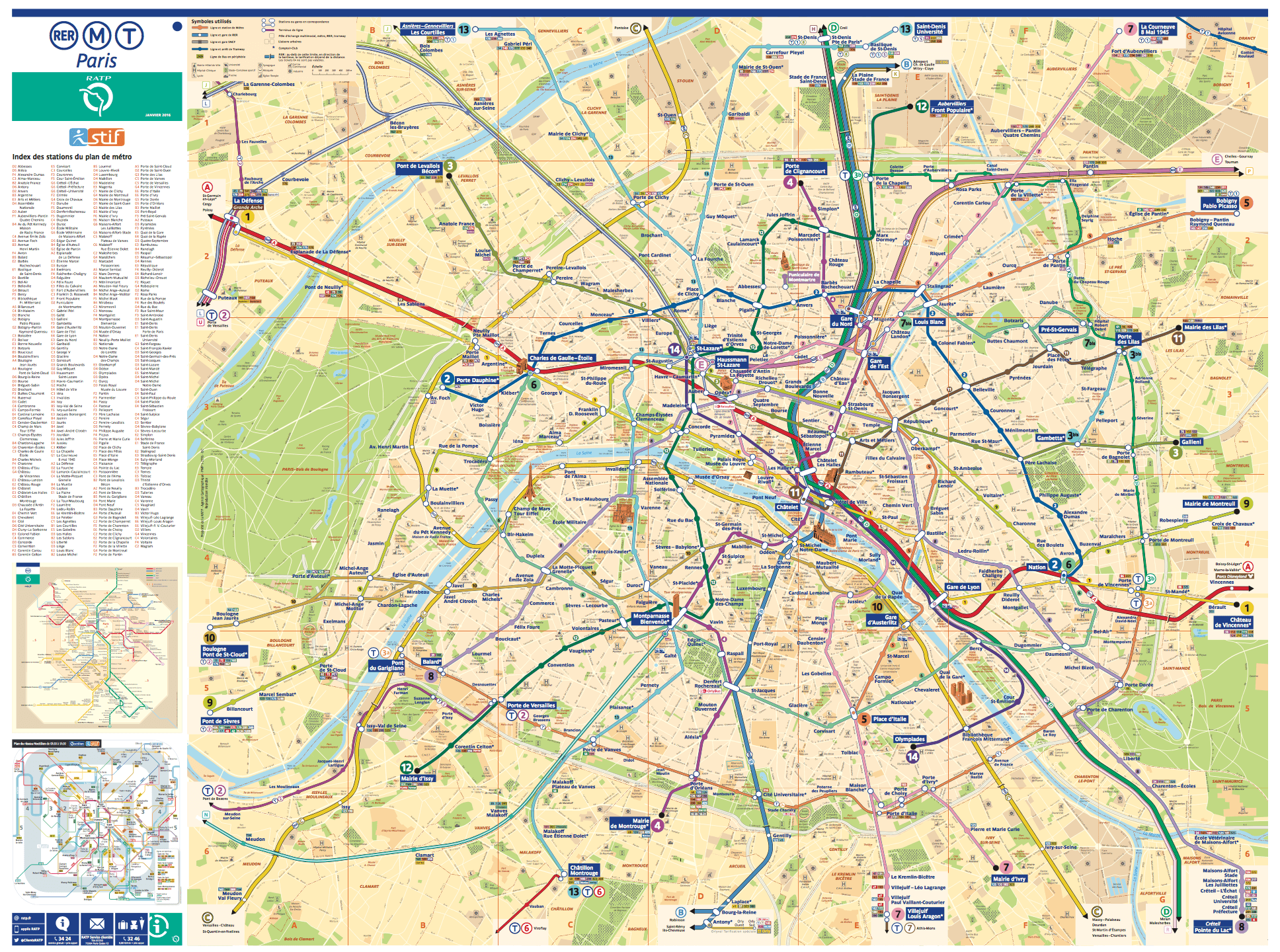
For comparison, this is the current official map.
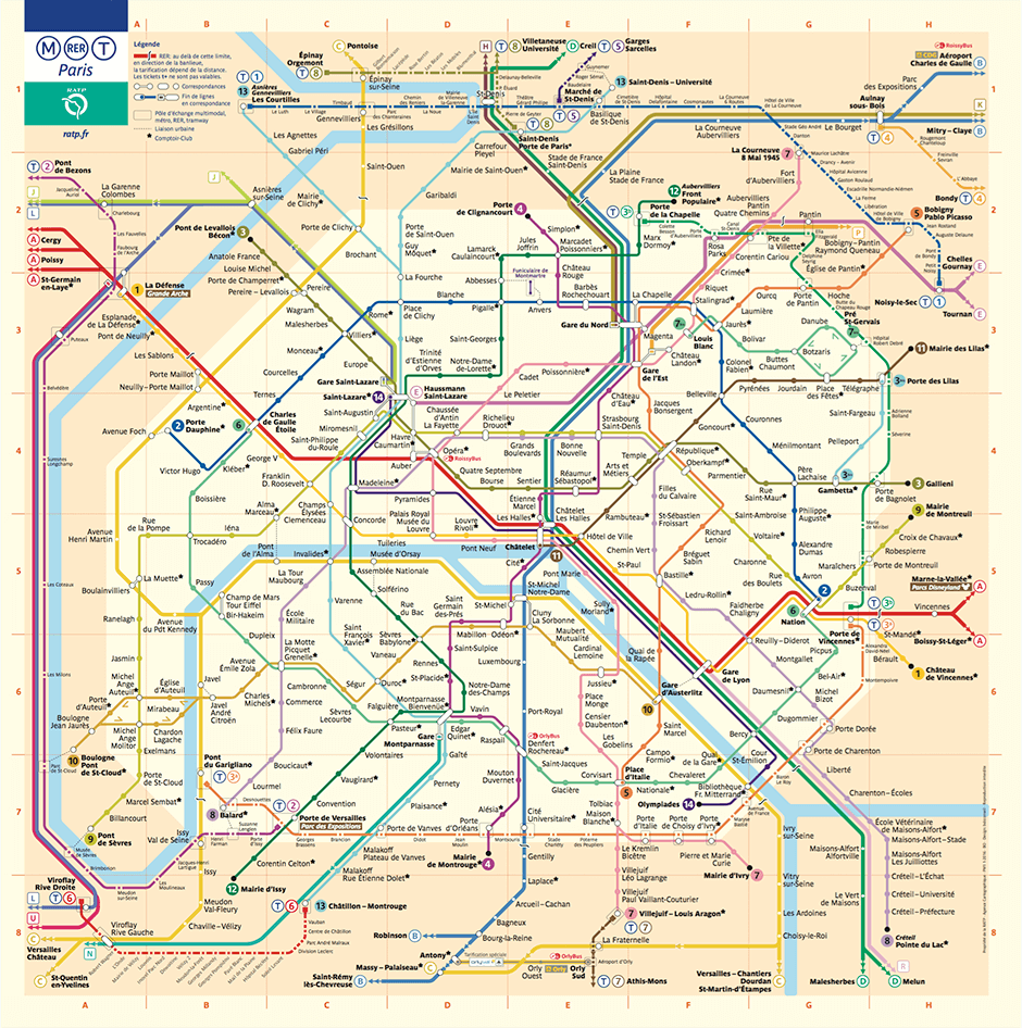
Indeed, its appearance is rather forbidding. There are numerous lines twisted about chaotically, and the eye lacks a clear anchor, because there is nothing characteristic or memorable to grasp onto. Naturally, if used frequently, maps become customary and familiar. However, for a city that has more tourists than local residents, this element of urban navigation has obvious shortcomings.
A Circular Image Of The City
Where did the circle come from in my version if the original map has nothing of the sort? Is Paris circular all of a sudden?
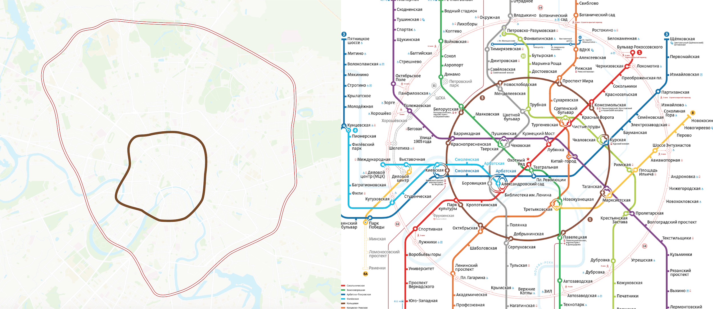
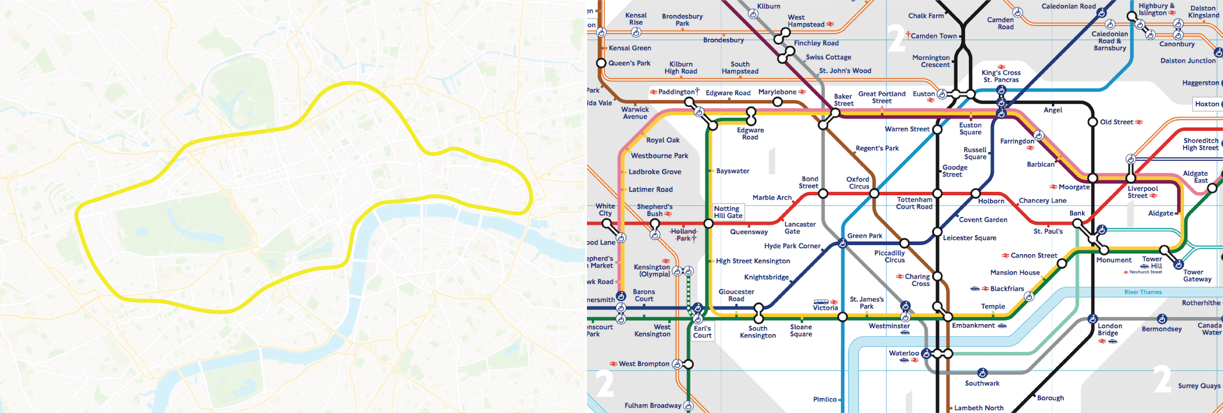
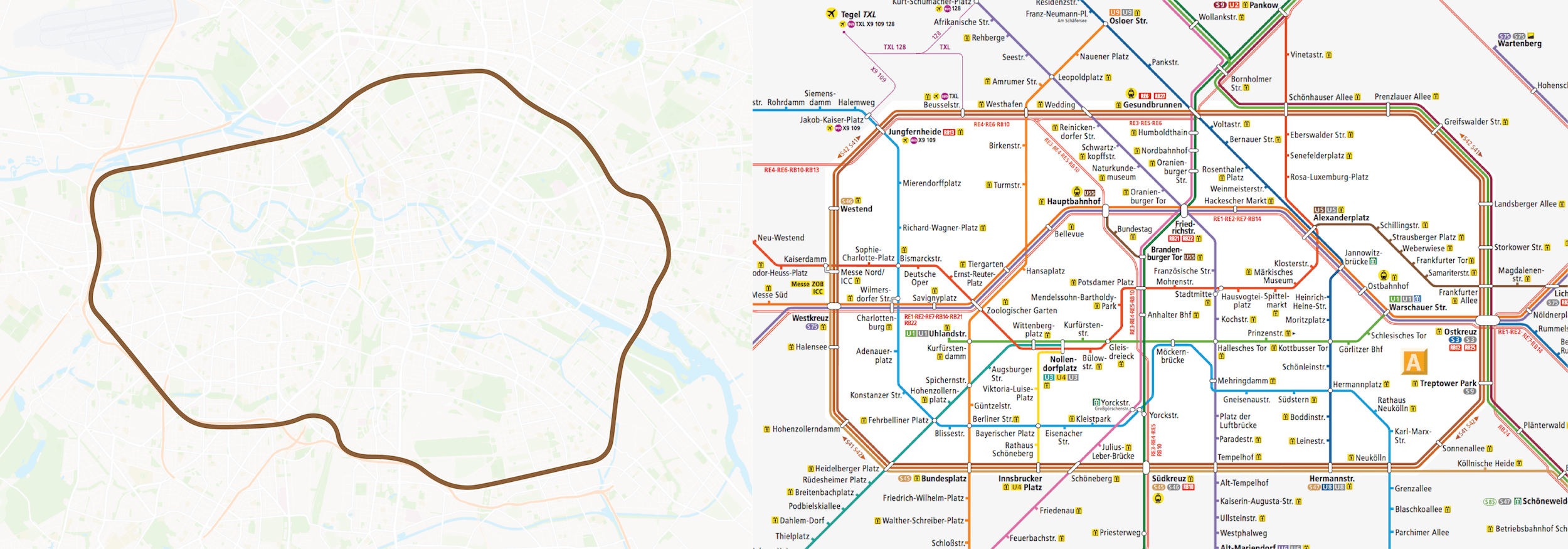
The answer is yes, Paris actually is circular to a certain extent. Let us take the maps of Moscow, London and Berlin as examples and match them with the real geographies of the cities. It is clear that all of these maps share a certain distinctive feature.
The map of the Moscow metro includes two ring-shaped lines, one brown and one pink (the surface metro line). But when the tracks of these lines are superimposed on the geographic map (on the left), both lines are seen to be circular in only the most remote sense. As can obviously be discerned from the metro map, these lines are shown as rings only for simplicity’s sake.
London’s map has a closed, bottle-shaped contour. This is not a circle, but it is still another memorable form that makes orienting oneself in the city easier. Even though, geographically speaking, the shape of the line is far more complex (as can be seen in the image to the left), it is nonetheless depicted in the shape of a bottle. Still, the line is locally known as the Circle.
In Berlin, lines S41 and S42 are known as the Ring, even though, from a geographic perspective, the lines do not resemble a perfect circle. Also, the Ring is not drawn as a circle on the map, but is instead shown as a symmetrical octagon. What is most important is that, thanks to its geometric simplicity, this shape can be easily recognized on the map and forms the central tariff zone A. This is a great and super-convenient detail, even among other shortcomings of the Berlin map.
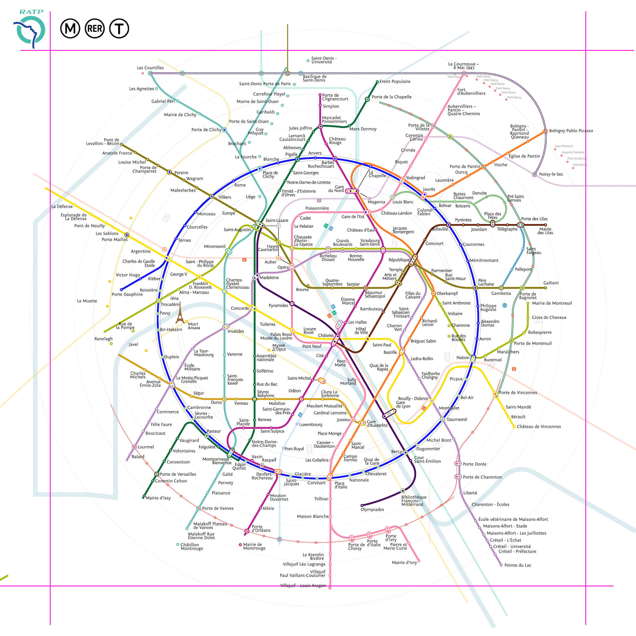
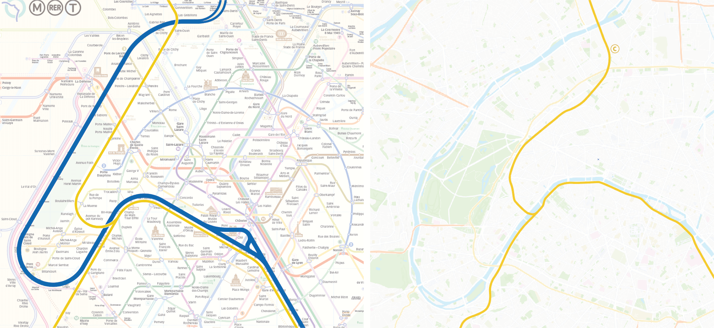
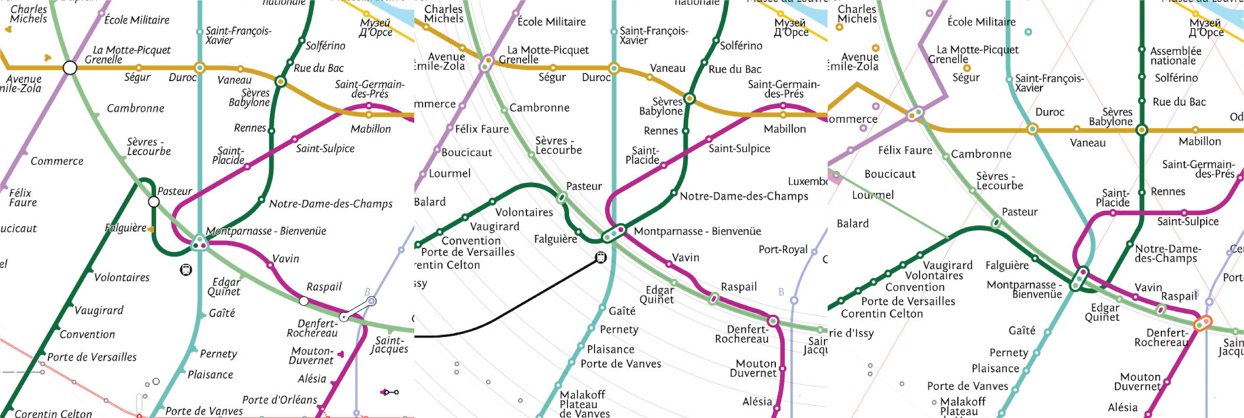
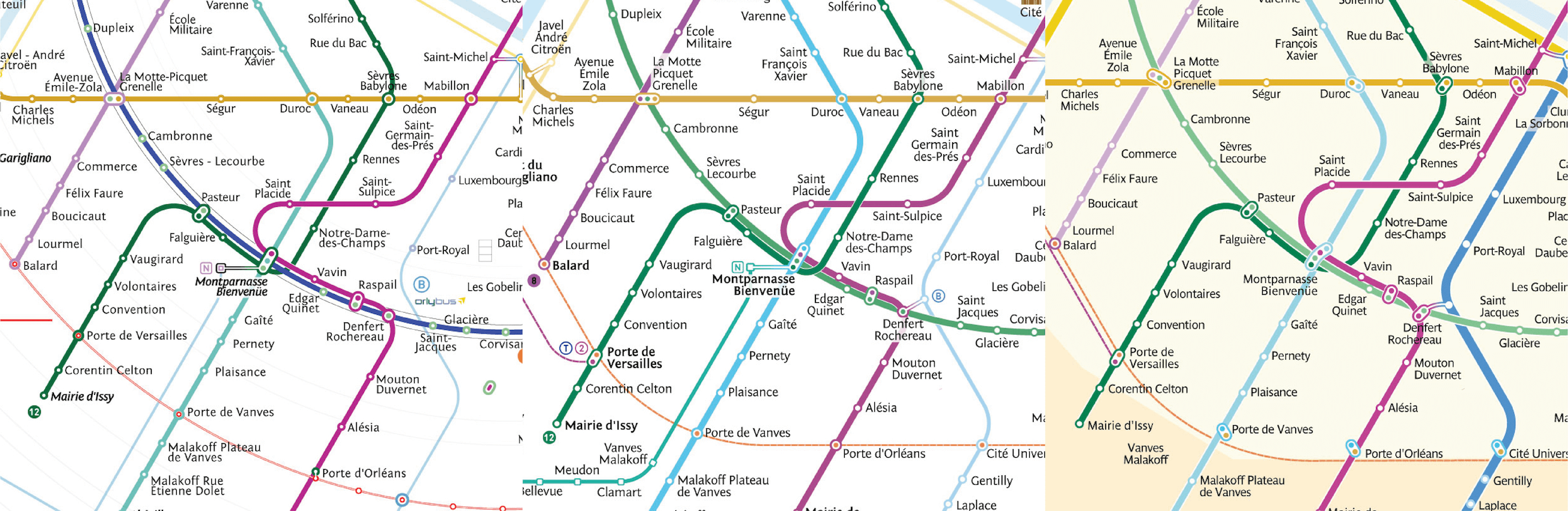
But what about Paris? Paris is similar to these cities in its construction — the city can be broken down into two circles. One circle includes metro lines 2 and 6. The second of the two tram routes has still yet to form a loop, but construction is in progress. Still, it is safe to nominally say that the second circle is in fact the administrative border of the city, which happens to correspond to the tram line. However, looking at the official map, we cannot see the same clear-cut contour we see in other cities. The fact is that these contours simply merge with the other numerous lines.
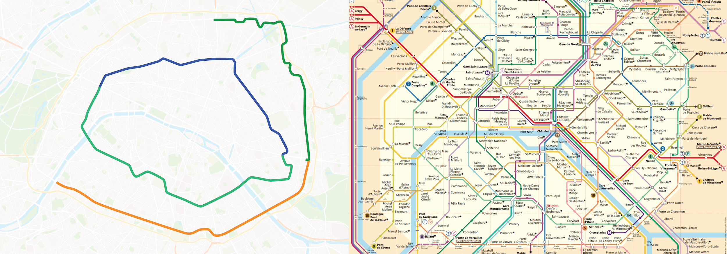
Also, when the geographic map is superimposed on the transit map, it is easy to see that on the official Paris metro map, lines 2 and 6 are considerably distorted and do not conform to the true geographic shape. If so, why not simplify these two lines and represent them as a recognizable shape, as in the cases of other cities?
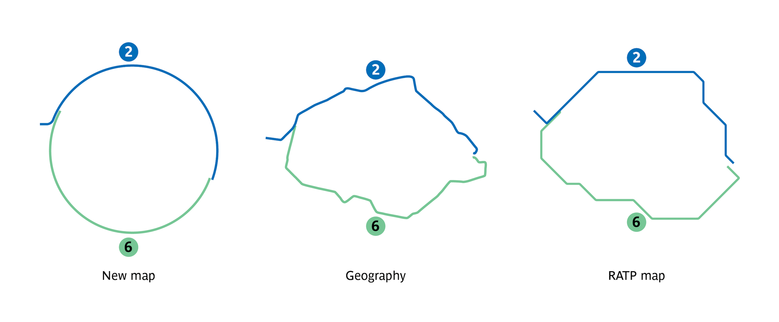
The only difference between Paris and other cities is that the ring would be formed from two lines.
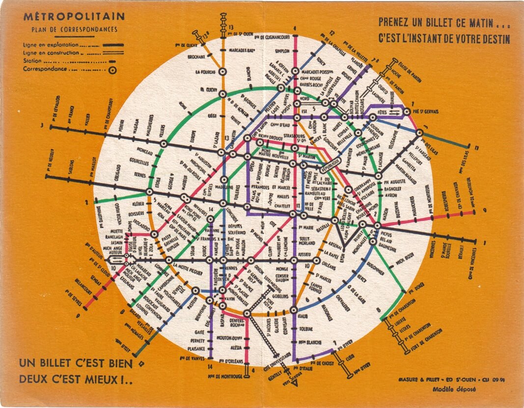
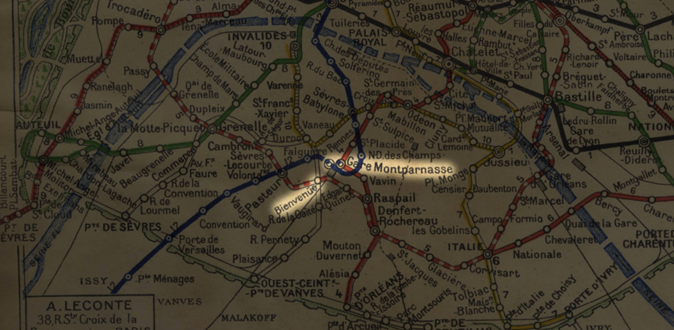
Before World War II, the metro ring was even divided into three lines. A portion of the present-day 6 (the lower portion of the ring) was a continuation of the 5 (the orange line in the image below). Plus, even back then, attempts were made to simplify the map using a regular circle, but they ended without much success. Ever since then, many designers have tried their hand at depicting a circular Paris.
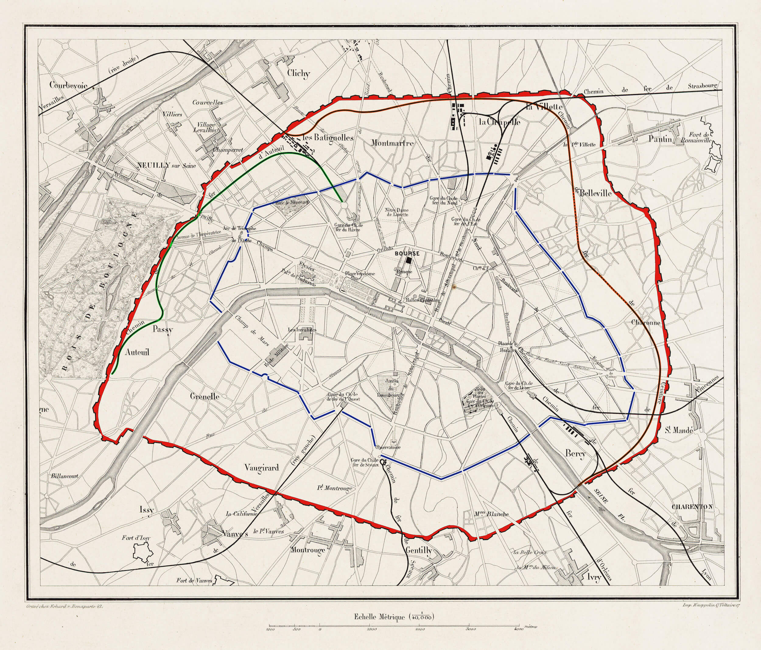
Delving deeper into history, you’d discover that both of these Paris rings corresponded to the contours along which defensive walls were built in the city: the Farmers-General Wall (shown in blue in the image below) and the Thiers Wall (red), which themselves formed closed loops around the city. These days, the walls no longer exist, having been replaced by boulevards. These boulevards were then used to build some of the first metro lines, and a tram recently started operating along the outer ring. One particularly characteristic detail is that the metro lines tracing the location of former city walls are all above ground, with the exception of small underground sections. This allows riders to easily associate the metro ring with the above-ground portion of the city. In other words, if circular metro lines were shown as nominal circles on the map, then finding one’s desired station would be easier because a ring is easy to spot against a background of other numerous lines.
In 1992, RATP, the Parisian public transportation operator, replaced its logo with a circle and a silhouette of girl looking upwards. This symbol also represents the Seine flowing through Paris, which happens to be depicted as a circle.
Lately, this sign can be seen on every metro car, bus, ticket and transit map in Paris.
Map Grid And Non-Geographic Depiction
The existence of two metro maps is appropriate for a city: one aligned with the city’s geography, and the other composed according to schematic representation of the lines. When a transit map is made on a city’s actual map, the lines correspond to real positions in the city, which is convenient to the extent that geographic precision is preserved. Such a map, however, has many disadvantages.
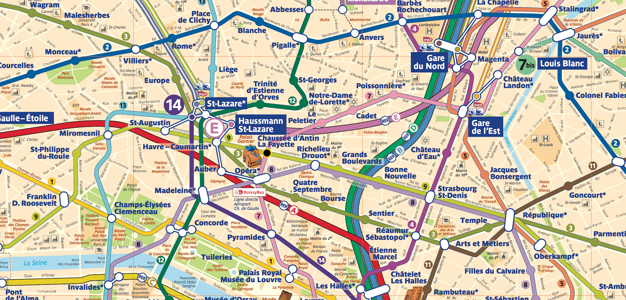
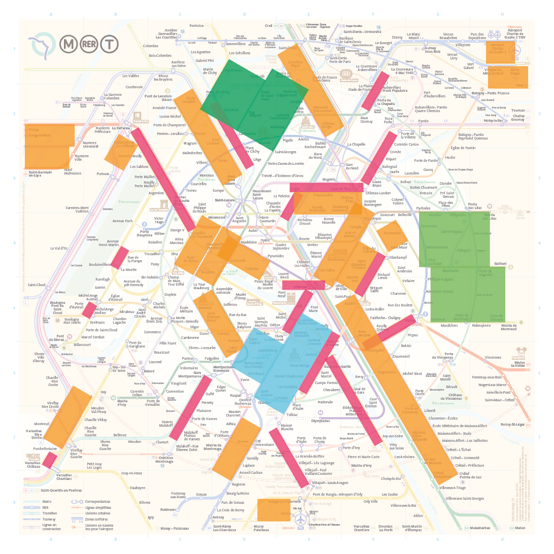
For example, here is the official map of the Paris metro integrated with a map of the city:
There is a lot of information to handle here, beyond just station names and maps of metro lines, overloading it to an unacceptable extent. The names of stations are tiny compared to the map as a whole and cannot be easily read; using a map like this on the run would be very difficult. Just imagine trying to puzzle out interchanges on this map if you were to find yourself in an unfamiliar city:
This is why complex maps are usually simplified and drawn to be more readable. To simplify, geography is sacrificed, allowing the map to be built according to a set of rules designed for readability and easier plotting of routes from point A to point B.
These rules include line color, point size, station designations and the coordinate grid used to plot the lines. A grid with an angle increment of 45 degrees is typically used. This is sufficient for most transit maps. Still, when a map gets more complex and the number of lines increases, the lines start getting tangled with one another, creating extra curves and misleading sections with stacks of parallel lines in which it is easy to get lost.
Transit maps must connect station location points in the simplest way possible, and the coordinate grid should assist this process.
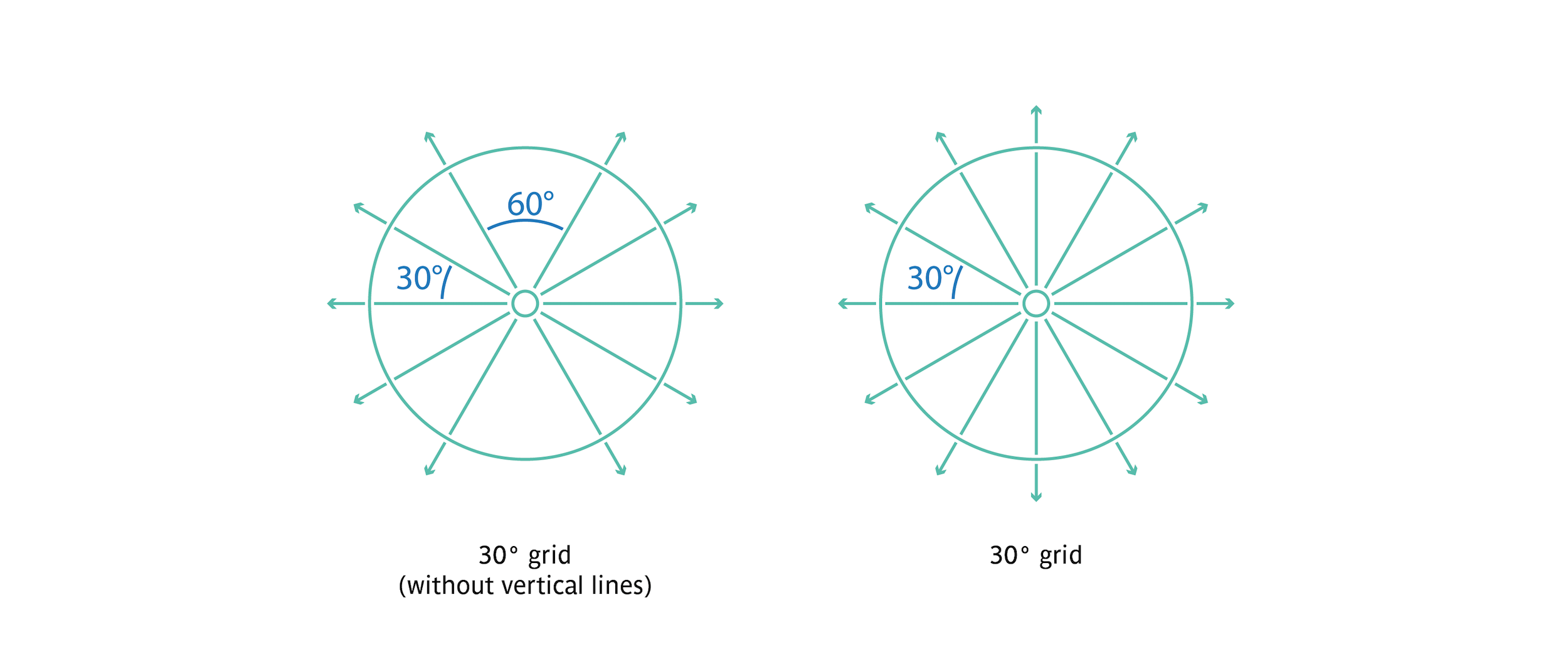
After studying the problematic spots on the official Paris metro map, I concluded that the 45-degree grid is not the best solution for Paris. I instead believe that if a 30-degree grid is employed, the extra curves and other tricky sections could be eliminated by virtue of a larger number of axes.
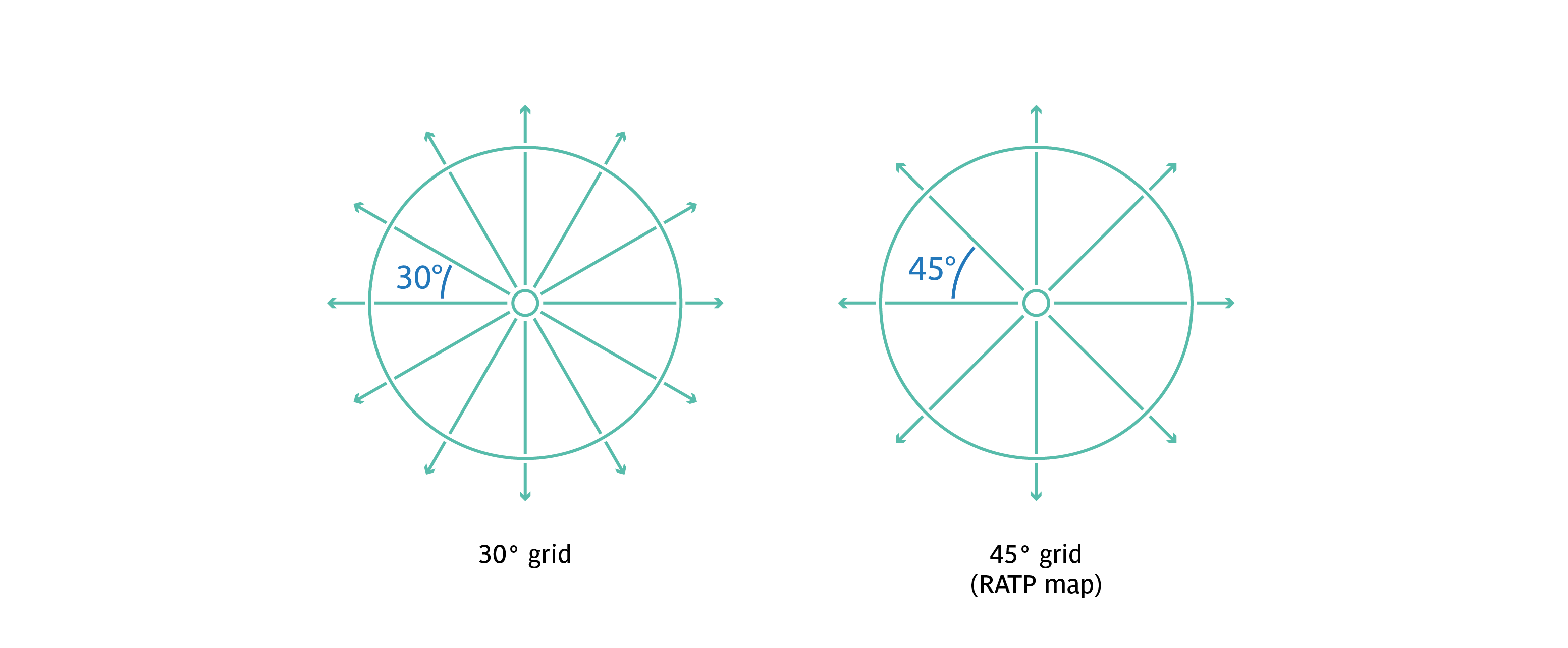
When I first started working on the map, I imagined that, despite all of the advantages of the 30-degree grid, I would still be unable to create a stable graphical form for the overall map. The vertical sections of some lines still attract more attention than they are intended to.
At some point, I understood that the reason why the shape is unstable is my use of a vertical axis. When the 30-degree grid is used, so many axes are created that its most vertical catches the eye more easily than the others when one is viewing the image as a whole. Humans have evolved to constantly look for patterns in everything. In this way, even adults can imagine that clouds take on the shape of animals. Two windows cut into a blank wall next to each other attract our attention, and pure imagination transforms them into the eyes of an unknown creature.
In this case, the vertical axis draws attention and is likened to a foreign object on the image. This is why I decided to get rid of all verticals, but continued to work with the 30-degree grid.
So, through trial and error, I found myself using the 30-degree grid, but without any vertical lines.
Initially, I had wanted to simplify the complex shapes and limit the number of curves compared to the official map. By adopting a 30-degree grid, I was able to reduce the number of line curves by 2.5 times. Difficult interchange nodes were disentangled, thus becoming more easily understood.
Line Curvature Radius
Another requirement directly related to the coordinate grid is changing the radii of the line curvature. Many transit designers pay no attention to this detail, but it is very important to producing an attractive graphical image of transit lines. Let’s start with three angles, 90, 120 and 150 degrees:
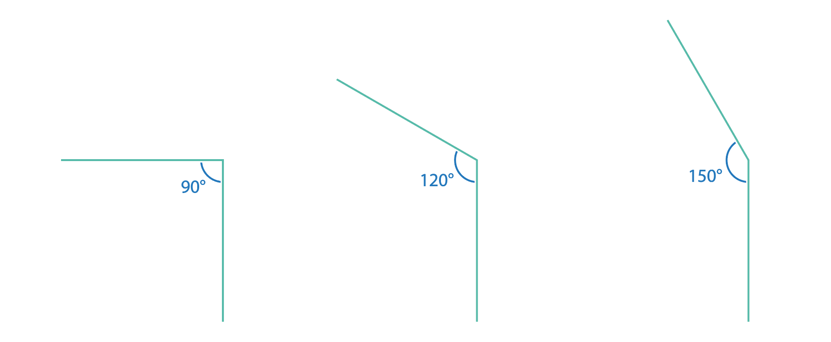
If we smoothed them out with the same curvature radius, these lines would not look so similar. The bend of the 90-degree angle would be too smooth (about one-quarter of the curve), while the 150-degree angle would be so sharp that little difference would be perceived in the angle without rounding.
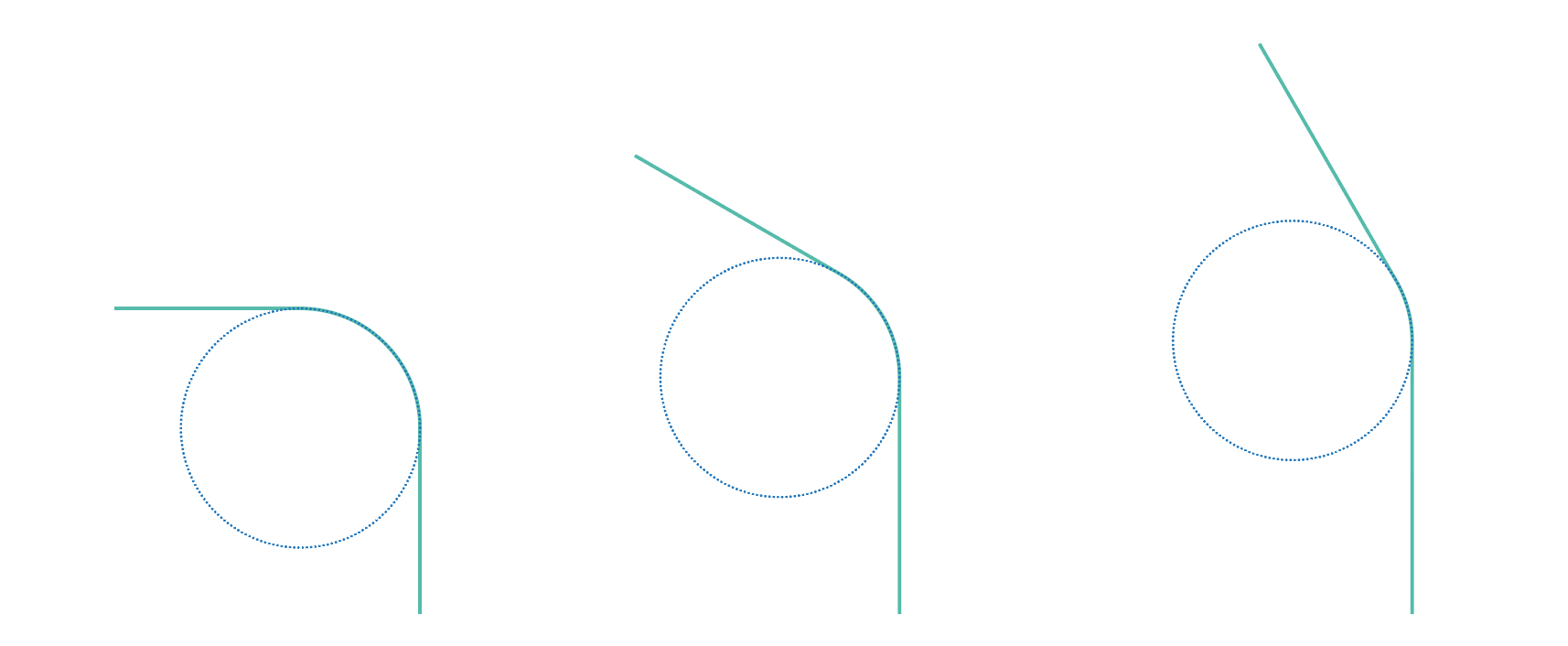
Let’s conduct a short experiment. Take a drinking straw and start bending it — first lightly, then all the way to an acute angle. Notice that when the bend is minor, the curvature radius is quite large, and when the angle is acute, the curvature radius shrinks. This observation is useful when building transit maps. The sharper the bend, the more noticeable it becomes, so the curvature radius should be smaller. If the curvature is insignificant, then there would be no point in sharply accentuating it, so the radius would increase in this case.
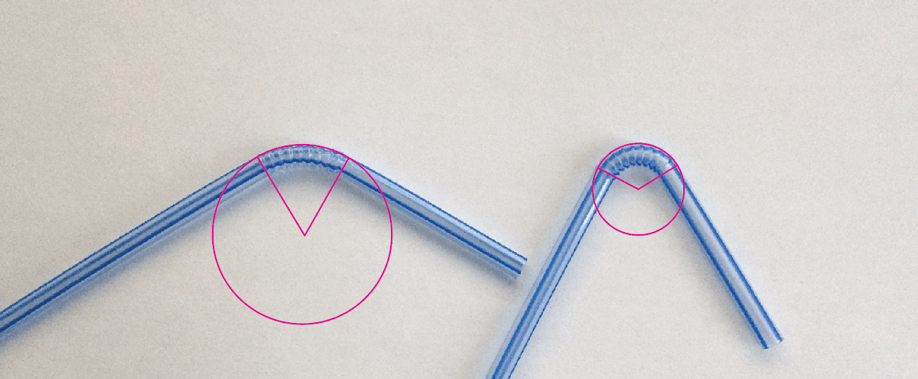
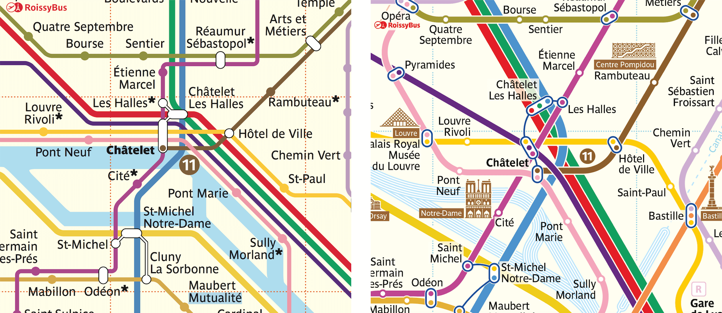
Note the bends on this map:
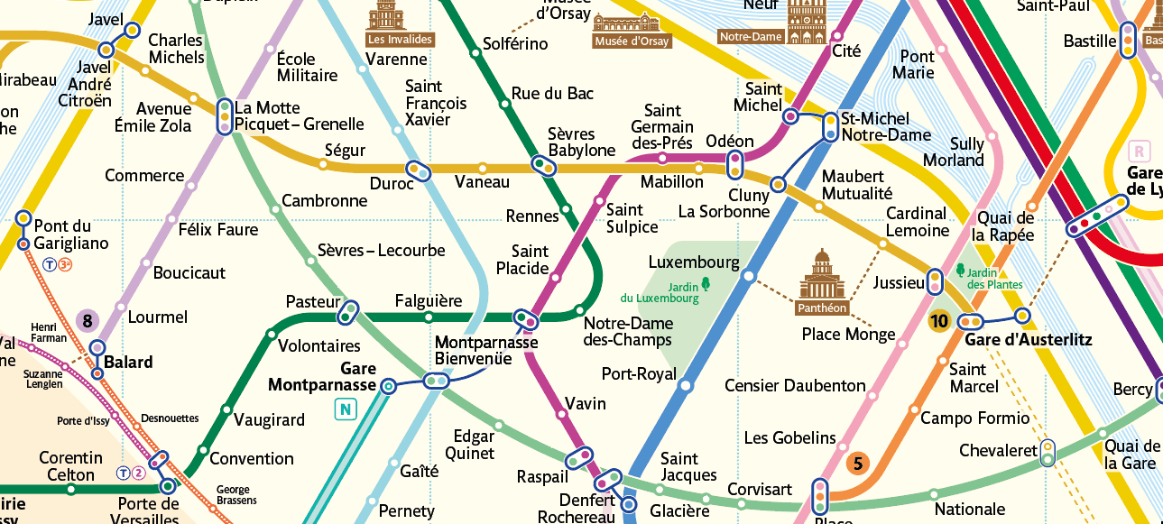
If a line follows its route and only bends 150 degrees, then the turn would be smoothed out by a streamlined curve. But if attention needs to be brought to a sharp turn (a 60-degree angle), then the curvature radius could be reduced, and the line bent more aggressively, catching the eye when the user is planning a route. Such curves are natural for the eye, because they approximate the physical curves encountered in a real environment.
(It is rather easy to guess the principle of radius change depending on the angle of the bend. I am fully confident that many readers can solve this simple geometric equation with alacrity.)
Colors
In the process of its composition, the new map adopted a layout quite dissimilar from the official version. Therefore, I decided to stylize it with colors that would be more familiar to Parisians.
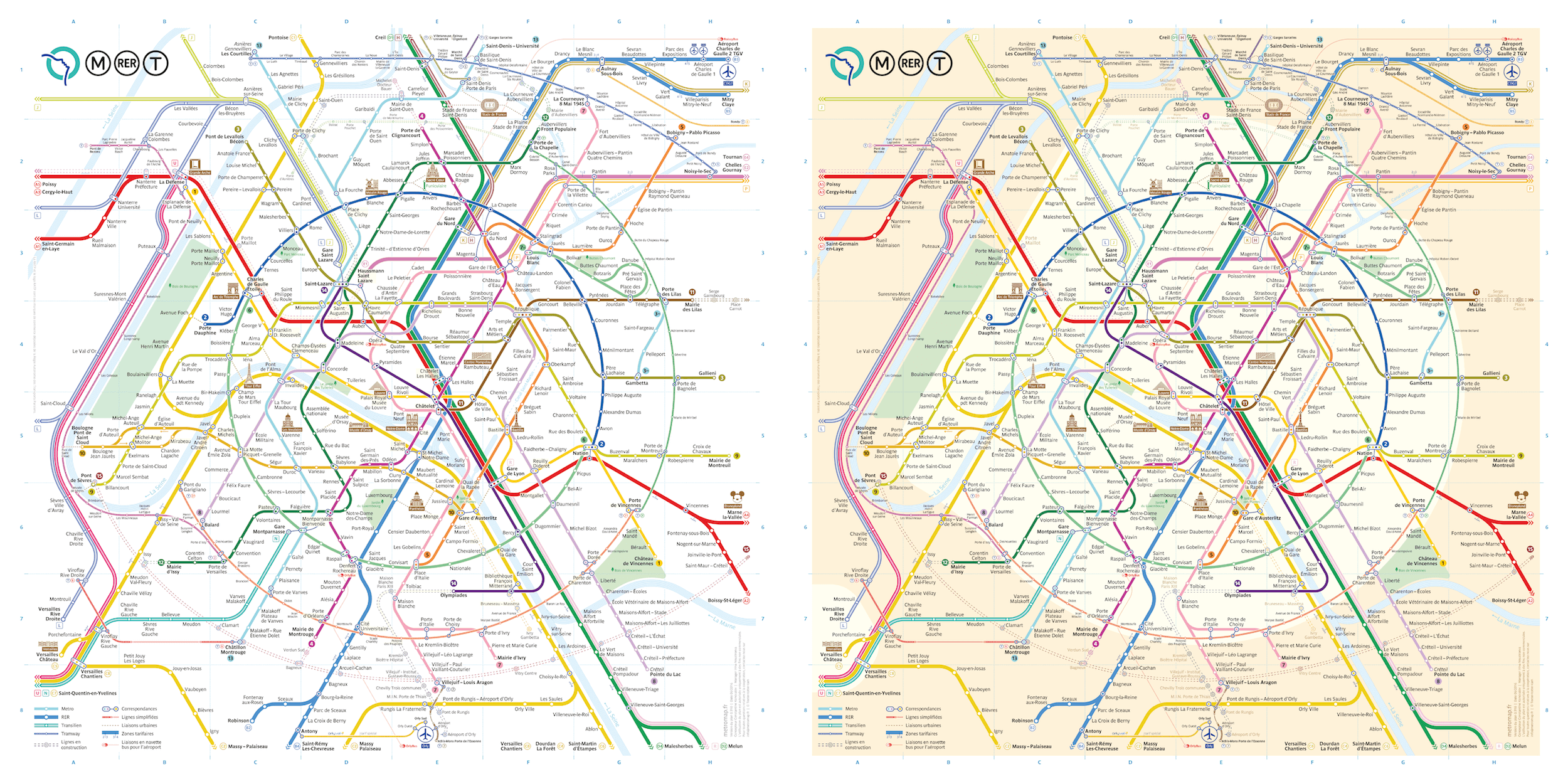
I also repainted the background to match the style of the official map, so that it would be better associated with Paris.
To a certain extent, I dislike this solution because the map loses its sharpness, due to the yellow background. On the other hand, it looks much closer to the official map that so many have become accustomed to — a rather clever perception trick.
Also, to make the map easier to understand, I reduced it to the major geographic principles of the Paris transit system, including the official colors of lines, fonts and graphical designations.
Icons
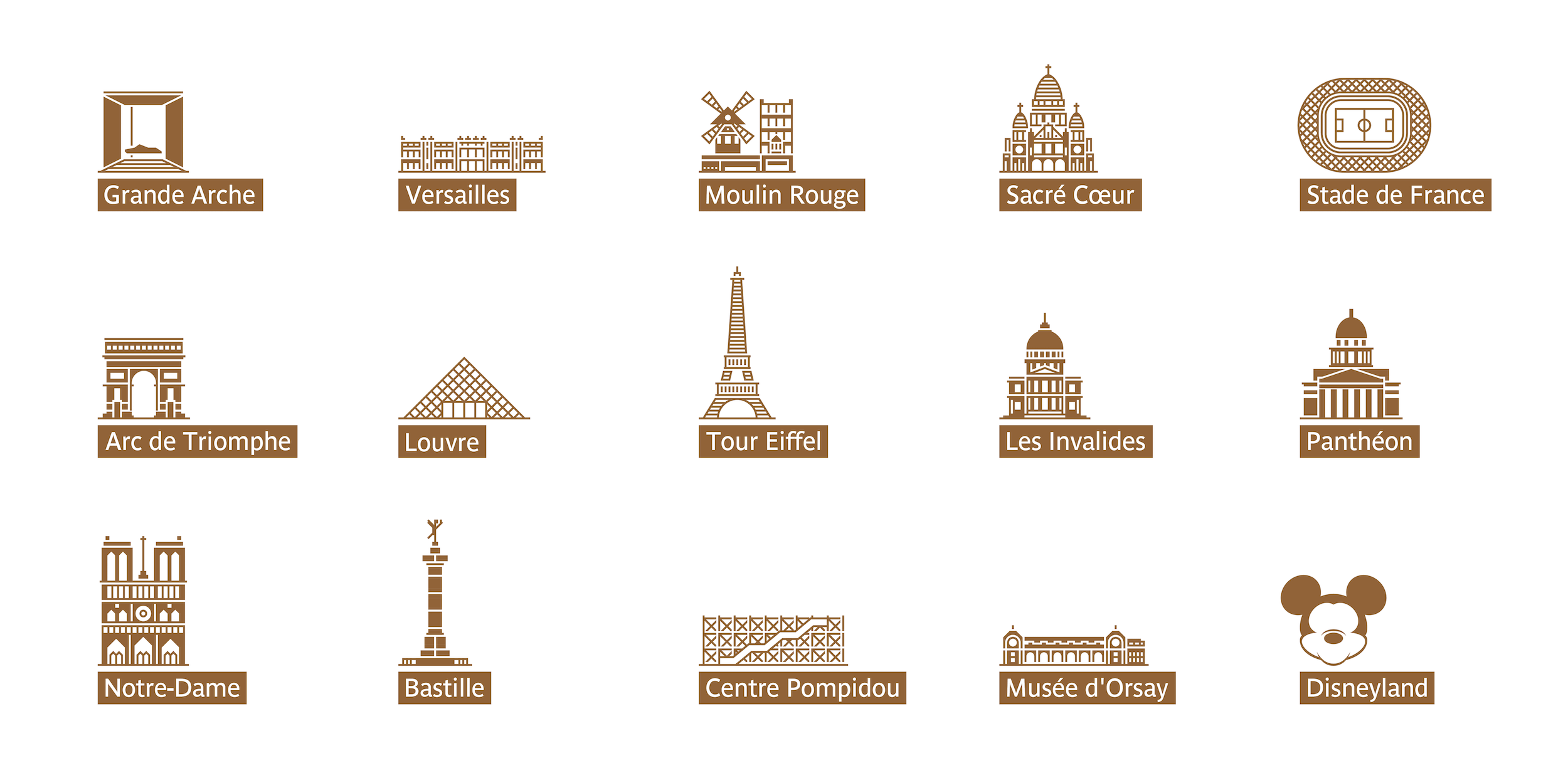
In tourism capitals, it is very important to direct visitors to where the main sights are located, using directions and maps.
The color brown is typically used to depict walking proximity to noteworthy sights. To create icons for Paris’ most famous sights, I used a square, regular grid after approximately calculating that, when printing the map in A3 format, the printer would be able to precisely print each cell.
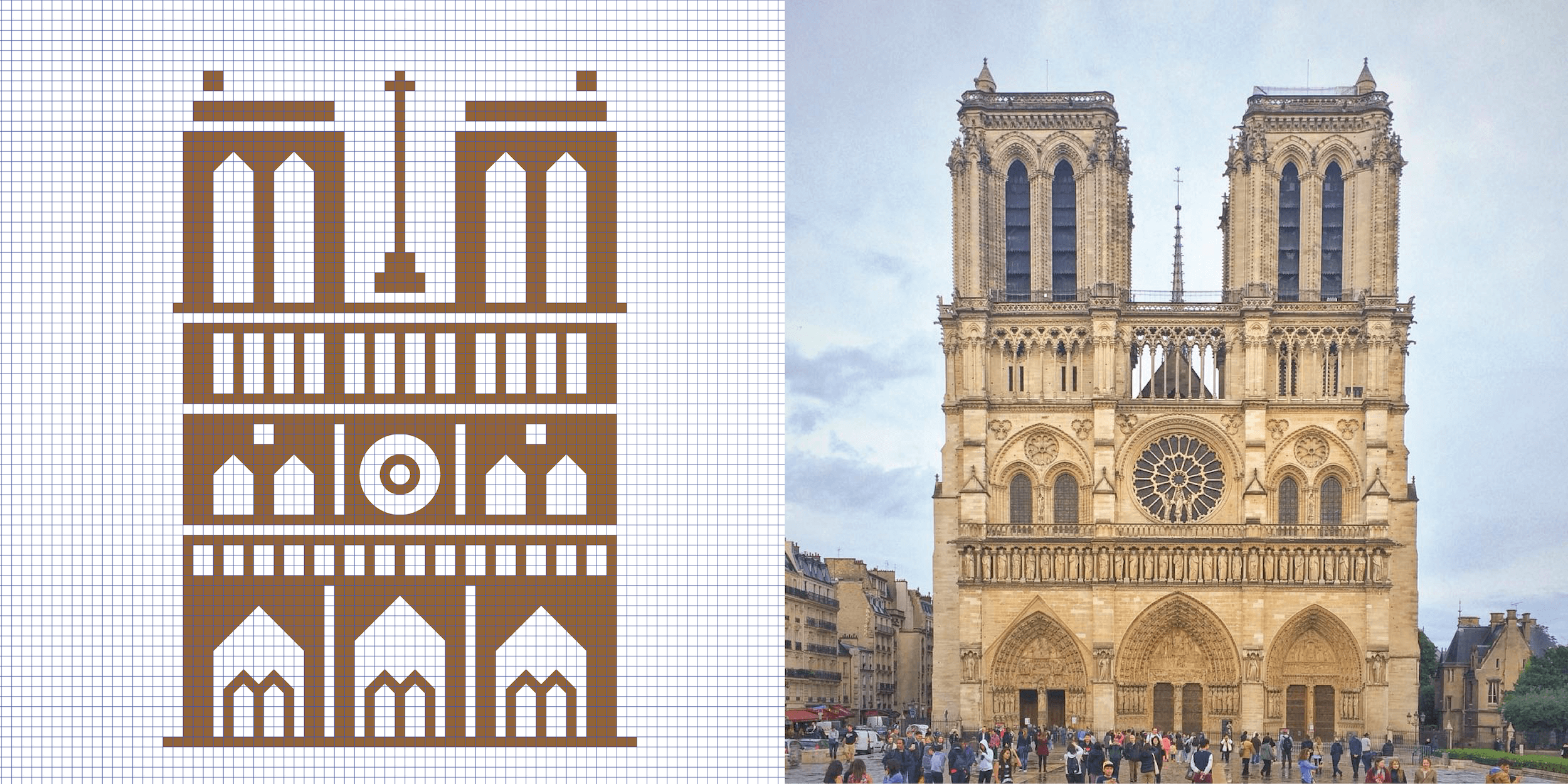
To make the sights more noticeable in smaller format, they must first be simplified. This turned out to be a rather fascinating process. The principal features of each building are singled out from their photographs. These could include recognizable windows and doors, bas-reliefs or sculptures. Naturally, an icon need not be very precise, but should only adhere to the shape and general image of the building. Similar to how the exact borders of the city or ring-shaped transport lines cannot be reproduced from memory, it is easier to just remember a more simplified, concise version of them, just as it is impossible to recall the precise number of sculptures on the facade of Notre Dame de Paris. An entire picture simply cannot fit into the average memory. People only remember general features: two towers, a circular window in the center, three arches below. This is sufficient to make an icon memorable and not to overload it at the same time. Icons with excessive detail in a small format look messy on a map.
But while many sights can be easily depicted based on a photo of the facade, there are exceptions. For example, a sports stadium or Disneyland would need to be drawn differently.
Yet stadiums are not always recognizable when viewed from the side, and they rarely possess any characteristic features or unique architectural forms. However, when viewed from the top, they are easily perceptible because the inside can be depicted as a football field. Also, people more frequently see stadiums on TV when they are filmed from a bird’s-eye view.
Places like Disneyland are more easily recognizable not from any architectural image, but from their symbols. For Disneyland, that is Mickey Mouse.
Line Harmony
To avoid making the map look chaotic and to give it a certain graphical rhythm, I needed to create connections between the similar placement of parallel lines on the map itself.
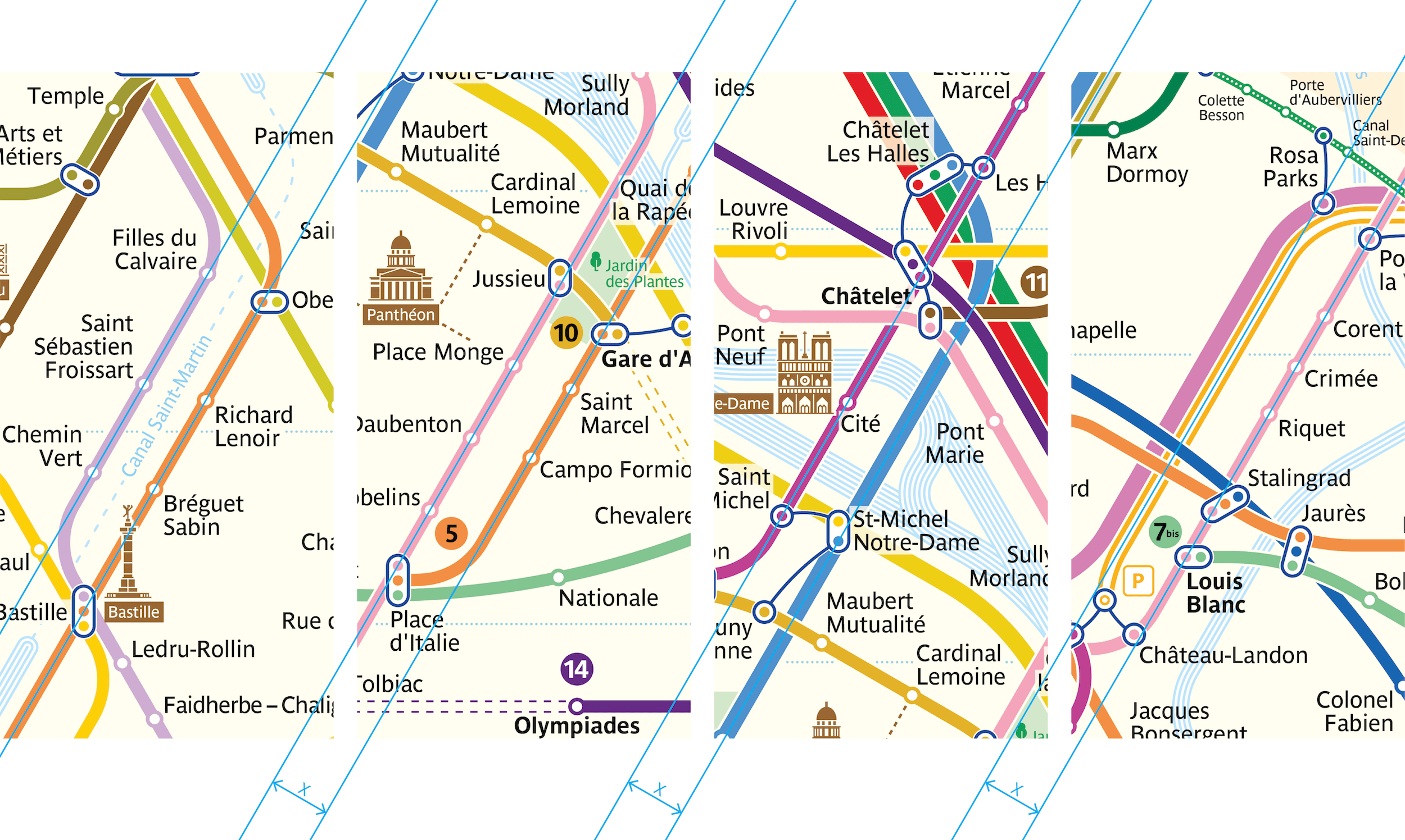
Take a look at these four fragments. It is not difficult to notice that the distance between two parallel lines in any of the four cases is the same. This was done on purpose as a way to “calm” the graphical elements on the map. In other words, this is another addition to the rules of the grid and radii of curvature. But here, no rule is ever set in stone. There may be several types of indentations between parallel lines, and their selection is directly related to the overall artistic theme.
Below, I used rectangles to highlight the places where the same space is left between parallel lines. They set the rhythm of the image.
Naturally, this is just a sample of the equal distances. There are far more of them, and their interdependencies might be far more complex.
For example, elegant graphics can be created by manipulating the curves of river and transit lines. The image on the left shows the river and RER C line (yellow) on the map, and the one on the right shows their actual geographic position.
A few paragraphs above, we covered the rules for smoothing angles and established certain principles, but the design also allows for exceptions to even the strictest rules. The curves of the RER C line do not follow the rules of the other bends. Here, the curvature radius of angles is formed following the river’s general rhythm, because the shape of the line depends largely on the route of the Seine. Therefore, the RER C line simply clings to the river and moves along with it.
Iterations
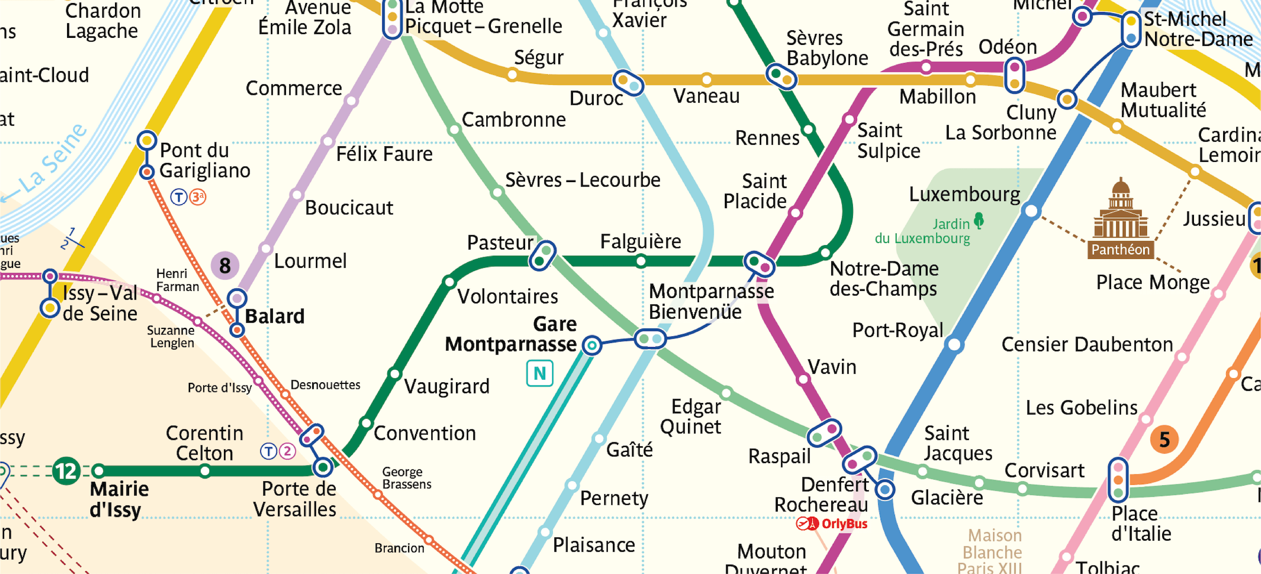
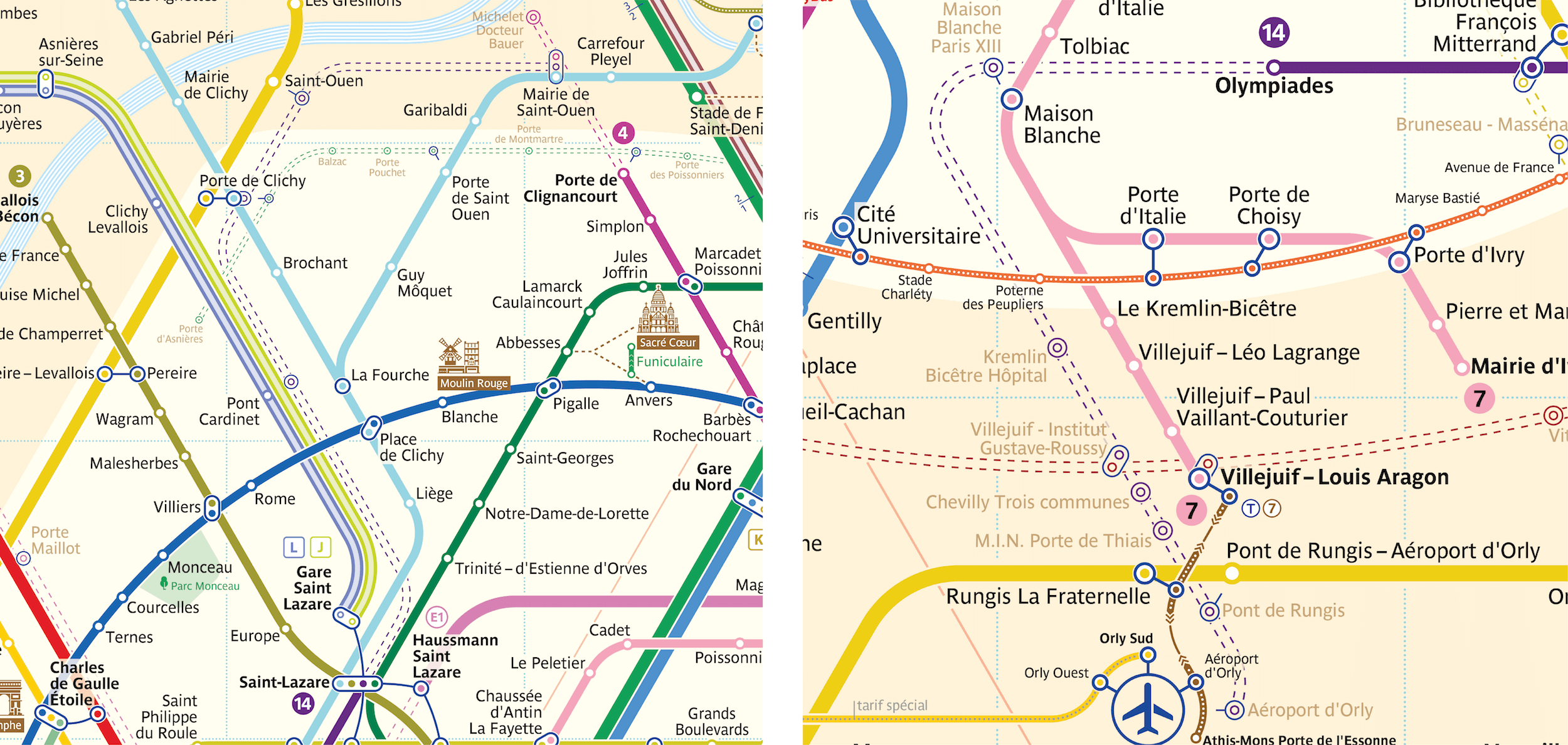
This article cannot cover each individual fragment of the map, so I will limit myself to a description of just one of the most complex sections and how it developed. The topic of focus here is the Montparnasse-Bienvenüe junction. I believe this example does a lot to explain the general process of working on this map.
First, I attempted to bring the lines together in such a way that the transfer would be depicted as a single point where the lines of each transfer station are intersecting.
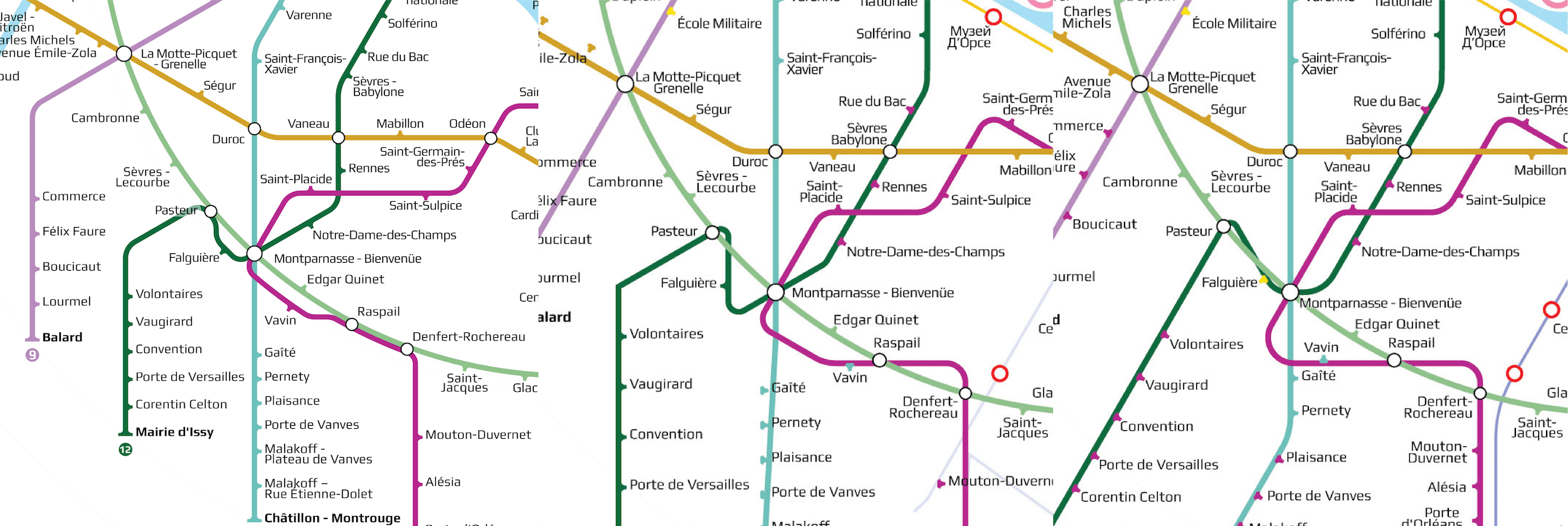
But the resulting crossings were not visually pleasing, and the straight lines failed to meld with the ring line.
Ultimately, I tried several versions to solve this issue, and also attempted to draw sections of the straight lines as ring lines.
At some point, the junction even started to come into its own. I felt like I could just stop there, but after digging through the old maps of Paris and talking to city residents, I understood that the transfer as a whole could not be narrowed down to just a single point. The heart of the matter was that, in the past, the Montparnasse-Bienvenüe station did not yet exist; rather, there were actually two different transfer junctions, Gare Montparnasse and Bienvenüe. Between them there was no transfer. So, the common name, Montparnasse-Bienvenüe, was adopted only after they had been joined. And the distance between these stations is expansive, so transfers here are quite long and inconvenient.
If there were no alternative options to building the route, they could just be left as they were, with no attention paid to the fact that transferring here takes so long. But when looking at the official map, many passengers travelling on the 12 (dark green) see the very first crossing with the 6 (light green) at the Montparnasse-Bienvenüe station, even though they could take a much shorter transfer at Pasteur if they continued a little further. But the eye fails to catch this detail.
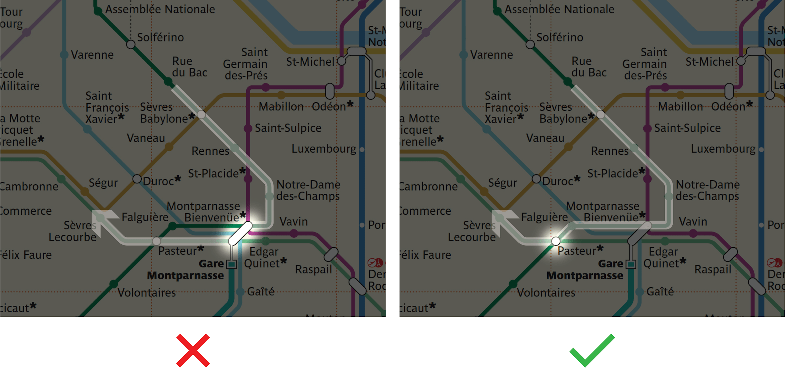
Thus, on my map, I divided up the transfer visually to hint at the long transfer time.
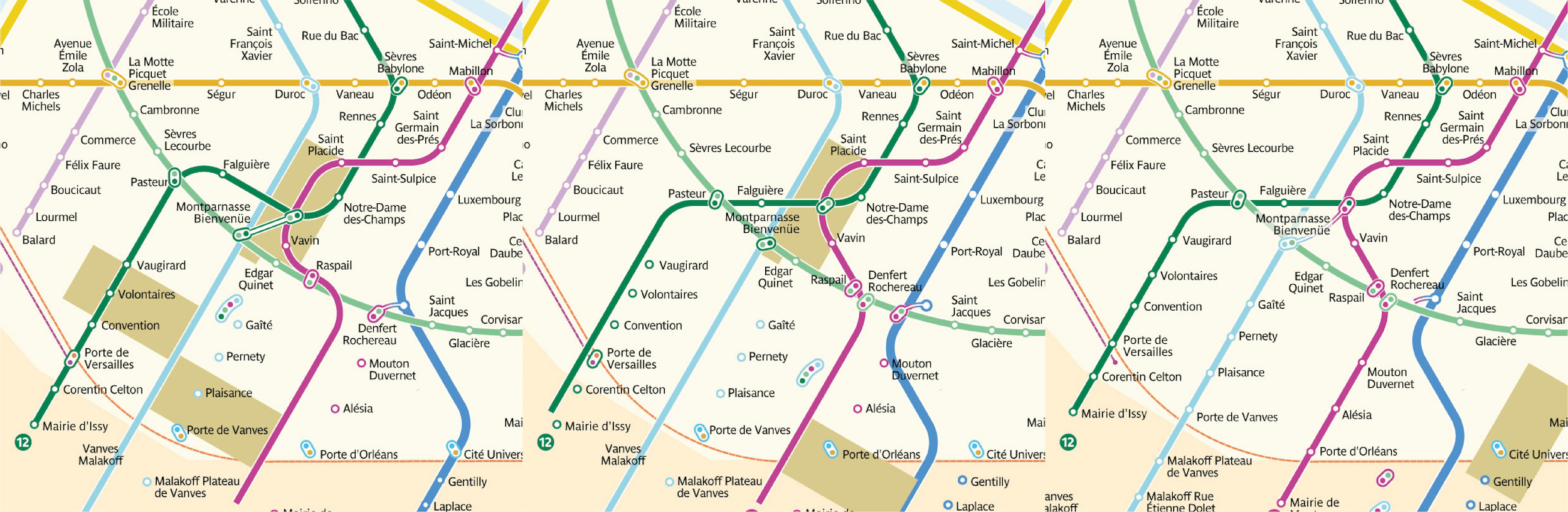
After another dozen iterations, I arrived at the following result:
It seems wrong to break the transfer into two parts connected by a communication line, but after studying all of the details, it is evident that a map should first and foremost help passengers map the quickest routes.
Development Perspectives
When developing a new map for a rapidly growing city, studying plans for further construction is also a must. My idea for ring-shaped lines enjoys significant support from Paris’ future urban development plans. Another ring-shaped line will be made into a loop around Paris within the next 15 years. This time, the new ring will be made up of just the 15 line.
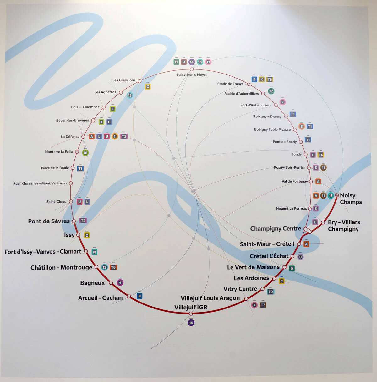
I ultimately chose not to allocate much precious space to the new ring before it has even been built. So, I compressed it into the shape of an egg and only included the section that will be operational by 2024, the lower semi-ring.
To integrate the new semi-ring visually with the rest of the map, I repeated the shape in the already existing tram line T1, and I mirrored the semi-ring shape to the north.
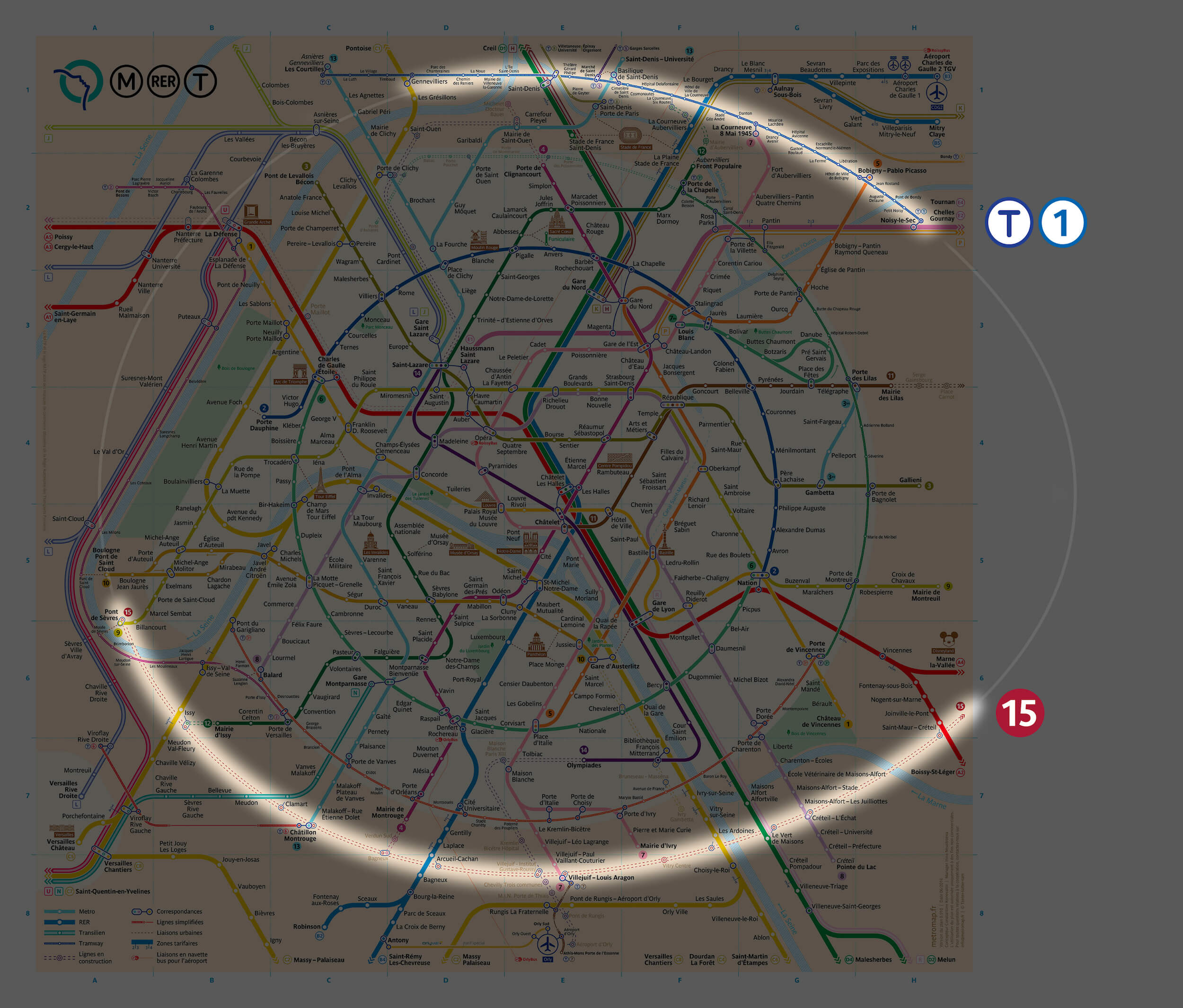
Aside from the 15, serious changes are scheduled for both the RER E and 14, which will be extended beyond city limits. Therefore, when working on my map, I immediately took them into account. All lines currently being built are shown by dotted lines.
The Process
In my effort to create a new Paris metro map, I saved the intermediate versions so that I could return to them if I deviated too far in a certain direction for any reason. I created mockups of the map every 15 to 30 minutes by saving them to a new file. By the time the first version was completed, I had over 800 files saved.
I then combined all of these files into a video to show more concisely what went into the creation of the new map. You can now see how each node evolved as the project went on.
The map is still not recognized as official, but I have over one hundred reports of satisfied users after its publication in June.
I hope that the Paris public transportation operator will take my experience into account when updating the official map. I also intend to expand the map and supplement it with new stations as soon as they open. The latest version of the map is available on my website.
Further Reading
- Redesigning Ekaterinburg’s Metro Map
- Maps In Modern Web Design: Showcase and Examples
- A Collection Of Train and Airport Signs
- 50 Problems In 50 Days: The Power Of Not Knowing


