Styled Components: Enforcing Best Practices In Component-Based Systems

Email Newsletter
Weekly tips on front-end & UX.
Trusted by 182,000+ folks.


 Custom Web Forms for Angular, React, & Vue. Your backend.
 Celebrating 10 million developers
After this shift in mindset towards building component-based user interfaces, we are now in what we like to call the “component age.” The rise of JavaScript frameworks such as React, Ember and recently Angular 2, the effort of the W3C to standardize a web-native component system, pattern libraries and style guides being considered the “right way” to build web applications, and many other things have illuminated this revolution.
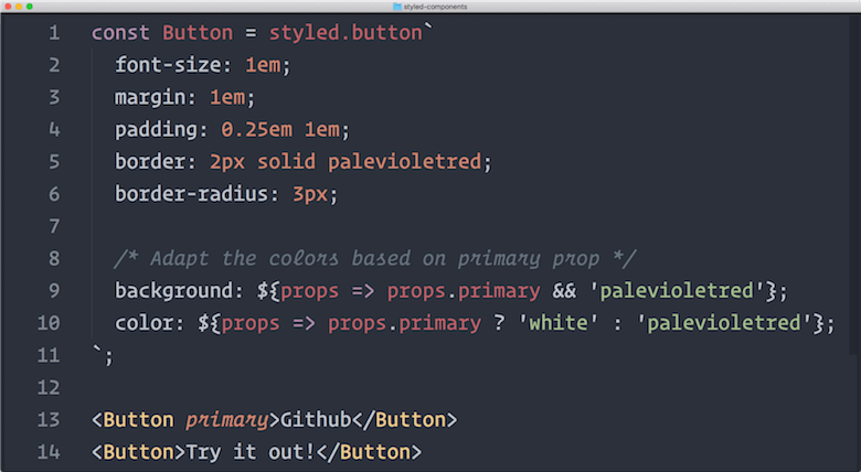
Button React component written with styled components. (View large version)Best Practices In Component-Based Systems
As we’ve built more and more apps with components, we’ve discovered some best practices when working with them. I want to talk about three main ones today: building small, focused and independent components; splitting container and presentational components; and having single-use CSS class names.
Build-Small Components
Instead of relying on classes for composition, use components to your advantage and compose them together. For example, imagine a Button component that renders to the DOM. One could also render a bigger, more important button. Making a bigger button would be as easy as attaching the btn–primary class in the DOM: .
Instead of forcing users of the component to know which particular class to attach, the Button component should have a primary property. Making a primary button would be as easy as ! Here is how we could implement this:
// Button.js

function Button(props) {
  const className = `btn${props.primary ? ' btn—-primary' : ''}`
  return (
    <button className={className}>{props.children}</button>
  );
}
Now, users no longer need to know which particular class it applies; they just render a primary button. What happens when the primary property is set is an implementation detail of the component. Changing the styling, classes or behavior of the button now requires editing only a single file where the component is created, instead of hundreds of files where it is used.
Split Container And Presentational Components
With React, some of your components may have state associated with them. Try to split components that handle data and/or logic (for example, data formatting) from components that handle styling. By separating these two concerns, reasoning about changes in your code base will be a lot easier.
If the back-end API format has to change, all you have to do is go into your container components and make sure you render the same presentational components as before, even with the new format, and everything will work perfectly fine.
On the other hand, if the visual design or user experiences of your app have to change, all you have to do is go into your presentational components and make sure they look correct on their own. Because these components don’t care about when and where they’re rendered, and you haven’t changed which components get rendered, everything will work perfectly fine.
By separating these two types of components, you avoid doing multiple unrelated changes at the same time, thus avoiding accidental errors.
Have Single-Use Class Names
Going back to our Button component, it has a .btn class. Changing the styles of that class should not affect anything except the Button. If changing the background-color in my .btn class messes up the layout of the header and gives the footer two columns instead of three, then something is wrong. That violates the entire premise of having independent components.
This essentially boils down to using every class in your CSS only once (outside of “mixins” like .clearfix). This way, bugs like the one above can never happen.
The problem, as always, is us humans. Ever encountered a bug in a program? It was only there because a human put it there. If programs could exist without humans, then bugs would not be a thing. Human error accounts for every single bug you’ve ever found and squashed.
There is a famous joke in the front-end development world:
"Two CSS properties walk into a bar. A barstool in an entirely different bar falls over."
The reception and repetition this joke has gotten tells you how many developers have seen this type of bug before. It happens, especially in teams, no matter how hard you try to avoid it.
With that and a few other things in mind, Glen Maddern and I sat down and started thinking about styling in this new era. We didn’t want to reinvent or get rid of CSS; it’s a language that’s made for styling and that browsers natively support. Let’s instead take the best parts of CSS and make human error in component-based systems almost impossible.
Enforcing Best Practices
The basic idea of styled components is to enforce best practices by removing the mapping between styles and components. If you think about any styling method you’ve used, there is always a mapping between a style fragment and your HTML.
With standard CSS, this would be a class name (or maybe an ID). With styles in JavaScript libraries in React, it’s either setting a class from a variable or passing a JavaScript object to the style property.
Because we want to use each class only once, what if we just removed that mapping?
As it turns out, by doing so, we also enforce the split between container and presentational components, and we make sure that developers can only build small and focused components.
Another interesting feature of styled components is that it allows you to write actual CSS in your JavaScript (not just CSS-as-JavaScript objects). It leverages an infrequently used feature of ECMAScript 2015 (the new version of the JavaScript standard), called tagged template literals, to make that work a pleasant experience for the developer.
The Basics
Now, you might be wondering what that looks like. Well, let’s take a look!
const Title = styled.h1`
  color: palevioletred;
  font-size: 1.5em;
  text-align: center;
`;
You can now use this React component like any other:
<Wrapper>
  <Title>Hello World, this is my first styled component!</Title>
</Wrapper>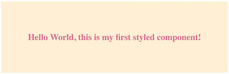
Quite a few things are going on here, so let’s dissect this code snippet.
styled.h1 is a function that, when called, returns a React component that renders an <h1> into the DOM. If you’re wondering, “Where do we call that function? I see only backticks, no parentheses!” that’s exactly where the ECMAScript 2015 features come into play.
What you’re seeing above is a tagged template literal, which is a new feature of JavaScript the language. (No special tooling is needed to use styled-components.) You can call functions with backticks (like styled.h1``), and they will receive the string passed in as the first argument. As we go along, you’ll see how this differs from calling functions normally with parentheses, but let’s leave it at this for now.
So, this styled.h1 call returns a React component. This React component has a class attached to it that styled components automatically generates and uniquifies. This class name has the styles associated with it that you pass to the template literal.
Summed up, this means that the styled.h1 call returns a React component that has the styles applied that you pass to the template literal.
Full CSS Support
Because styled-components is just CSS, it supports all of CSS perfectly fine. Media queries, pseudo-selectors, even nesting just work. We are generating a class name and injecting the CSS into the DOM; so, whatever works in CSS works with styled-components, too.
const Input = styled.input`
  font-size: 1.25em;
  border: none;
  background: papayawhip;
  /* ...more styles here... */

  &:hover {
    box-shadow: inset 1px 1px 2px rgba(0,0,0,0.1);
  }

  @media (min-width: 650px) {
    font-size: 1.5em;
  }
`;
This Input component will now have nice hover styles and will resize itself to be a bit bigger on large screens. Let’s see what one of these inputs looks like with and without a placeholder:

As you can see, making a container component that has styling or making a presentational component that has logic is impossible. We are also building a lot of small components and combining them into bigger containers, and because there are no visible classes, we cannot use them more than once.
Essentially, by using styled-components, we have to build a good component system — there is no other way. It enforces the best practices for us — no special architectural code review needed.
Wrapping Up
Styled components offers a lot more great features, such as built-in theming and full React Native support. I encourage you to dive into the documentation and try it out on one of your projects. Not having to worry about best practices makes the development experience so much better and quicker. I’m obviously very biased, but I don’t ever want to go back to another way of styling React apps.
Here are a few miscellaneous links related to styles in JavaScript that aren’t specific to styled components but that talk about the topic more generally:
- “React JS Style Components” (video), Michael Chan, Full Stack Talks An amazing talk about leveraging components as a styling construct. If you’re using React and haven’t heard this talk yet, stop what you’re doing and watch it right now.
- “The magic behind ? styled-components”, Max Stoiber This article by yours truly dives deep into tagged template literals, how they work and why they are super useful, based on the example of styled-components.
- “The Future of Reusable CSS” (video), Glen Maddern, ColdFront16 This talk by styled-components’ cocreator doesn’t talk about the library itself, but explains how theming component-based systems should work. A lot of these ideas have made their way into the library.
- “Rendering Khan Academy’s Learn Menu Wherever I Please,” Jordan Scales A great article that documents the move of a complex code base from a Handlebars and LESS combo to React and styles in JavaScript. Highly recommended if you’re not sure whether either React or Styles in JavaScript are for you.
Further Reading
- Styling Web Components Using A Shared Style Sheet
- A Glimpse Into The Future With React Native For Web
- Finally, CSS In JavaScript! Meet CSSX
- How Marketing Changed OOP In JavaScript
 (rb, vf, il, yk, al, mrn)

