The Underestimated Power Of Color In Mobile App Design

Email Newsletter
Weekly tips on front-end & UX.
Trusted by 182,000+ folks.
 Register for Free
 Celebrating 10 million developers

 Custom Web Forms for Angular, React, & Vue. Your backend.
Color is arguably the second most important aspect of your app, after functionality. The human to computer interaction is heavily based on interacting with graphical UI elements, and color plays a critical role in this interaction. It helps users see and interpret your app’s content, interact with the correct elements, and understand actions. Every app has a color scheme, and it uses the primary colors for its main areas.
When designing a new app, it’s often difficult to decide on a color scheme that works well, as there are an infinite number of possible color combinations out there. In this article, we’ll go over the most important points related to color in apps. We’ll cover traditional color scheme patterns (monochrome, analogous, complementary), custom color combinations that aren’t based strictly on any one pattern, and we’ll also learn how to choose colors and contrasts for your app that support usability. If you’d like to hone your own color usage skills, you can download and test Adobe XD for free, and get started right away.
How To Select An Effective Color Scheme
When creating a color scheme there are many factors to consider, including brand colors and color associations for your region.
How Many Colors?
Keeping your color combinations simple will help you improve the user experience. A simple color scheme isn’t overwhelming to the eye and makes your content easier to understand. Conversely, having too many colors in too many places is an easy way to mess up a design.
A University of Toronto study on how people used Adobe Color CC revealed that most people preferred simple color combinations that relied on only two to three colors.
How To Create A Scheme
So, how do you choose those two or three colors? The color wheel can help.
There are a number of predefined color scheme standards that make creating new schemes easier, especially for beginners.
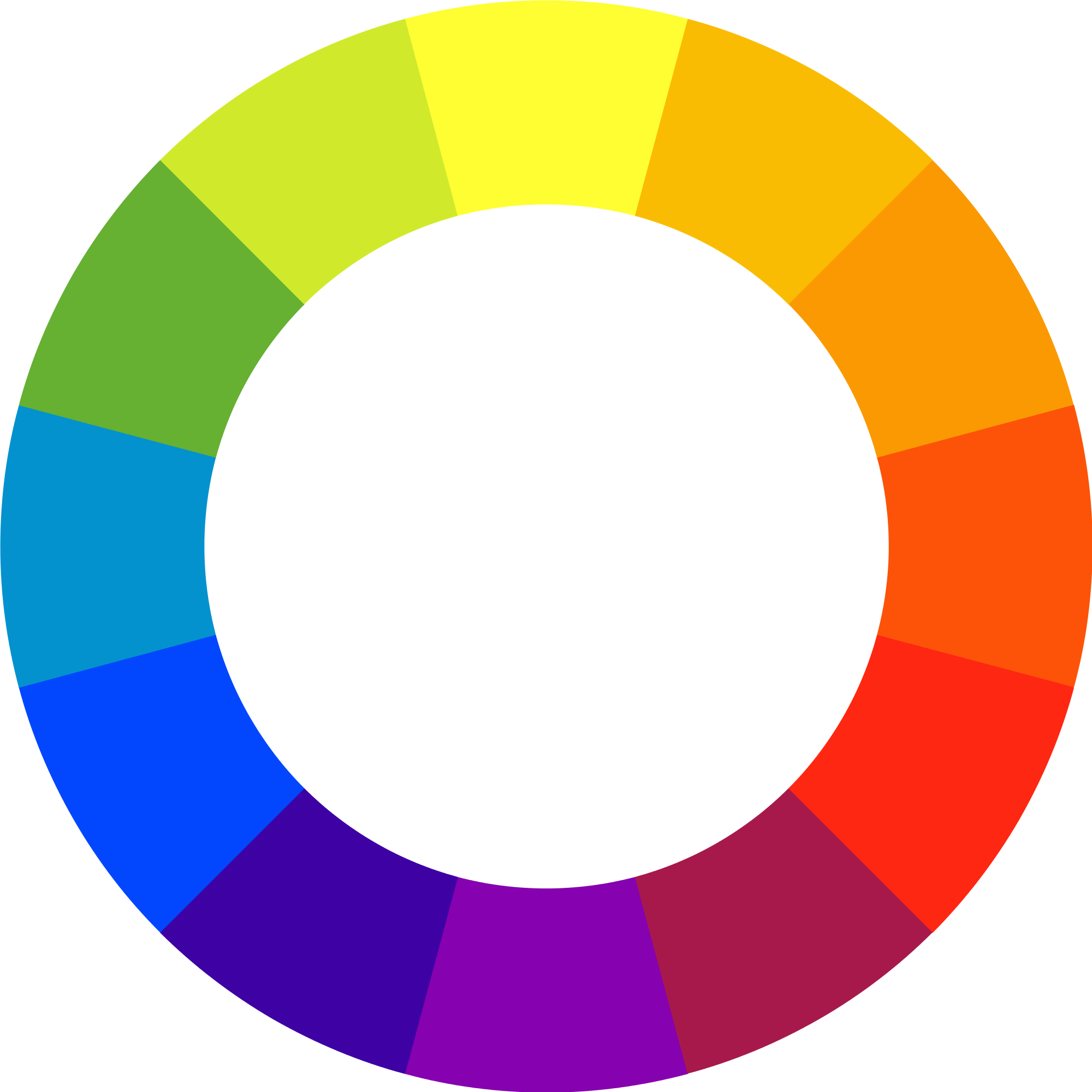
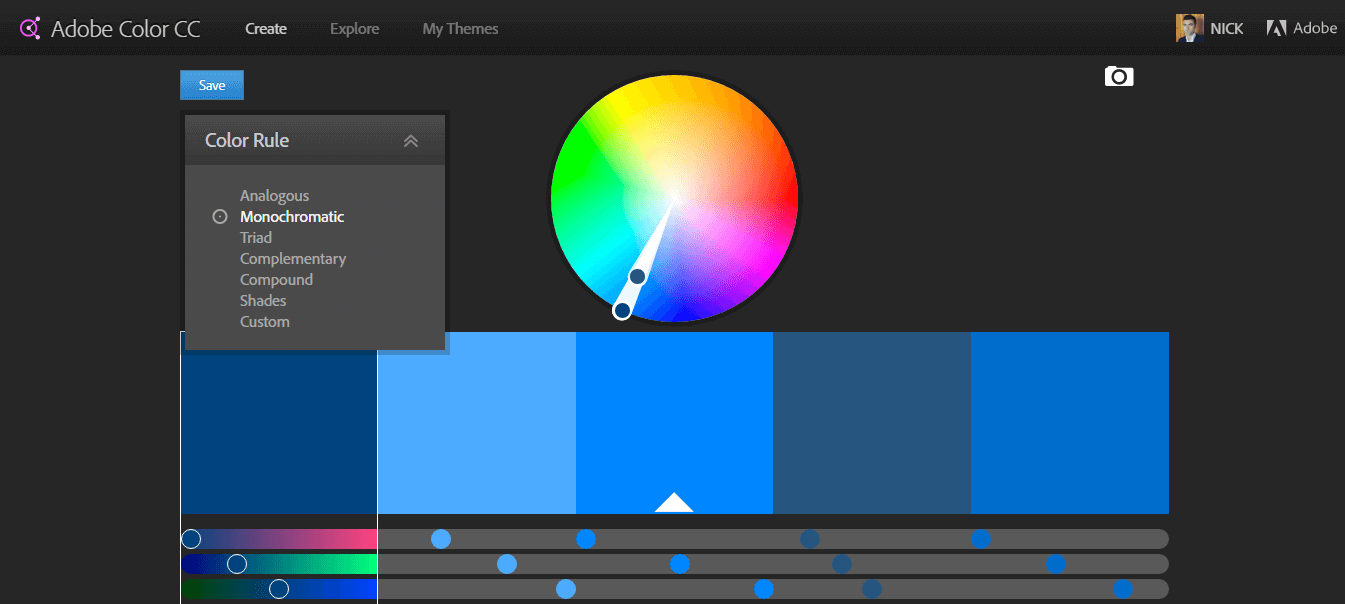
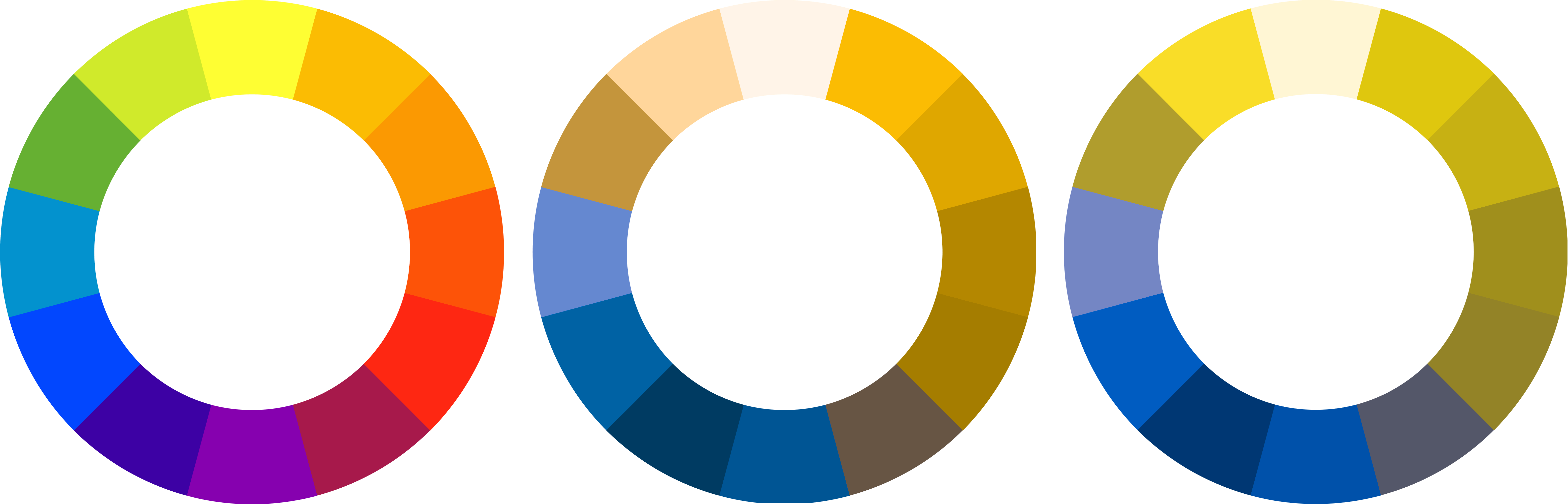
Monochromatic
Monochromatic schemes are the simplest color schemes to create, as each color is taken from the same base color. Monochromatic colors go well together, producing a soothing effect.
The monochromatic scheme is very easy on the eyes, especially with blue or green hues.

As you can see, the scheme looks clean and elegant.
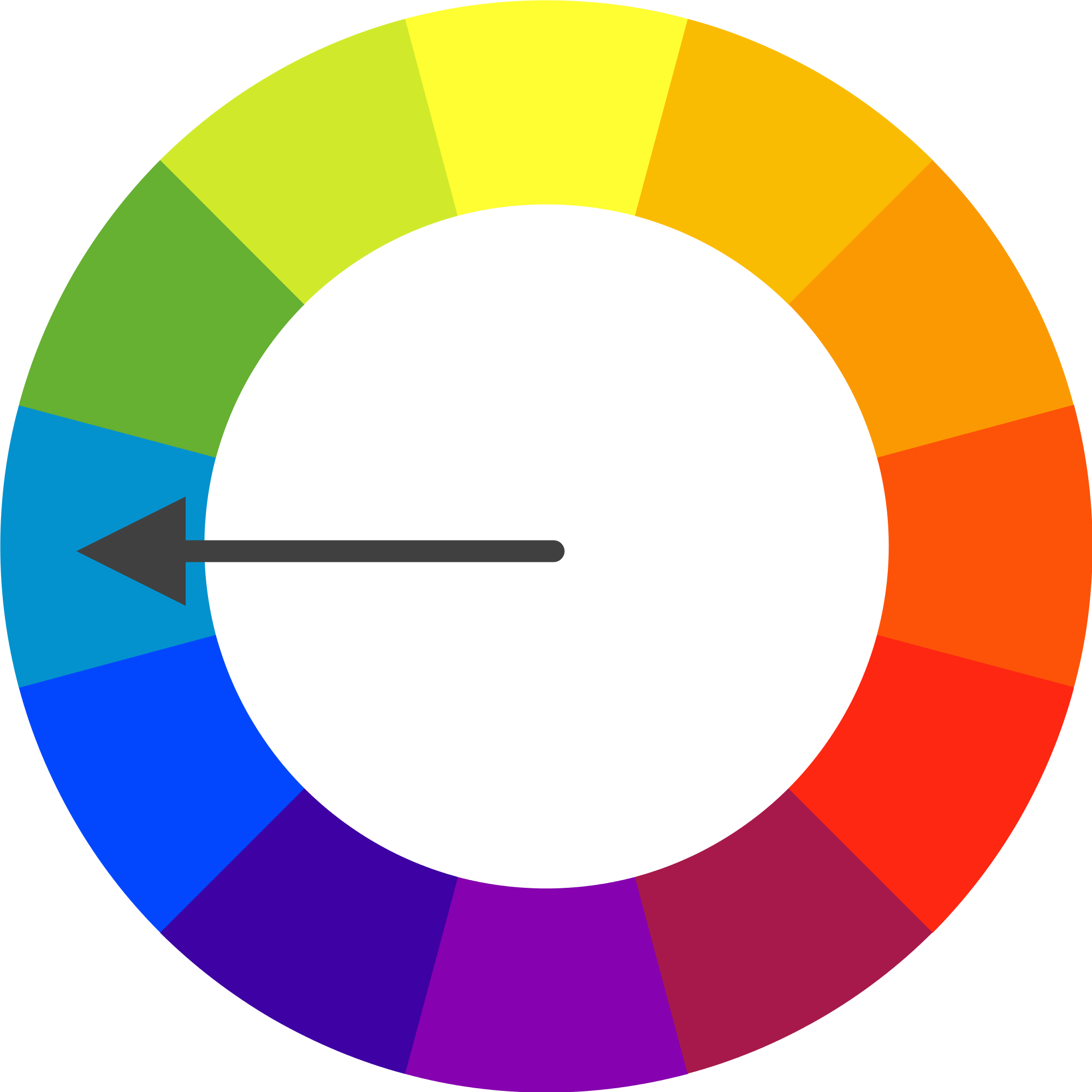
Analogous
Analogous color schemes are created from related colors that don’t stand out from one another; one color is used as a dominant color while others are used to enrich the scheme.
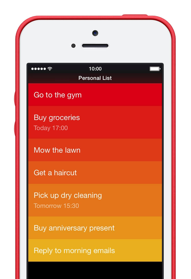
While this scheme is relatively easy to pull off, the trick is in deciding which vibrancy of color to use, as it will be exaggerated. For example, Clear, a gesture-driven to-do app, uses the analogous colors to visually prioritize current set of tasks.

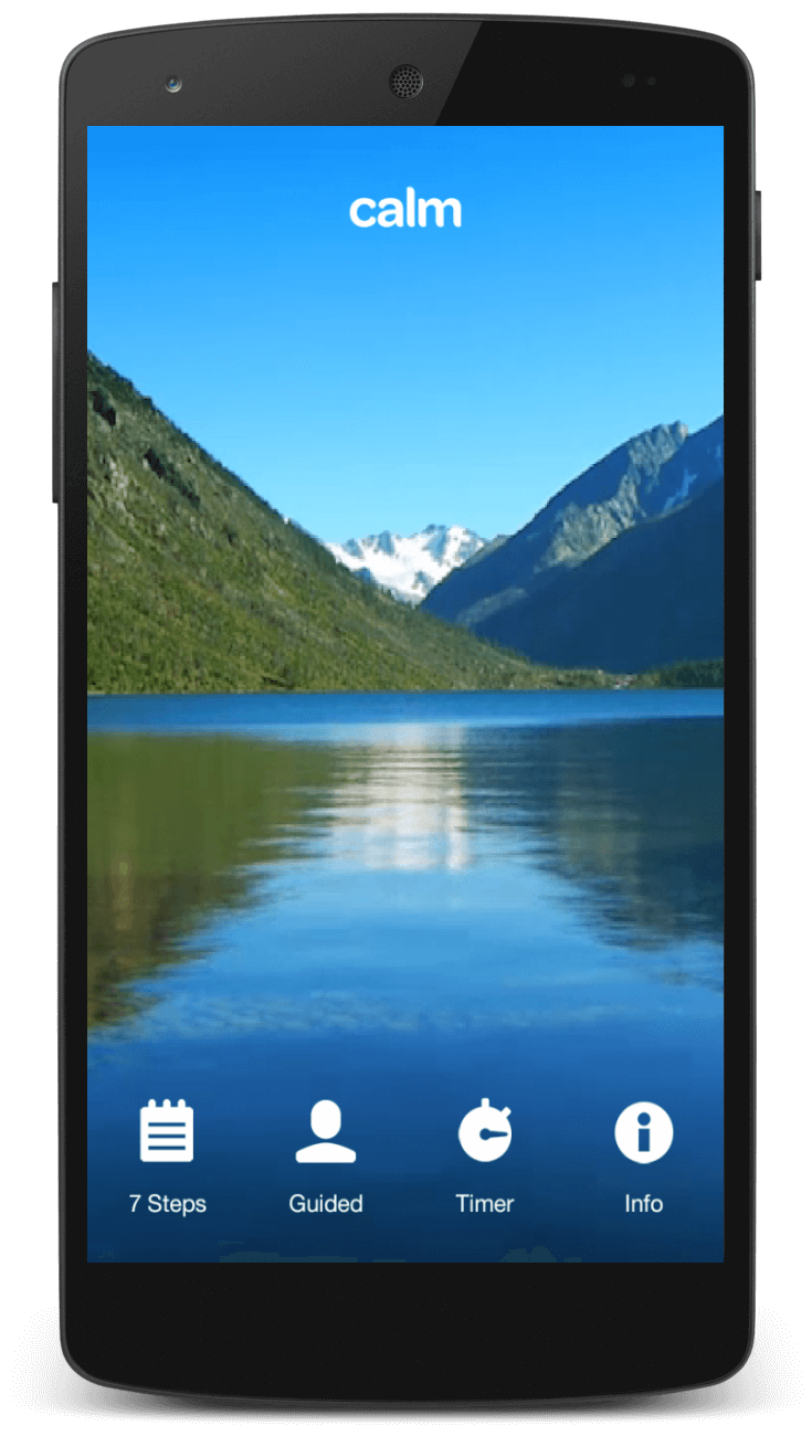
While Calm, a meditation app, uses the analogous colors blue and green to help users feel relaxed and peaceful.

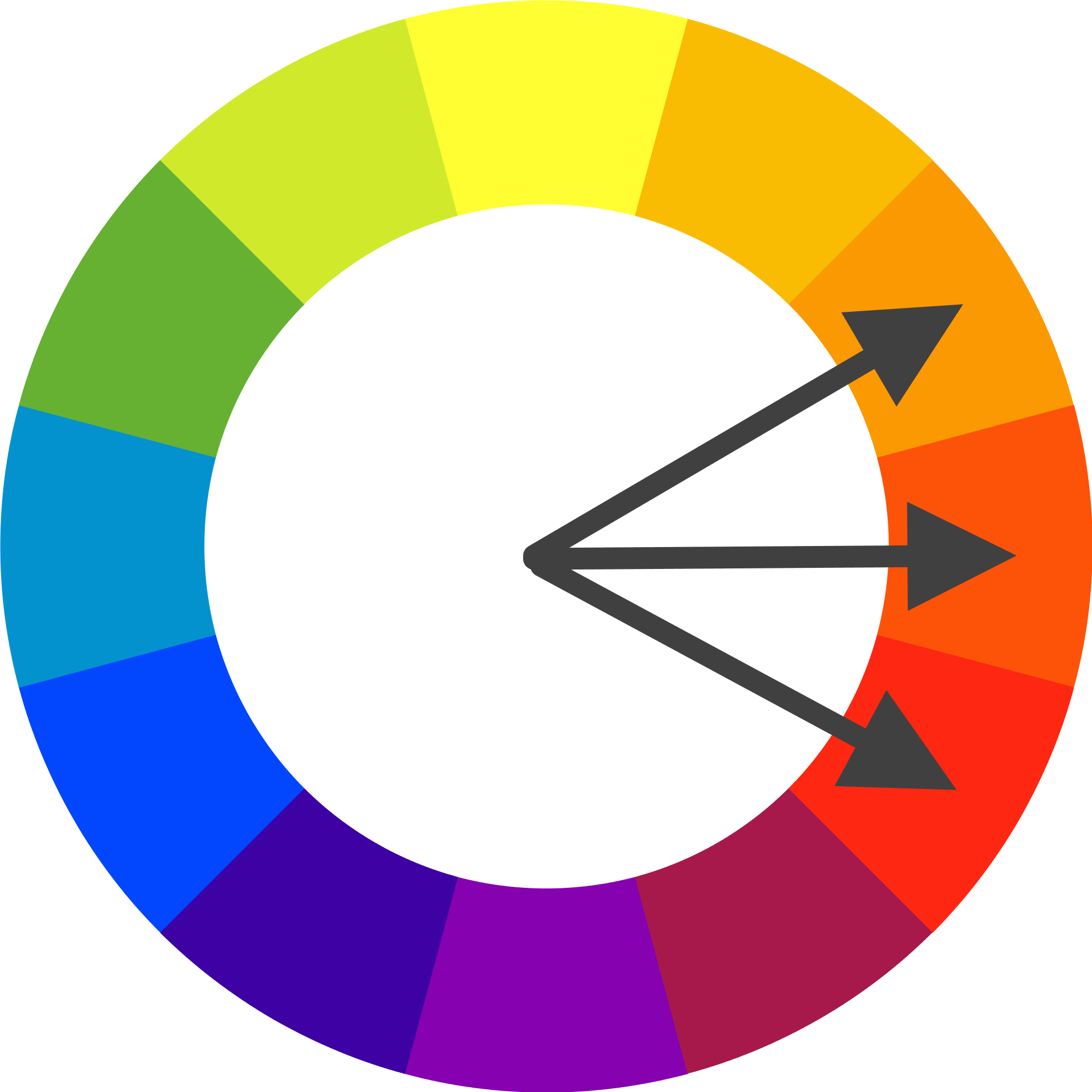
Complementary
Colors aren’t always at odds with each other; complementary colors are opposite colors.
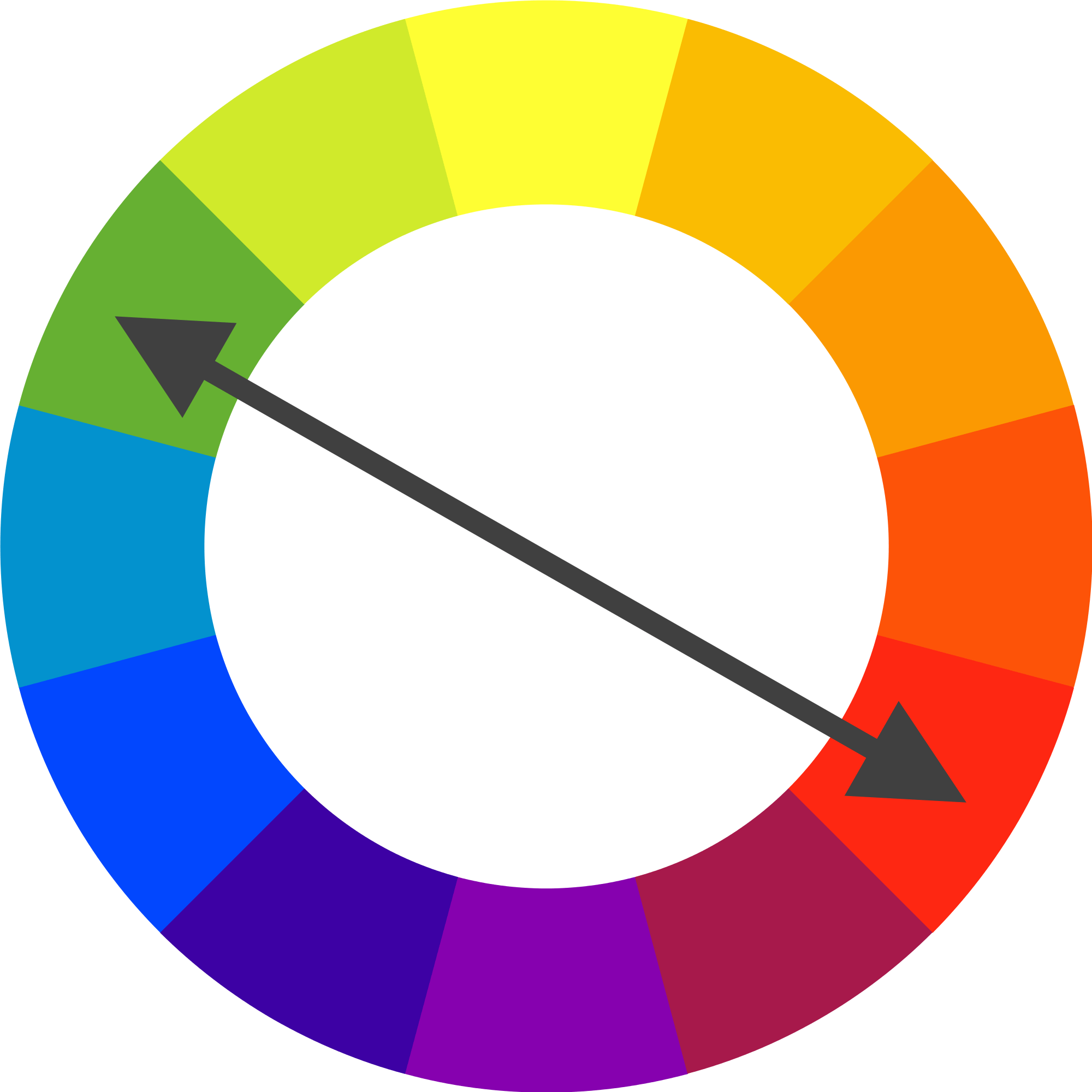
They contrast strongly, and they can be used to attract the viewer’s attention. When using a complementary scheme, it is important to choose a dominant color and use its complementary color for accents. For example, when the human eye sees an object full of different hues of greens, a bit of red is going to stand out very well.

However, you have to use complementary colors carefully to keep your content from being visually jarring.
Custom Color Scheme
Creating your own color schemes is not as complicated as many people think. Adding a bright accent color into an otherwise neutral palette is one of the easiest color schemes to create, and it’s also one of the most visually striking.

White canvases and cool gray copy, splashed with accents of blue, make up the Dropbox color scheme.
Adobe Color CC Makes Your Life Easier
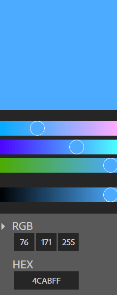
Adobe Color CC, previously known as Kuler, makes color selection extremely easy. Every color on the palette can be individually modified or chosen as the base color with a few simple clicks.
Palettes can be saved and added directly to a library. In addition, there are a number of great color schemes created by the community available on the site.
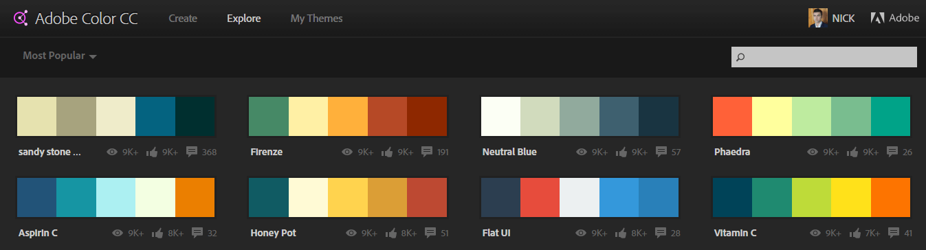
Check it out, so you don’t need to start from scratch.
The Impact Of Color Contrast
Typically, a colored object or area on a UI is not displayed in isolation, but is adjacent to or superimposed on another colored object or area. This creates contrast effects. Contrast is how one color stands apart from another. Properly used, it reduces eyestrain and focuses user attention by clearly dividing elements on a screen.

Contrast And Text Readability
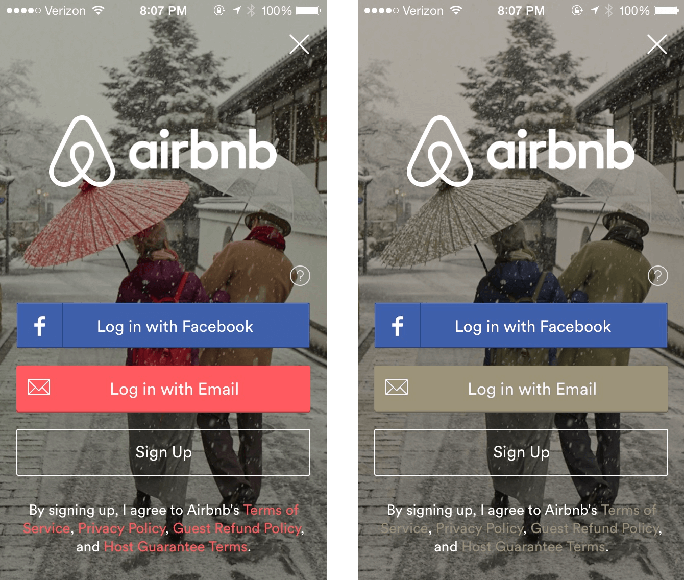
Color contrast is one area where color theory is crucial to the usability of a design. Designers often like to use low contrast techniques because low contrast makes things look beautiful and harmonious. However, beautiful isn’t always the best for readability. When you’re using colors in text, be aware that placing two colors with low-value contrast next to each other can make your copy very difficult to read. This is especially true on mobile screens, where users are often on devices outdoors or in bright places that cause screen glare.

Make sure you have a fair amount of contrast between elements. It’s really not that hard — all you need to do is to check the contrast ratio. Contrast ratios represent how different a color is from another color (commonly written as 1:1 or 21:1). The higher the difference between the two numbers in the ratio, the greater the difference in relative luminance between the colors. The W3C recommends the following contrast ratios for body text and image text:
- Small text should have a contrast ratio of at least 4.5:1 against its background.
- Large text (at 14 pt bold/18 pt regular and up) should have a contrast ratio of at least 3:1 against its background.
This guideline also helps users with low vision, color blindness, or worsening vision see and read the text on your screen.

Icons or other critical elements should also use the above-recommended contrast ratios.

There are several free tools available to give you meaningful feedback about the levels of contrast in your chosen palette. One of them is WebAIM’s Color Contrast Checker which let you test colors you have already chosen.
Contrast And User’s Attention
Along with establishing readable text, contrast can also draw the user’s attention towards specific elements on a screen. Generally, high-contrast is the best choice for important content or key elements. So, if you want users to see or click something, make it stand out! For example, users are much more likely to click a call-to-action button that strongly contrasts with its background.
Designing For Color Blindness
Have you thought about your app appears to users who have visual impairments?
When people talk about color blindness, they usually refer to the inability of perceiving certain colors. Approximately 8% of men and 0.5% of women are affected by some form of color blindness. Red and green colors are a common problematic combination.
Since colorblindness takes different forms (including red-green, blue-yellow, and monochromatic), it’s important to use multiple visual cues to communicate important states in your app. Never rely on a color solely to indicates system status. Instead, use elements such as strokes, indicators, patterns, texture, or text to describe actions and content.
Also, Photoshop has really useful tools to help, and can simulate color blindness. This feature allows the designer to see what the app’s screen will look like to people with different types of color blindness.
Conclusion
We’ve barely covered the fundamentals of how color theory can enhance your app UI design. Honing your color usage skills is an ongoing endeavor. If you want to learn how to create beautiful, functional color schemes, all it takes is practice, determination, and lots of user testing.
"This article is part of the UX design series sponsored by Adobe. The newly introduced Experience Design app is made for a fast and fluid UX design process, creating interactive navigation prototypes, as well as testing and sharing them — all in one place.
You can check out more inspiring projects created with Adobe XD on Behance, and also visit the Adobe XD blog to stay updated and informed. Adobe XD is being updated with new features frequently, and since it's in public Beta, you can download and test it for free."
Further Reading
- How Functional Animation Helps Improve User Experience
- In-App Gestures And Mobile App User Experience
- Best Practices For Animated Progress Indicators
- Animated Microinteractions In Mobile Apps
 (ms, aa, il, mrn)

