Free Fonts With Personality And Style

Email Newsletter
Weekly tips on front-end & UX.
Trusted by 182,000+ folks.
 Try ProtoPie AI free →
 Celebrating 10 million developers

 SurveyJS: White-Label Survey Solution for Your JS App
 Register Free Now
When working on a project yourself, freebies like these can come to the rescue when you have to get along on a tight budget but, more often that that, they simply are the missing piece that’ll make your design complete.
In this post, we hand-picked 30 fonts that are bound to give your project the finishing touch, and maybe even inspire you to something entirely new. The fonts can all be downloaded for free. However, please note that some of them are free for personal use only and are clearly marked as such in the description. Also, please be sure to check the license agreements before using a font in your project as they may change from time to time.
For more free font goodness, also check out the following posts:
- 30 Great Free Fonts for 2019
- 55 Beautiful Free High-Quality Fonts To Jazz Up Your Designs
- 30 Brilliant Corporate Fonts
- 40 Delightful High-Quality Free Fonts
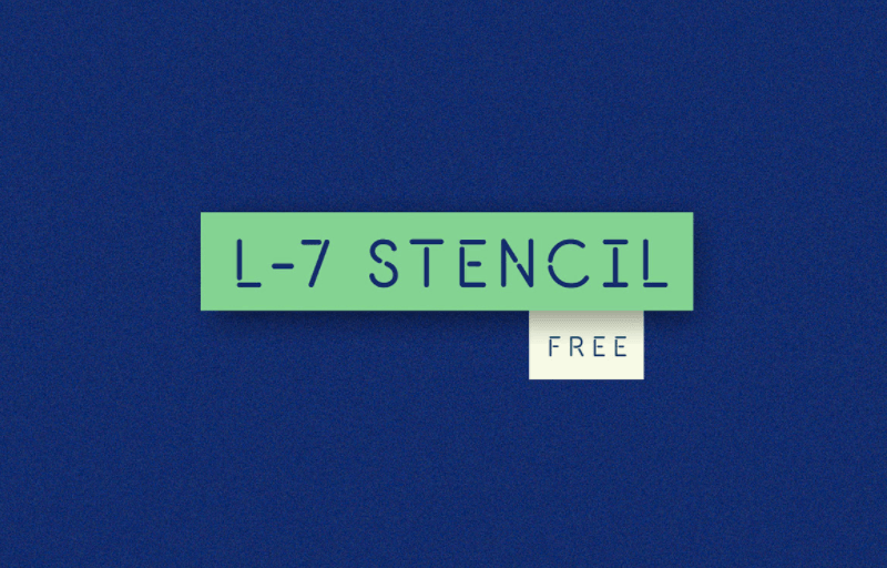
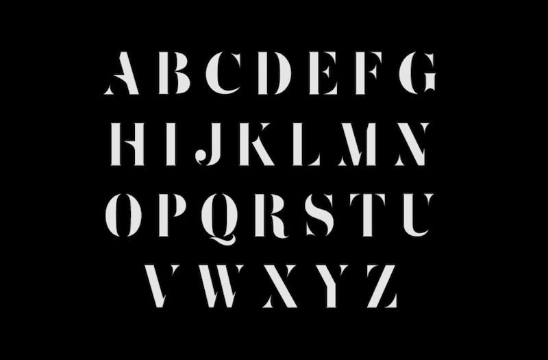
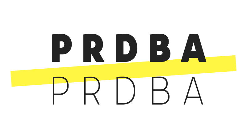
L-7 Stencil
Luis Calzadilla’s font L-7 Stencil is a good match for all those occasions when you want to make a bold statement while keeping the typeface itself rather than sleek and slim. Characteristic for the sans-serif font are the stencil-style, fragmented letters and the rounded terminals. The font supports capital letters and numbers and can be used for free in personal projects. If you want to use it in a commercial project, please be sure to credit the designer.
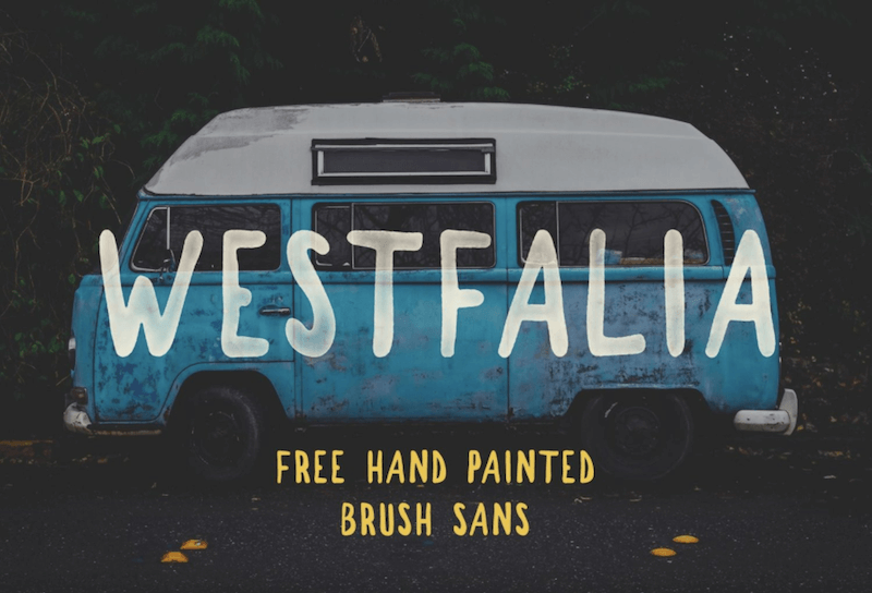
Westfalia
It’s not only the name of the brush sans Westfalia that wakes allusions of the famous campervan. With its hand-drawn feel, messy edges, and varied line thickness, the font also caters for a warm feeling of authenticity and adventure. Westfalia comes in one weight, with capital letters, numbers and punctuation marks, and works especially well as bold headings or on posters. It’s free to use for both personal and commercial projects.
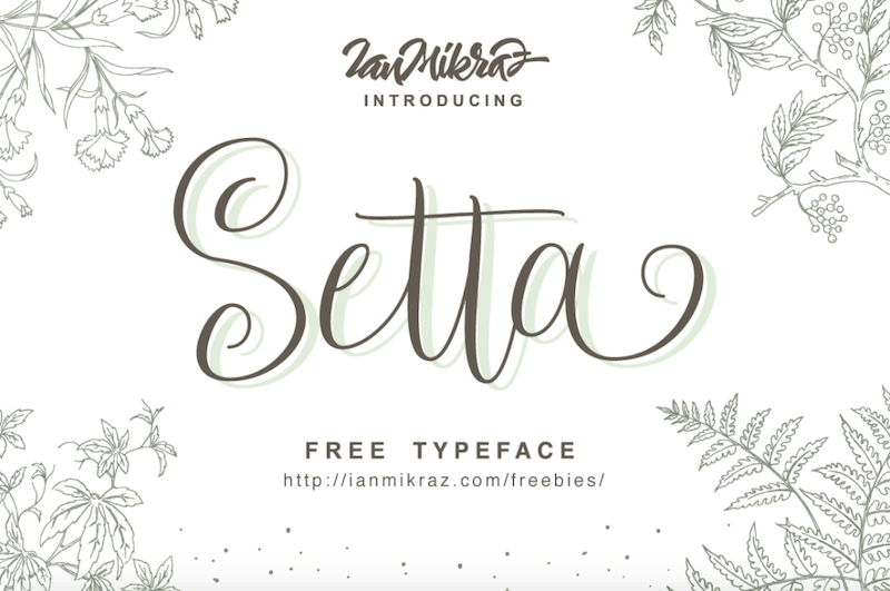
Setta Script
If you’re looking for something to add a personal touch to your projects, the modern calligraphy typeface Setta Script might be for you. It comes with 244 glyphs and 69 alternate characters with Opentype features. Ligatures are also supported. A perfect match for greeting cards and invitations.
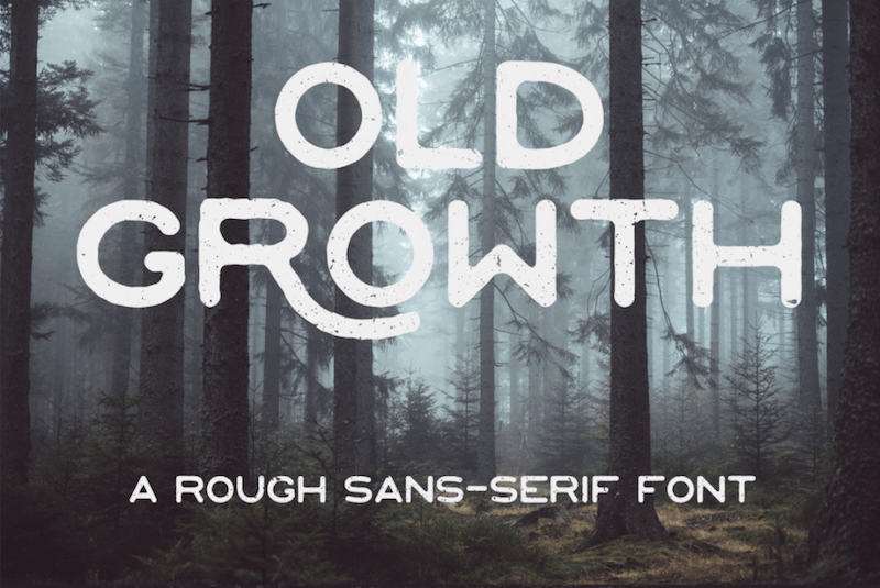
Old Growth
Inspired by the old growth forests of the West Coast, Old Growth is a rough sans-serif font with edges as uneven as the treetops in the woods. This one works especially well for branding, quotes, and headlines. You’re free to use the font to your liking in personal as well as commercial projects.
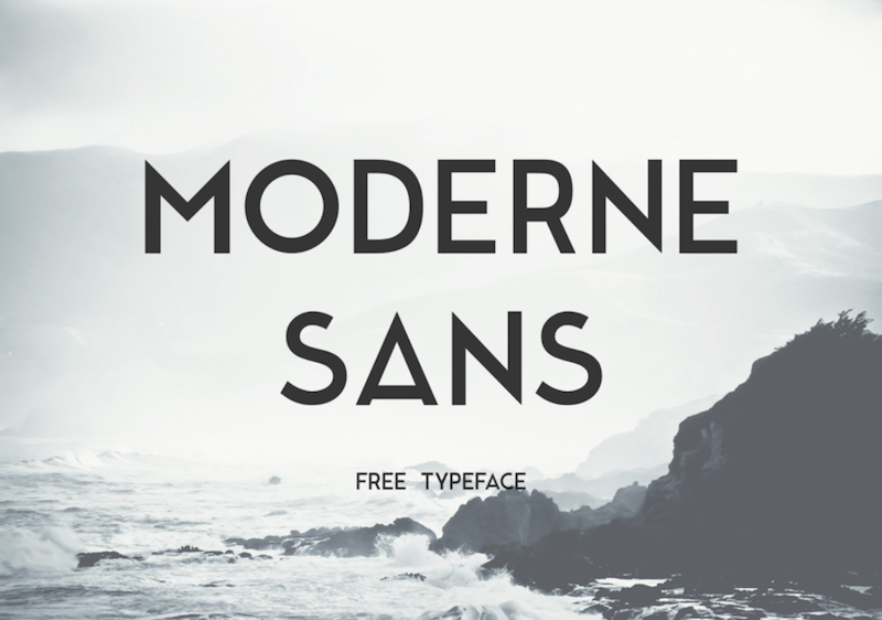
Moderne Sans
Inspired by the typography of the 1920’s, Marius Kempken designed Moderne Sans. The typeface is based on uppercase letters, but lowercase letters and numbers are included in the font, too. You may use Moderne Sans freely in both personal as well as commercial work.
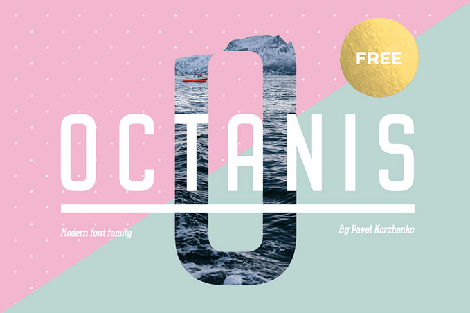
Octanis
The font family Octanis beautifully merges the new and the old. It comes in eight styles ranging from modern, even a bit futuristic sans-serif versions to a rather vintage-inspired slab serif. A nice choice for headlines and logos, but also paragraphs of text look great with it. You may use the typeface for free in both personal and commercial projects.
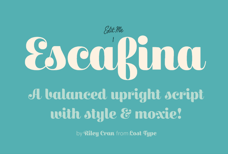
Escafina
A balanced upright script with style and moxie. That’s Escafina. Escafina is a modern interpretation of the letters you usually find in mid-century advertising and signage. It comes in three styles (high, medium, and low) and supports over 100 languages. Personal licenses are pay-as-you-want.
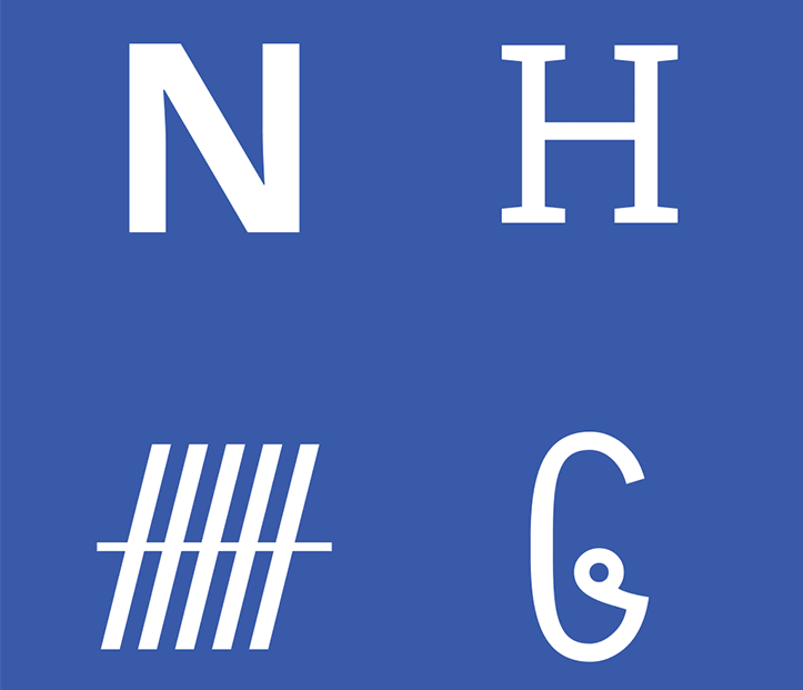
Noto
You know those little boxes that appear when a computer can’t render a character? Because of their shape, they are often referred to as “tofu”. Google’s answer to these little boxes is a font family that aims to support all existing languages and, thus, put an end to “tofu”. And what name could be better suited for such an undertaking as “Noto”, which is assembled from “no more tofu”? The Noto typeface comes in multiple styles and weights and is freely available. Perfect for when your project needs to support languages that other fonts usually fail to display.
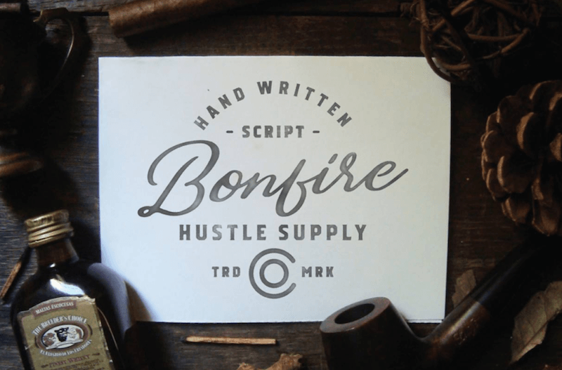
Bonfire
To give your project an authentic, handmade touch, Bonfire might be just what you were looking for. The hand-drawn brush font shines with its unique swashes. The free version includes upper and lowercase letters in one style that you may use for personal projects.
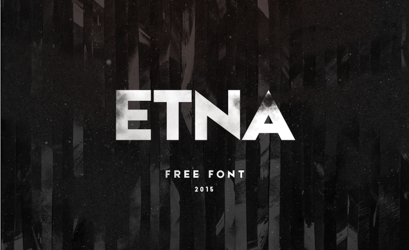
Etna
If you’re looking for a typeface with a seamless flow that still makes a bold statement, Etna may be one for you. Characteristic for Etna are the pointy edges of the capital letters that majestically stand out like the tip of a mountain. While the full version covers Latin as well as Cyrillic alphabets, the free version comes with Latin characters only. Free for personal use.
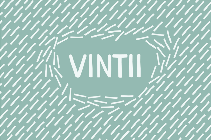
Vintii
Vintii is certainly a friendly and playful typeface that doesn’t take itself too seriously. With its cut-out looks, it’s a good catch for headlines and short descriptions, but it’s readable in larger blocks of text as well. The font contains all basic glyphs and characters and can be used to your liking.
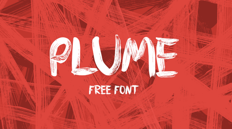
Plume
To create his typeface Plume, Krišjānis Mežulis chose a quite extraordinary approach: He used a thick brush to paint the individual letters, numbers, and punctuation marks on a plastic surface. The result: a crisp typeface with a unique splashed look.
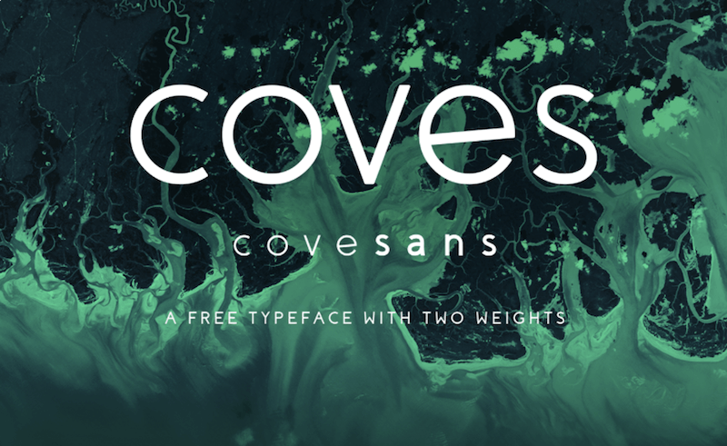
Coves
Simple rounded shapes and a sleek overall look are the determining elements of the font Coves. It comes in two weights (light and bold) and offers full glyph support. You’re free to use Coves in personal projects. If you’re interested in a commercial license, please be sure to contact the designer.
Zefani
Zefani is a typeface with a strong character and an elegant, sophisticated look. The stencil version comes with uppercase letters and can be used for free in private projects.
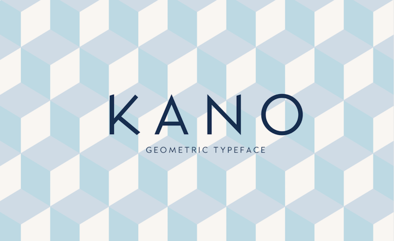
Kano
If you’re looking for a font with personality that is humble enough not to steal your content the show, check out Kano. With its geometric structure and sharp edge points, it makes a statement that is ideal for logos, posters, and other typographic work. Kano is free to use in personal and commercial projects.
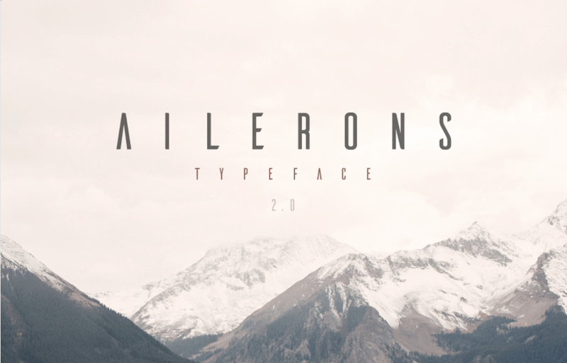
Ailerons
Ailerons can be translated as “little wing” in French, and that’s exactly where the typeface sought its inspiration: in aircraft models of the 1940s. The typeface is clean and stylish and works especially well for titles. You may use it freely as long as it’s for personal use only. If you’re interested in using Ailerons in a commercial project, please contact the designer.
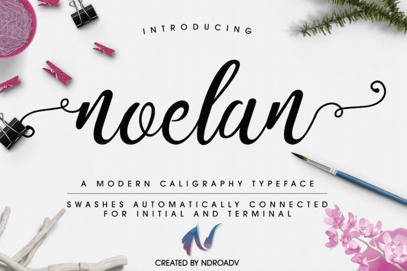
Noelan Script
Do you have a sweet spot for handlettering? Then, take a look at Noelan Script. The modern calligraphy typeface comes with Opentype features that allow swashes to be automatically connected for intial and terminal. And to improve the handwritten look even further, you can mix and match alternate characters for more variety. Noelan is free for personal and commercial use.
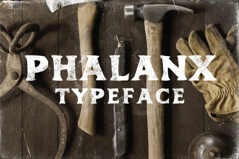
Phalanx
Inspired by vintage print catalogs from the early 1900s, Mark Richardson set out to create a typeface that captures the aesthetics of the era. What came out of it, is the free font Phalanx, and, well, rustic and honest are probably the words that best describe its look. Phalanx comes with a full uppercase alphabet and numbers. You’re free to use it as you wish.
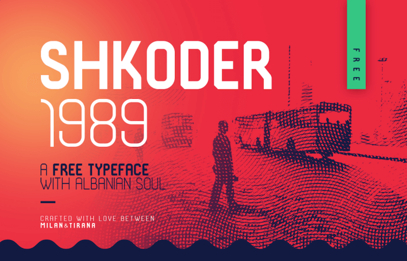
Shkoder 1989
How about some 90s vibes for a change? Shkoder 1989 seeks inspiration in the good things of the decade: sports, tech, and everything else that inspired a kid of the time. The typeface consists of caps, numbers, and a lot of glyphs that make it a good fit also for non-English projects. Two weights – one light, one black – are available. You may use Shkoder 1989 for any kind of project. If you decide to use it commercially, shoot the designers an email – they’d love to hear about it.
Wayward
A font that beautifully captures the aesthetic found in popular handwriting pieces is Wayward. The uppercase alphabet pairs well with script lettering and gives branding projects a personal touch. Free to use, also commercially.
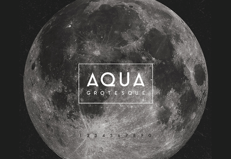
Aqua Grotesque
Aqua Grotesque is a grotesque typeface with a retro, 1940s touch. Its crisp, geometric shapes cater for a fresh and unique look. Feel free to use it as you like.
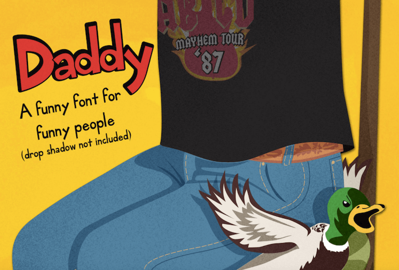
Daddy
“A funny font for funny people.” That’s how the font Daddy describes itself. Originally created for a children’s book, Daddy is bound to bring a fresh and playful twist to any kind of project. It’s free to use, even commercially.
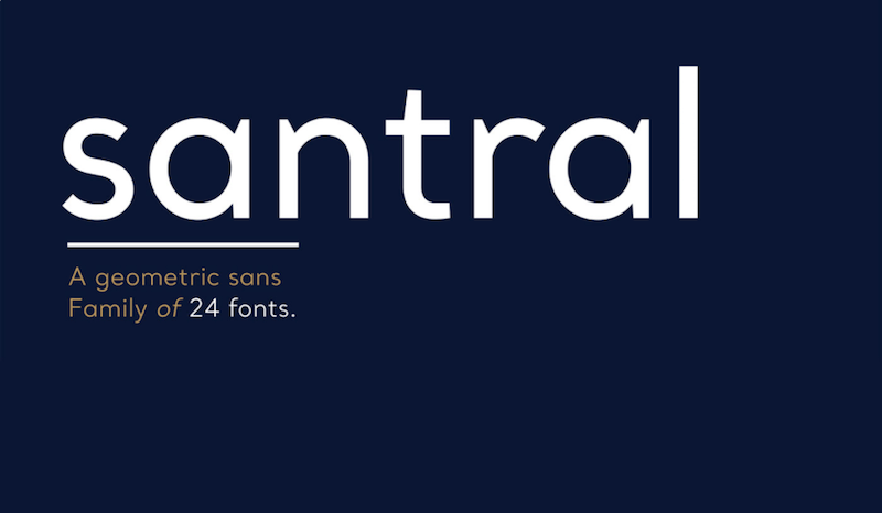
Santral
A sharp and precise design that enables a clear communication with the reader – that’s Santral. Santral was designed with a focus on keeping the balance between visual perfection and optical impression. The complete font family includes twelve weights and italic versions, two of them (Light and Light Italic) can be downloaded for free for personal projects.
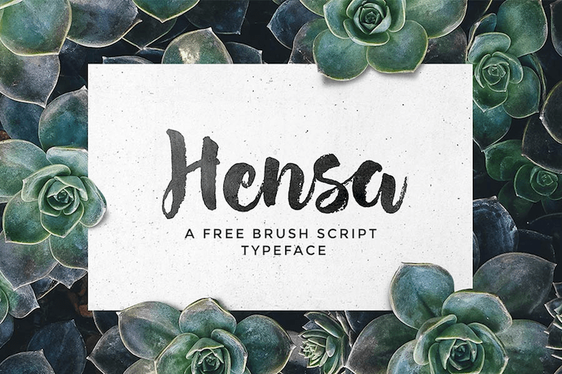
Hensa
The hand-painted brush script typeface Hensa is a nice choice for logos, packaging, greeting cards and the like. It supports standard Latin characters (upper- and lowercase), numerals, punctuation, ligatures, and – for the extra handmade touch – a set of swashes. Free for private and commercial use.
Affogato
Its high x-height and long descenders make Affogato an unusually expressive, yet friendly, typeface. It comes in five weights and a vast variety of glyphs which make it a good fit for diacritic-heavy languages, too. Affogato looks especially good as display type or in logos, but body copy works well, too. You may use it for free (also commercially) or can pay what you want for a license to show the designer your appreciation.
Stijla
How about something experimental for a change? Inspired by Kandinsky and Gestalt’s optical research, Alfonso Armenteros Parras designed Stijla, a typeface that wants to push the boundaries of legibility. The free version comes with a standard Latin alphabet and numbers.
Accent
Another rather experimental font is Accent. The combination of fine lines and bold geometric shapes works best for short titles and short words. You may use Accent for free in both personal and commercial projects.
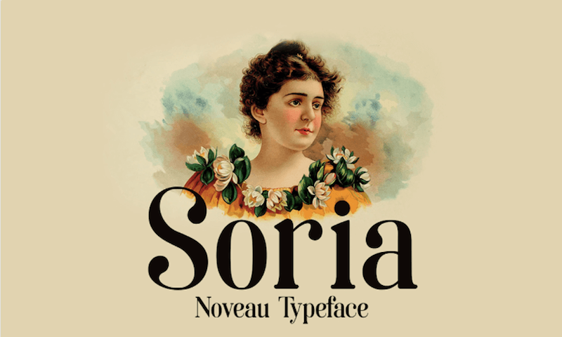
Soria
Art nouveau and the modern Didot typeface were the source of inspiration for Soria. Soria comes with a good selection of glyphs and beautiful ligatures. A timely piece with a unique, vintage touch.
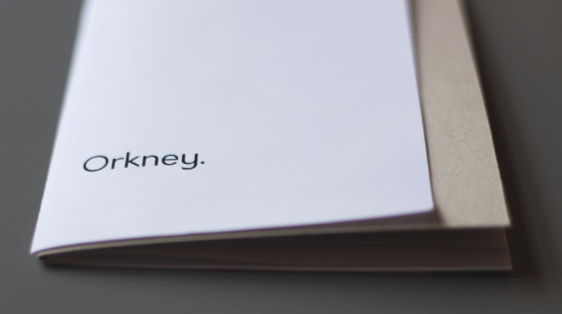
Orkney
A unique yet functional font is Orkney. With its geometric look and a high level of readability also in small font sizes, it works well in both print and web projects. The Orkney family includes four weights with more than 400 characters and wide language support. Released under the SIL Open Font License, you may use it commercially.
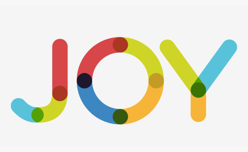
Multicolore
Technically speaking, Multicolore isn’t a font as it’s multicolored and you cannot write with it in your favorite program either. Instead, you’ll need a vector editing application to create text with it. But that’s nothing to worry about as the bold and playful fellow is best suited for text that includes only a few words anyhow. Multicolore comes in EPS, AI and PDF formats and is free even for commercial use.
Did you stumble across a free font recently that caught your attention? We’d love to hear about it in the comments!
Further Reading
- How To Build And Launch Powerful Responsive Websites With Editor X
- Meet Penpot, An Open-Source Design Platform Made For Designers And Developers Alike
- A New Way To Reduce Font Loading Impact: CSS Font Descriptors
- Free Fonts For Interface Designers


