Calligraphy Art: Getting Started And Lessons Learned

Email Newsletter
Weekly tips on front-end & UX.
Trusted by 182,000+ folks.
 Celebrating 10 million developers

 SurveyJS: White-Label Survey Solution for Your JS App
 Register Free Now
Typography is a primary element of composition. Being a designer, I pay a lot of attention to its quality. Operating Photoshop is easy for me; however, to level up my skills, I am always learning to work with letters, using my hands, without any computer programs.
The first time I took a calligraphy course was about a year ago, and the decision was quite hard. I was sure that it would be painstaking and that I would need excellent handwriting to learn this art. How mistaken I was!
"Type is saying things to us all the time. Typefaces express a mood, an atmosphere. They give words a certain coloring." – Rick Poynor (“Helvetica”, 2007)
Typefaces are always telling us something. We receive information through typography. Type influences us, adds coloring to words, sets a mood and atmosphere, assists, teaches, scares us, brings us joy and inspires us.
Typography is, foremost, an information medium. At the same time, it fulfils social functions and acts as an indicator of the age it belongs to. The contemporary world has its own rhythm, aesthetic and philosophy; while we are changing, everything is changing around us. In studying historical lettering in calligraphy, we can understand the character and potential of a writing instrument, and, as a result, we can manage its expressive means.
My Introduction To Calligraphy
When I joined the calligraphy course, I heard students talking amongst themselves: “I’ll never manage to do it this way!” “I can’t write in such a beautiful way!”
To tell the truth, I felt the same way. But that was nonsense! And I say that as a master of Photoshop who couldn’t handwrite plain lines only a year ago.
"Type is a visual language, which connects the writer and the reader." – Erik Spiekermann
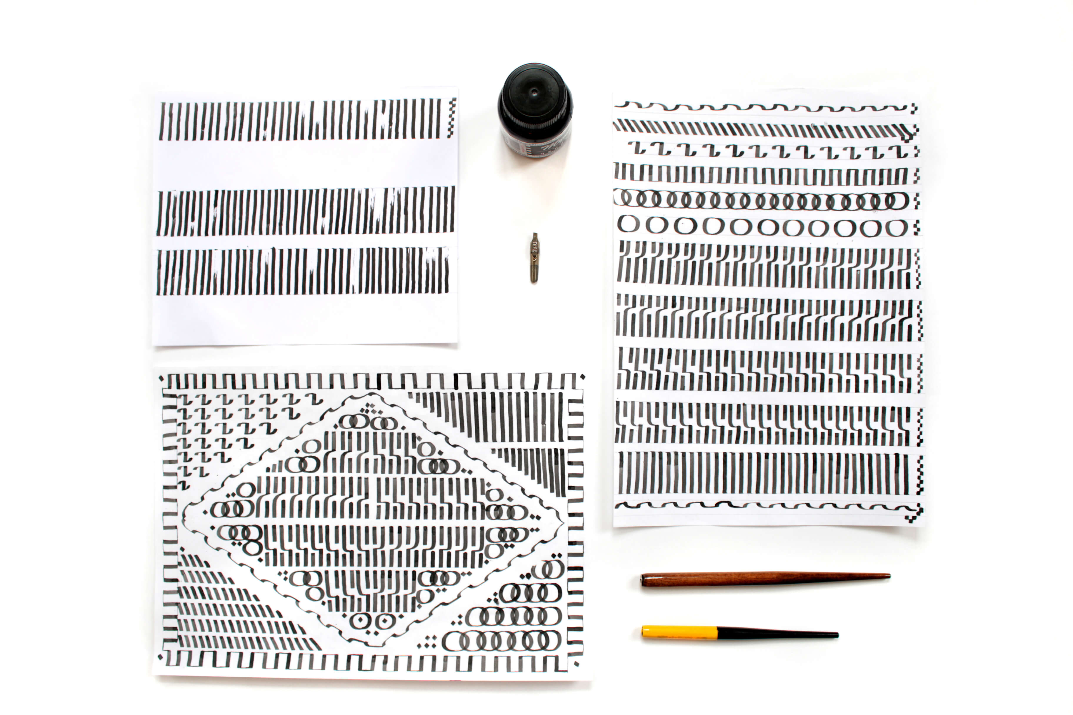
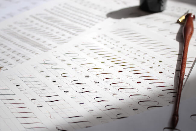
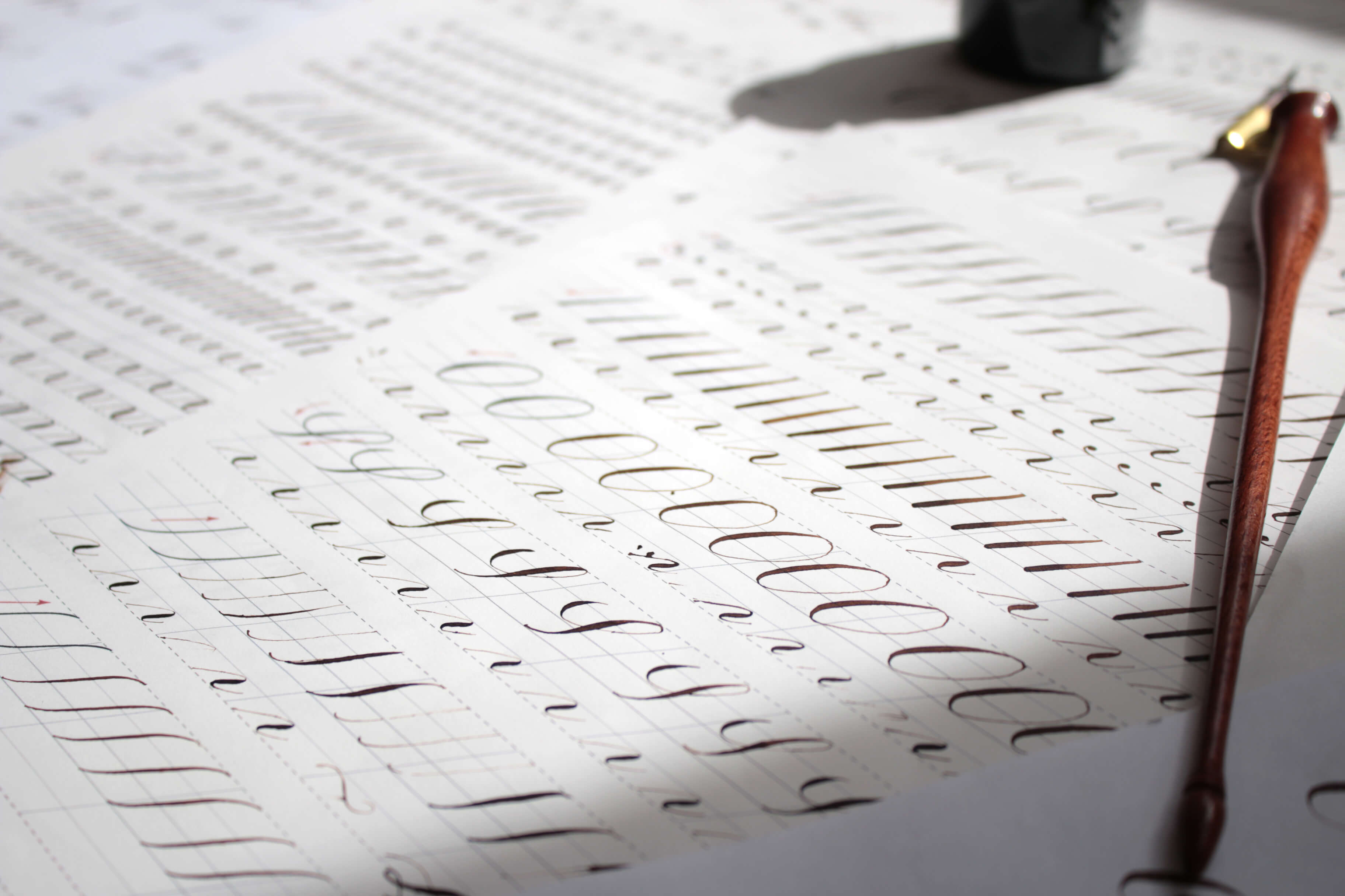
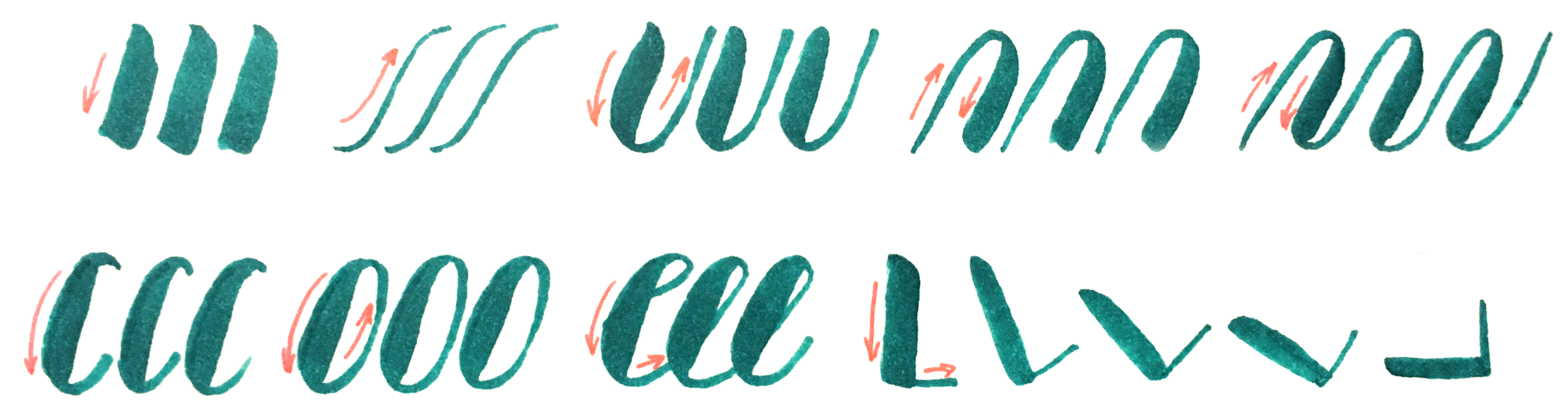
Our first lesson was to write simple strokes, the basis of all letters, with a flat paintbrush.

Tip: A lot of useful resources and online courses are on the Internet. However, I recommend starting by learning from professionals (in workshops, at calligraphy schools). A professional will help you to develop proper technique, answer your questions and prompt you in the nuances of the craft. Even something as seemingly simple as one’s posture and pen-holding technique will substantially influence the result.
Studying in a course had a positive outcome. Writing with different instruments and trying different techniques, I could figure out which instrument suits me best.
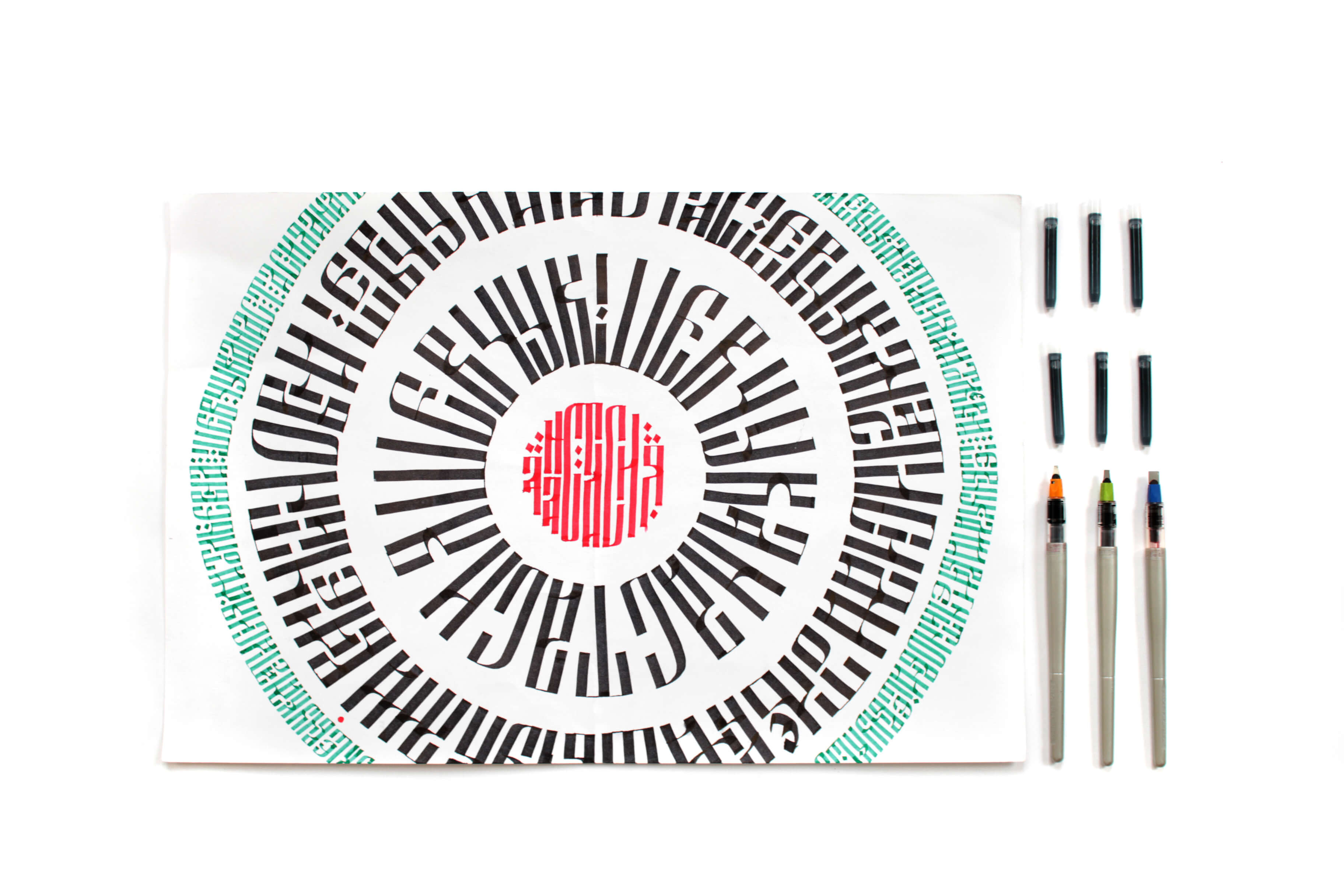
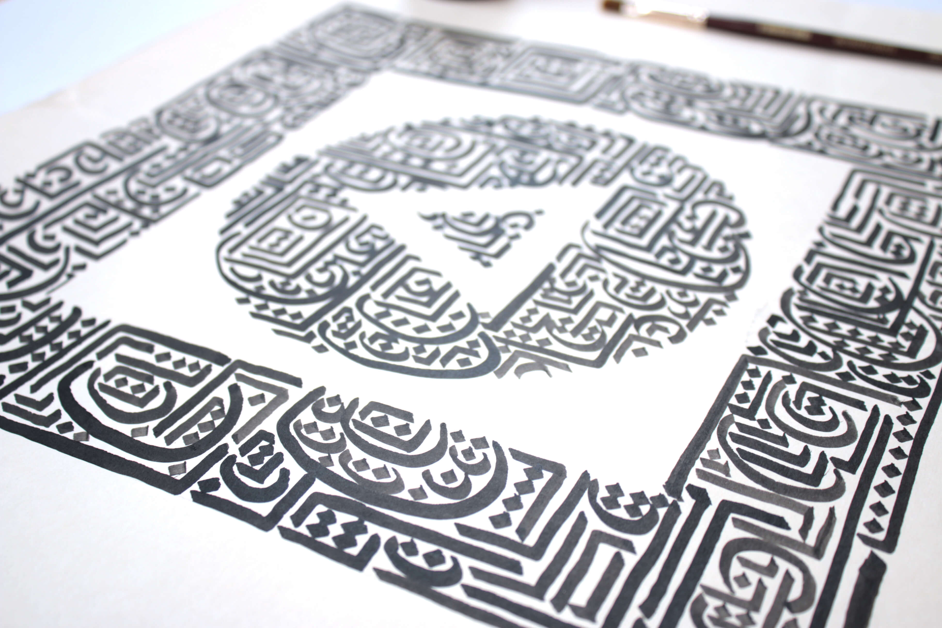
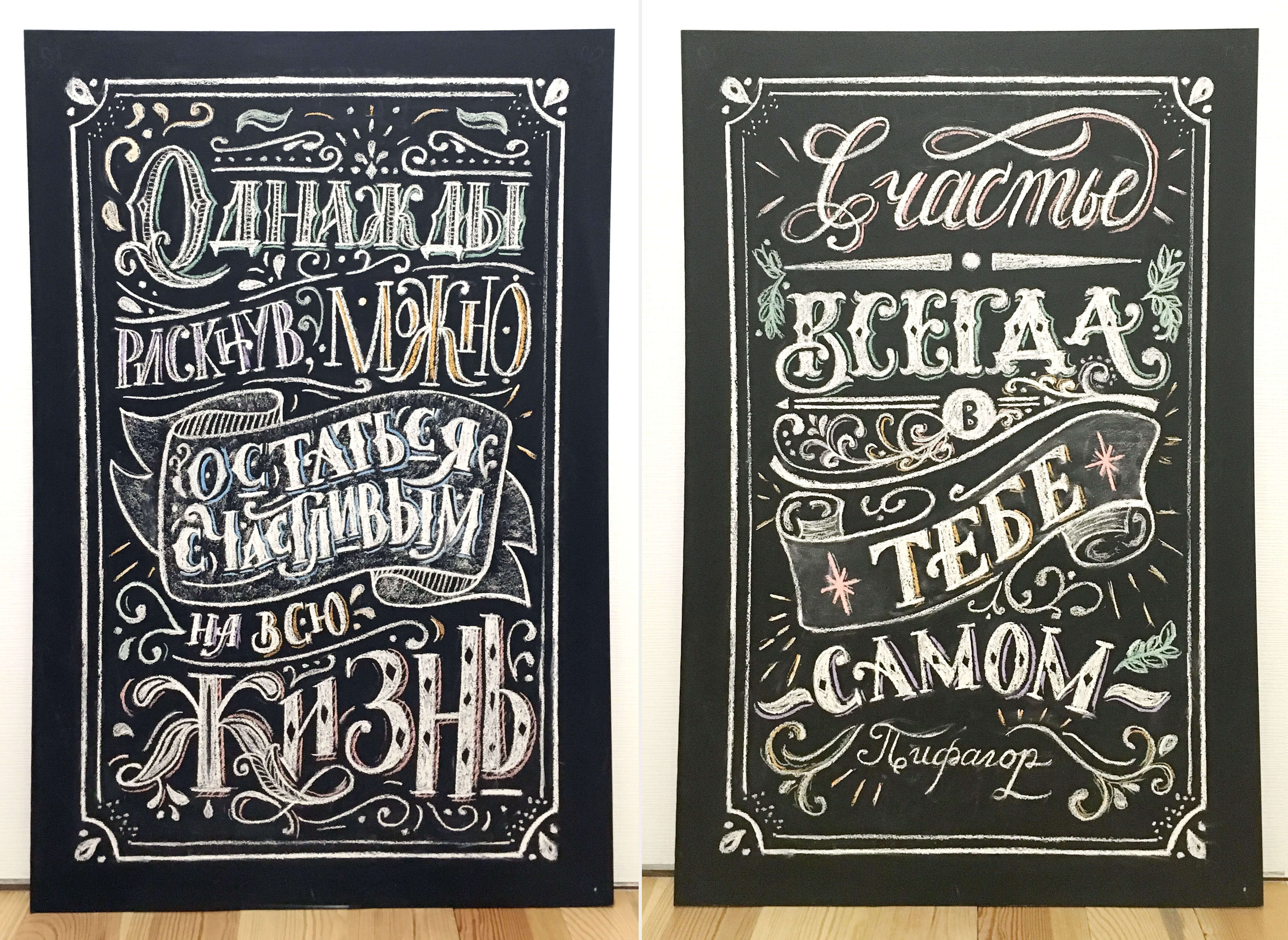
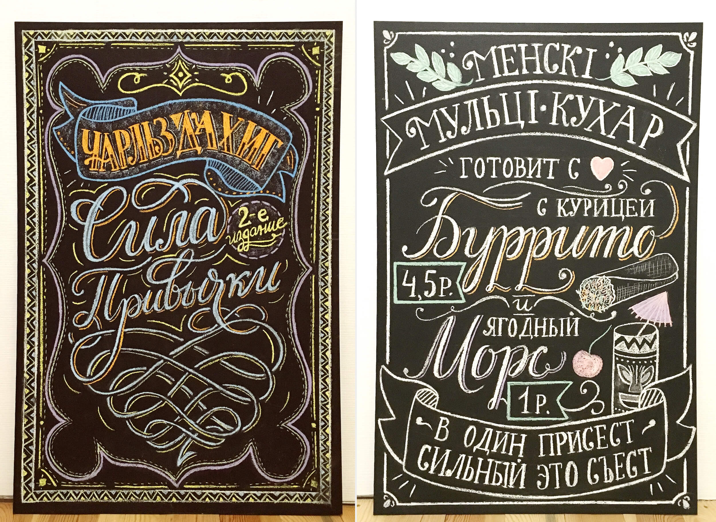
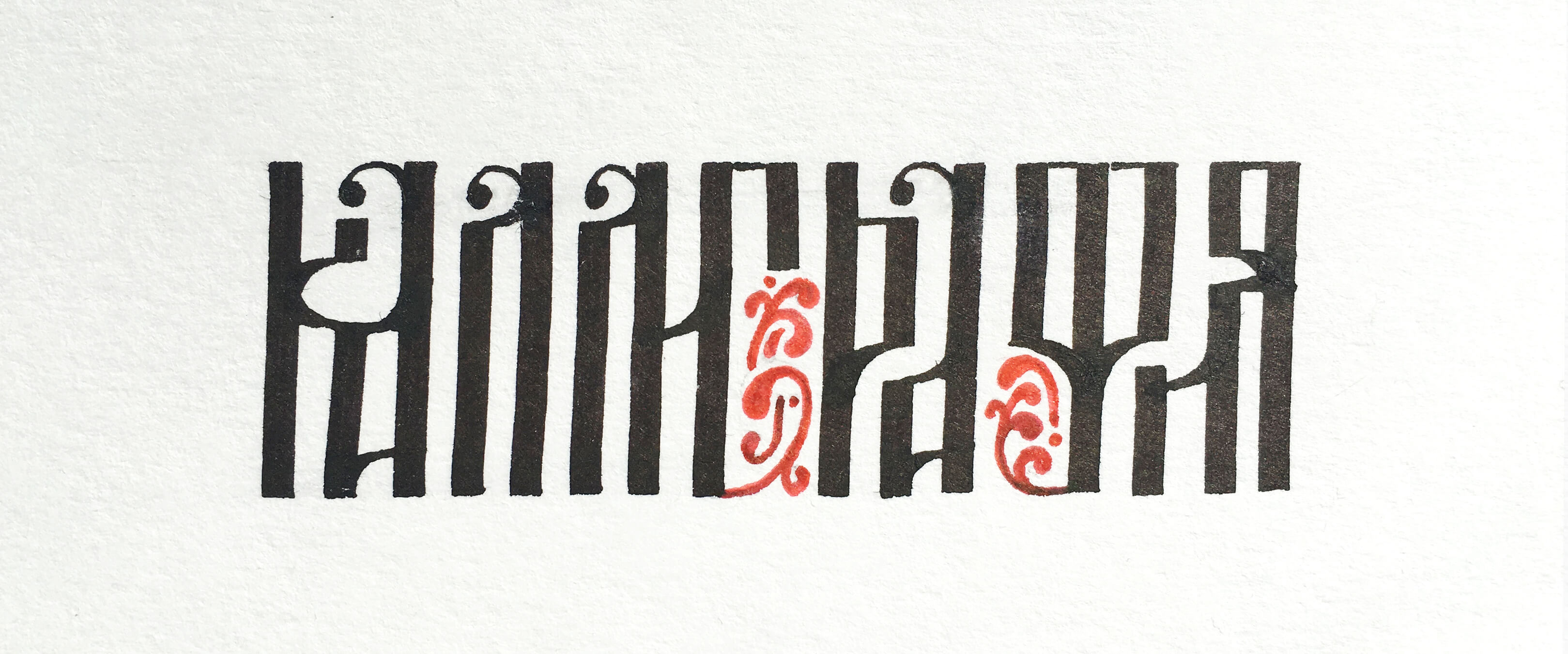
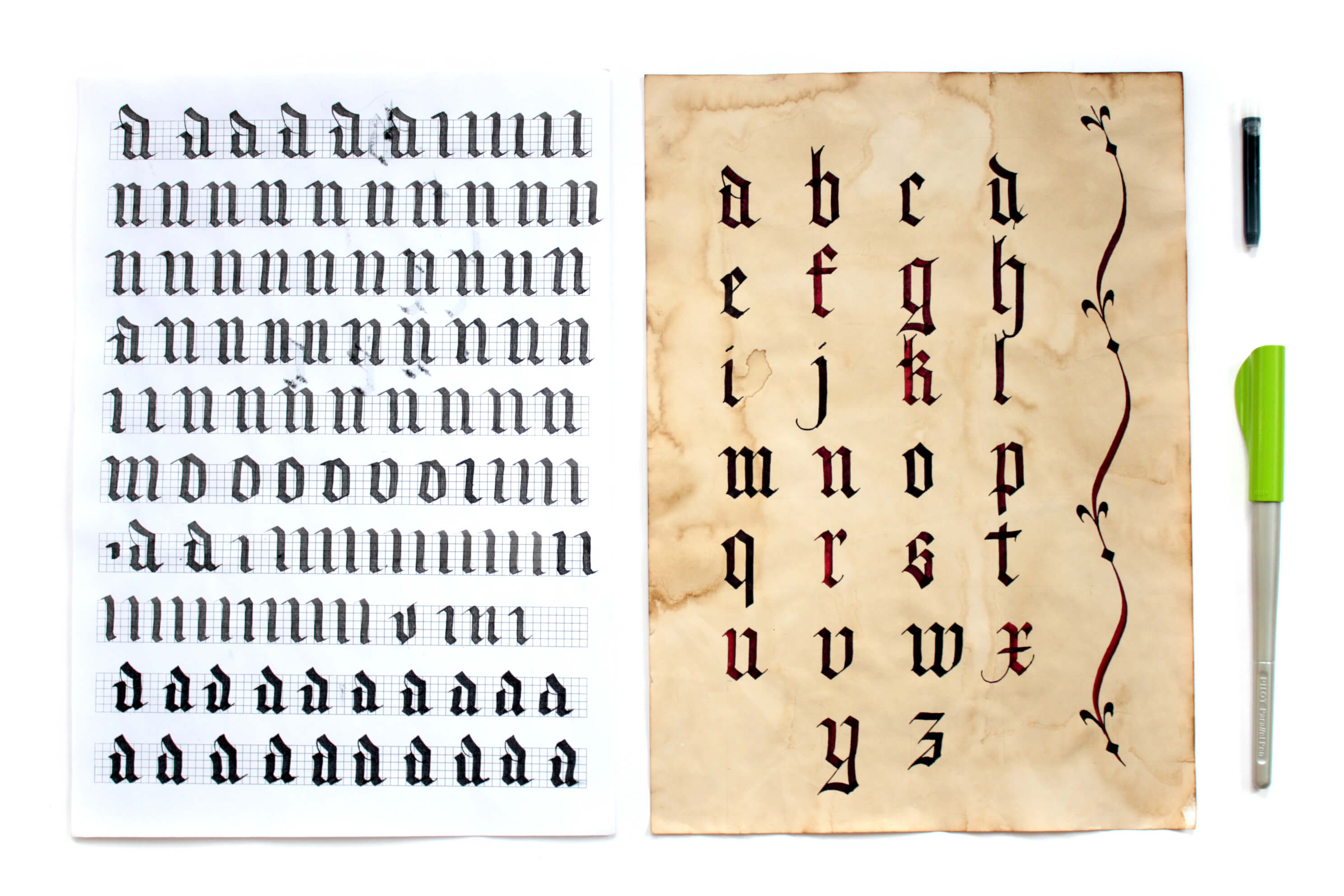
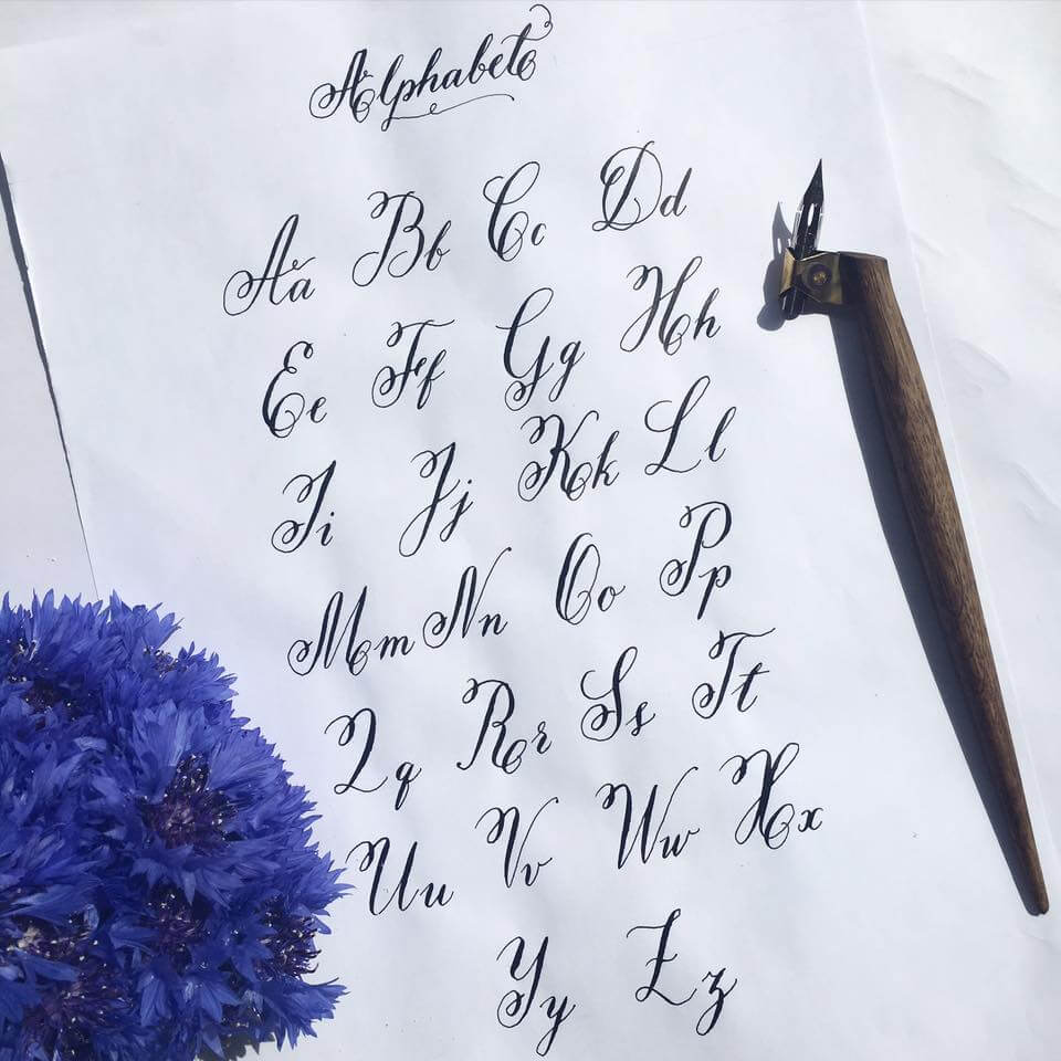
I learned the history of calligraphy, I learned how to customize my workplace, and I learned how to choose an instrument. I practiced Cyrillic ornamental script, textura quadrata, italic, English roundhand, modern calligraphy, brush pen lettering and chalk lettering. I also learned how to make my own calligraphy instruments.
"Calligraphy is the most intimate, personal, spontaneous form of expression. Like a fingerprint or a voice, it is unique for each person." – Hermann Zapf
Tip: I recommend devoting your initial lessons to writing with a flat paintbrush. Get accustomed to the instrument, and study the “skeleton” of letters (graphemes). Soon after that, practice Cyrillic ornamental script, textura quadrata and italic.
Write the alphabet, then start with words and continue on to sentences. Next, you could proceed to study the pointed nib and the typefaces that rely on it: English roundhand, modern calligraphy script, flourishing, Spencerian and other Copperplate styles.
"With the development of an international exchange of information, there is a need for universal fonts. Today, Texture and other Gothic fonts are only used as a reminder of a bygone era, in particular, in newspaper logos." – Erik Spiekermann
Each lesson was a meditation. Soon after a lesson, I felt relaxed, energetic and inspired. And I got a good result on paper! The craft is a remedy and exercise for the mind and soul.
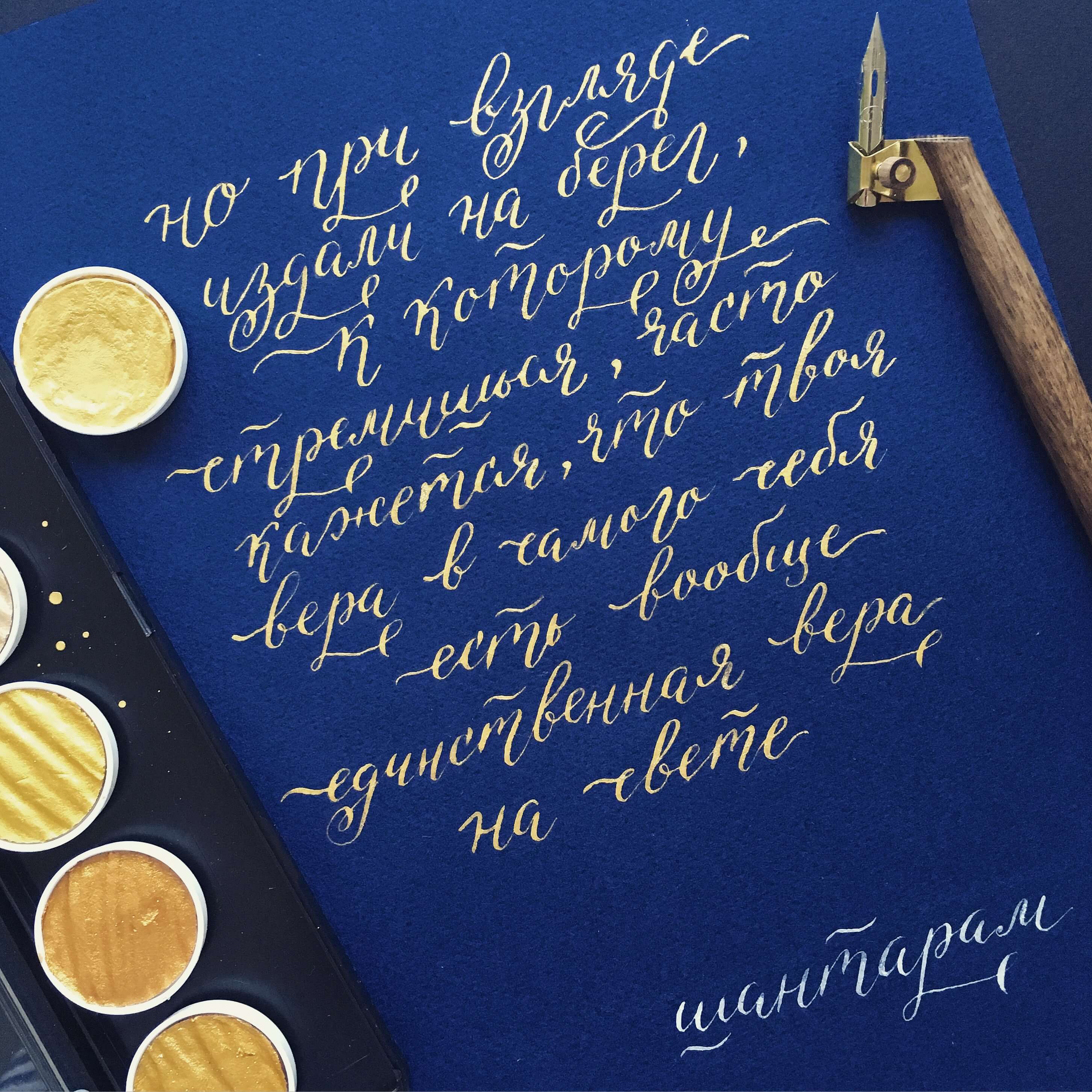
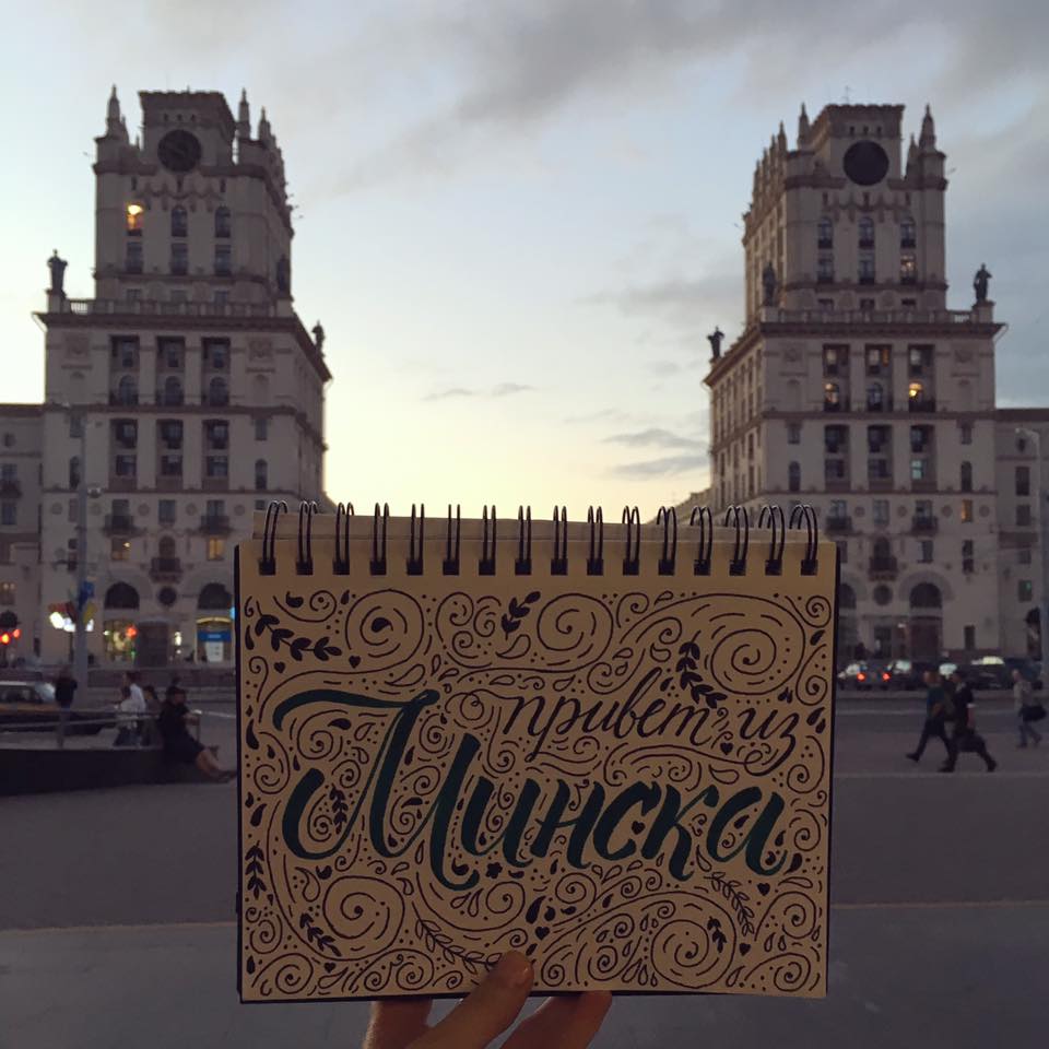
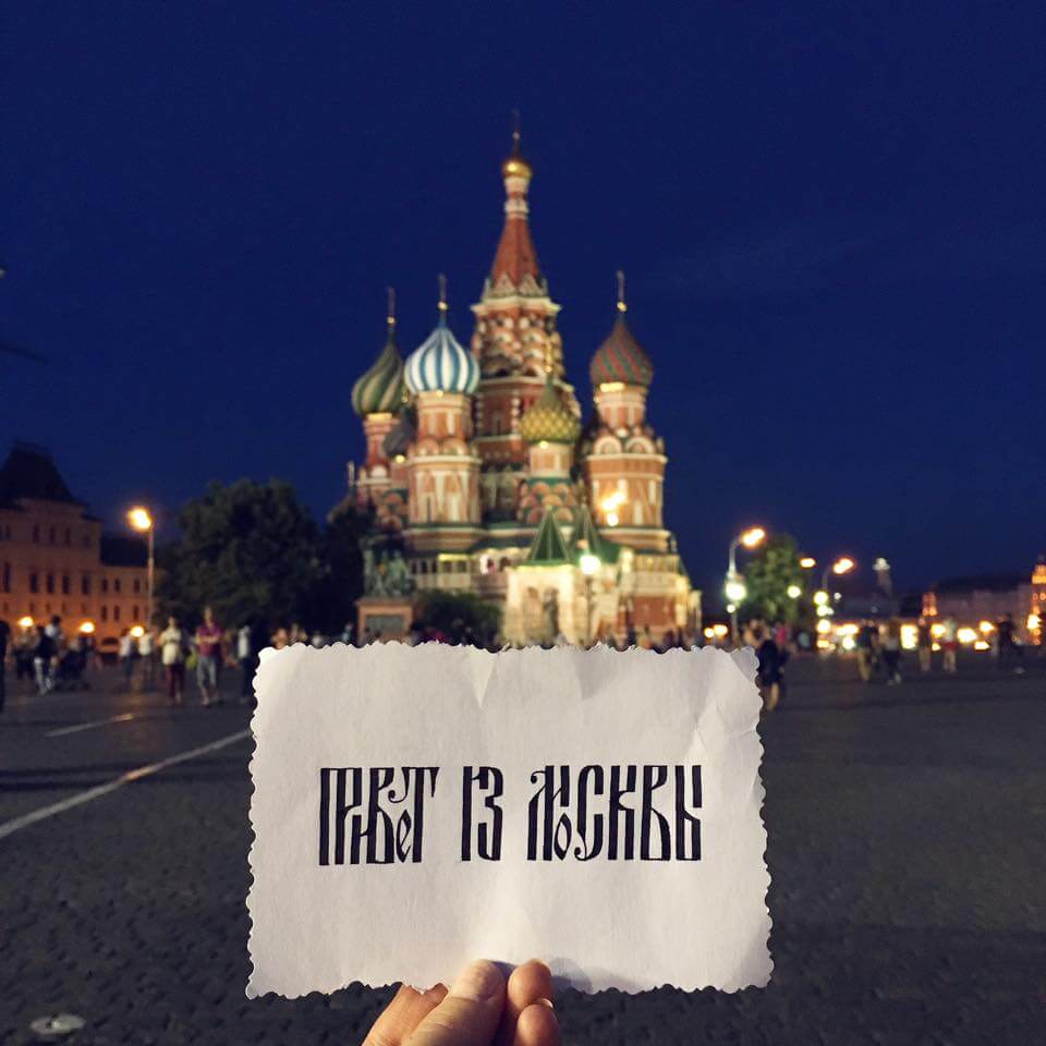
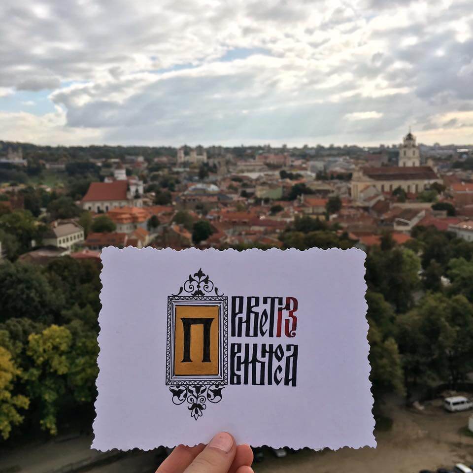
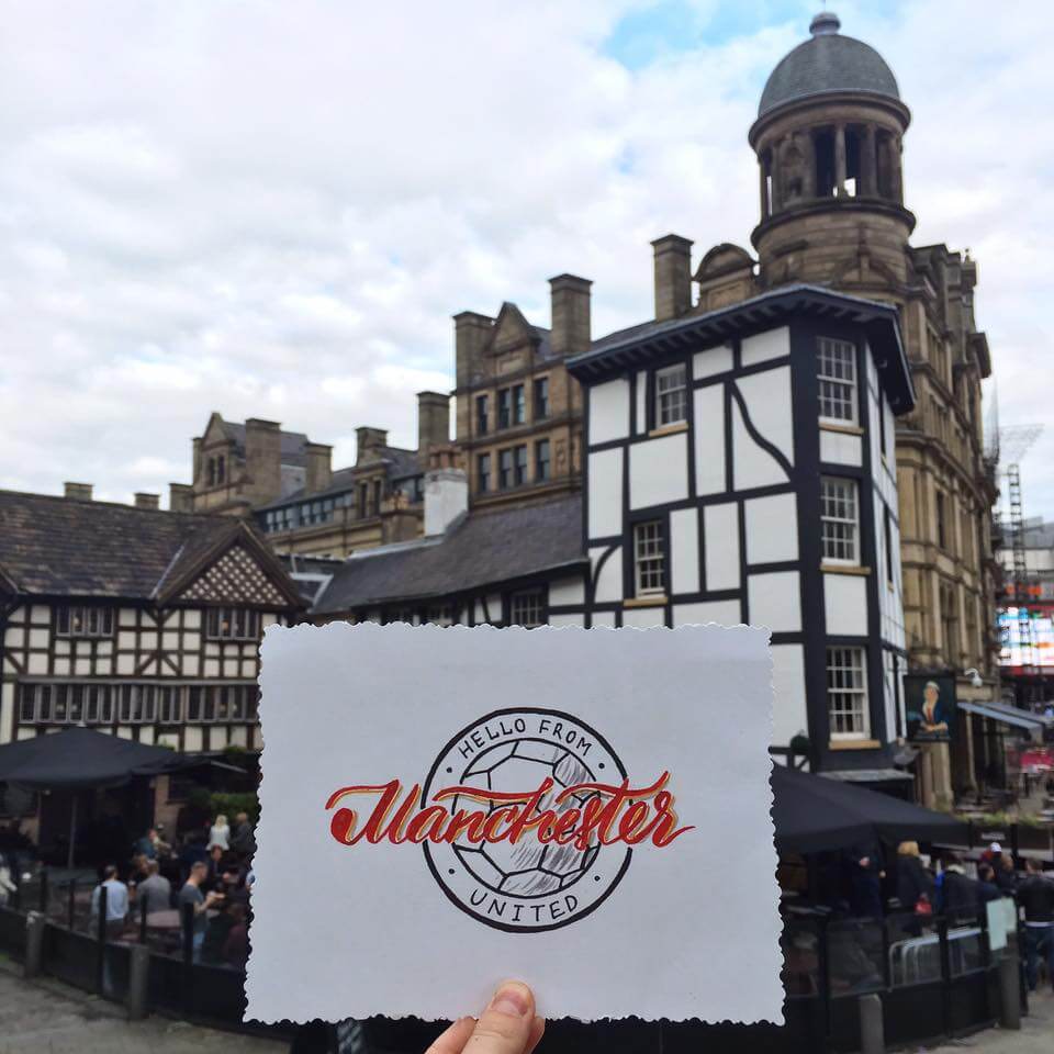
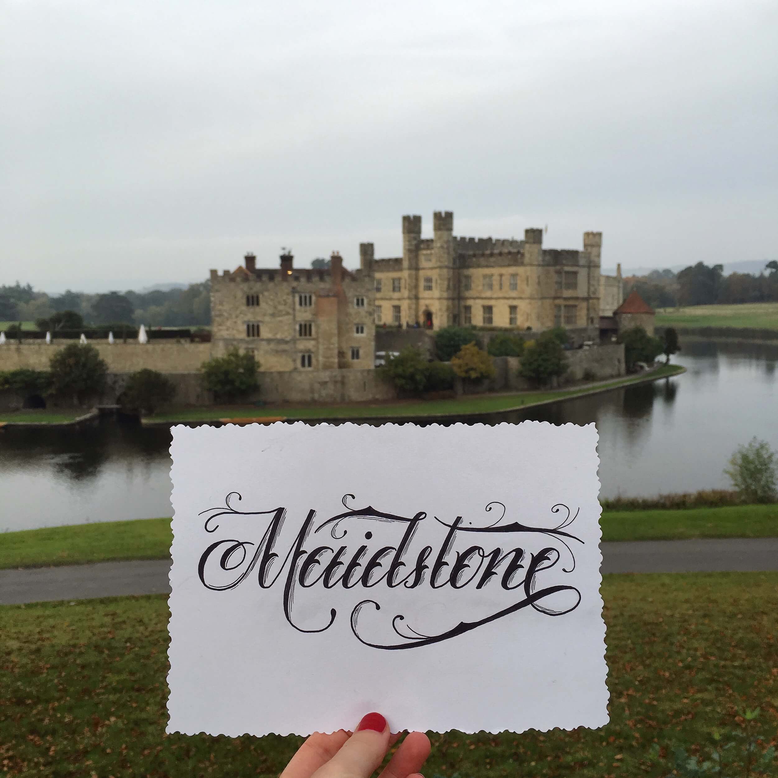
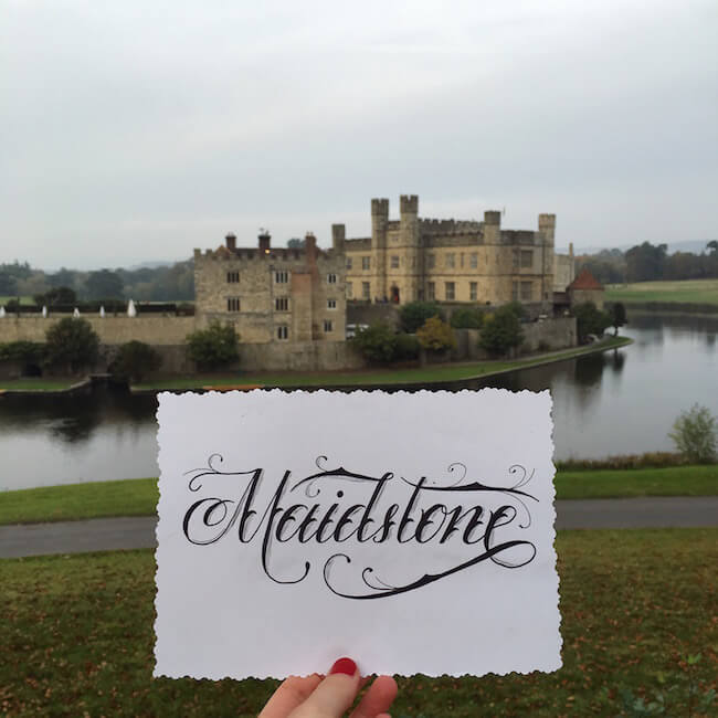
My Own Project: “Hello From…”
Having fallen in love with calligraphy, I came to prefer a sketchbook to a camera while on vacation. At a conference in St. Petersburg this spring, I got inspired by various graphic designers’ presentations and by the talk by renowned calligrapher Pokras Lampas. I wanted to put everything aside and write something. In such an inspired state, I signed a card to say hello to my friends from that wonderful city. Thus, a simple card began my project “Hello From.” The idea was to show the essence of a place through lettering; I would take a photo of the card with the city in the background.
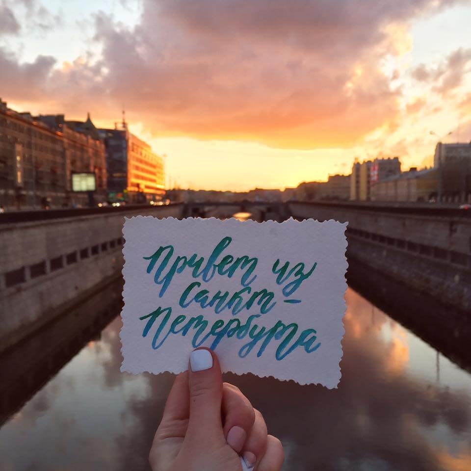
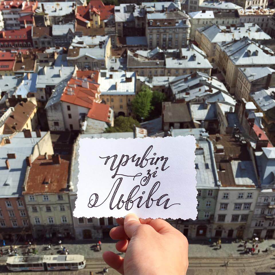
Other photos from the project can be found below. You can stay up to date on my Instagram account! There will be many interesting countries and medieval-aged cities soon!
Benefits: What Is The Use Of Calligraphy Lessons?
- New skill
Calligraphy would be a great addition to any designer’s skill set. Postcards, posters, invitation cards, website banners, prints for t-shirts and many other design products would look more authentic and interesting in calligraphy and lettering.
(View large version) - Pleasure You will derive great pleasure from working with your hands.
- Patience Calligraphy is meditative. Diving into the world of letters and waltzing through the soft lines will make you more calm and serene.
- Age not a factor Banish the thought that you can’t start learning because of your age. At any age, learning has a positive effect on the brain and expands one’s worldview. It is also good to teach children calligraphy, which will improve their brain activity and develop their fine motor skills.
- Quick progress
Your very first letter might be clunky, but I am sure that by the end of the first line it will get better. And I assure you that by the end of the first or second sheet of paper, the improvement will be noticeable!
(View large version) - A sketchbook, not a camera, for vacation I guarantee that you will see quick and steady progress and that you will want to take your sketchbook and pens with you wherever you go, to be able to write whenever you get inspired.
- Attention to surroundings You will become observant. You will find inspiration for new work everywhere, from building faces on the street to old books on the shelf.
- Selfmade postcards
You will be able to easily decorate postcards, giftwrapping, invitation cards and holiday cards for family and friends. It is always heartwarming getting a postcard made with love and attention to detail.
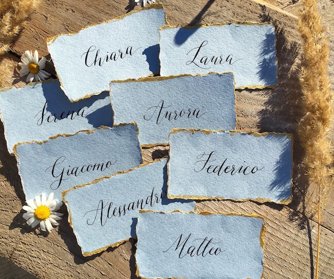
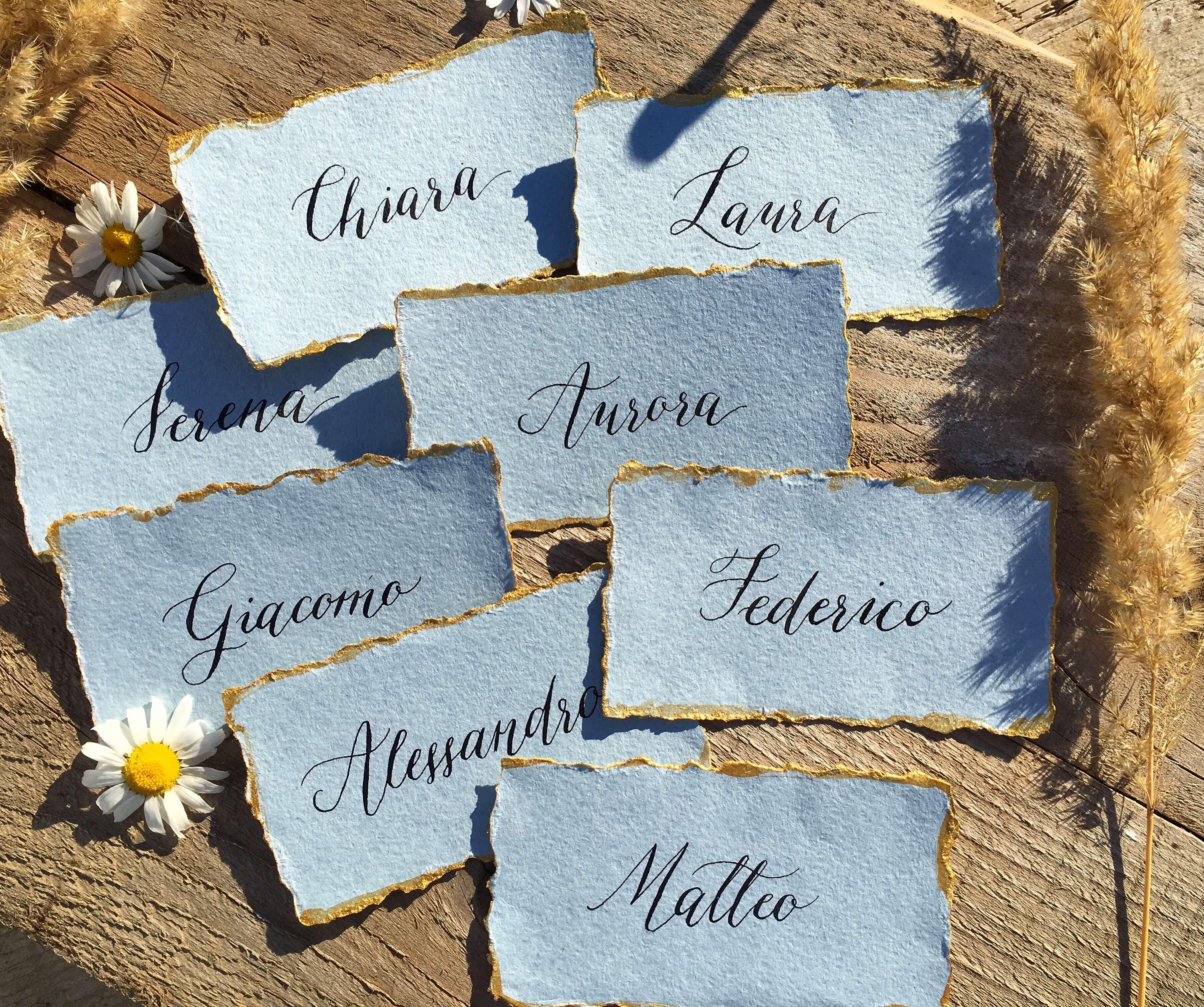
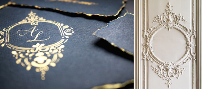
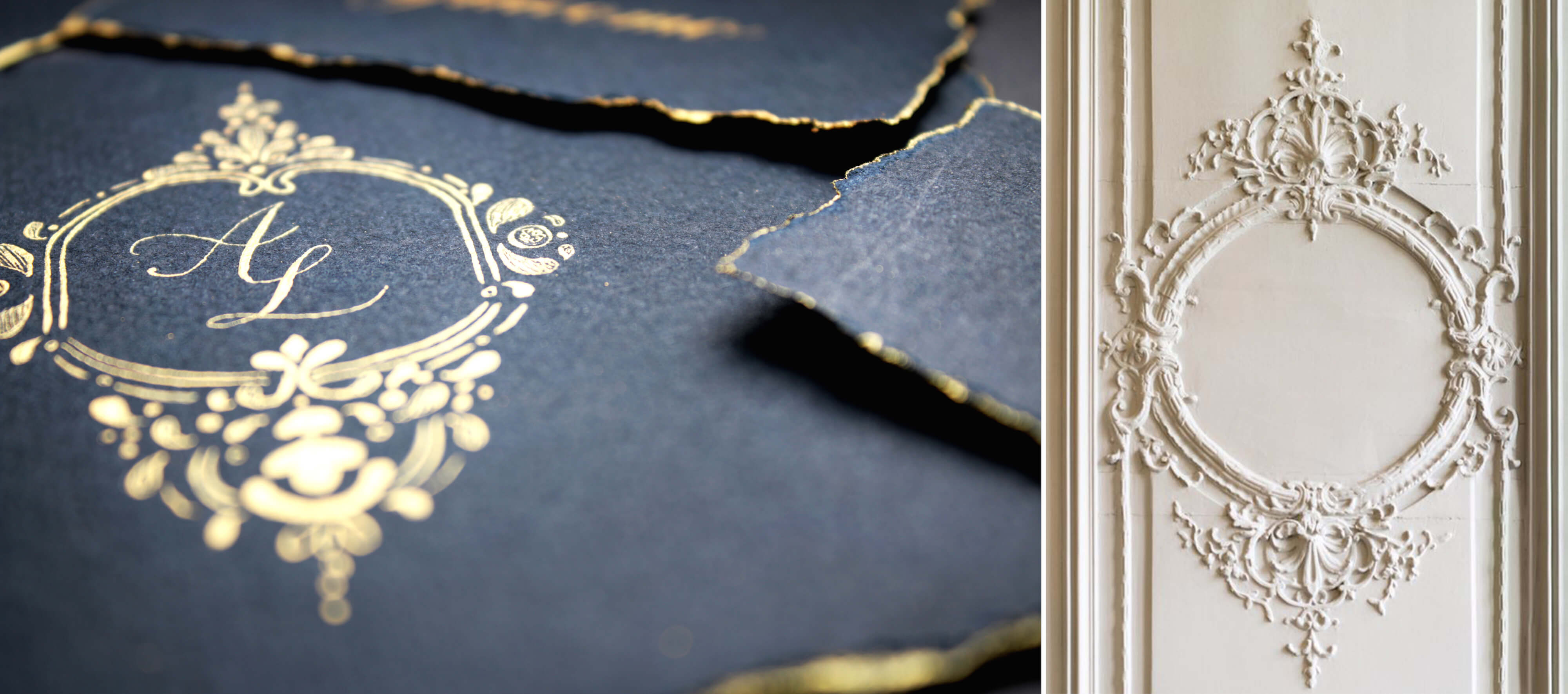
Simple wedding calligraphy for my Italian friends. (View large version) - Unique corporate identity More and more companies are using calligraphy and lettering in their trademark style. It lends uniqueness and instills trust in the customer.
- Manual dexterity The skill has an influence on one’s thinking, memory, imagination, powers of observation, coordination and agility.
- Inexpensive Most of the tools can be found at an affordable price. And craft paper can be done with the help of coffee, paint, etc.
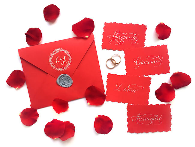
- Monetization Nowadays, calligraphy is especially popular for wedding invitations, holiday cards, logos and many other design elements.


Possible Challenges
- Damage of tools. Without sufficient knowledge, one might find it difficult to write with a nib. This could lead to tool damage, catching paper with the nib and, as a result, torn paper. A beginner might even give up because of such bad results.
- Silence helps. Some people (though not everybody) might have a problem working when a lot of people are distracting their attention. I recommend training in silence, relaxed and concentrated.
- Bad mood = bad result. You will not be able to draw soft, delicate lines in a state of anger. If you are in a bad mood, put the work aside.
As in sports and music, in calligraphy it is important to train every day, to be patient and to feel inspired.
Achieving Good Results
Here are some tips based on my experience:
- Learn every day. Attend master classes and courses, study online, and participate in competitions.
- Practice, practice, practice.
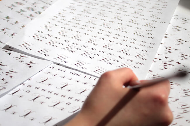
If you train every day, you won’t have to wait long for progress. Focus on sharpening your skill, don’t be afraid to experiment, and devote time to writing regularly.
(View large version) - Practice by copying. Choose projects you like and copy them to understand how the composition and contrast work.
- Warm up. Start with some warmup exercises before getting down to work. Clench and release your fingers, rub and move your hands in circles to warm them up. While writing, do eye exercises from time to time.
- Start with basic strokes.
Once you master this skill, it will be easier to move to letters and words.

(View large version) - Collect different styles of handwritings. You can find these in postcards and old letters. Analyze them. These will help you to come up with new and interesting combinations of typefaces.
- Try new things. Write with different tools and on different kinds of paper. Conventional designs are only one benefit! I write on wallpapers, bookshelf stands and old notebooks. It’s enough to begin writing with ordinary tools everybody has at home (pencils, brushes, markers). If none are at your disposal, then you can get creative and even try writing with a carrot, for example.
- Take care of your tools. Wash and wipe dry your tools after each exercise. When I was a beginner, I rusted and damaged several nibs irrevocably because of untimely cleaning.
- Show your work to professionals. An objective review will help you to find and correct mistakes. Don’t be offended by criticism; treat it as a compliment.
- Don’t worry about other people’s opinion. Don’t give up, even if your progress is not as fast as you would like. Good results will come.
- Mind your sitting posture. This rule is key to beautiful handwriting. If you follow it, you will be able to work at the table for a long time without discomfort or hand pain.
- Collect references. A box of ideas is very helpful. When I’m not feeling inspired and need a creative punch, I close my eyes and take out two magazine cuttings; I’ll analyze them and try to combine their styles and play around with them.
Sources Of Inspiration
"Inspiration. From real life. I open my eyes and I travel and I look. And I read everything." – Erik Spiekermann
It is hard to create something without experience. Therefore, I recommend collecting ideas. However, at the beginning, after looking through hundreds of beautiful pictures, I sometimes lose confidence and think, “I can’t do that!” Calm down. Before you panic, do the following:
- Look around.
Perhaps you are sitting in a comfortable armchair near a bookcase. You might find diverse typefaces and cover designs in those books.
(View large version) - Open the cabinet. If you have a box of old postcards and magazines, look through them. Cut out worthwhile elements and put them in an ideas box (your personal, offline Pinterest).
- Wander the city with a camera. You will find a lot of bars and cafes with interesting logo designs, window designs and branding. These visuals will give you ideas for interesting compositions.
- Hit the market. Buy a couple of cheap vintage books and postcards from your local book market. Analyze the typefaces, text designs and color schemes.
- Go on a field trip.
Nothing inspires me more than a new city, exploring its architecture, wayfinding marks, sign plates on houses, bookstores and markets. So cute! (Yes, I am hard to travel with. I often make stops to take photos.)

Logos in the streets of Vilnius and Moscow (View large version) - Photograph building faces.
The diverse ornaments you’ll find will give you plenty of ideas for exquisite and vintage logos.
My version of a logo from an architectural carving found on Pinterest. (View large version) - Meet new people and share your experience. Together, you can create new projects and get valuable feedback. Showing your work to others will enable you to find and correct mistakes more quickly. Collaborate with photographers and other creative people.
- Follow trends. Analyze what is in fashion now and what will be in fashion for the next couple of years. Constantly move forward.
- Check in on Instagram, Pinterest or Google. Here, you will find plenty of beautiful design work. However, be cautious, and don’t be overwhelmed. The less you look at readymade solutions on the Internet, the better. You want to give yourself the chance to create something completely unique.

Interested In Calligraphy Yet?
Then let’s start! Let’s look at the tools you will need for the first lesson.
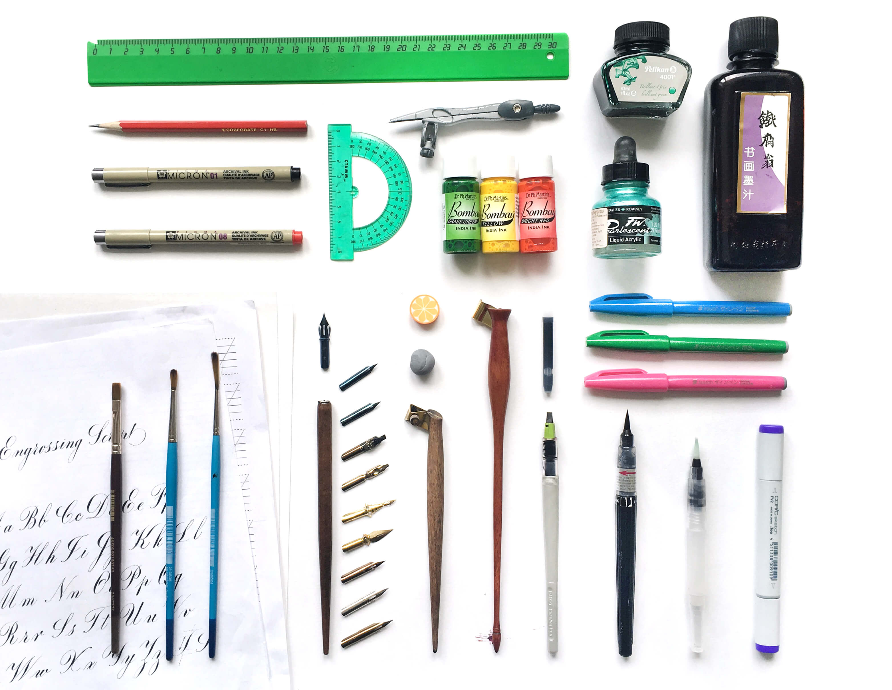
Sure, you don’t have to buy everything in this photo! Consider your abilities and preferences. Below is a detailed list to give you a general idea of the tools you’ll need for different styles of writing:
- paper for handwriting,
- printed handwriting worksheets,
- examples of alphabets,
- ruler,
- pencil,
- pair of compasses,
- pigma micron permanent pens,
- rubber and kneaded rubber,
- calligraphy ink,
- flat paintbrushes,
- straight pen holder,
- oblique pen holder,
- nibs (square cut and pointed),
- Pilot Parallel pen and cartridges,
- brush pens,
- water brush.
Details About Tools
Paper
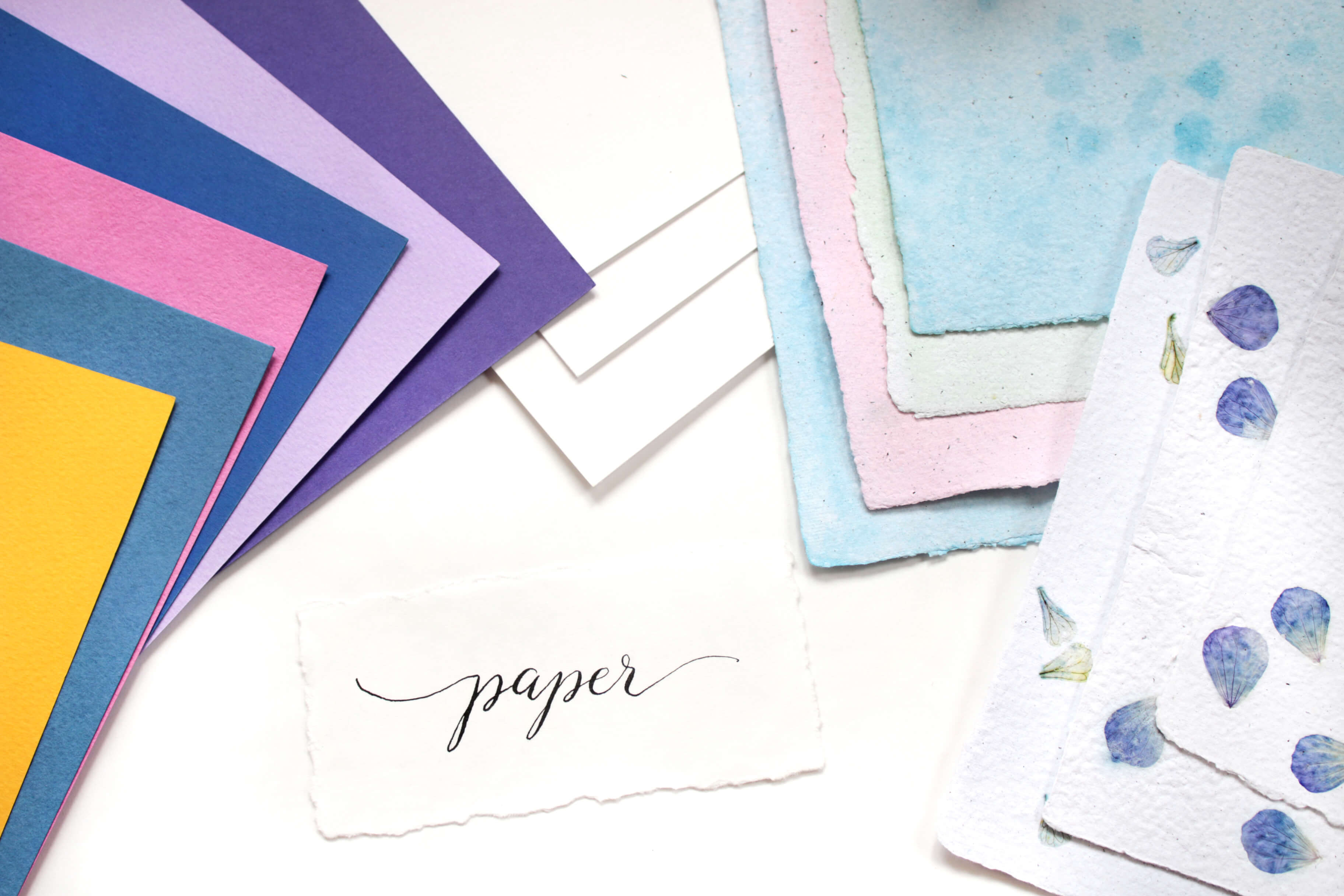
In the beginning, ordinary notebooks, copy books, office paper and even old wallpaper will be enough for practice. Try to get paper with a smooth surface and a higher density than office paper; otherwise, the ink will not flow and the nib will not catch the paper. Rhobia and Fabriano paper are quite good, but try different variants to find the best one for you.
Unused wallpaper and draft work is perfectly suited to writing with brushes and brush pens. At a more advanced level, you could use texture paper and handmade paper, which is great for making postcards and wedding invitations.
Printed Handwriting Worksheets And Alphabets
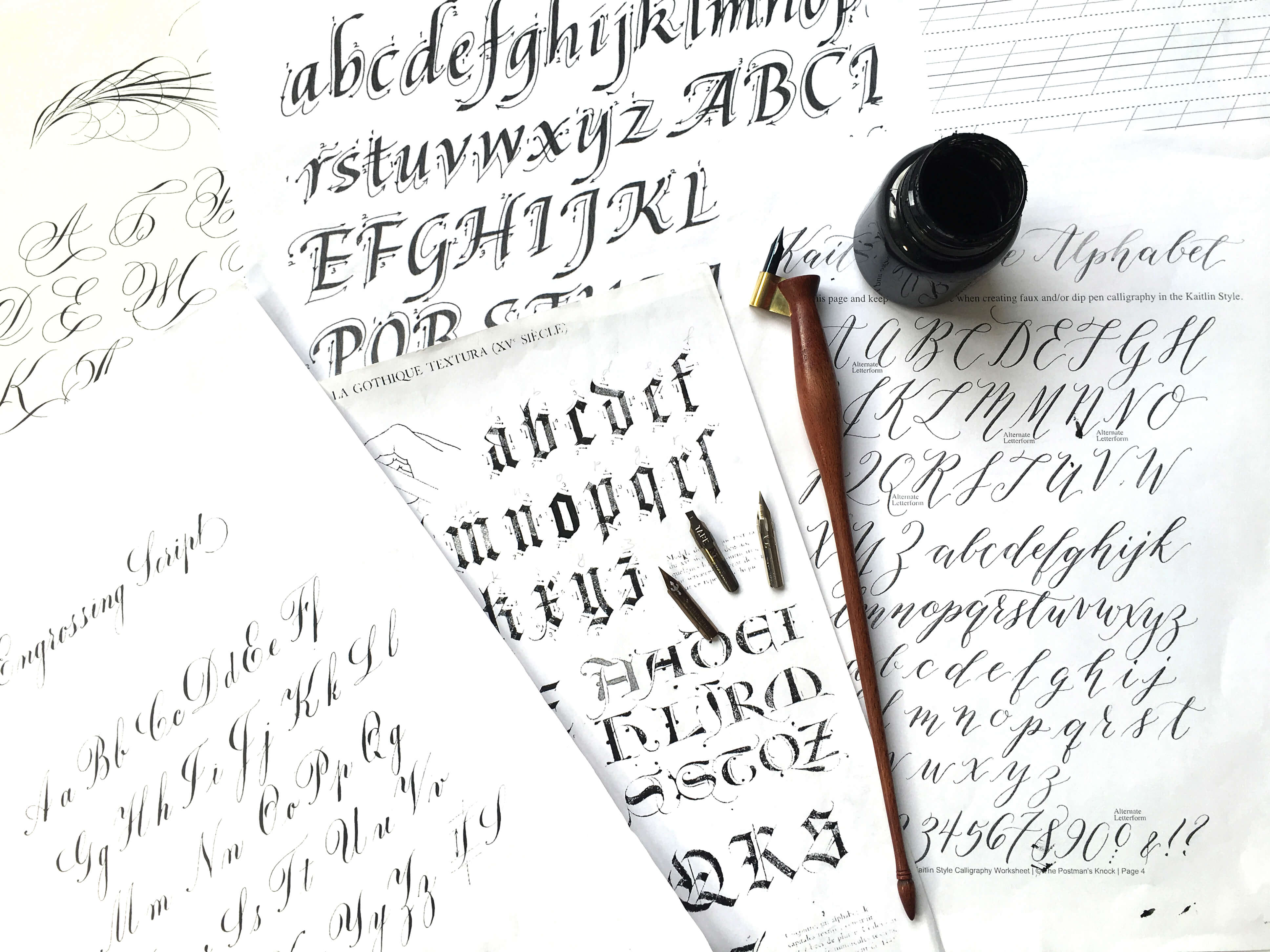
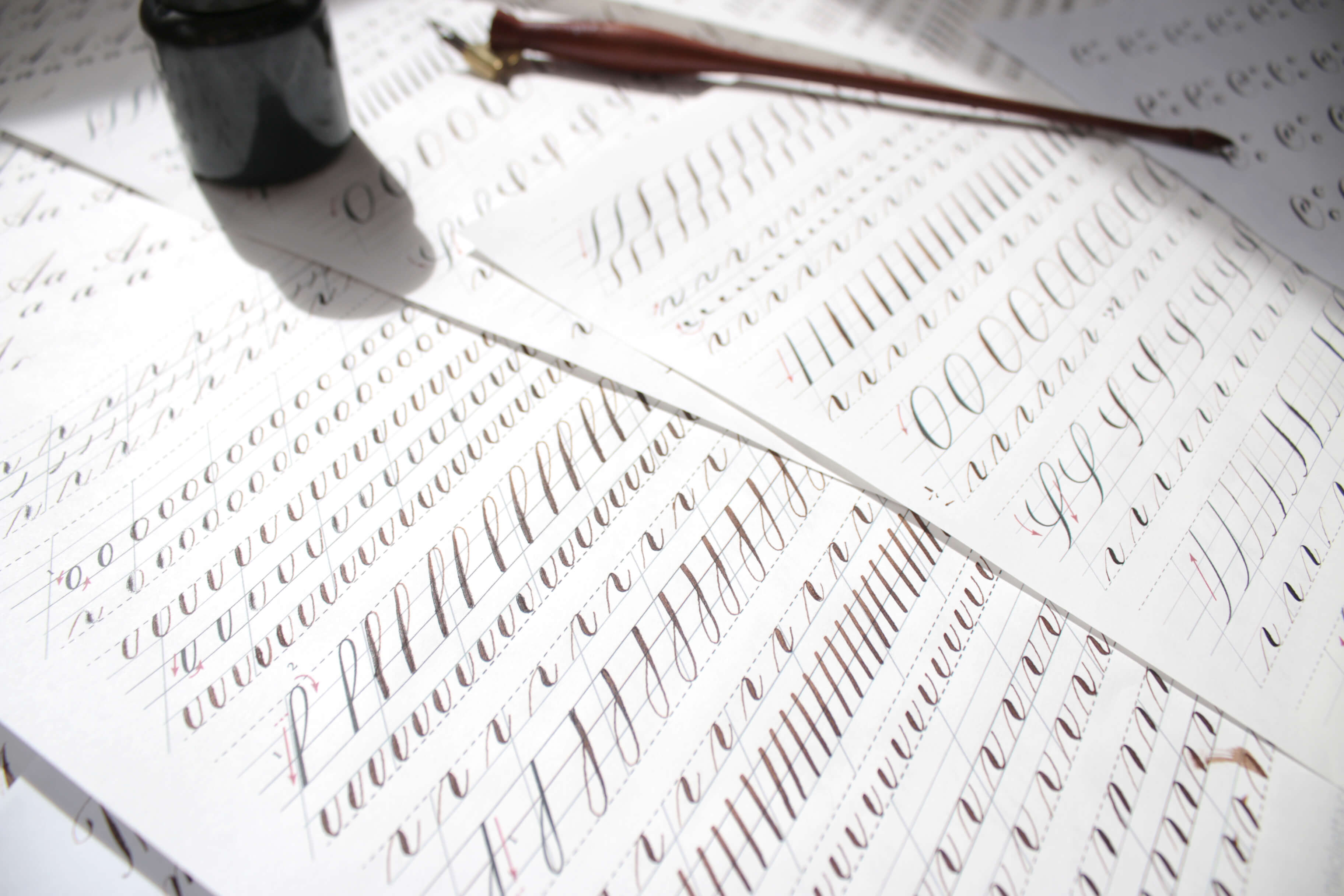
This is mandatory: It is impossible to write letters at a proper height or write a line of text without positioning and marking the sheet of paper. The most handy solution would be to put a printed handwriting worksheet under the sheet of paper you’re writing on. The worksheet will show through the paper, guiding you on the height and incline of elements. A ruler and pencil might also help, but lining would take time.
You can download handwriting worksheets or make the required adjustments yourself (second link in Russian).
Samples of alphabets will show you how to draw letters correctly. Print them out and put them under your sheet of paper as a guideline. Examples can be found and downloaded on Pinterest.
I recommend writing each letter on a separate sheet of paper, to better remember the motion of letters and to train your hand. This will surely take more time, but after you’ve written a lot of drafts, your hand will move confidently without trembling, and you will remember how letters are drawn by heart. Let’s start!
Calligraphy Ink, Ink And Paint
Stores offer a great selection of calligraphy ink. Choose whatever you want — experiment! For an entry level, ordinary watercolor paint is quite enough.
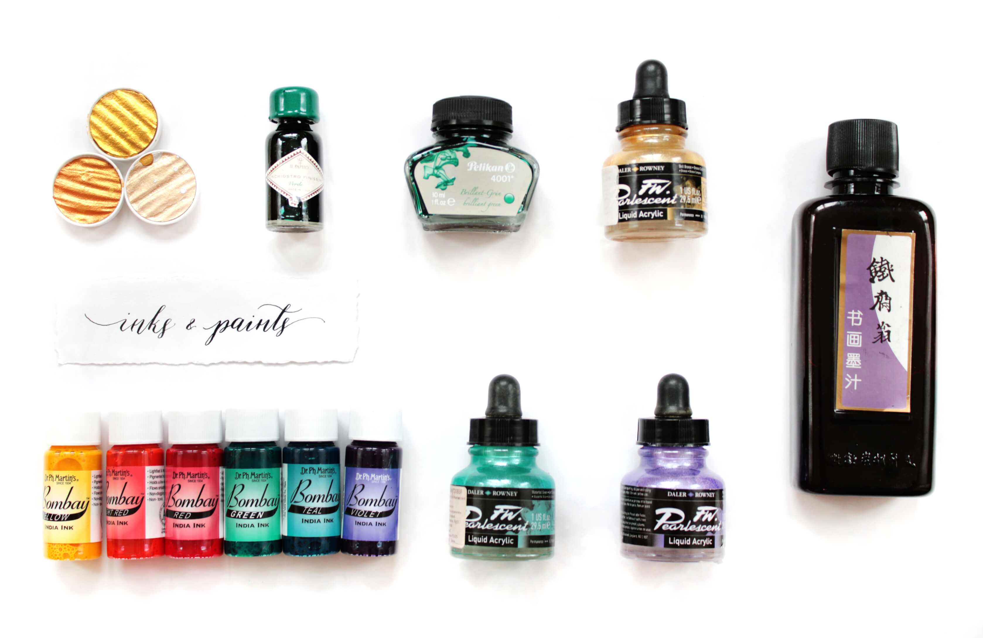
Chinese ink is perfect for this work. But pay attention to the expiry date. Buy fresh ink, otherwise you risk getting clods, which will impede the flow of ink from the nib.
Dr. Ph. Martin’s ink is one of my favorites. The selection of colors and variants is quite extensive, but it is quite expensive.
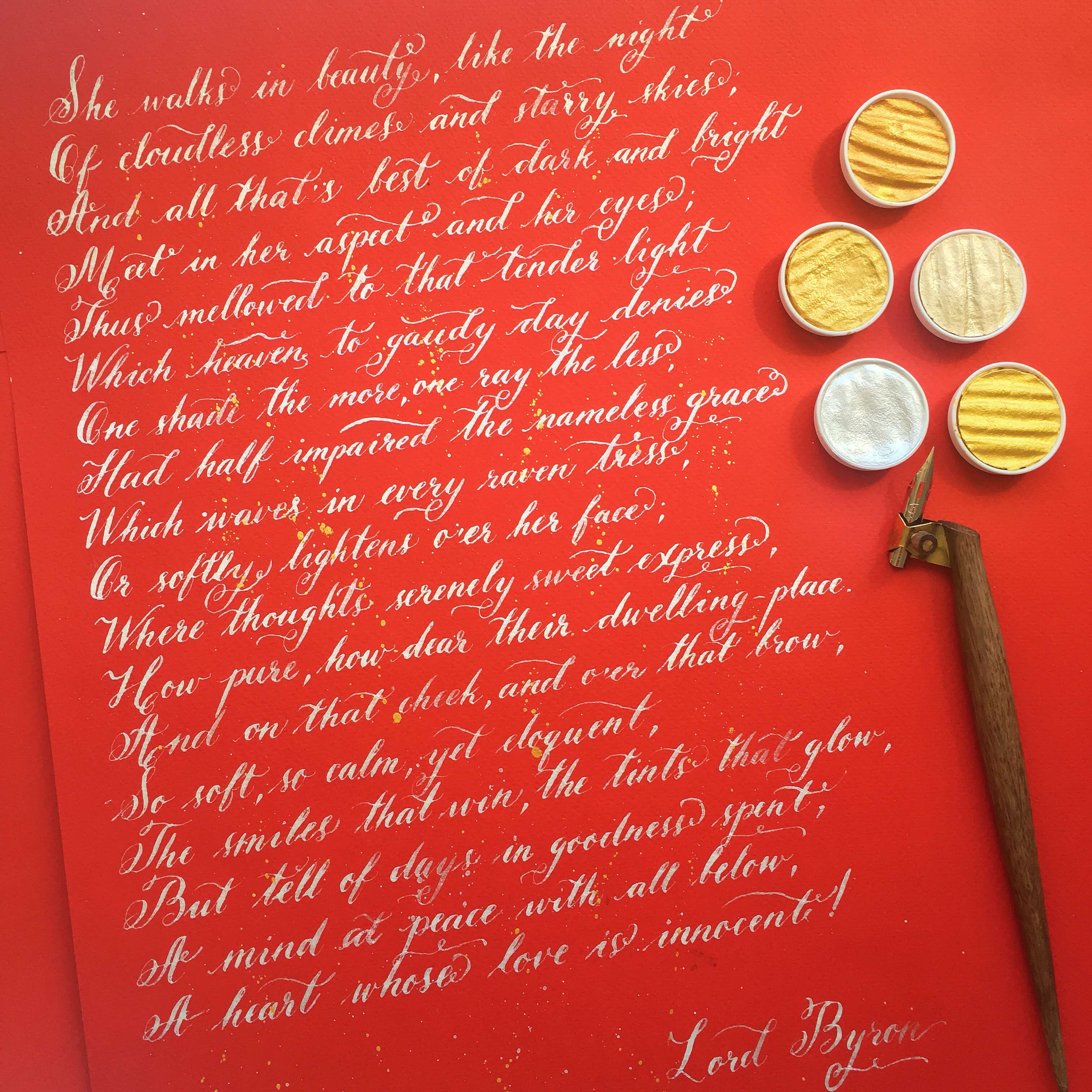
Pearl ink looks beautiful on dark and high-contrast surfaces. I like Finetec’s dry golden palettes. Work done with it looks exquisite.
Flat Paint Brushes And Brush Pens
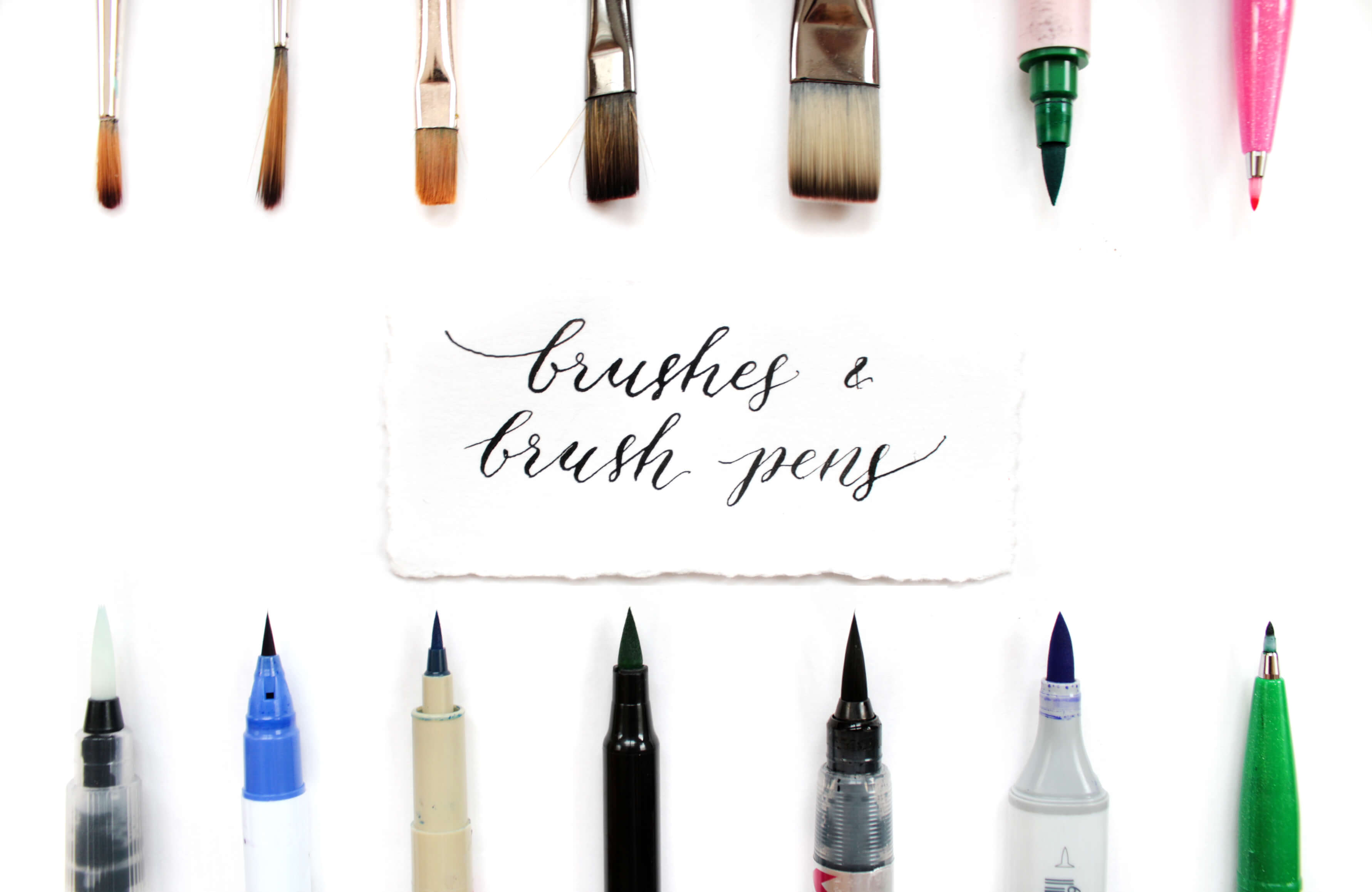
As mentioned, I first learned to write with a flat synthetic paintbrush. It’s a great choice for learning letter graphemes, and it is the most economical choice.
Brush pens are a good tool to learn brush calligraphy and lettering. They come with and without cartridges. Brushes have different quality levels, densities, sizes and shapes. Find one you are comfortable writing with.
Water brushes are handy because you can fill them with ink or watercolor yourself. The disadvantage is that if, used improperly, they can get dry or dirty. I prefer to put my water brushes in ink or paint but not to fill them in. This way, they last longer.
Pen Holders
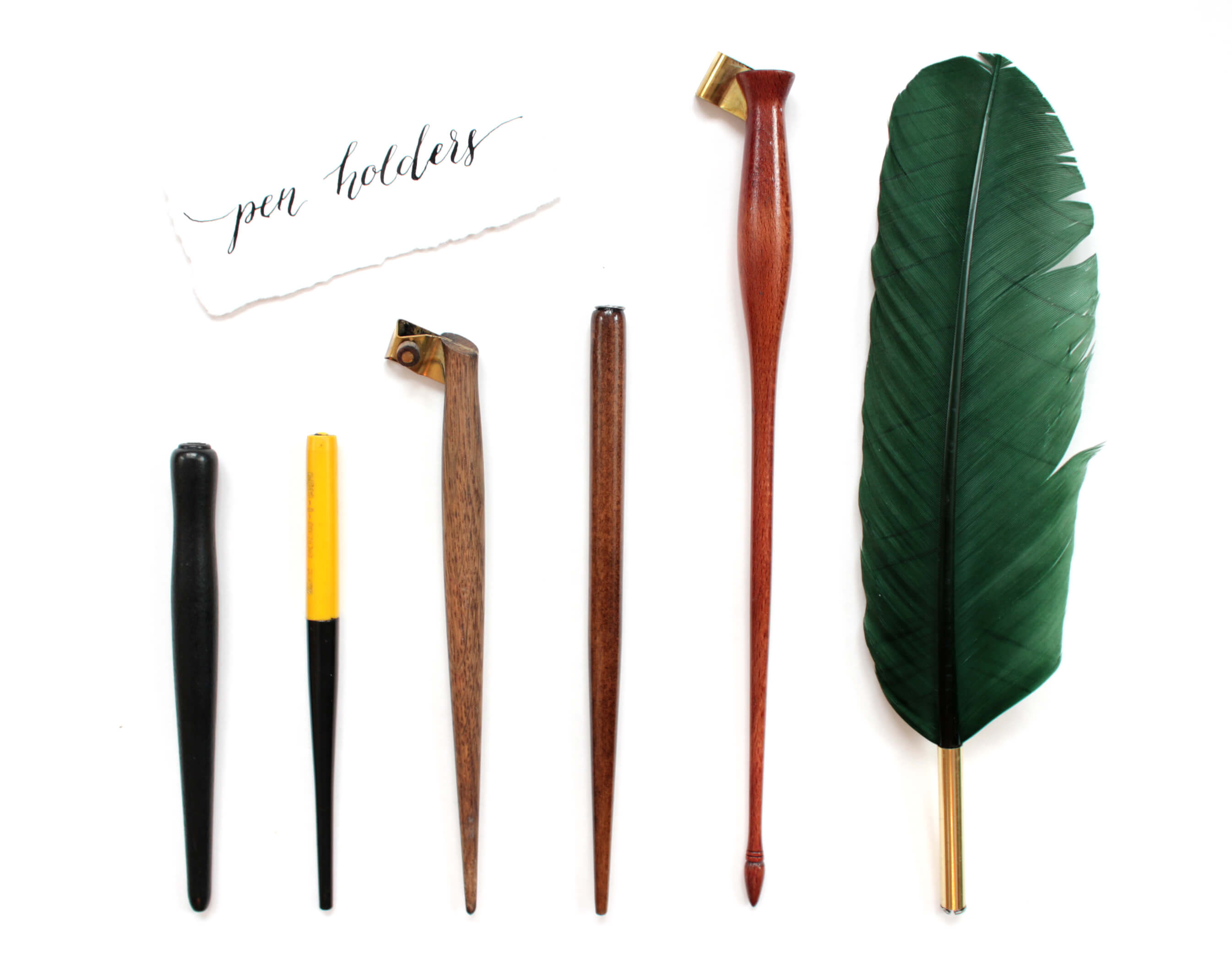
Pen holders can be straight and oblique. A straight pen holder is good for square-cut pens and for writing different typefaces (for example, rustic capitals, square capitals, uncials and artificial uncials, textura quadrata, italics, etc.).
At the same time, an oblique pen holder with a pointed pen better suits cursive writing. Due to its initial incline, you will not have to bend your hand so much. It can be adjusted for different pens or just one particular pen.
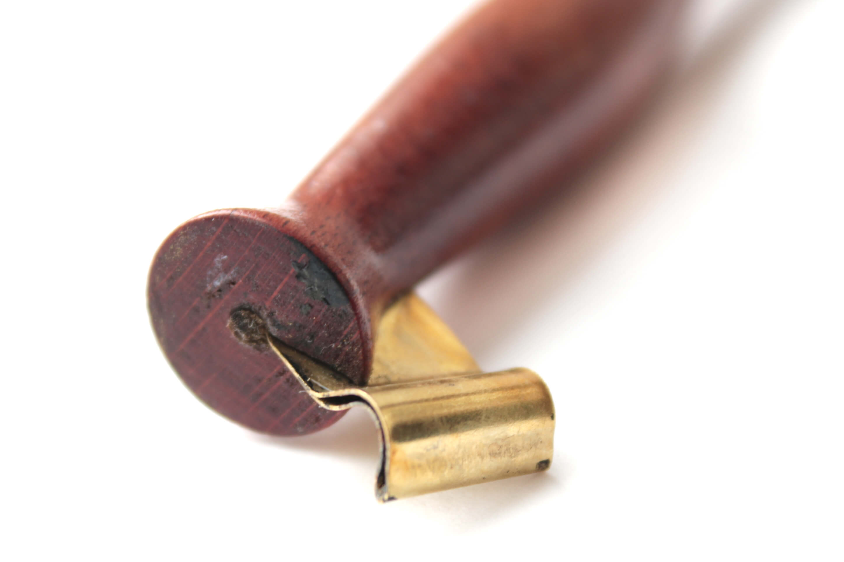
Oblique pen holders have a flange at the end of the handle — the metal part of the holder where the pen is put in. This helps to regulate the angle of incline.
I also have a straight holder that looks like a feather. It is more decorative and adds some atmosphere as I’m working, but it is not as comfortable as other holders. I use it mainly for photos.
Nibs
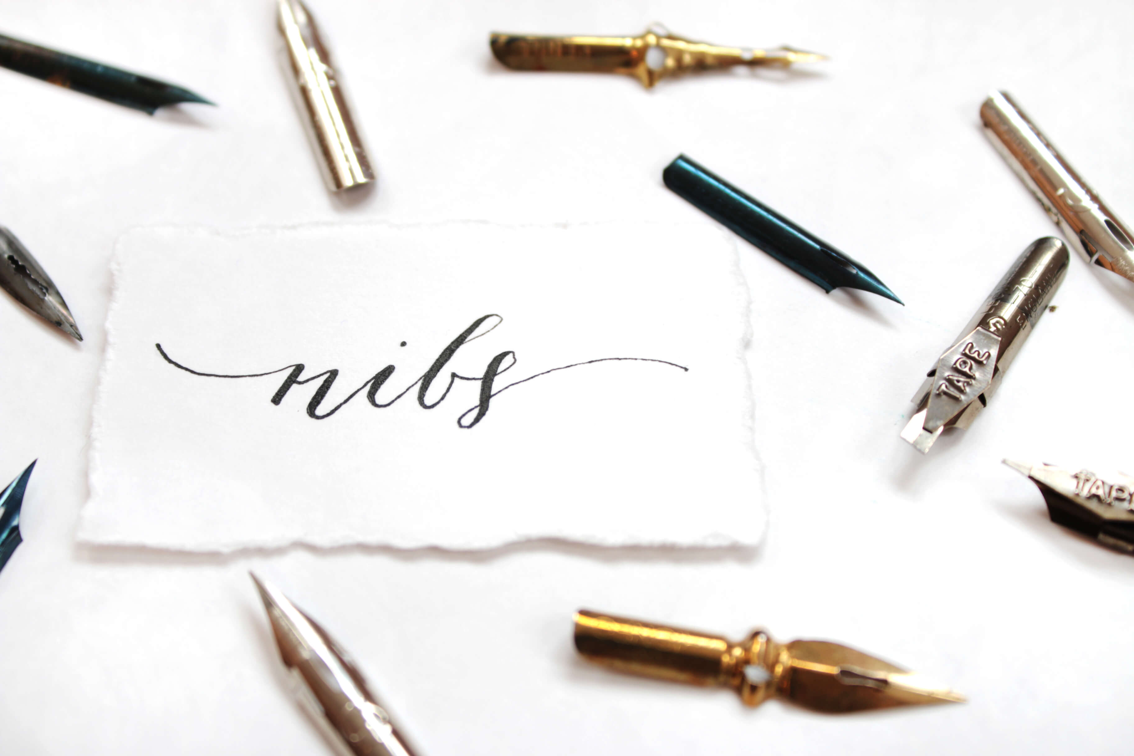
Nibs are square cut or pointed. As suggested earlier, you’d better learn typefaces with a square-cut nib. These nibs are quite rough, which makes the work easier and which will train you for a pointed nib.
Tip: If you are left-handed, you just need to find a nib that bends from right to left.
Pointed nibs are specially designed for cursive. They come in different sizes and can be used for different line thicknesses and different writing styles. After trying several of them, you will find a favorite.
Tip: Take care of your writing tools. Wash and wipe dry your tools after each exercise.
Pilot Parallel Pen
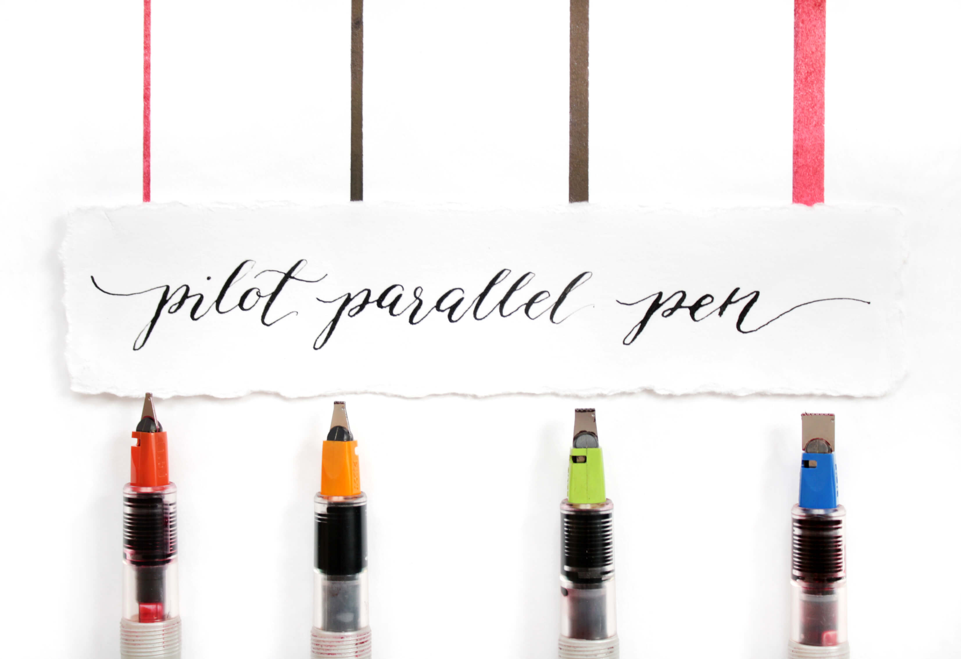
These are wonderful pens with a square-cut nib! They are very firm and comfortable to use. Though they work with the original cartridges (which are quite expensive), the empty ones can be refilled with a syringe.
Literature
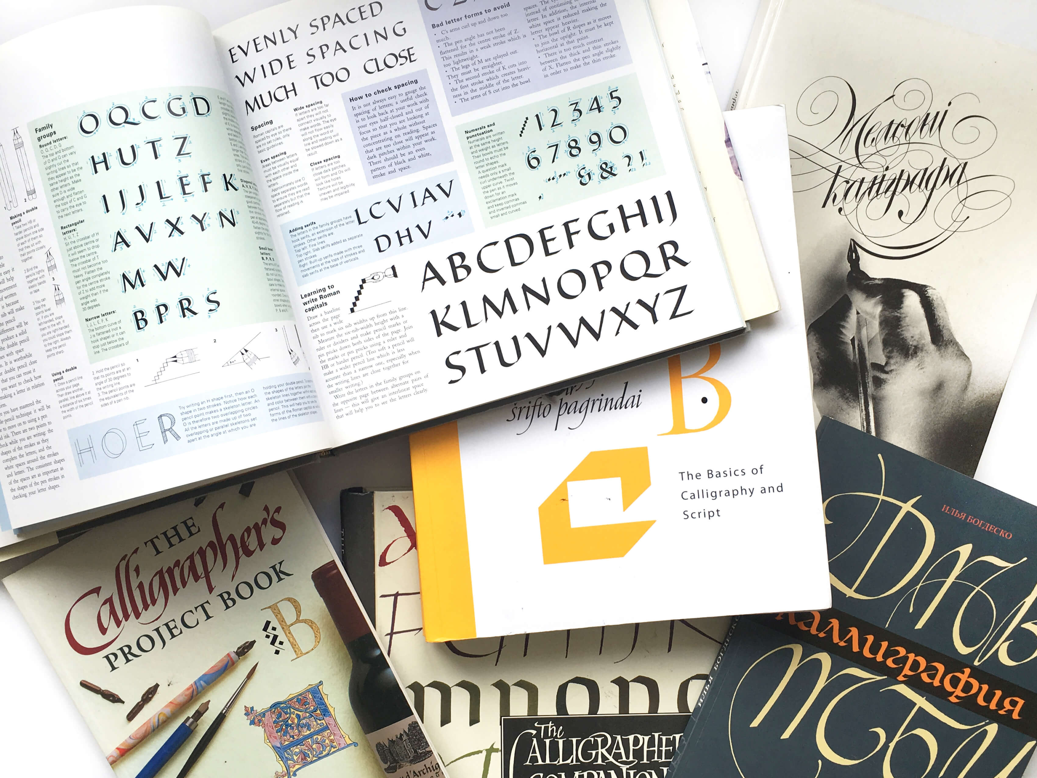
Mmm, books! You will find a lot of useful information and tips in books. I recommend beginning with these wonderful ones:
- The Art of Calligraphy
- The Calligrapher’s Bible
- The Complete Calligrapher
- Modern Calligraphy and Hand Lettering
- Calligraphy: A Book of Contemporary Inspiration
- Step-by-Step: Calligraphy
- The Complete Book of Chalk Lettering: Create and Develop Your Own Style
In these books, you will learn the history of calligraphy, find descriptions of diverse alphabets (written using the elements of handwriting worksheets), learn about tools, read tips on how to adjust your workspace, tutorials and more.
Other Tools
- Pencils. Many books recommend starting calligraphy by writing with two pencils (firmly bound together), training yourself to build letters this way. In any case, a pencil will be useful for sketches and draft text writing, which you can use as a basis for writing in ink.
- A pair of compasses. For lining round objects in composition.
- Pigma micron permanent pens. These pens are perfect for preliminary sketches and drawing out letters.
- Writing desk. A wooden sketchboard can be adjusted at different angles against the table, and the sheet of paper would then be fixed on the surface.
- A rubber and a kneaded rubber. I mostly use a kneaded rubber, because it doesn’t leave waste after cleaning.
- Rulers. They are needed to mark up the sheet of paper and to set the height of letters. You could use a printed handwriting worksheet and put it under the sheet of paper instead.
Other Photos From My Project “Hello From…”


Conclusion
Nowadays calligraphy is in fashion, which only makes me happier. In comparison to digital text, handwriting is a distinct art form, and its uniqueness is being valued more and more highly.
The art of beautiful handwriting shouldn’t be forgotten, and I thank everybody who supports and promotes it today.
I hope that I’ve managed to convince you that anyone can learn the art of calligraphy! All you need is daily practice, inspiration and belief in yourself. And I believe in you. Good luck!
Let’s Practice!
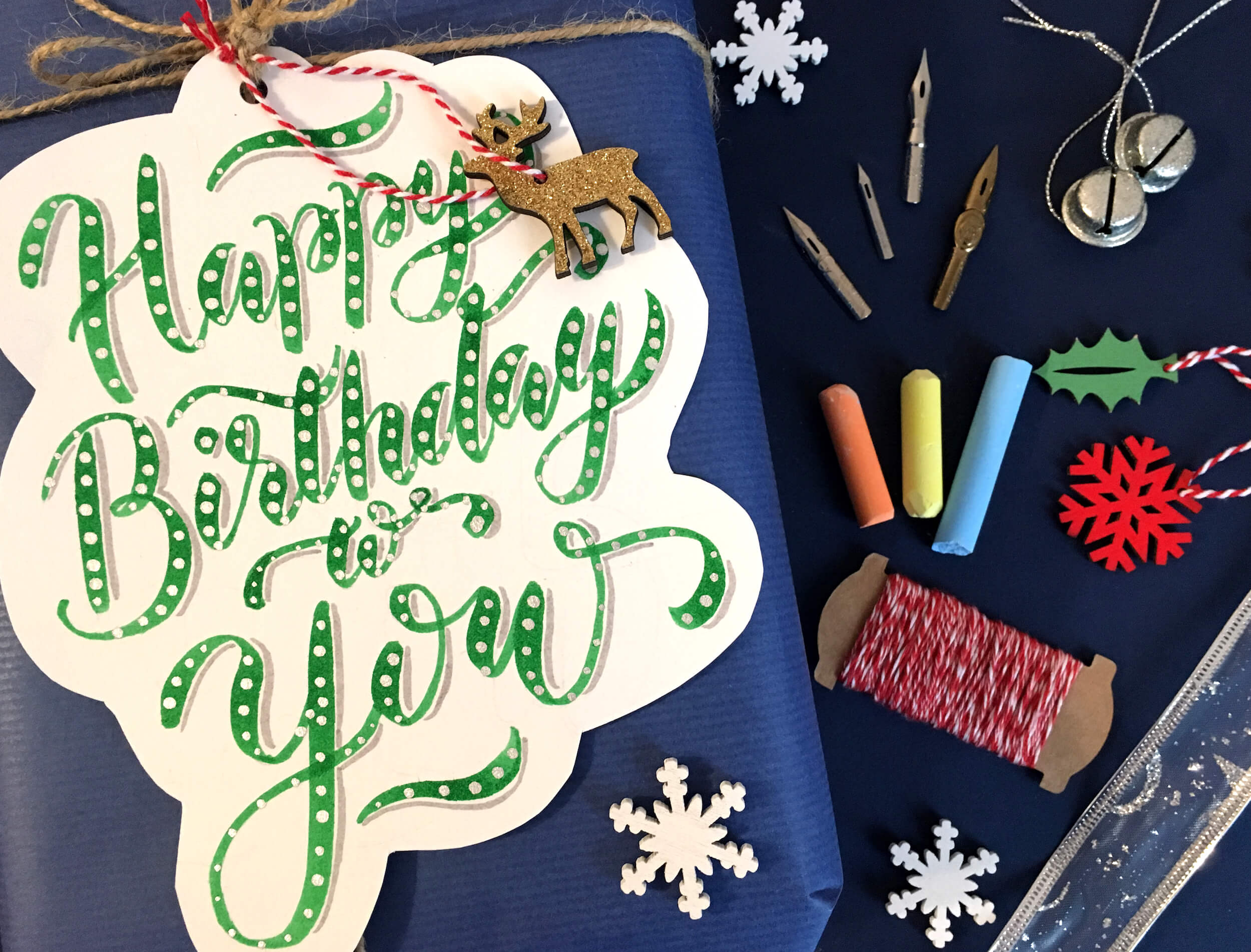
To consolidate your knowledge, I suggest you draw a birthday card. Grab a brush, ink or paint and some cartridge paper. Line the paper, and write your text in the middle of the paper with a pencil. Feel free to add some decorative elements around the lettering according to your taste (balloons, flowers, confetti, etc.).
Make sure that the final composition is aligned and symmetrical. Now you can trace around the letters in ink. Not that difficult, right?
Attach your result in the comments. Can’t wait to see them!
Here is mine:
If you have any questions, please feel free to contact me via Twitter or email.
Sources
- The Calligrapher’s Bible: 100 Complete Alphabets and How to Draw Them, David Harris
- The Art of Calligraphy: A Practical Guide to the Skills and Techniques, David Harris
- Stop Stealing Sheep and Find Out How Type Works, Erik Spiekermann
- Helvetica (documentary film)
- The Postman’s Knock
Further Reading
- Understanding The Difference Between Type And Lettering
- Writing Systems And Calligraphy Of The World
- Taking A Closer Look At Arabic Calligraphy
- Beautiful Handwriting, Lettering and Calligraphy
- The Art Of Hand Lettering


