Craft For Sketch Plugin: Designing With Real Data

Email Newsletter
Weekly tips on front-end & UX.
Trusted by 182,000+ folks.
 Register for Free
 Celebrating 10 million developers

 Custom Web Forms for Angular, React, & Vue. Your backend.

Besides the user’s needs, what’s another vital aspect of an app? Your first thought might be its design. That’s important, correct, but before you can even think about the design, you need to get something else right: the data.
Data should be the cornerstone of everything you create. Not only does it help you to make more informed decisions, but it also makes it easier to account for edge cases, or things you might not have thought of otherwise.
If you want to get even more out of Sketch, feel free to check out our fancy new book, “The Sketch Handbook”, with practical examples that you can follow along, step-by-step, to master even the trickiest, advanced facets and become a true master of Sketch.
The easiest way to work with real data in Sketch is the with Craft plugin from InVision. It provides a wealth of predefined content, such as names, dates, and addresses, lets you scour a website for the required information, and enables you to feed in a JSON file and work with the provided data. That’s exactly what we will do with our made-up Movie Finder app.
You can use it to search for movies based on different terms, such as name, director and year. This data will be provided by a JSON file, an open-standard format that allows data to be stored with key-value pairs, such as “category”: “Dramas”.
Heads Up
Before we can start to pull in some data, we need to take care of the layout of the app. If you are just interested in the “content” part (i.e. how to populate the design with real data), you can continue reading from the “From One to Many” section onwards. Otherwise, follow along and let me show you how to create the entire app from A to Z. I won’t explain every bit in detail; you’ll need some basic knowledge of Sketch. You will need the free font Clear Sans from Intel.
I wanted to keep the app as universal as possible, without tying it to a certain platform, so I chose an artboard size of 360 × 640 pixels, and I renamed it to “Movie Finder.” This is a common Android size, but you can easily go to iPhone sizes from there. Select the checkbox “Background Color” in the Inspector panel to give it a white background. Now, press R (to select the Rectangle tool) and create a rectangle at the top for the header; it should be the full width of the artboard. Be sure to remove the default border by pressing B on the keyboard, and save this style for future shapes with “Edit” → “Set Style as Default” from the menu bar. The height of the rectangle doesn’t matter at the moment, but the layer name does, so please set it to “BG.” To simplify the process of laying out elements and deciding on their sizes, set up an 8-pixel grid from “View” → “Canvas” → “Grid Settings” in the menu bar. For the “Grid block size,” enter “8px”; for “Thick lines every,” use “0.” Everything else can be left alone.
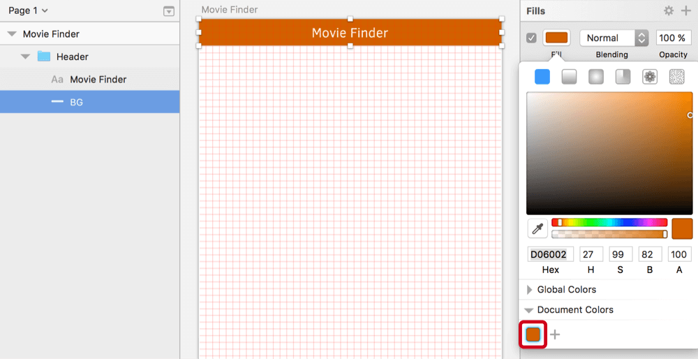
The first time we will use this grid is for the height of the header. Drag the rectangle we just created to be 32 pixels high. Choose a color of your liking that has enough contrast with white text; I went for #D06002, which I also saved to the “Document Colors” in the color dialog with a click on the “+” button, for later reference. For the title, “Movie Finder,” create a new text layer (press T) with a size of 16 pixels and the color white, and center it in both dimensions to the background. My font of choice is Clear Sans by Intel due to its clean look, but also the good selection of weights. Choose the “Regular” weight for the title. Complete the header by moving all of the current elements into a “Header” group.
Search And Find
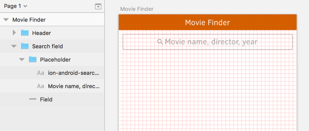
The next task is the search field. Add another rectangle with dimensions of 344 × 32 pixels, and assign it rounded corners of “3,” a white background and a gray border (#B4B4B4). Rename it to “Field.” Move it 1 grid unit away from the header, and center it to the artboard (using the fourth icon at the top of the Inspector, or a right-click and then “Align Horizontally”). The placeholder consists of an icon and some text. For the former, I have used the plugin Icon Font, which enables you to easily pull in different icons. It requires you to install the font bundle, a package of the most popular fonts. In case you need some assistance with this multi-step process, have a look at the screencast. Now, go to “Plugins” → “Icon Font” → “Grid Insert” → “Ionicons” in the menu bar and enter “search.” Click on the first icon to add it to the artboard, but change its font size to 16 pixels. Drag it over to the search field.
For the placeholder text, add a new text layer with T, set to the same font size, a “Regular” weight and the content “Movie name, director, year.” Also, make sure the “Clear Sans” font is used. Move it 3 pixels away from the icon, select both elements, and center them vertically with a right-click and “Align Vertically.” Set the color of both to #4A4A4A. Because this will be our default text color from now on, add it to the “Document Colors.” Create a new group from these elements (named “Placeholder”), which you can tone down to 50% opacity with 5 on the keyboard. Move it a little up afterwards with the arrow key for correct optical alignment. Select this new group together with the field itself, and center them in both dimensions (right-click → “Align Horizontally” and “Align Vertically”), and create a “Search field” group. In the layers list, it should be below the header group; move it there with Cmd + Alt + Ctrl + ↓.
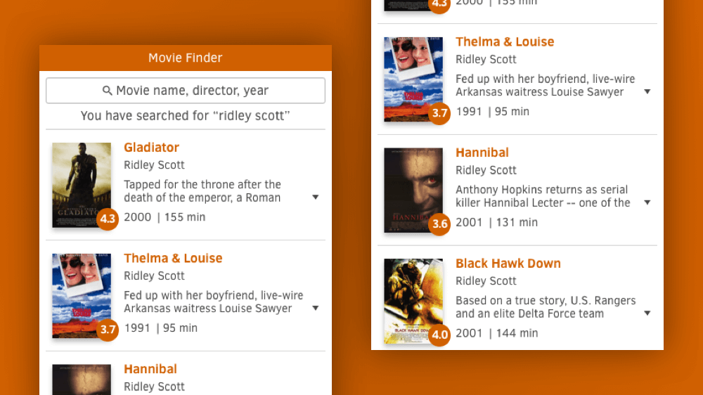
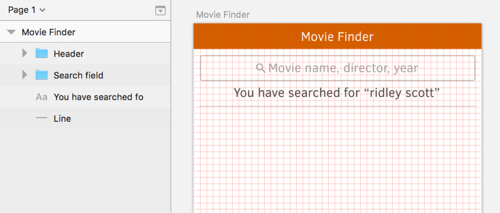
Now, duplicate the placeholder text for the search term below with Cmd + D, but move it down until its text box has a spacing of about 3 pixels from the border of the input field. This new layer doesn’t need to sit on a grid line (you can break this rule — not everything has to align perfectly). Use ‘You have searched for “ridley scott”’ as the content. Also, drag it out of the groups in the layers list, below the “Search field” group, and center it to the artboard.
Right below the text layer, add a line to clearly distinguish the search results. This can be created with either a thin rectangle (1-pixel high) or a line (1-pixel thick). I prefer the former because it’s a tad easier to handle. Create it with the same width and spacing as the search field, and name it “Line.” Set the fill to #D4D4D4, and align it on top of a grid line (which should give it a spacing of about 7 pixels from the text layer above). Move it to the bottom of the layers list, together with the text layer.
Show Me The Results
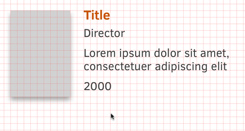
Now we can finally turn to the search results. Each result consists of the poster of the movie, the name, the director, a short description, the year of release and the running time. It also shows the user rating at a glance. But instead of adding all of the information by hand, we will just create placeholders that will be filled with the actual content later!
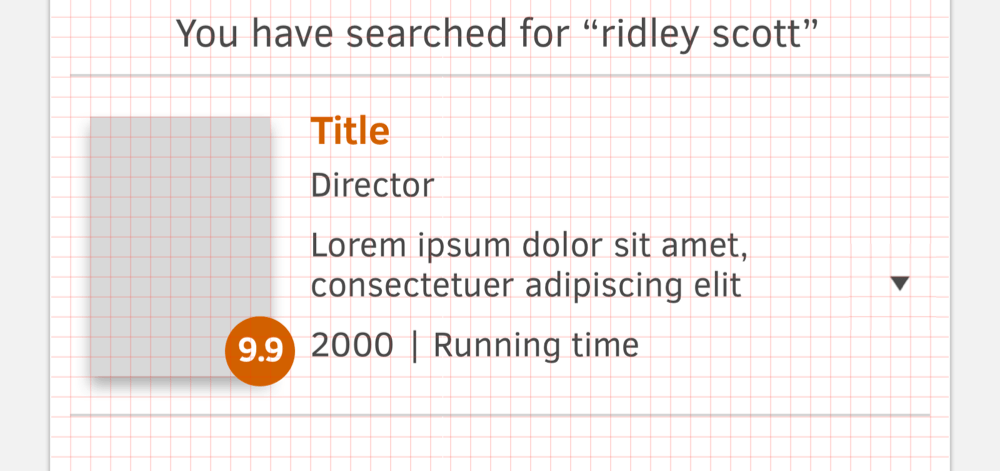
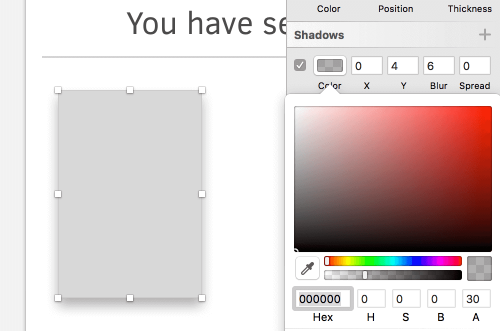
Let’s start with the poster. Add a rectangle of 72 × 104 pixels at the left edge, with a spacing of 2 grid units from the artboard’s edge and the line above. Name it “Poster.” A black shadow with the properties “0/4/6/0” (X/Y/blur/spread) and 30% opacity will give it a slightly raised appearance.
Right next to it, with another horizontal spacing of 2 grid units, add a text layer for the “Title” (use exactly that as the content). The font size should already be at 16 pixels. For the color, choose the same as the header’s background (get it from the “Document Colors” in the color dialog). Make it bold with Cmd + B, and move it so that the top of the text (not the text box) is at the same height as that of the poster. Use the arrow keys to fine-tune this position. Duplicate it for the “Director” (as above, use this as the content), move it down and align its baseline to a grid line. Once you have lowered the font size to 14 pixels, this should give it a spacing of about 2 pixels from the previous text layer. For the weight, use “Regular” again, and for the color, the black color we saved to the “Document Colors” earlier.
More Text
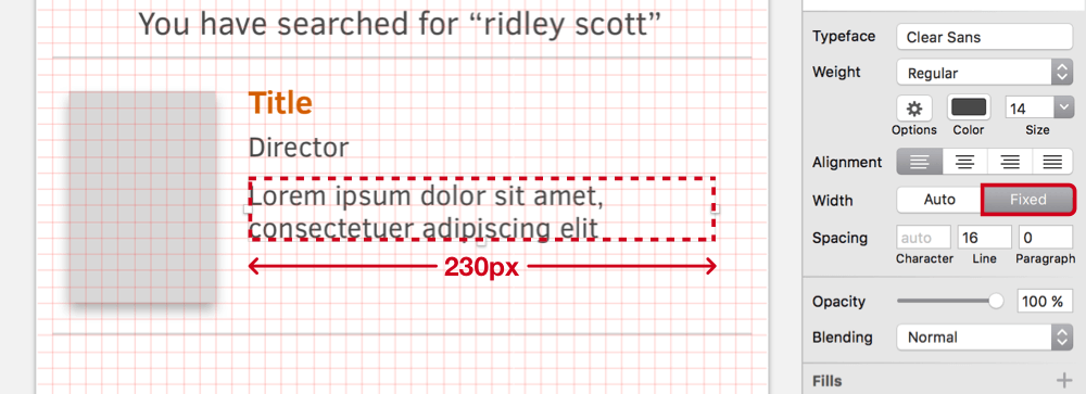
Continue with the description in the same fashion: Duplicate the previous text layer with Cmd + D, and move it down so that there’s spacing of about 2 grid units in between, after you have aligned its baseline to the grid. You just need to make sure that the filler text has two lines: Use the well-known placeholder “Lorem ipsum dolor sit amet, consectetuer adipiscing elit” as the content for now, but set the width of the text layer to 230 pixels in the Inspector panel. This will create a fixed text layer that automatically breaks at the right, creating two lines of text. Tighten the line spacing to 16 pixels in the Inspector panel, which will align both lines to the grid.
Because these will be just the first two lines of the description, we will add a so-called “disclosure triangle” that indicates more text. Create a triangle (from “Insert” → “Shape” → “Triangle” in the toolbar) with dimensions of 8×6 pixels, and flip it vertically with a right-click and “Transform” → “Flip Vertical.” In case you have difficulty getting these measurements, switch off the grid temporarily with Ctrl + G and zoom in a bit with Cmd + +. Assign this triangle the same color as the text, and center it to the second line of the description (you can switch on the grid again now). To make it independent of the text length, move it to the right edge of the artboard, with a spacing of 2 grid units. Finally, rename it to “Disclosure,” and make sure that it is above the adjacent text layer in the layers list.
Time And Time Again
For the remaining two text layers — the year and running time — we can take the text layer of the “Director” as the base again. Duplicate it, move it down, so that there is another spacing of about 2 grid units from the description, but change the content to something like “2000” (so that we have a good indication of how long a typical year will be). As before, its baseline should align to the grid. Hold Alt, drag it to the right with the mouse to create another copy, and change this one to “|” to separate it from the year. You may also want to press Shift while dragging to keep it on the same line. Add the last layer in the same fashion, with “Running time” as the content. These text layers should have a horizontal spacing of about 4 pixels from each other.
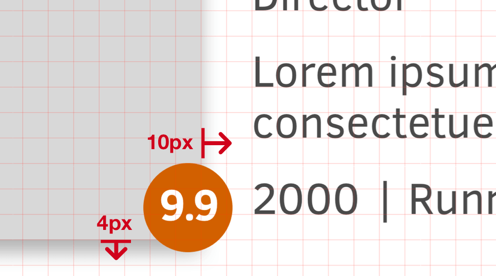
The only thing we have to do before we can start pulling in some real content is the rating. First, it contains a circle with a diameter of 28 pixels (switch off the grid again) and the same fill color as the title of the movie. The second element is a white text layer (“9.9,” for example), with a font size of 14 pixels, a bold weight and center alignment (press Cmd + |). Changing the character spacing to “–0.8” will give it a tighter feel. Align these two layers to each other, but trust your own eyes for the optical alignment instead of Sketch’s functionality, because that will produce a better result.
After you have combined these into a “Rating” group, move it to the bottom right of the poster so that it sticks out about 10 pixels horizontally and 4 pixels vertically. Make sure that it is above the poster in the layer hierarchy. One last step: Duplicate the line from above so that it acts as a separator between the other search results we are going to create. Move it down until it has a spacing of 2 grid units from the poster and sits on top of a grid line.
From One To Many
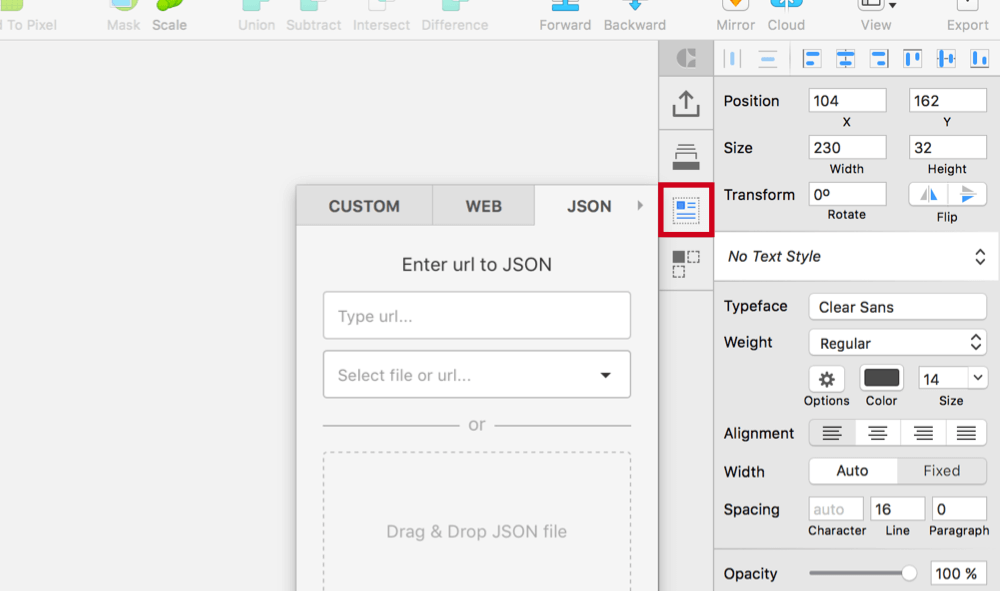
The design is ready. There are numerous ways in which we can fill it with real content (with the help of some plugins), but the best and easiest is Craft. Apart from pulling in data, it also enables us to duplicate elements and vary their contents automatically. After you have installed the plugin, a handy panel next to the Inspector panel will appear (if not, open it with “Craft” → “Toggle Panel” from the menu bar), which will provide more functionality in Sketch. For us, the “data” section (third icon from the top) is of most interest and, in particular, the “JSON” tab.
We will pull our data from the Netflix Roulette website, which provides an application programming interface (or an API, which is a way to access different parts of a service) for all shows on Netflix. Because we would like to get all movies from director Ridley Scott, we will use the “director” keyword with his name, which leads to the URL https://netflixroulette.net/api/api.php?director=Ridley%20Scott. Click on it to see the JSON file. The file might seem like a mess at first, but it’s just an unordered collection of the key-value pairs — i.e. the properties — of the movies, such as show_title, category and runtime. We will bring some order to this list shortly.
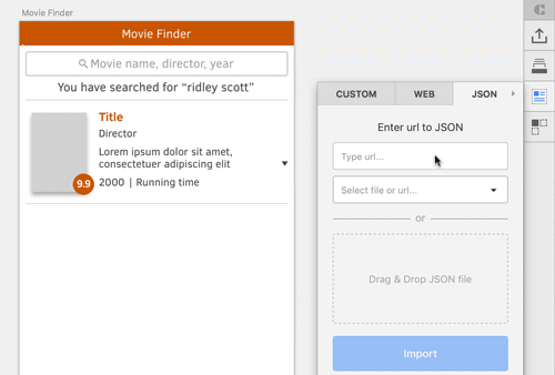
Take this exact URL and paste it in the input field of the “JSON” tab in the Craft panel that says “Type URL…”. Clicking on “Import” will bring up a list of (currently) seven entries, which you can extend with the arrow on the left.
Note: In case the JSON file from Netflix Roulette can’t be processed, you need to take another approach: Open the URL in your browser, but instead of pasting it into Craft, save the JSON file with a right-click and “Save As…” to your hard drive. Now drag this file from the Finder into the JSON panel of Craft where it says “Drag & Drop JSON file”. Now you should be able to use the JSON data as described.
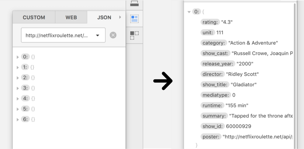
Start at 0, which should be the one for the movie Gladiator; a look at show_title confirms that. With a simple click on the key, you can assign its value (or any other from the JSON file) to layers on your artboard (for example, after selecting the “Title” text layer). Do the same for the “Director” text layer and the director key, as well as “Description” and summary. Unfortunately, the content from Netflix Roulette is much longer than what we have arranged for the text layer. Fix that by dragging the height of the text layer back to 34 pixels again (using the Inspector panel won’t work here).
0), and assign the values to the layers on the artboard.Now, continue with the remaining text layers. Select “2000” on the artboard, and assign the value from release_year, as well as “Running time” on the canvas and runtime from Craft. For the rating in the orange circle, use (you guessed it!) the rating field. Instead of using a URL for the JSON file, you can employ your own data: Delete the current source with the “x” icon next to the input field, and drag your JSON data to the appropriate field below (or simply click there and select it from the computer).
Note: A list with numerous JSON files for you to play with can be found on GitHub.
A Picture Paints A Thousand Words
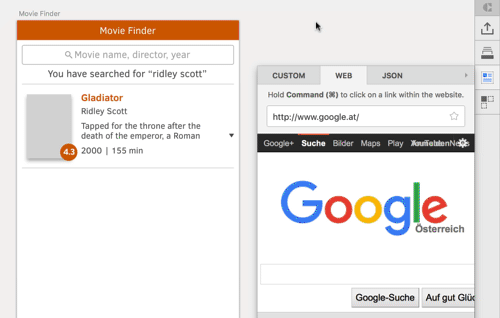
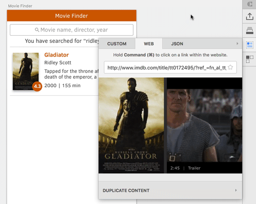
You can use Craft to fill not only text layers but also image layers. Unfortunately, selecting the “Poster” layer and clicking on the poster field in Craft won’t give us the desired result: it seems that the image path isn’t valid, so nothing more than the three dots (which usually act as a loading indicator) will be shown. Luckily, Craft can do even more: You can use the “Web” tab — which is basically just a browser — to navigate to a website and grab the poster from, say, IMBd. On the page for Gladiator, scroll down and click on the movie poster, which will assign the correct image to the placeholder on the artboard (make sure that it is selected first). In case you want to follow a link, you need to hold Cmd before clicking.
Now we have a search result that is fully filled with content about the Gladiator movie, without having typed a single value by hand. Magic!
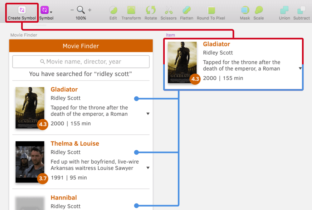
But it doesn’t stop there. Getting to the other search results, all based on the same JSON file, is just a matter of a few clicks. As preparation, combine all of the layers of the search result into an “Item” group (including the line), and move it to the bottom of the layers list (you can use Ctrl + Alt + Cmd + ↓). Now, click on “Duplicate content” in the Craft panel, which will bring you to the “Duplicate” section. This will let you lay out an element in both directions, with a certain count and spacing in between. We want “4” items in total, with a gutter of “10,” aligned vertically. Press “Duplicate Content” and watch the magic unfold.
We’ve gotten three new search results, all filled with more movie data. Craft was clever to use the other entries from the JSON file here. Alongside these additional entries, another new layer was created in the layers list: “Duplicate control.” This one’s really powerful: In case the new entries don’t align to the grid, you can use it to change the spacing on the fly. Just select the “Duplicate control” layer in the layers list, and drag the slider below the “Gutter” field in the Craft panel.
But it does even more. If you need more (or fewer) entries later on, you can resize the “Duplicate control” layer on the canvas, and the plugin will automatically adapt the number of search results! Just mind that plugins sometimes break with each new version of Sketch, so if something doesn’t work as expected, a fix might already be on the way.
The only thing that doesn’t perfectly work are the posters. They seem to be broken in general, so we need to use the “Web” tab again. Navigate to the respective detail pages on IMDb, and select the appropriate poster images. But that’s a small price to pay.
In For A Penny, In For A Pound
Basically, we are done now, but I want to show you one last trick. Though we have four similar elements, they aren’t tied to each other in any way. Changing one of the entries won’t affect the others. A symbol would help here.
Start by deleting all of the item groups except the first; remove the outer “Group” that Craft created with Shift + Cmd + G, as well as the “Duplicate control” layer, and select the remaining item. Now, click on “Create Symbol” in the toolbar, but don’t send it to the Symbols page. This will place the symbol next to the artboard, which will make modifications easier later because you can instantly see how all instances will be affected.
In contrast, if you select “Send Symbol to ‘Symbols’ Page,” the symbol will be created on a separate page. While this is better for organization, it becomes much harder to see the direct correlation between the master symbol and its instances when you change it.
For the rest of the items, you can proceed in the same way as before. Select the first item, the instance of the symbol we just changed (not the master symbol next to the artboard), go to the “Duplicate” panel in Craft (the last icon), enter “4” for the count and “10” for the gutter, and you are done. Because all entries are tied to the same symbol now, you can try to change the size of the title, for example, and see how it adapts in every search result.
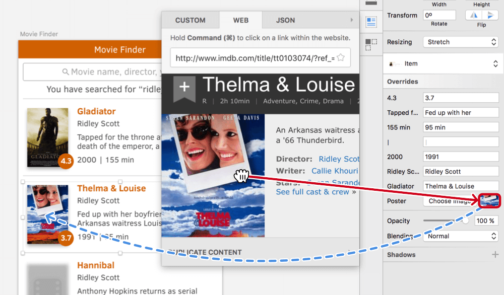
The poster problem needs a slightly different approach, however. Selecting the poster of each search result isn’t possible anymore when using a symbol. Instead, click on the small thumbnail next to the “Choose Image” button in the “Overrides” section of the Inspector panel. Navigate to the appropriate IMDb page from the “Web” tab in the Craft panel again, and drag the poster to this thumbnail. This will apply it to the respective instance of the symbol. Goal achieved!
Conclusion
I hope you’ve enjoyed this tutorial, in which I’ve shown how you can stop worrying about dummy content and start using real data with the help of the Craft plugin. This could not only speed up your design process but also make you think more about edge cases, or how certain parts of a design can interact with each other.
Please feel free to post your questions or point out a different approach to a certain part of the tutorial. You can also contact me on Twitter (@SketchTips) or visit my little side project (SketchTips), where I provide more tips about Sketch. For the full package, have a look at The Sketch Handbook from Smashing Magazine, which will tell you everything you ever wanted to know about designing with Sketch.
Further Reading
- Sketch, Illustrator or Fireworks?
- Using Sketch For Responsive Web Design
- Sketch Vs. Figma: The Showdown
- Sketch With Material Design


