Copy If You Can: Improving Your UI Design Skills With Copywork
There’s a technique for improving one’s user interface design skills that is the most efficient way I know of expanding one’s visual vocabulary but that I’ve rarely heard mentioned by digital designers.
I’m talking about copywork. Copywork is a technique that writers and painters have been using for centuries. It is the process of recreating an existing work as closely as possible in order to improve one’s skill. In our case, this means recreating a user interface (UI) design pixel for pixel.
It’s not as pointless as it sounds, I promise. The trick is to pick a design that is better than what you are currently capable of. By copying something outside of your wheelhouse, you will be expanding your skills.
So, if you want to improve your use of color, copy something with some crazy gradients or a bold palette. If you want to get better at luxury branding, copy a preeminent website with a ritzy look and feel.
Obviously, this technique is not rocket science. Actually, it would be hard to think of a more mundane exercise. But it is the most effective way I know to improve my UI design skills.
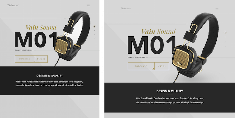
But we’re getting ahead of ourselves.
Writers Copying Writers
I first heard about copywork on the blog The Art of Manliness, where Brett McKay gives a long history of those who’ve used copywork to develop their writing skill.
- Jack London copied swaths of Rudyard Kipling’s writing to adapt his forebear’s world-class cadence and phrasing.
- Robert Louis Stevenson would meticulously study sections of writing he found particularly beautiful, then reproduce them word for word from memory.
- Benjamin Franklin followed a variant of copywork, writing notes about each sentence in an essay and then, a few days later, trying to recreate the essay by reading his notes — and comparing the results.
The list goes on. I know that Raymond Chandler, the famous mystery writer, used a technique similar to Benjamin Franklin’s, rewriting a novelette from a detailed description, and then comparing his with the original to study the flow.
He actually wrote to the original author later in life, telling him how instructive the exercise was. Pay attention to his analysis:
"I found out that the trickiest part of your technique was the ability to put over situations, which verged on the implausible but which in the reading seemed quite real. I hope you understand I mean this as a compliment. I have never even come near to doing it myself. Dumas had this quality in very strong degree. Also Dickens. It’s probably the fundamental of all rapid work, because naturally rapid work has a large measure of improvisation, and to make an improvised scene seem inevitable is quite a trick."
This is not a rote exercise. Chandler is extremely thoughtful about the differences between his work and the original and is well versed in the subtleties of style of many authors. Can you speak this articulately about UI design? If not, may I recommend copywork?
Just as a writer copying the greats before him unconsciously absorbs the tiniest choices those authors made — the word choice, phrasing, cadence and so on — a designer doing copywork also absorbs the subtlest choices in the designs they study — the spacing, layout, fonts, decorative elements. Therein lies its power.
Let’s take a quick look at copywork in one other art form, though, one with a remarkably long history.
Painting The Old Masters
If you’ve wandered through an art museum, you’ve probably seen copywork in action. Apart from my own desk, it’s the only place I’ve seen it.
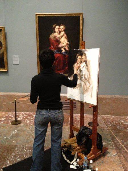
Painters have an even longer history than writers of copying the masters. Leonardo da Vinci developed his art (one of his arts, anyhow) by copying his teacher, Andrea Del Verrocchio — a common practice among Renaissance apprentice artists. Da Vinci actually prescribed copywork as practice numero uno for art students:
"The artist ought first to exercise his hand by copying drawings from the hand of a good master."
Why? Because copying directly from a master provides a controlled setting in which to train your eye.
When you’re painting a live scene, on the other hand, there’s a lot to worry about — the model will move, the wind will pick up, the sun will set. Until your brain can think naturally in shape and color, painting in the real world will be tough. But in the studio, you can take all the time you need to absorb the basics.
While UI designers do not model anything after a natural scene in the same way as painters, copywork provides a useful way to eliminate variables and distractions while honing your skill.
But although it was once a foundational exercise of some of the world’s greatest artists, copywork has fallen out of favor. Nowadays, it’s viewed as rote, uncreative and reeking of plagiarism.
So, why should a UI designer copy for practice?
It’s All About (Recreating) The Details
The gist is this: When you recreate a design, pixel for pixel, you’re forced to remake every decision the original designer made. Which font? How big? How are things laid out? Which images and background and decorations? You immerse yourself in the small design decisions made by awesome designers.
You might argue that you’d be missing out on all of the choices the designer considered, and the rationale for why they picked what they did. Fair enough — but that’s missing the point. Done right, copywork exposes you to design decisions you simply wouldn’t have made on your own.
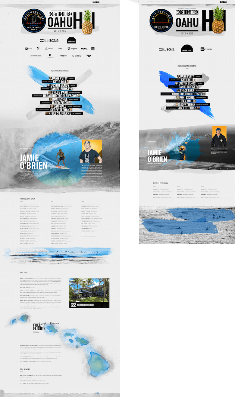
Let’s take an example. One of the most vocabulary-expanding pieces I’ve copied is Dann Petty’s wonderful Epicurrence website. I internalized three things from the header alone:
- Insanely large font size. My copy of the original included the Hawaii initials “HI” in size 365 font. Never in my years of professional work had I even considered making text that big. Yet he uses it as a visual element, aligning it with the other header elements, even putting an image between the letters. Very cool.
- Paint stroke as “shadow” A watercolor smudge runs across the bottom of the seal, the header and the pineapple. It’s in the spot where a shadow might be, as if the shadow were painted on the page. Whoa — that’s not the usual way of doing it!
- Uppercase type with generous letter-spacing. No doubt, that uppercase text adds a strong element of alignment, and pumping up the letter-spacing is a textbook way to add some classiness to type, but I find myself getting self-conscious about doing it much. It was cool to see that all of the text here is capitalized, and basically all of it has modified letter-spacing, too.
Now, I’d seen Dann Petty’s design before deciding to copy it. I thought, “Wow, this looks great.” And even as my eyes glossed over the design, it’s not like I immediately internalized every technique he used. Only when I copied it did I start to consciously adopt those things in my UI toolkit.
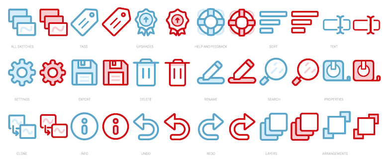
Here’s another example, the Skedio icon set by master icon designer Vic Bell. (Her originals are in blue, my copywork in red.)
This was a fascinating exercise for me, particularly because Vic’s icons are a step or two more detailed than most of what I make for the apps I work on. She added this complexity in two subtle ways:
- A second, lighter shade of blue. Compare the fill color of the “Settings” icon (row 2, icon 1) to the outline color. Most icons I’ve designed are one color only.
- A second, lighter line width. You can see it in the “text” of the “Tags” icon (row 1, icon 2) and in the arrow on the “Upgrades” icon (row 1, icon 3). I’ve lived by the rule that consistency is paramount in icon design, so seeing Vic’s use of 3-pixel accent lines in a primarily 4-pixel line set was fascinating.
But the strength of copywork is not just in seeing these details at a superficial level, but also in becoming intimately familiar with how they are used across the design.
Let’s take the idea of the second, lighter shade. It’s one thing to decide to use a second shade as an accent color. Here are four ways Vic has used the lighter shade in this icon set:
- As a shadow. The trash can lid of the “Delete” icon (row 2, icon 3) has this secondary blue in its shadow. You can see a similar but even subtler shadow beneath the medallion in the “Upgrades” icon (row 1, icon 3).
- As a gleam of light. The lighter shade is used as a reflection of light in the magnifying glass of the “Search” icon (row 3, icon 5).
- For color contrast. Vic uses white and light blue as two contrasting colors in the life-preserver ring of the “Help and feedback” icon (row 1, icon 4). Same story with the pencil in the “Rename” icon below it (row 2, icon 4).
- For visual weight contrast. This one was the subtlest for me. Notice how the background cards — but not the foreground card — of the “All sketches” icon (row 1, icon 1) and the “Layers” icon (row 3, icon 5) are light blue. The foreground card in both is white, giving it more contrast with the rest of the icon. If the background cards had white fills, then the sharp contrast between their borders and fills would have distracted the eye — as it is, the eye is directed straight to the front card.
These strategies are more detailed than any class on icons would get into. They’re one-off tips and techniques that go straight from the mind of a master to yours, if you’re willing to put the effort into doing copywork.
All right, let’s cover one more example here.
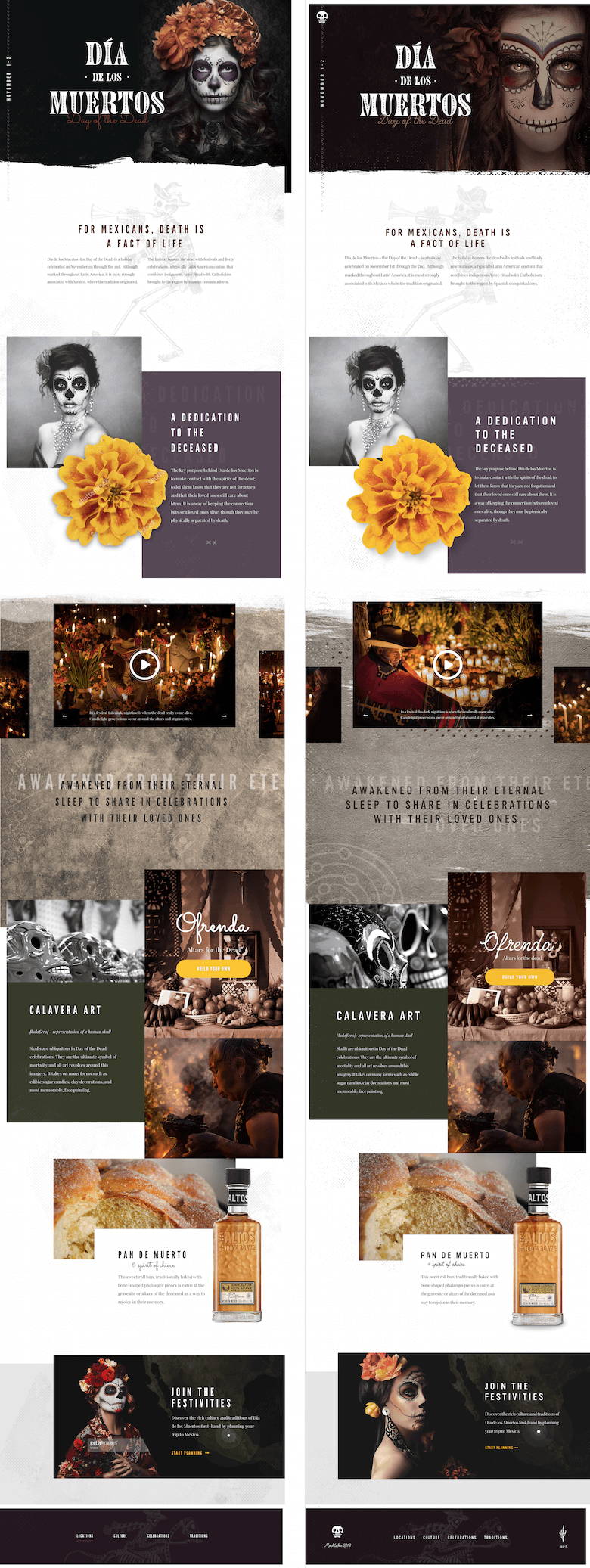
I saw Taylor Perrin’s Día de los Muertos design not long ago, and it blew me away. He does a fantastic job of using elements that I struggle with, such as beautiful photography, rich textures and panoramic layouts.
A lot of this is due to what I spend my time designing — mostly information apps for businesses. The look is clean and simple, the branding staid.
Copying Taylor’s Día de los Muertos mockup expanded my design thinking in a number of ways:
- A new workflow. I’ve been a huge proponent of Sketch since day one, and I even teach a UI course based on Sketch, but there are downsides to its simplicity. Namely, since switching from Photoshop to Sketch, my design reflexes have tended way towards everything being flat rectangles. In this exercise, I textured almost every background on the whole page, and it was a great reminder that a pass in Photoshop during the design process allows me much more versatility in style than simple colored rectangles.
- Making decent assets shine. One of the first assets I had to track down and restyle was the illustration of the skeleton playing the horn. When I found it online, I was underwhelmed. In fact, if I had been designing the original mockup and found that illustration, I probably would have passed it up. Yet it looked great in Perrin’s mockup. Comparing the original image to his mockup was a lesson in all of the cleanup work you can do with mediocre assets, and in envisioning their use beyond their immediate appearance.
- Full-width layouts. Although it’s become popular to have panoramic layouts span the page’s width no matter how wide the screen gets, I’ve done very little of this myself. This exercise was a great confidence-booster for this type of layout. As I copied, I would try to guess certain details (such as the font size of a particular piece of copy) and see what felt right; then, I checked and adjusted. The next time I make a layout 1400 pixels wide, I won’t feel odd about headings being 60 pixels.
So, am I as good as Dann Petty or Vic Bell or Taylor Perrin now? I’m afraid that will take some time — they’re among the best UI designers in the game. But you better believe that every day I am pushing my set of skills and techniques to incorporate their know-how.
Common Questions
When Do You Do Copywork?
I start off many mornings with 30 minutes of copywork. This has two benefits:
- It energizes me for the day because I’m learning new stuff right when I wake up.
- It’s a way more productive low-energy wake-up activity than checking email or social media. Something needs to get done as the coffee brews.
Only 30 Minutes? What If You Don’t Finish A Piece?
Then I keep going the next day. And so on.
What Should I Copy?
Copy something that pushes one of your skills beyond its current level. Copy something that exhibits a technique you’ve not honed.
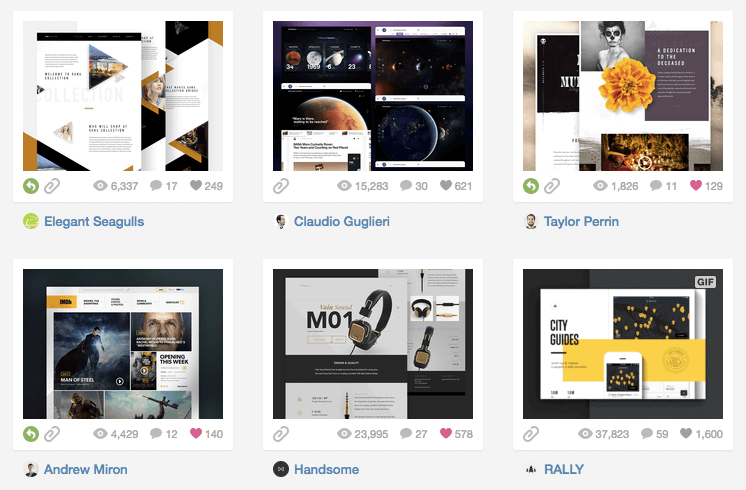
For ideas, I love to browse Dribbble. I keep a Dribbble bucket of copywork images — things I’ve found from other designers that I want to copy (or already have).
I can also recommend a few designers who have carved out their own style and offer a lot to those who are still learning the basics:
- Jonathan Quentin uses color and gradients really well. Check out his work to up your color chops.
- Brijan Powell is the boss at making designs that are classy and upscale yet thoroughly masculine.
- Tubik Studio is fantastic at everything bright, colorful and cheery.
Though I use Dribbble for copywork (it’s a great way to quickly browse and save high-quality images), live websites work great, too. For instance, Blu Homes is next on my list!
If you’re a professional designer, here are a few more ideas:
- I sometimes copy my clients’ websites and apps if they want more UI work done in that style.
- I sometimes copy my potential clients’ websites and apps, so that from the very first conversation, I have a deeper knowledge of their visual design language.
For instance, I did some design work for Soylent, the meal-replacement company. As soon as they reached out to me, I put it on my to-do list to reproduce their home page. I wanted to be able to talk fluently about how they used color, typography and imagery.

Must I Copy The Original Perfectly?
I think copywork is subject to diminishing returns — so, no, you don’t have to copy perfectly. But (and this is important) you can’t copy it worse than the original. You have to achieve something that you view as equal or better, even if the details don’t totally line up.
You won’t always have access to the same fonts and resources, so slight differences are par for the course. I’ve found Identifont and WhatTheFont to be great resources for finding which fonts are used in images.
Do You Copy Multiple Images In Series To Improve A Certain Skill?
Copying five designs that demonstrate excellence in, say, typography is a great way to get better at that one skill. However, I much prefer to bounce around to whatever catches my eye. It’s a good counterbalance to what I’m working on at the time, and it keeps things interesting.
Do You Copy In Sketch Or In HTML And CSS?
I copy in Sketch. I find that CSS is a poor medium for visual thinking, and copywork is a visual exercise. Writing CSS, I get bogged down thinking about the proper way to position each little element — which is exactly the kind of thing to worry about if you want to be a good CSS coder, but a terrible distraction if you’re trying to improve your visual design skill.
Can I Put It In My Portfolio?
Don’t do that. Portfolios are for showing off your own work. Copywork is just an exercise to improve your design skills.
Won’t This Cause Me To Plagiarize?
No, but here’s some great advice from designer Sean McCabe about avoiding plagiarism:
- Soak up all the inspiration you want.
- Sleep on it.
- Produce your new work from memory.
Incidentally, copying from memory, rather than from the original right in front of you, is a variant of copywork that makes you far less prone to exact reproduction. However, I’d recommend this exercise for more advanced copiers. Working blind, you’ll be making both the low-level and high-level decisions without guidance. If you’re trying to reproduce something above your level, there’s plenty to be learned from direct copying.
There is remarkable consensus among artists and creative folk that creativity is fundamentally about mixing together what already exists. Nothing is entirely original.
"Immature poets imitate; mature poets steal; bad poets deface what they take, and good poets make it into something better, or at least something different. The good poet welds his theft into a whole of feeling which is unique, utterly different from that from which it was torn; the bad poet throws it into something which has no cohesion." – T.S. Eliot
"I wanted to hear music that had not yet happened, by putting together things that suggested a new thing which did not yet exist." – Brian Eno
"All writing is in fact cut-ups. A collage of words read heard overheard. What else?" – William S. Burroughs
Copywork enables you to pick up inspiration and remix it into your own style. A casual glance at a great new design would only reveal the surface level of technique and style, but with copywork, you can go deep and really expand your skills.
Is Copywork Really For Me?
Unless you’re known the world over for your inimitable style, then yes, you would probably benefit from it.
That covers the most frequent questions I get about copywork. It’s a simple practice but one that pays dividends. If you consistently copy pieces that impress you or are above your level, then you’ll pick up a handful — if not dozens — of techniques and tactics that you can apply to whatever you are working on. The rest of the art world has been doing this for centuries; it’s time for designers to catch up.
So, the next time you want to expand your visual vocabulary, open up a great design (for starters, you can browse my Dribbble copywork bucket for inspiration), put on some good music, and start cranking out the pixels.
Further Reading
- How To Transform Your Problem-Solving And Creativity
- Using Sketch For Responsive Web Design
- Understanding Copyright And Licenses
- The Messy Art Of UX Sketching


 Claim Your Free Spot!

 Celebrating 10 million developers
 SurveyJS: White-Label Survey Solution for Your JS App
 Register Free Now

