Mobile First Is Just Not Good Enough: Meet Journey-Driven Design

Email Newsletter
Weekly tips on front-end & UX.
Trusted by 182,000+ folks.
 Register for Free
 Custom Web Forms for Angular, React, & Vue. Your backend.
 Celebrating 10 million developers

In a recent sales meeting for a prospective healthcare client, our team at Mad*Pow found ourselves answering an all-too-familiar question. We had covered the fundamental approach of user-centered design, agreed on leading with research and strategy, and everything was going smoothly. Just as we were wrapping up, the head of their team suddenly asked, “Oh, you guys design mobile-first, right?”
Well, that’s a difficult question to answer.
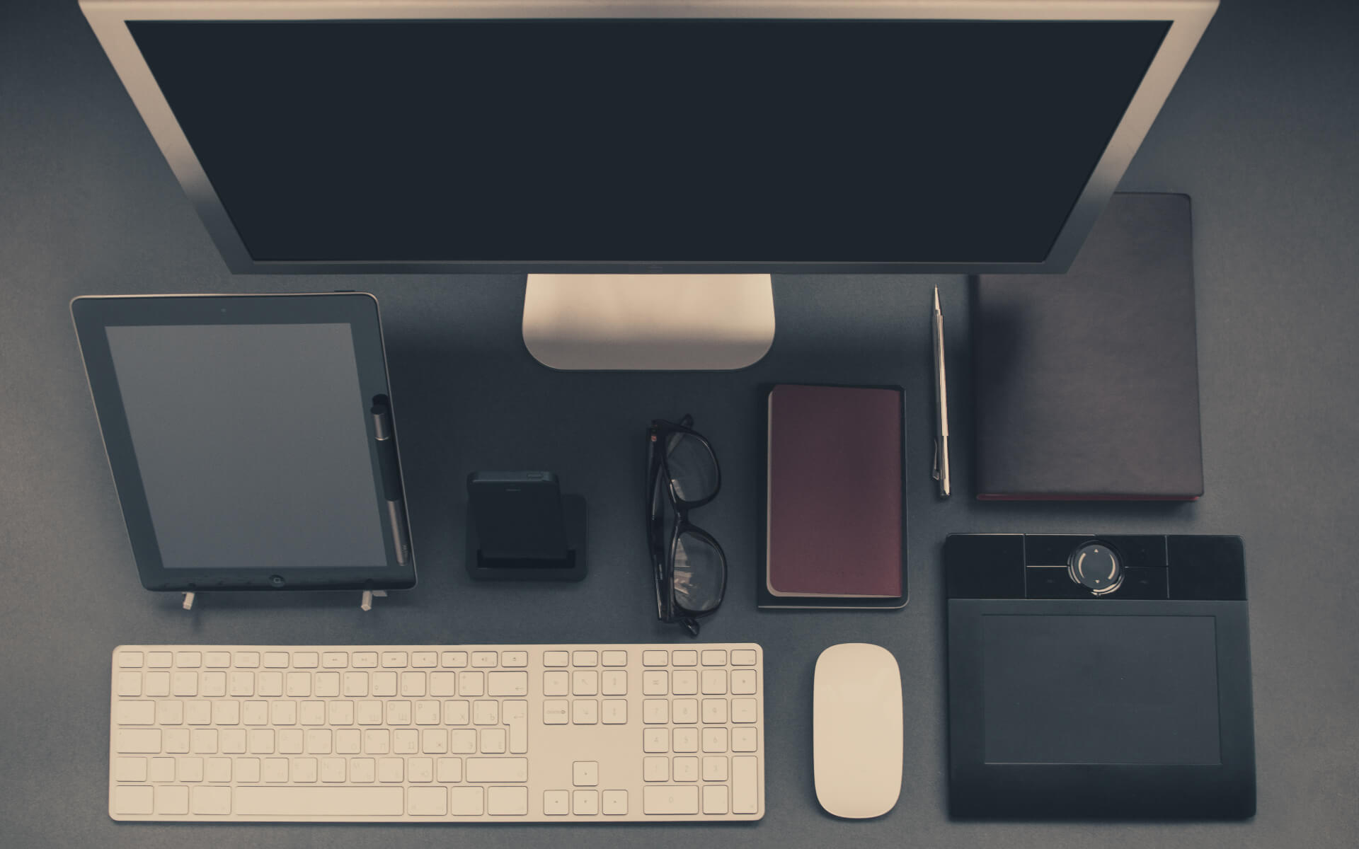
While the concept of mobile first began as a philosophy to help prioritize content and ensure positive, device-agnostic experiences, budgetary and scheduling constraints often result in mobile first meaning mobile-only.
But according to the analytics data of our healthcare clients, the majority of their users are still on desktop. We want to provide a positive experience for those users and for users on mobile and tablet apps and for those using mobile browsers — and even for users having an in-person experience! It is not accurate to assume that mobile is the primary experience.
We’ve come to the conclusion that mobile first is not specific enough to user needs. Truly user-centered design needs to start with the journeys our users are taking and the flows they follow to complete their objectives. In other words, journey-driven design. Journey-driven design naturally emerges from a user-centered approach that factors in the who, the when and the how to reveal the truly complex set of user needs. Good design doesn’t force users to pick up the device that we designers want them to pick up; good design gives users the best of what a company has to offer on the device that the user wants to use at that point in their journey.
What’s Wrong With Mobile First?
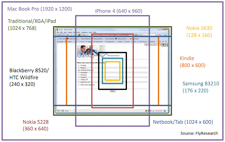
Early in the world of mobile, we (designers in general) essentially designed for desktops… desktops with small screens. UX designers were used to thinking about things like how their users would approach a website and what visual, linguistic and contextual clues they would need to complete their tasks, but we didn’t think about the screen’s size changing. In 1999, we merely worked with 800 pixels. Then, we expanded to 1024, then 1200. Designers rejoiced!
As mobile design improved, battery life lengthened and Wi-Fi became ubiquitous, we learned that users were likely to approach a website from their mobile screen. But all of the design considerations for desktop didn’t translate well.
The idea of mobile first was a triumph for the user. In 2009, Luke Wroblewski introduced this best practice. Karen McGrane added to the conversation with her Content Strategy for Mobile in 2012. They found that designing with the constraints of small screens helps us to prioritize content, which leads to a better experience for the end user. In addition, the capabilities of mobile devices left more opportunities for engaging experiences.
Still, it focused on only one great experience. One variation focused on the concept of graceful degradation, which suggested that we design a perfect experience (typically for desktop), and then account for older browsers and less common devices by ensuring functionality, even if the design suffered. Similarly, we tried progressive enhancement, which suggested starting small (mobile), and then enhancing the design as the device or browser gets bigger. Neither accounted for a great design across the realm.
And, more importantly, no one intended mobile first to mean mobile-only.
Now it’s 2017, and we assume that every project needs to be mobile-friendly; so, when budgets decrease, mobile first does become mobile-only. After all, 34% of people use the Internet predominantly from their mobile phones, and as of April 2015, Google penalizes websites that aren’t usable on mobile. But the choice isn’t as simple as mobile or desktop. Many users switch devices mid-task, making it even more vital that we focus our content and create consistency across the experiences. In healthcare, 50% of smartphone users download health apps — which also means that 50% do not yet.
In a recent report on mobile marketing statistics, Smart Insights’ founder Dave Chafey analyzed the reports and concluded:
"The reality is that while smartphone use is overwhelmingly popular for some activities such as social media, messaging and catching up with news and gossip, the majority of consumers in western markets also have desktop (and tablet) devices which they tend to use for more detailed review and purchasing."
We have to ask: Did a patient get their diagnosis via a phone call at home and then turn to their desktop, or were they at the doctor’s office searching on their mobile phone? Did that shoe shopper peek at their phone for a cheaper online deal, or did they go home and make the purchase on their tablet?
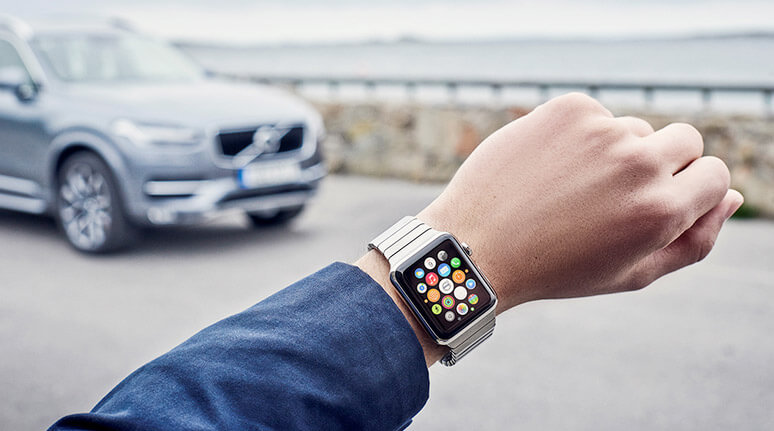
The divide between online and offline has dissolved as the Internet of Things expands, and our experiences are likely to cross between phone, laptop, tablet, TV, watch, refrigerator, car and even toilet! Pixels and dimensions mean far less than responsive design, adaptive content and journey mapping. There is no obvious starting point for a journey, and no clear template to follow. In order to prioritize content as well as to design for screens beyond mobile, we need to focus on the journey as a holistic piece.
Uncovering The Journey
What makes journey-first design more effective than mobile first is that we are looking at the process holistically. This means that even small budgets have the time and money to take into account design thinking for more screen sizes. In addition, journey-first provides context, a necessary element of today’s design, which was not a focus when mobile-first design began.
The first step in journey-driven design is to map the journey itself, with a focus on how someone accomplishes their goals, and the best person to ask is the end user. Most user-centered design projects already begin with a research phase. It’s an opportunity to hear from users or prospective users and to learn what their expectations are, where they have pain points, and what device or devices they will use as they navigate through the experience.
Based on the research, we create personas, and then map out each persona’s ideal journey, including making note of every touchpoint along the way to the final objective. These are the times when the business and the persona communicate, whether via email, website, social media, store visit, phone call, mailing or other method. Those touchpoints will be what we can actually design, in order to shape the complete experience. In other words, we can’t necessarily control what a user does when they’re out for a walk, with their phone on silent, but we can control what they see when they receive an email from us, and that will affect the portions of their experience when we’re not connected.
For one of our healthcare clients, this became particularly clear when we considered how end users interact with insurance companies. Though the patient’s goal is to get their lab results, on the way to the doctor’s office, the patient might wonder what their copayment is. If they check the mobile website to log in, that’s a touchpoint for us. If they look for signs in the doctor’s office that list typical copayments, that’s another potential touchpoint. After the appointment, when the claim is filed, we have an opportunity to email the patient an update — another touchpoint.
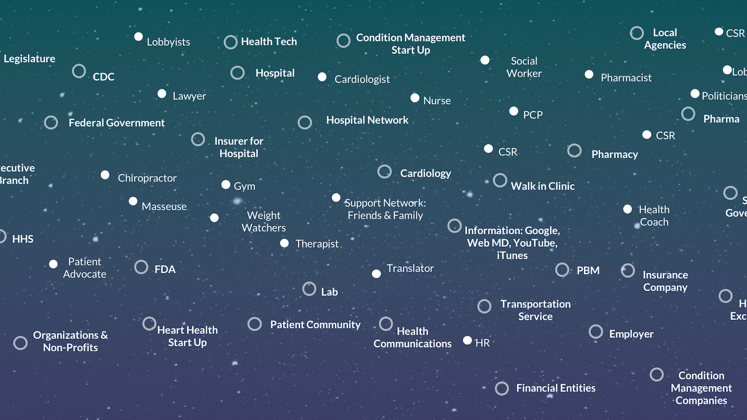
All of these touchpoints come together in an ecosystem web, which is one of our primary tools when we engage in journey-driven design. The ecosystem web will help us make connections between the areas of our website, the various other technologies involved in the Internet of Things, and the actions the user is taking. On the ecosystem web, we can also identify which device the persona is using at each digital touchpoint. We might know this information from user research, or we can gather it from analytics, which can get so granular as to tell us which pages on a website are most visited by which devices.
From Journey To Design
Knowing the touchpoints and designing an ecosystem map is all well and good, but there’s still the matter of designing an appropriate user interface and interactions to help the end user accomplish their goal(s). We still need to build out wireframes or mockups that can ultimately be developed into an app or website.
For some designers, creating an ecosystem map or shifting that into a journey map (whether current or idealized) is as far as journey-driven design goes, before shifting back to mobile-first. The consistency of viewing all designs in mobile-sized mockups is attractive, and stakeholders love the cohesive feel. But our job as designers is to sell them on the need for a variety of screens. We need to consider each set of interactions independently. If there is an ideal user journey that begins on mobile but after four screens switches to desktop, then we need to design four steps for mobile and then change to desktop. If another prospective user journey (maybe the power user’s journey) within the same app begins on a tablet, then we should begin with a tablet design. If still another begins on the watch, then that’s where we begin. We’re still prioritizing content, but we’re also accounting for the visual frame.
After designing each interaction, ask these key questions:
- Have I designed for the most critical device?
- What other devices might come into play here?
- What is the context for this interaction? Where will my user physically be?
Although the designs won’t have the cohesive feel of a stack of mobile screens, it will have the context of the user’s scenario and their rationale for particular actions. As an added benefit, this type of non-linear thinking will encourage new design approaches. Plus, front-end developers love getting a few screens for each screen size early on; it helps them to structure their development work.
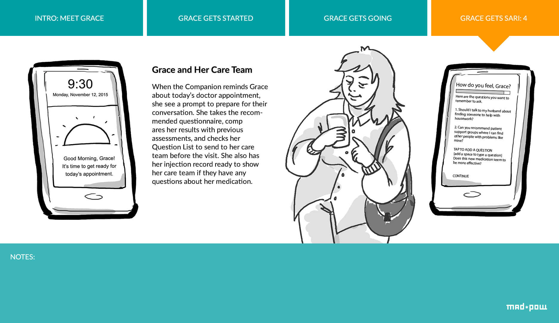
For our healthcare client, we sketched out an ideal journey map on sticky notes, using one sticky note for each touchpoint, and different colors for each likely device. Once we understood the touchpoints along the journey, we were able to think in terms of interactions on screens. We designed every screen for tablet, as well as variations for the six screens most likely to be done on mobile and the four most likely to be done on a larger desktop monitor. We used mobile first and responsive design best practices, resulting in screens that engage users across all devices.
But best of all, we improve our work as storytellers by linking interactions back to the journey. Even the best, most user-focused designers can forget about the narrative when they begin to focus on individual interactions. The shift from one device to another will help recenter you, reminding you again and again of who the user is, where they are, why they’re doing what they’re doing and what their main focus is — particularly when their focus is not on your UI!
Adding In Content
For designers working with content, there’s still another benefit to journey-driven design. Content strategists tend to plan out screen content by identifying what the goal of a screen is, and then providing copy to accomplish that goal and to get across any related messages. In traditional UX design, different content strategists have different methods for determining the goal of any given screen. But with journey-drive design, the designer and strategist will identify the goal or action happening each step of the way early on.
The designer and content strategist should work together to consider the goals of each touchpoint through the journey. Rather than waiting to ultimately write copy in wireframes, the content strategist can help ascertain the goals during the mapping of the ecosystem, which gives the designer a leg up on designing something that will work hand in hand with the content.
In addition, content strategists need to consider what content will be static and what will be adaptive. When the designer designs different screens for different steps of the journey, they provide insight into how content will be perceived, whether the user will be distracted and what other clues to context the content strategist should consider.
In short, journey-driven design provides us with a big-picture approach that ensures fewer surprises and easier work the farther you go into the project. It keeps the whole team working together, all engaged in the creation of the ecosystem, so that decisions are shared early on, before designs are begun.
Evolving And Expanding
At its heart, journey-driven design is still just another flavor of user-centered design. Once the ecosystem is mapped and the journey identified, journey-driven design proceeds like any other UX project. Designs need to be created for other screen sizes and then checked for consistency across devices to account for edge cases. Usability testing, revising and iterating is as much a part of journey-driven design as any other.
Looking to get started with your own journey maps? Try out these steps:
- Begin with user research. Ask current members how they accomplish their goals — it’s a great way to identify the current user’s journey!
- During research, pursue pain points. When you understand the pain points, it’s easier to brainstorm potential solutions. Those potential solutions become the ideal user journey.
- Keep track of the steps in the journey. When the team moves into wireframes and visual design, don’t lose sight of the rationale for beginning each step on its designated device. Annotations or a digitized version of the journey can help keep these top of mind.
- Test the journey. Designing based on a journey is great, but then we need to make sure it works! Follow the analytics to find out where people drop off and what devices people are using along the way. Then go back and improve the ideal journey.
We live in an Internet of Things. There’s no use pretending that mobile, desktop or tablets will be the way of the future. There are still more devices to come our way, more technologies to infuse our homes, workplaces and commutes. Journey-driven design allows design to expand and evolve as technologies evolve. We’re starting to practice this more and more, and we hope to share a case study or two in the coming months.
Resources
- “New BBC News Website: Your Reaction,” Niko Vijayaratnam See why the BBC News website changed to responsive in 2015.
- “5 UX Demons That Need Exorcising,” Robert Hoekman Jr The problem with “the fold” and other UX myths.
- “Designing Digital Strategies, Part 1: Cartography,” Sofia Hussain An overview of ecosystem maps.
- “Mobile First,” Luke Wroblewski Luke’s 2009 explanation of mobile-first.
- “Adapting Ourselves to Adaptive Content,” Karen McGrane A presentation that showcases how the web affects our static views of content.
- “Desktop-First vs. Mobile-First Web Design: What’s Best for Your Business?,” Splash Omnimedia The pros and cons of desktop- and mobile-first design.
- “Mobile First Design: Why It’s Great and Why It Sucks,” Code My Views Graceful degradation, progressive enhancement and how mobile-first design works.
- “Consumers Take a Multi-Device Path to Purchase,” Steve Olenski 67% of people start shopping on one device and continue on another. See the stats.
- “The Data Digest: Our Multi-Device Journey Through the Digital World,” Anjali Lai A look at popular activities that encourage changing devices midstream.
- “Is Mobile Healthcare the Future? [Infographic],” GreatCall Inc. An infographic of the ways in which mobile devices are used for healthcare.
- “30 Amazing Mobile Health Technology Statistics for Today’s Physician,” Jonathan Govette An article about the ways people interact with healthcare professionals.
- “How Successful Companies Design for Users’ Multi-Device Lives,” Marc Abraham A look at the digital ecosystem and designing across devices.
Further Reading
- Everything I Know About UX Research I First Learned From Lt. Columbo
- Getting Started With Wearables: How To Plan, Build And Design
- The Thumb Zone: Designing For Mobile Users
- How To Poison The Mobile User
 (cc, vf, al, il, mrn)

