The Realities Of User Experience Design Within The Luxury Industry

Email Newsletter
Weekly tips on front-end & UX.
Trusted by 182,000+ folks.
 Custom Web Forms for Angular, React, & Vue. Your backend.
 Celebrating 10 million developers


For luxury companies and upscale lifestyle service providers, excellence in experience is an essential component of the value delivered. Conceptually different from the mass market, the luxury domain relies not only on offering the highest differentiated products and services, but on delivering experiential value.
Adopting technology and embracing a digital presence through platforms and initiatives, the luxury industry today is tackling the challenge of designing an unparalleled user experience (UX) online. In this article, we’ll present a case study and share observations on the peculiarities of the UX design of a luxury lifestyle service platform and its mobile apps.
Some time ago, 415Agency teamed up with VERITAMO to design a digital UX for its platform, which enables luxury service providers and lifestyle-management companies to deliver personalized services to its clients. Among the services offered are travel arrangements and bookings, luxury shopping experiences, gastronomy and more. A typical client of the platform is either a provider of high-end services or a lifestyle-management company that serves affluent clients. The company offers a back-office solution, together with integrated white-label mobile apps for use by its clientele.
The goal was to enable service providers to deliver a unique UX journey to a very particular type of consumer. We were extremely curious to solve the challenge of creating an upscale mobile experience in a time when digital personalization and customization are available to anyone.
User Profile
According to a recent study by McKinsey & Company, modern luxury consumers have become “highly digital, social and mobile,” with 75% already owning several digital devices. They are known for putting less value on owning physical high-end items, focusing instead on the authentic and special experiences that luxury companies offer. Moreover, they want their experience to be smooth, omnichannel and available 24⁄7, but at the same time only when and where they want. Based on research by Bain & Company, the profiles of luxury consumers today are very diverse, both demographically and geographically, covering many different segments of people. With the changes and expansion in the luxury customer’s profile, mindset and habits, luxury companies and service providers have to experiment at the intersection of technology, culture and commerce to keep their devotees interested, informed and entertained.
For our project, our primary understanding of the luxury service’s end users (their demographics and psychographics) was based on insights from VERITAMO’s customers. Based on their observations, we were able to frame the initial end user’s profile and make it the baseline for our further work. The insights highlighted the following important areas:
- prospective audience,
- user behavior patterns and rhythms,
- context of use of concierge services platforms (web, mobile),
- potential drivers of user behaviors and reactions,
- implicit user goals.
These initial findings covered the core user research questions: who, what, when and where. We used this data to set early hypotheses on the peculiarities of the digital luxury experience and on ways to address it in our design solution. We expected end users of luxury lifestyle services to be highly detail oriented; to be willing to learn and participate in all stages of service requests, search and the booking process; and to anticipate the highest and the most transparent level of customer service, with an exclusive and extra personal touch.
We focused on investigating the missing why and how: understanding customer incentives and the steps they needed to take within the app to reach their goals. Additional surveys and user interviews were conducted iteratively during the design process. Some of our initial assumptions and the methods we selected turned out to be incorrect or inappropriate, so we had to adjust them along the way.
Expectations
Our initial assumptions about the digital luxury experience spun around highly personalized service delivery. At the beginning, we believed that swift customer service and elevated human-to-human interactions were key to offering efficient mobile tools to connect luxury consumers with their service providers. We believed that these aspects alone were enough for service providers to lure discerning, busy consumers to the mobile apps created by VERITAMO.
As it turns out, we were wrong. App usage statistics across the spectrum of service providers showed that there was no significant difference in the rate of orders from clients who downloaded the app and those who didn’t. Furthermore, mobile user retention suffered dramatically when service providers did not make any effort to market their apps.
We formed several hypotheses to explain this. With so many apps out there competing for real estate on users’ phone, incremental improvement to interaction with service providers was not enough. After all, consumers already had communication channels established with their service providers — even if they were brittle and inefficient.
Based on feedback from digital product managers and client services managers at the biggest concierge companies (including AmEx Centurion, John Paul, Quintessentially, Ten Group, LesConcierges, Aspire Lifestyles and several others), we learned that luxury service providers were seeking better management of and greater transparency with client requests. We decided to make this our key design motivation.
Service Discovery Process
Initially, when working on the service discovery process, we offered mobile users a vast variety of search options, including multiple search criteria, filters and instant browsing. The initial design contained a flyout search menu (via the famous hamburger icon), which confused users about the navigation. They browsed only the current category selected, without understanding that other search options were available.
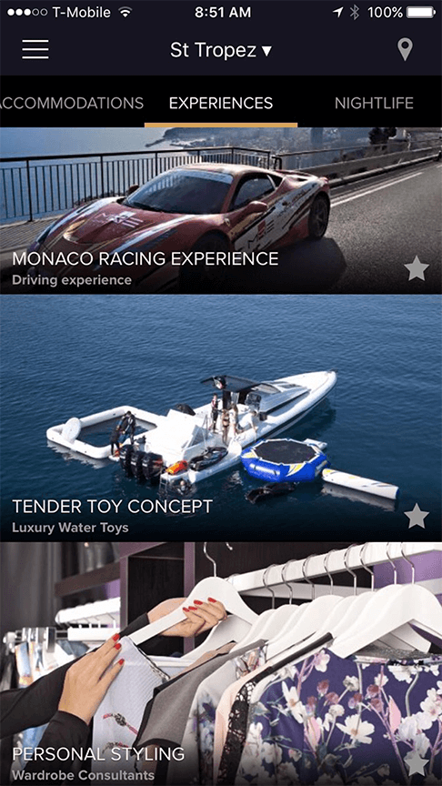
So, we changed the design to the variant below:
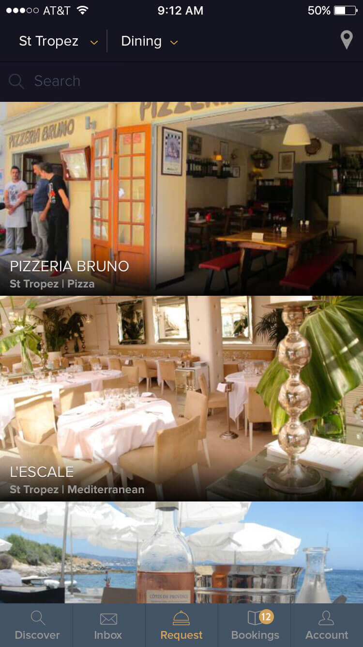
Using the combination of screen recording and concierge testing we observed users were still struggling with the discovery process. Customers expected immediate results with minimum data input. Yet they also expected several options to choose from. Some users reported being overwhelmed by choices that may or may not have been of interest to them. Additionally, the absence of expected results (such as “The restaurant that I know is hot right now”) created a negative impression of the service provided by their lifestyle manager (“They don’t even know the best restaurants in my city.”).
Mobile users relied more on the suggested offerings preselected by their service provider. Rather than desiring freedom of choice, they valued interaction with a dedicated advisor who would promptly respond to their requests with just a few relevant options. Discovery of services became a secondary feature of the mobile platform.
This observation can be further explained by the high degree of sophistication of the affluent clientele and their motivation to research available services. With limited time available, these customers have a precise reason for turning to their service providers for advice. After all, such needs are their very reason for retaining the services of a lifestyle manager in the first place.
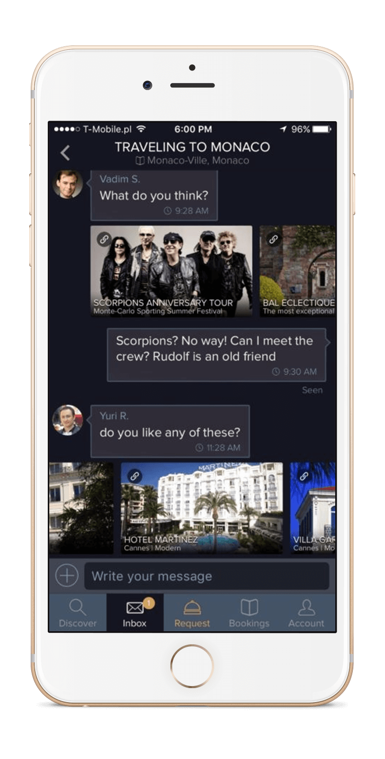
Based on the user test results, we limited the number of service options to several categories, including “recommended / featured services,” “popular in your area,” etc. At the same time, in order to offer the richness of experience that one would encounter in close one-on-one communication, we improved the app’s navigation to enable easy access to the concierge chat feature and to allow delivery of options for review directly in the communication thread.
Using our evolutionary approach to UX design, we combined the client CRM, the content management system and interactive messaging functionality to create something quite powerful for the luxury industry. Service providers are now able to serve multiple clients simultaneously, without sacrificing personalization and exclusivity. The next step in our roadmap is to test targeted suggestions for each client in order to automate predictable and mundane tasks, freeing each service provider to concentrate on their main value proposition, which is to humanize the personal, bespoke approach to serving their clients’ needs.
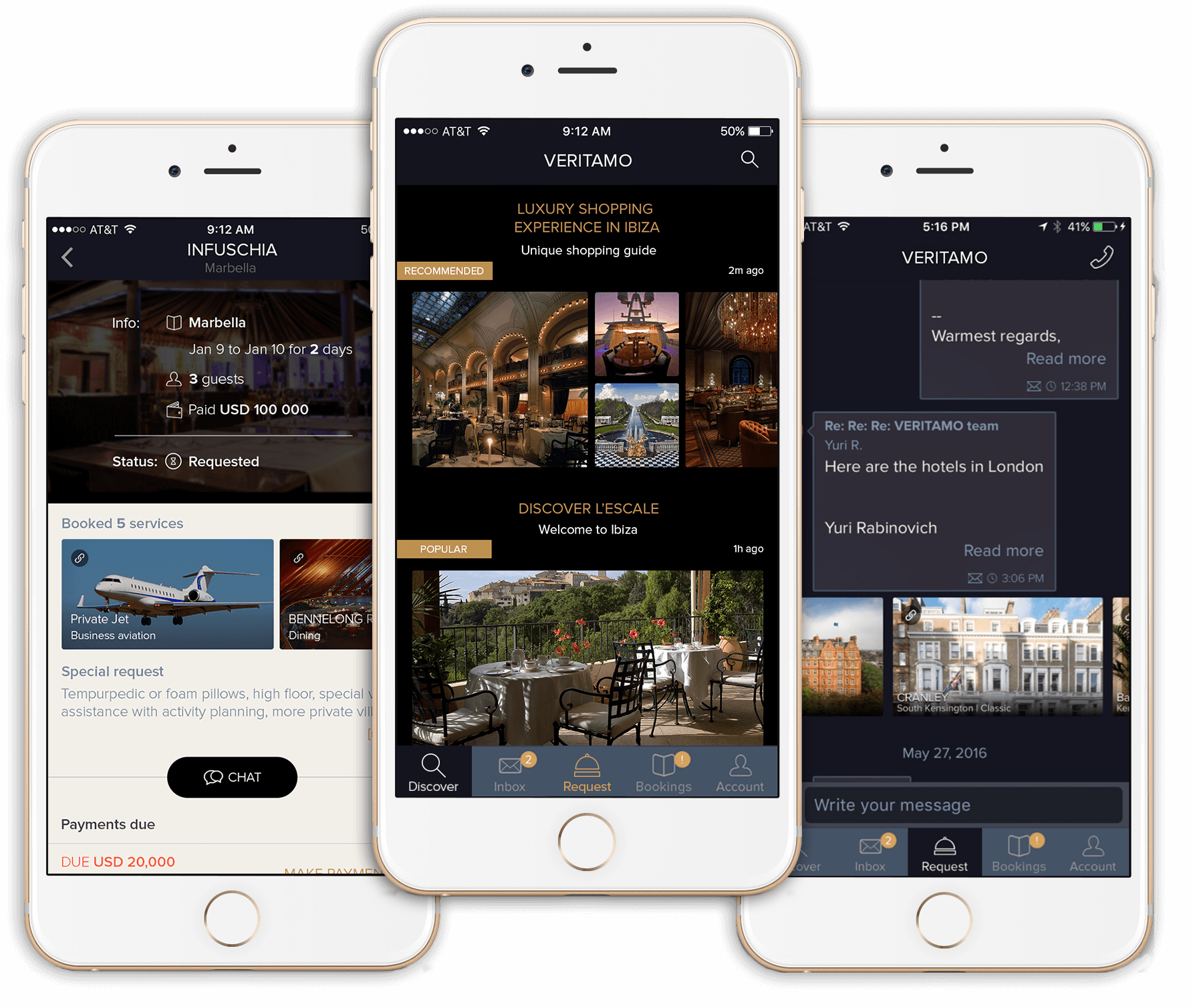
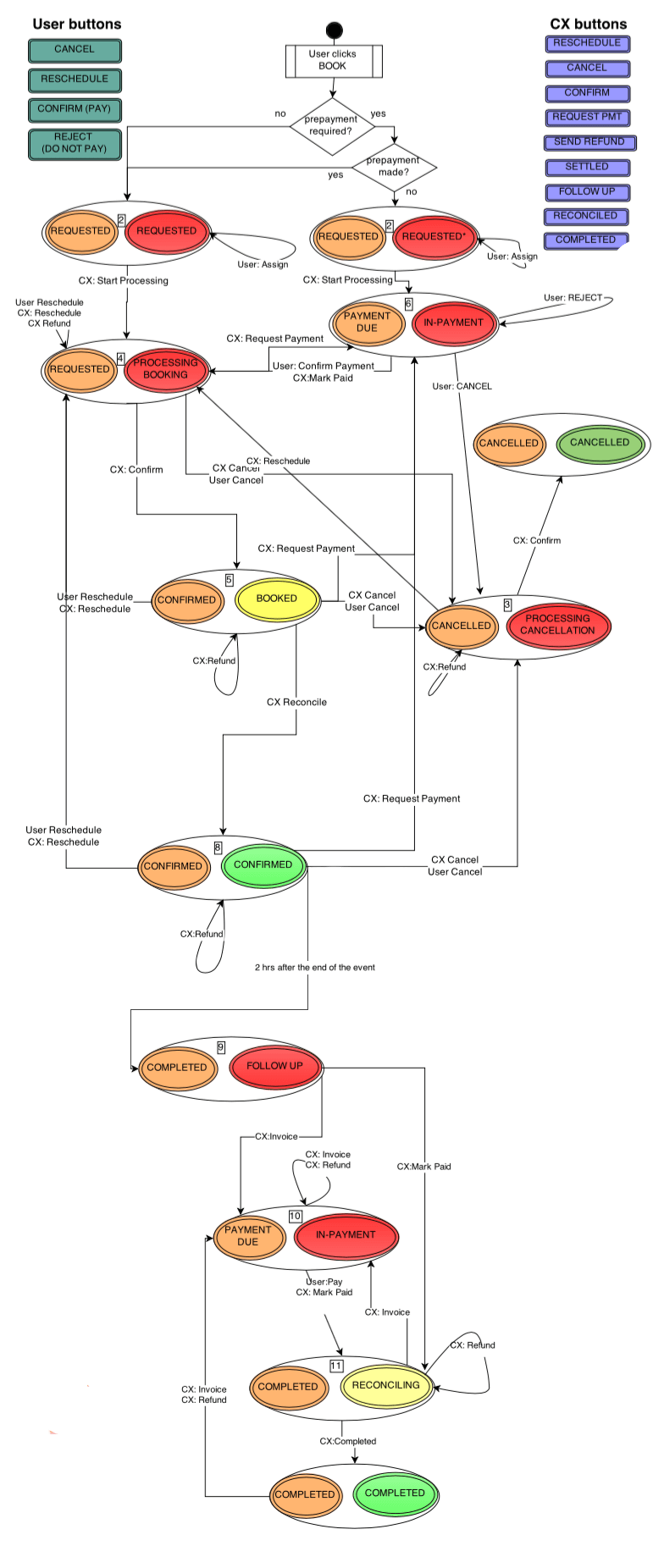
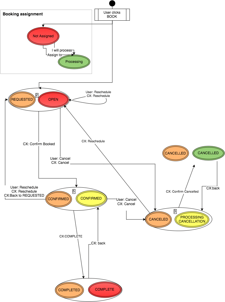
Service Booking And Payment Processing
We expected a transparent booking process to involve several stages for both the client and the concierge, with all steps tracked in the app — for example, order status options (booked, processed, confirmed, rejected), payment status (requested, pending, confirmed), etc. — and the possibility to send out request status notifications to clients. As mentioned before, initially we believed this information was crucial for picky luxury consumers. The reality was that we were all wrong: customers were not interested in participating and following the multi-step process. They considered it extremely important to know that someone was working on their request and what the outcome is, but without knowing many more details, which were considered bothersome.
They also expected the “one-button approach” and instant order confirmations. They anticipated it to be as short as possible, with immediate results, no extra information, and always five-star customer service, which implied a concierge to be handling all transitional steps, including changes, issues, and updates.
Mobile User Onboarding
Our initial assumptions about the psychology of the perception of luxury helped us to create a rather sophisticated onboarding process. It included, first, limiting initial access to a mobile service in order to create artificial demand and, secondly, personalizing “invitations” for each user. We used the term “nomination” (rather than “invitation”) and implemented an approval workflow to accept new users to the service. Prospective clients had to “apply” for membership and await approval.
This approach was met with positive feedback from service providers because it enabled them to control their membership base and to weed out time-wasters. As for mobile users, our tests told us that our approach was not ideal and had to be improved.
We measured, first, the time it took for a person to respond to an onboarding questionnaire and, secondly, retention of approved users. We assumed that the demand-creation approach would outweigh the negative effect of limiting immediate access to the app.
The incentive to complete the questionnaire would be to get access to the mobile service. However, because service providers took some time approving accounts, the incentive quickly disappeared. Users who had to wait for approval were two to three times less likely to come back once the approval notice was sent to them.
We simplified the onboarding process from over 2 minutes down to an average of around 40 seconds, by asking for only the most basic information before an approval was made and then asking for the rest upon first successful entry into the app. We also introduced a pre-approval process to eliminate the wait time and to allow access to the app right away, while still properly communicating the privilege of access.
Further testing is required to assess the effect of the term “nomination” (as opposed to “invitation”) on the likelihood of referrals because existing users can “nominate” their friends to get exclusive membership with their service provider.
Visual Elements
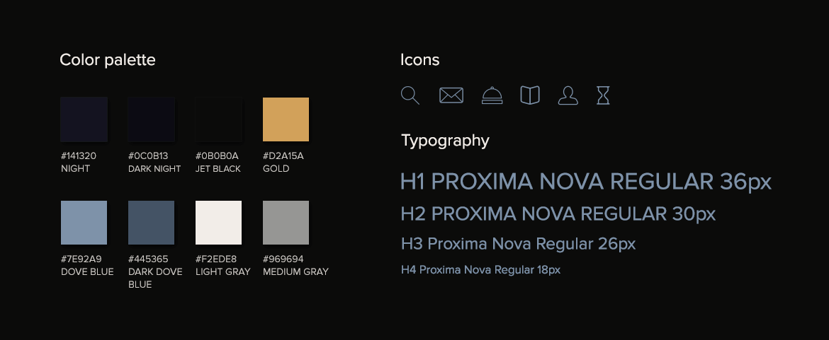
The visual part of UX design in the luxury industry is essential to communicating excellence and exclusivity. In order to create a holistic app experience, we strived to reflect these qualities both in the UI design and the functionality. With maximum attention to detail in the typography, color palette and iconography design, we aimed to establish solid visual cues that would determine how users experience the app. Using colors associated with luxury — gold, jet black, dark blue — we emphasized the timelessness of the experience. Thin classic typography and a minimalist design of icons added to the feel of modernity and elegance.
Concierge Admin Console Design
Luxury companies need to prove their value to customers more extensively than other brands, offering an experience that justifies the price and loyalty. With utmost customer care and exclusiveness of selection, they ensure that the transition to a sale happens seemingly effortlessly.
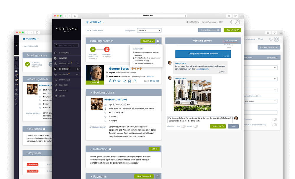
While from the user’s perspective the process may look absolutely effortless and refined, the system behind it is truly sophisticated. In the case of VERITAMO’s platform, the interface for the service advisor and concierge had to have a highly detailed structure and yet be as simple as possible to use. It needed to contain all information about the user: preferences, recent choices, a summary of their previous experience, current requests, current order status, history of requested changes and other details. It was absolutely necessary to provide a highly personalized level of customer service and to address user inquiries, concerns and frustrations with class, swiftness, and simplicity.
Takeaways
The customer experience in each industry is perceived differently. Very often, when we take up a new project, our initial assumptions put us in a rigid framework of predetermined creative responses that misalign UX design solutions with real user needs. Filing our observations as “Things we wish we knew when starting the project,” we see that it is essential to do a reality check on one’s expectations of user behavior and to keep in mind that a compelling UX design goes beyond the confines of a particular industry and the user’s social standing.
These are our key observations and takeaways on UX design for the luxury domain:
- Time is the ultimate asset for upscale service users. Time and convenience greatly influence their online behavior.
- Luxury consumers know exactly what kind of experience they are looking for and/or anticipate advice from trusted sources.
- The user journey should be as short as possible, enabling users to get what they are looking for instantly.
- Transparency is expected. Moreover, it translates to superior service delivery, which is associated with immediacy and a simplified user flow, rather than an overly detailed step-by-step process.
- “Less is more” applies to the process of searching services, as well as to the overall user journey. The process of creating a highly sophisticated UX needs to focus on what to leave out, rather than what to include.
- Human interaction matters and is highly valued.
- Fewer options are better, but those options are expected to be highly relevant and individually tailored.
- The “one-button” approach is the epitome of UX design for the luxury field.
- The user path should be simple and clear, with a highly sophisticated yet simple back-office support system.
Conclusion
Despite the fact that modern luxury lifestyle consumers are becoming highly sophisticated and tech-savvy, many of the key observations our team made during this project do not seem to be exclusive to the luxury field. Sound UX principles apply to all user groups, regardless of their social status or preferences.
Today, users anticipate a superior experience and have a strong understanding of the value delivered. They are focused on results and a one-button approach, expecting their orders to be addressed efficiently, at the highest level of service and with maximum transparency. However, more so in the luxury field, human interaction within the digital experience is not an option, but rather an undeniably powerful tool that improves communication and increases loyalty.
At the end of the day, a white-glove UX is all about delivering the right information, in the right amount, in the right place and at the right time, while maintaining a refined and confident appearance.
Articles Cited
- “Digital Inside: Get Wired for the Ultimate Luxury Experience,” Nathalie Remy, McKinsey & Company
- “The New Luxury Buyer: Younger, Richer and Well-Wired,” Nicola Clark, New York Times
- “Why a Cognitive Approach Is Key to Luxury Marketing,” Matthew Willcox, Luxury Daily
Further Reading
- CSS Scroll Snapping Aligned With Global Page Layout: A Full-Width Slider Case Study
- Client Experience Design
- All You Need To Know About Customer Journey Mapping
- Recent Trends In Storytelling


