How To Use Shadows And Blur Effects In Modern UI Design

Email Newsletter
Weekly tips on front-end & UX.
Trusted by 182,000+ folks.
 Register for Free
 Celebrating 10 million developers
 Custom Web Forms for Angular, React, & Vue. Your backend.

When you examine the most successful interaction designs of recent years, the clear winners are those who provide an excellent functionality. While functional aspect of a design is key to product success, aesthetics and visual details are equally important — particularly how they can improve those functional elements.
In today’s article, I’ll explain how visual elements, such as shadows and blur effects, can improve the functional elements of a design. If you’d like to try adding these elements to your designs, you can download and test Adobe XD for free and get started right away.
Shadows And User Interface Discoverability
There’s a reason GUI designers incorporate shadows into their designs — they help create visual cues in the interface which tell human brains what user interface elements they’re looking at.
Design Affordance
Since the early days of graphical user interfaces, screens have employed shadows to help users understand how to use an interface. Images and elements with shadows seem to pop off of a page, and it gives users the impression that they can physically interact with the element. Even though visual cues vary from app to app, users can usually rely on two assumptions:
- Elements that appear raised look like they could be pressed down (clicked with the mouse or tapped with a finger). This technique is often used as a visual signifier for buttons.
- Elements that appear sunken look like they could be filled. This technique is often used as a visual signifier for input fields.
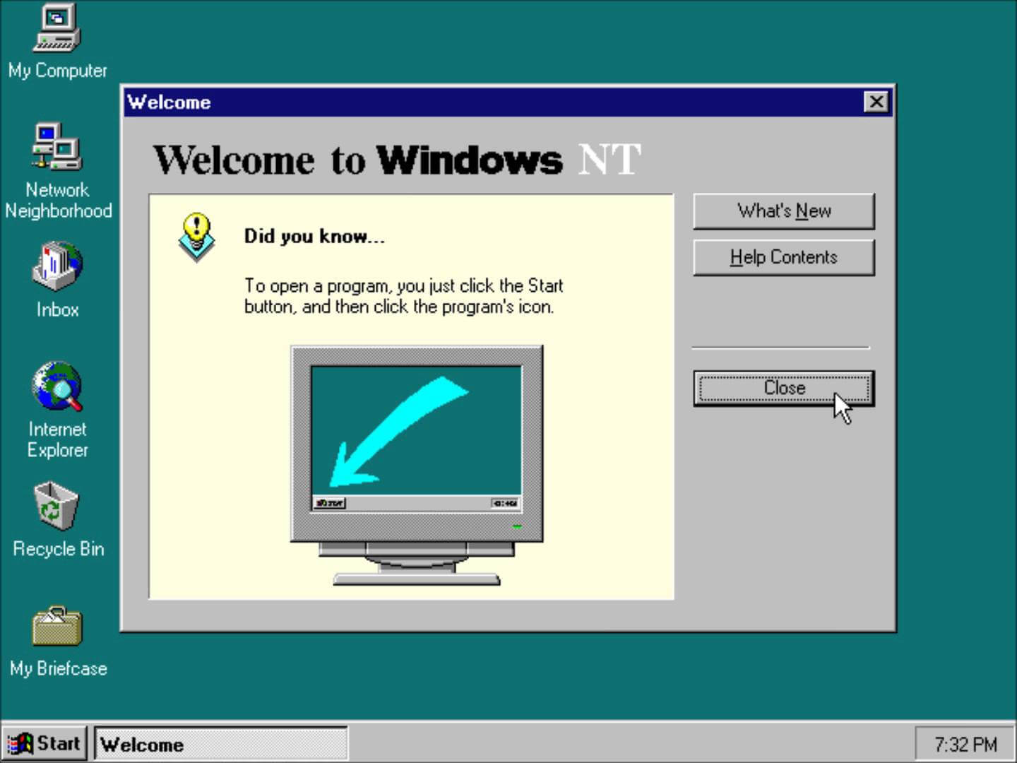
You can see how the use of shadows and highlights help users understand which elements are interactive in this Windows 2000 dialog box:
Create A Visual Hierarchy And Impression Of Depth
Modern interfaces are layered and take full advantage of the z-axis. The position of several objects in the z-axis act as important cues to the user.
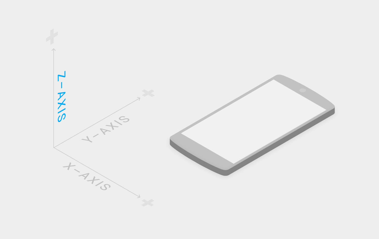
Shadows help indicate the hierarchy of elements by differentiating between two objects. Also, in some cases, shadows help users understand that one object is above another.
Why is it so important to visualize the position of an element within three-dimensional space? The answer is simple — laws of physics.
Everything in the physical world is dimensional, and elements interact in three-dimensional space with each other: they can be stacked or affixed to one another, but cannot pass through each other. Objects also cast shadows and reflect light. The understanding of these interactions is the basis for our understanding of the graphical interface.
Let’s have a look at Google’s Material Design for a moment. A lot of people still call it flat design, but the key feature is that it has dimension — the use of consistent metaphors and principles borrowed from physics help users make sense of interfaces and interpret visual hierarchies in context.
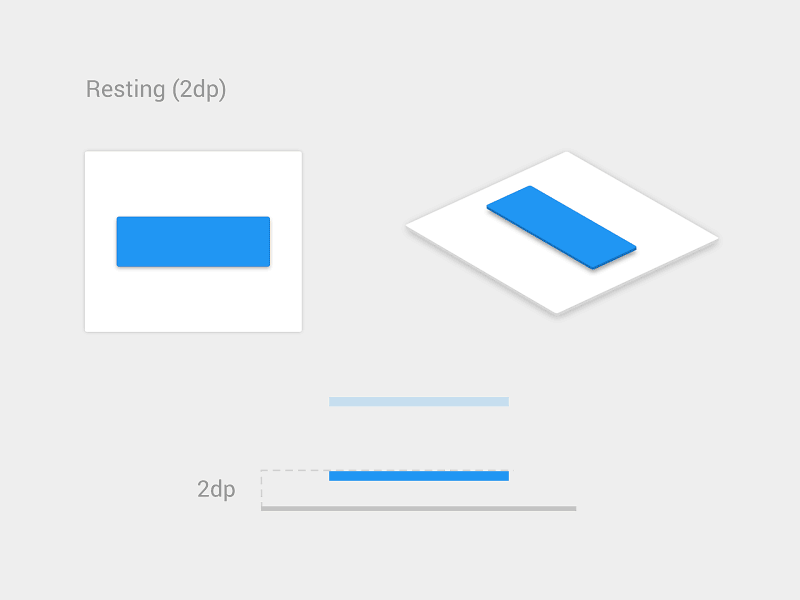
Provide Visual Feedback Using Elevation
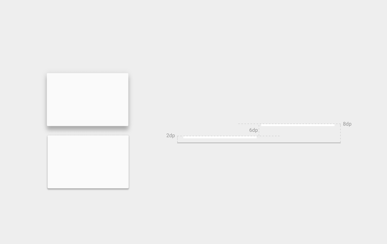
One very important thing about shadows is that they work in tandem with elevation. The elevation is the relative depth, or distance, between two surfaces along the z-axis. Measured from the front of one surface to another, an element’s elevation indicates the distance between surfaces and the depth of its shadow. As you can see from the image below, the shadow gets bigger and blurrier the greater the distance between object and ground.
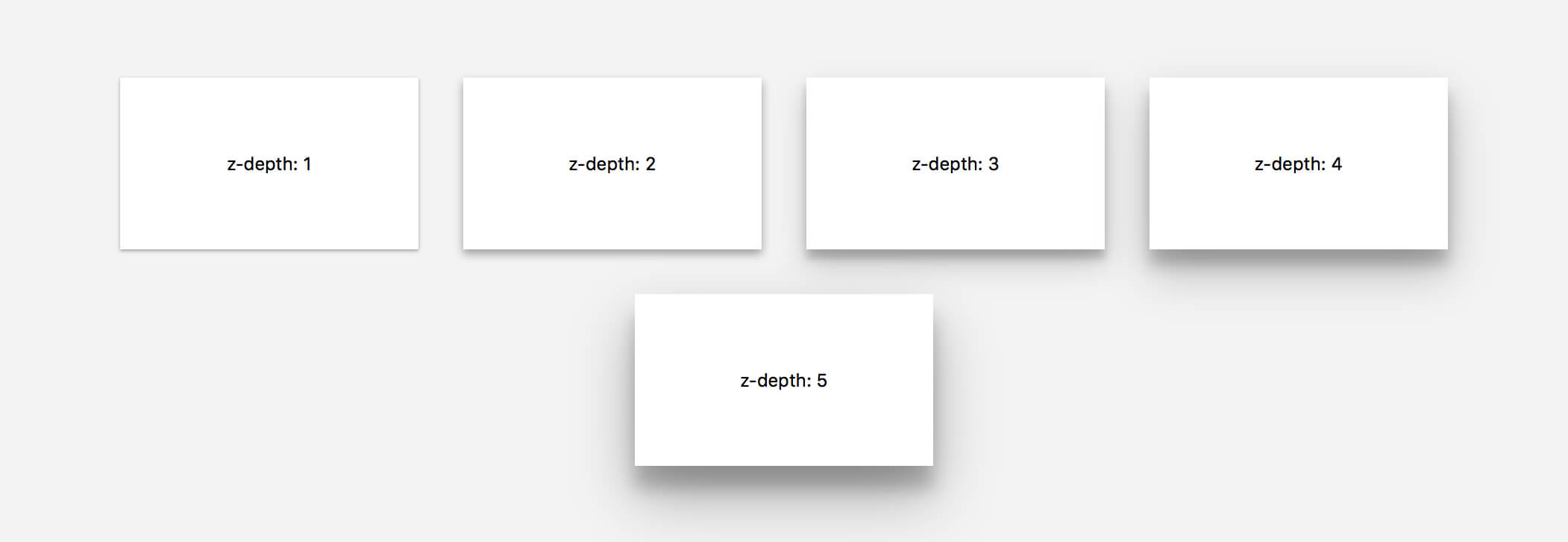
Some elements like buttons have dynamic elevation, meaning they change elevation in response to user input (e.g., normal, focused, and pressed). Shadows provide useful clues about an object’s direction of movement and whether the distance between surfaces is increasing or decreasing. For users to feel confident that something is clickable or tappable, they need immediate reassurance after clicking and tapping, which elevation provides through visual cues:
Blur Effects
Blur Effects For Mobile Apps
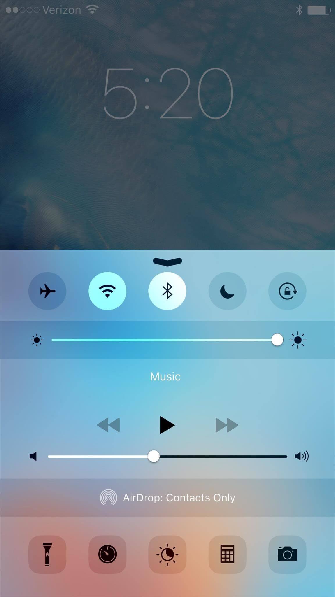
When Apple introduced iOS 8, it raised the bar for app design, especially when it came to on-screen effects. One of the most significant changes was the use of blur throughout, most notably in Control Center; when you swipe up from the bottom edge of a screen you reveal the Control Center, and the background is blurred. This blur occurs in an interactive fashion, as you control it completely with the movement of your finger.
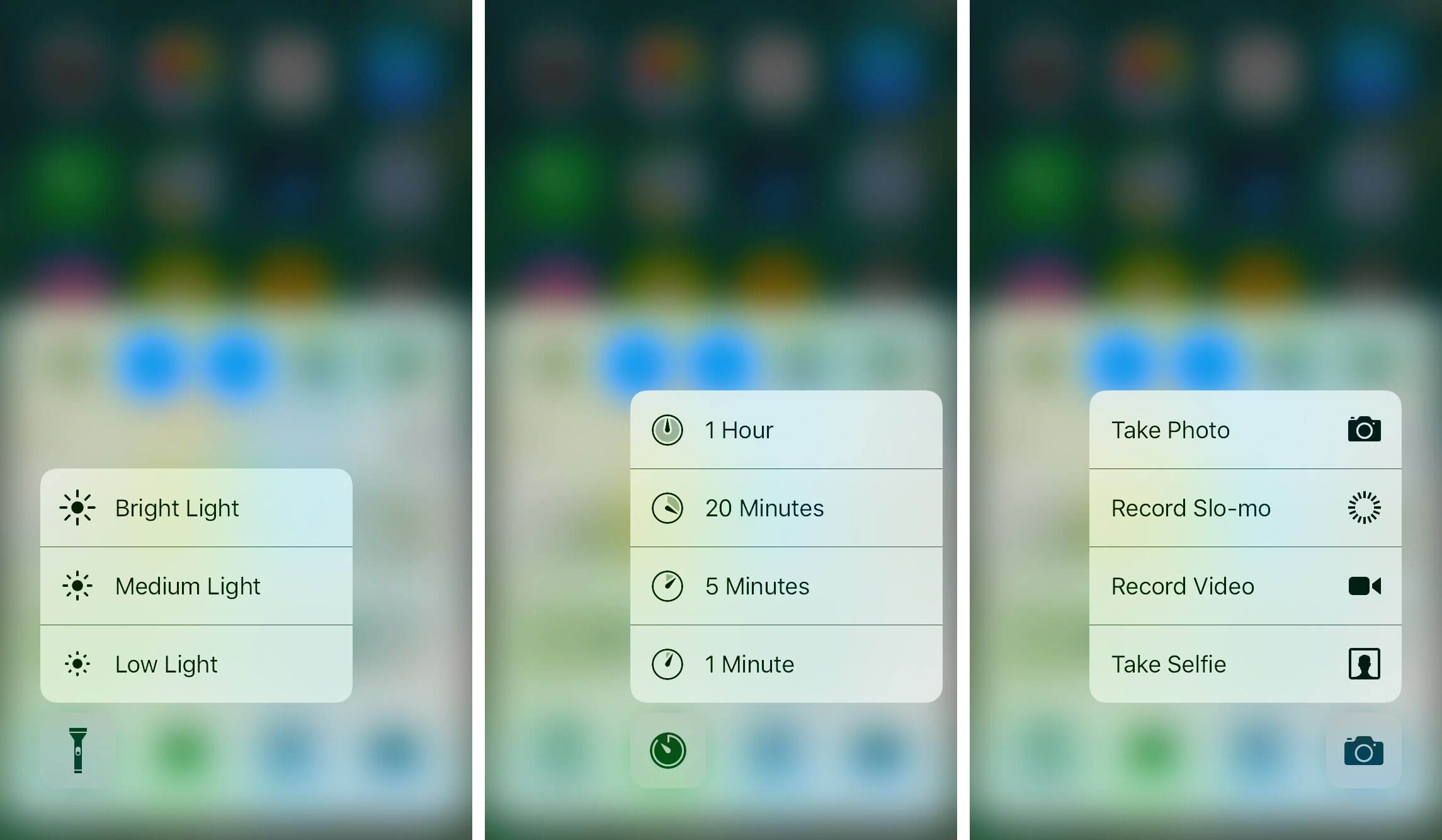
Apple moved further in this direction with the latest version of iOS which uses 3D Touch for the flashlight, camera, calculator and timer icons. When a user’s hand presses on those icons, real-time blur effect takes place.
Blur Technique Has The Following Benefits For Modern Mobile Interfaces:
Make User Flow Obvious
Blur effects allow for a certain amount of play within the layers and hierarchy of an interface, especially for mobile apps. It’s a very efficient solution when working with layered UI since it gives the user a clear understanding of a mobile app’s user flow.
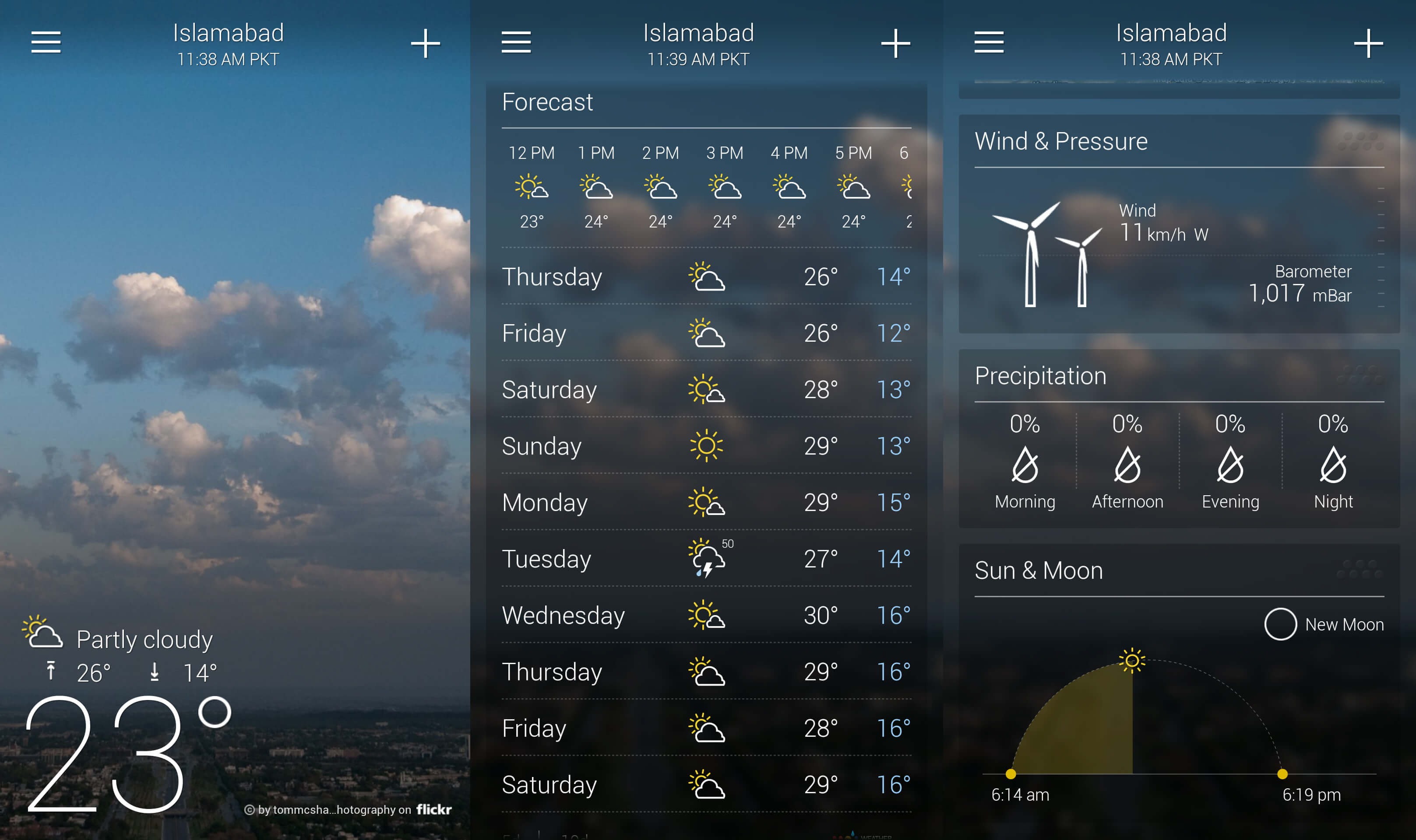
The Yahoo Weather app for iOS displays a photo of each weather location, and the basic weather data you need is immediately visible, with more detailed data only a single tap away. Rather than cover the photo with another UI layer, the app keeps you in context after you tap — the detailed information is easily revealed, and the photo remains in the background.
Direct the User’s Attention
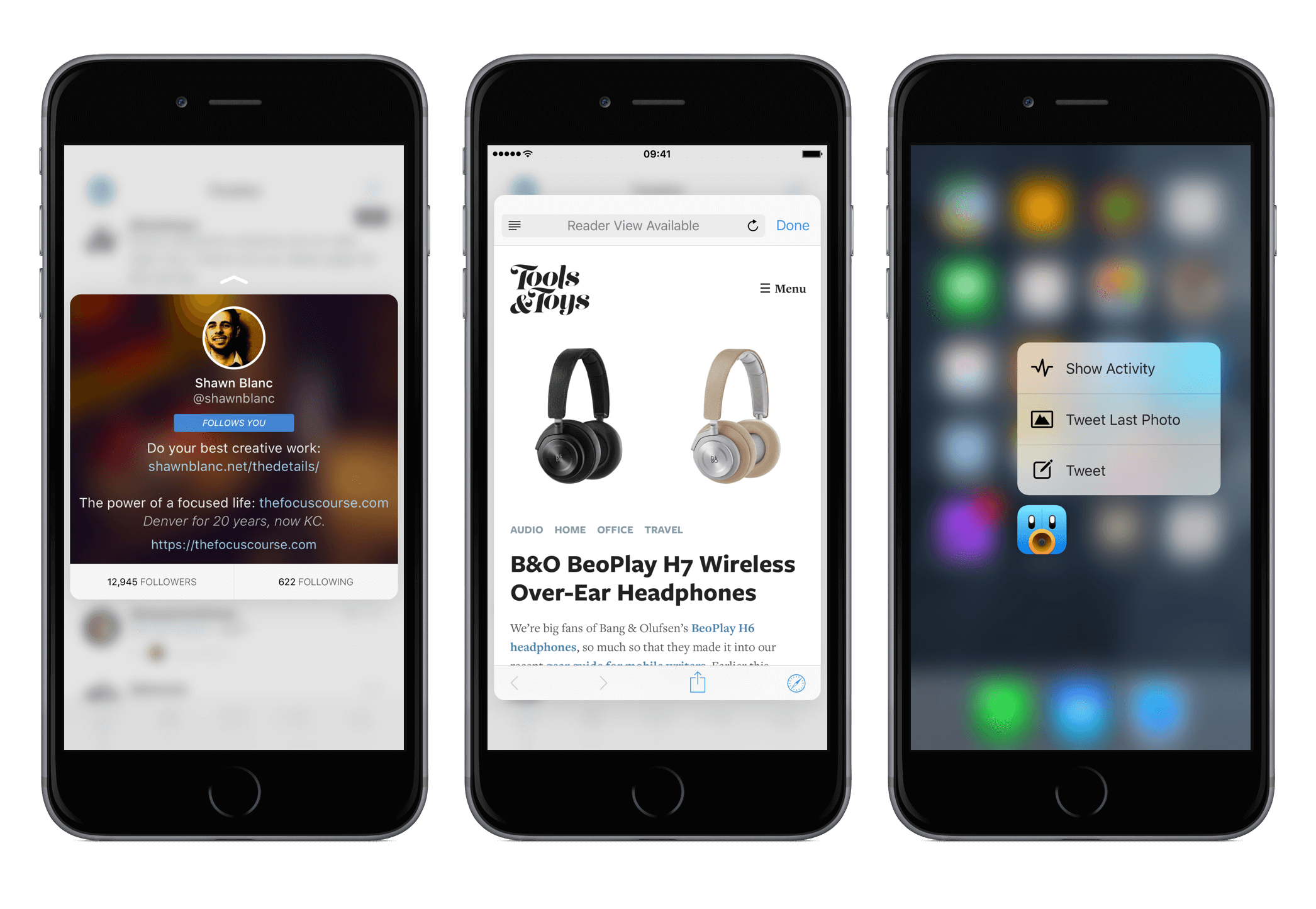
Humans have a tendency to pay attention to objects that are in focus and ignore objects that aren’t. It’s a natural consequence of how our eyes work, known as accommodation reflex. App designers can use it to blur unimportant items on the screen in an effort to direct a user’s attention directly to the valuable content or critical controls. The Tweetbot app uses blur to draw users attention to what needs to be focused on; the background is barely recognizable, while the focus is on information about accounts and call to action buttons.
Make Overlaid Text Legible
The purpose of text in your app is to establish a clear connection between the app and user, as well as to help your users accomplish their goals. Typography plays a vital role in this process, as good typography makes the act of reading effortless, while poor typography turns users off.
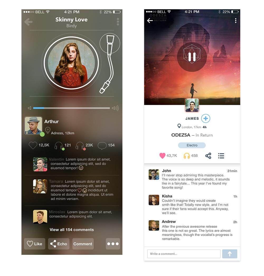
In order to maximize the readability of text, you need to create a proper contrast between the text and background. Blur gives designers a perfect opportunity to make overlaid text legible — they can simply blur a part of the underlying image. In the example below, you can see a restaurant feed which features the closest restaurants to the user. Immediately, your attention goes to the restaurant images as they feature a darkened blur with text overlay.
Blur Effects In Web Design
Blurred effect can seamlessly blend into the website design.
Decorative Background
Together with full-screen photo backgrounds, frequently used for website decorations, blur backgrounds have found their niche in modern website design. This decorative effect also has a practical value: by blurring one object, it brings focus to another. Thus, if you want to emphasize your subject and leave the background out of focus, the blurring technique is the best solution.
The website for Trellis Farm uses an iconic image of a farm to give visitors a sense of place for its website. For added interest, the photo is layered with a great typeface to grab a visitor’s attention. The blur is nice because it helps the visitor focus on the text and the next actions to take on the screen.

Progressive Image Loading
As modern web pages load more and more images, it’s good to think of their loading process, since it affects performance and user experience. Using blur effect you can create a progressive image loading effect. One good example is Medium.com, which blurs the post image cover as well as images within the post content until the image is fully loaded. First, it loads a small blurry image (thumbnail) and then makes a transition to the large image.
This technique has two benefits:
- It helps you serve different images sizes depending on the device that makes the requests, optimizing the weight of the page.
- The thumbnails are very small (just a few kilobytes) which combined with the blurry effect allows for a better placeholder than a solid color, without sacrificing payload.
If you want to reproduce this effect on your site see the Resources and Tutorials section.
Testing Websites’ Visual Hierarchy
Blur effect can be used not only as visual design technique but also as a good testing technique for page visual hierarchy.
A blur test is a quick technique to help you determine if your user’s eye is truly going where you want it to go. All you need to do is, take a screenshot of your site and add a 5–10 px Gaussian blur in Photoshop. Look at a blurred version of your page (like the Mailchimp example below) and see what elements stand out. If you don’t like what’s projecting, you need to go back and make some revisions.

Mailchimp’s homepage passes the blur test because the prominent items are the sign-up button and text copy which states the benefits of using the product.
When Blur Effect Can Cause Problems
Overuse of Blurs in Mobile Apps
Blur effect isn’t exactly free. It costs something — graphics performance and battery usage. Since blurring is a memory bandwidth and power intensive effect, it can affect system performance and battery life. Over-used blurs result in slower apps with largely degraded user experiences.
We all want to create a beautiful design, but at the same time, we can’t make users suffer from long loading or empty battery. Blur effects should be used wisely and sparsely — you need to find a balance between great appearance and the resource utilization. Thus, when using blur effects always check CPU, GPU, Memory and Power usage of your app (see section Resources and Tutorials for more information).
Blur Effect and Text Readability Issues
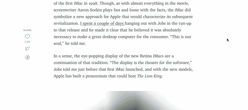
Another factor that you should remember — blurring is not as dynamic. If your image ever changes, make sure the text is always over the blurry bits. In the example below, you can see what happens when you forget this.
Resources And Tutorials
The following resources can help you implement blur effect into your design:
- Adobe has a pretty nice tutorial on how to add creative blur to photos
- In his article “How Medium Does Progressive Image Loading,” José M. Pérez provides solutions on how to incorporate progressive image loading using blur effect using CSS filters or HTML canvas elements.
- The article, “Creating A Blurring Overlay View,” provides examples of applying the blur effect to images in Apple iOS 8+ using the UIVisualEffectView class, with both Objective-C and Swift code samples. This is a native API that has been fine-tuned for performance and great battery life.
- In his article, “iOS App Performance: Instruments And Beyond Igor Mandrigin,” show how to measure performance of the different areas of the app.
Conclusion
Shadows and blur effects provide visual cues that allow users to better and more easily understand what is occurring. In particular, they allow the designer to inform users on objects’ relationships with each other, as well as potential interactions with these objects. When carefully applied, such elements can (and should) improve a functional aspect of design.
"This article is part of the UX design series sponsored by Adobe. The newly introduced Experience Design app is made for a fast and fluid UX design process, as it lets you go from idea to prototype faster. Design, prototype and share — all in one app.
You can check out more inspiring projects created with Adobe XD on Behance, and also visit the Adobe XD blog to stay updated and informed. Adobe XD is being updated with new features frequently, and since it's in public Beta, you can download and test it for free".
Further Reading
- Web Design Criticism: A How-To
- Facing Your Fears: Approaching People For Research
- How To Respond Effectively To Design Criticism
- The Rainbow Spreadsheet: A Collaborative Lean UX Research Tool
 (il, aa, mrn)

