The Role Of Empty States In User Onboarding

Email Newsletter
Weekly tips on front-end & UX.
Trusted by 182,000+ folks.


 Celebrating 10 million developers
 Custom Web Forms for Angular, React, & Vue. Your backend.

The first set of screens with which users interact, set the expectations of the app. To make sure your users don’t delete your app after the first use, you should teach them how to complete key tasks and make them want to come back for more. In other words, you need to successfully onboard and engage your users during those first interactions.
The onboarding process is a critical step in setting up your users for success with your product. You only get one chance to make a first impression. In this article, we'll provide some tips on how to approach onboarding using a simple pattern called "empty states." If you'd like to bring your app or website to life with little effort, you can download and test Adobe XD for free.
What Is An Empty State?
Content is what provides value for most apps. Whether it's a news feed, a to-do app, or system dashboard, it's why people use apps – for the content. This is why it's critical to consider how we design empty states; those moments in a user's journey where an app might not have content for a user yet.
An app screen whose default state is empty and requires users to go through one or more steps to populate it with data, is perfectly suited to onboarding. Besides informing the user about what content to expect on the page, empty states also teach people how to use your app. Even if the onboarding process consists of just one step, the guidance will reassure users that they are doing the right thing.
The Value Of An Empty State During Onboarding
Consider a "first-use" empty state as part of a cohesive onboarding experience. You should utilize the empty state screen to educate and engage your users. Use this screen as an opportunity to turn a moment of nothing into something.
Educate Users
First and foremost, the empty state screen should help users understand the context. Setting expectations for what'll happen makes users get comfortable. The best way to deliver this information is a show-or-tell format: show the user what the screen will look like when it's filled with content or tell them with a clear instructions.
Prompt To Action
Most empty states will tell you what they are for and why you're seeing them. But, effective empty states will take this even further and tell you what you can do next. Educating your users is important, but true success in your first empty state means driving an action. Think of this empty state as a starting point and design it to encourage user activity.
Create A Pleasurable User Experience
While your app should be functional (it should solve a problem for your users) and usable (it should be easy to learn and easy to use), it should also be pleasurable. Empty states are an excellent opportunity to make a human connection with your users and get across the personality of your app.
How To Design An Ideal Blank State
Despite the fact that empty states can engage users, they're often overlooked during design and development. This happens because we normally design for a populated interface where everything in the layout looks well arranged. However, how should we design our page when the content is pending user action? Empty state design is actually an amazing opportunity for creativity and usability.
Avoid Dead-Ends
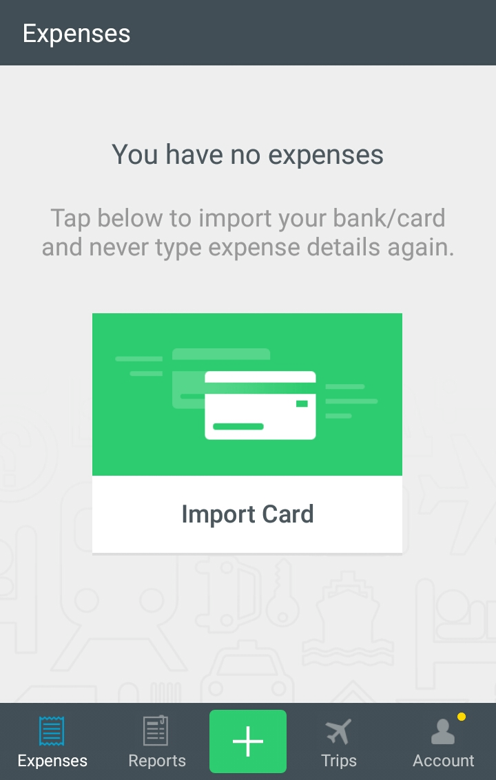
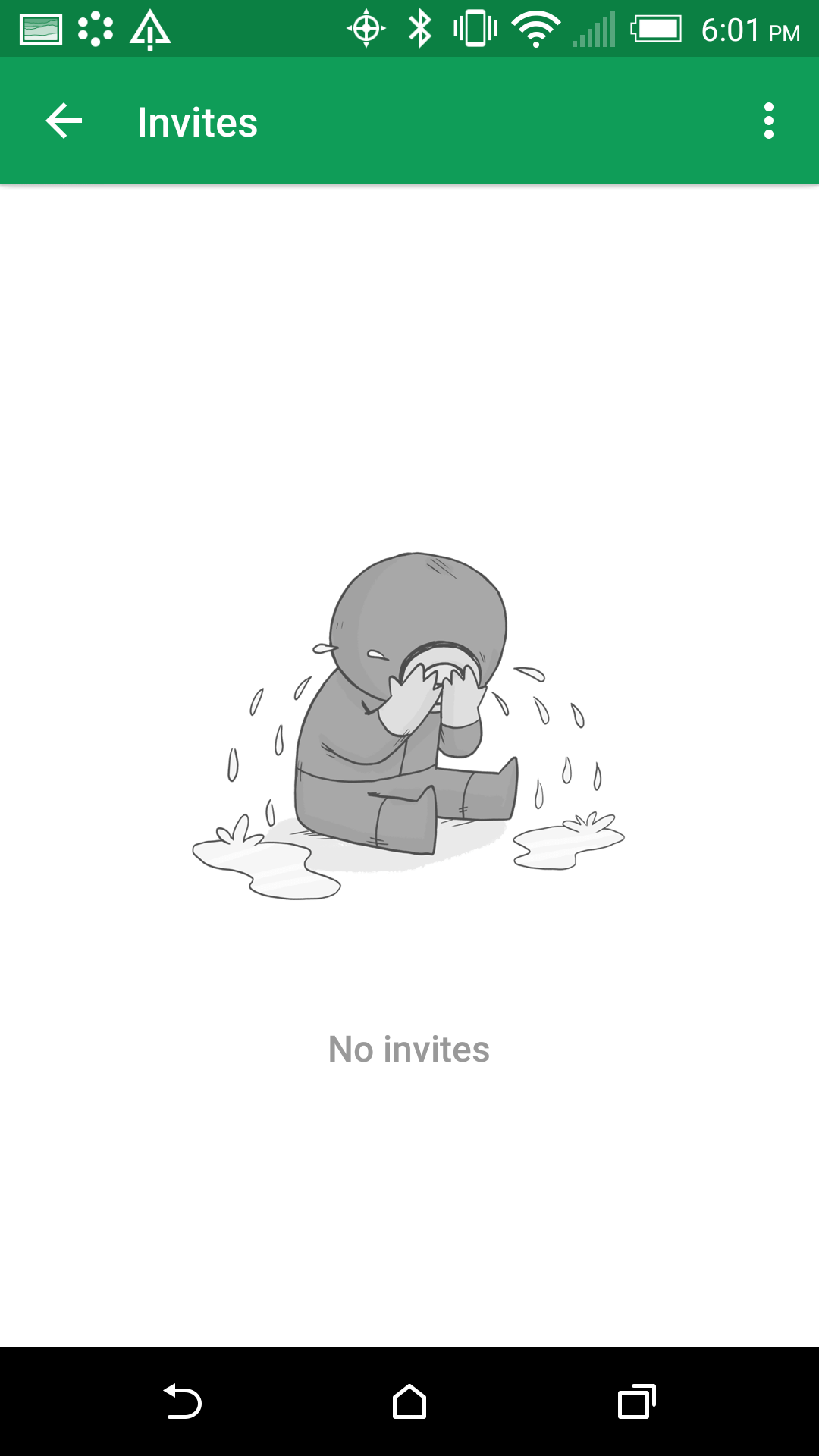
The absolute worst thing you can do with an empty state is to drop your users into a dead-end. Dead-ends create confusion and lead to additional and unnecessary taps. Consider the difference between the following two examples from Modspot's Posts screens. The first image is Modspot's current screen for first-time users; a useful and smartly crafted empty state reduces friction by guiding users along to an action that will get them started.
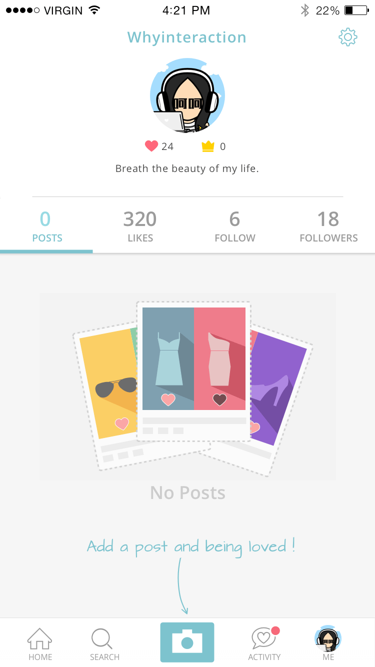
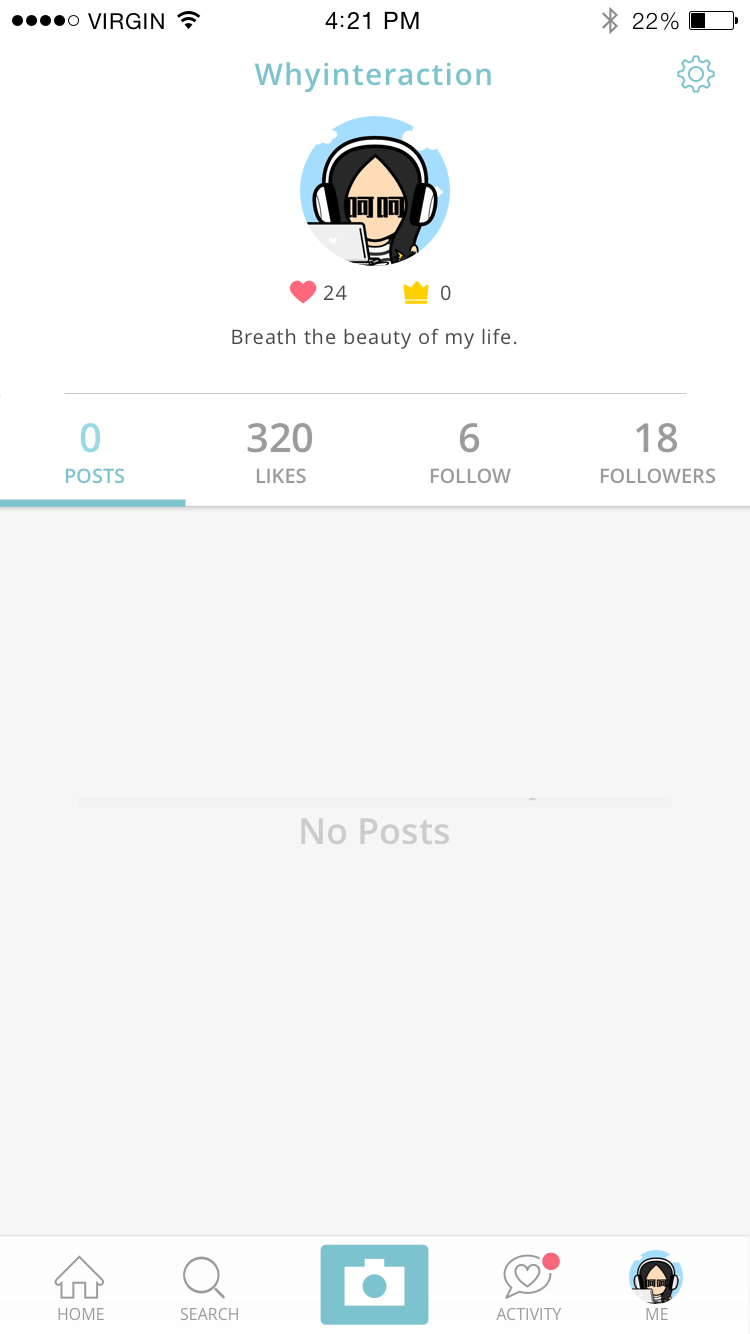
The second image is a fake version of the same screen that I’ve created to demonstrate an ineffective empty state that provides no guidance, no examples – only a dead end.
Keep Empty States Visually Simple
The beauty of a great empty state design is its simplicity. You should use a minimalist design approach in order to bring the most important content to the forefront and minimize distractions. Thus, only include well-written and easily scannable copy (clear, brief descriptions or easy-to-follow instructions) and wrap it together with good visuals.
Make Empty States Intuitive
Don't forget that empty states aren't only about visual aesthetics. They should also help users understand the context. Even if it's meant to be just a temporary onboarding step, you should maximize its communication value for users and provide directions on how to change an empty state to an active one.
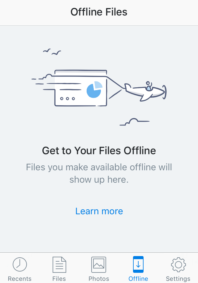
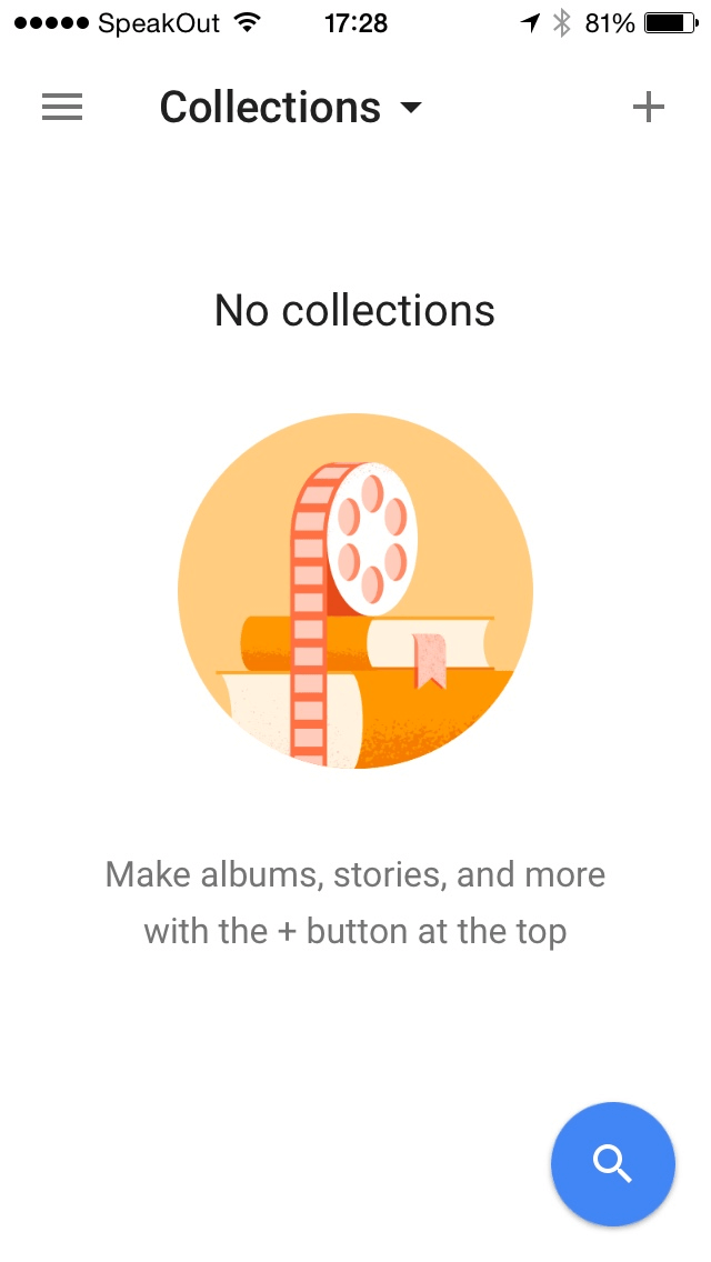
Let's take an empty state screen from Google Photos as an example. Visually it looks great: a well-composed layout with beautiful graphics. However, this empty state simply doesn't help users understand the context, and doesn't provide an answer on following questions:
- What is a collection?
- How can I get one?
Let Personality Shine
A good first impression isn't just about usability, it's also about personality. Personality is what makes your app memorable and pleasurable to use. It may not seem like much, but if your first empty state looks a bit different from similar products, your users will notice and expect the entire product experience to be different, as well. For example, below you can see how Khaylo Workout uses its empty states to convey personality and tone.
Encourage Users To Act
Your primary goal is to persuade your users to do something as soon as possible so that the screen won't be empty. To prompt action on an empty state don't just show users the benefit they will receive when they interact with your app, but direct them to the desired action as well.
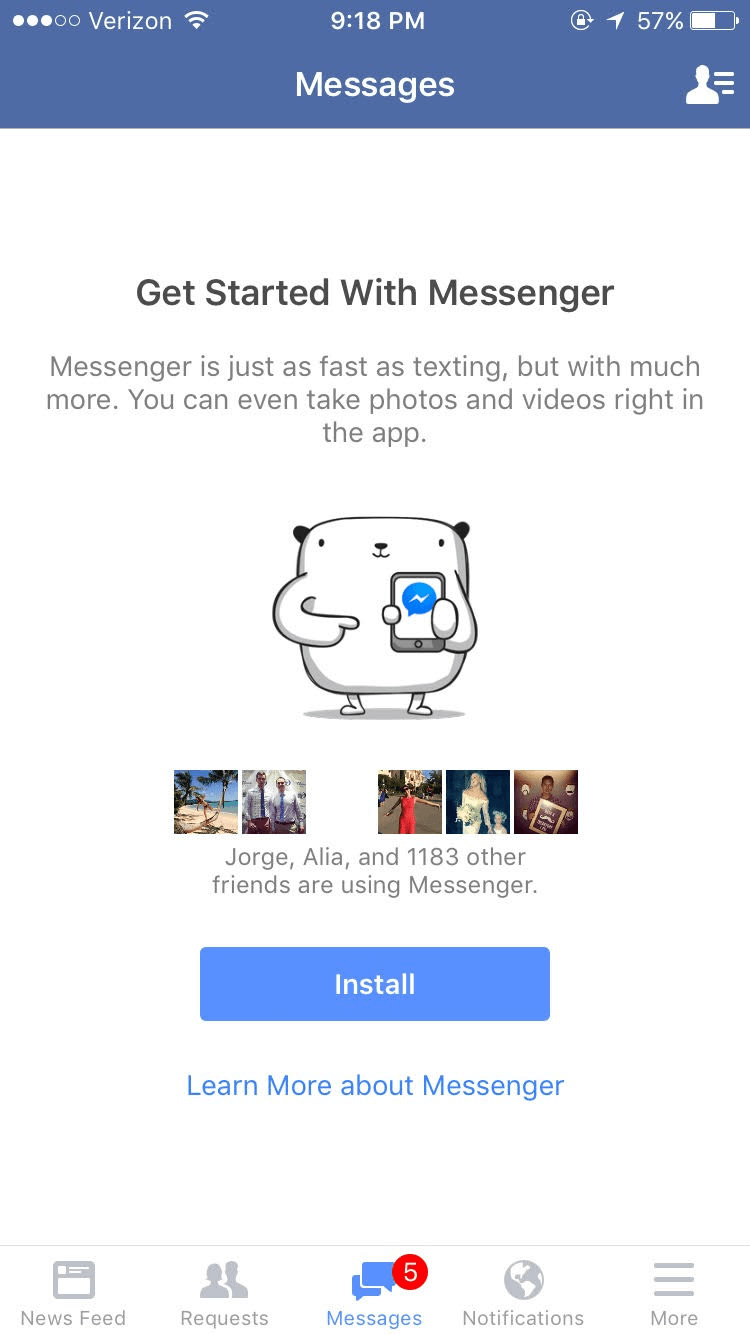
Let's examine the install screen of Facebook Messenger. When users arrive at this screen, they are met with encouragement – the screen lets users know the benefits of the product (a user can take pictures or record video using Messenger) and tells them how many of their Facebook friends are already using the app. The ‘Install' button guides users onto the next step necessary to clear up the empty state. Users simply have no other option than to touch install.
If Possible, Provide Content That’s Personalized
When you personalize your app for users, you show off the value of your product even faster. The main goal of personalization is to deliver content that matches specific user needs or interests, with no effort from the targeted users. The app profiles the user and adjusts the interface – fill empty states – according to that profile.
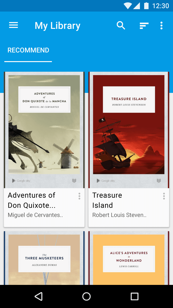
Consider providing starter content that will allow users to explore your app right away. For example, a book reading app might provide all users with a few books based on information about a user.
Bake Emotion Into The UI
Empty states can help you show the human side of your business or product. Positive emotional stimuli can build a sense of engagement with your users. What kind of feeling your empty state conveys, depends on the purpose of your app. An example below shows the emotional side of empty state in Google Hangouts and how it can incentivize users to get invites on Hangouts.
Of course, showing emotion in design like in the example above is risky – some people don’t get it, and some people may even hate it. But, that’s OK, since emotional response to your design is much better than indifference.
Introduce Success States
The moment a first-time user completes an important task is a great opportunity for you to create a positive emotional connection between them and your product. Let your users know that they are doing great by acknowledging their progress and celebrate success with the user.
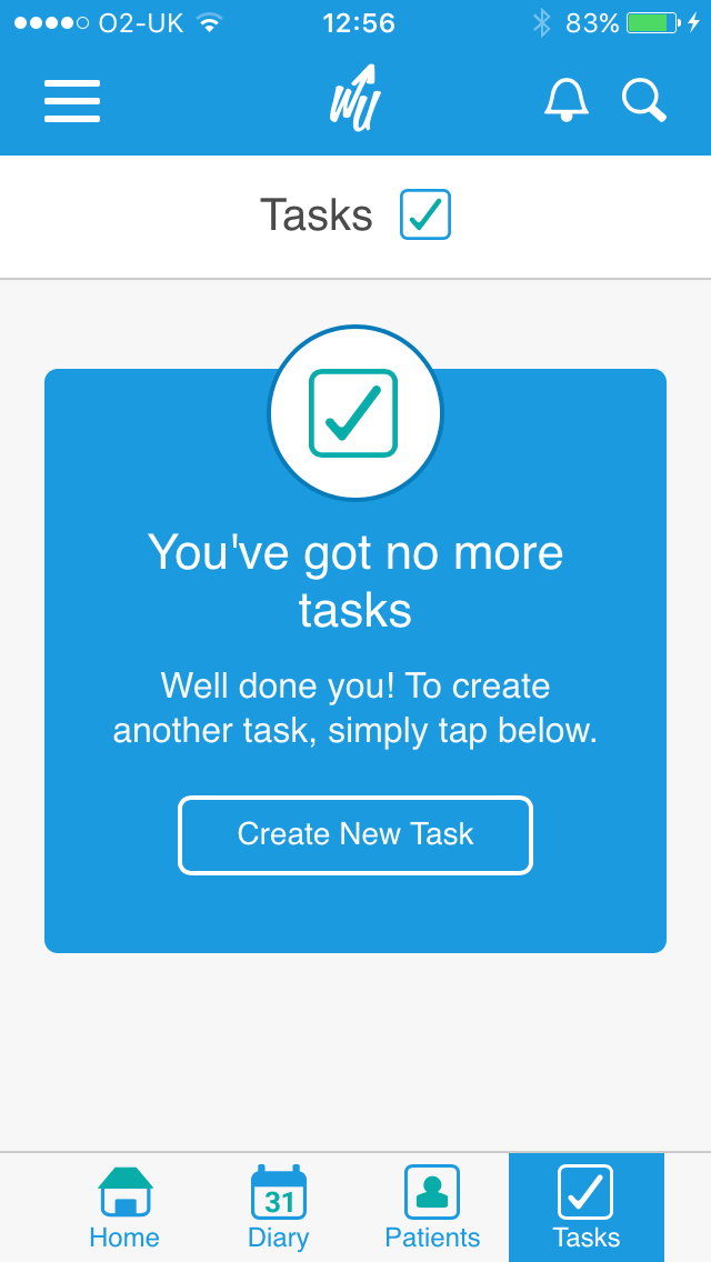
Success state is an amazing opportunity to congratulate users on a job well done and prompt them toward new interactions. For example, clearing a task list is certainly a positive achievement for Writeupp users. It's great that the app offers a congratulatory, "Well done!" as a positive reinforcement. This success state delights users and offers next steps to keep them engaged.
Dig In Deeper
The following resources can help you find user onboarding and user interface inspiration:
- Useronboard is a great resource for exploring existing onboarding experiences and reading detailed teardowns.

- Uxarchive is another great resource that contains breakdowns of onboarding in many popular apps.
- Ui-patterns has a collection of web-app user onboarding & user interface.
- Emptystat.es is a collection of empty state screenshots that has been taking user submissions since 2013. A majority of screenshots for this article were taken from this resource.
Conclusion
Your empty state should never feel empty. Don't let the user face a blank screen the first time they open an app. Invest in empty states because they aren't a temporary or minor part of the user experience. In fact, they are just as important as other design components and full of potential to drive engagement and delight users when they have just signed up.
"This article is part of the UX design series sponsored by Adobe. The newly introduced Experience Design app is made for a fast and fluid UX design process, creating interactive navigation prototypes, as well as testing and sharing them – all in one place."
"You can check out more inspiring projects created with Adobe XD on Behance, and also visit the Adobe XD blog to stay updated and informed. Adobe XD is being updated with new features frequently, and since it's in public Beta, you can download and test it for free."
Further Reading
- Better Context Menus With Safe Triangles
- In-App Gestures And Mobile App User Experience
- Best Practices For Animated Progress Indicators
- Designing Card-Based User Interfaces


