How To Improve Your Billing Form’s UX In One Day

Email Newsletter
Weekly tips on front-end & UX.
Trusted by 182,000+ folks.
 Register for Free


 Celebrating 10 million developers
 Custom Web Forms for Angular, React, & Vue. Your backend.
The checkout page is the last page a user visits before finally decide to complete a purchase on your website. It’s where window shoppers turn into paying customers. If you want to leave a good impression, you should provide optimal usability of the billing form and improve it wherever it is possible to.
In less than one day, you can add some simple and useful features to your project to make your billing form user-friendly and easy to fill in. A demo with all the functions covered below is available. You can find its code in the GitHub repository.
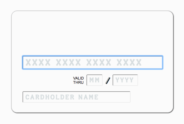
Credit-card details are among the most commonly corrected fields in forms. Fortunately, nowadays almost every popular browser has an autofill feature, allowing the users to store their card data in the browser and to fill out form fields more quickly. Also, since iOS 8, mobile Safari users can scan their card’s information with the iPhone’s camera and fill in their card’s number, expiration date and name fields automatically. Autocomplete is simple, clear and built into HTML5, so we’ll add it to our form first.
Both autofill and card-scanning work only with forms that have special attributes: autocomplete for modern browsers (listed in the HTML5 standard) and name for browsers without HTML5 support.
Note: A demo with all the functions covered below is available. You can find its code in the GitHub repository.
Credit cards have specific autofill attributes. For autocomplete:
cc-namecc-numbercc-csccc-exp-monthcc-exp-yearcc-expcc-typecc-csc
For name:
ccnamecardnumbercvcccmonthccyearexpdatecard-typecvc
To use autofill, you should add the relevant autocomplete and name attributes for the input elements in your index.html file:
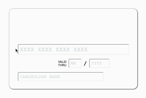
<input type="text" id="card__input_number" class="card__input card__input_number" placeholder="XXXX XXXX XXXX XXXX" pattern="[0-9]{14,23}" required autofocus autocomplete="cc-number" name="cardnumber">
<input type="text" id="card__input_month" class="card__input card__input_date card__input_month" placeholder="MM" pattern="[0-9]{1,2}" required autocomplete="cc-exp-month" name="ccmonth">
<input type="text" id="card__input_year" class="card__input card__input_date card__input_year" placeholder="YYYY" pattern="[0-9]{2,4}" required autocomplete="cc-exp-year" name="ccyear">
<input type="text" class="card__input card__input_cardholder" placeholder="CARDHOLDER NAME" required autocomplete="cc-name" name="ccname">
Don’t forget to use placeholder in input fields to help users understand the required data formats. We can provide input validation with HTML5 attributes: pattern (based on JavaScript regular expressions) and required. For example, with pattern=”[0-9\s]{14,23}” required attributes in a field, the user won’t be able to submit the form if the field is empty, has a non-numeric or non-space symbol, or is shorter than 14 symbols or longer than 23 symbols.
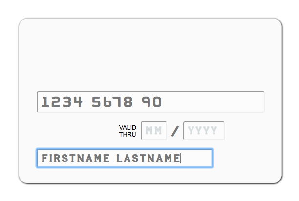
Once the user has saved their card data in the browser, we can see how it works:
Notice that using one field for the expiration date (MM/YYYY) is not recommended because Safari requires separate month and year fields to autocomplete.
Of course, autocomplete and autofill attributes are widely used not only for billing forms but also for names, email and postal addresses and passwords. You can save the user time and make them even happier by correctly using these attributes in your forms.
Even though we now have autocomplete, Google Payments and Apple Wallet, many users still prefer to enter their credit-card details manually, and no one is safe from making a typo with a 16-digit number. Long numbers are hard to read, even more painful to write and almost impossible to verify.
To help users feel comfortable with their long card number, we can divide it into four-digit groups by adding the simple VanillaMasker library by BankFacil to our project. Inputted data will be transformed to a masked string. So, we can add a custom pattern with spaces after every fourth digit of a card number, a two-digit pattern for the expiration month and a four-digit pattern for the expiration year. VanillaMasker can also verify data formats: If we have passed only “9” (the default number for the masker) to the ID, then all non-numeric characters will be deleted after input.
npm install vanilla-masker --save
In our index.js file, let’s import the library and use it with one string for every field:
import masker from 'vanilla-masker';

const cardNumber = document.getElementById('card__input_number');
const cardMonth = document.getElementById('card__input_month');
const cardYear = document.getElementById('card__input_year');

masker(cardNumber).maskPattern('9999 9999 9999 9999 99');
masker(cardMonth).maskPattern('99');
masker(cardYear).maskPattern('9999');
Thus, the digits of the card number in our form will be separated, like on a real card:
The masker will erase characters with an incorrect value type or length, although our HTML validation will notify the user about invalid data only after the form has been submitted. But we can also check a card number’s correctness as it is being filled in. Did you know that all plastic credit-card numbers are generated according to the simple and effective Luhn algorithm? It was created in 1954 by Hans Peter Luhn and subsequently set as an international standard. We can include the Luhn algorithm to pre-validate the card number’s input field and warn the user about a typo.
To do this, we can use the tiny fast-luhn npm package, adapted from Shirtless Kirk’s gist. We need to add it to our project’s dependencies:
npm install fast-luhn --save
To use fast-luhn, we’ll import it in a module and just call luhn(number) on the input event to check whether the number is correct. For example, let’s add the card__input_invalid class to change the outline and field’s text color when the user has made an accidental error and a check has not been passed. Note that VanillaMasker adds a space after every four-digit group, so we need to convert the inputted value to a plain number without spaces using the split and join methods, before calling lunh.
The result is code that looks like this:
import luhn from 'fast-luhn';

const cardNumber = document.getElementById('card-number');

cardNumber.addEventListener('input', (event) => {
  const number = event.target.value;

  if (number.length >= 14) {
    const isLuhnCheckPassed = luhn(number.split(' ').join(''));
    cardNumber.classList.toggle('card__input_invalid', !isLuhnCheckPassed);
    cardNumber.classList.toggle('card__input_valid', isLuhnCheckPassed);
  } else {
    cardNumber.classList.remove('card__input_invalid', 'card__input_valid');
  }
});
To prevent luhn from being called while the user is typing, let’s call it only if the inputted number is as long as the minimum length with spaces (14 characters, including 12 digits) or longer, or else remove the card__input_invalid class.
Here are the validation examples in action:
The Luhn algorithm is also used for some discount card numbers, IMEI numbers, National Provider Identifier numbers in the US, and Social Insurance Numbers in Canada. So, this package isn’t limited to credit cards.
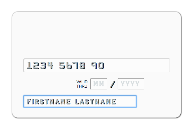
Many users want to check their card details with their own eyes, even if they know the form is being validated. But human beings perceive things in a way that makes comparison of differently styled numbers a little confusing. As we want the interface to be simple and intuitive, we can help users by showing a font that looks similar to the one they would find on a real card. Also, the font will make our card-like input form look more realistic and appropriate.
Several free credit-card fonts are available:
- Halter, Apostrophic Labs
- Kredit, Typodermic Fonts
- Credit Card, K-Type (free for personal use)
We’ll use Halter. First, download the font, place it in the project’s folder, and create a CSS3 @font-face rule in style.css:
@font-face {
  font-family: Halter;
  src: url(font/HALTER__.ttf);
}
Then, simply add it to the font-family rule for the .card-input class:
.card-input {
  color: #777;
  font-family: Halter, monospace;
}
Don’t forget that if you input the CSS in a JavaScript file with the webpack bundle, you’ll need to add file-loader:
npm install file-loader --save
And add file-loader for the font file types in webpack.config.js:
module: {
   loaders: [
   {
     test: /\.(ttf|eot|svg|woff(2)?)(\?[a-z0-9=&.]+)?$/,
     loader: 'file',
   }],
 },
The result looks pretty good:
You can make it even fancier, if you like, with an embossed effect using a double text-shadow and a semi-transparency on the text’s color:
.card-input {
  color: rgba(84,110,122,0.5);
  text-shadow: -0.75px -0.75px white, 0.75px 0.75px 0 black;
  font-family: Halter, monospace;
}
text-shadowLast but not least, you can pleasantly surprise customers by adding a coloring feature to the form. Every bank has its own brand color, which usually dominates that bank’s card. To make a billing form even more user-friendly, we can use this color and print the bank’s name above the form fields (corresponding to where it appears on a real card). This will also help the user to avoid making a typo in the number and to ensure they have picked the right card.
We can identify the bank of every user’s card by the first six digits, which contain the Issuer Identification Number (IIN) or Bank Identification Number (BIN). Banks DB by Ramoona is a database that gets a bank’s name and brand color from this prefix. The author has set up a demo of Banks DB.
This database is community-driven, so it doesn’t contain all of the world’s bank. If a user’s bank isn’t represented, the space for the bank’s name will be empty and the background will show the default color (#fafafa).
Banks DB assumes one of two ways of using it: with PostCSS or with CSS in JavaScript. We are using it with PostCSS. If you are new to PostCSS, this is a good reason to start using it. You can learn more about PostCSS in the official documentation or in Drew Minns’ article “An Introduction to PostCSS”.
We need to install the PostCSS Banks DB plugin to set the CSS template for Banks DB and install the PostCSS Contrast plugin to improve the readability of the bank’s name:
npm install banks-db postcss-banks-db postcss-contrast --save
After that, we’ll add these new plugins to our PostCSS process in accordance with the module bundler and the load configuration used in our project. For example, with Webpack and postcss-load-config, simply add the new plugins to the .postcssrc file.
Then, in our style.css file, we need to add a new class rule template for Banks DB with the postcss-contrast plugin:
@banks-db-template {
  .card_bank-%code% {
    background-color: %color%;
    color: contrast(%color%);
  }
}
We could also set a long transition on the whole .card class to smoothly fade in and out the background and text color, so as not to startle users with an abrupt change:
.card {
  …
  transition: background 0.6s, color 0.6s;
}
Now, import Banks DB in index.js, and use it in the input event listener. If the BIN is represented in the database, we’ll add the class containing the bank’s name to the form in order to insert the name and change the form’s background.
import banksDB from 'banks-db';

const billingForm = document.querySelector('.card');
const bankName = document.querySelector('.card__bank-name');
const cardNumber = document.getElementById('card__input_number');

cardNumber.addEventListener('input', (event) => {
  const number = event.target.value;
  const bank = banksDB(number);

  if (bank.code) {
    billingForm.classList.add(`card_bank-${(bank.code || 'other')}`);
    bankName.innerText = bank.country === 'ru' ? bank.localTitle : bank.engTitle;
  } else {
    billingForm.className = 'card';
    bankName.innerText = '';
  }
});
If you use webpack, add json-loader for the .json file extension to webpack’s configuration in order to input the database in the bundle correctly.
Here is a working example of Banks DB:
In case you see no effect with your bank card, you can open an issue or add your bank to the database.
Conclusion
Improving your billing form can make the user experience much more intuitive and, as a result, ensure user convenience and increase confidence in your product. It’s an important part of web applications. We can improve it quickly and easily using these simple features:
- suitable
autocompleteandnameattributes for autofilling, placeholderattribute to inform the user of the input format,patternandrequireattributes to prevent incorrect submission of form,- VanillaMasker to separate card digits,
- fast-luhn to verify the card number,
- Halter font for easy comparison,
- Banks DB for a nicer presentation of colors.
Note that only Banks DB requires a module bundler; you can use the others within the simple script. Adding all of this functionality to your checkout page would most likely take less than a day.
Further Reading
- Reducing Abandoned Shopping Carts In E-Commerce
- Form-Field Validation: The Errors-Only Approach
- Fundamental Guidelines Of E-Commerce Checkout Design
- An Extensive Guide To Web Form Usability
 (rb, al, il, mrn)

