Prototype And Code: Creating A Custom Pull-To-Refresh Gesture Animation

Email Newsletter
Weekly tips on front-end & UX.
Trusted by 182,000+ folks.
 Register for Free
 Custom Web Forms for Angular, React, & Vue. Your backend.
 Celebrating 10 million developers

Pull-to-refresh is one of the most popular gestures in mobile applications right now. It’s easy to use, natural and so intuitive that it is hard to imagine refreshing a page without it. In 2010, Loren Brichter created Tweetie, one of numerous Twitter applications. Diving into the pool of similar applications, you won’t see much difference among them; but Loren’s Tweetie stood out then.
It was one simple animation that changed the game — pull-to-refresh, an absolute innovation for the time. No wonder Twitter didn’t hesitate to buy Tweetie and hire Loren Brichter. Wise choice! As time went on, more and more developers integrated this gesture into their applications, and finally, Apple itself brought pull-to-refresh to its system application Mail, to the joy of people who value usability.
Today, most clients wish to see this gesture in their apps, and most designers want to create prototypes with integrated pull-to-refresh animation, preferably a custom one. This tutorial explains how to build a prototype in Flinto, a tool that makes swipe-gesture animation possible, and obviously you cannot create a pull-to-refresh animation without a pull. However, it would be fair to say that Flinto is not the only tool that gives us the swipe gesture — Facebook Origami and POP are worth mentioning. After we create a prototype, we will code it into our design of an Android application.
This tutorial will help you master Flinto, understand the logic of creating prototypes of this kind, and learn the process of coding these prototypes in your application. To follow the steps, you will need macOS, Sketch for Mac, Flinto for Mac to create the prototype, and Android Studio and JDK 7+ to write the code.
Prototype In Flinto
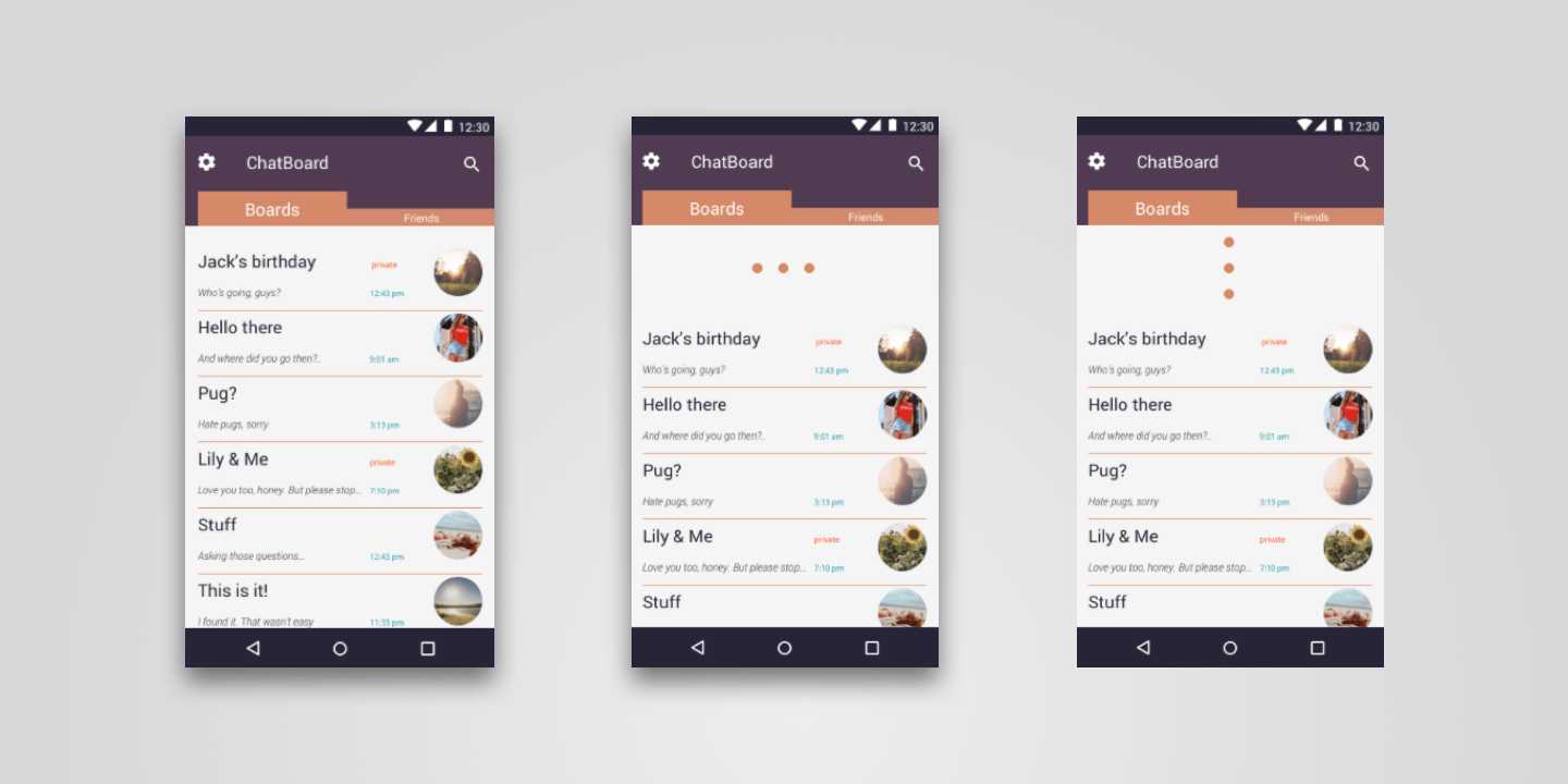
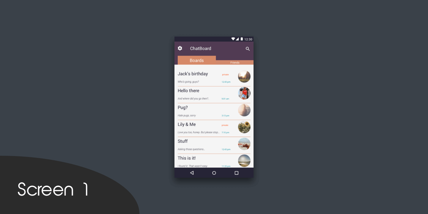
For the prototype, I am using screens of ChatBoard, an Android chat application by Erminesoft. The list of user chat rooms would be a perfect place to integrate a refresh animation to check new messages. Let’s begin!
Step 1
We’ll make all of the designs in Sketch. For the first step, we’ll need to create one screen with any list of items the user will be able to refresh. Now we need to export the screen to Flinto. We have two options here:
- Export as separate PNG files.
- Use the plugin Send to Flinto.
Step 2
Let’s move to Flinto for Mac, which you can buy for $99, or you can download a free trial on the website. To make a simple pull-to-refresh animation, we need five screens. At this point, we can add a custom image or use standard Flinto forms (a rectangle or circle) to create the animated element. For this project, I am using three standard circles. Stop right there: Don’t search for a circle form. Use a rectangle ®, make a square out of it, and set a maximum corner radius. There you go — you’ve got a circle!
Step 3
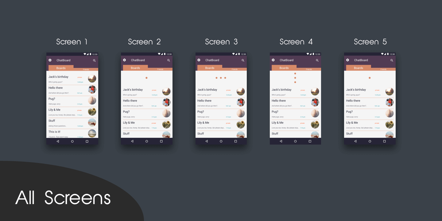
The first animation frame requires a separate layer with the list of content. Behind it, we’ll place the animated element in the starting position; in our case, there will be three circles placed on the same X and Y coordinates. That’s screen 1.
Step 4
On screen 2, we need to move the content down the Y-axis, revealing the animated element hidden behind the list of content.
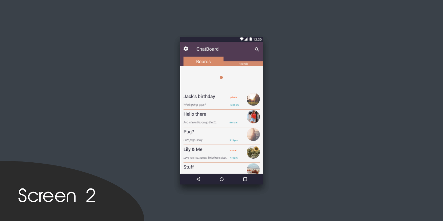
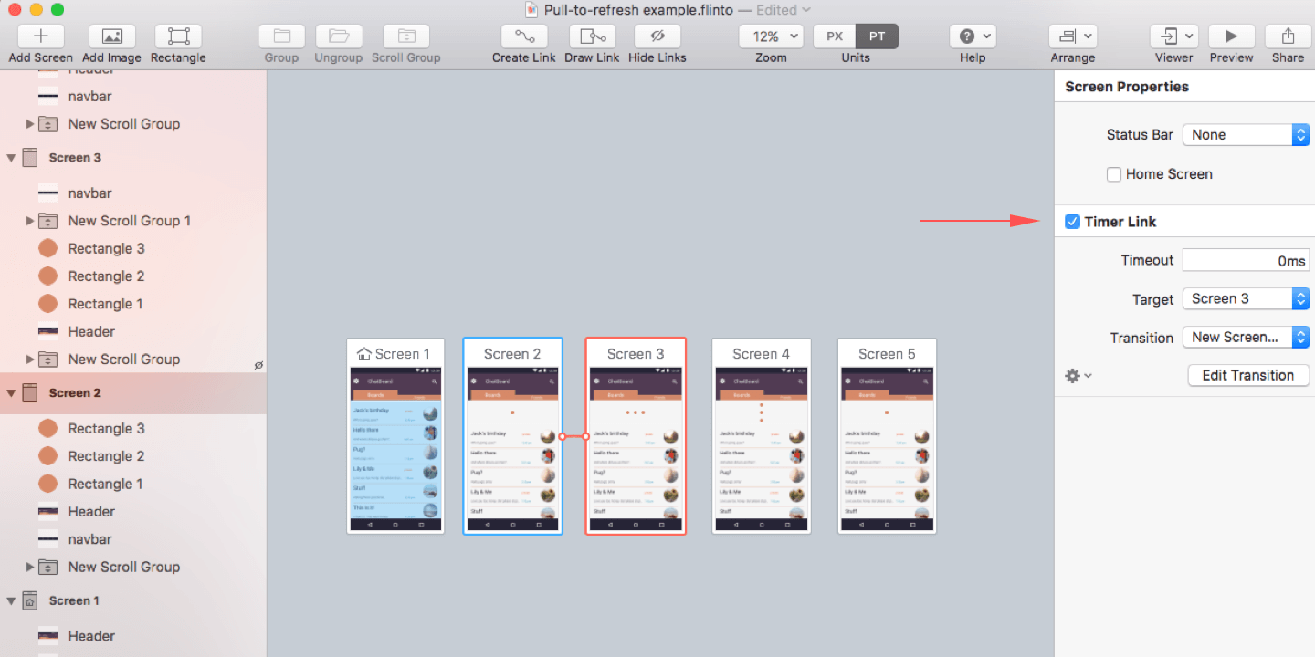
Additionally at this step (and all following steps), the transition timer (“Timer Link”) should be turned on and set to 0 milliseconds, to eliminate any lag in transition to the next animation screen. Just click on an artboard title to see the timer transition settings.
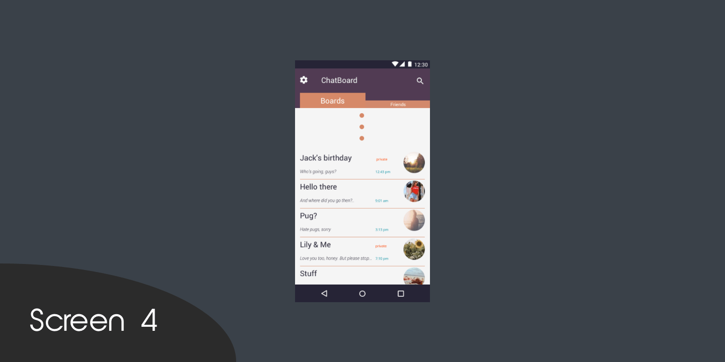
Step 5
The previous screen (screen 2) shows only one circle, but remember that three circles are placed at the same X and Y coordinates. At this point (screen 3), our task is to move one of the circles 30 pixels left along the X-axis, and another circle 30 pixels right along the X-axis. Don’t forget to set the transition timer to 0 milliseconds.

Step 6
Let’s move on to screen 4. Repeat step 5 doing the same thing but moving the circles along the Y-axis instead of the X-axis for the same 30 pixels. The X coordinates of all of the elements should be the same and center-aligned. Don’t forget about the transition timer.
Step 7
Copy screen 2 for the new screen 5. At this step, all we need to do is change the timer link’s target not to screen 3 but to our home screen.
Step 8
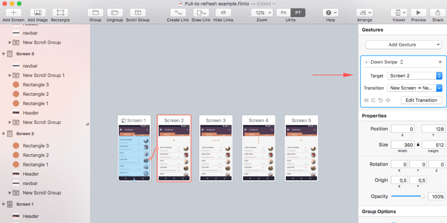
All of the preparations are done, and we can now move to the animations. Create a new transition. Select the layer of content on the home screen, press F, and link it to screen 2.
(By the way, the key F refers to the name of the program itself, “Flinto.” It is its signature key.)
Apply the following transition settings:
- Gesture: down swipe
- Target: “Screen 2”
- Transition: “New transition”
Step 9
Now we get to the custom transition animation section. The first thing to do here is to lay one screen above the other. This creates the impression that it is one animated screen, instead of two screens, because it technically is.
Step 10
At this point, we need to set the connections between elements throughout the screens in order for the program to associate them. For example, the element named “Circle-1” on the home screen is the same object on all of the screens. We just need to select two identical elements and click “Connect Layers.”
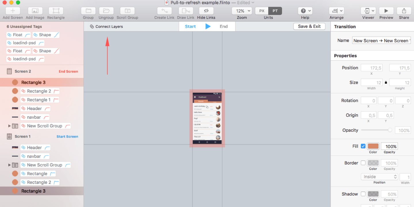
We have to connect all identical elements in this way for our “New Transition.” You can try out various kinds of animations in the “Effects” section, but in this particular case, I advise you to use “Spring,” to make our circles bounce.
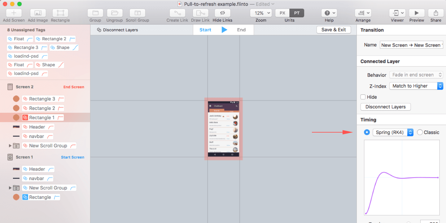
Step 11
Click “Save & Exit.” Now we need to select this transition type for all of the transitions in our project, including our timers.
(An interesting fact: In Principle, the prototyping tool, layers are connected automatically when the program finds two elements with identical names. I find the automatic connection more convenient for those who keep Sketch’s layers’ names in order. Flinto is a better choice for the lazy ones who prefer to connect all animated elements while creating a prototype.)
Additionally, to achieve a more realistic effect, you can make the refreshed screen show an update or an additional item.
Despite the simplicity of this animation, it delivers surprising dynamics and responsiveness to the prototype. It also gives a feeling of product completeness, and it is necessary to making a prototype feel as product-like as possible.
Prototyping is a crucial stage in application development, not only impressing the client and verifying the design concept, but also helping to establish a hand-off process between the designers (who create the animations) and the developers (who implement them). Prototypes can become a valuable asset of communication between team members because they ensure that coders understand the project’s specifications and can implement the designer’s custom animations.
Now, let’s proceed to code our prototype in a Java application for Android mobile devices.
Code
The whole process of creating a custom PullToRefreshListView for Android involves only three steps:
- Create the animated element.
- Code a custom
ListView. - Integrate the element into the application’s code.
1. The Animated Element
Take the drawable folder in our project, and create a file named point.xml with the following content:
<?xml version="1.0" encoding="utf-8"?>
<shape xmlns:android="https://schemas.android.com/apk/res/android"
    android:dither="true"
    android:shape="oval">

    <gradient
        android:endColor="#ffff6600"
        android:gradientRadius="10dp"
        android:startColor="#ffffcc00"
        android:type="radial"
        android:useLevel="false" />

    <size
        android:height="10dp"
        android:width="10dp" />

</shape>
The element has now been formed. The next step is to build the animated movement of these elements. Let’s jump to the anim folder (or create it if it’s absent), and add two files, named left_step_anim.xml and right_step_anim.xml.
The following code listing is for left_step_anim.xml:
<?xml version="1.0" encoding="utf-8"?>
<set xmlns:android="https://schemas.android.com/apk/res/android"
    android:duration="800"
    android:repeatMode="restart">

    <translate
        android:fromXDelta="0%"
        android:toXDelta="-50" />

    <translate
        android:startOffset="800"
        android:toYDelta="50"
        android:toXDelta="50" />

    <translate
        android:startOffset="1600"
        android:toYDelta="-50" />

</set>
The following code should be placed in right_step_anim.xml:
<?xml version="1.0" encoding="utf-8"?>
<set xmlns:android="https://schemas.android.com/apk/res/android"
    android:duration="800">

    <translate
        android:fromXDelta="0%p"
        android:toXDelta="50" />

    <translate
        android:startOffset="800"
        android:toYDelta="-50"
        android:toXDelta="-50" />

    <translate
        android:startOffset="1600"
        android:toYDelta="50" />

</set>
Now we need to add our animation to the markdown. Browse to the layout folder, and create a file named ptr_header.xml, with the following code:
<?xml version="1.0" encoding="utf-8"?>
<LinearLayout xmlns:android="https://schemas.android.com/apk/res/android"
    android:orientation="vertical" android:layout_width="match_parent"
    android:layout_height="match_parent"
    android:gravity="center_horizontal">
    <RelativeLayout android:id="@+id/ptr_id_header"
        android:layout_width="fill_parent"
        android:layout_height="wrap_content"
        android:gravity="center_vertical"
        android:padding="5dp">

        <ImageView
            android:id="@+id/point"
            android:paddingTop="30dp"
            android:paddingBottom="30dp"
            android:layout_width="wrap_content"
            android:layout_height="wrap_content"
            android:layout_centerHorizontal="true"
            android:contentDescription="point"
            android:scaleType="fitCenter"
            android:src="@drawable/point" />

        <ImageView
            android:id="@+id/point2"
            android:paddingTop="30dp"
            android:paddingBottom="30dp"
            android:layout_width="wrap_content"
            android:layout_height="wrap_content"
            android:layout_centerHorizontal="true"
            android:contentDescription="point"
            android:scaleType="fitCenter"
            android:src="@drawable/point" />

        <ImageView
            android:id="@+id/point3"
            android:paddingTop="30dp"
            android:paddingBottom="30dp"
            android:layout_width="wrap_content"
            android:layout_height="wrap_content"
            android:contentDescription="point"
           android:scaleType="fitCenter"
            android:src="@drawable/point"
            android:layout_alignTop="@+id/point"
            android:layout_alignLeft="@+id/point"
            android:layout_alignStart="@+id/point" />

    </RelativeLayout>
</LinearLayout>
The file we’ve created will serve as the animated element. Let’s proceed to the second step.
2. Custom ListView
We need to create an item to use in our custom ListView. To do this, navigate to the layout folder and create a file named list_item.xml, containing one TextView element. This is what it should look like:
<?xml version="1.0" encoding="utf-8"?>
<LinearLayout xmlns:android="https://schemas.android.com/apk/res/android"
    android:layout_width="fill_parent"
    android:layout_height="wrap_content" >

    <TextView
        android:id="@+id/textView1"
        android:layout_width="wrap_content"
        android:layout_height="fill_parent"
        android:padding="5dp"
        android:singleLine="true"
        android:textColor="@android:color/black"
        android:textSize="10pt" />

</LinearLayout>
Now, let’s add a file with our ListView to the layout folder. In our case, it is a file named main.xml in a folder named layout. It should read as follows:
<?xml version="1.0" encoding="utf-8"?>
<LinearLayout xmlns:android="https://schemas.android.com/apk/res/android"
    android:layout_width="fill_parent"
    android:layout_height="fill_parent"
    android:orientation="vertical">

    <erminesoft.com.listreload.PullToRefreshListView
        android:id="@+id/pull_to_refresh_listview"
        android:layout_height="fill_parent"
        android:layout_width="fill_parent"

        android:background="@android:color/white"
        android:cacheColorHint="@android:color/white" />

</LinearLayout>
The custom ListView has now been created.
3. Integrating The Elements
The last step of this process involves binding together all of the elements above. We need to create two classes. The first class is named PullToRefreshListViewSampleActivity and is used when launching the application. The second class, PullToRefreshListView, will contain our element.
In the PullToRefreshListViewSampleActivity class, our attention is on the onRefresh() method of the onCreate() method. This method is exactly where all of the ListView refreshing magic will happen. Because this is an example, we’ve added our own test data with the loadData() method of the internal class PullToRfreshListSampleAdapter. The remaining code of the PullToRefreshListViewSampleActivity class is relatively simple.
Let’s move on to the PullToRefreshListView class. Because the main functionality is built on the standard ListView, we’ll add extends ListView to its name. The class is quite simple, yet animation involves a few constants that are defined by experimentation. Besides that, the interface implements the onRefresh() method.
Now let’s add a file with our ListView to the layout folder. In our case, it is a file named main.xml in a folder named layout. It should read as follows:
public interface OnRefreshListener{
    void onRefresh();
}
This method will be used to refresh the ListView. Our class also contains several constructors to create the View element.
public PullToRefreshListView(Context context){
    super(context);
    init(context);
}

public PullToRefreshListView(Context context, AttributeSet attrs){
    super(context, attrs);
    init(context);
}

public PullToRefreshListView(Context context, AttributeSet attrs, int defStyle){
    super(context, attrs, defStyle);
    init(context);
}
The class also includes the onTouchEvent and onScrollChanged event handlers. These are standard solutions that have to be implemented. You will also need the private class HeaderAnimationListener, which handles animation in the ListView.
private class HeaderAnimationListener implements AnimationListener{
...
}
There you go! The code is available on GitHub.
This tutorial is intended to encourage designers and developers to work together to integrate a custom pull-to-refresh animation and to make it a small yet nice surprise for users. It adds a certain uniqueness to an application and shows that the developers are dedicated to creating an engaging experience for the user above all else. It is also the foundation for making more complex animation, limited only by your imagination. We believe it’s important to experiment with custom animations, adding a touch of creativity to every project you build!
Further Reading
- In-App Gestures And Mobile App User Experience
- How Functional Animation Helps Improve UX
- The Thumb Zone: Designing For Mobile Users
- Creating Advanced Animations In Photoshop
 (da, al, il, mrn)

