The Road To Resilient Web Design

Email Newsletter
Weekly tips on front-end & UX.
Trusted by 182,000+ folks.
 Celebrating 10 million developers


 Custom Web Forms for Angular, React, & Vue. Your backend.
In the world of web design, we tend to become preoccupied with the here and now. In “Resilient Web Design”, Jeremy Keith emphasizes the importance of learning from the past in order to better prepare ourselves for the future. So, perhaps we should stop and think more beyond our present moment? The following is an excerpt from Jeremy’s web book.
Design adds clarity. Using colour, typography, hierarchy, contrast, and all the other tools at their disposal, designers can take an unordered jumble of information and turn it into something that’s easy to use and pleasurable to behold. Like life itself, design can win a small victory against the entropy of the universe, creating pockets of order from the raw materials of chaos.
The Book of Kells is a beautifully illustrated manuscript created over 1200 years ago. It’s tempting to call it a work of art, but it is a work of design. The purpose of the book is to communicate a message; the gospels of the Christian religion. Through the use of illustration and calligraphy, that message is conveyed in an inviting context, making it pleasing to behold.
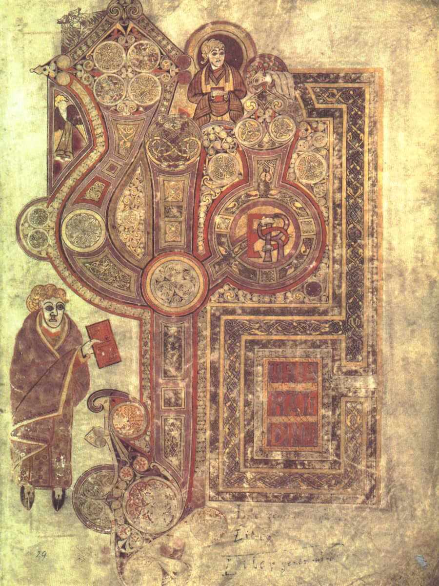
Design works within constraints. The Columban monks who crafted the Book of Kells worked with four inks on vellum, a material made of calfskin. The materials were simple but clearly defined. The cenobitic designers knew the hues of the inks, the weight of the vellum, and crucially, they knew the dimensions of each page.
Prints And The Revolution
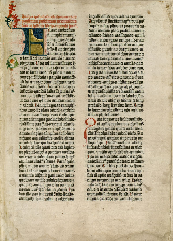
Materials and processes have changed and evolved over the past millennium or so. Gutenberg’s invention of movable type was a revolution in production. Whereas it would have taken just as long to create a second copy of the Book of Kells as it took to create the first, multiple copies of the Gutenberg bible could be produced with much less labour. Even so, many of the design patterns such as drop caps and columns were carried over from illuminated manuscripts. The fundamental design process remained the same: knowing the width and height of the page, designers created a pleasing arrangement of elements.
The techniques of the print designer reached their zenith in the 20th century with the rise of the Swiss Style. Its structured layout and clear typography is exemplified in the work of designers like Josef Müller‐Brockmann and Jan Tschichold. They formulated grid systems and typographic scales based on the preceding centuries of design.
Knowing the ratio of the dimensions of a page, designers could position elements with maximum effect. The page is a constraint and the grid system is a way of imposing order on it.
Taking Your Talent To The Web
When the web began to conquer the world in the 1990s, designers started migrating from paper to pixels. David Siegel’s Creating Killer Websites came along at just the right time. Its clever TABLE and GIF hacks allowed designers to replicate the same kind of layouts that they had previously created for the printed page.
Those TABLE layouts later became CSS layouts, but the fundamental thinking remained the same: the browser window — like the page before it — was treated as a known constraint upon which designers imposed order.
There’s a problem with this approach. Whereas a piece of paper or vellum has a fixed ratio, a browser window could be any size. There’s no way for a web designer to know in advance what size any particular person’s browser window will be.
Designers had grown accustomed to knowing the dimensions of the rectangles they were designing within. The web removed that constraint.
If It Ain’t Fixed, Don’t Break It
There’s nothing quite as frightening as the unknown. These words of former US Secretary of Defense Donald Rumsfeld should be truly terrifying (although the general consensus at the time was that they sounded like nonsense):
"There are known knowns. There are things we know we know. We also know there are known unknowns, that is to say we know there are some things we do not know. But there are also unknown unknowns — the ones we don’t know we don’t know."
The ratio of the browser window is just one example of a known unknown on the web. The simplest way to deal with this situation is to use flexible units for layout: percentages rather than pixels. Instead, designers chose to pretend that the browser dimensions were a known known. They created fixed‐width layouts for one specific window size.
In the early days of the web, most monitors were 640 pixels wide. Web designers created layouts that were 640 pixels wide. As more and more people began using monitors that were 800 pixels wide, more and more designers began creating 800 pixel wide layouts. A few years later, that became 1024 pixels. At some point web designers settled on the magic number of 960 pixels as the ideal width.
It was as though the web design community were participating in a shared consensual hallucination. Rather than acknowledge the flexible nature of the browser window, they chose to settle on one set width as the ideal …even if that meant changing the ideal every few years.
Not everyone went along with this web‐wide memo.
Dao Or Dao Not
In the year 2000 the online magazine A List Apart published an article entitled A Dao of Web Design. It has stood the test of time remarkably well.
In the article, John Allsopp points out that new mediums often start out by taking on the tropes of a previous medium. Scott McCloud makes the same point in his book Understanding Comics:
"Each new medium begins its life by imitating its predecessors. Many early movies were like filmed stage plays; much early television was like radio with pictures or reduced movies."
With that in mind, it’s hardly surprising that web design began with attempts to recreate the kinds of layouts that designers were familiar with from the print world. As John put it:
"“Killer Web Sites” are usually those which tame the wildness of the web, constraining pages as if they were made of paper — Desktop Publishing for the Web."
Web design can benefit from the centuries of learning that have informed print design. Massimo Vignelli, whose work epitomises the Swiss Style, begins his famous Canon with a list of The Intangibles including discipline, appropriateness, timelessness, responsibility, and more. Everything in that list can be applied to designing for the web. Vignelli’s Canon also includes a list of The Tangibles. That list begins with paper sizes.
The web is not print. The known constraints of paper — its width and height — simply don’t exist. The web isn’t bound by pre‐set dimensions. John Allsopp’s A Dao Of Web Design called on practitioners to acknowledge this:
"The control which designers know in the print medium, and often desire in the web medium, is simply a function of the limitation of the printed page. We should embrace the fact that the web doesn’t have the same constraints, and design for this flexibility."
This call to arms went unheeded. Designers remained in their Matrix-like consensual hallucination where everyone’s browser was the same width. That’s understandable. There’s a great comfort to be had in believing a reassuring fiction, especially when it confers the illusion of control.
There is another reason why web designers clung to the comfort of their fixed‐width layouts. The tools of the trade encouraged a paper‐like approach to designing for the web.
Ship Of Tools
It’s a poor craftsperson who always blames their tools. And yet every craftsperson is influenced by their choice of tools. As Marshall McLuhan’s colleague John Culkin put it, “we shape our tools and thereafter our tools shape us.”
When the discipline of web design was emerging, there was no software created specifically for visualising layouts on the web. Instead designers co‐opted existing tools.
Adobe Photoshop was originally intended for image manipulation; touching up photos, applying filters, compositing layers, and so on. By the mid nineties it had become an indispensable tool for graphic designers. When those same designers began designing for the web, they continued using the software they were already familiar with.
If you’ve ever used Photoshop then you’ll know what happens when you select “New” from the “File” menu: you will be asked to enter fixed dimensions for the canvas you are about to work within. Before adding a single pixel, a fundamental design decision has been made that reinforces the consensual hallucination of an inflexible web.
Photoshop alone can’t take the blame for fixed‐width thinking. After all, it was never intended for designing web pages. Eventually, software was released with the specific goal of creating web pages. Macromedia’s Dreamweaver was an early example of a web design tool. Unfortunately it operated according to the idea of WYSIWYG: What You See Is What You Get.
While it’s true that when designing with Dreamweaver, what you see is what you get, on the web there is no guarantee that what you see is what everyone else will get. Once again, web designers were encouraged to embrace the illusion of control rather than face the inherent uncertainty of their medium.
It’s possible to overcome the built‐in biases of tools like Photoshop and Dreamweaver, but it isn’t easy. We might like to think that we are in control of our tools, that we bend them to our will, but the truth is that all software is opinionated software. As futurist Jamais Cascio put it, “software, like all technologies, is inherently political”:
"Code inevitably reflects the choices, biases and desires of its creators."
Small wonder then that designers working with the grain of their tools produced websites that mirrored the assumptions baked into those tools — assumptions around the ability to control and tame the known unknowns of the World Wide Web.
Reality Bites
By the middle of the first decade of the twenty‐first century, the field of web design was propped up by multiple assumptions:
- that everyone was browsing with a screen large enough to view a 960 pixel wide layout;
- that everyone had broadband internet access, mitigating the need to optimise the number and file size of images on web pages;
- that everyone was using a modern web browser with the latest plug‐ins installed.
A minority of web designers were still pleading for fluid layouts. I counted myself amongst their number. We were tolerated in much the same manner as a prophet of doom on the street corner wearing a sandwich board reading “The End Is Nigh” — an inconvenient but harmless distraction.
There were even designers suggesting that Photoshop might not be the best tool for the web, and that we could consider designing directly in the browser using CSS and HTML. That approach was criticised as being too constraining. As we’ve seen, Photoshop has its own constraints but those had been internalised by designers so comfortable in using the tool that they no longer recognised its shortcomings.
This debate around the merits of designing Photoshop comps and designing in the browser would have remained largely academic if it weren’t for an event that would shake up the world of web design forever.
Stuck Inside Of Mobile
"An iPod. A phone. And an internet communicator. An iPod. A phone …are you getting it? These are not three separate devices. This is one device. And we are calling it: iPhone."
With those words in 2007, Steve Jobs unveiled a mobile device that could be used to browse the World Wide Web.
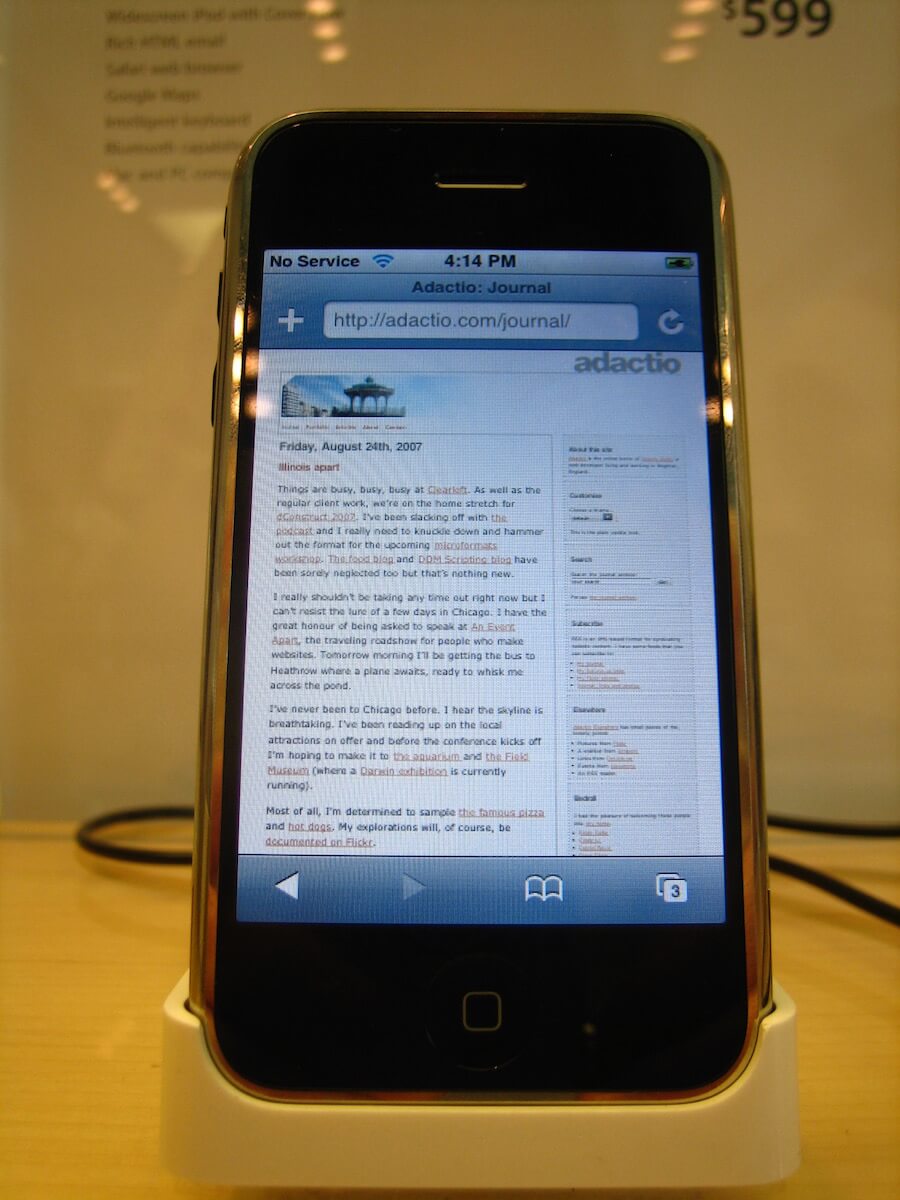
Web‐capable mobile devices existed before the iPhone, but they were mostly limited to displaying a specialised mobile‐friendly file format called WML. Very few devices could render HTML. With the introduction of the iPhone and its competitors, handheld devices were shipping with modern web browsers capable of being first‐class citizens on the web. This threw the field of web design into turmoil.
Assumptions that had formed the basis for an entire industry were now being called into question:
- How do we know if people are using wide desktop screens or narrow handheld screens?
- How do we know if people are browsing with a fast broadband connection at home or with a slow mobile network?
- How do we know if a device even supports a particular technology or plug‐in?
The rise of mobile devices was confronting web designers with the true nature of the web as a flexible medium filled with unknowns.
The initial reaction to this newly‐exposed reality involved segmentation. Rather than rethink the existing desktop‐optimised website, what if mobile devices could be shunted off to a separate silo? This mobile ghetto was often at a separate subdomain to the “real” site: m.example.com or mobile.example.com.
This segmented approach was bolstered by the use of the term “the mobile web” instead of the more accurate term “the web as experienced on mobile.” In the tradition of their earlier consensual hallucinations, web designers were thinking of mobile and desktop not just as separate classes of device, but as entirely separate websites.
Determining which devices were sent to which subdomain required checking the browser’s user‐agent string against an ever‐expanding list of known browsers. It was a Red Queen’s race just to stay up to date. As well as being error‐prone, it was also fairly arbitrary. While it might have once been easy to classify, say, an iPhone as a mobile device, that distinction grew more difficult over time. With the introduction of tablets such as the iPad, it was no longer clear which devices should be redirected to the mobile URL. Perhaps a new subdomain was called for — t.example.com or tablet.example.com — along with a new term like “the tablet web”. But what about the “TV web” or the “internet‐enabled fridge web?”
We Are One
The practice of creating different sites for different devices just didn’t scale. It also ran counter to a long‐held ideal called One Web:
"One Web means making, as far as is reasonable, the same information and services available to users irrespective of the device they are using."
But this doesn’t mean that small‐screen devices should be served page layouts that were designed for larger dimensions:
"However, it does not mean that exactly the same information is available in exactly the same representation across all devices."
If web designers wished to remain true to the spirit of One Web, they needed to provide the same core content at the same URL to everyone regardless of their device. At the same time, they needed to be able to create different layouts depending on the screen real‐estate available.
The shared illusion of a one‐size‐fits‐all approach to web design began to evaporate. It was gradually replaced by an acceptance of the ever‐changing fluid nature of the web.
Positive Response
In April of 2010 Ethan Marcotte stood on stage at An Event Apart in Seattle, a gathering for people who make websites. He spoke about an interesting school of thought in the world of architecture: responsive design, the idea that buildings could change and adapt according to the needs of the people using the building. This, he explained, could be a way to approach making websites.
One month later he expanded on this idea in an article called Responsive Web Design. It was published on A List Apart, the same website that had published John Allsopp’s A Dao Of Web Design ten years earlier. Ethan’s article shared the same spirit as John’s earlier rallying cry. In fact, Ethan begins his article by referencing A Dao Of Web Design.
Both articles called on web designers to embrace the idea of One Web. But whereas A Dao Of Web Design was largely rejected by designers comfortable with their WYSIWYG tools, Responsive Web Design found an audience of designers desperate to resolve the mobile conundrum.
The Adjacent Possible
Writer Steven Johnson has documented the history of invention and innovation. In his book Where Good Ideas Come From, he explores an idea called “the adjacent possible”:
"At every moment in the timeline of an expanding biosphere, there are doors that cannot be unlocked yet. In human culture, we like to think of breakthrough ideas as sudden accelerations on the timeline, where a genius jumps ahead fifty years and invents something that normal minds, trapped in the present moment, couldn’t possibly have come up with. But the truth is that technological (and scientific) advances rarely break out of the adjacent possible; the history of cultural progress is, almost without exception, a story of one door leading to another door, exploring the palace one room at a time."
This is why the microwave oven could not have been invented in medieval France; there are too many preceding steps required — manufacturing, energy, theory — to make that kind of leap. Facebook could not exist without the World Wide Web, which could not exist without the internet, which could not exist without computers, and so on. Each step depends upon the accumulated layers below.
By the time Ethan coined the term Responsive Web Design a number of technological advances had fallen into place. As I wrote in the foreword to Ethan’s subsequent book on the topic:
"The technologies existed already: fluid grids, flexible images, and media queries. But Ethan united these techniques under a single banner, and in so doing changed the way we think about web design."
- Fluid grids. The option to use percentages instead of pixels has been with us since the days of
TABLElayouts. - Flexible images. Research carried out by Richard Rutter showed that browsers were becoming increasingly adept at resizing images. The intrinsic dimensions of an image need not be a limiting factor.
- Media queries. Thanks to the error‐handling model of CSS, browsers had been adding feature upon feature over time. One of those features was CSS media queries — the ability to define styles according to certain parameters, such as the dimensions of the browser window.
The layers were in place. A desire for change — driven by the relentless rise of mobile — was also in place. What was needed was a slogan under which these could be united. That’s what Ethan gave us with Responsive Web Design.
Changing Mindset
The first experiments in responsive design involved retrofitting existing desktop‐centric websites: converting pixels to percentages, and adding media queries to remove the grid layout on smaller screens. But this reactive approach didn’t provide a firm foundation to build upon. Fortunately another slogan was able to encapsulate a more resilient approach.
Luke Wroblewski coined the term Mobile First in response to the ascendency of mobile devices:
"Losing 80% of your screen space forces you to focus. You need to make sure that what stays on the screen is the most important set of features for your customers and your business. There simply isn’t room for any interface debris or content of questionable value. You need to know what matters most."
If you can prioritise your content and make it work within the confined space of a small screen, then you will have created a robust, resilient design that you can build upon for larger screen sizes.
Stephanie and Bryan Rieger encapsulated the mobile‐first responsive design approach:
"The lack of a media query is your first media query."
In this context, Mobile First is less about mobile devices per se, and instead focuses on prioritising content and tasks regardless of the device. It discourages assumptions. In the past, web designers had fallen foul of unfounded assumptions about desktop devices. Now it was equally important to avoid making assumptions about mobile devices.
Web designers could no longer make assumptions about screen sizes, bandwidth, or browser capabilities. They were left with the one aspect of the website that was genuinely under their control: the content.
Echoing A Dao Of Web Design, designer Mark Boulton put this new approach into a historical context:
"Embrace the fluidity of the web. Design layouts and systems that can cope to whatever environment they may find themselves in. But the only way we can do any of this is to shed ways of thinking that have been shackles around our necks. They’re holding us back. Start designing from the content out, rather than the canvas in."
This content‐out way of thinking is fundamentally different to the canvas‐in approach that dates all the way back to the Book of Kells. It asks web designers to give up the illusion of control and create a materially‐honest discipline for the World Wide Web.
Relinquishing control does not mean relinquishing quality. Quite the opposite. In acknowledging the many unknowns involved in designing for the web, designers can craft in a resilient flexible way that is true to the medium.
Texan web designer Trent Walton was initially wary of responsive design, but soon realised that it was a more honest, authentic approach than creating fixed‐width Photoshop mock‐ups:
"My love for responsive centers around the idea that my website will meet you wherever you are — from mobile to full‐blown desktop and anywhere in between."
For years, web design was dictated by the designer. The user had no choice but to accommodate the site’s demand for a screen of a certain size or a network connection of a certain speed. Now, web design can be a conversation between the designer and the user. Now, web design can reflect the underlying principles of the web itself.
On the twentieth anniversary of the World Wide Web, Tim Berners‐Lee wrote an article for Scientific American in which he reiterated those underlying principles:
"The primary design principle underlying the Web’s usefulness and growth is universality. The Web should be usable by people with disabilities. It must work with any form of information, be it a document or a point of data, and information of any quality — from a silly tweet to a scholarly paper. And it should be accessible from any kind of hardware that can connect to the Internet: stationary or mobile, small screen or large."
References
- A Dao of Web Design by John Allsopp
- The Vignelli Canon by Massimo Vignelli
- Openness and the Metaverse Singularity by Jamais Cascio
- One Web by Jo Rabin and Charles McCathieNevile
- Responsive Web Design by Ethan Marcotte
- A Richer Canvas by Mark Boulton
- Fit To Scale by Trent Walton
- Long Live the Web: A Call for Continued Open Standards and Neutrality by Tim Berners‐Lee
Further Reading
- CSS Inheritance, The Cascade And Global Scope: Your New Old Worst Best Friends
- Improving Your UI Design Skills With Copywork
- Pursuing Semantic Value
- FabUnit: A Smart Way To Control And Synchronize Typo And Space
 (yk, il, mrn)

