Understanding Stacked Bar Charts: The Worst Or The Best?

Email Newsletter
Weekly tips on front-end & UX.
Trusted by 182,000+ folks.


 Celebrating 10 million developers
 Custom Web Forms for Angular, React, & Vue. Your backend.
Data visualization has become an important part of our everyday life, allowing us to quickly assess information. And with so many chart types out there to choose from, it should be possible to effectively solve almost any task, whether it’s exploratory (i.e. researching and analyzing data to better understand it for yourself) or explanatory (i.e. reporting and communicating data to end users).
However, variety can also cause confusion, making it difficult to clearly understand the purpose of each form of data visualization. As a result, when an inappropriate type of chart is applied to data, the user not only might be confused by the information, but, more importantly, could make bad decisions based on such a presentation.
Today, we’ll talk about stacked bar charts, because — much to my surprise — I’ve recently learned these chart types can be real troublemakers.
Risk Of Confusion
One vivid example is Robert Kosara, senior research scientist at Tableau Software and former associate professor of computer science. In his blog post “Stacked Bar Charts Are the Worst,” he calls stacked bar charts inconvenient, useless and even harmful. But is that really fair?
I’d say that stacked bar charts are undeservingly demonized in his article. The author simply seems to have fallen victim to a common misunderstanding of their real purpose. In fact, stacked bar charts are supposed to be used to compare total values across several categories and, at the same time, to identify which series is to “blame” for making one total bigger or perhaps smaller than another.
However, Kosara says they are the worst because they are useless for comparing series magnitudes in one or another certain category. Well, I agree: Stacked bar charts are really bad at that, and a regular multiseries bar chart would always seem to be a better choice. But that is not what they are supposed to be used for. It’s like using a hammer to change a lightbulb — you’ll just end up with a mess!
In this article, I’ll try to explain the real goals of visualizing data in regular and stacked bar charts and what exactly they should be used for. To get started, let’s look at a conventional bar chart.
Bar Charts: Simple Comparison
The main purpose of a bar chart is to compare individual data points with each other. It’s easy. Let’s look at regular vertical bar (also called column) charts.
Multiseries Bar Charts
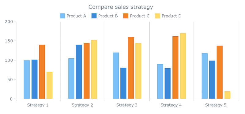
This multiseries bar chart displays sales of each product within each sales strategy and helps us to answer the following questions:
- Which strategy generated the most sales of every single product?
- How did the products perform individually within a given strategy?
Of course, when these are the questions being asked, we need to compare values within every single series (sales of a certain product across all strategies) and within every single category (sales of each product within a certain strategy). With that said, let’s look into this example.
We can clearly see now that Product D was most successful in Strategy 4 and the least successful in Strategy 5.
We also see that the biggest sales within Strategy 1 are attributable to Product C, whereas Product D finished last, and Products A and B are almost identical.
With this example, we can quickly analyze all product-level differences, and that is what we use such bar charts for.
Single-Series Bar Charts
Now, what if we only want to see the overall sales for each strategy and then compare them with each other? We know that some products performed better or worse than others in each strategy, but which strategy resulted in the greatest total sales overall, with no regard to individual product performance?
To analyze only the differences between category totals, we simply add up the product values and represent them as columns in a single-series bar chart:c
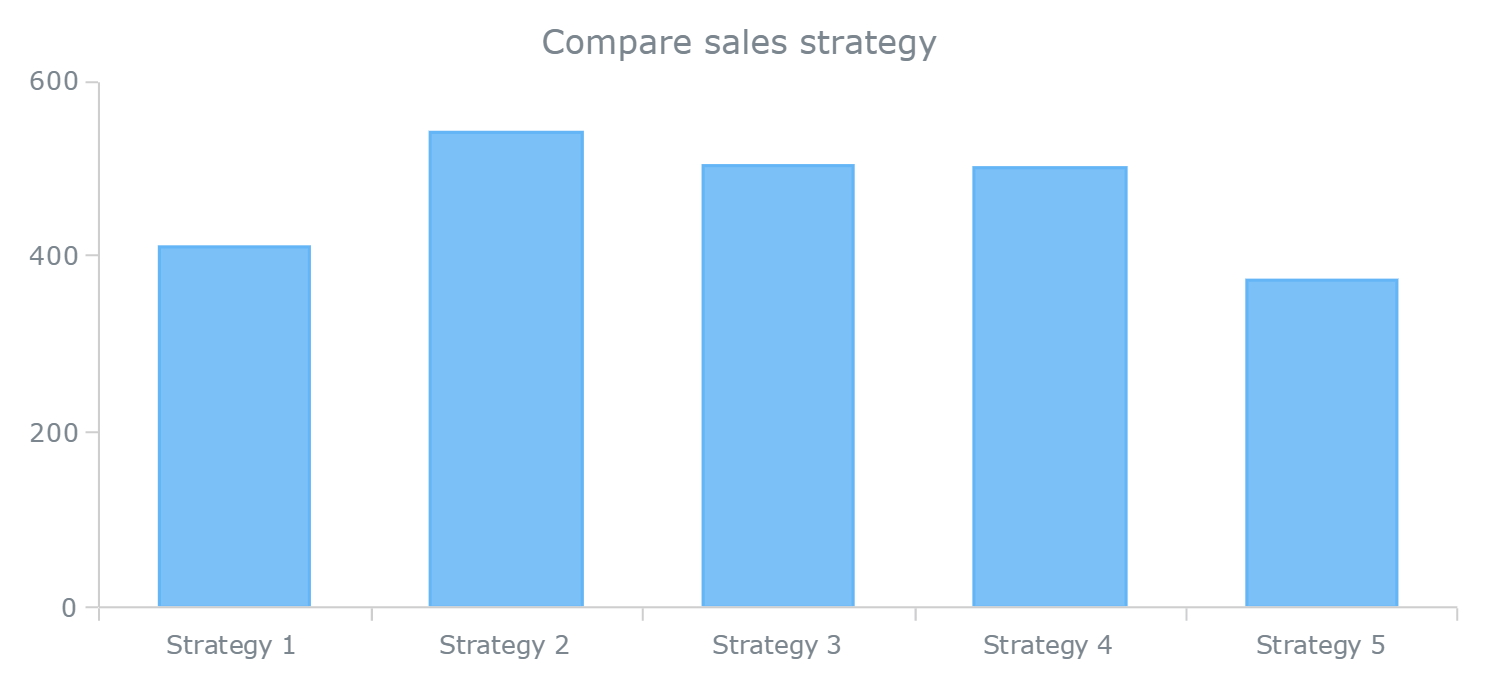
This chart fully answers the question we asked. It is clear that the Strategy 2 was overall most effective and Strategy 5 was the least.
To conclude, these conventional bar charts have helped us:
- compare products sales performance by strategy,
- identify the difference between strategies in terms of overall total effectiveness.
So far, so good.
However, we can go further still and discover the relationships between what we noticed in the first (multiseries) and second (single-series) graphs in order to understand more deeply what actually happened. For this purpose, we need to plot both category totals and product-specific data on one stage, and this is where a stacked bar chart starts to shine.
Stacked Bar Charts: Totals Against Parts

We might also want to ask, “Why did Strategy X undermine the sales of one or another product?” Or, “What was the performance of a product within one strategy in relation to its sales within other strategies?” Great questions, but remember that stacked bar charts are not supposed to answer these or similar questions with that type of detail. Sorry, no superheroes here.
Stacked bar charts are designed to help you simultaneously compare totals and notice sharp changes at the item level that are likely to have the most influence on movements in category totals.
Looking at our stacked bar chart, we clearly see, for example, that Strategy 5 was the least effective overall, and this is mainly because sales from Product D were so much lower compared to the other strategies.
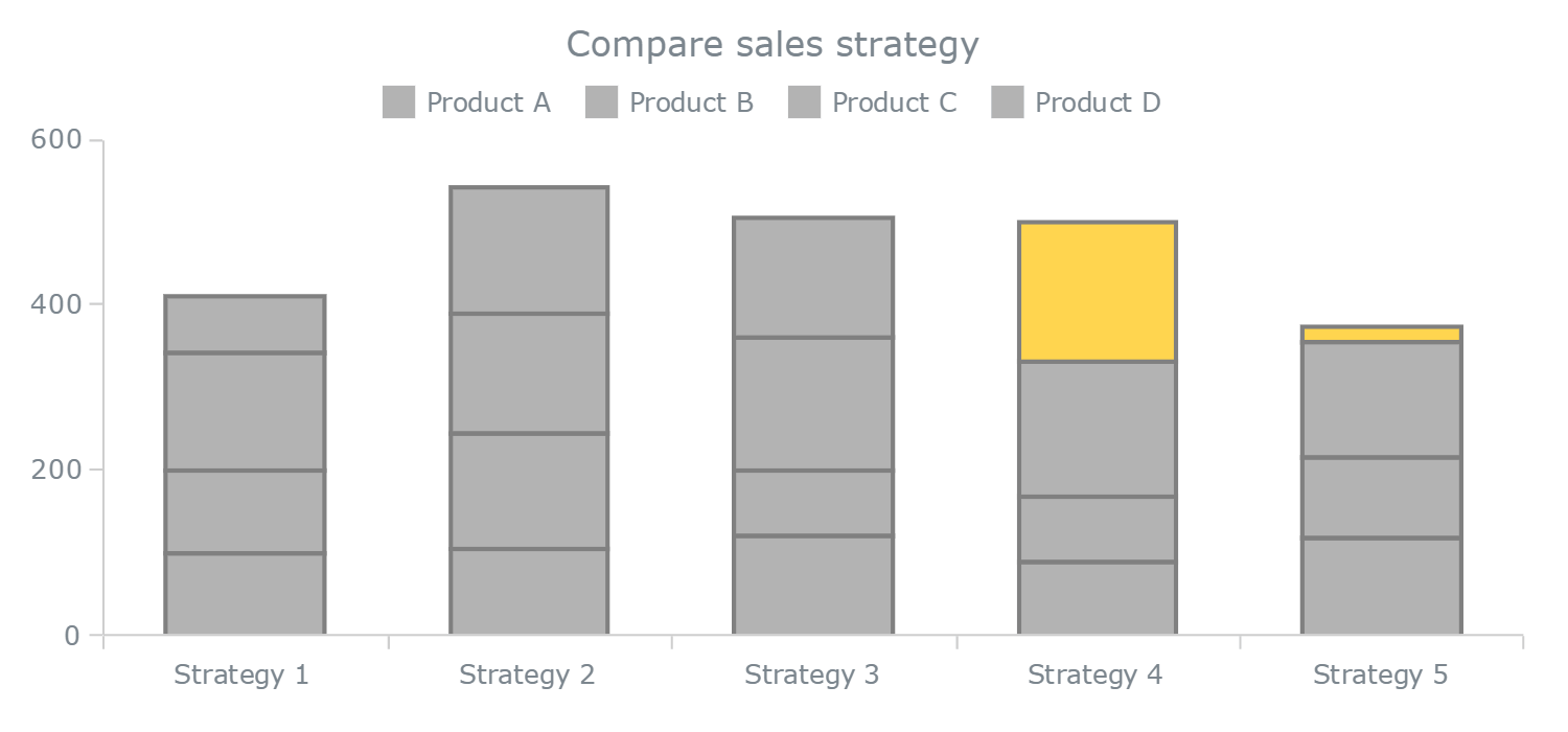
Take a moment to see what other insights our stacked bar chart provides by identifying other visually apparent relationships. In the meantime, let me stress that we cannot rely on this chart type to clarify absolutely all of the differences and contributions. Generally speaking, stacked bar charts are quite similar to sparklines in terms of usage: The main purpose of both types is to enable a better understanding of the big picture, without much focus on details such as light changes.
Of course, if you require deeper, more comprehensive or just different insights, then you’ll need to choose another chart type, one that will help you to answer your specific questions about your specific data.
Stacked Bar Charts Versus Combined Charts
I showed the first draft of this article to a couple of my colleagues. One of them wondered:
“If you want to show both category totals and item-specific data at the same time, why not use a dual-axis graph with separate bars for each product and a line series for totals? Wouldn’t that be better than a stacked bar chart, because it will help you to understand all of the differences, including at the product level?”
It’s an interesting question. Let’s take a look.
While bringing all category totals into a separate line series with its own axis and then letting regular bars take care of the rest might sound appropriate, I don’t think so. Not to mention that I am not a big fan of dual-axis charts, at least when I have data and questions like these. But let’s check it out and you decide.

In this case, we can simultaneously see the totals and compare data points within a category. But the main issue is that this combined chart is actually harder to read, because the view is overloaded with columns, each attracting considerable attention, not to mention the line series with the second axis cluttering the view.
And things only get worse if we have a few more strategies, in this case just three more:
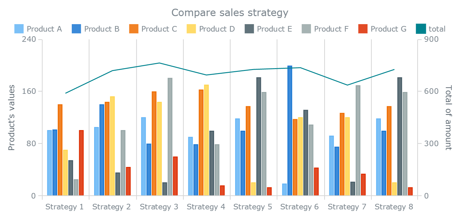
Large data sets are not uncommon, and while this one is far from large, I think you’ll agree that the eye gets lost in the presentation. As a matter of fact, we would have to spend too much time reading the combination of bar charts and line graph in both cases. So, when visualizing large amounts of data, we’d certainly be better off switching to another view, rather than piling up everything in one chart.
I think you’ll agree, a stacked bar chart seems to make more sense, even in this situation:

Conclusion
Now you’ve seen it with your own eager eyes. The stacked bar charts showcased in this article not only allow us to see the category totals first, but also get a rough yet helpful understanding of the item level within each category. As a result, they’ve clearly answered the questions asked:
- Which strategies are better (and lead to higher sales)?
- Which significant product-level leaps made one or another strategy more (or less) effective?
I hope you also agree that our stacked bar charts turned out to be concise and easy to read.
Please keep in mind that this chart type is very specific. Use it carefully and only when your questions and data fully correspond to the purposes it serves. For example, to compare item values more precisely and comprehensively, pick a conventional bar chart instead, because that is its purpose. However, I am sure you now share my feeling and experience: Stacked bar (column) charts are far from the “worst,” much less are they useless.
I will repeat myself and say that the main, strategic purpose of stacked bar charts is to help you assess the big picture at a glance, focusing on category totals and drastic series-level changes, and then let you decide what to research next if needed. Depending on the situation, you might find a better solution for other kinds of data and questions. However, stacked bar charts are often worthwhile and should be considered when the occasion demands.
I’ve made all of the chart illustrations from this article available on CodePen so you can explore them in detail, test your own data, and so on. You are also welcome to use Chartopedia, a guide for choosing right chart types that I am currently building, to learn more about various data visualization methods and their purpose.
Further Reading
- Finding Better Mobile Analytics
- Fun With Physics In Data Visualization
- Is Your Responsive Design Working? Google Analytics Will Tell You
- Create An Animated Bar Graph With HTML, CSS And jQuery


